SYNC — Creative Portfolio Website Design & Development

Nabeel Ahmed


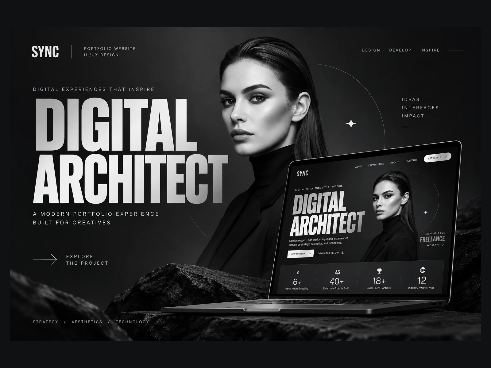
SYNC — Designing Digital Experiences That Make an Impact
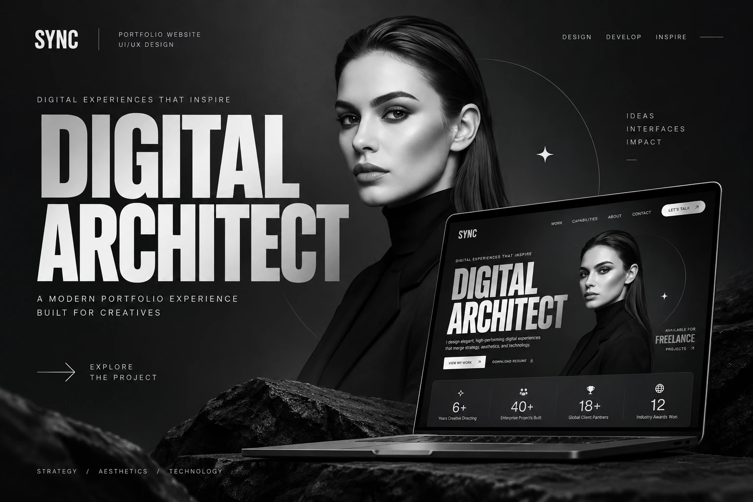
SYNC is a bold creative portfolio website designed to present digital work through a distinctive, editorial-inspired experience. The concept combines oversized typography, monochrome imagery, strong visual hierarchy, and minimal interface elements to establish an immediate creative identity. The opening experience was designed to communicate personality and expertise from the first interaction while directing visitors naturally toward selected work, capabilities, and opportunities for collaboration.
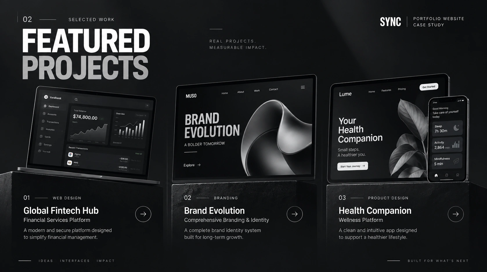
Selected Work Presented with Clarity and Purpose
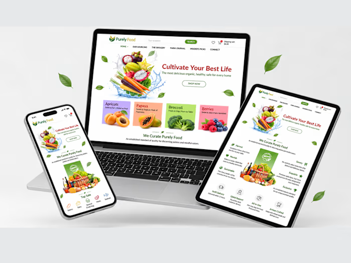
The featured work section was designed to make portfolio exploration visual, immediate, and easy to understand. Individual projects are presented through large device mockups, clear project categories, concise descriptions, and direct navigation points, allowing visitors to quickly understand the range of work across web design, branding, financial platforms, and digital product experiences. The restrained monochrome treatment keeps attention on the projects while preserving the overall identity of the portfolio.
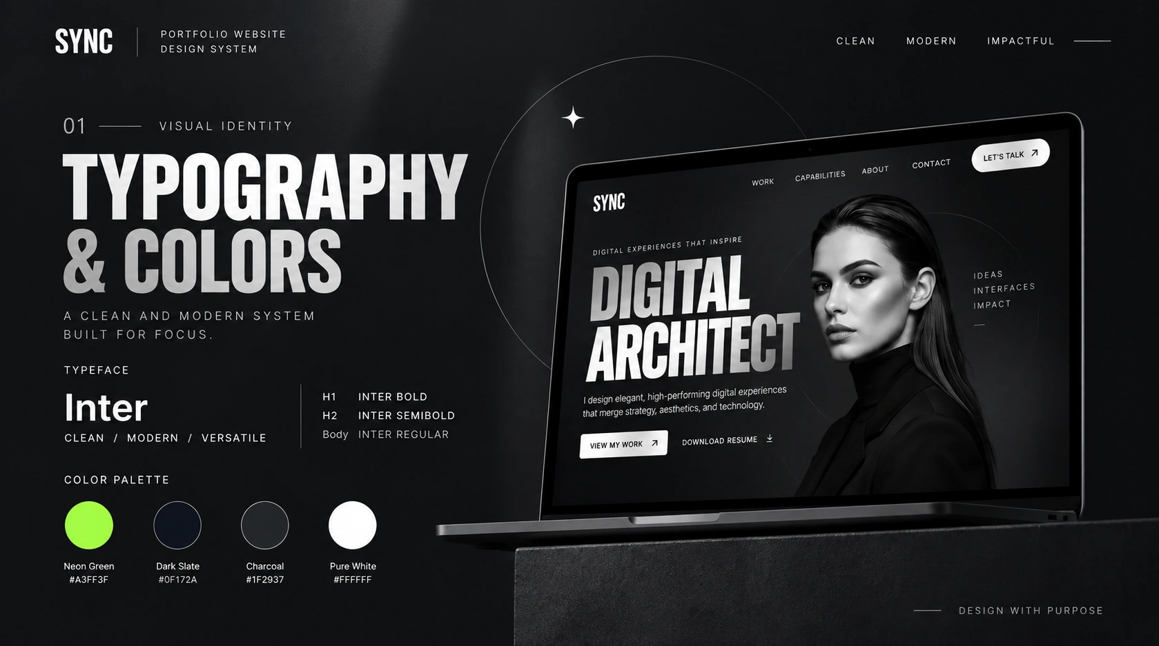
A Minimal Visual System with Maximum Presence
The visual identity was built around a deliberately restrained system that lets typography, imagery, and composition carry the experience. Bold Inter typography creates strong editorial hierarchy, while dark slate, charcoal, and pure white establish the monochrome foundation. A vibrant neon accent introduces contrast where additional emphasis is needed. Consistent spacing, fine-line graphic elements, circular forms, and minimal interface components reinforce the clean, modern, and confident character of SYNC across the website.
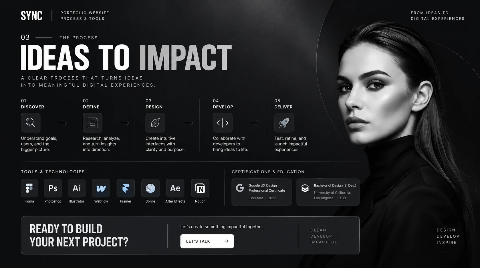
From the First Idea to a Meaningful Digital Experience
The creative process was structured around five clear stages — Discover, Define, Design, Develop, and Deliver — creating a practical path from understanding the initial challenge to launching the final experience. Research and strategic direction inform the interface design before ideas move into development, testing, and refinement. The section also presents the wider creative toolkit and professional background, reinforcing the multidisciplinary approach behind the portfolio and its digital projects.
Bringing the SYNC Experience into the Real World
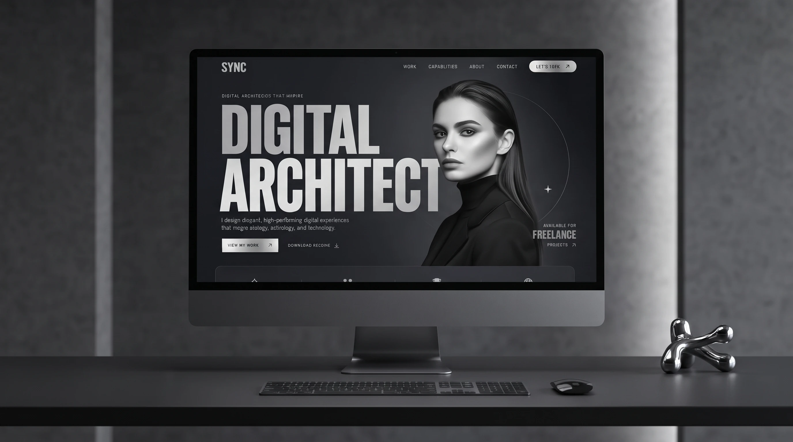
The final presentation places the SYNC interface within a realistic desktop environment, demonstrating how the bold typography, monochrome imagery, navigation, and carefully balanced composition translate to a large-screen experience. The minimal surrounding environment complements the visual direction of the website and keeps attention focused on the interface, presenting the final result as a polished and professional digital portfolio ready for real-world use.
Built to Turn Creative Work into Digital Impact
SYNC brings strategy, visual identity, interface design, and modern web development together in one focused portfolio experience. Every element — from the bold first impression and curated project presentation to the structured creative process and final call to action — was designed to communicate confidence, clarity, and creative capability while turning a personal portfolio into a memorable digital presence.
Like this project
Posted Sep 24, 2026
Designed and developed a bold creative portfolio in Framer, combining selected work, services, process, and a distinctive monochrome visual identity.
Likes
0
Views
3