Midtown Beauty Bar
Case Studies
Goal:
Refresh current website for Midtown Beauty Bar to include new services, a second location, and updated photography.
Target Audience:
Beauty minded people in Reno, NV who are looking for lash extensions, waxing, and skincare services in a hip, comfortable environment. Also lash artists seeking lashing supplies and education from this well-known local business.
Challenges:
Appeal to aesthetically driven clientele
Improve booking user flow
Improve lash artists user flow
Inform both website visitors and search engines of second business location and expanded services
Must be mobile friendly
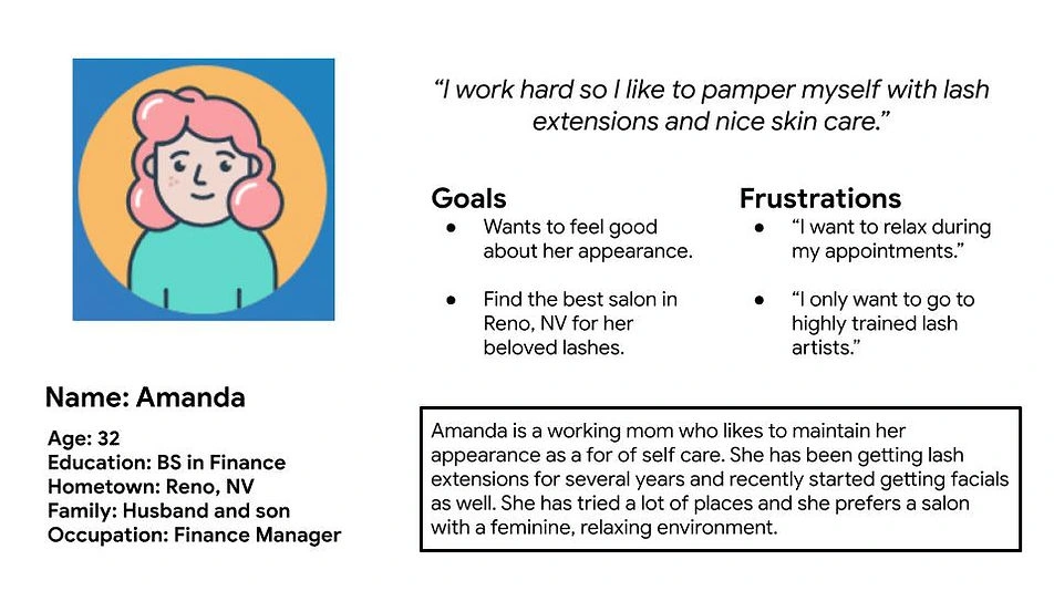
User persona
Research:
For this project I used primary research of the business's audience utilizing online data collected since the original website development in 2019. I was able to utilize two years worth of data gathered from Google Analytics to determine how visitors were interacting with the site and make adjustments accordingly. I was also able to use this data to update the SEO of the website, integrating the new services offered and the two new physical locations for this business.
Additionally, I did a deep dive of the business's social media profiles and online reviews to conduct qualitative research of their audience and users in lieu of formal interviews, surveys, or usability studies which were not feasible within this client's budget.
Through my research I identified the following areas of opportunity:
Most users on the site go straight to the booking page without viewing other pages, making the booking user flow the most important priority
Need for clearer messaging around the addition of the second location and the services provided at that location
Need for updated visuals of the physical space. The website is still showing pictures from an old location that they no longer have.
Ideation:
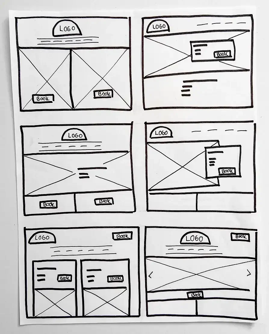
During the initial design phase I started with paper wireframes, working to identify a new user flow for the main page to make navigating to the booking page seamless from anywhere on the page and to add the information around the second location.
Once I had the new wireframe mapped out I moved directly into updating the website to match, utilizing the new photography as I went.
Paper wireframes
User Testing:
I conducted an unmoderated usability study of three participants, tasking each of them with visiting each page of the website and to access the bookings page from a minimum of three locations.
Based on the feedback, I did add one additional booking button adjacent to the map featured on the homepage.
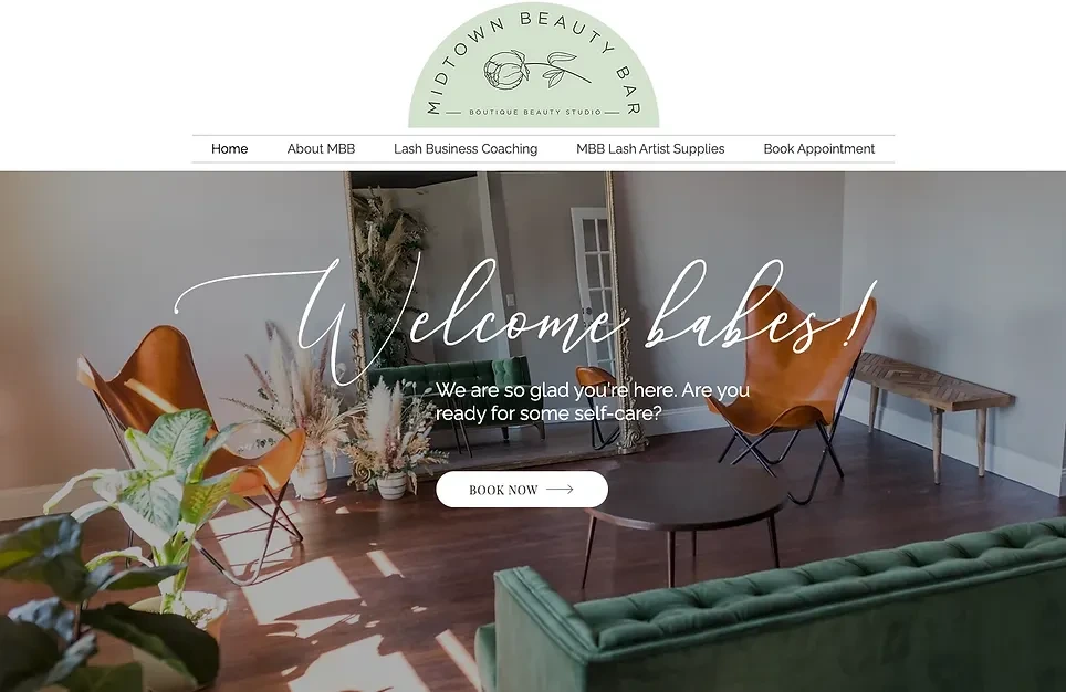
Updated home page
Conclusion:
This client is extremely pleased with how the project came out. I was able to address all of her business related issues with the site while keeping a close eye on the overall user experience.
The next step will be to monitor how users interact with the new "book now" buttons to determine if there is any redundancy or further need to adjust the user flow.
This project challenged me to keep the users of the site front of mind rather than only focusing on the requests of the client. It is easy to get caught up in the action items from the client and lose track of the overall user experience. In the end, I was able to meet the client's needs and create a beautiful user experience without her ever being aware of that effort. For me, being able to seamlessly do both is the ultimate way to care for your client.
Like this project
Posted Aug 27, 2024
Complete UX case study for work on Midtown Beauty Bar website.
Likes
0
Views
1
