USAF Alpha Charlatan
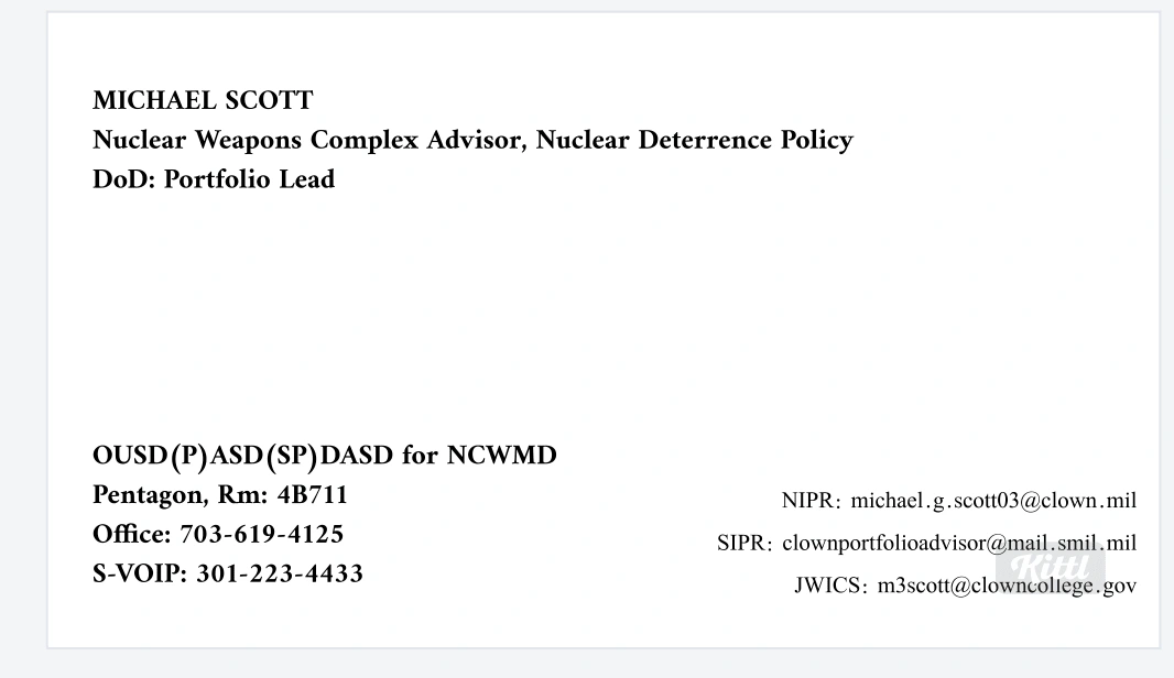
I started with the standard white card that was requested on our Discovery Call and began adding and doctoring layers.
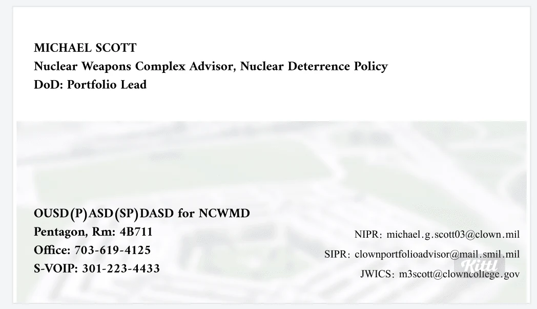
I tested multiple blocking techniques on the first template
This was done to provide various display options for the information to be organized, spaced well and easy for readers to follow without overwhelming them with the size or amount of text.
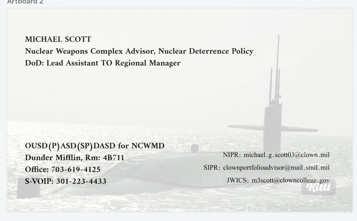
This one is my personal favorite! I love that I was able to make adjustments to keep the radiance ☀️ of the photo, despite it being translucent.
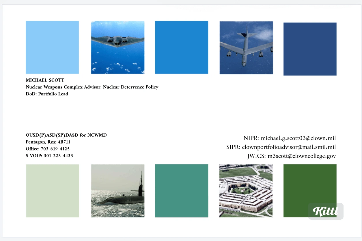
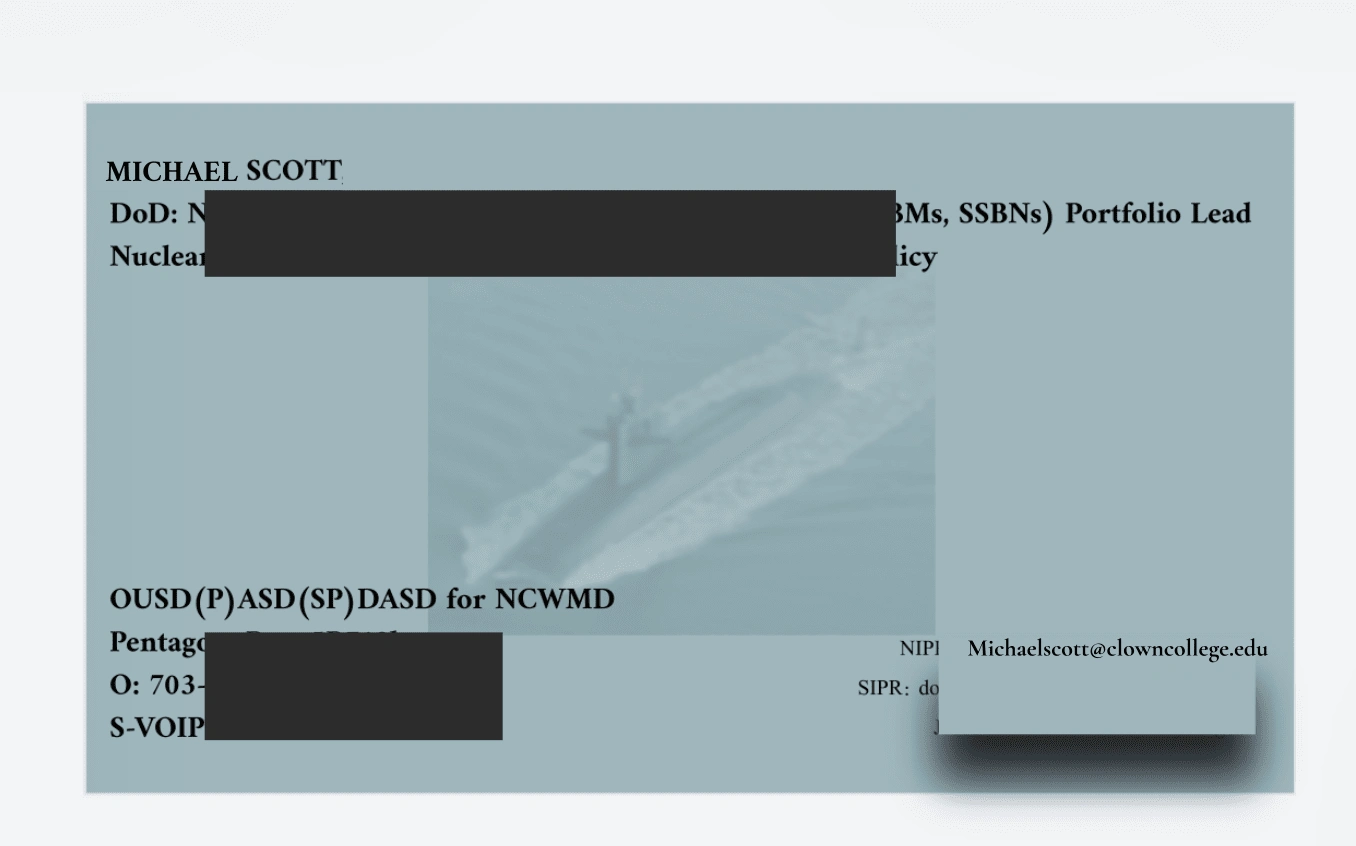
For the last two, I can't help but throw out colorful & bold wildcards, even if they get rejected.
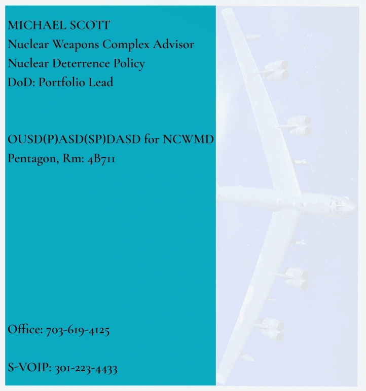
Like this project
Posted Oct 8, 2024
Client requested: Plain white/neutral business cards with plain black text, Pentagon in the background, along with B-52 & B-2 bombers, ICBM missile, SSBN sub.
