SAKI: Brand Identity & Packaging System for Organic Beauty

Usama A.


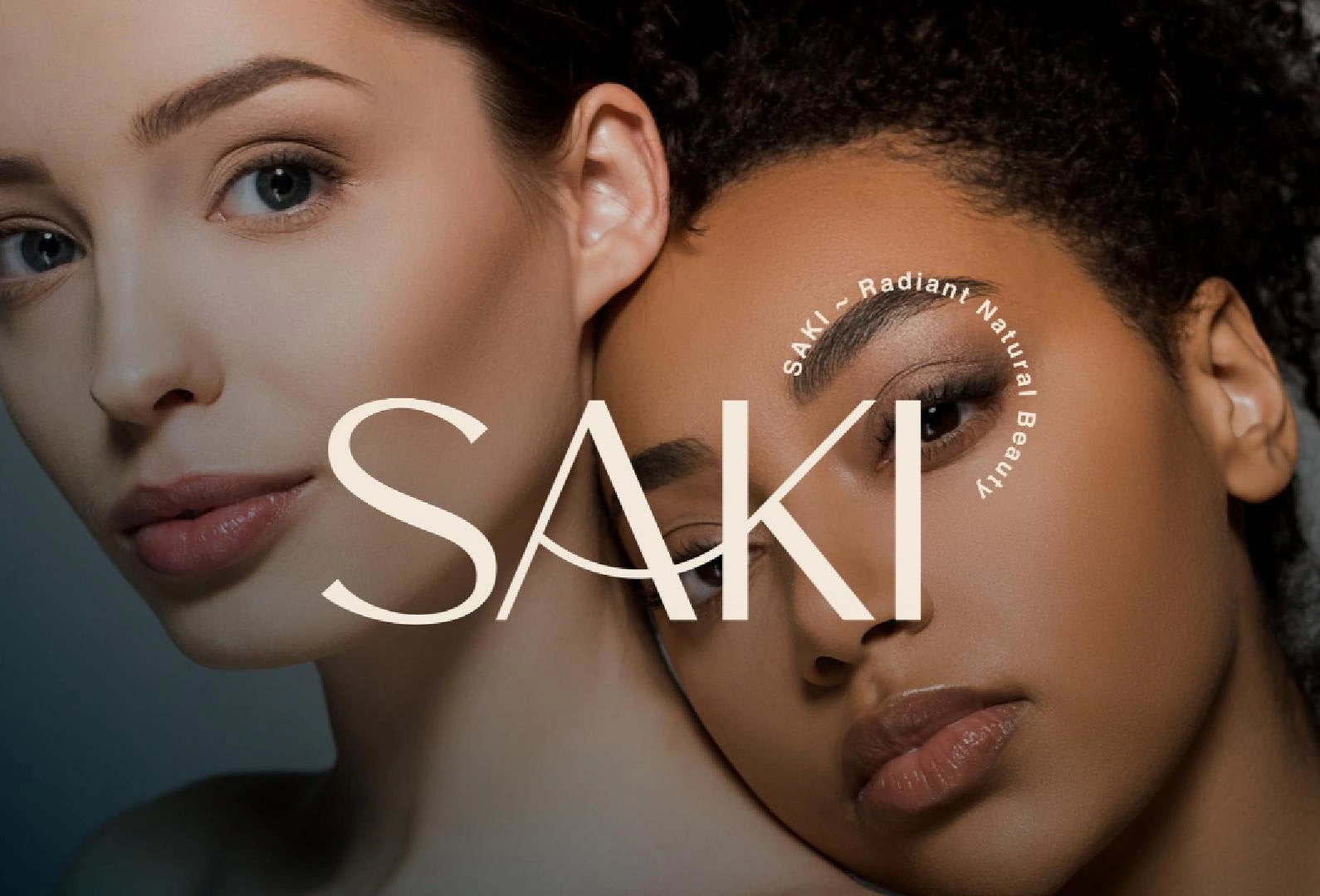
SAKI: Complete Brand Identity & Packaging System
Client: SAKI
Industry: Beauty & Wellness / E-commerce
My Role: Brand Strategist & Lead Designer
Services: Visual Identity, Packaging Design, Brand Guidelines, Art Direction
Tools: Adobe Illustrator, Photoshop
The organic beauty market is crowded with "green and brown" clichés. SAKI came to me with a high-quality product but a generic visual presence that didn't reflect their premium price point.
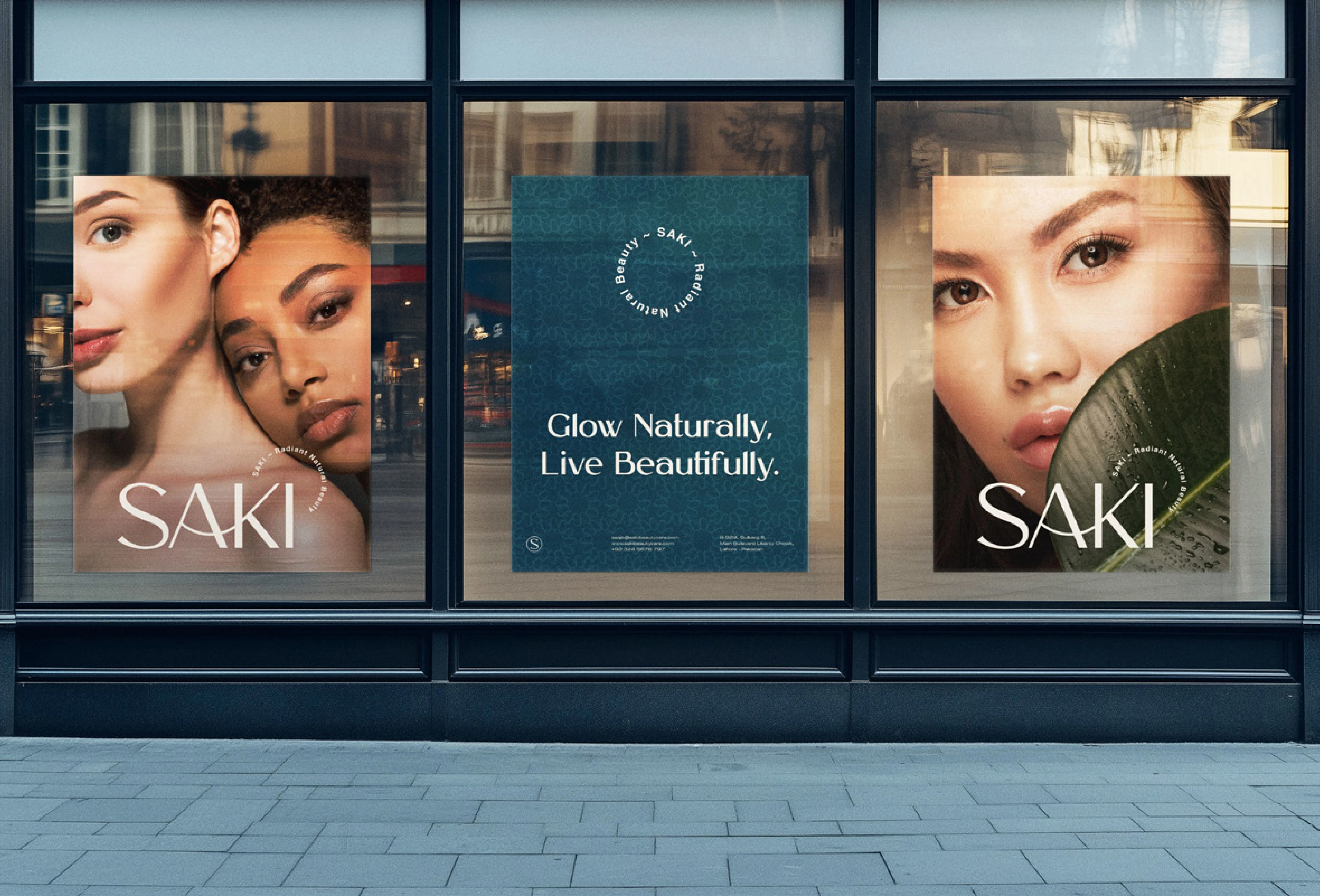
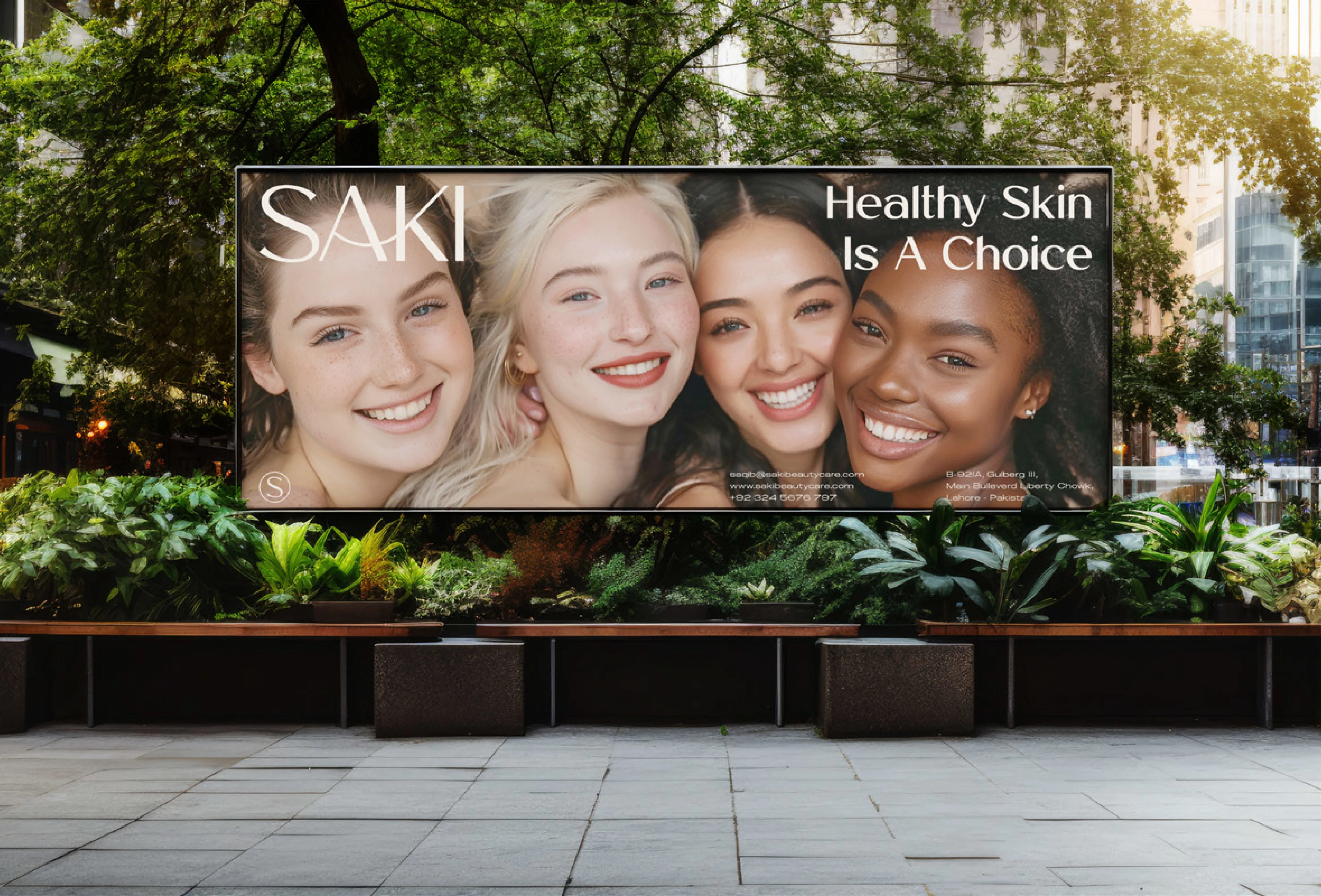
They needed a brand identity that felt pure, ethical, and luxurious without looking like every other eco-friendly brand on the shelf. The goal was to build trust with conscious consumers while establishing a distinct visual language that could scale across digital and physical touchpoints.
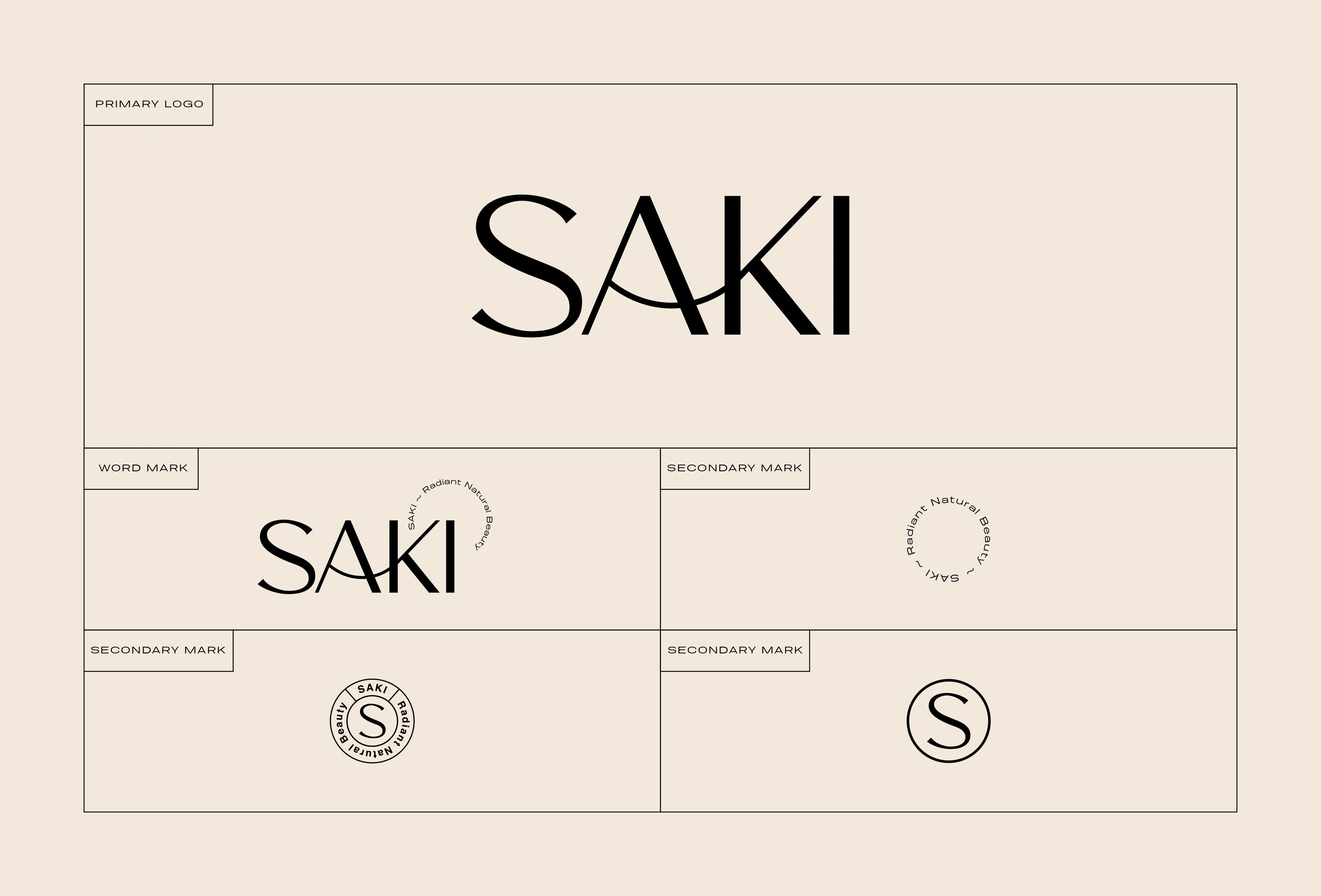
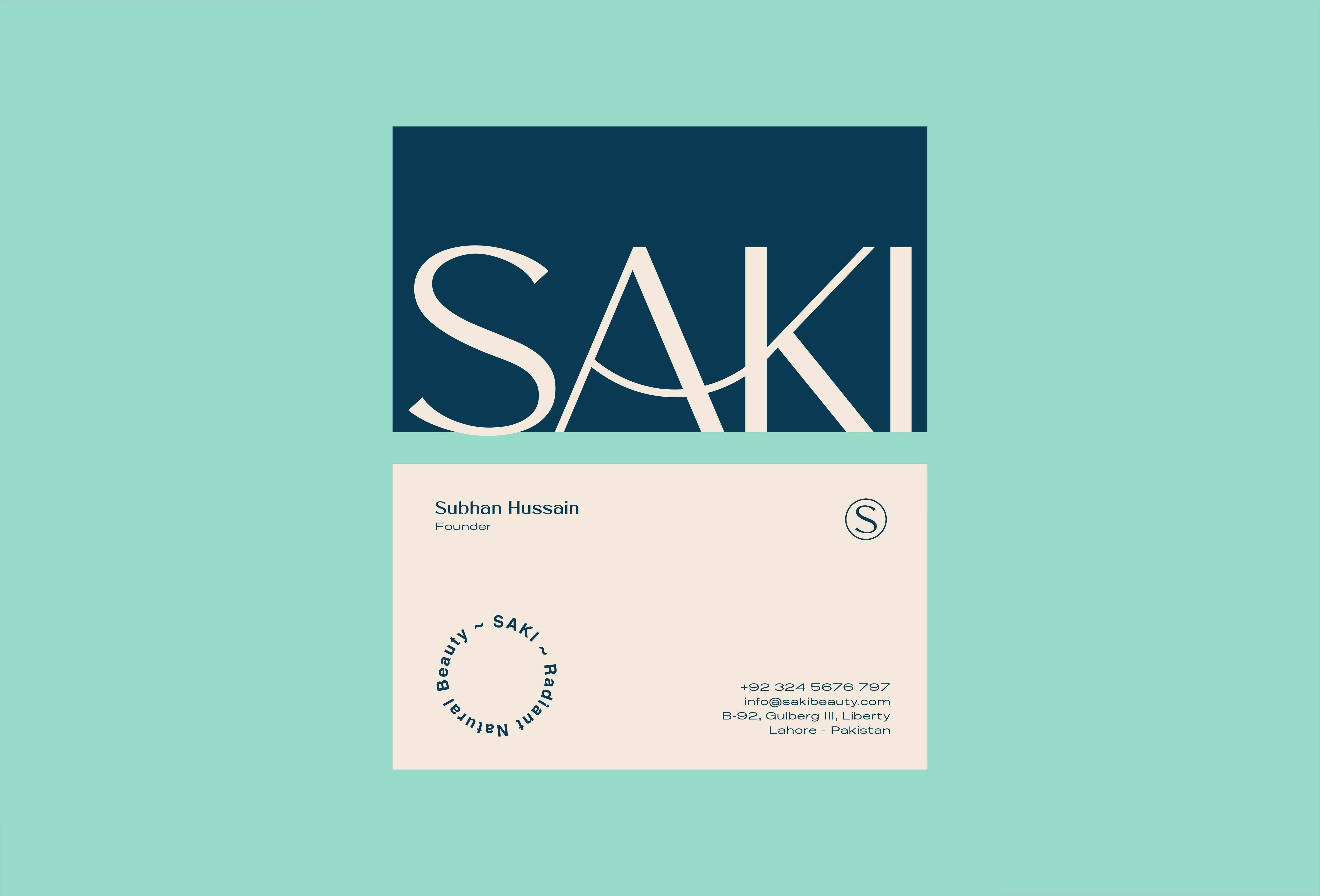
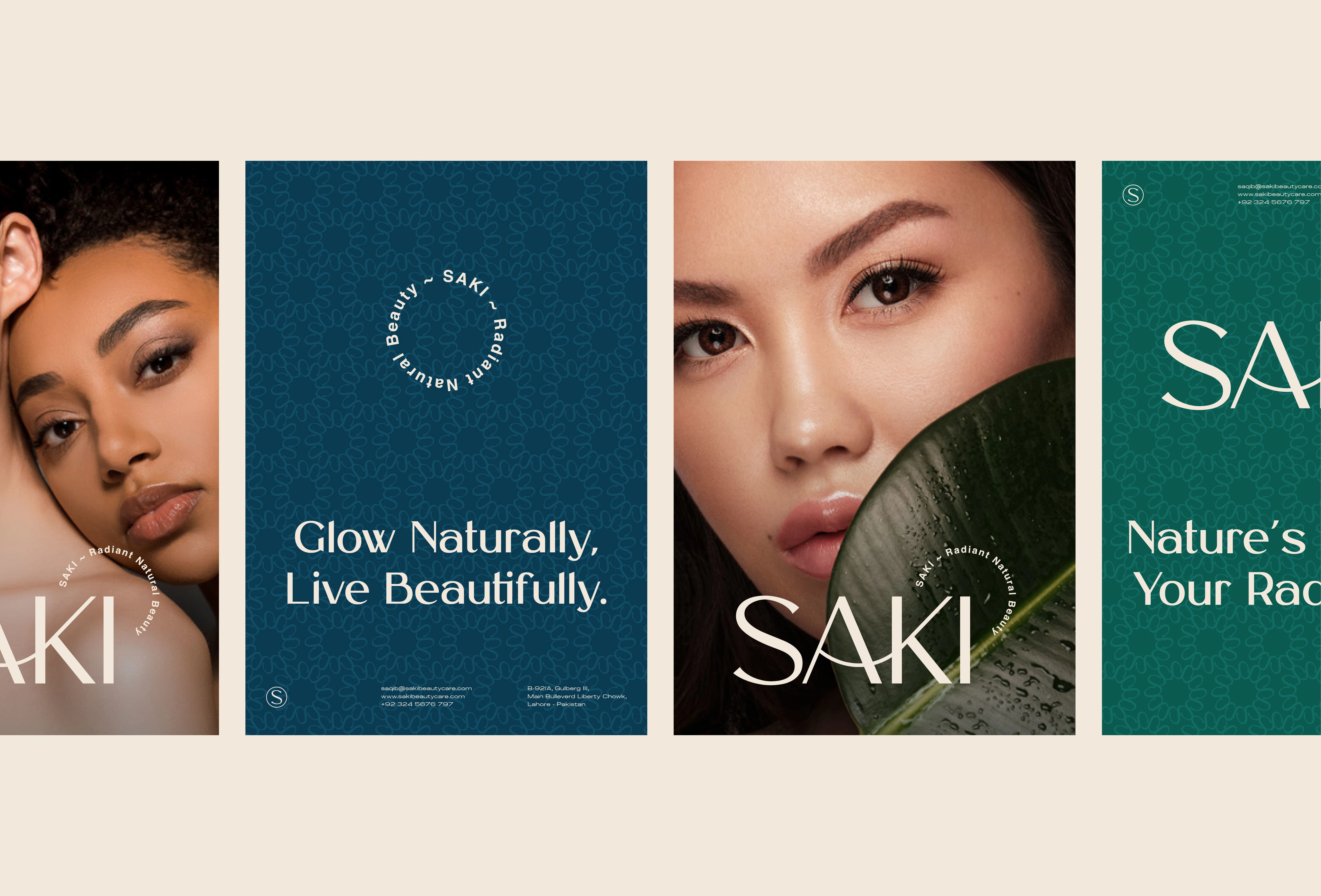
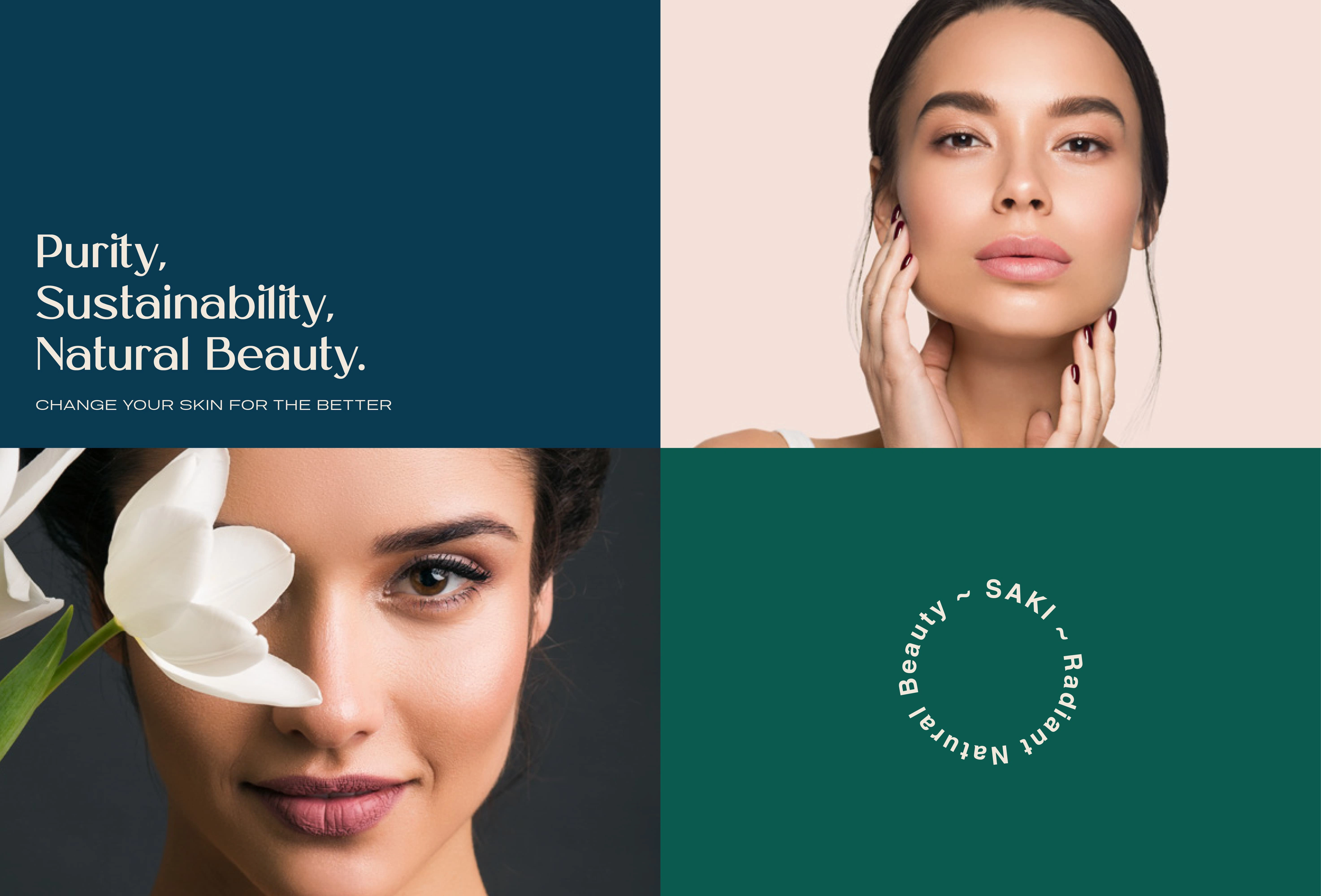
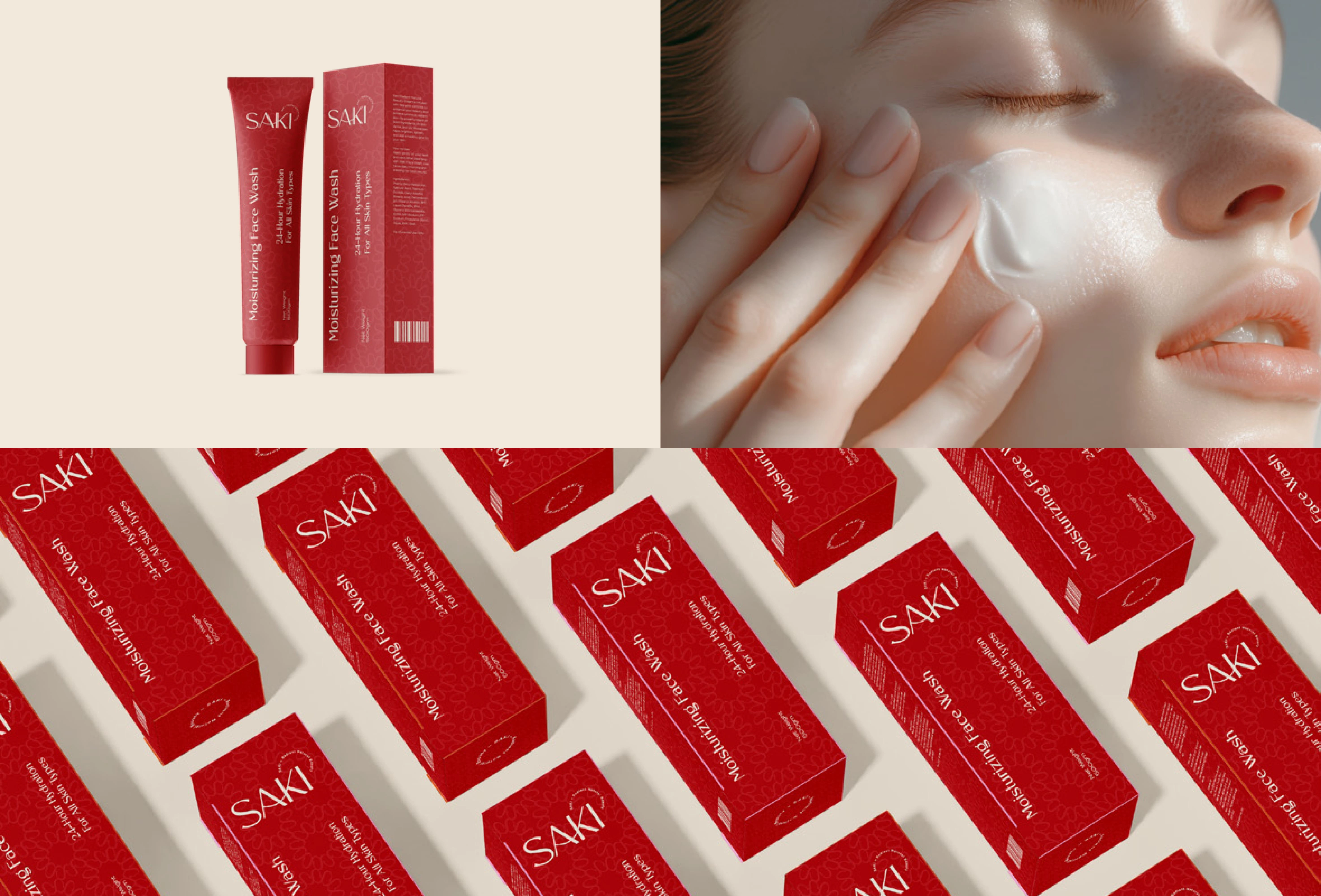
The Logo: I designed a clean, typographic wordmark that balances elegance with approachability. The spacing suggests "breathing room," reinforcing the concept of skin health and purity.
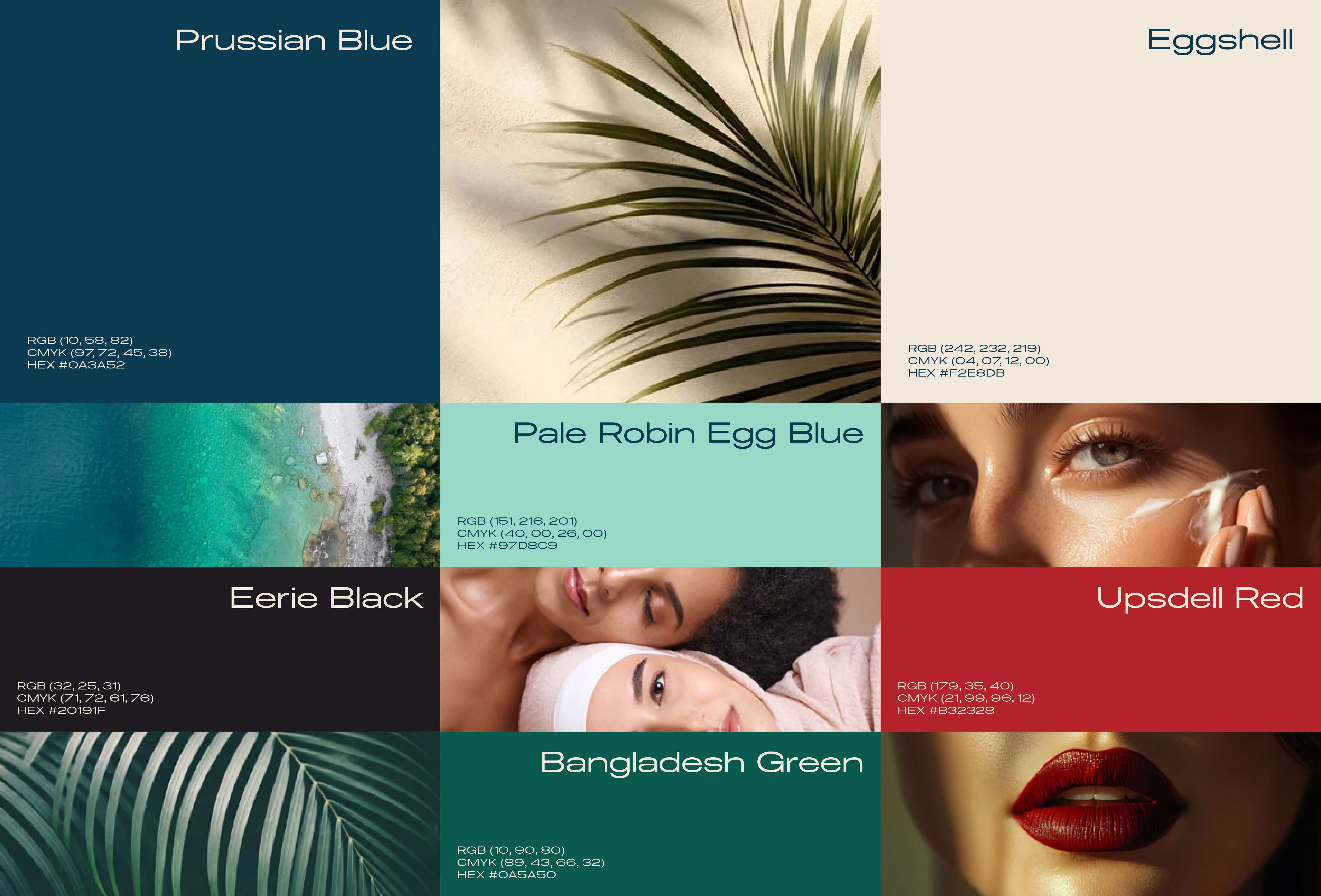
Color Palette: Instead of standard earth tones, we utilized a soft, muted palette (sage greens, cream, and charcoal) to evoke a sense of calm and clinical efficacy.
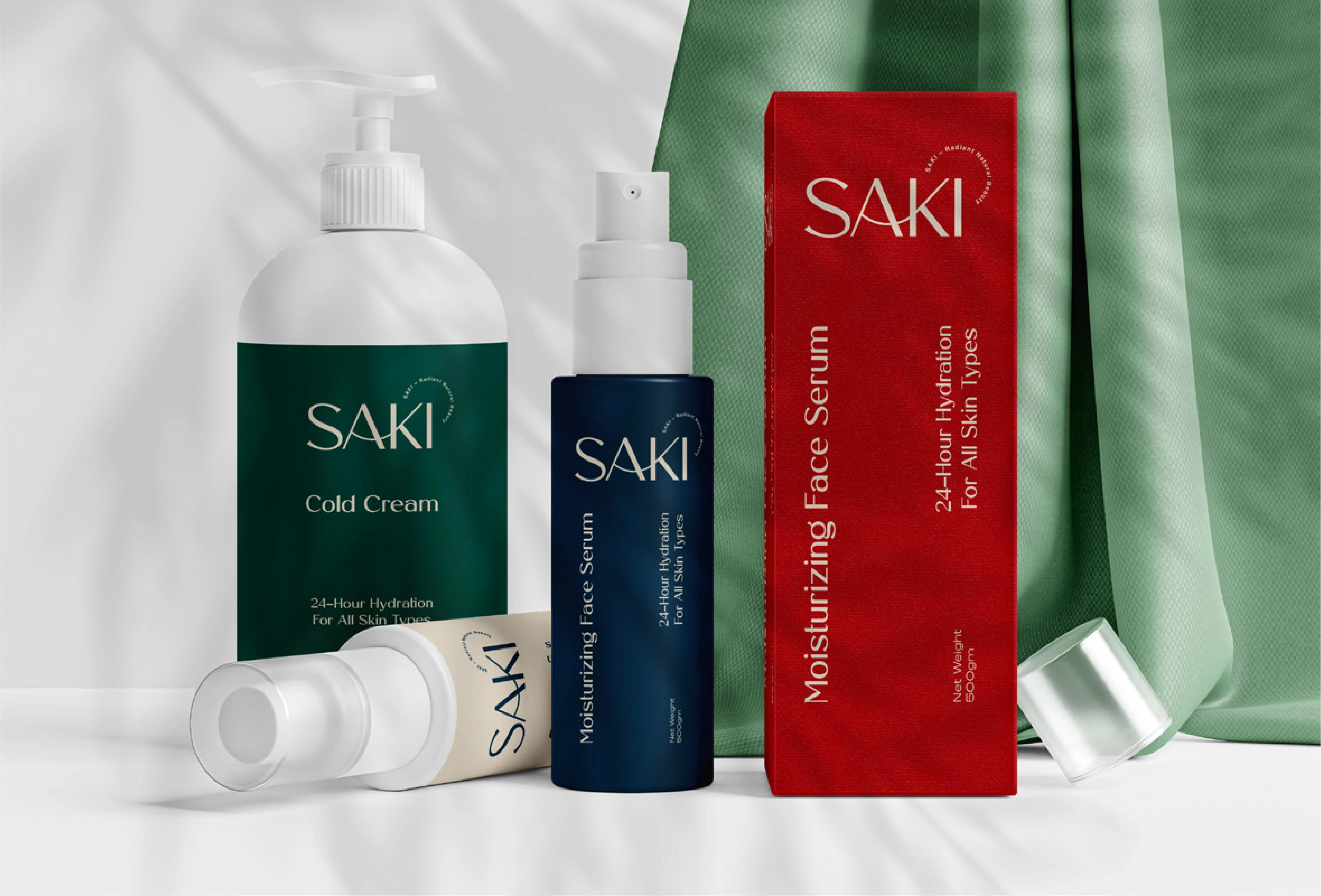
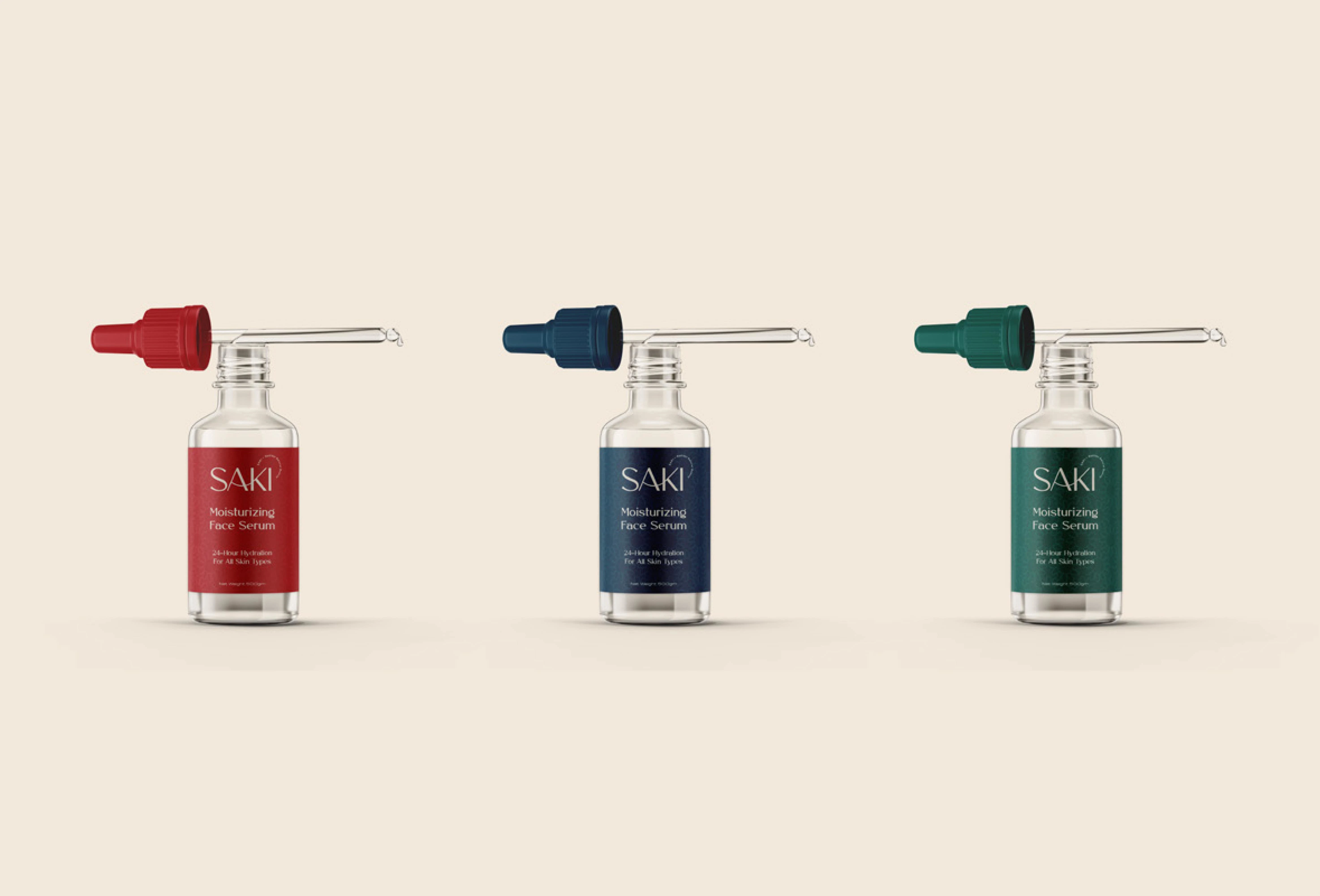
Packaging Architecture: We created a modular packaging system. The hierarchy was strictly organized to ensure customers could instantly identify the product benefits (e.g., "Hydrating," "Exfoliating") without visual clutter.
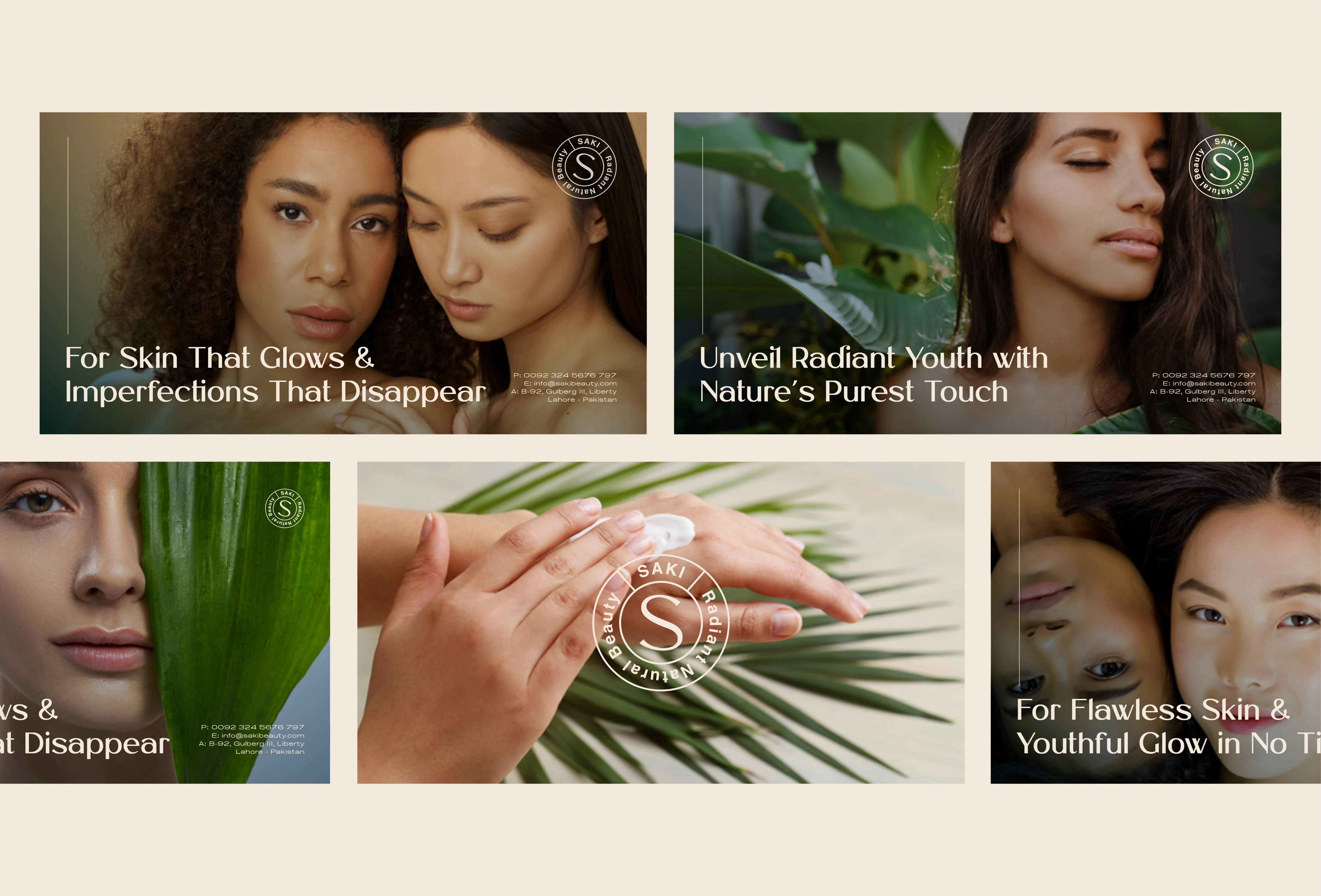
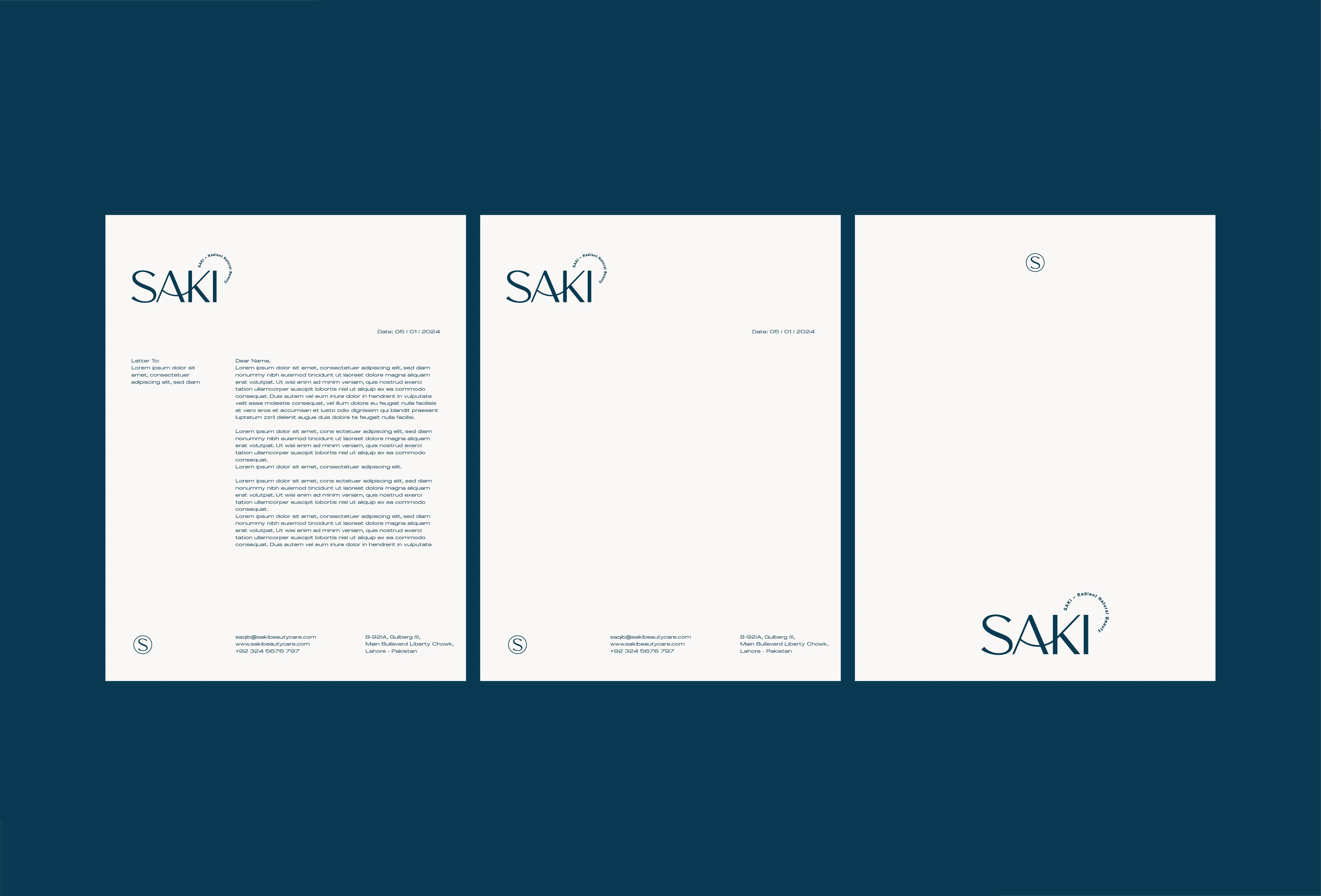
Unified Brand Voice: Delivered a comprehensive Brand Style Guide ensuring consistency across social media and packaging.
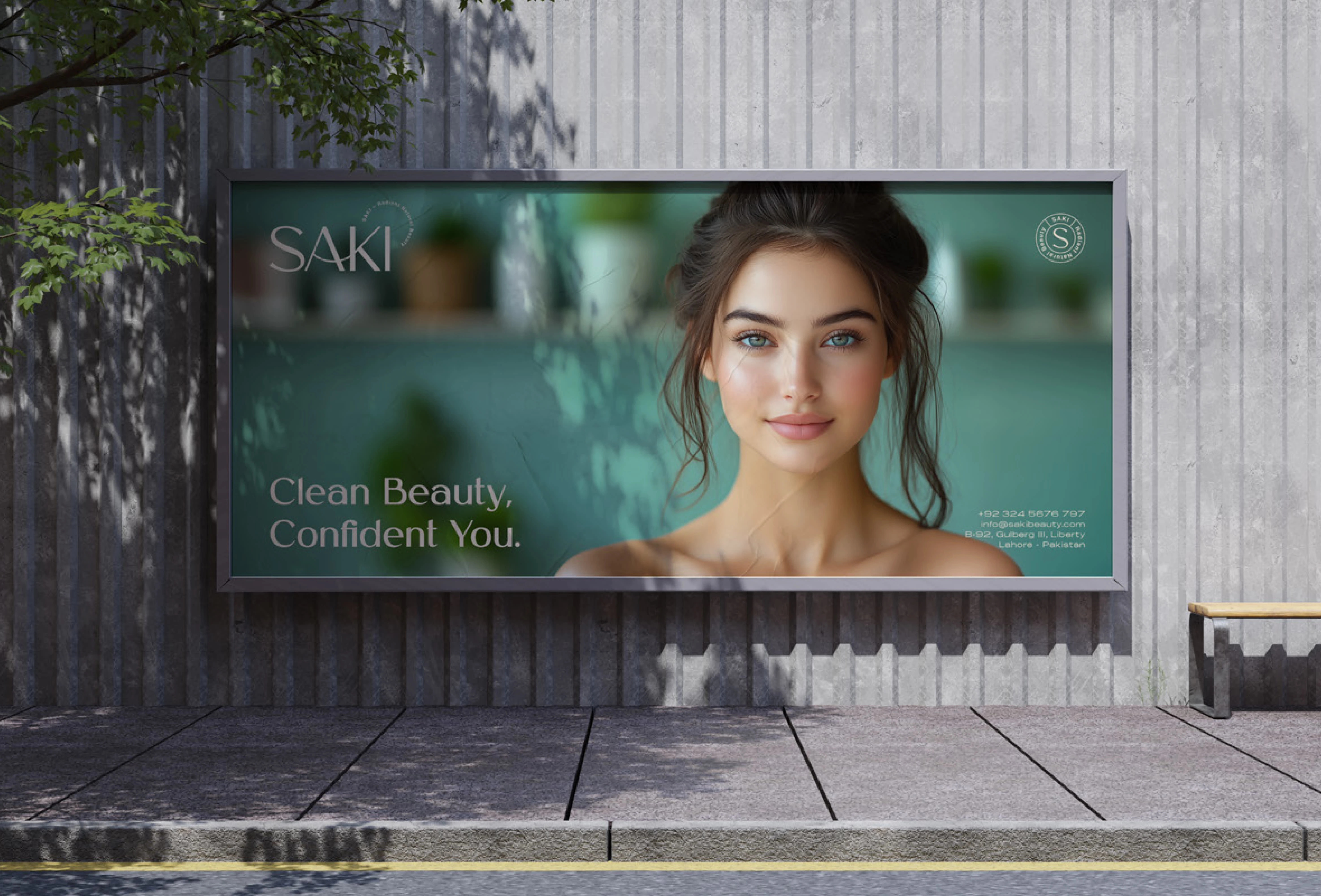
Shelf Impact: The packaging design was optimized for both physical retail visibility and digital unboxing experiences.
Scalability: The visual system is flexible enough to accommodate future product lines without losing brand recognition.
Like this project
Posted Mar 18, 2025
A premium brand identity and packaging system positioning SAKI as a modern leader in the organic beauty market.
Likes
2
Views
18
Timeline
Nov 7, 2024 - Feb 4, 2025