https://contra.com/p/eXrYgr7P-velaine-luxury-fragrance-brand...

Alaa

VELAÏNE — Luxury Fragrance Visual Identity
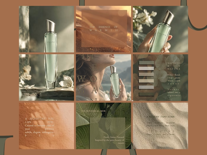
I wanted to share part of my work on VELAÏNE, from developing the brand concept to designing its social media campaign.
One of the main challenges was choosing the right text colors and backgrounds. I didn’t want every post to use the same color, so I explored different backgrounds, textures, and elements inspired by the fragrance’s ingredients while keeping the overall look elegant and refined.
Do you think the current colors work well for the identity, or would earthy tones be a better direction?
Which post or color caught your attention the most?
For the full project details and case study, you can find the link in my bio.
Like this project
Posted Sep 19, 2026
https://contra.com/p/eXrYgr7P-velaine-luxury-fragrance-brand-identity?referralExperimentNid=DEFAULT_REFERRAL_PROGRAM&referrerUsername=a_laa_5o8brv9p VELAÏNE...
Likes
0
Views
0