
Overview & The Problem:
Inconsistent UI components, missing edge-case states, and unclear handoff specs slow down product teams and create friction for engineering. This work highlights how I structure scalable Figma design systems with multi-tier tokens, full component states, and accessibility standards to keep product delivery consistent.
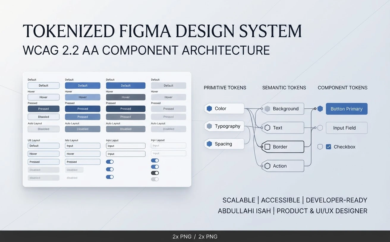
Tokenized Figma Design System
System Structure & Key Features:
Multi-Tier Design Tokens: Organized design tokens across Primitive, Semantic, and Component layers to keep visual decisions consistent and adaptable.
Full-State Component Libraries: Built reusable components with clear state coverage—including default, empty, loading, error, and offline states—using Figma variables and Auto Layout.
WCAG 2.2 AA Accessibility: Applied accessibility checks and clear annotations so interfaces remain usable and compliant.
Developer Handoff Readiness: Structured components and specifications to reduce engineering guesswork and speed up implementation.
Key Outcomes:
Reduces UI inconsistencies across screens and product updates.
Gives engineers clear, predictable component states and specifications for smoother handoffs.
0 likes · 0 views · Nov 20, 2026
Tokenized Figma Design System & WCAG 2.2 AA Component Architecture. Role: Product Designer & UI/UX Designer
