Built with Framer
Ecommerce Pharmacy Website Design with Framer
Prince Olorunfemi
Ecommerce website — pharmacy landing & product pages (Framer)
Role
Lead designer & builder — end-to-end UI, interaction design, and Framer implementation.

Overview
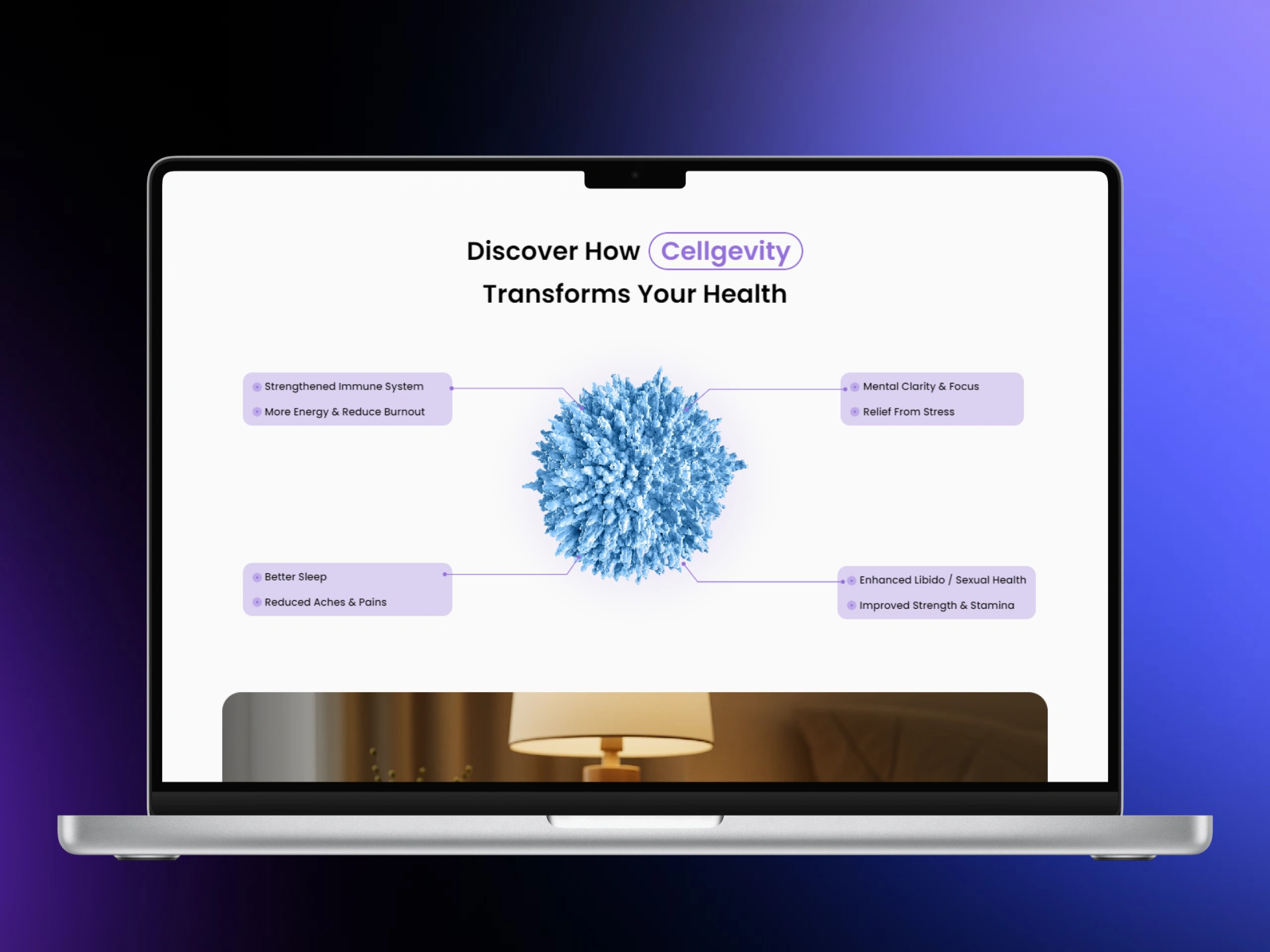
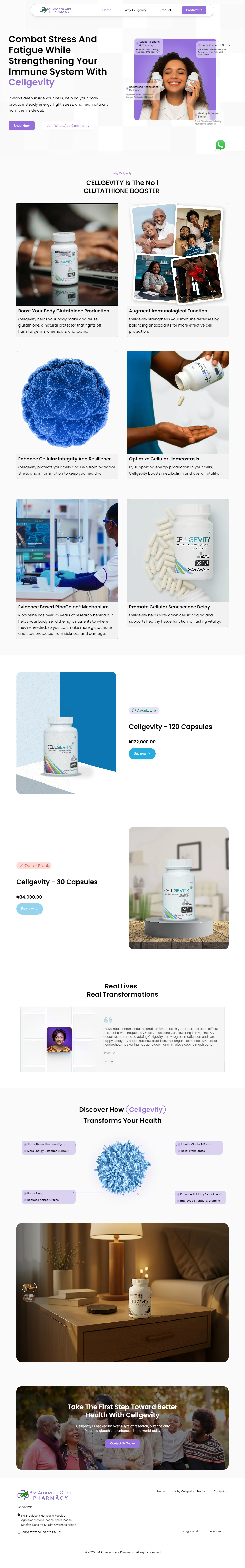
Create a clean, trust-first product experience for a premium health supplement so visitors understand benefits fast and can buy with confidence — mobile-first, image-led, and WhatsApp checkout ready.
Problem
The client sold a scientifically dense product. The challenge was twofold: translate clinical claims into clear consumer benefits, and convert cautious buyers without overwhelming them with jargon or friction.
My approach
Research
• Reviewed product literature and ingredient claims to identify the true user benefits to highlight.
• Skimmed competitor pages and health marketing patterns to find gaps in clarity and credibility.
Information architecture
• Reduced content to three persuasive layers: Claim (what it does), Proof (why it works), and Action (how to buy).
• Re-ordered sections so the hero answers “What is it?”, “Why trust it?”, then “How do I get it?” within three scrolls.
Wireframes & prototypes
• Low-fi flows to test hero variations and CTA placement.
• Interactive Framer prototype to test the WhatsApp checkout microflow and product card behaviors on mobile.
Visual system & motion
• Image-forward layout with large product photography and testimonial blocks to build trust.
• Micro-interactions for “Buy now” and stock states, subtle motion to guide attention without sounding salesy.
Build & handoff
• Built directly in Framer for a smooth designer-to-live workflow.
• Delivered a tidy component set: product cards, testimonial carousel, and tokenized text styles for fast swaps and localization.
Solution highlight
• Outcome-first hero that communicates core benefit in one glance.
• Product cards with clear pricing, availability, and WhatsApp “Buy now” CTA for low-friction transactions.
• Evidence blocks that translate RiboCeine research into short, human language plus trust visuals.
• Testimonial section with repeating social proof to reduce cognitive risk for buyers.
• Mobile-optimized flows with progressive image loading for faster perceived performance.
Impact & next experiments
Delivered a production-ready Framer site that makes a technical product approachable and purchaseable. Next steps I recommend:
• A/B test hero copy + CTA color to measure lift in click-to-WhatsApp conversions.
• Track time-to-first-action and add a lightweight “Why it works” micro-toggle to improve trust signals for hesitant buyers.

Like this project
Posted Dec 29, 2025
Designed ecommerce landing & product pages for a pharmacy using Framer.