Rebasive Homepage Redesign

Ayodele Okanlawon


Introduction
Money transfer is an industry where trust, clarity, and ease of use determine adoption. As research from Nielsen Norman notes, “Users’ first impressions are 94% design-related” – in financial products, a confusing or outdated interface can instantly reduce credibility.
Rebasive’s original homepage carried strong functional content but lacked emotional resonance and modern visual clarity. The redesign was crafted to create a bolder, more trustworthy experience that positions Rebasive as both global and personal.
Rebasive Homepage Redesign
Research and Pain Points
In the original homepage:
Visual overload: Multiple gradients, icons, and text blocks competed for attention, diluting focus.
Messaging ambiguity: The headline “Send Spend Everywhere Instantly & Safely” tried to do too much at once, making the brand promise harder to digest.
Trust signals: Although present, they were buried in the hierarchy and not tied strongly to emotional cues.
Calculator placement: The transfer calculator was available but visually blended into the content, reducing its prominence as a conversion tool.
These issues are aligned with findings from Baymard Institute, which highlights that “users quickly abandon financial service websites if the core value proposition is unclear or if critical tools are not easy to find.”
Design Goals
The redesign was driven by four key goals:
Clarity of value proposition – Make the promise simple and immediate.
Emotional resonance – Humanize the product with lifestyle visuals and storytelling.
Trust and transparency – Reinforce security, savings, and credibility in a visually strong way.
Conversion focus – Elevate the money transfer calculator and calls to action.
The Redesign
1. Hero Section
Before: A gradient background with bold but cluttered headline text. The promise “Send Spend Everywhere Instantly & Safely” felt rushed and somewhat generic.
After: A cleaner hero with a lifestyle photograph of a user. The headline “Send Globally. Spend Freely.” is shorter, sharper, and emotionally grounded. It invites curiosity without jargon. Trust badges remain, but hierarchy is streamlined.
Hero design
2. Information Hierarchy
Before: Six cards under “Everything you need to manage money globally,” all equal in weight, creating cognitive overload.
After: Simplified grid layout with refined visuals. Fewer distractions and clearer iconography guide the eye more naturally.
Features Section
3. Transfer Calculator
Before: The calculator was buried mid-page, competing with other content. Its impact as the core conversion driver was weakened.
After: The calculator is visually lifted with more whitespace and prominence. Currency values are clear, fees are transparent, and the CTA “Send money” is emphasized.
Calcula
4. Trust and Safety Communication
Before: Security and transparency information was buried in text-heavy boxes with icons.
After: Simplified trust section with a strong central lock illustration. Key messages are concise and easy to scan. Testimonials are also redesigned with stronger visual hierarchy and human portraits for authenticity.
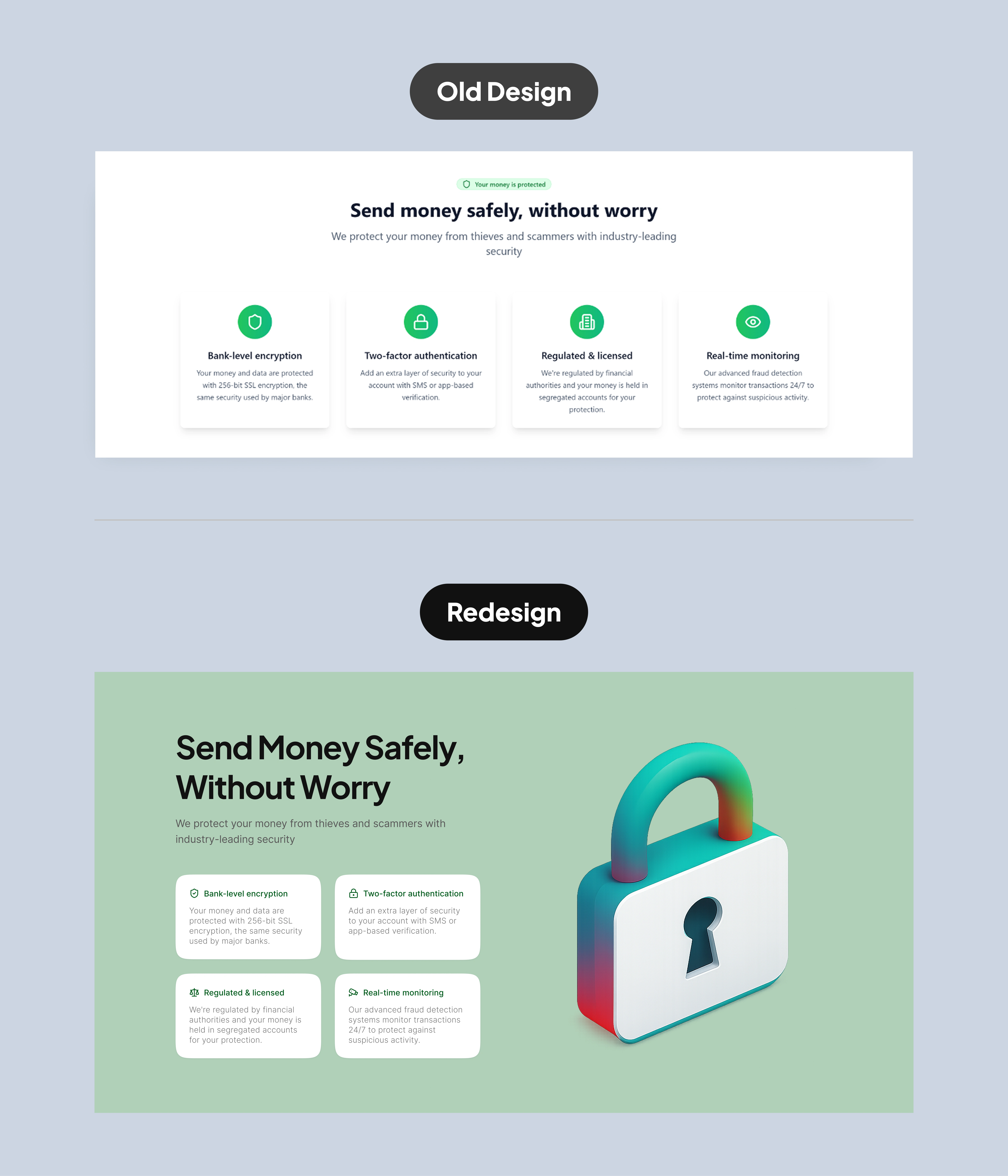
Security Section
5. Visual Language and Accessibility
Before: Multiple gradients and color effects reduced readability and accessibility.
After: Cleaner palette, higher contrast, and consistent typography improve readability and accessibility. The use of bold CTAs and reduced gradients keeps attention where it matters.
Outcome and Reflection
The redesign successfully modernizes Rebasive’s homepage by combining clarity, emotional resonance, and usability. The storytelling shift from functional overload to human-centered design ensures trust is felt immediately, while conversion paths are clearer.
By moving from gradients and clutter to focused hierarchy and lifestyle imagery, the homepage aligns better with industry leaders like Wise, Revolut, and Remitly, who leverage clean design to communicate both trust and modernity.
As Steve Krug writes in Don’t Make Me Think, “Clarity trumps persuasion.” The redesigned Rebasive homepage proves this point; by making the promise simple and obvious, it persuades through clarity itself.
See the final design here
Like this project
Posted Oct 3, 2025
Design Goals: - Simplify the value proposition - Humanize the experience - Elevate trust signals - Increase conversion focus - Improve accessibility
Likes
2
Views
6
Timeline
Sep 14, 2025 - Sep 19, 2025
Clients
Rebasive


TradeFarm Website – UI/UX Design for a Forex Trading Platform
Lumora: A Mental Wellness & Mindfulness Learning Platform

Social Media Designs
Scriptured - WordPress Ecommerce Design