Web Design for an Enterprise Software Platform
Brennin Wall
Nextiva
Cross-channel growth design system for an AI-powered customer experience platform
Nextiva needed a scalable creative system that could bring consistency, polish, and conversion focus across its expanding marketing ecosystem. The work spanned landing pages, paid social, gated content, product storytelling, marketplace concepts, vertical campaigns, resource hubs, and brand extensions.
The goal was to make complex communication products feel clear, modern, and immediately valuable to business buyers. Across every asset, the system translated Nextiva’s platform story into sharper campaign messaging, cleaner conversion paths, and a more cohesive digital presence.
Designing for clarity and conversion
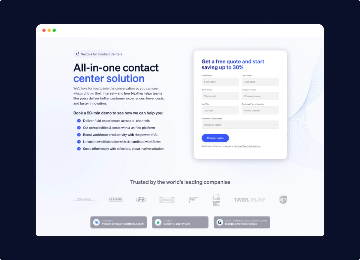
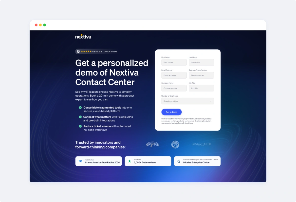
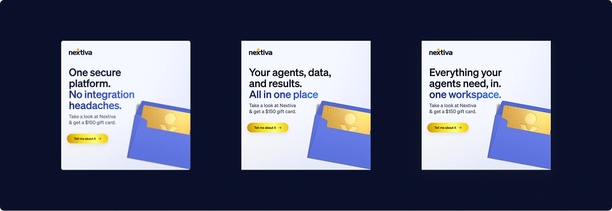
The landing page work centered around a clear acquisition pattern: explain the value quickly, build trust, and make the next action obvious.
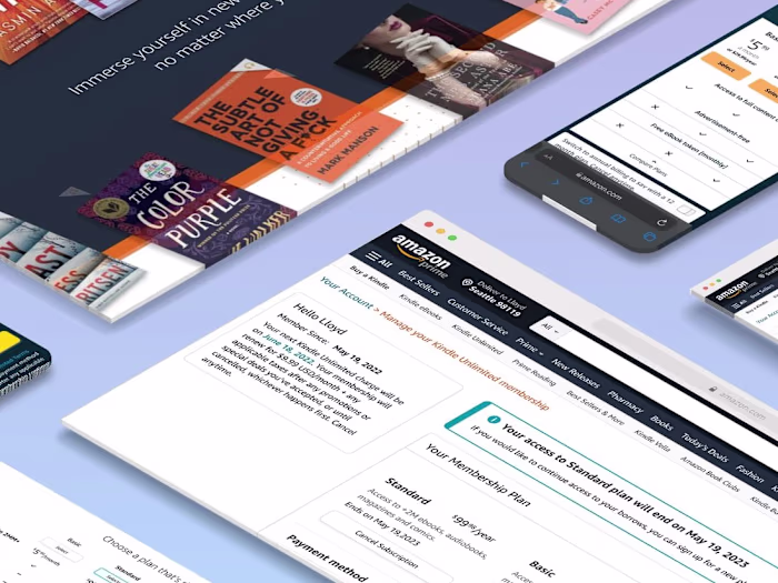
Several pages use a split hero structure with a strong headline on one side and a lead form on the other. This approach appears across demo pages, quote pages, buyer’s guide pages, switcher campaigns, and contact center landing pages. The layout keeps the user focused while allowing supporting proof points, logos, review badges, and benefits to reinforce the decision.
The visual system also creates contrast between high-impact hero sections and lighter content areas. Dark sections communicate authority and product sophistication, while white and pale blue sections create breathing room for forms, cards, and educational content.
Discount Offer Landing Page
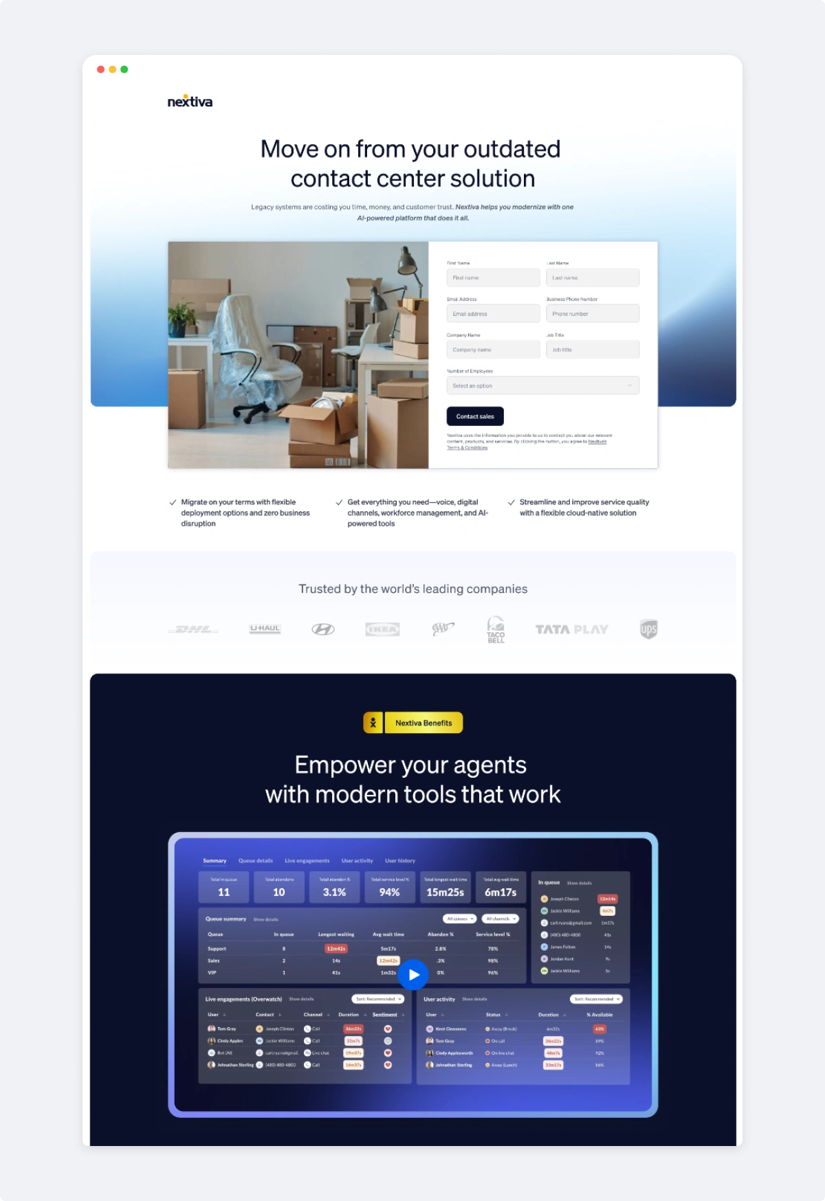
Retarget LP for Clients using Competitor Software
Main Sales Contact Landing Page
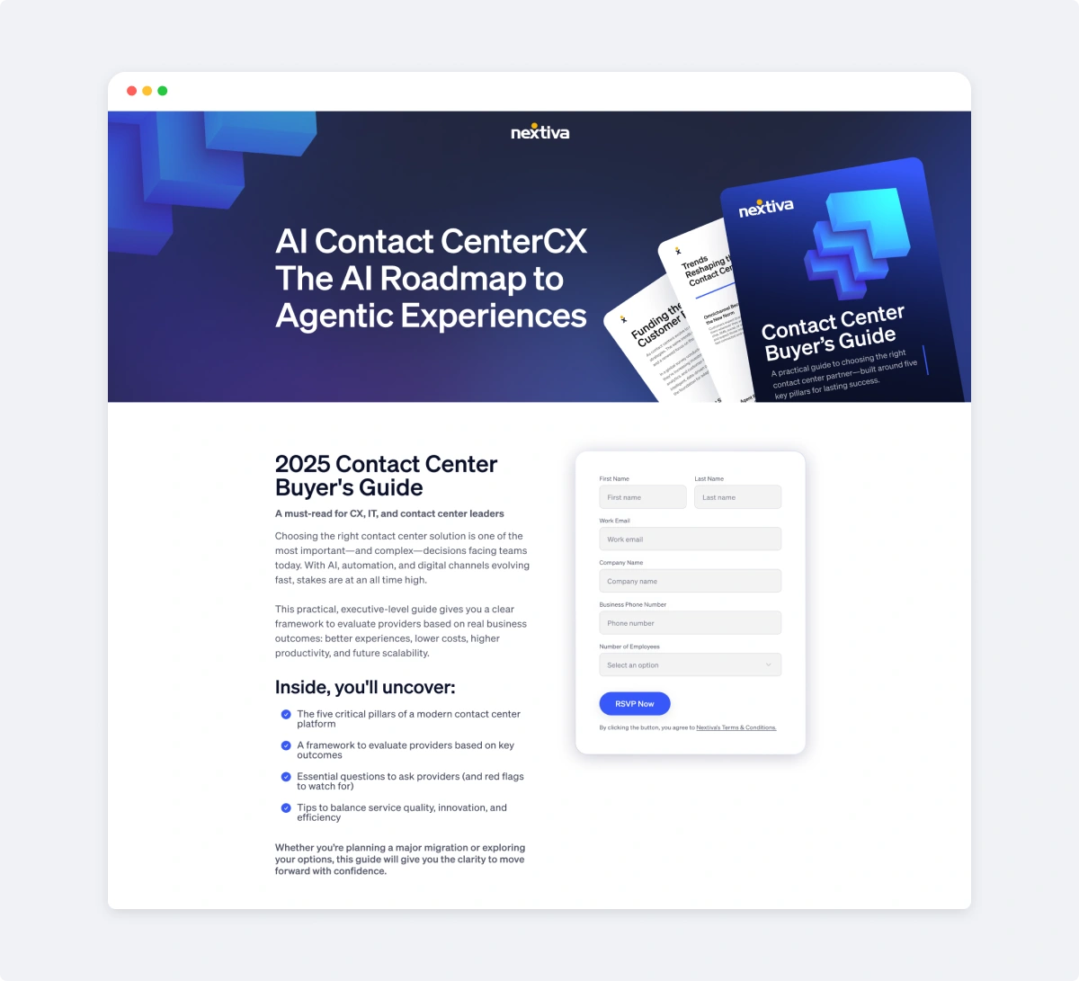
Buyers Guide Offer Page
Building campaign pages focused on the buyer journey
For contact center buyers, the pages emphasize consolidation, automation, AI, customer experience, and operational efficiency. For competitive switcher campaigns, the message becomes more direct: move away from outdated or fragmented systems and get a clear incentive to switch. For gated guides, the page shifts into an educational mode, positioning Nextiva as a trusted resource for complex buying decisions.
Each page follows a simple journey:
problem → value proposition → proof → form → supporting detail.
This creates a repeatable system that can be adapted to new offers without redesigning the entire experience each time.
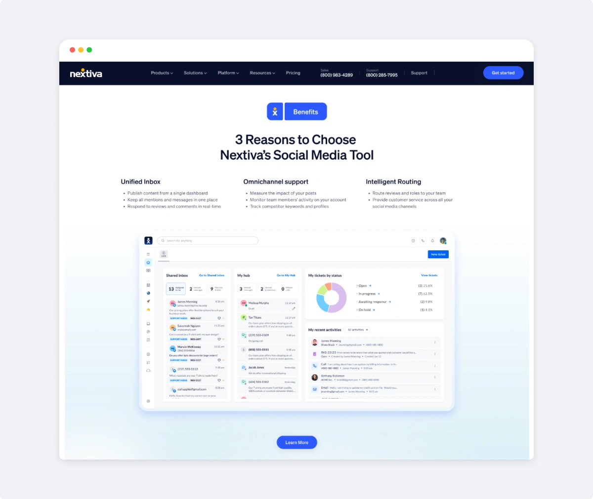
Benefits Section for Social Media Tool
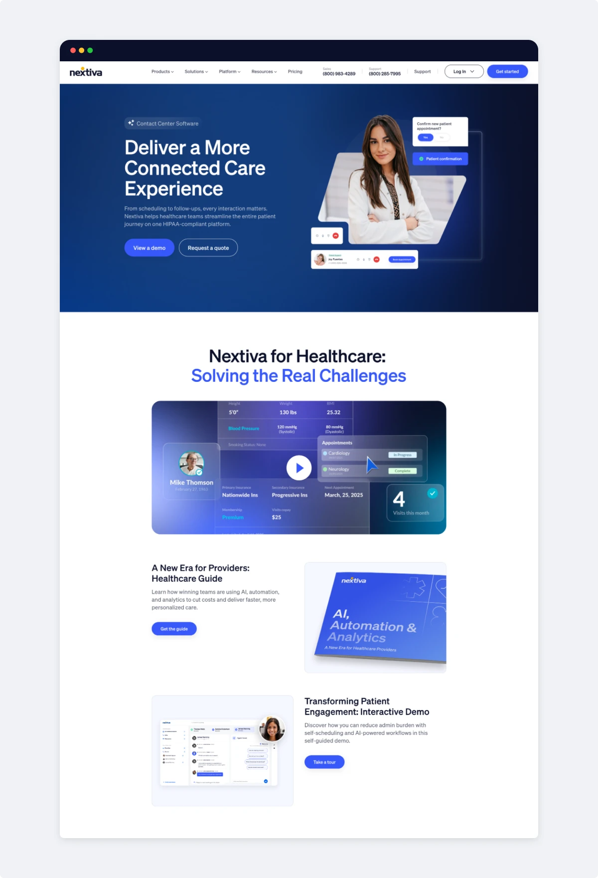
1 of 5 Customer Specific Landing Pages (Health Care)
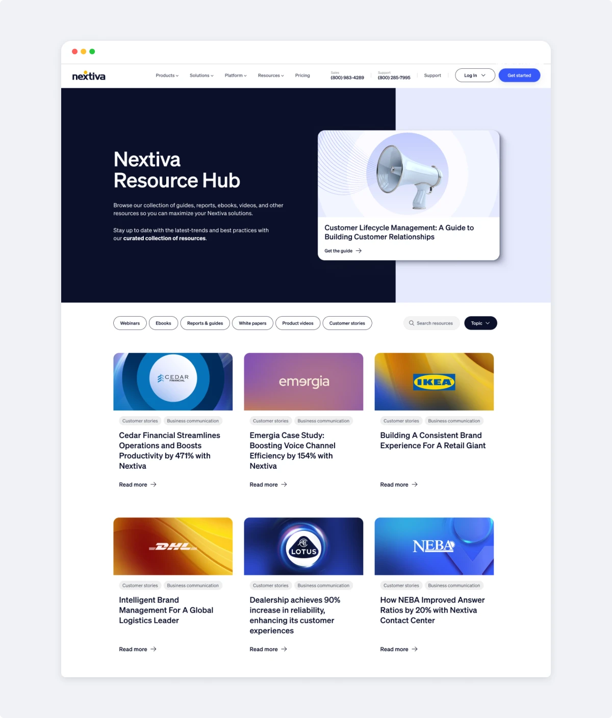
Elevating gated content into premium resources
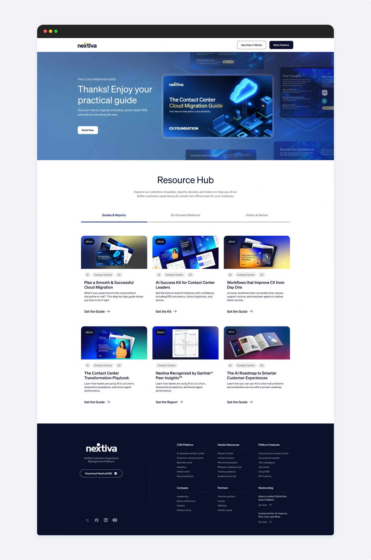
Nextiva’s guides, reports, ebooks, webinars, videos, and demos needed to feel more valuable before users exchanged their information.
The resource hub concepts reposition content as a curated library rather than a basic download archive. Cards, filters, topic tags, content types, and featured hero modules make the experience easier to browse and more editorial. The layouts create a stronger sense of depth around Nextiva’s expertise in contact center, CX, AI, automation, and business communication.
The gated guide pages extend that same thinking. Large branded covers, clear page titles, concise benefit copy, and embedded forms make the content offer feel structured and credible. Rather than overwhelming users with too much information, the pages focus on what the reader will learn and why it matters.
Gated Content Post Sign-Up Resource Page
Main Resource Page
Creating a flexible paid social system
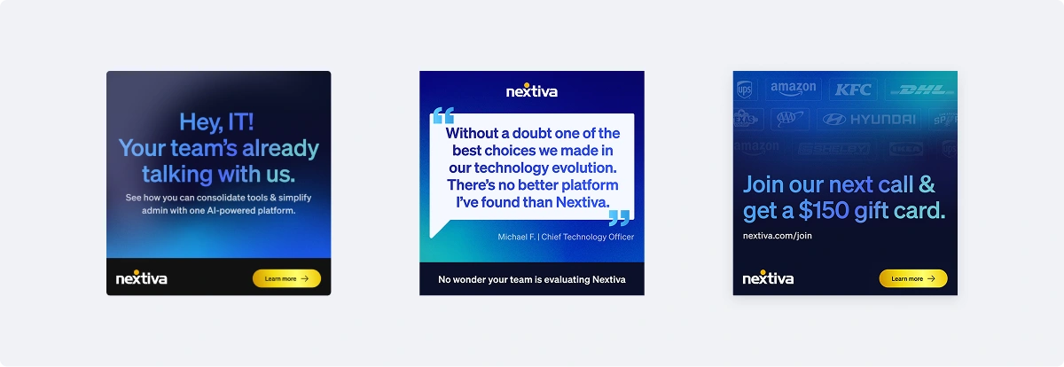
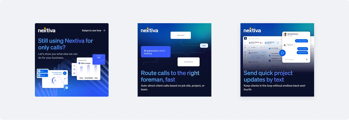
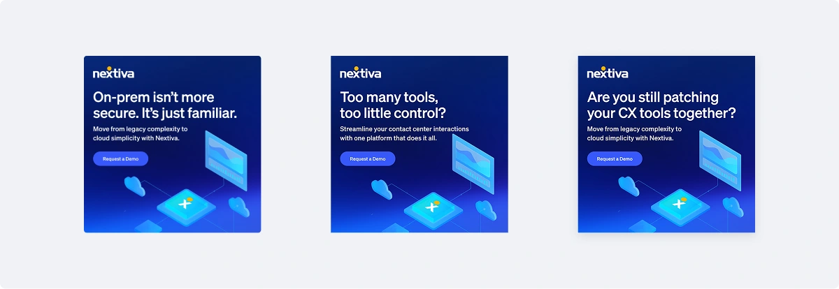
The paid social assets were built as a modular campaign system. Each format could support different messages, audiences, offers, and product stories while still feeling recognizably Nextiva.
The ads use a mix of approaches:
Customer proof and social validation
Customer outcome ads and testimonial-style creative give the campaign system credibility while keeping the message concise enough for paid channels.
Pain-point messaging
Examples like “Too many tools, too little control?” and “Are you still patching your CX tools together?” identify business friction quickly and create urgency around simplification.
Migration and modernization messaging
Campaigns around on-prem systems, cloud migration, and outdated contact center tools position Nextiva as the path from legacy complexity to modern operations.
Offer-driven creative
Gift card and demo ads use bold headlines, bright yellow CTA moments, and simple compositions to drive action.
The result is a system that can produce many variations quickly without sacrificing brand quality.
Customer Proof and Social Validation
Pain-Point Messaging
Migration and Modernization Messaging
Offer-Driven Creative
Designing the marketplace experience
The marketplace concepts show how Nextiva could present integrations and workflows inside a product-like environment.
The main marketplace page introduces apps and workflows tailored to the user’s business, with recognizable app cards for tools like Microsoft Teams, Salesforce, Duda, and other integrations. The detailed app page expands the experience with overview content, install actions, ratings, pricing, compatibility, setup guides, and support information.
The design makes integrations feel approachable and organized. It also extends the brand beyond marketing pages into a platform ecosystem, showing how Nextiva can connect with the tools businesses already use.
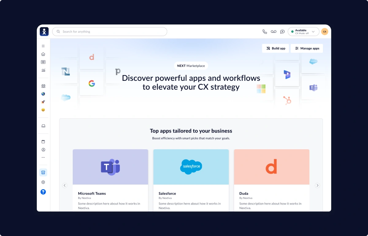
NEXT Marketplace In-App Main Page
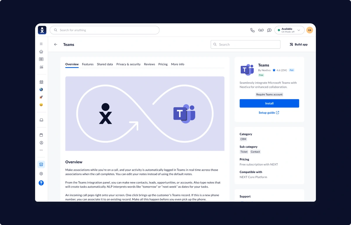
In-App Marketplace MS Teams Install Page
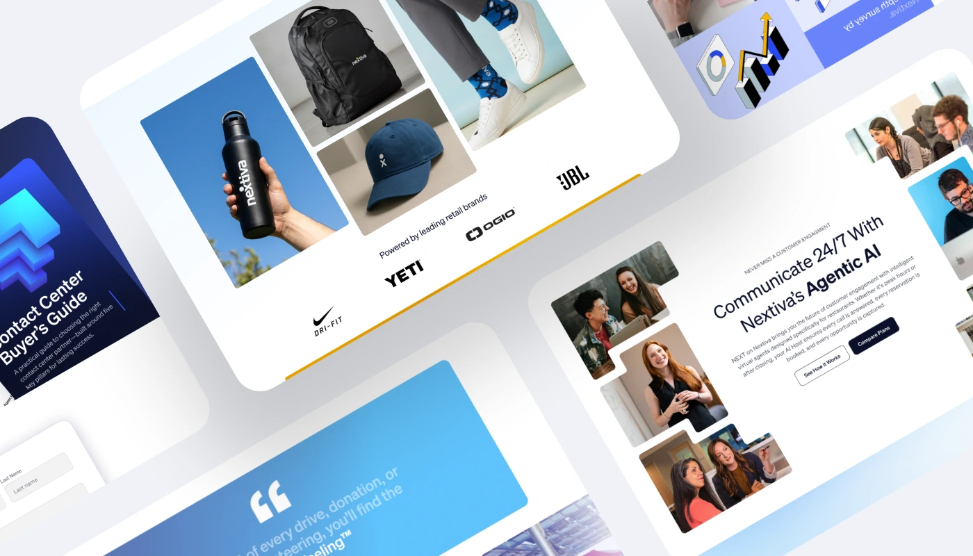
Extending the brand beyond software
The swag and apparel homepage shifts away from their standard visual identity to a more lifestyle-driven side of the Nextiva brand.
This experience uses AI-generated product photography, apparel tiles, seasonal banners, retail-style category modules, and partner logos to create a branded merchandise experience. It shifts the tone from enterprise SaaS into something more human, playful, and tangible.
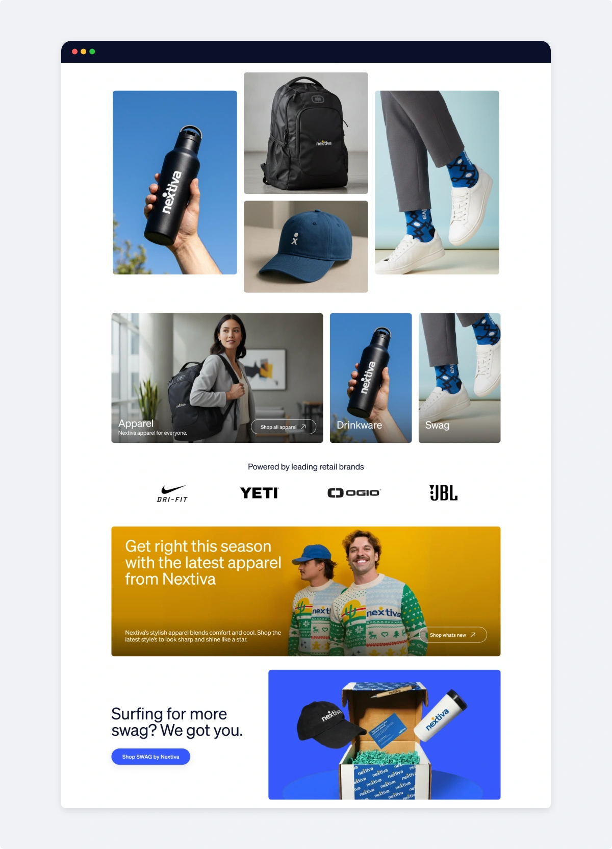
Nextiva Merch Store Homepage
Like this project
Posted Jun 16, 2026
Nextiva needed to accelerate marketing execution across web, paid media, email, and social while maintaining consistency and creative quality at scale.
Likes
1
Views
0
Timeline
Feb 14, 2025 - Jan 1, 2026
Clients
Nextiva