Kaya: A Volunteering Website
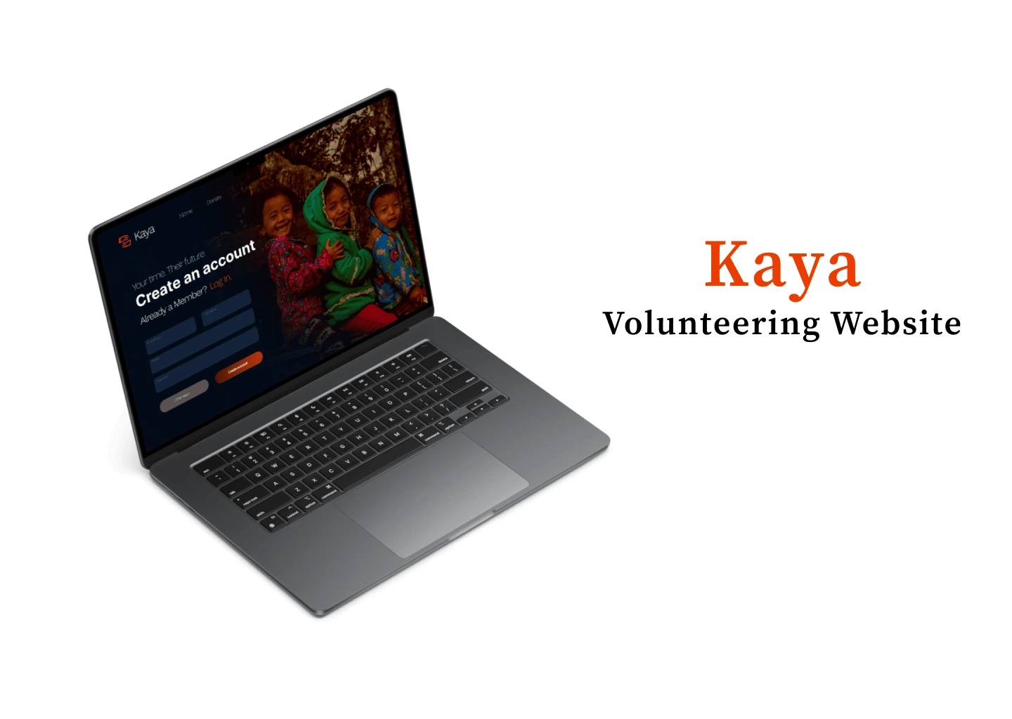
This case study is part of the completion requirements for my UI/UX course, where I designed and developed Kaya, a volunteering website aimed at connecting volunteers with non-profit organizations. The original plan for Kaya was to develop it as a mobile app, but are you curious about how it transformed into a website? Here’s the journey.
The Problem: Will a volunteering website gather more volunteers?
As part of a non-profit, I’ve seen how volunteering can impact communities. For my UI/UX case study, I developed a platform inspired by Catchafire, focused on making volunteering easier and more accessible in the Philippines.
Target Users
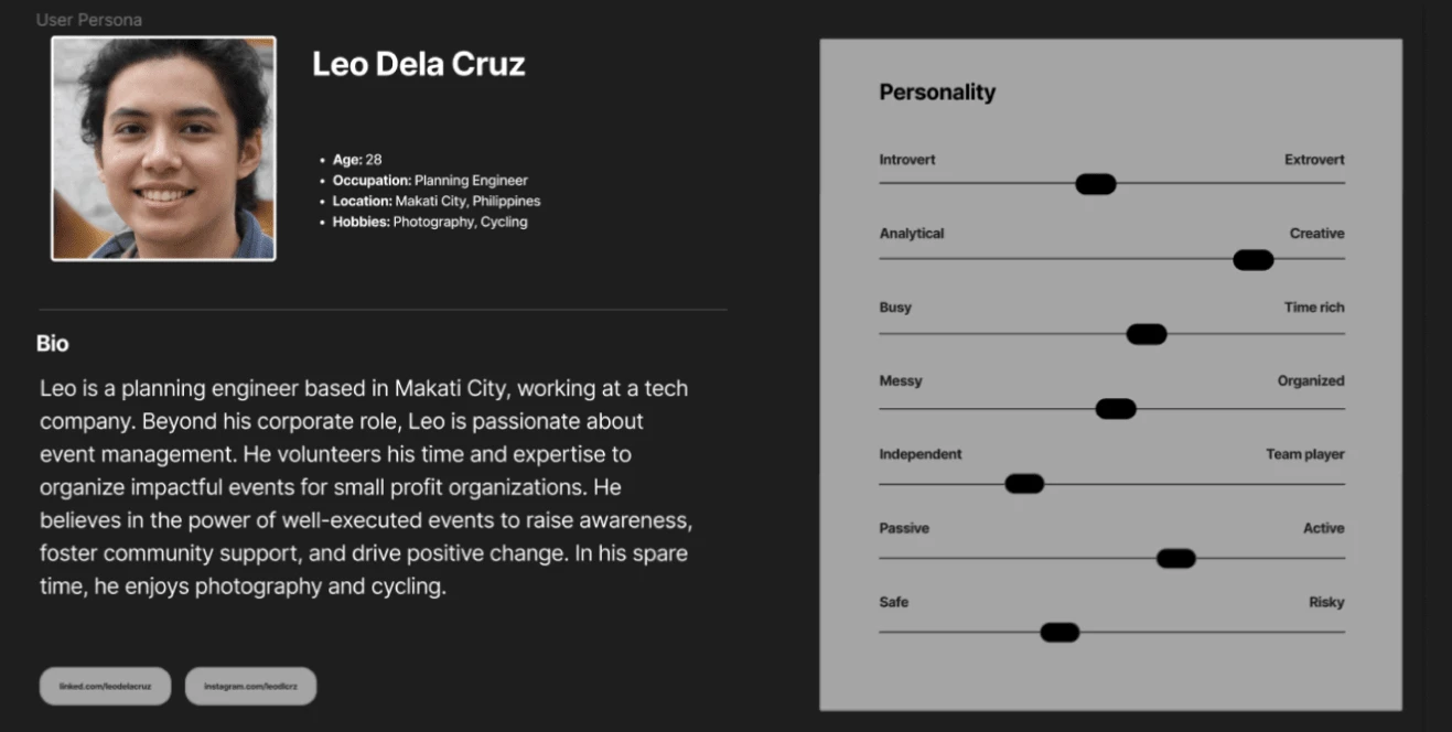
According to iVolunteer’s database (2015), in the Philippines a substantial number of volunteers are young people, with 77% being under 30 years old. This is closely linked to their life stages and priorities, as many are also single or without their own families. I determined that the potential users are between 18 and 60 years old, either unemployed or in a professional job, and have a lot of free time. Whom use volunteerism to make their free time more productive and impactful.
UX Interview
After identifying the potential users, I wanted to gather insights directly from them about their expectations for a volunteering mobile app. To do this, I conducted interviews with five respondents, some of whom had prior volunteering experience while others did not. Notably, none of the participants had ever used a volunteering mobile app before, which provided valuable feedback on their fresh perspectives and expectations for such a platform.
"I will not volunteer in a daily basis, I will not install it if it is an app for it will take up too much storage in my phone"- Drew, 23
The main problems identified with the platform so far are:
- Users are less likely to engage with the platform for extended periods due to it being used only during their free time.
- Concerns about the mobile app taking up significant data storage on their devices.
- A desire for more interactive features, such as viewing other users' activities.
- Requests for a scrolling feature to allow for casual browsing and increased engagement.
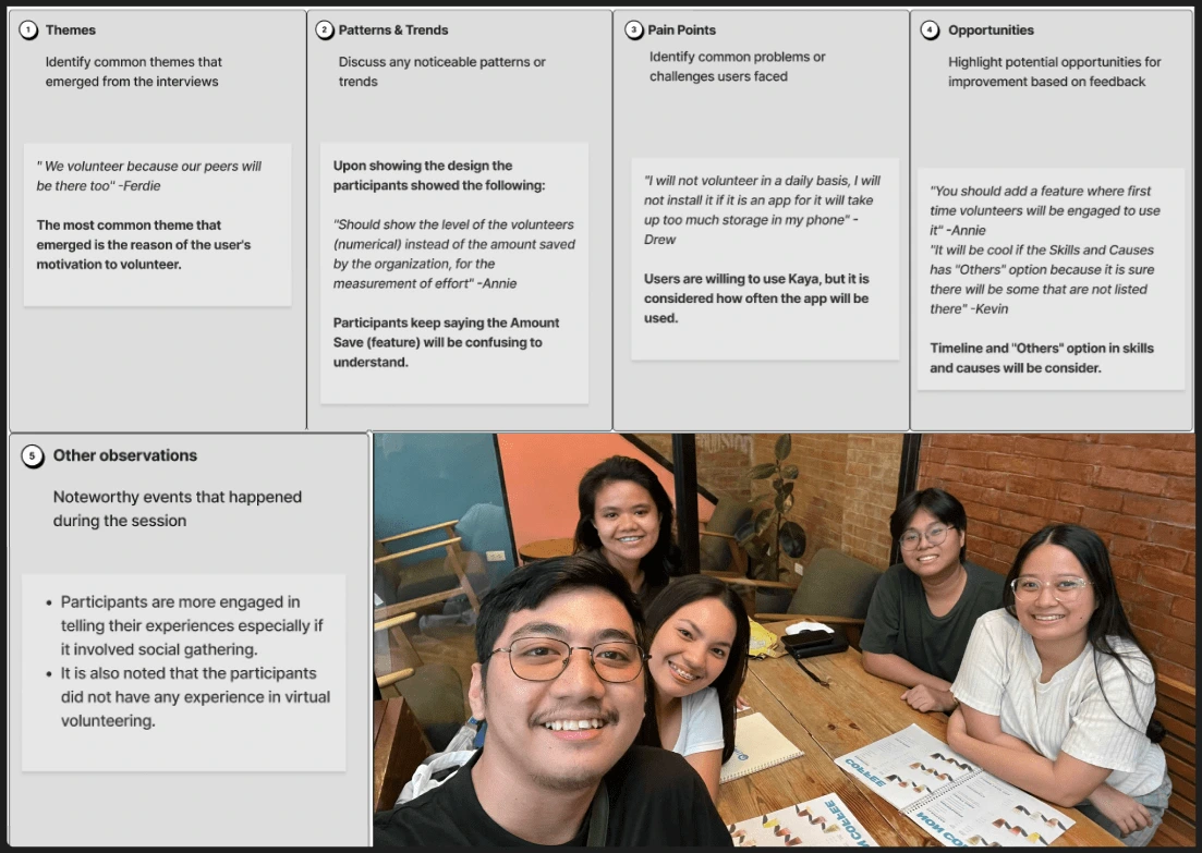
These issues prompted a shift from the mobile app format to a website to better accommodate user preferences.
Features
⋆ Causes - Volunteers can select a cause they are passionate about, allowing them to focus their efforts on areas they care deeply about. .
⋆ Skills - Users can choose skills they possess and apply them to specific volunteer opportunities.
⋆ Approach - Volunteers can choose how they want to contribute, whether through a quick piece of advice, a 1-hour phone call, or by working on full-length projects.
⋆ Newsfeed/Homepage - Volunteers can see posts from other volunteers or organizations.
⋆ Messages - Users can communicate directly with other volunteers or organizations.
⋆Donate - Users can donate any amount to their chosen organizations.
Wireframing & Designing
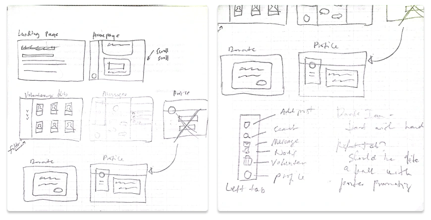
I created the wireframes by hand, as I found this method more convenient and allowed me to add more detail.
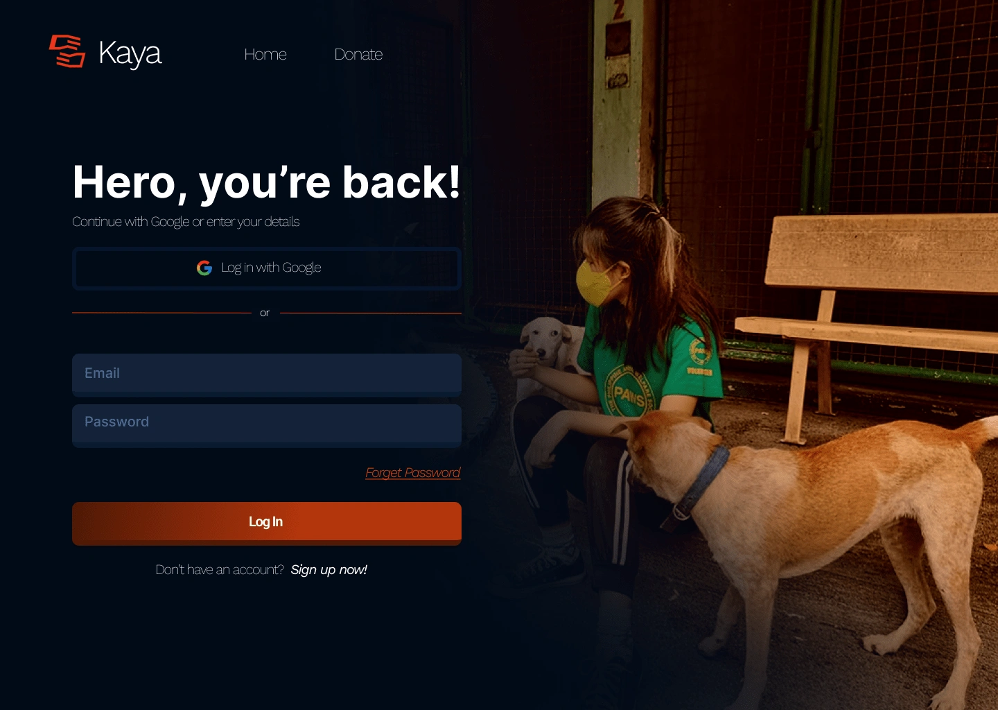
Dark blue and orange for the website’s color palette to create a sense of trust and energy. Dark blue brings professionalism, while orange adds vibrancy, making the interface approachable yet reliable.
Sitemap
After completing the wireframing and design, I created a sitemap that visually outlines the structure of the platform, showing how different pages are connected.

Prototyping & User Testing
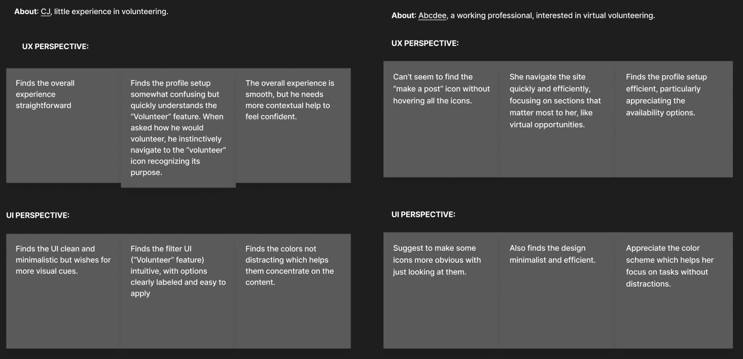
In this process, I conducted interviews with 5 people (a mix of students and working professionals) who were different from the initial respondents in the earlier interviews. Their ages ranged from 21 to 33 years old.
⋆ UX
Focuses on the overall feel and flow of the website.
Emphasizes ease of navigation and clarity of information.
The filter feature is intuitive and helps users tailor their searches efficiently.
Users generally know where to find key features and how to use them without needing much guidance.
⋆ UI
The interface is clean, with well-placed icons and clear labeling that make navigation easy.
Visual design of filters and profile setup is user-friendly, with responsive elements that ensure smooth interaction.
Findings & It's Solutions
Throughout the entire user testing process, I conclude the key user problems and developed solutions based on them:
⋆ Storage Concerns - Users hesitated to install a mobile app, so I shifted the platform to a website.
⋆ Lack of Familiarity - Inspired by social media platforms for a familiar interface.
⋆ Engagement - A newsfeed was added for interaction and increased user activity.
⋆ Profile Setup - Improved with clearer labels and an activity metrics feature.
Final Design
Like this project
Posted Sep 11, 2024
A platform connecting volunteers with organizations through flexible opportunities. Thoughtful design empowers both to make a positive impact together.
Likes
0
Views
7


