SunSip Soda Packaging Redesign
Umar Tanveer
SunSip Soda Packaging Design That Brings Refreshment to Everyday Moments
About the Brand:
SunSip is a fresh, modern soda brand built around real refreshment, bold flavors, and feel-good everyday experiences. Created for people who enjoy light, flavorful drinks without the heaviness of traditional sodas, SunSip turns simple moments into refreshing breaks. From social hangouts to on-the-go refreshment, SunSip celebrates easy sipping, vibrant taste, and effortless enjoyment.
The Design:
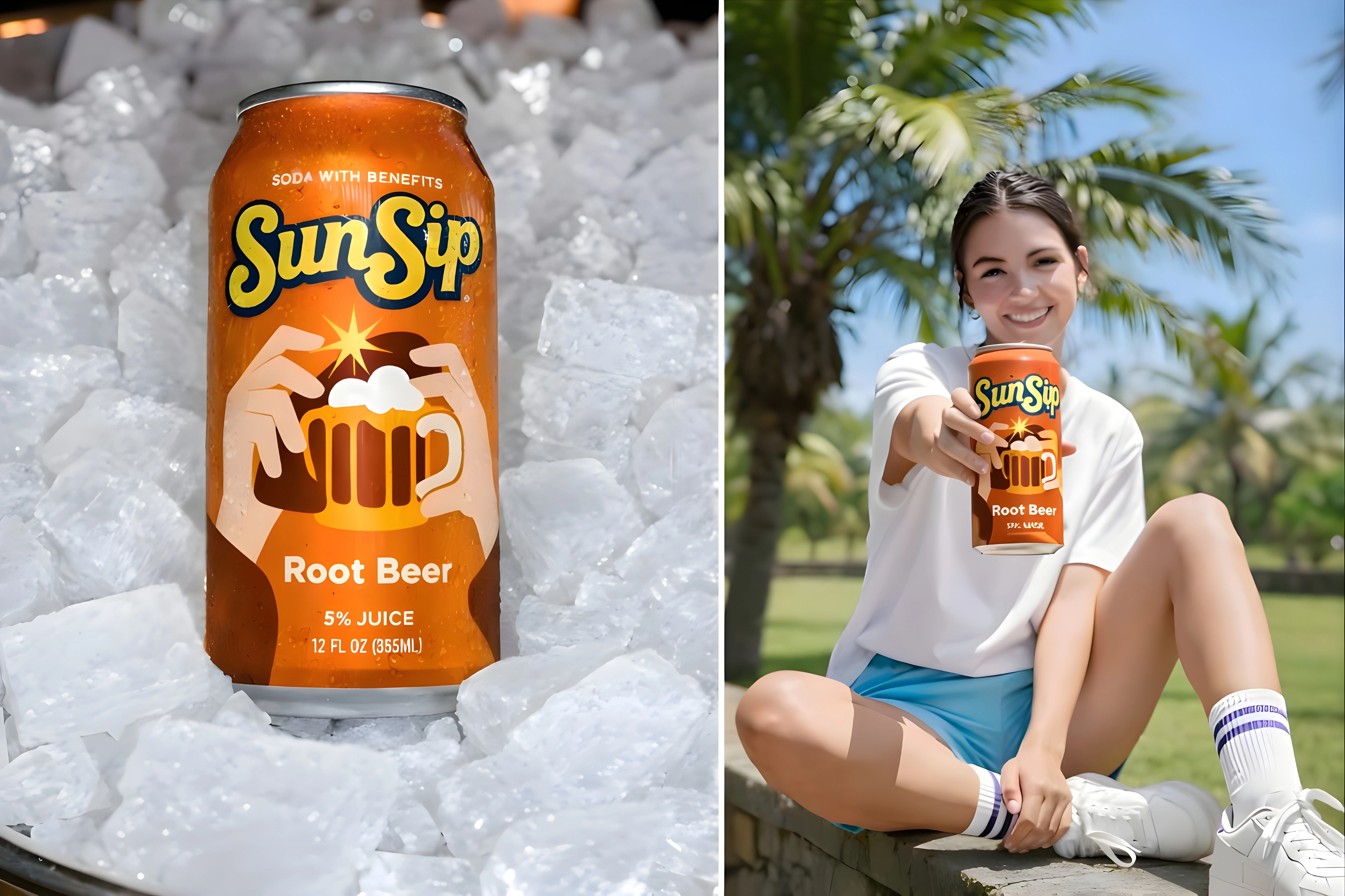
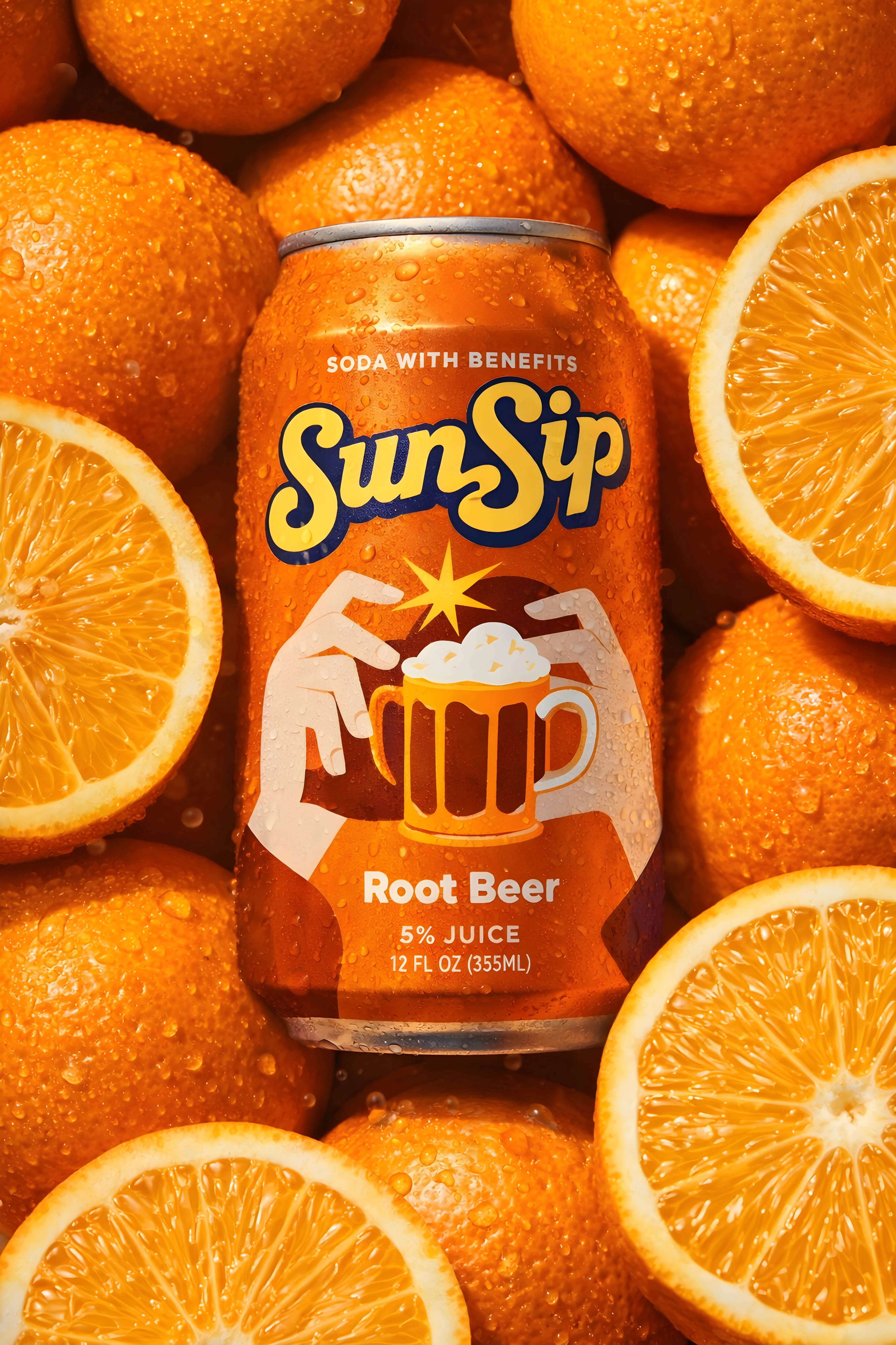
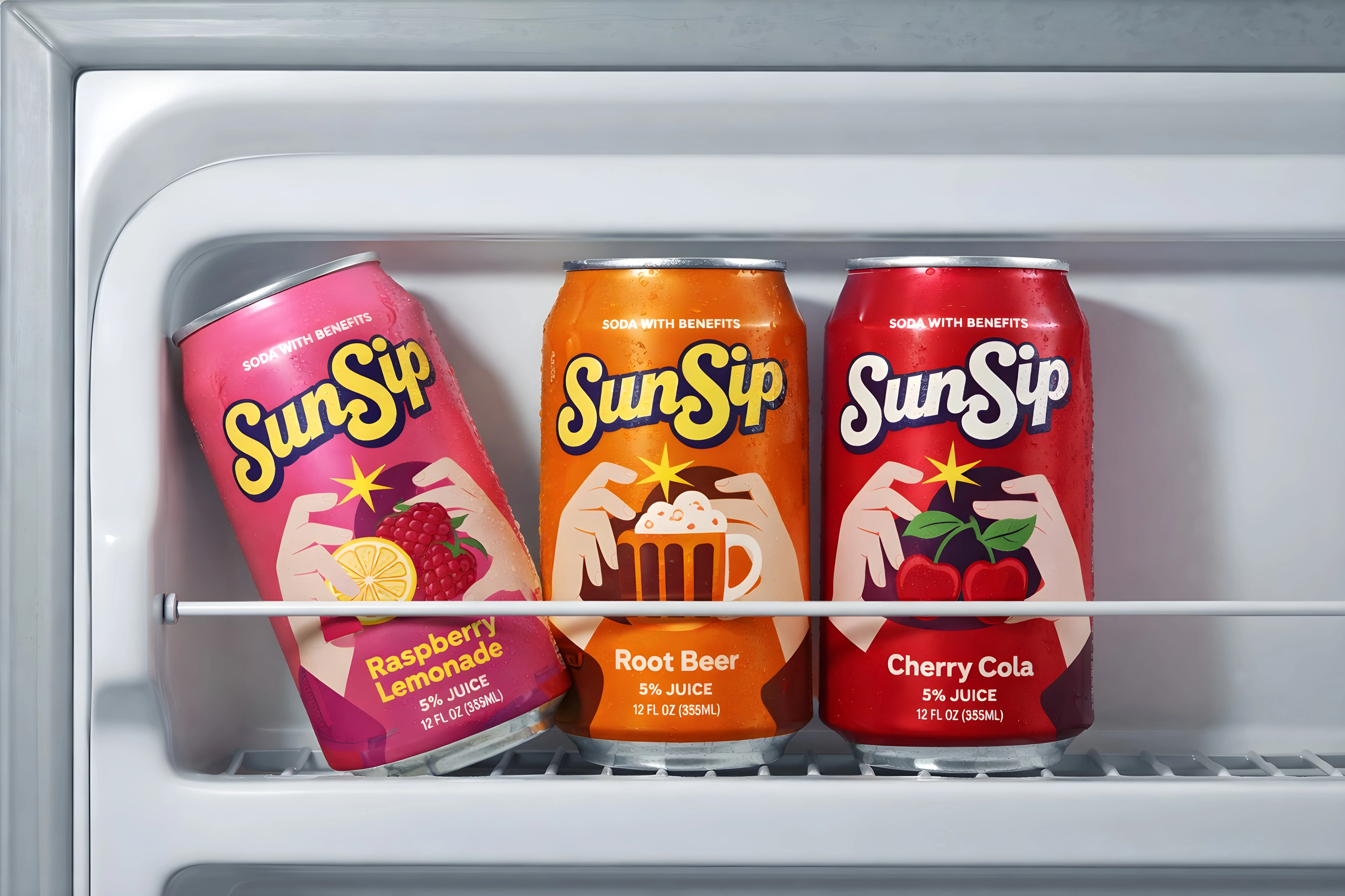
The packaging design reflects SunSip’s clean, bright, and contemporary brand personality. A refreshing color palette inspired by each flavor, paired with bold yet minimal typography, creates strong shelf presence while maintaining a natural and premium feel.
High-quality can finishes, realistic textures, and clear flavor cues were used to enhance authenticity and visual appeal. The layouts are clean and balanced, allowing the branding to breathe while highlighting freshness, flavor, and drinkability. Each can is designed to feel crisp, modern, and refreshing—instantly communicating quality, taste, and lifestyle.
Services:
Soda Can Packaging ReDesign
Flavor System & Visual Direction
Tools:
Kittl
Adobe Suite
Jitter
Packaging Design
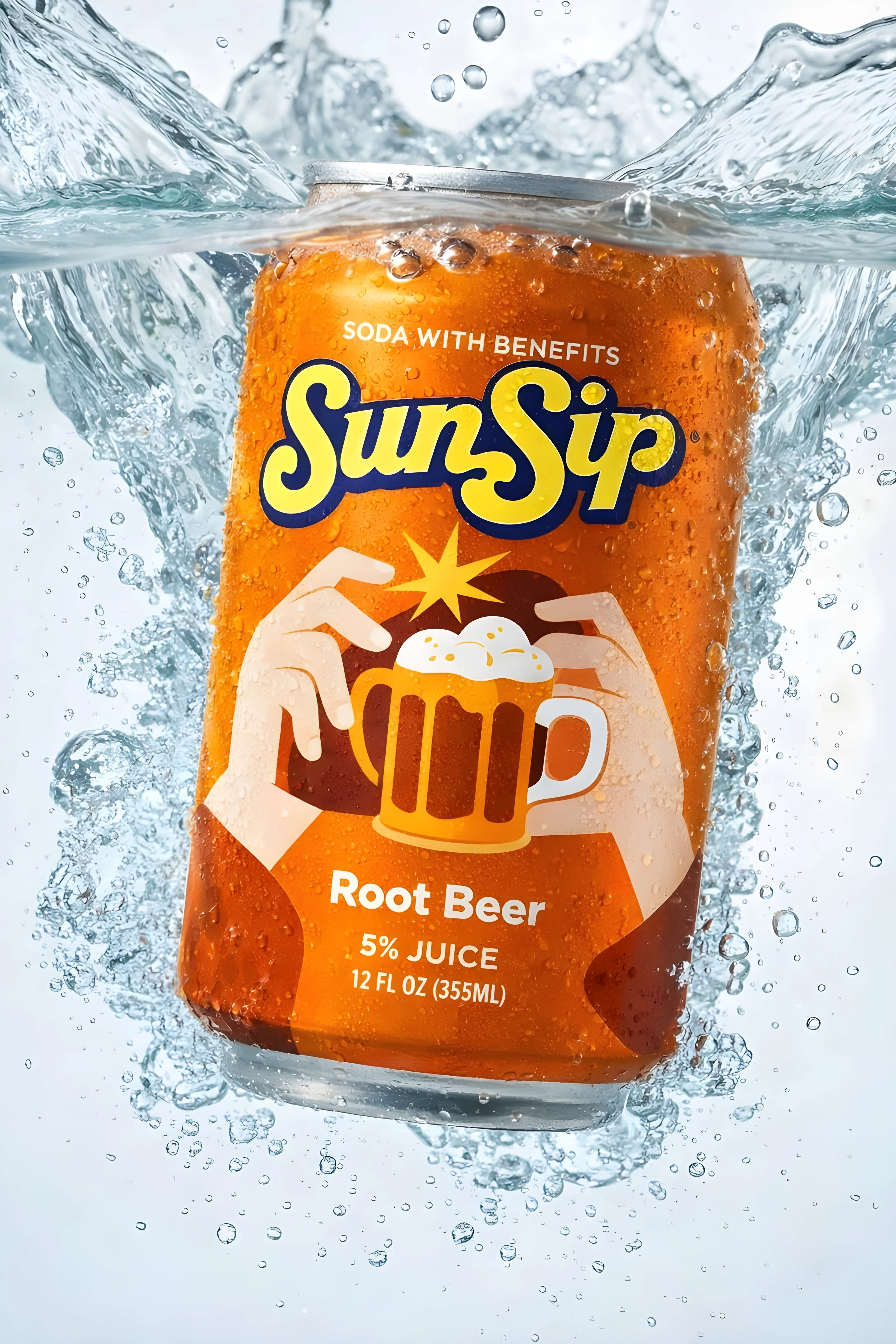
Orange Flavor
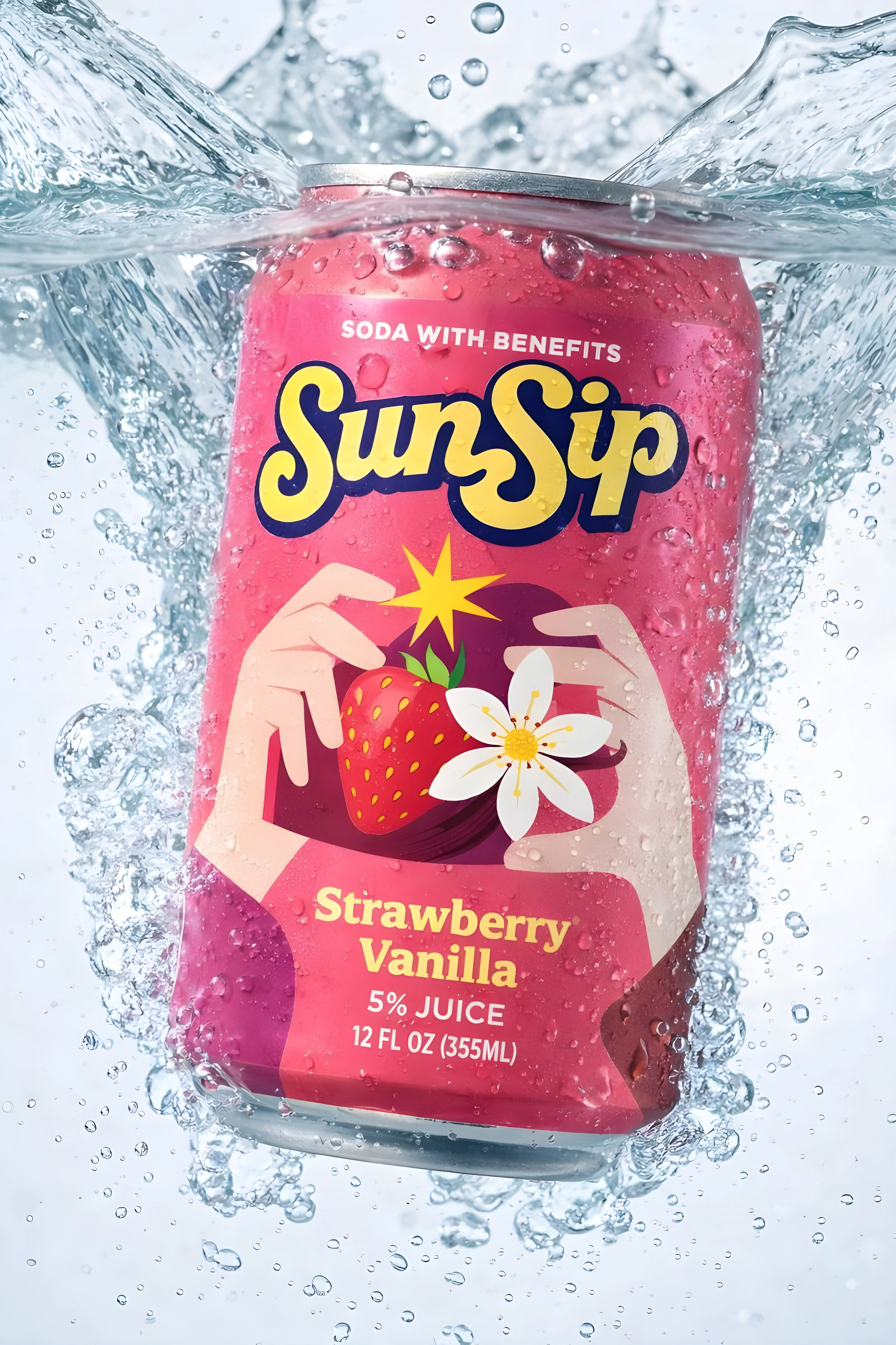
Strawberry Flavor
Packaging Redesign
Can Brand Visuals
Drink Brand Visuals
Can Visuals
Using Jitter
If you’re ready to craft a brand identity that’s as distinctive and purposeful as your amazing business, let’s connect below. 💜
Like this project
Posted Jan 27, 2026
Redesigned SunSip soda packaging with a clean, modern look, vibrant flavors, and a refreshing visual identity that feels premium and real.
Likes
0
Views
17
Timeline
Jan 27, 2026 - Jan 28, 2026