Built with Framer
Probatus Labs Website | BrandGuide | Logo
Client : Mohammad Ubaid
Project Requirements :
Mohammad Ubaid from Probatus Labs, a software and app development company, approached us to create a full branding package. His vision was a professional, tech-oriented brand identity that conveyed reliability and quality, capturing the essence of “proven” or “tested” solutions. He required:
A unique logo that aligns with the brand's values
A visually appealing and functional landing page
Clear presentation of services, social proof, and user-friendly calls-to-action
Our Approach:
1. Logo & Brand Identity Design
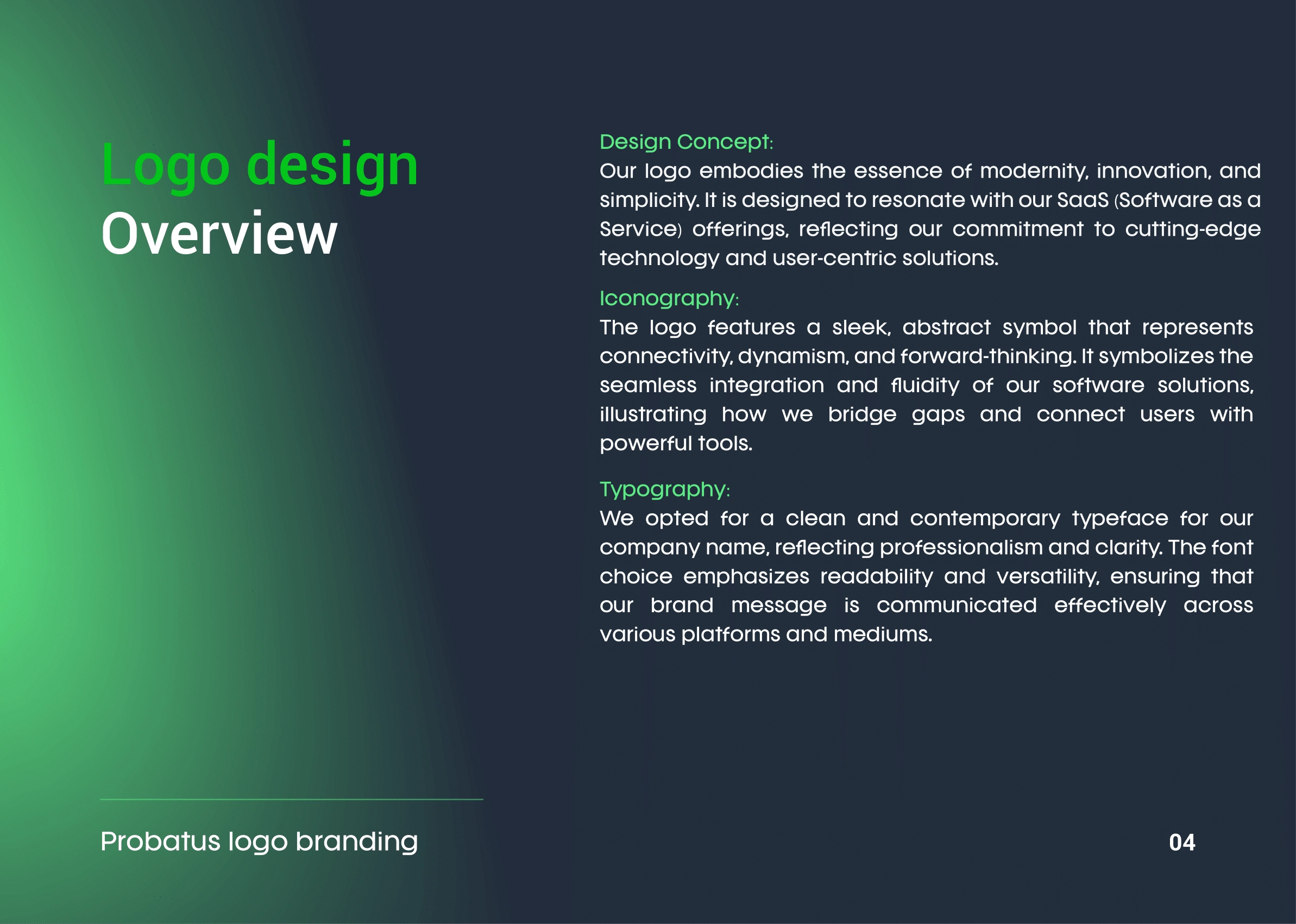
Concept: We conceptualized the Probatus logo with a bold “tick” mark integrated within the brand’s initials. This “tick” symbolized the trustworthiness and tested quality of their solutions, making it instantly recognizable.
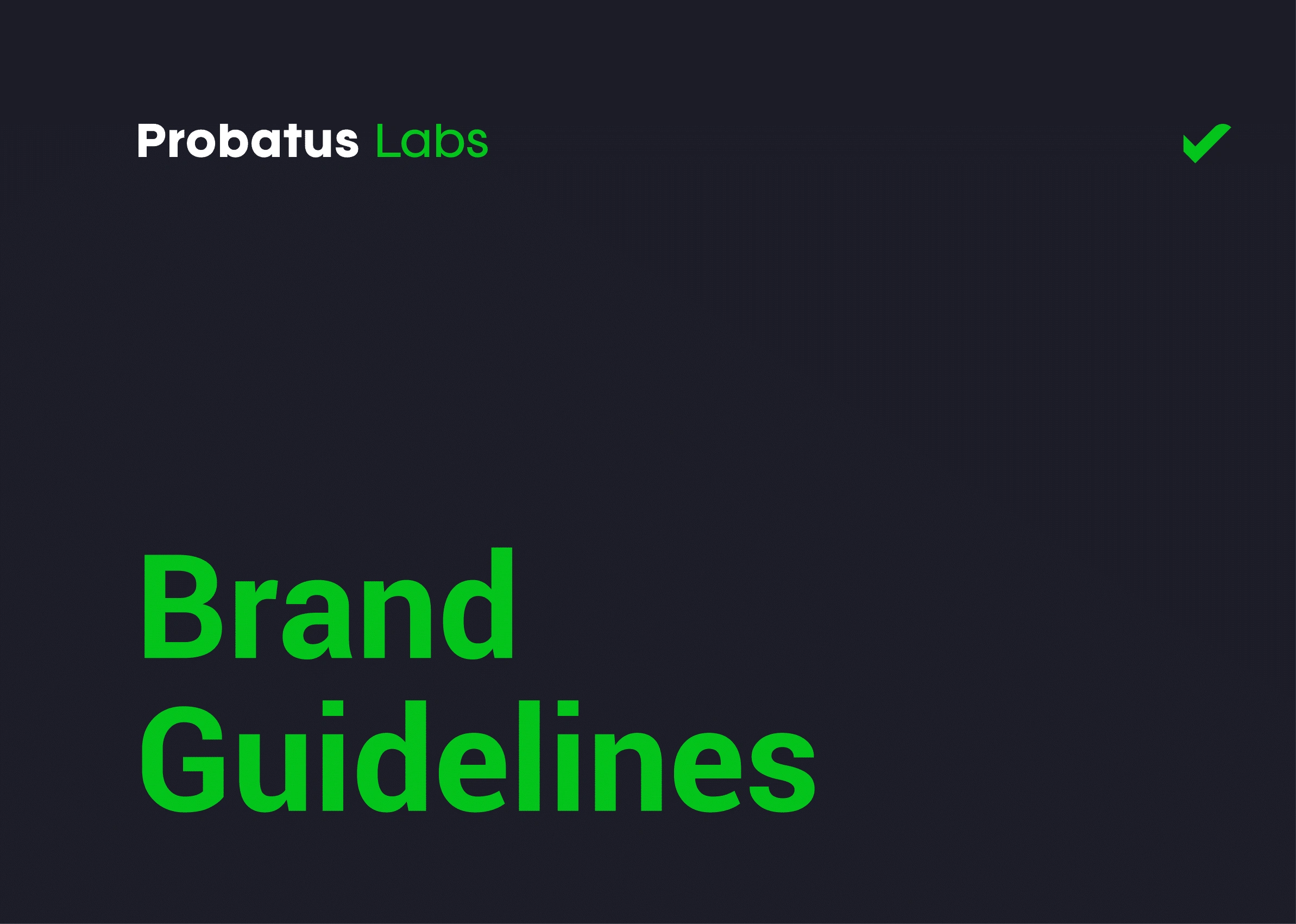
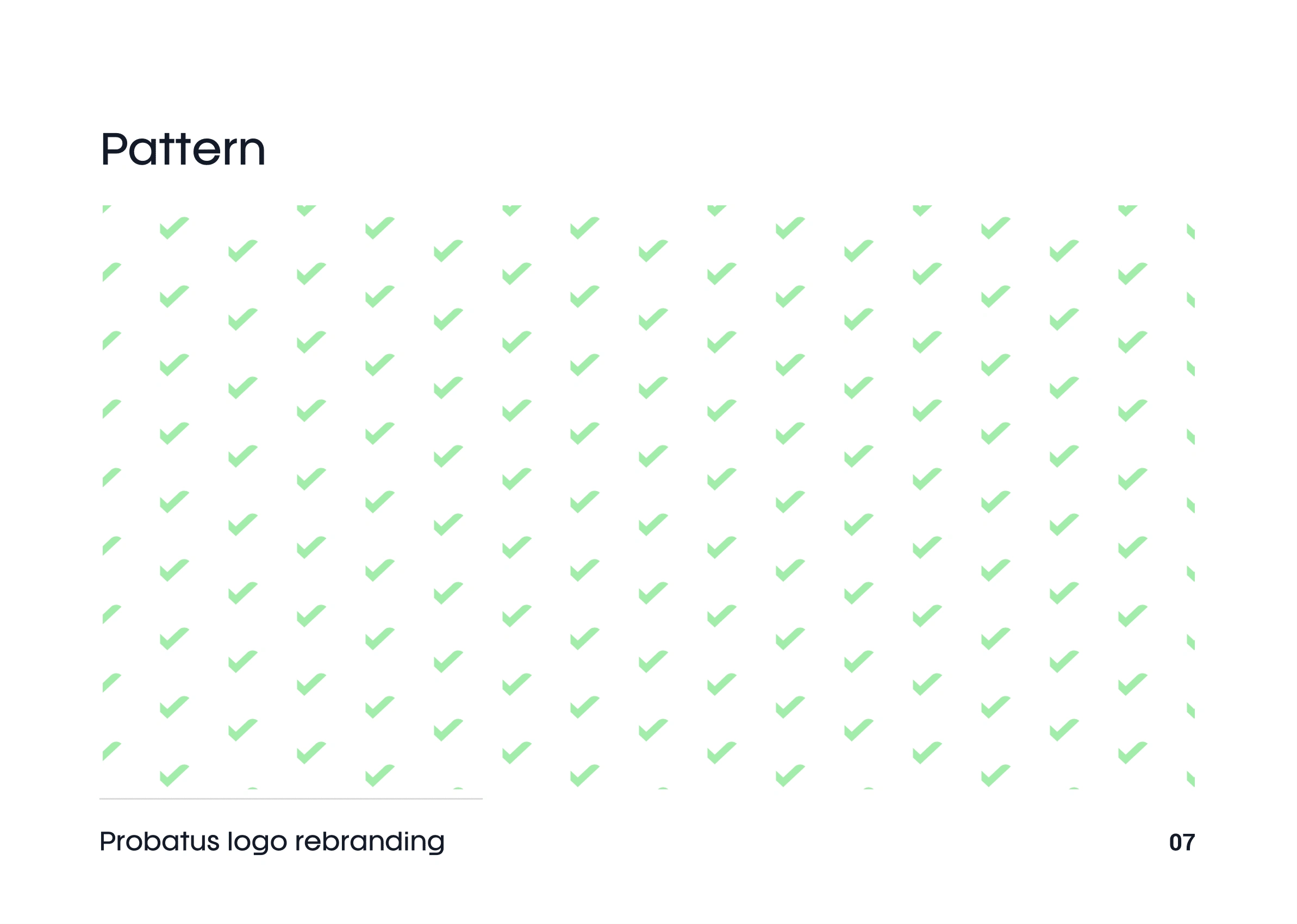
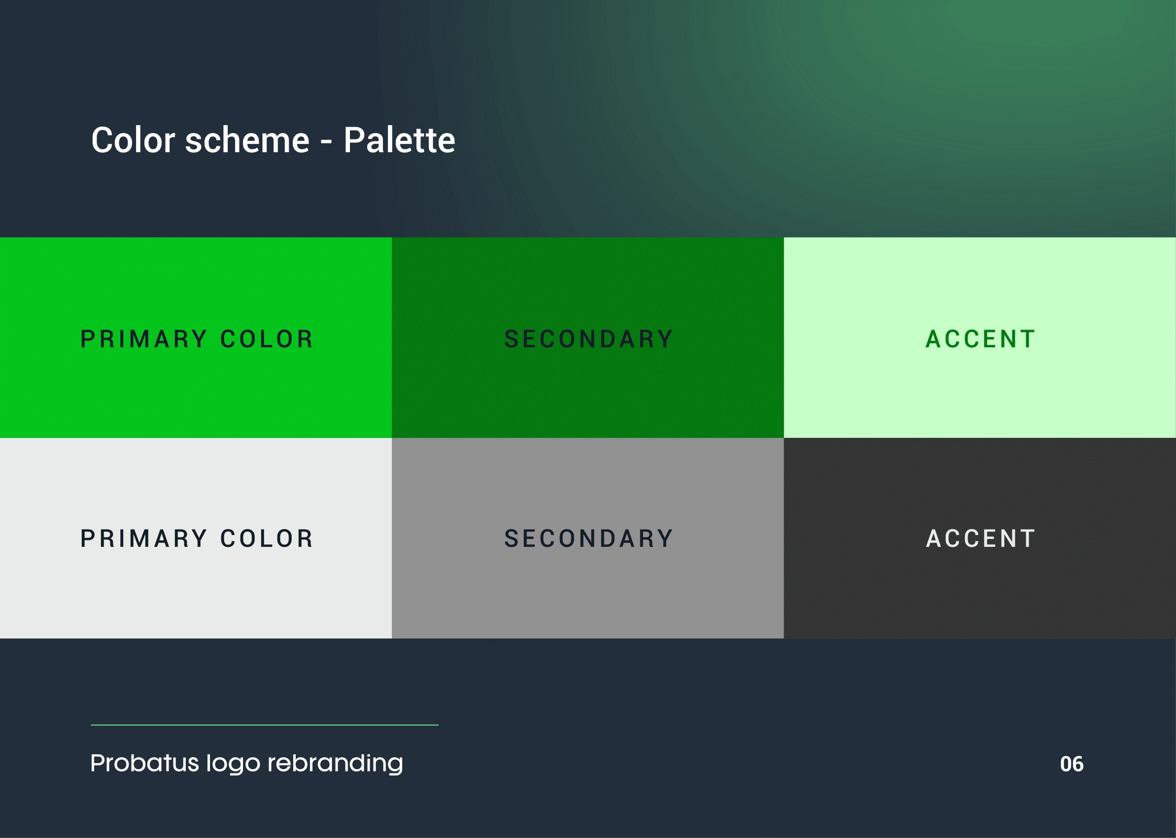
Color and Style: We chose a modern tech-inspired color scheme, with dark shades balanced by bright, accent colors. The palette is both professional and approachable, conveying a sense of innovation.
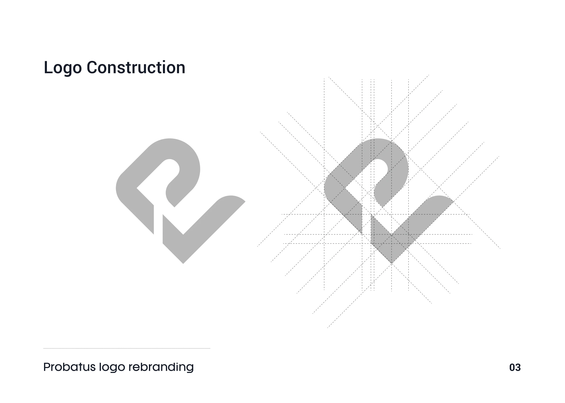
Structure and Precision: We employed a grid structure for the logo construction, ensuring every angle and line represented meticulous craftsmanship, resonating with the company’s commitment to precision in development.
2. Landing Page Design & Optimization
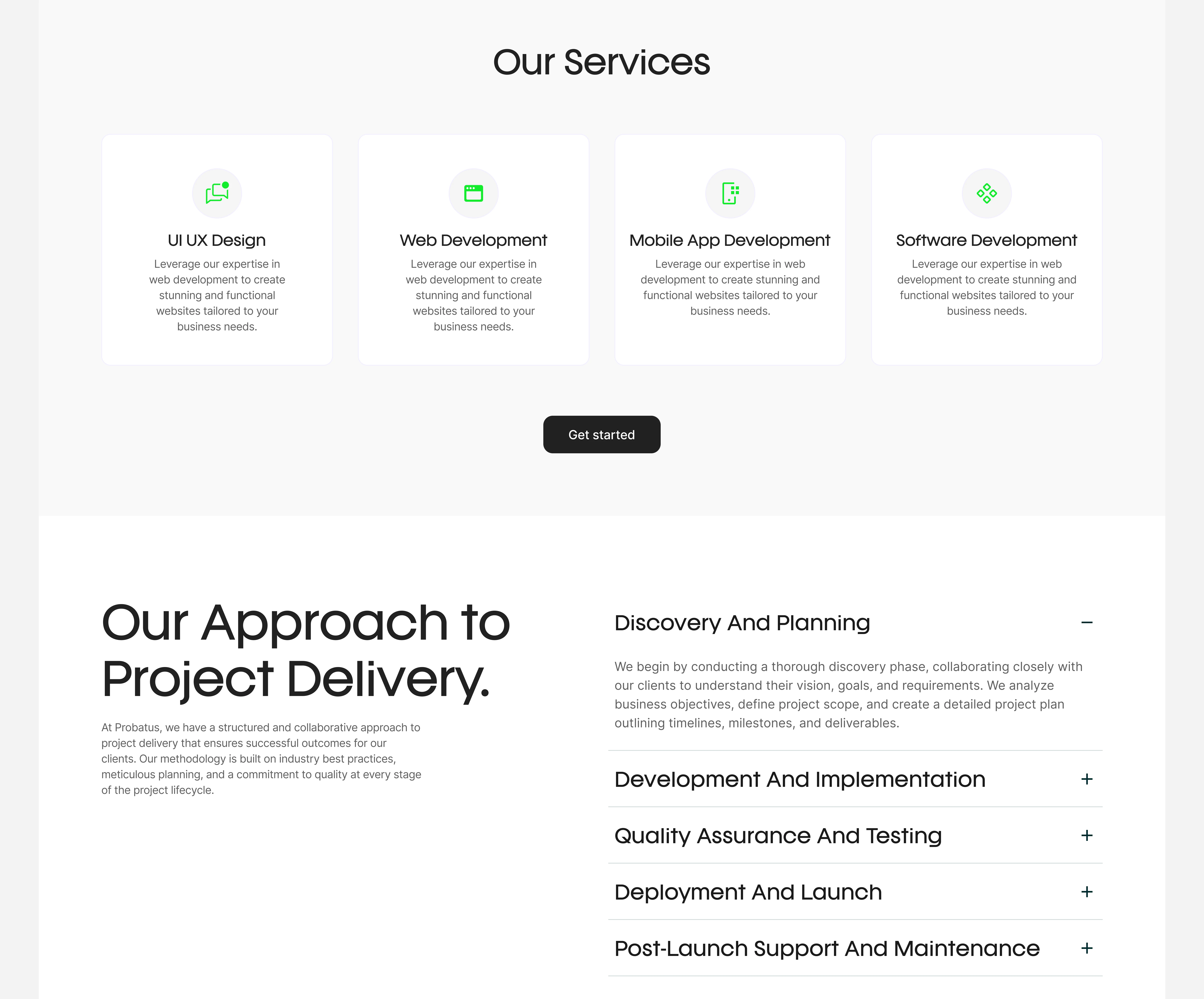
Visual Hierarchy: The landing page was crafted to draw attention to key elements sequentially—About Us, Services, Testimonials, and Contact. This flow guides visitors through the story of Probatus Labs in a user-friendly, mobile-optimized format.
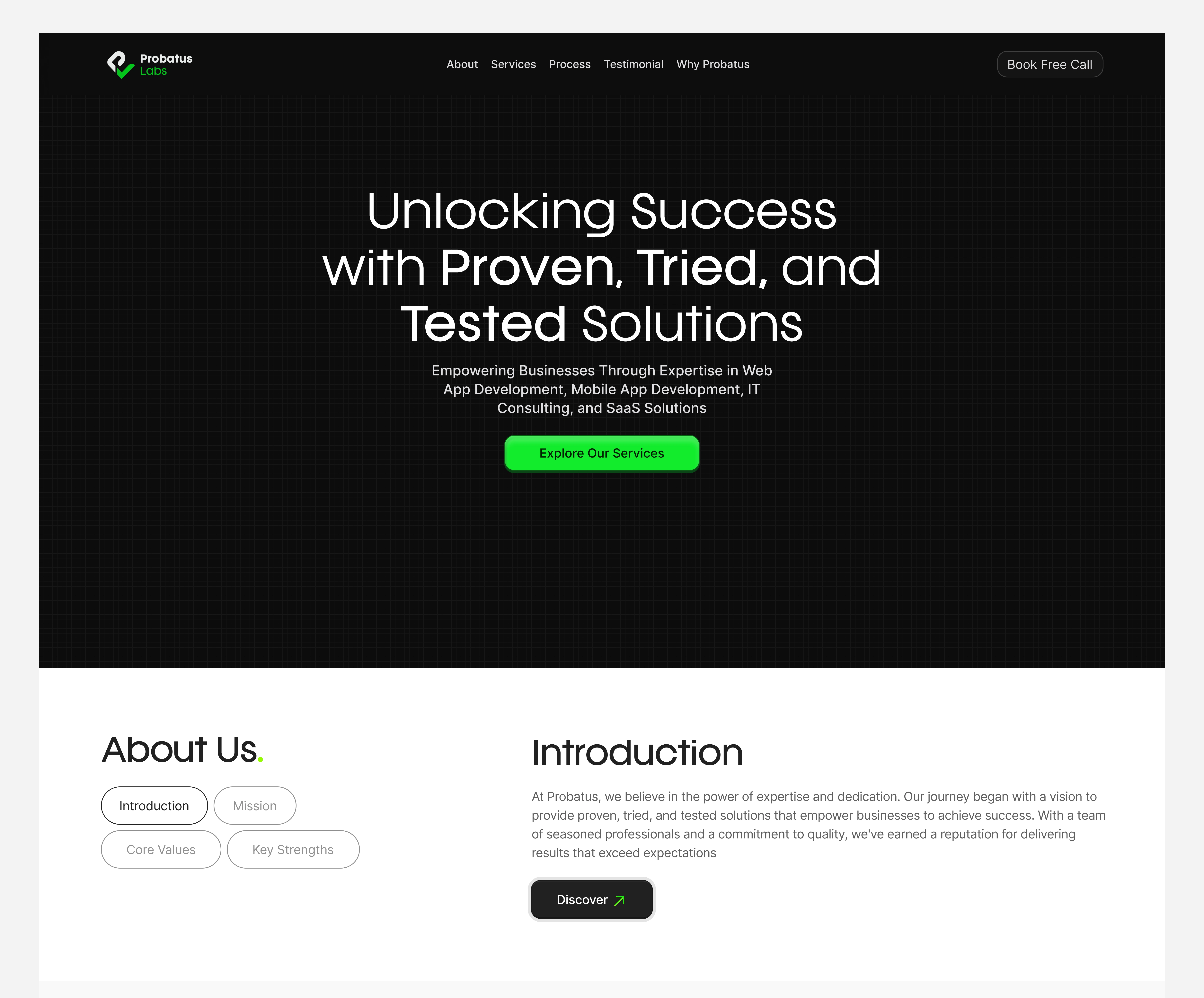
Clear Service Presentation: Each service (UI/UX design, software development, app solutions) was highlighted with dedicated sections, ensuring potential clients can quickly grasp Probatus’ offerings.
Social Proof & Testimonials: Testimonials and client stories were integrated to build trust. This social proof section is crucial for software companies seeking new clients.
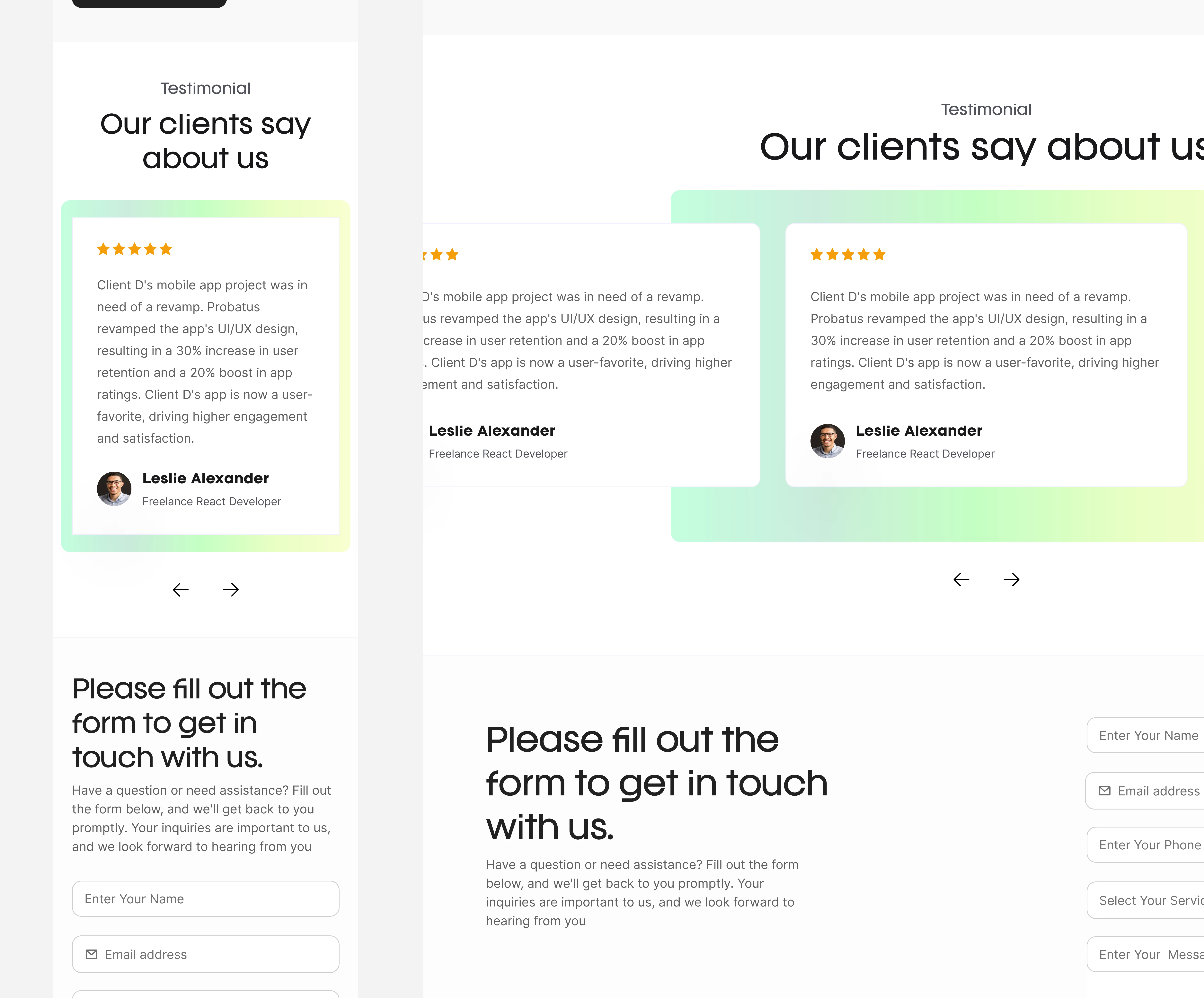
Strong Calls-to-Action: Prominent CTAs, such as “Get in Touch” and “Book a Demo,” were strategically placed for easy access, enhancing the conversion rate.
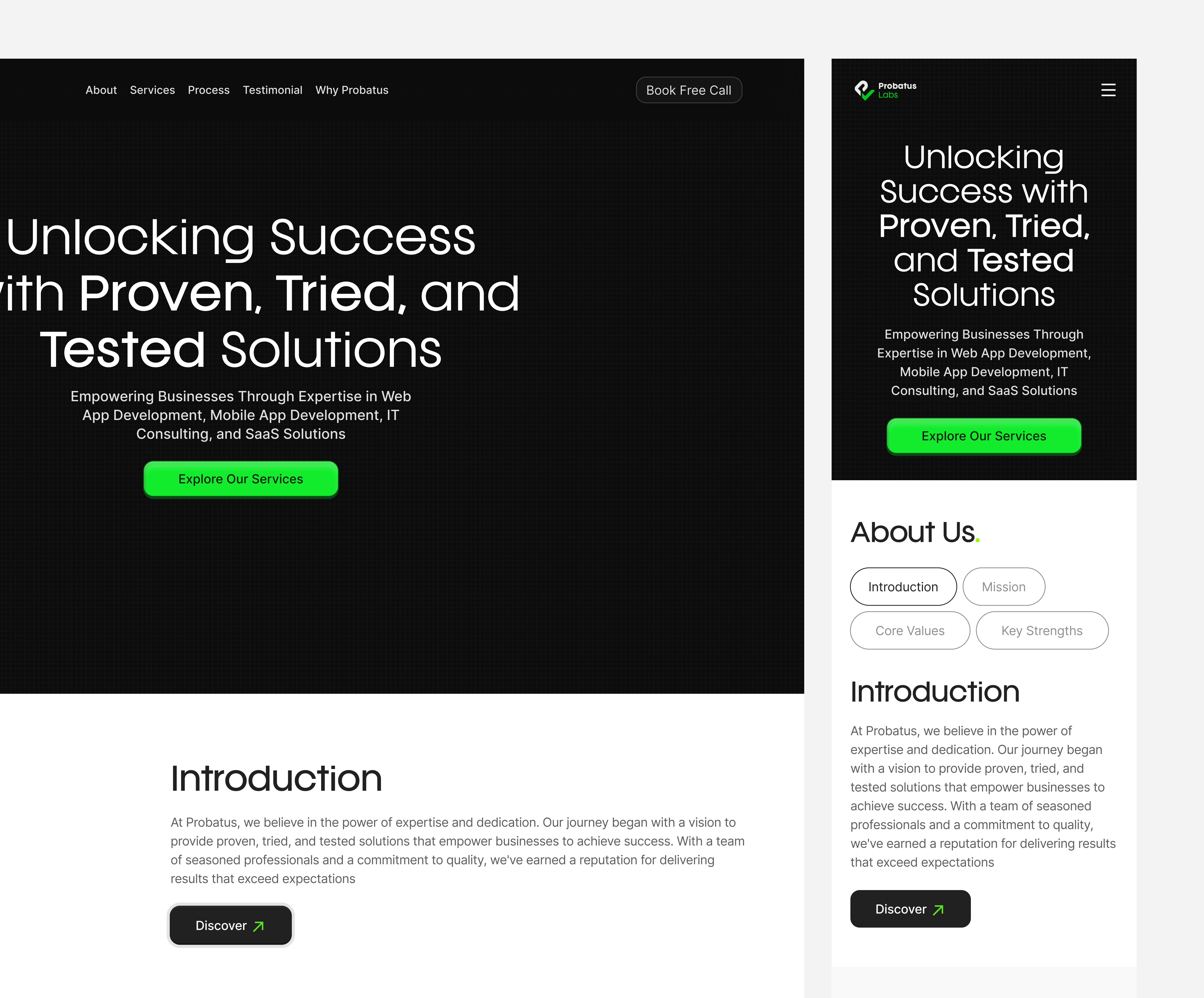
Responsive Mobile Design: With mobile browsing in mind, we ensured the landing page retained its usability and aesthetic on smaller screens, making it seamless for users to navigate.
Client Feedback:
I had the pleasure of working with Tabish on the design of my upcoming website’s landing page, and I couldn’t be more impressed with the results. From the very beginning, Tabish demonstrated a deep understanding of both user experience and aesthetic design. He took the time to thoroughly understand my vision and business goals, and then translated that into a landing page that is not only visually stunning but also highly functional.
I highly recommend Tabish to anyone in need of top tier UX design
Like this project
Posted Aug 12, 2024
Designed a tech-centric website for a development agency, capturing the essence of innovation and digital expertise
Likes
0
Views
30

