The Black Pearl | Identity for Seafood restaurant
Viktoriia Boldyrieva
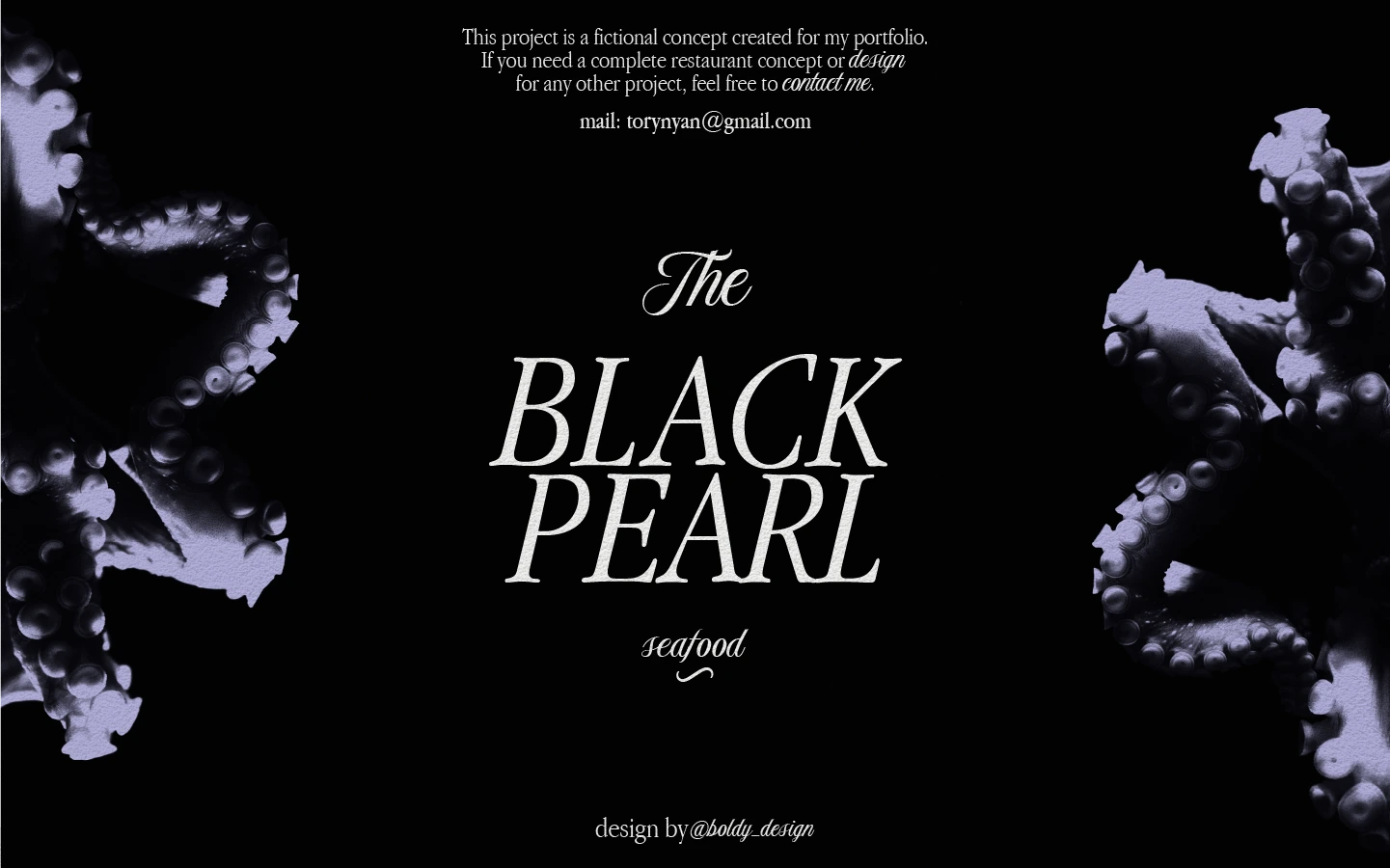
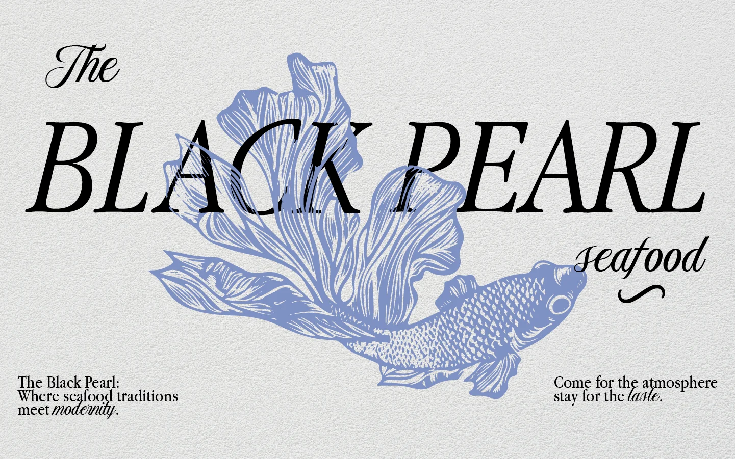
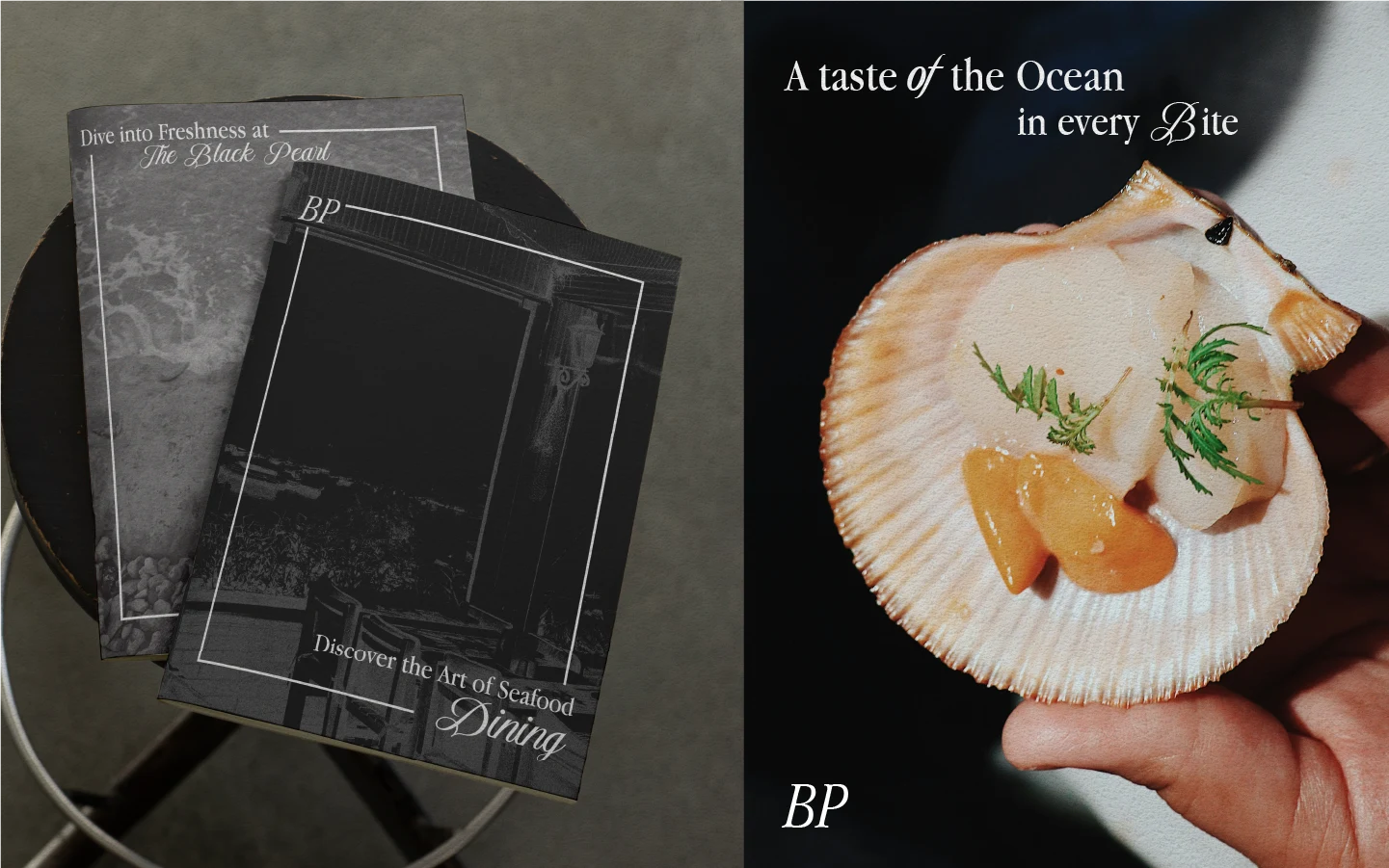
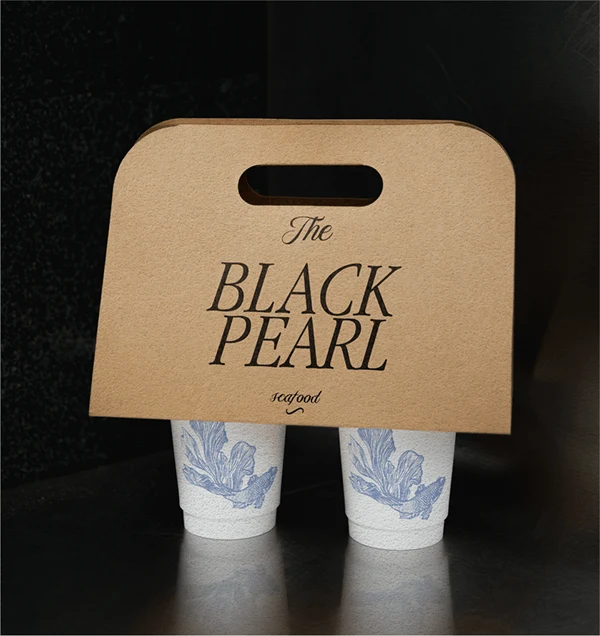
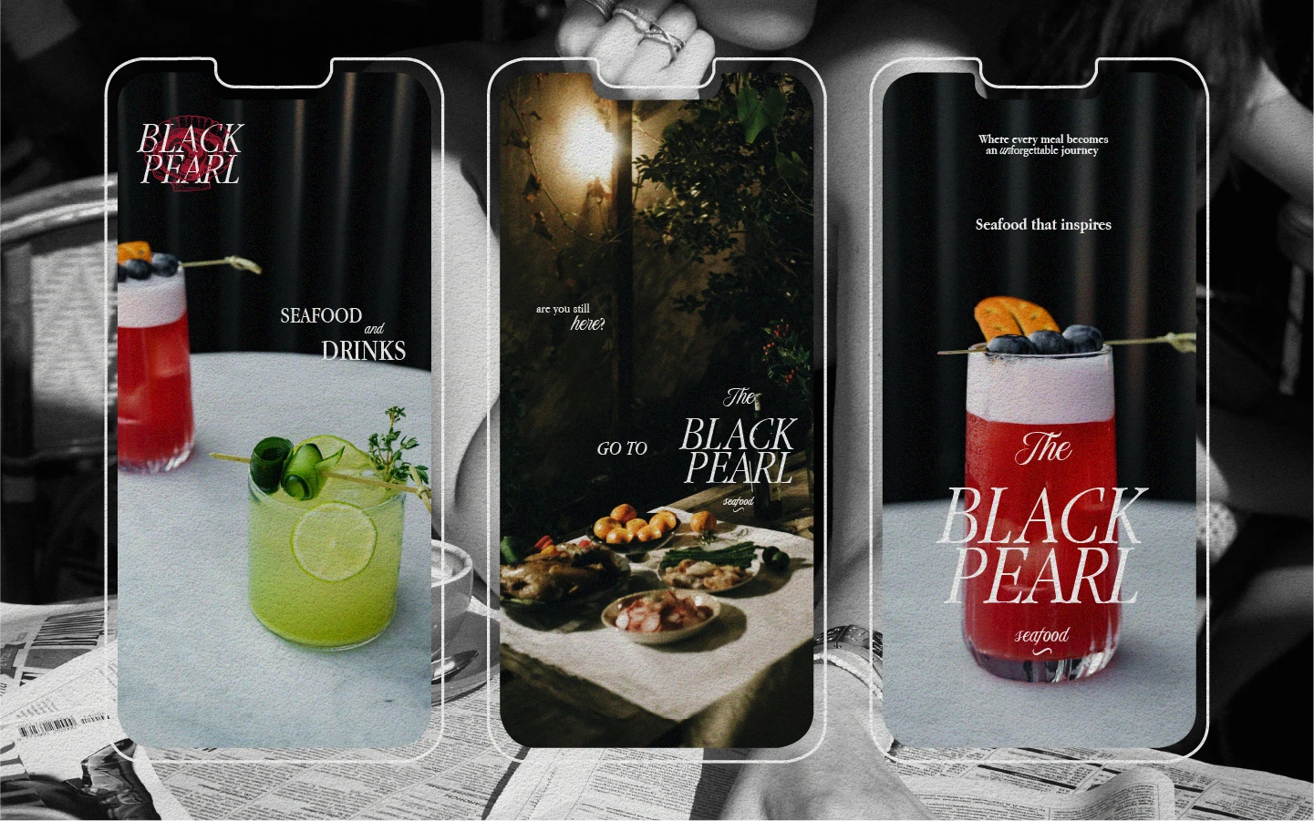
EN: The Black Pearl project encapsulates the essence of elegance and maritime adventure, reflected in every element of its design. The logo is a seamless blend of modernity and tradition, created with a sleek serif font that conveys both sophistication and boldness. The sharp edges and flowing lines of the font symbolize the refined craftsmanship and mastery of the culinary art that the restaurant embodies.
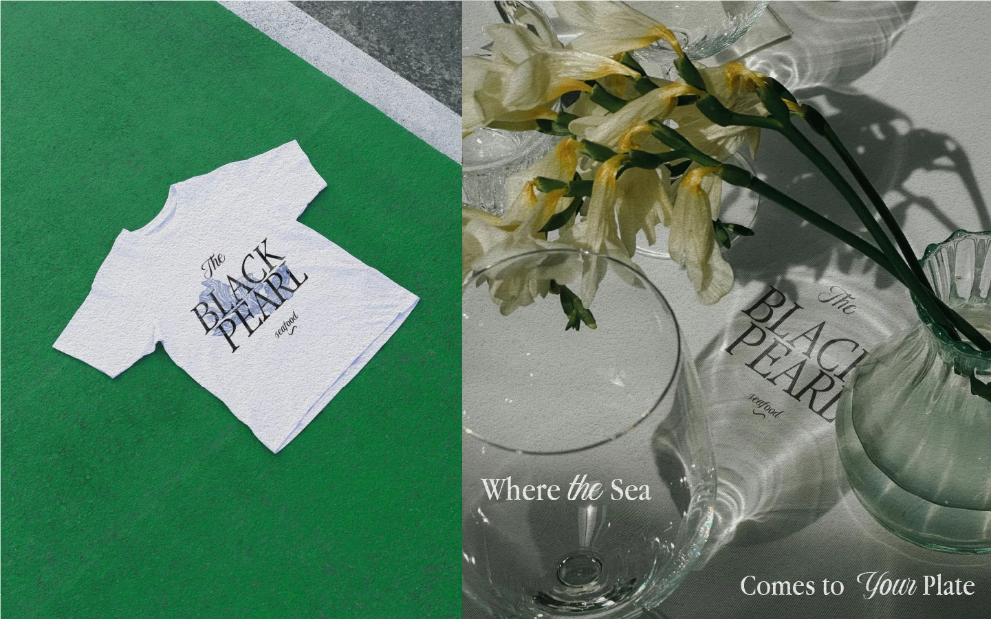
Each element of the logo is thoughtfully designed to evoke the freshness and richness of the sea, balancing simplicity with attention to detail. The logo's clean, memorable design ensures that it resonates with customers and communicates a sense of premium quality and exclusivity.
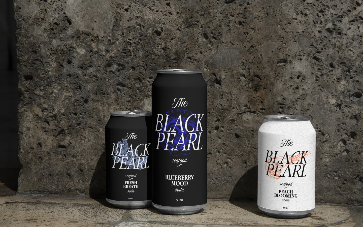
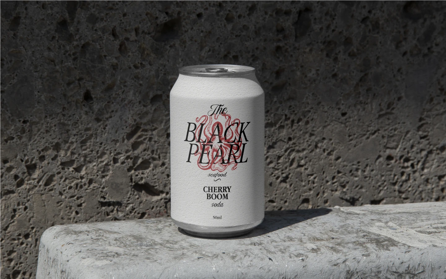
In addition to the primary logo, there are variations where illustrations of different sea creatures are integrated into the text, adding depth and thematic richness to the visual identity. These graphic elements enhance the restaurant's maritime theme and create a unique and recognizable brand image.

Cooperation:
Instagram: boldy_design
Telegram: vika_boldy

Like this project
Posted Jul 17, 2025
The Black Pearl project encapsulates the essence of elegance and maritime adventure, reflected in every element of its design.