
New York City Bicycle Repair
A concept brand identity for a neighborhood bike shop

Project type | Concept project (self-initiated, not a real client)
My role | Brand strategy, identity design, print and signage design
Tools | Illustrator, Photoshop, [Figma]
Deliverables | Logo, color system, typography, business cards, storefront sign, price menu, Grand Opening posters, community ride poster
1. The Challenge
Bike repair shops are usually forgettable: a greasy sign, a cluttered window, no real brand. But a bike shop is one of the few businesses that touches a neighborhood every week.
The brief I gave myself: build an identity for New York City Bicycle Repair that feels professional enough to trust with your bike and warm enough to become a community hub.
2. The Big Idea
A repair shop with the confidence of a modern brand.
The identity pairs a dark, industrial base with one hot, energetic accent. Dark says "skilled workshop." Orange says "fast, friendly, alive."
3. Brand Identity
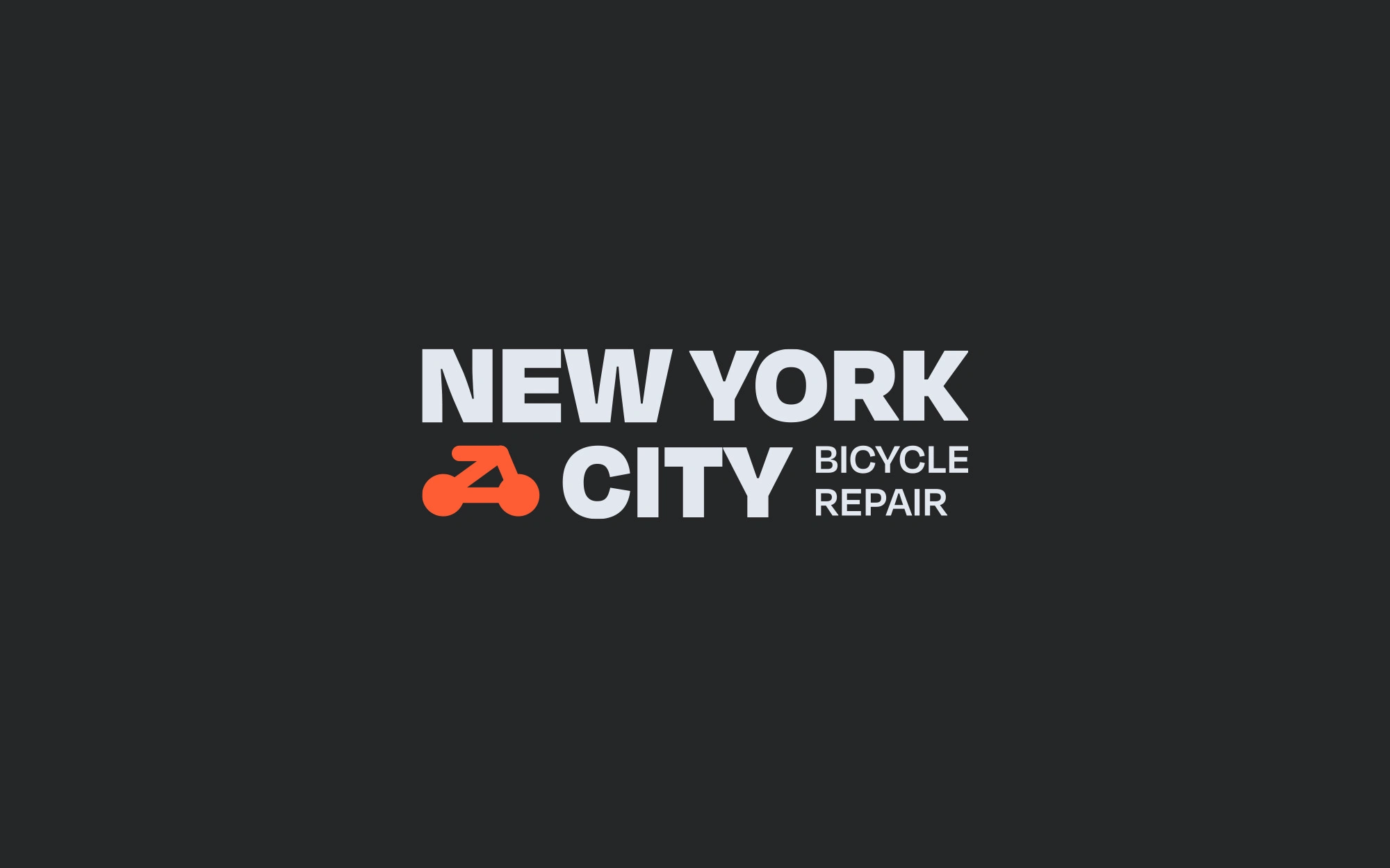
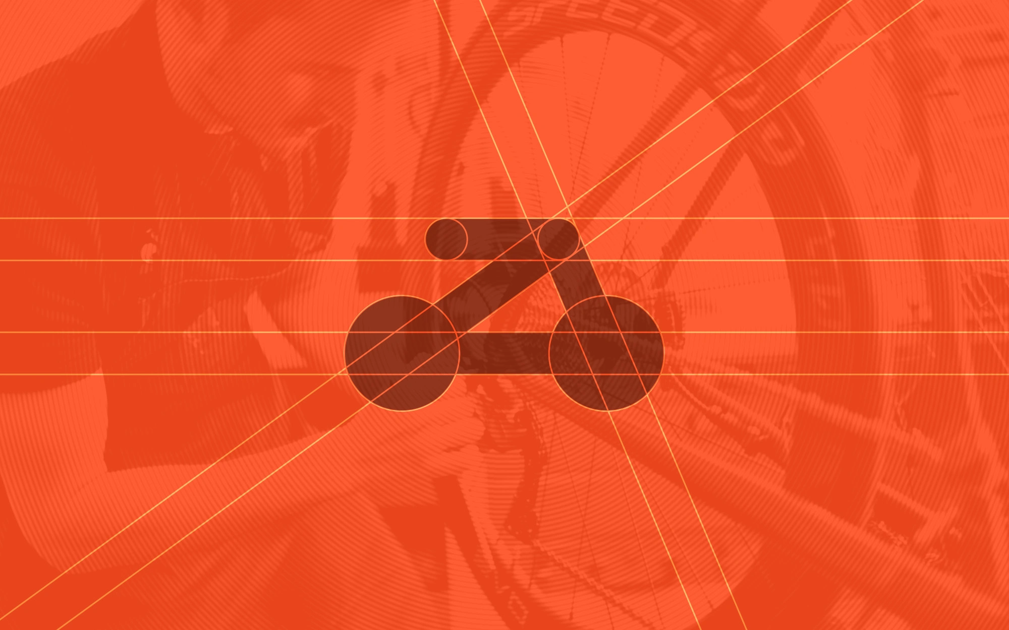
Logo: a bold wordmark, NEW YORK CITY / BICYCLE REPAIR, with a bike-inspired icon mark in vermilion.
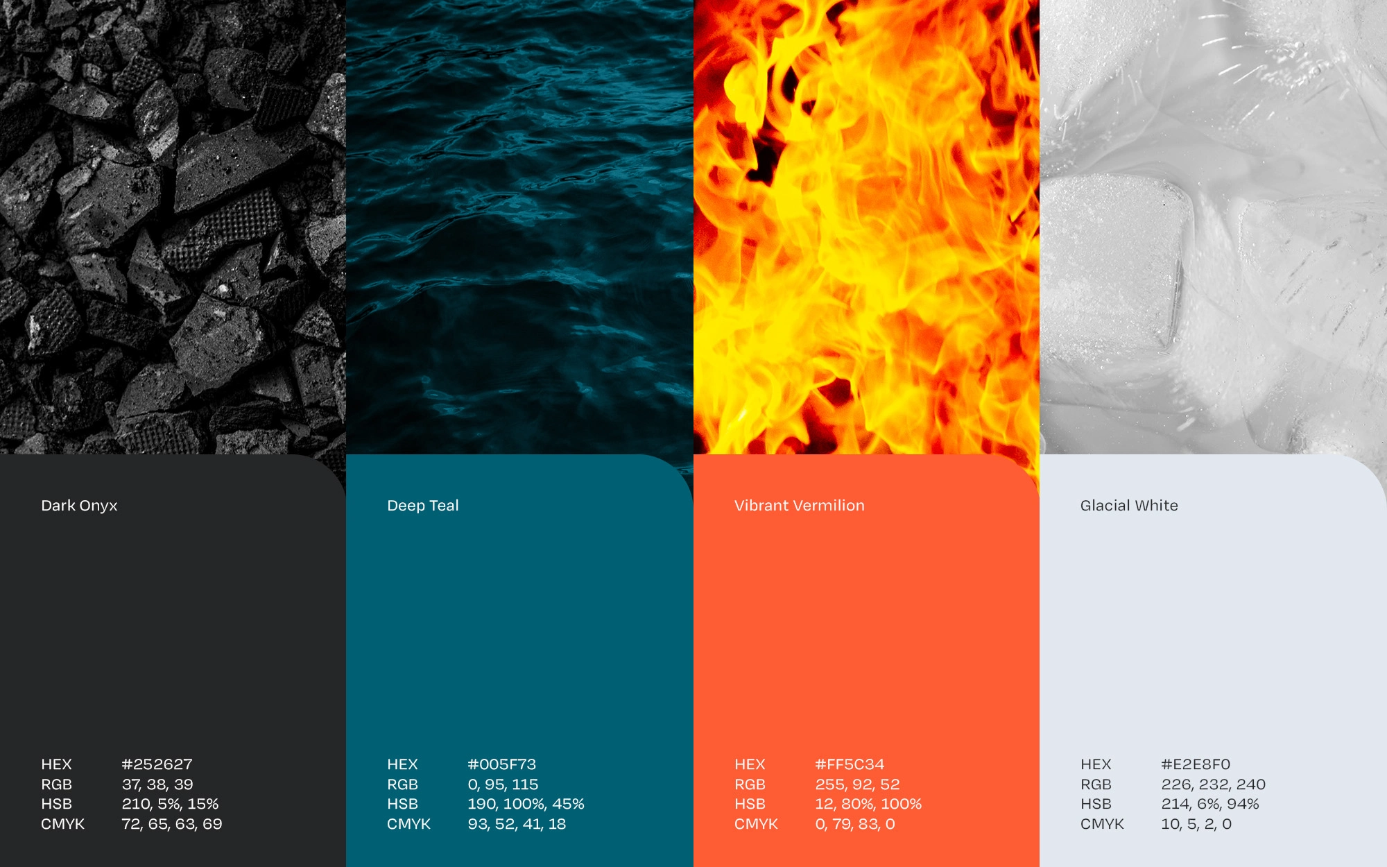
Color system: four colors, each with a clear job.
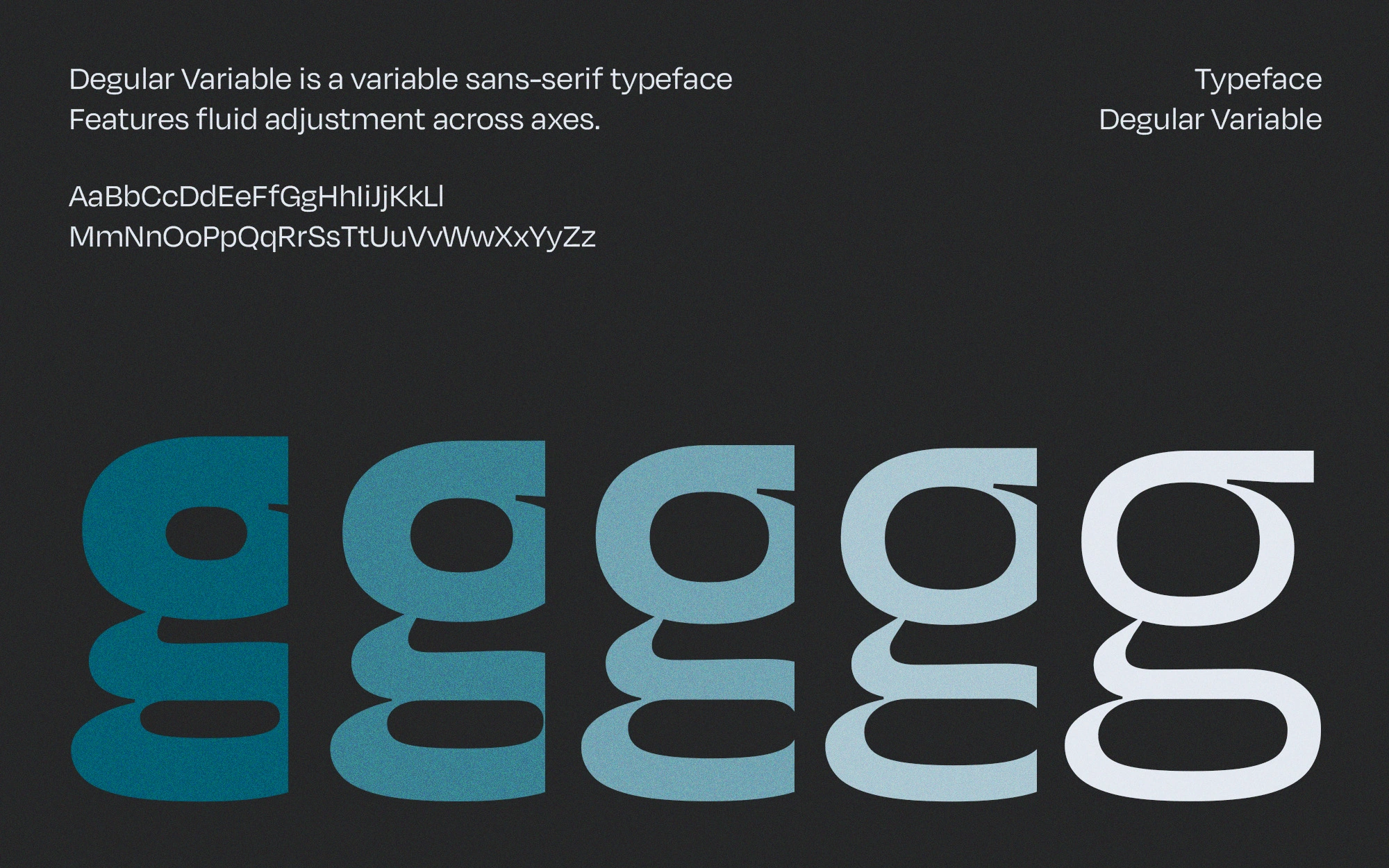
Typography: Degular Variable, a variable sans-serif that adjusts fluidly across weight and width axes. One typeface covers everything from massive headlines to tiny menu text, which keeps the system consistent and flexible.
4. The System in Use
A brand is only as good as its worst application. Here is how the identity works across touchpoints:
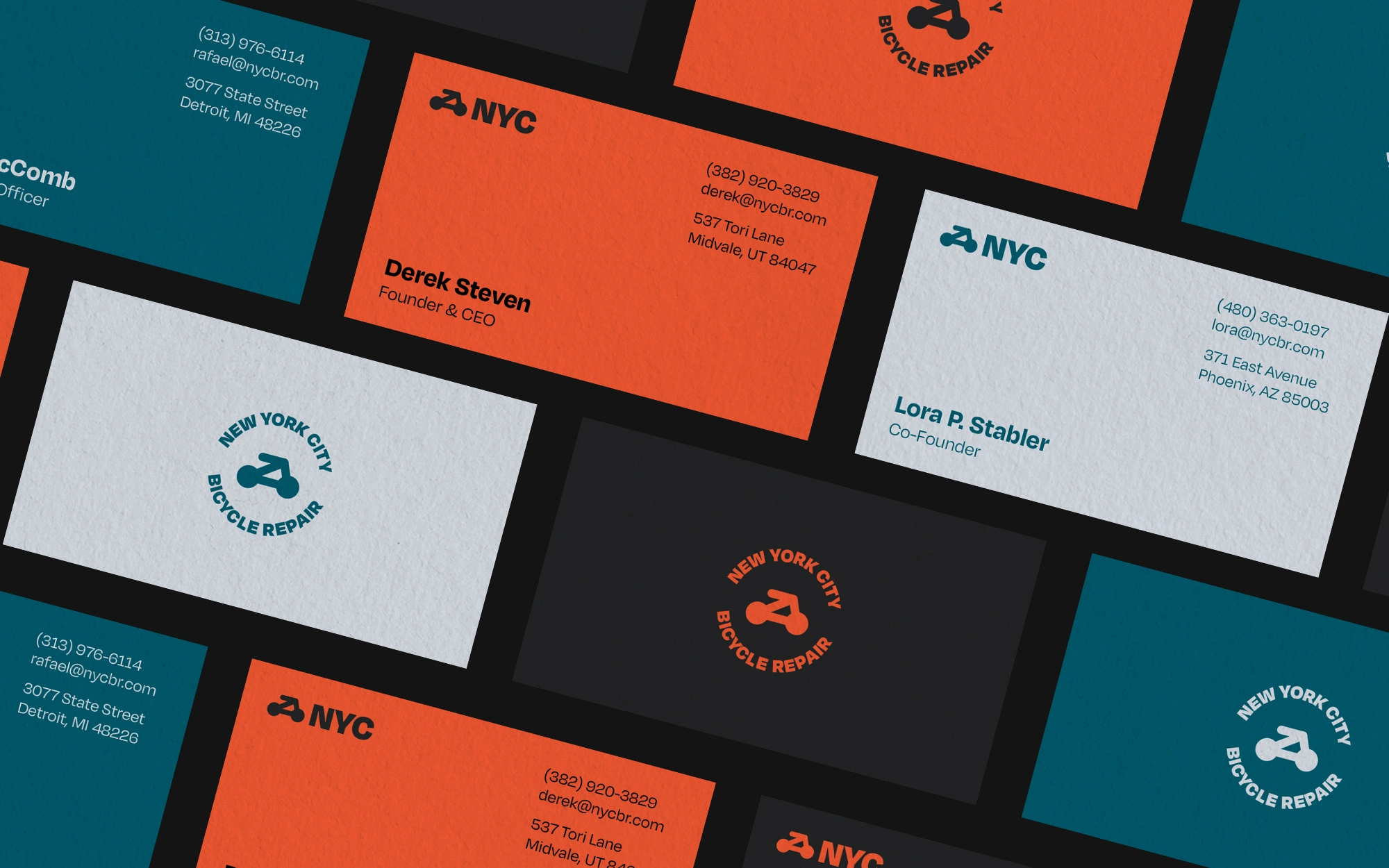
Business cards: orange, teal and white cards that rotate the palette while staying clearly one family
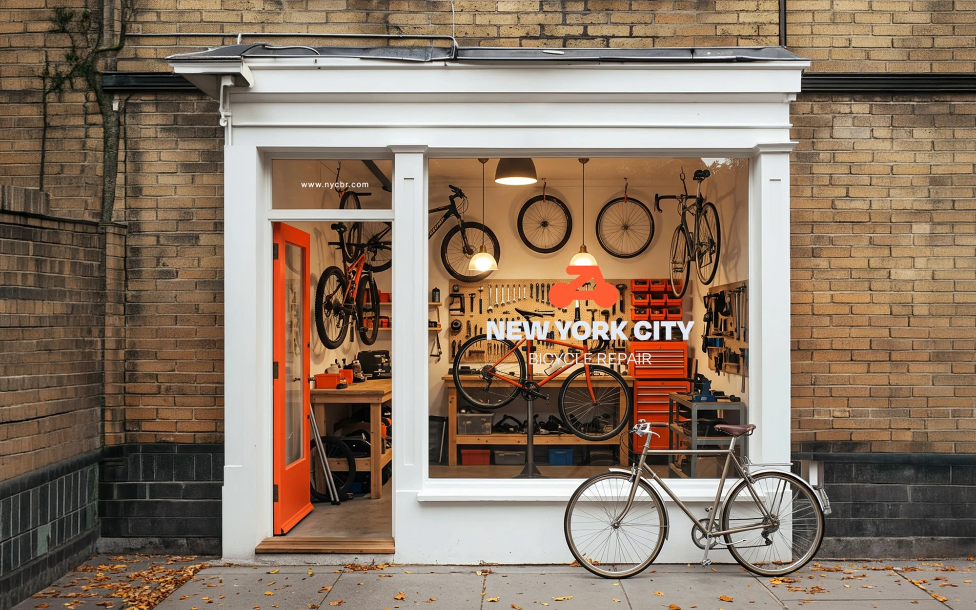
Storefront and illuminated sign: the vermilion logo glows against the dark facade, readable from across the street
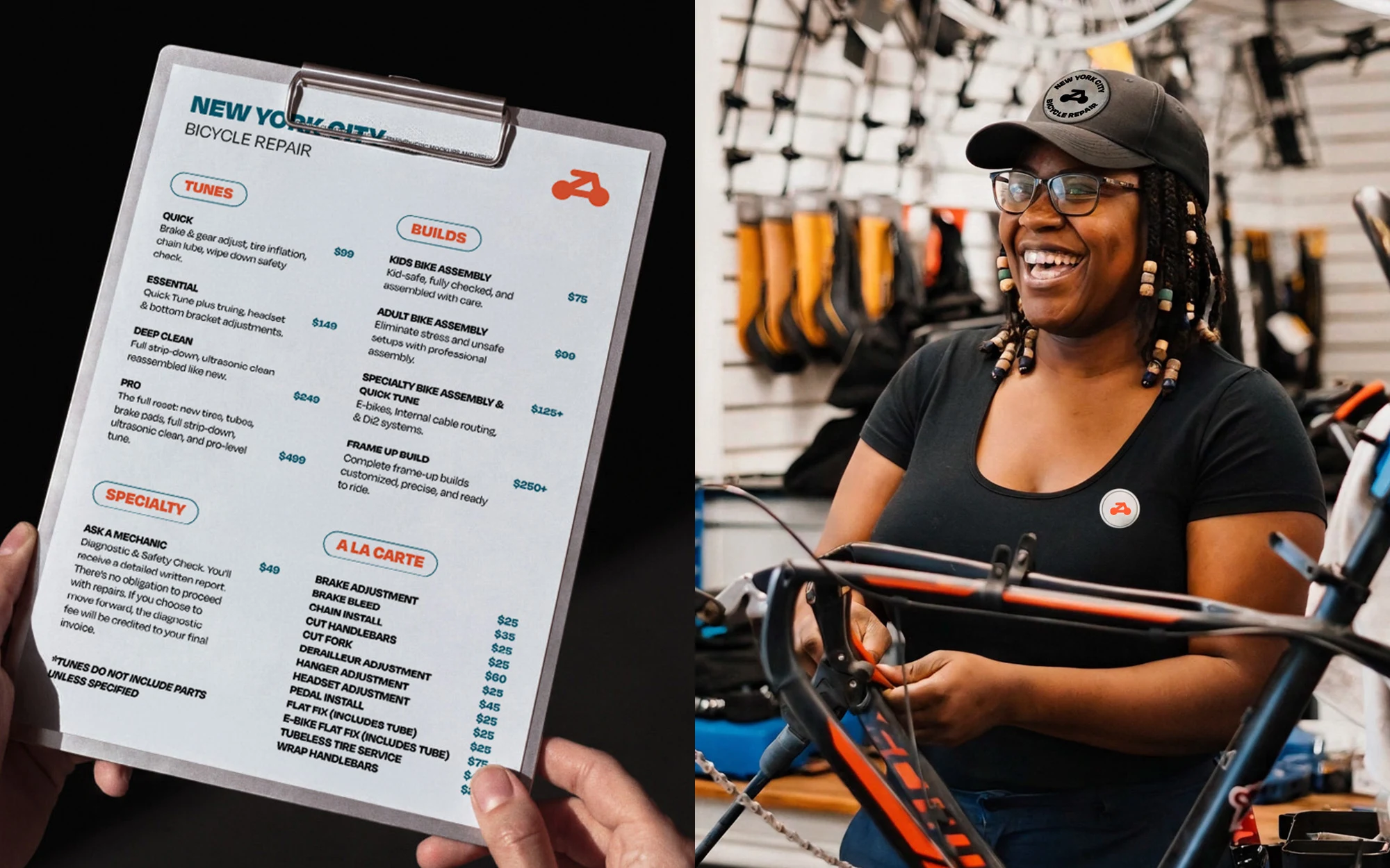
Price menu: a clean, scannable service list so customers see costs at a glance
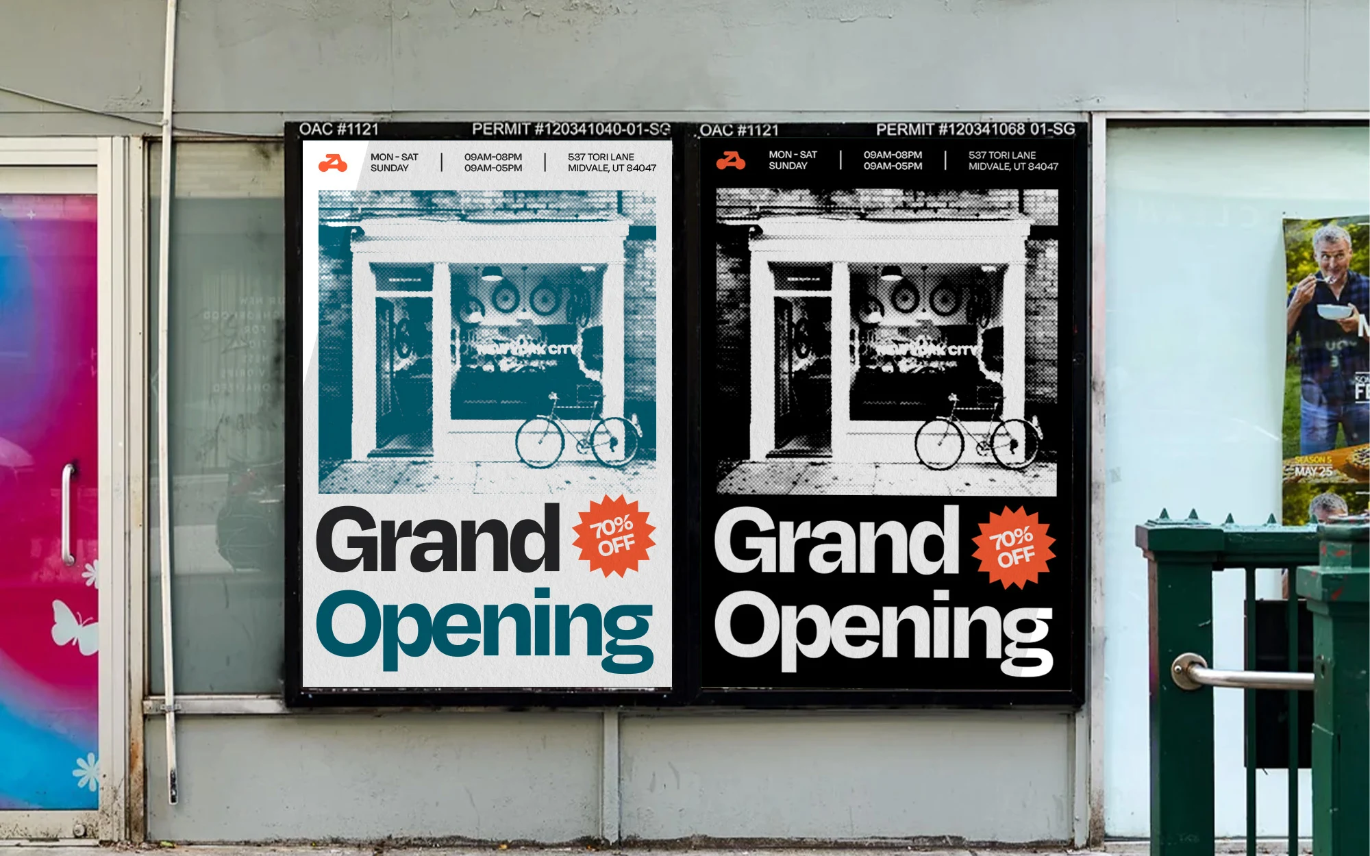
Grand Opening posters: large, bold type that works at street level
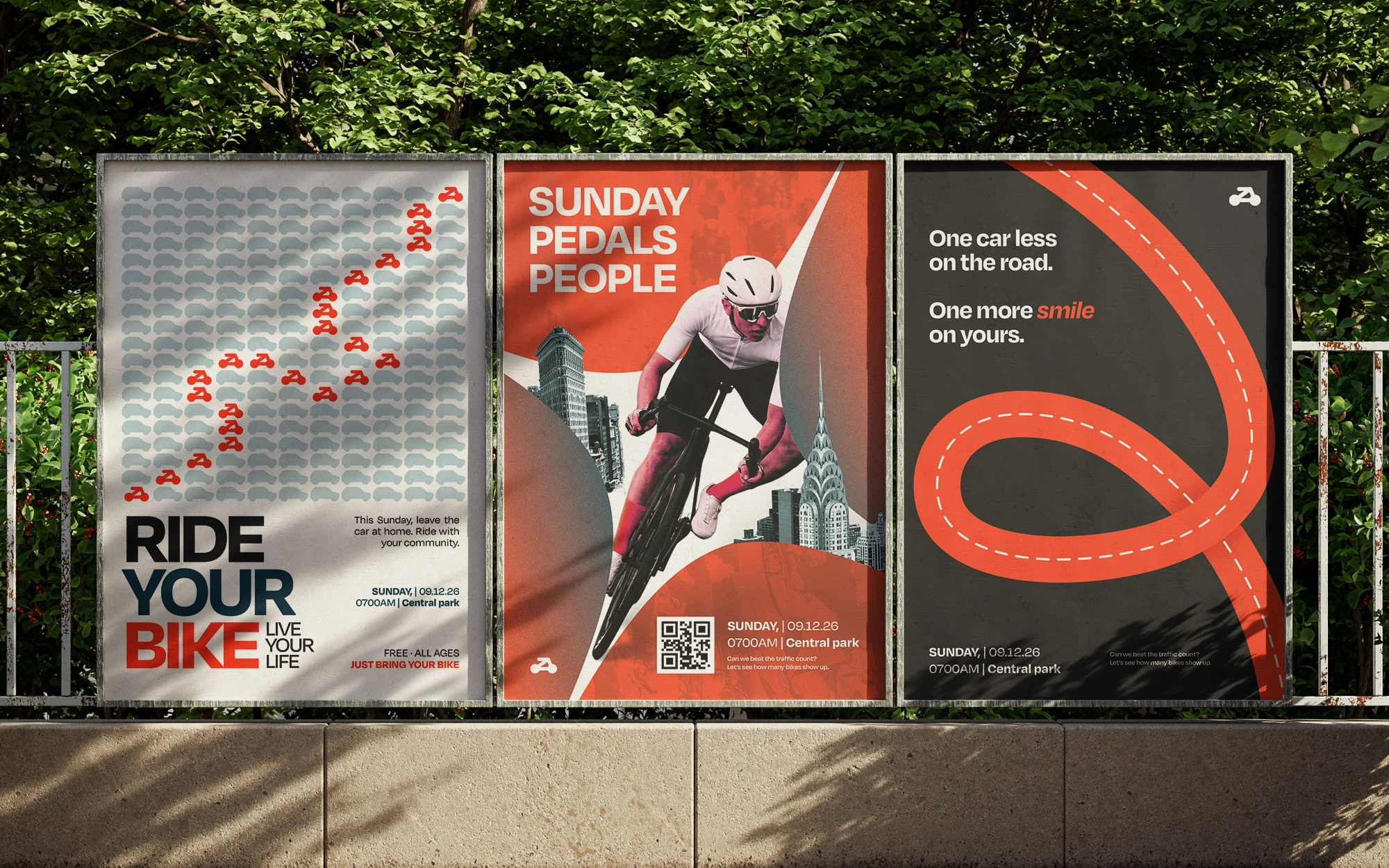
5. Community: The "Ride Your Bike" Poster
A repair shop wins by becoming part of the neighborhood. So I designed a community poster to gather riders for a Sunday group ride.
6. What I Learned
One accent color does a lot. Keeping vermilion for the logo, signs and calls to action made every touchpoint instantly recognizable.
A variable typeface keeps a system tight. One family, many voices.
Community content builds brand, not just awareness. The ride poster gives the shop a reason to be talked about beyond repairs.

0 likes · 3 views · Oct 30, 2026
Concept brand identity for a NYC bike repair shop: logo, 4-color palette, signage, menu, posters and a community ride campaign, all built as one system.


