Building Trust: OneTap’s Secure, Seamless Identity 🔐


About Brand
OneTap is a FinTech startup offering a revolutionary money transfer and banking service designed for today's tech-savvy individual. Our core value proposition lies in providing the simplest and fastest way to manage finances, empowering users with a single-tap experience.
Logo Animation
Concept
Instant Access: Emphasizes the ease of payments with just a single tap, highlighting a fast, modern user experience.
Security First: Designed with robust security features to ensure user trust, making every transaction safe and reliable.
User-Centric Design: Intuitive interface that simplifies financial tasks, merging security with ease of use.
Modern Identity: Clean, minimalistic visuals represent the tech-forward, no-fuss approach of the brand.
Effortless Banking: Aimed at making complex financial interactions feel simple, quick, and accessible to everyone.
Logo Showcase
Brand Messages
Voice: Professional, trustworthy, and approachable.
Personality: Agile, innovative, and user-centric.
Logo Grid
Logo Creation
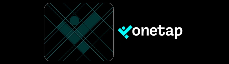
Circle as 'O': The "O" in OneTap is designed as a circle, symbolizing completeness and the ease of a single tap.
Tick Mark for Security: A tick mark is integrated within the "O" to signify secure and confirmed payments, reinforcing trust.
45° Angle: The tick mark is positioned at a 45° angle, symbolizing forward movement and dynamic interactions.
Dual Purpose: When inverted, the tick mark resembles the "T" in "Tap," creatively blending elements for a cohesive identity.
Square Box with Sharp Edges: The square surrounding the tick mark represents precision, reliability, and the sharp, fast nature of transactions.
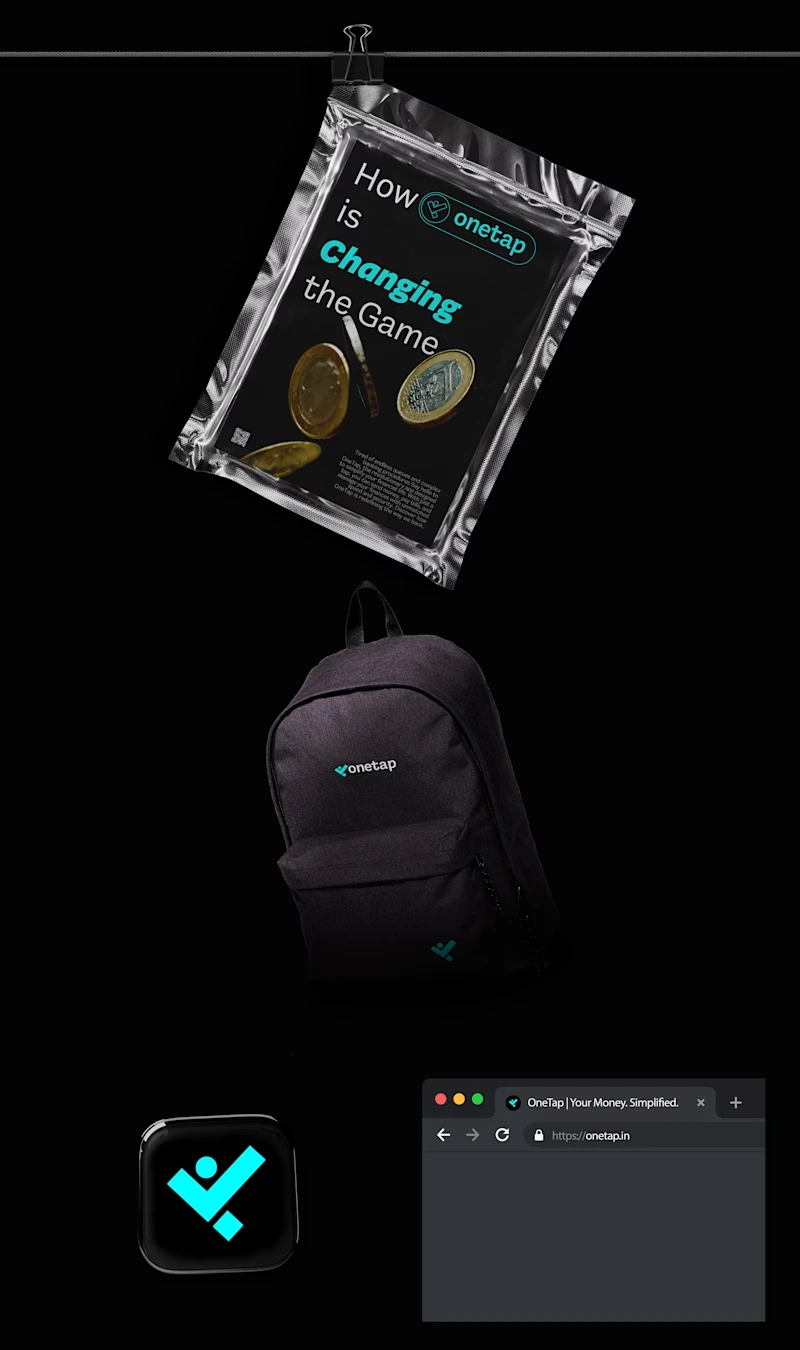
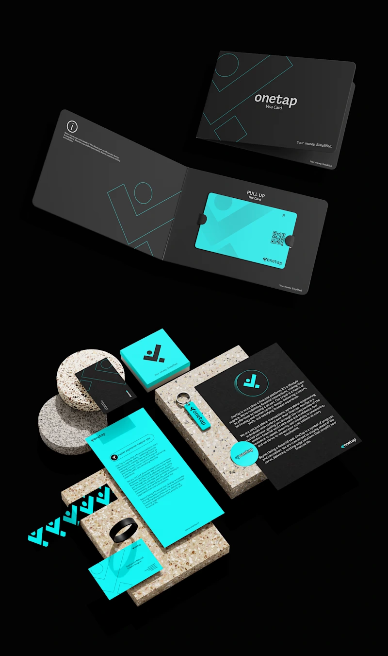
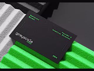
Brand Mockups
Social Media Post Designs
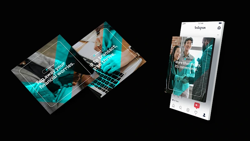
Social Media Designs
Website Showcase
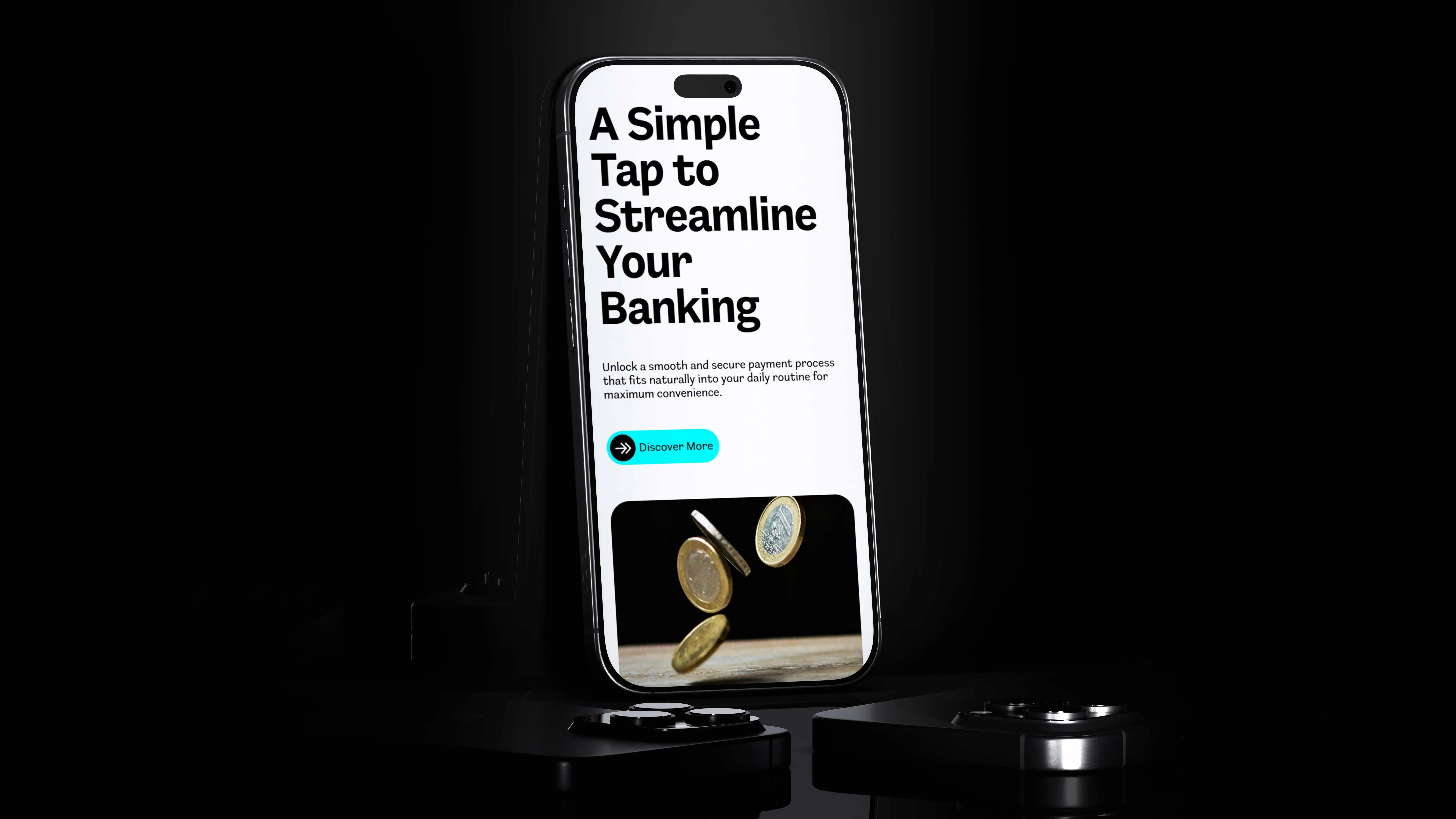
Website in Iphone
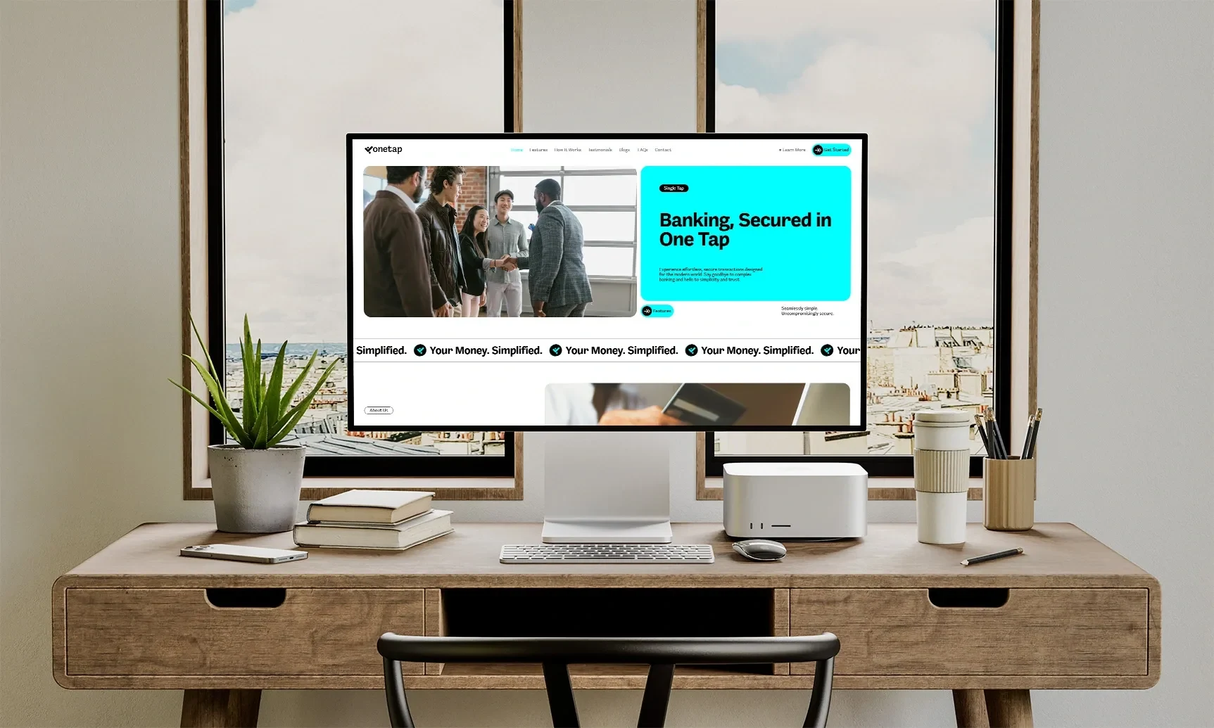
Website in Mac
Click to Check The Website 👉 - https://onetapfinance.framer.website/
Check The Full Project Here 👇
Like this project
0
Posted Dec 20, 2024
Experience seamless, secure banking in just one tap. OneTap combines speed and trust for effortless, modern transactions you can rely on.


Crafting Comfort: A Modern Twist on Global Traditions 🍽️
Designing Elegance: Where Light Meets Luxury in Every Detail 💫
Unveiling Design Excellence: A Journey Through Innovation 🚀
Nurturing Radiance: Pure Beauty Rooted in Nature 🌿