Mark OS

Vadim Carazan


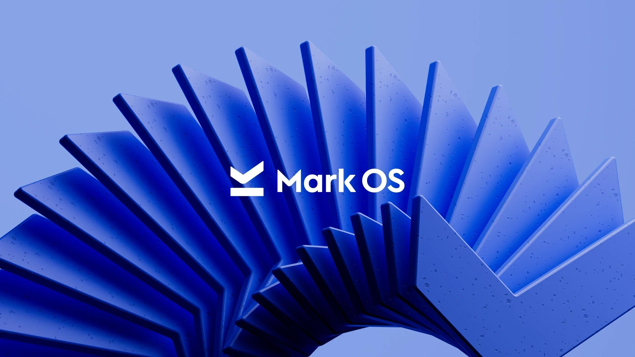
Mark OS
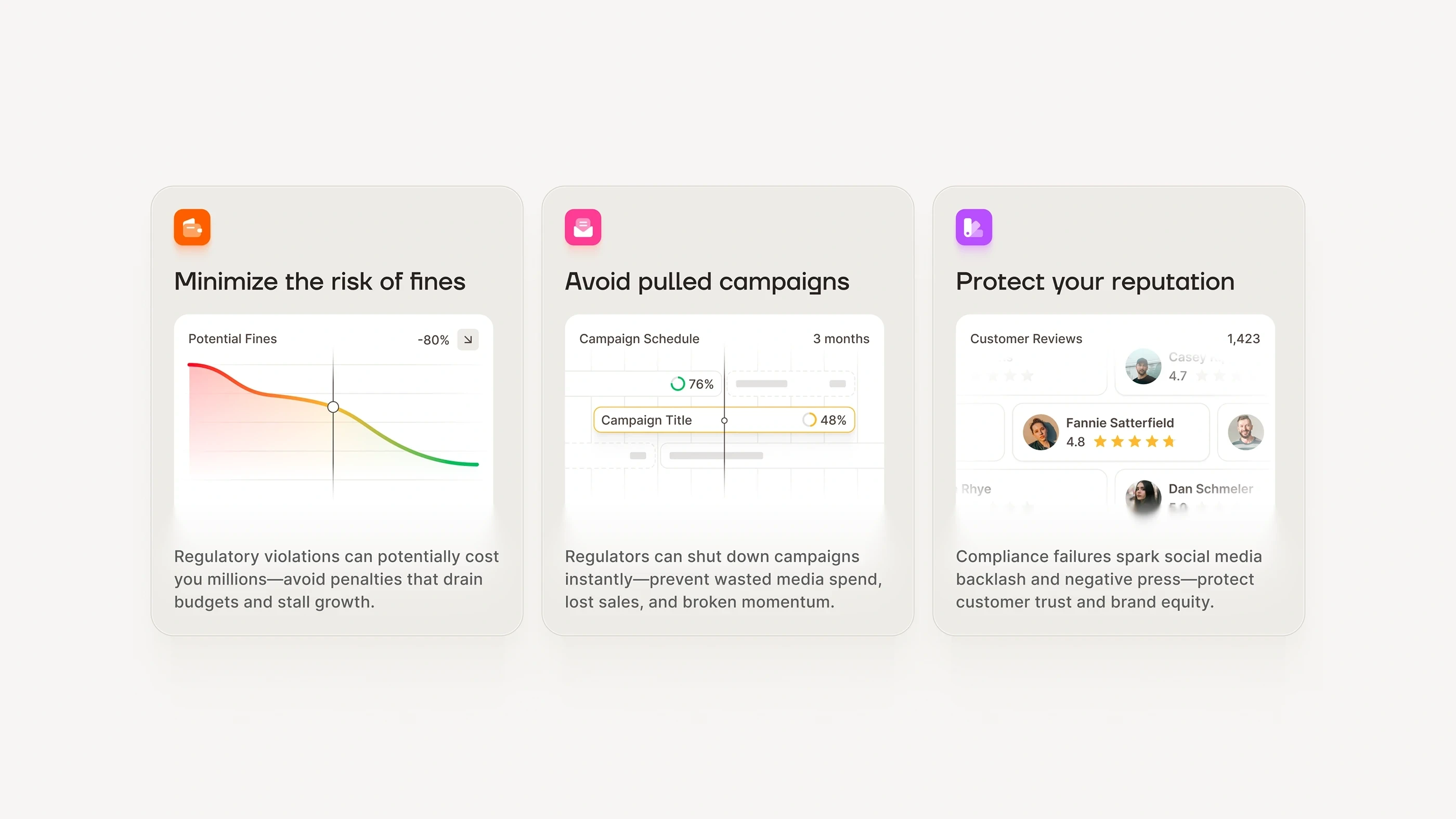
Mark OS is an AI platform that reviews marketing content for brand, legal, and performance issues before it goes live. It tells teams whether their work is on-brand, compliant, and ready to perform, the moment before it ships.
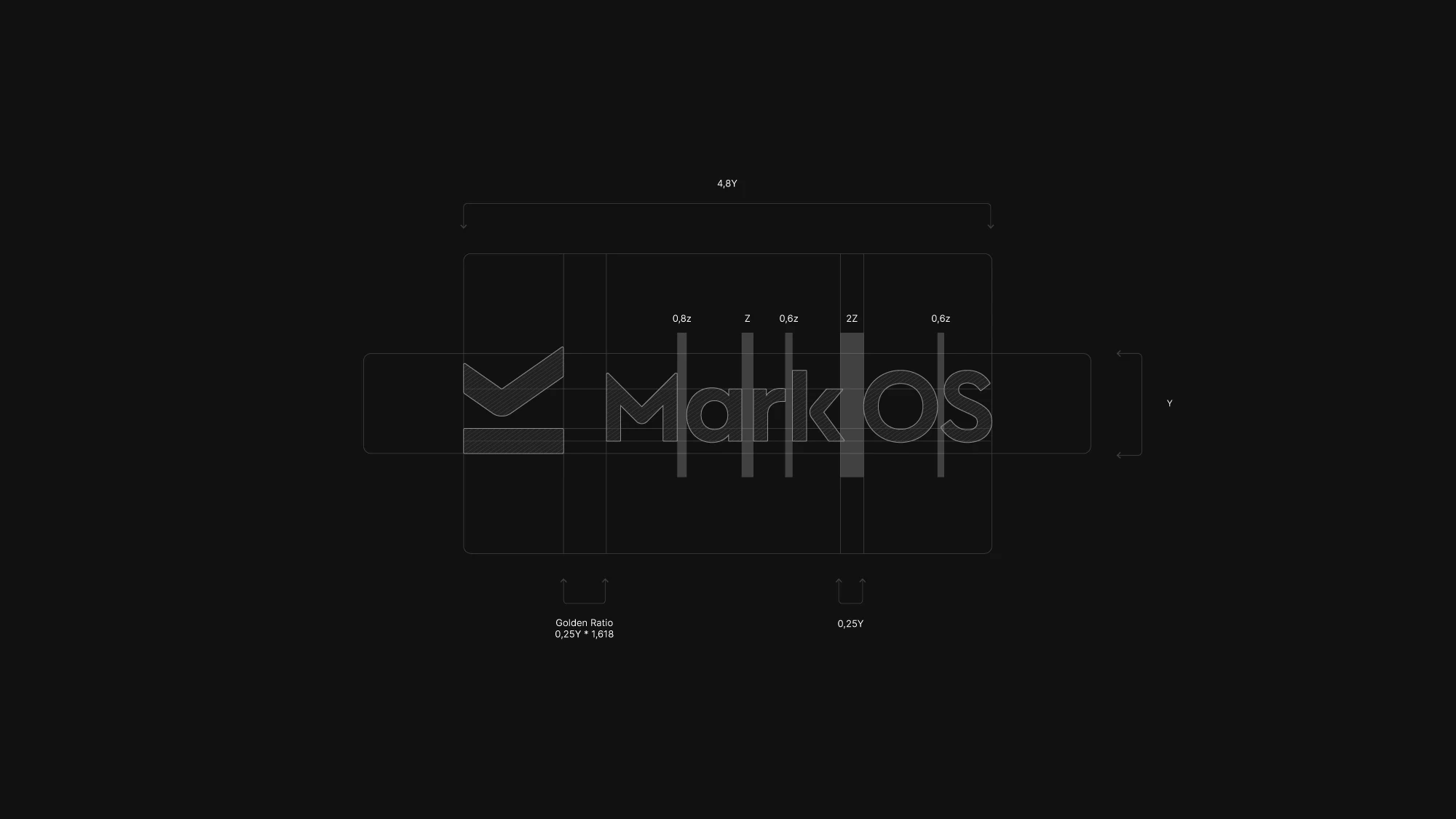
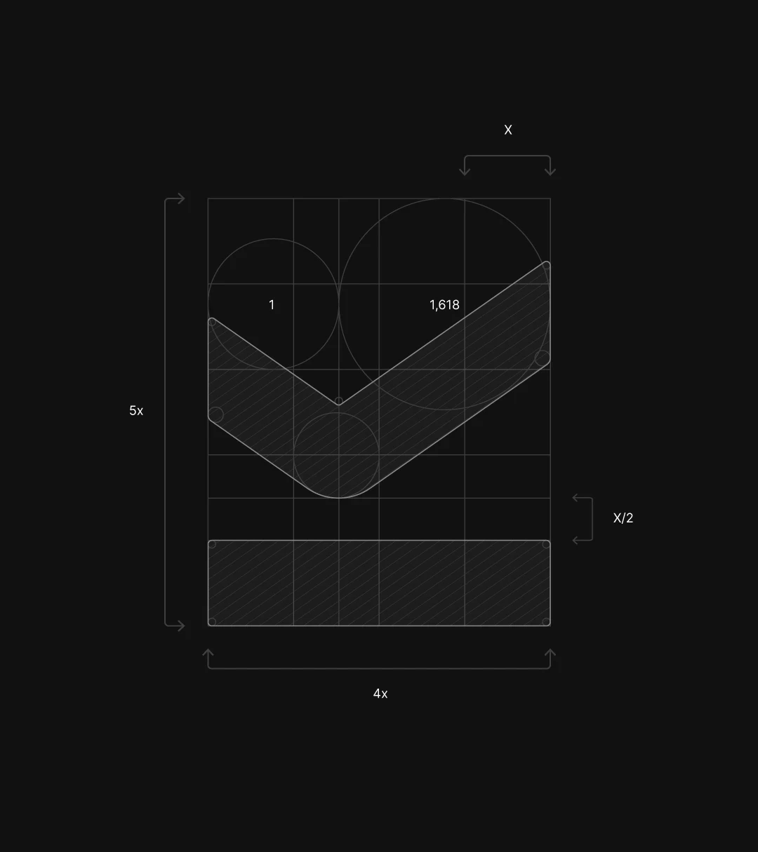
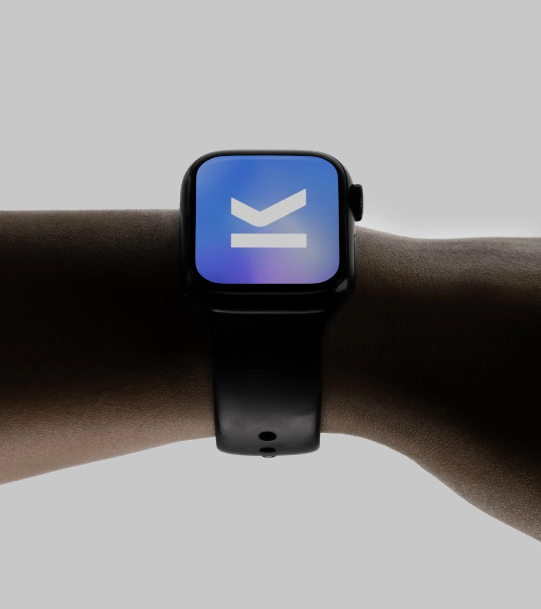
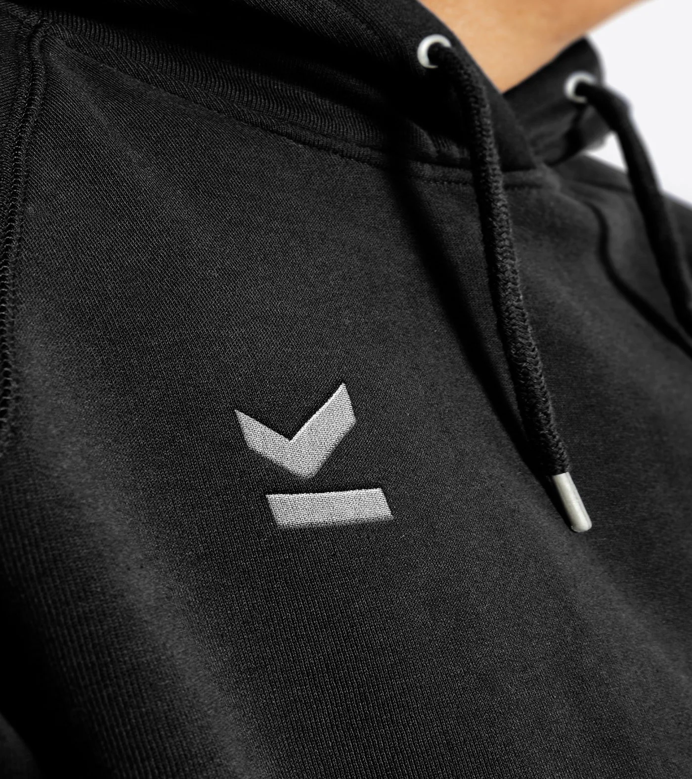
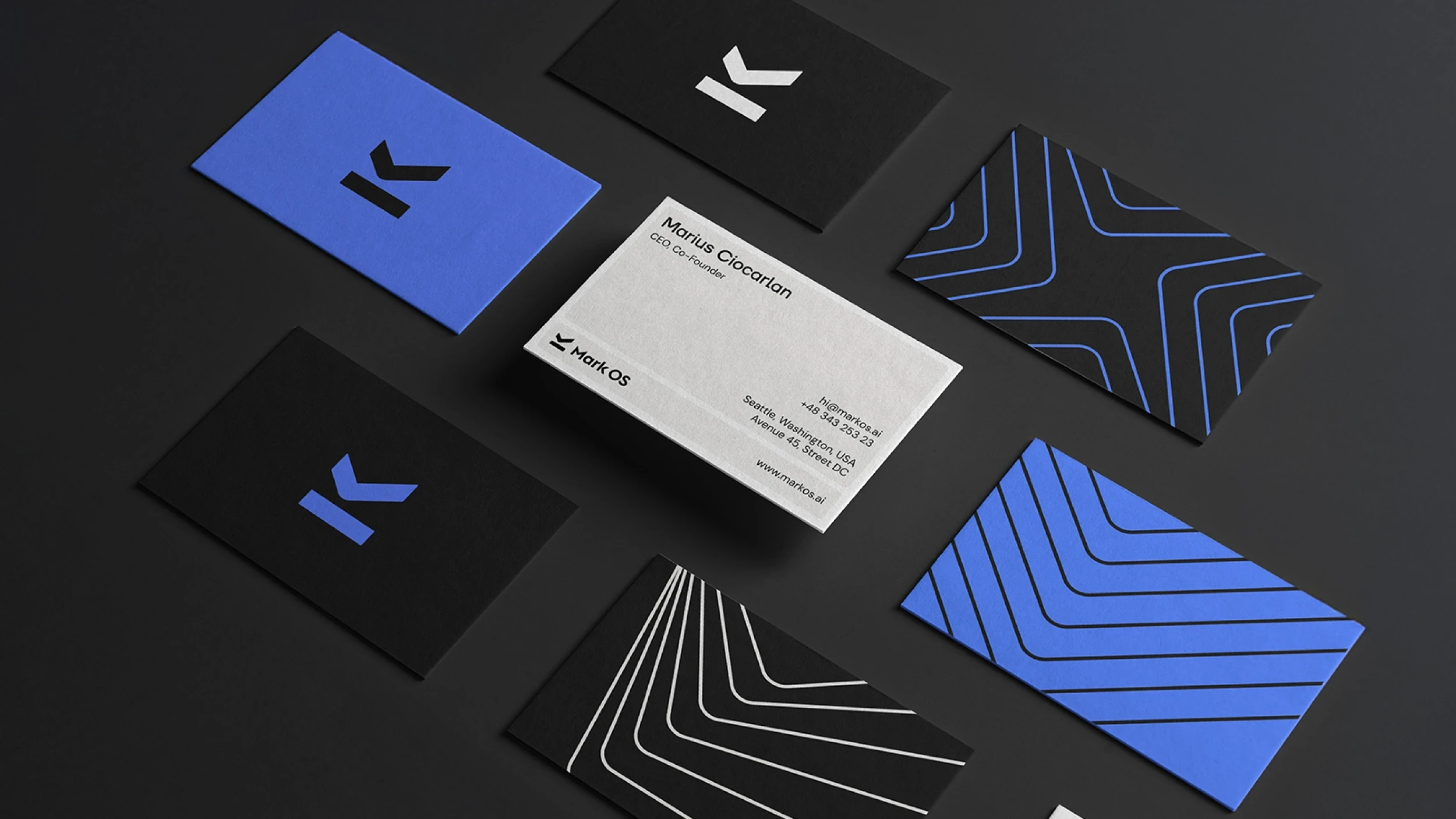
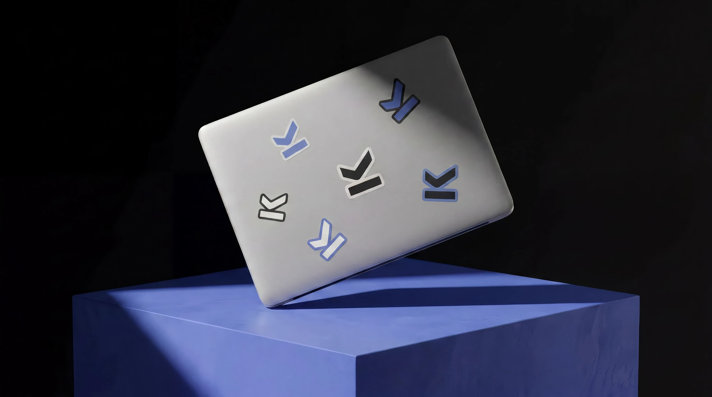
We built the full brand and digital identity around a single idea: the mark of approval. The logomark carries three meanings at once, an M for Mark, a checkmark for approval, and an underline that signals making your mark. One symbol that reads instantly at any size, and works as hard as the product it represents.
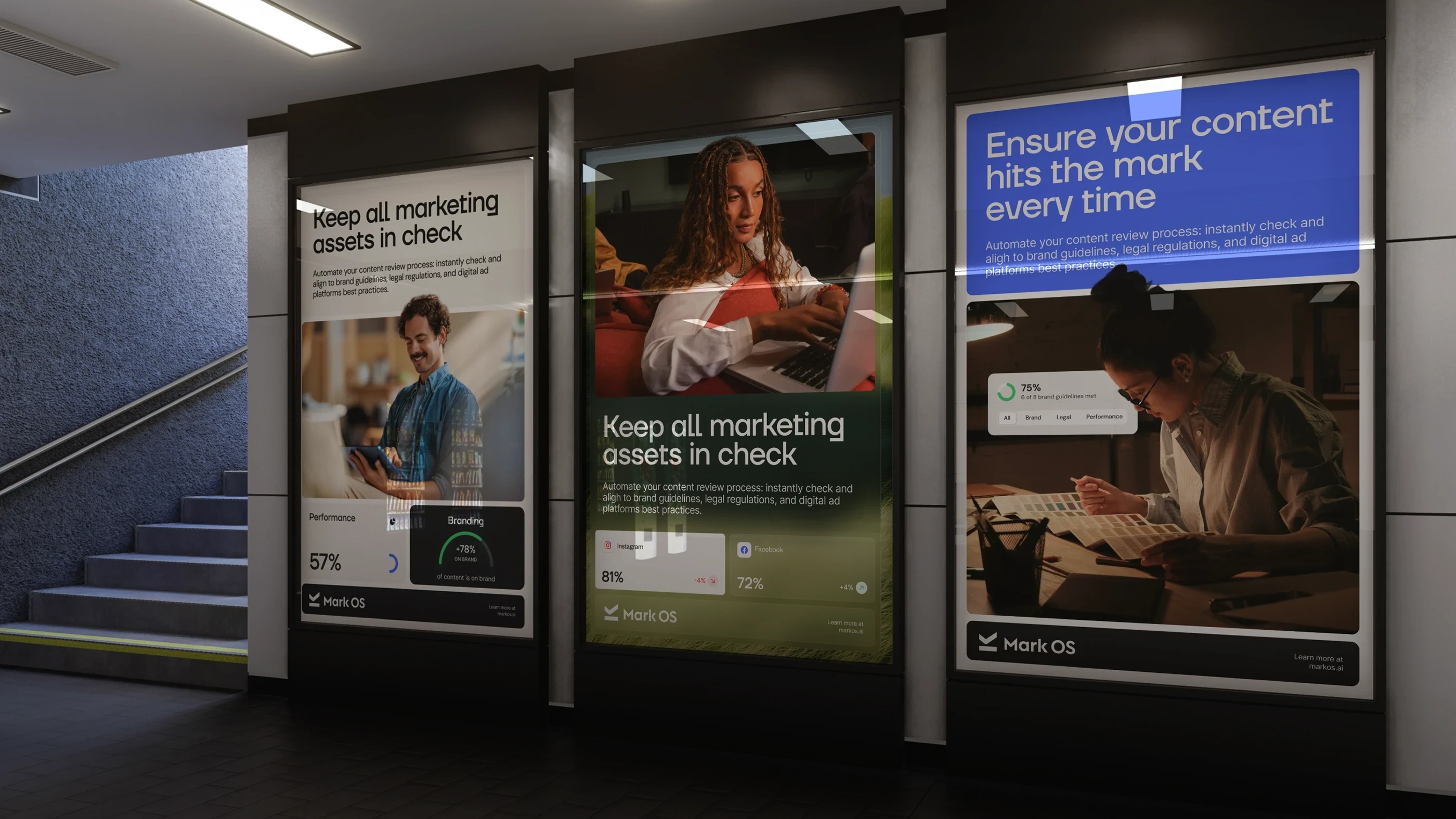
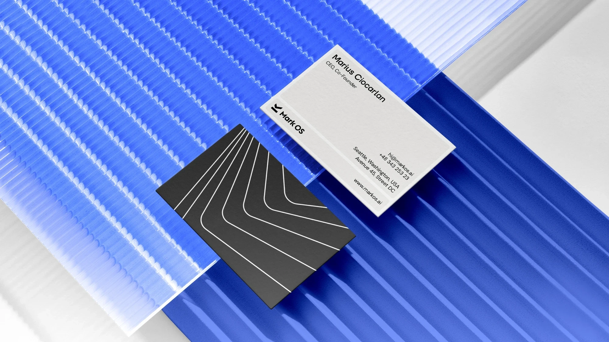
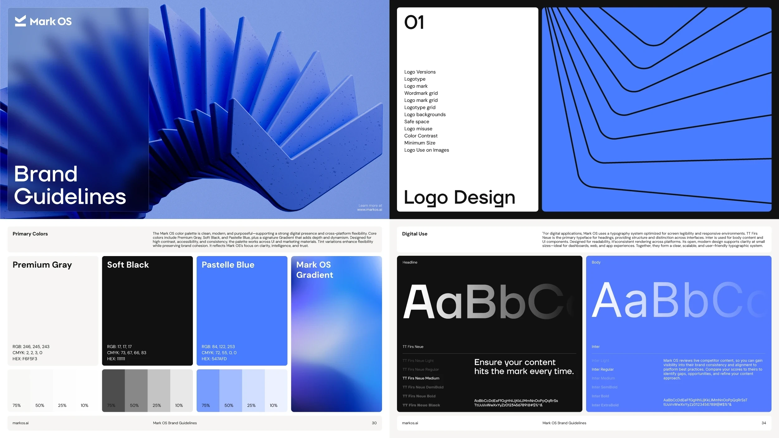
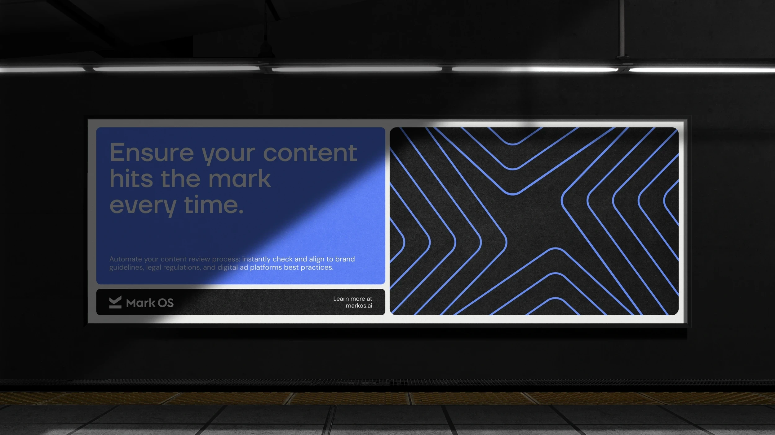
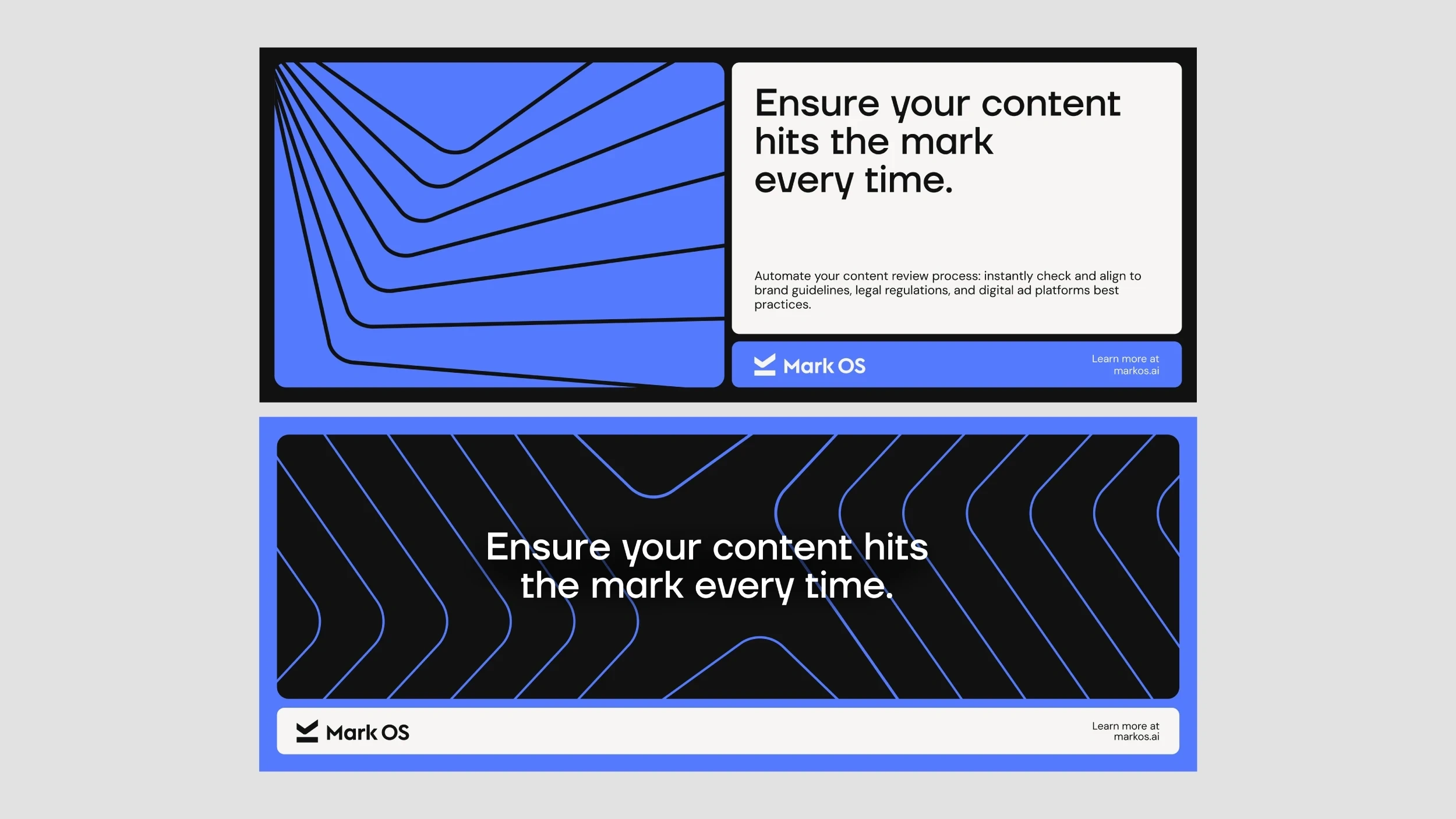
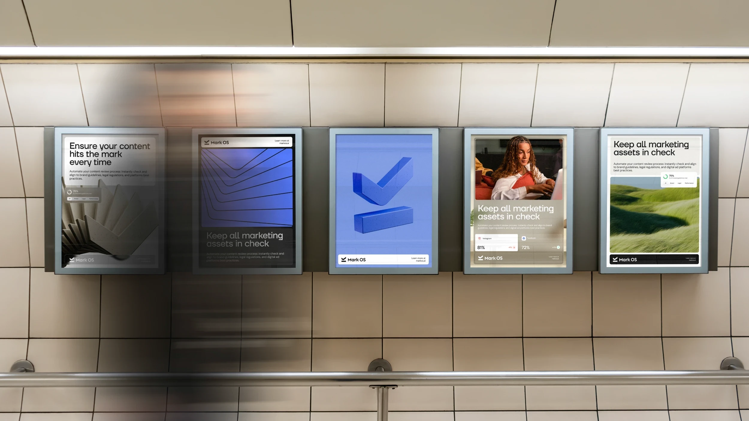
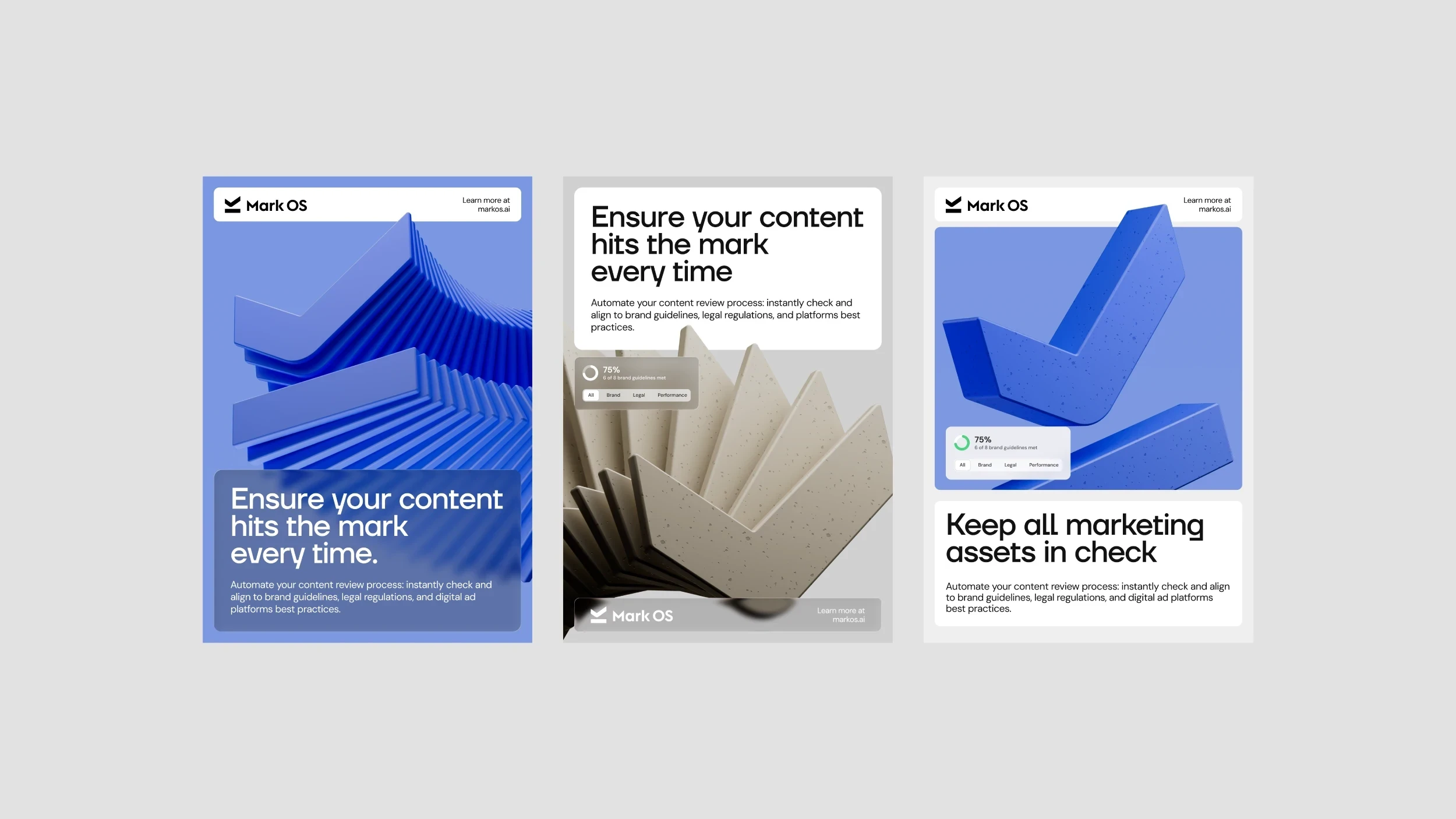
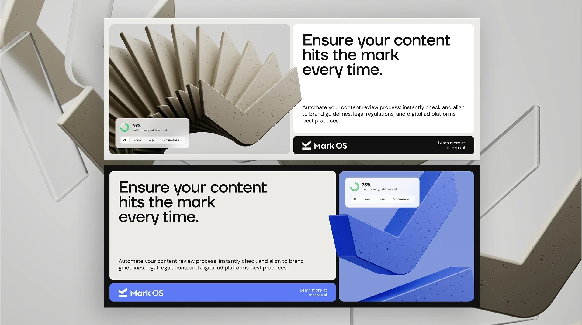
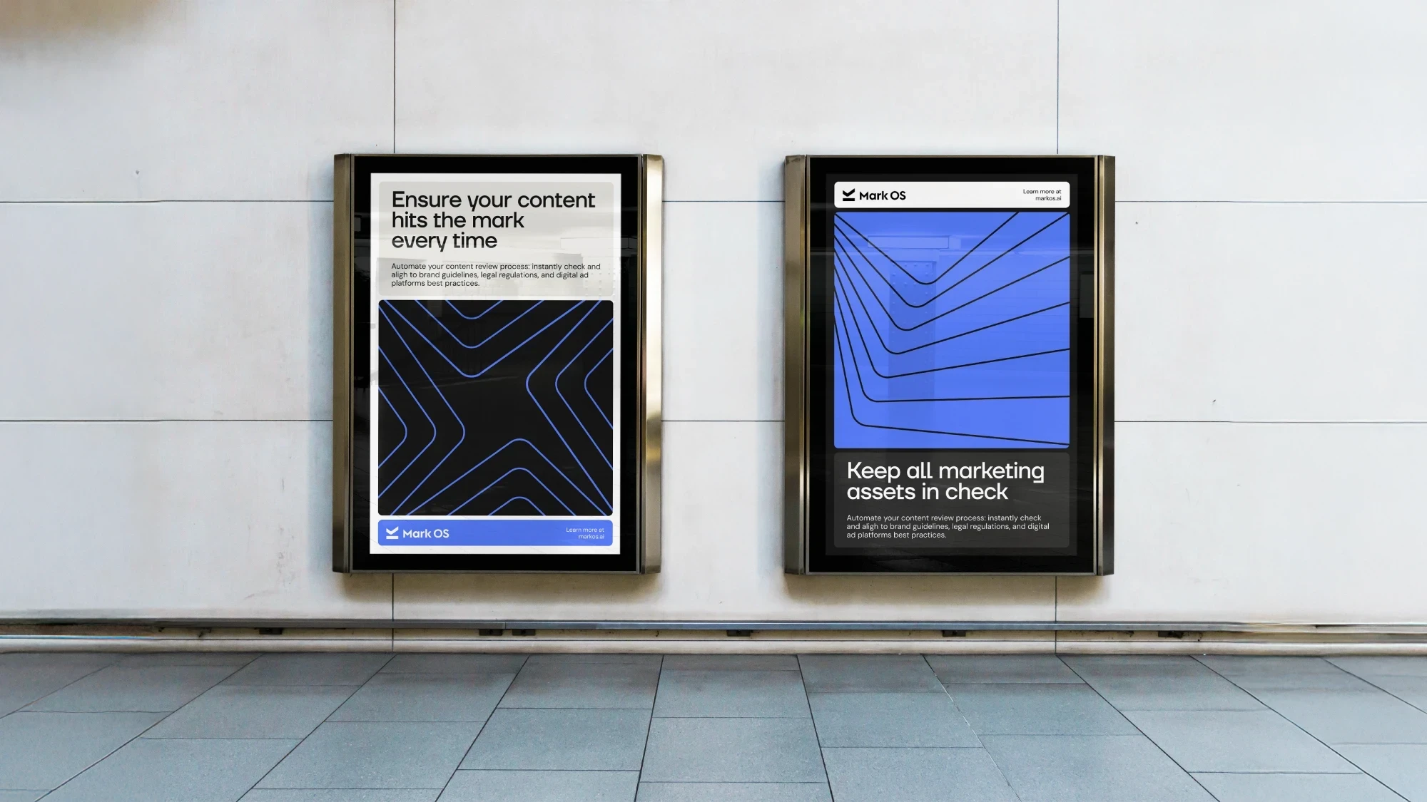
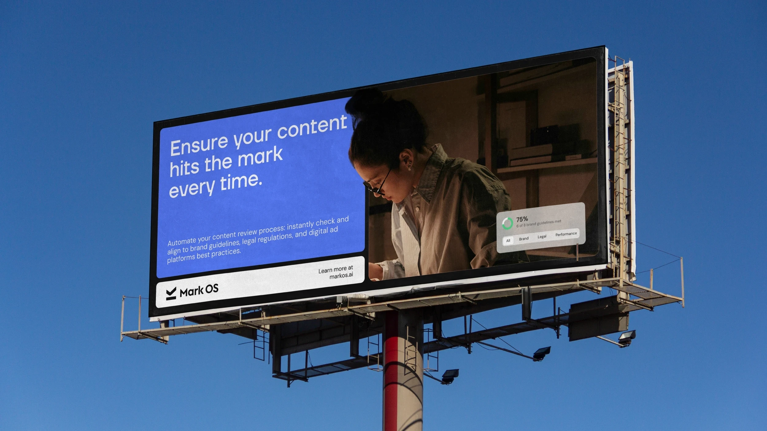
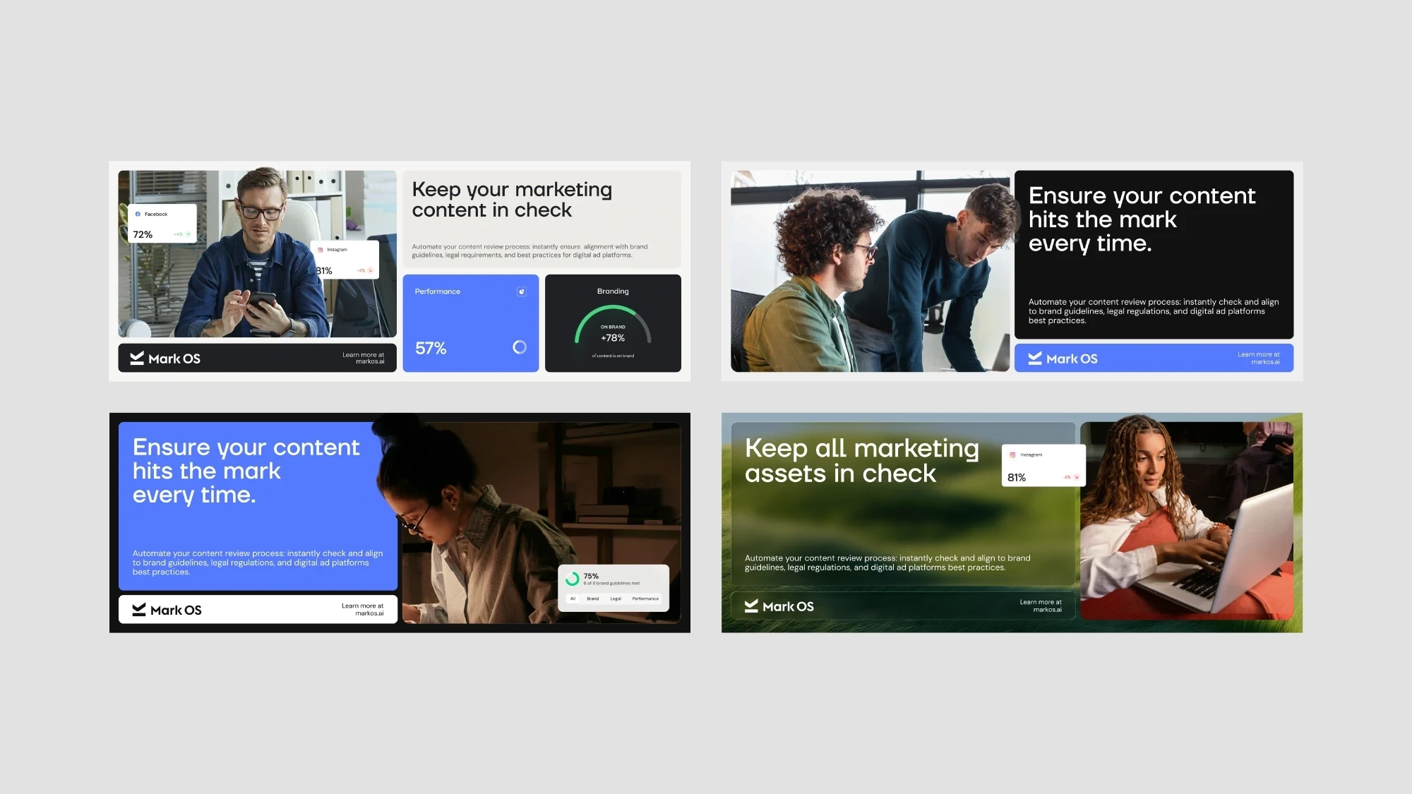
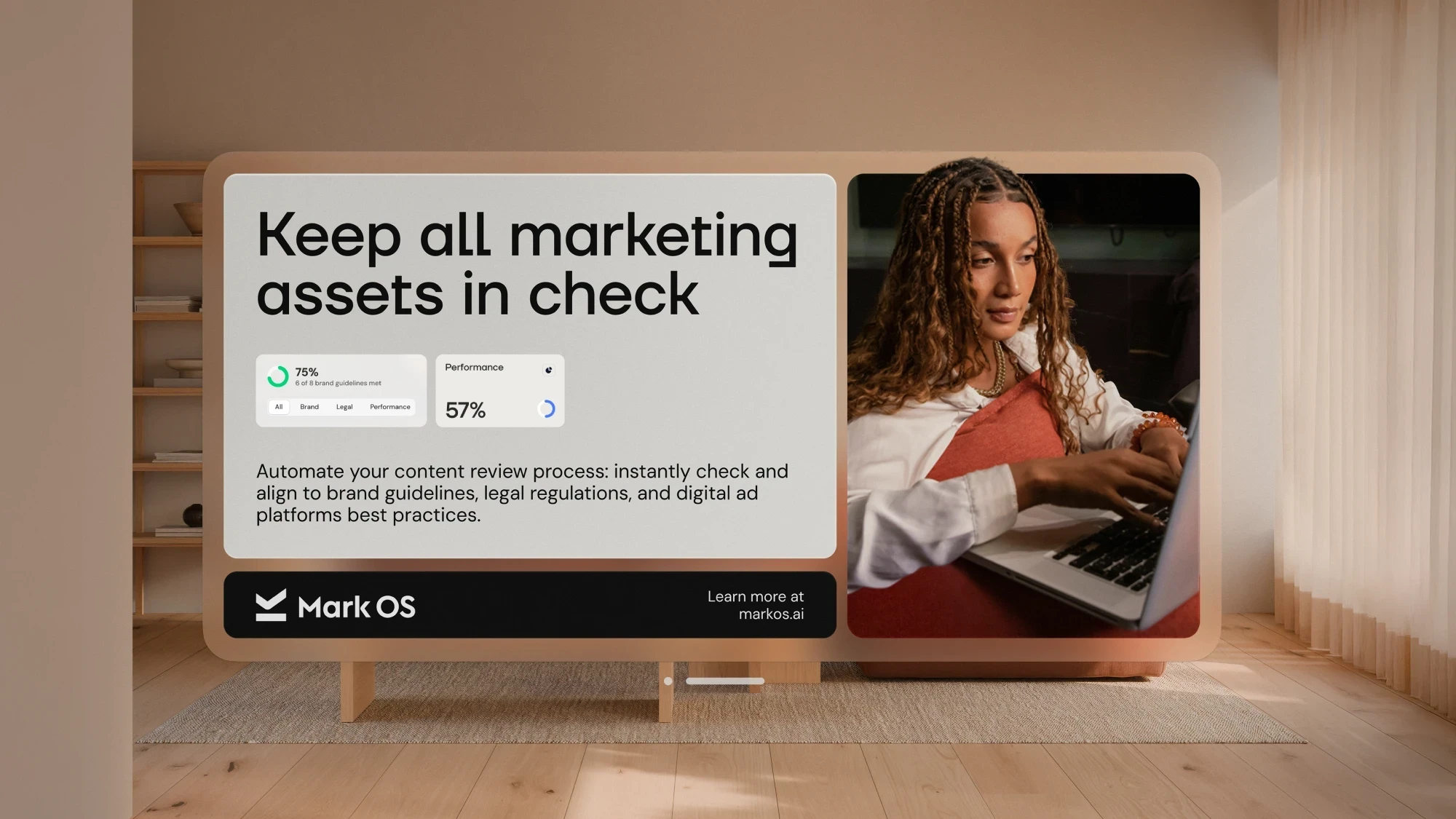
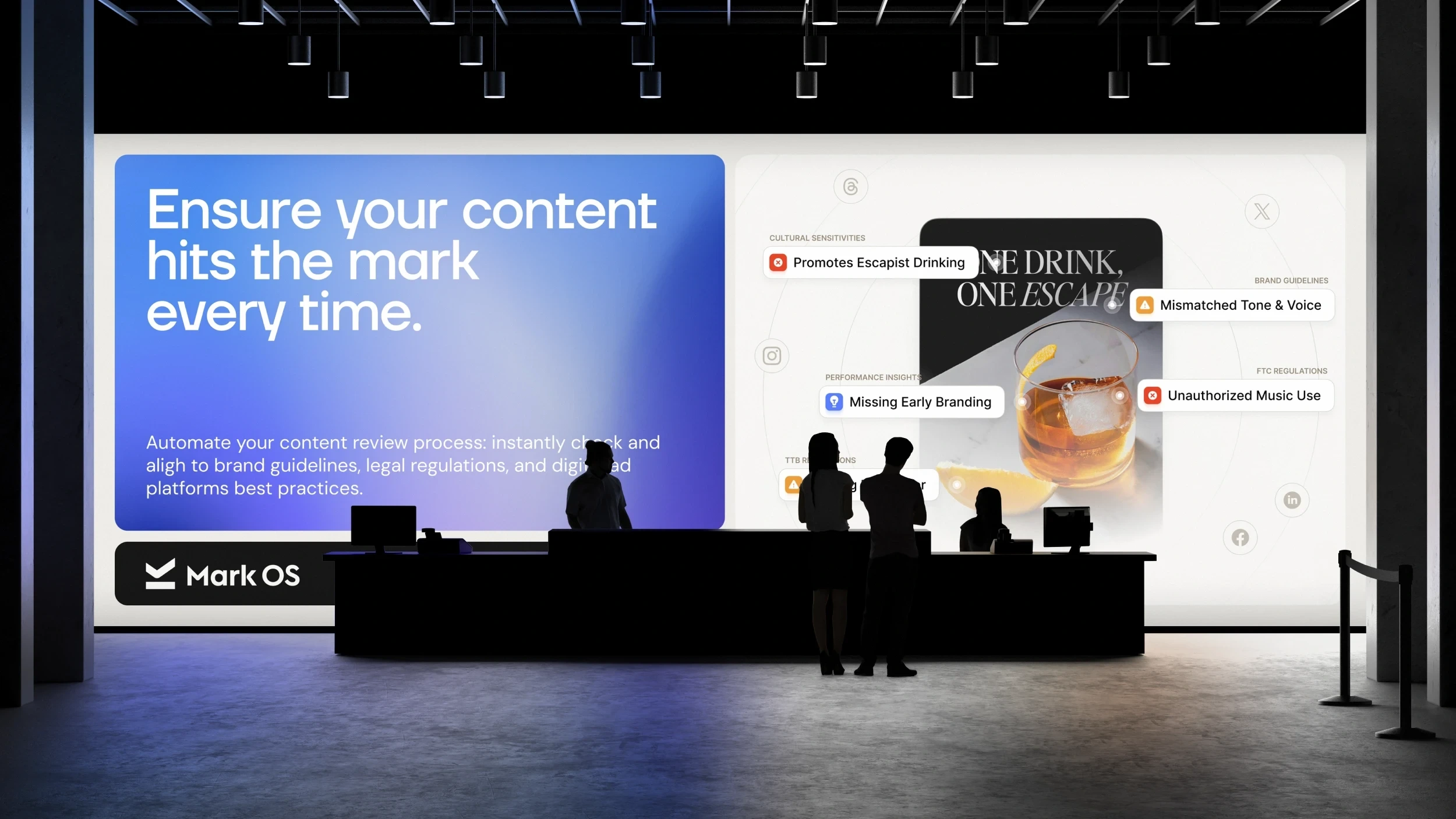
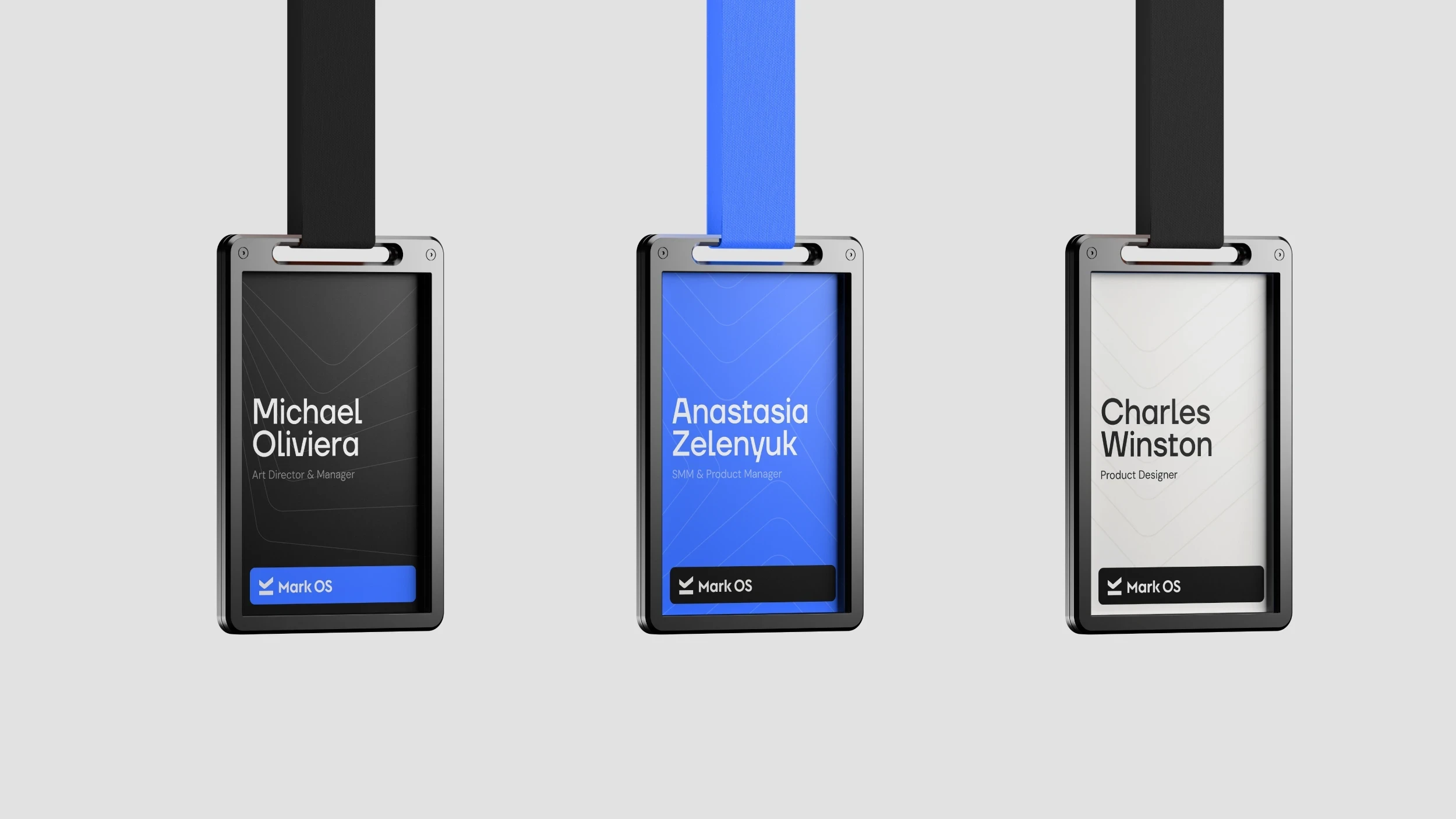
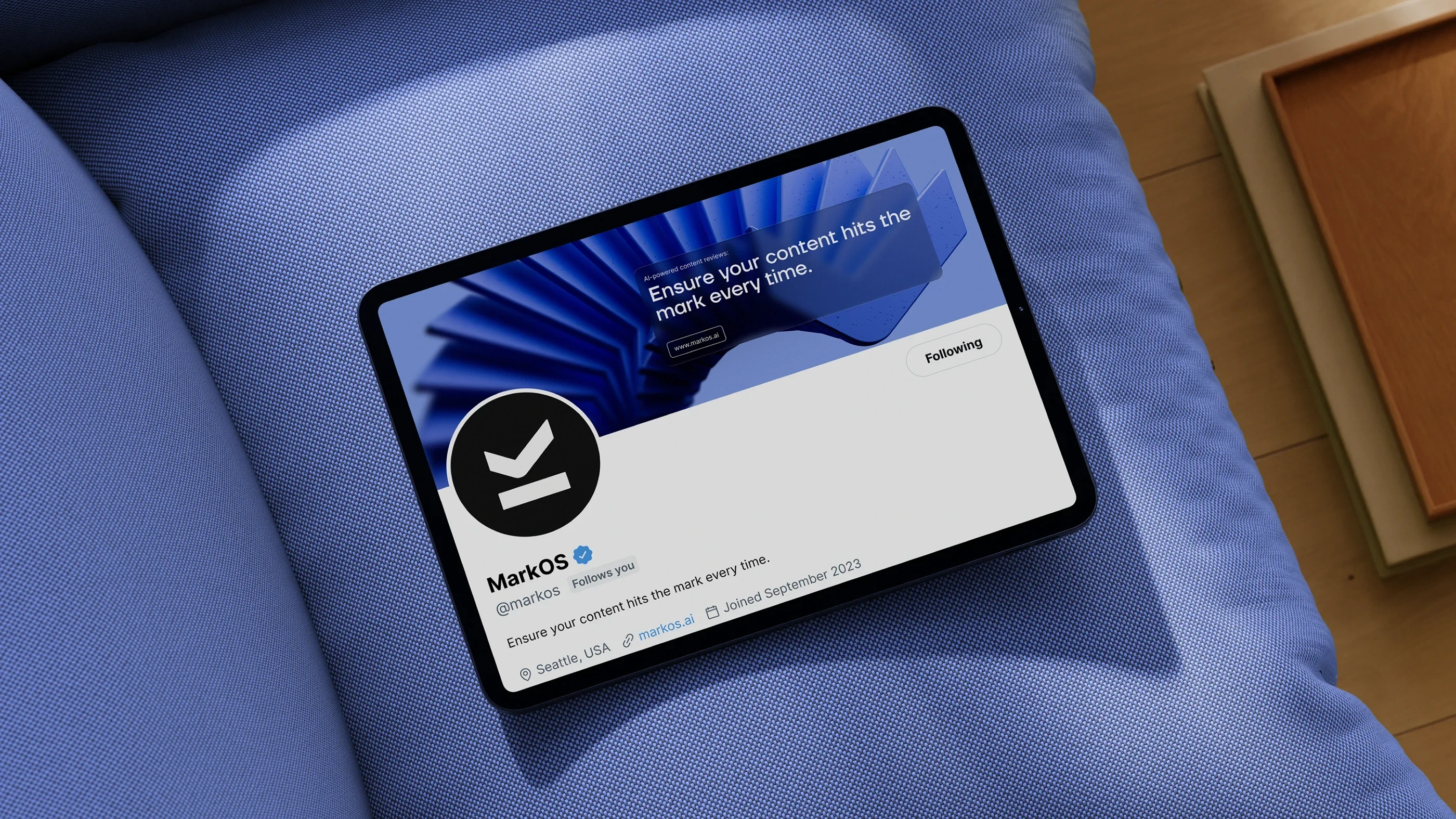
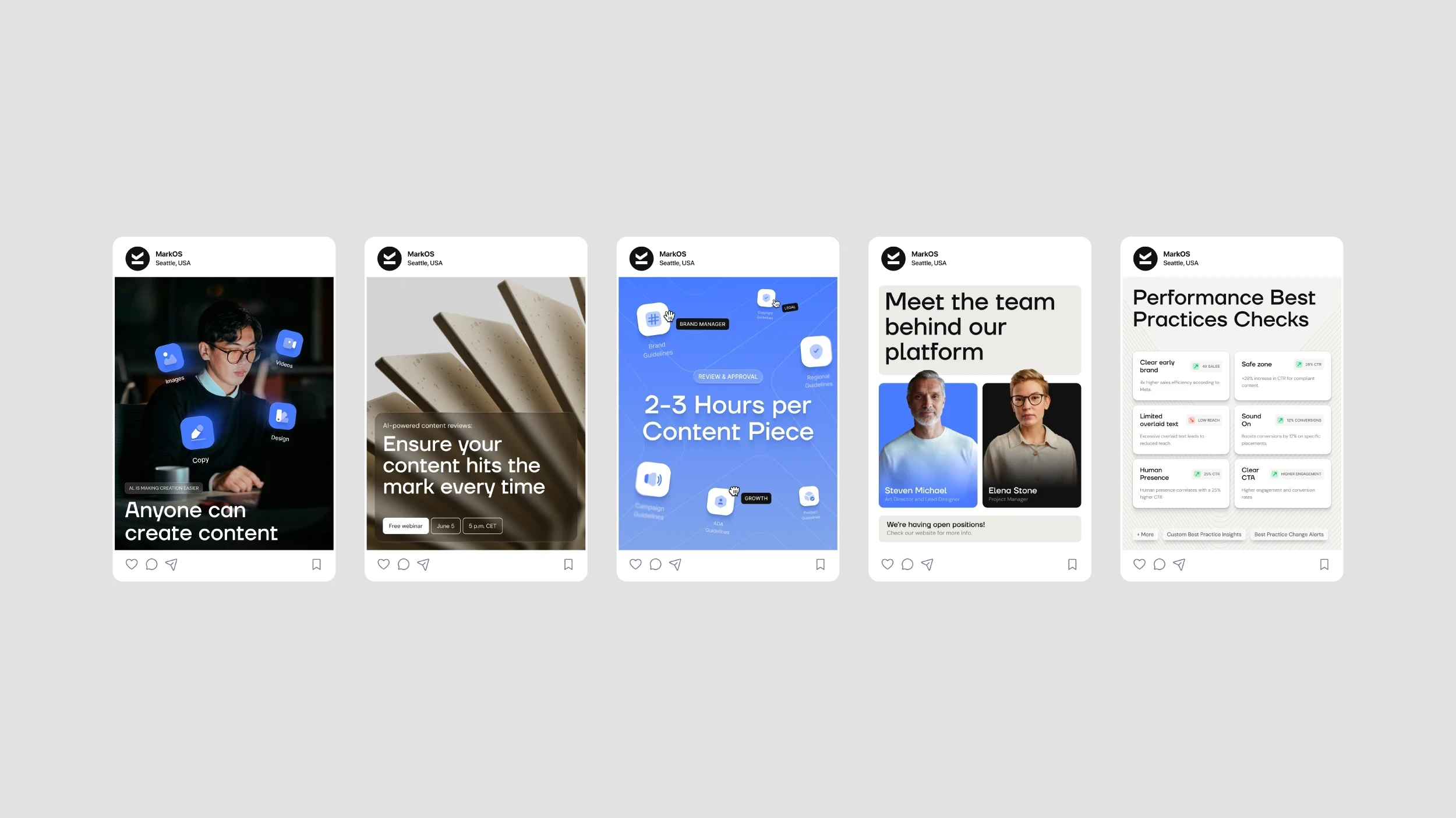
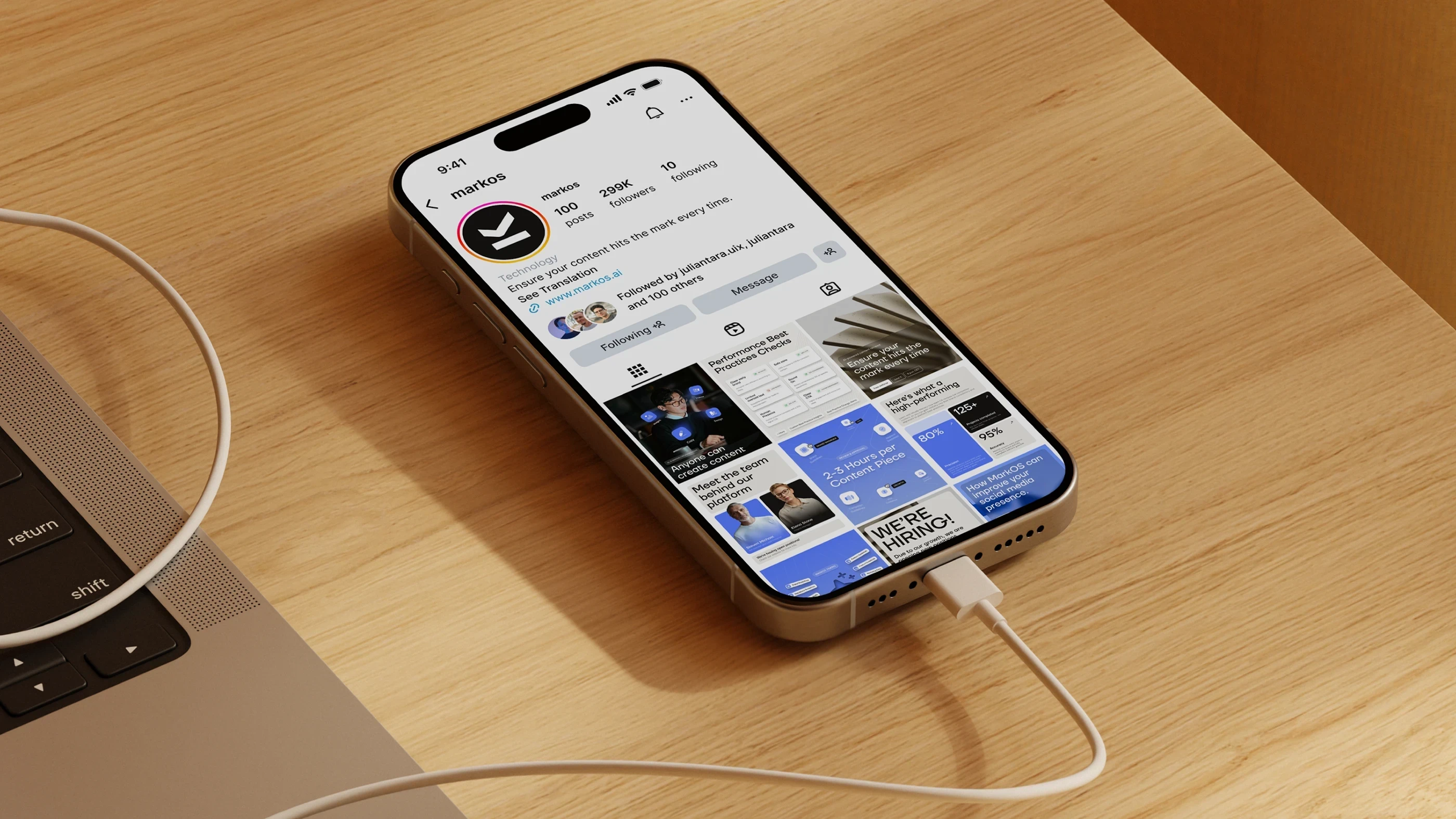
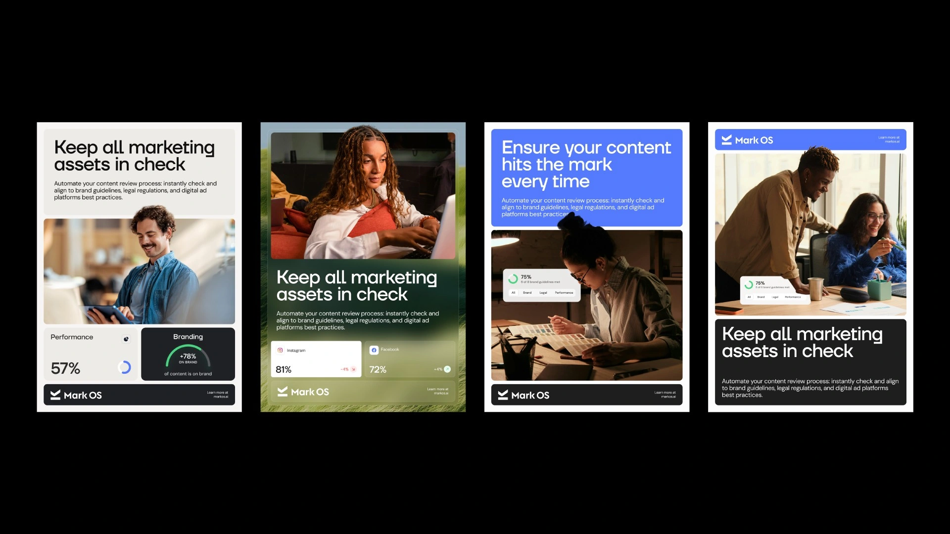
From there we built a system designed to feel as precise as the product itself. Every choice, the confident sans-serif, the restrained palette of premium gray, soft black, and a signature blue, was made to signal clarity, intelligence, and trust, the same qualities Mark OS promises its customers. Nothing decorative, nothing arbitrary. A flexible grid holds the brand together across posters, social, web, and out-of-home, so it stays unmistakably itself everywhere it appears. The consistency is the point: a brand that never drifts, built for a product whose entire job is to keep brands from drifting.
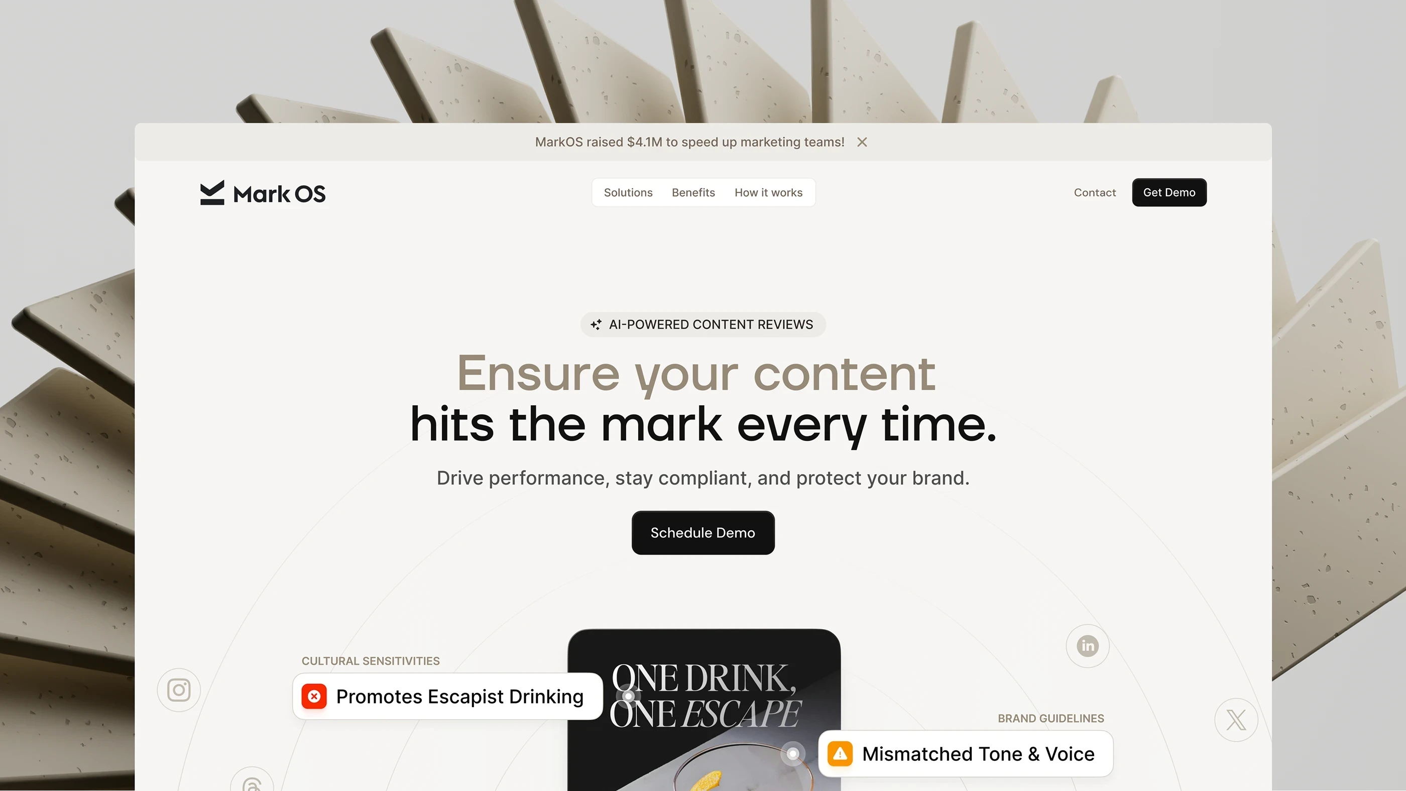
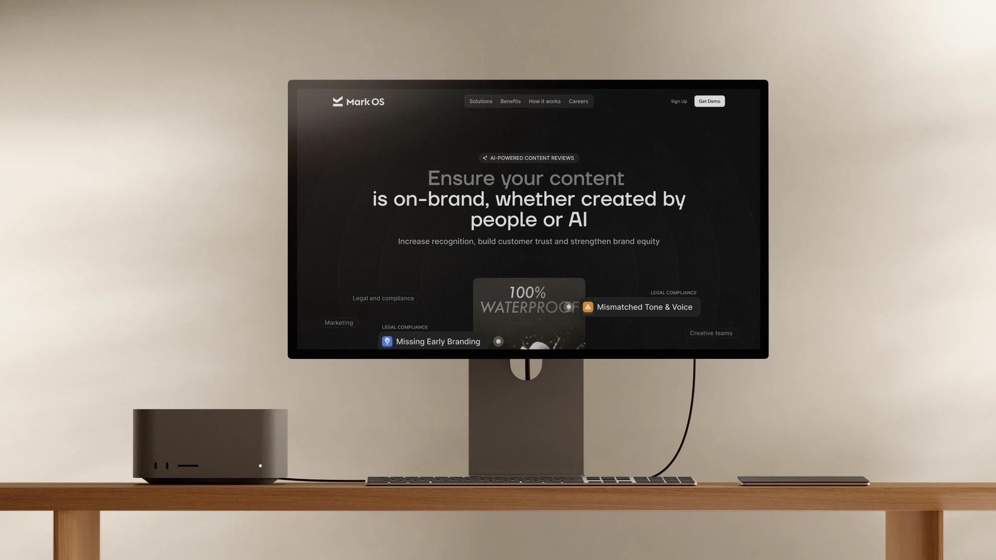
The website translates the identity into motion, surfacing the product's real compliance flags around live creative so visitors see it working before they read a single feature. The result is a brand that feels as precise, intelligent, and trustworthy as the technology behind it.
Mark OS has raised $4.1M and works with brands including Suntory, Almave, and The King's Trust.
Year
2026
Industry
AI, Marketing
Project Direction
Branding Strategy, Logo, Brand Identity, Web Design, Design System, Animation, Website Copy


Like this project
Posted Jun 21, 2026
An AI platform providing marketing content review for brand compliance and performance before launch.