Design Systems Case Study
Sondhayni Murmu
Design Systems
Where design and engineering thinking conflict — and what it takes to resolve that conflict in the system itself.
Role
Lead UX Engineer / Senior Product Engineer
Timeline
Hearth 2021–2022 · Big Health 2024–present
Tools
React, TypeScript, Tamagui, Storybook, Figma
I've built two design systems from scratch. One in a company where the design and engineering teams had outgrown their informal agreements; the other currently in progress, at a company still establishing its design language while shipping against it.
What I've learned across both isn't about components or tokens. It's about where design and engineering thinking conflict — and what it takes to resolve that conflict in the system itself, rather than in every individual decision.
The Work
Semantic Tokens
Opinionated API
Designing the Collaboration
The System Lives in the Gaps
Where This Lands
The Work
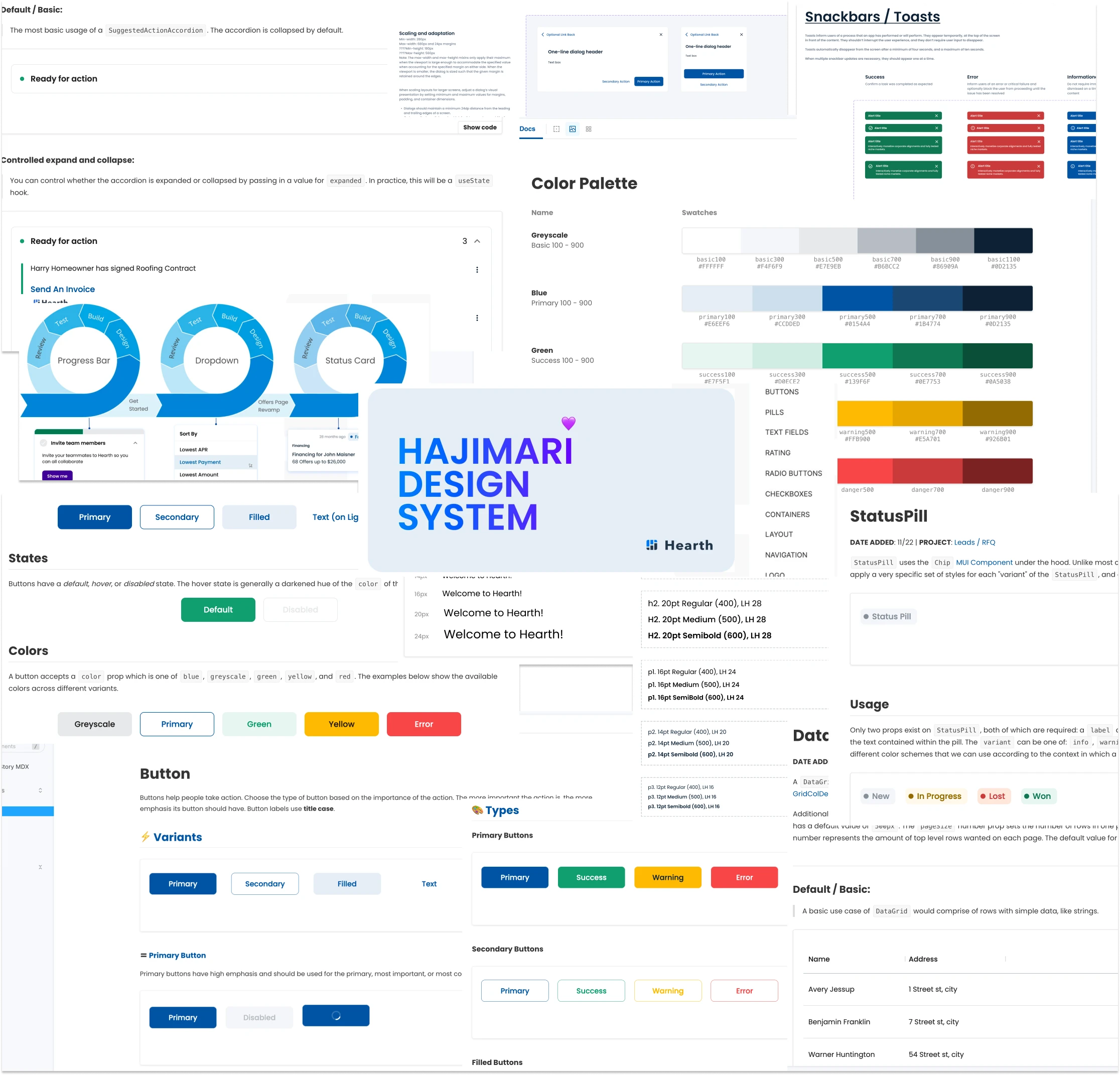
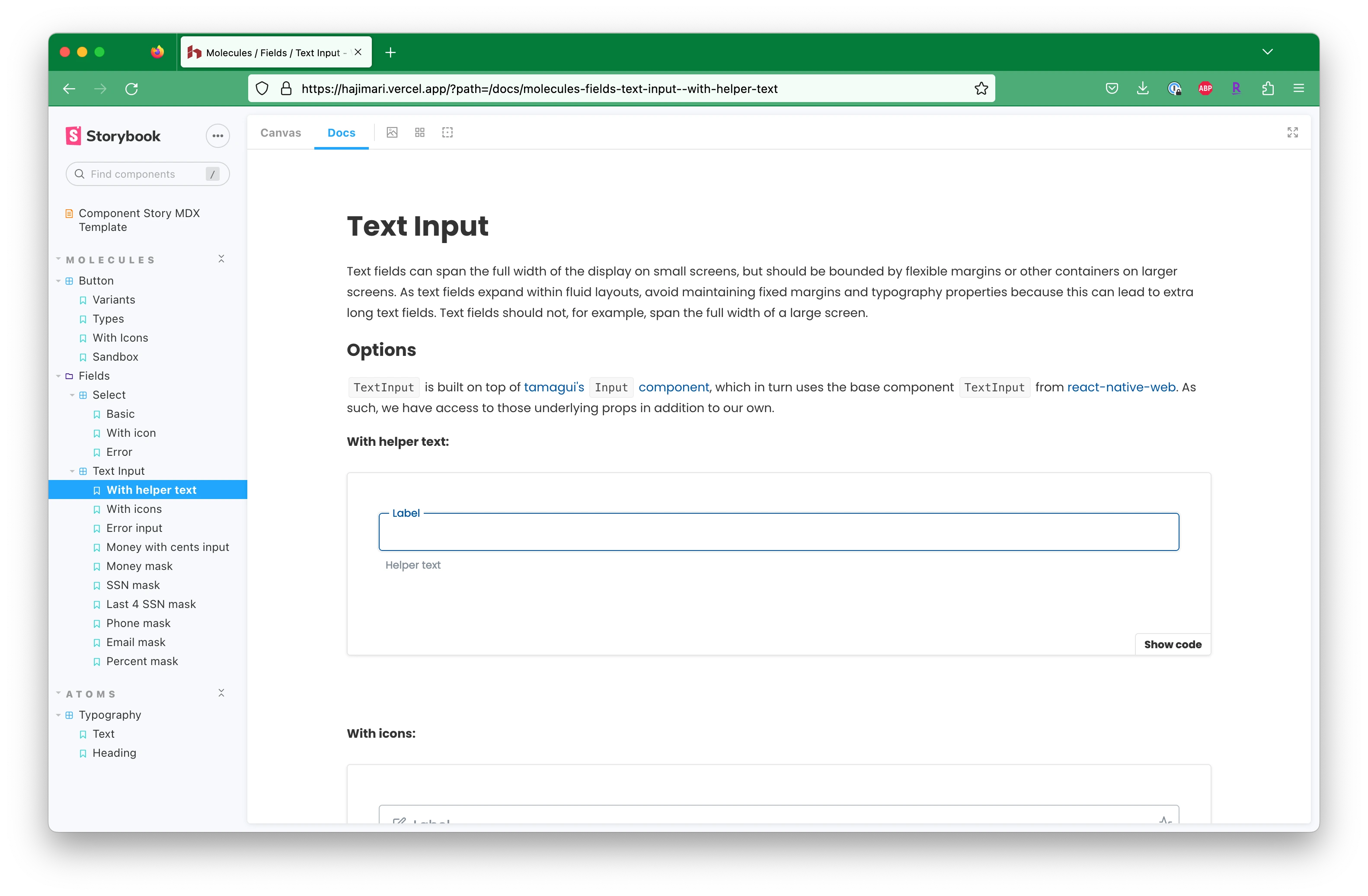
Hajimari — Hearth
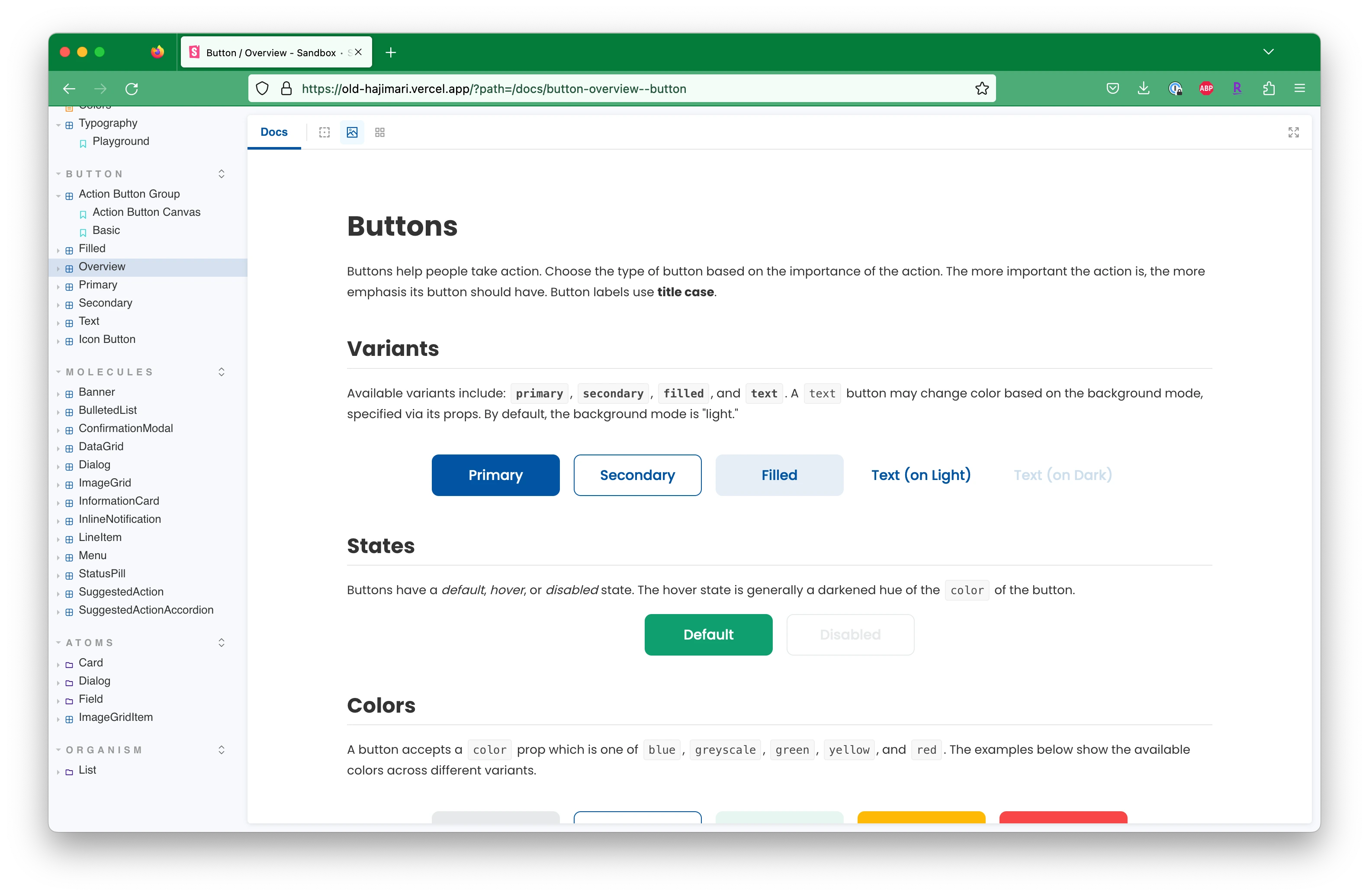
Hajimari
Design system built from scratch at Hearth, a fintech platform for home improvement financing. Co-authored with the design team as Lead UX Engineer. Shipped as the foundation for Hearth's universal app launch.
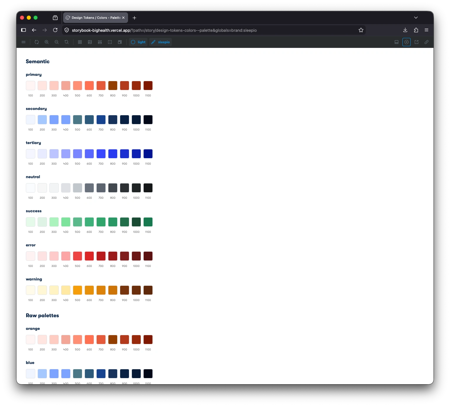
COG — Big Health
COG
Design system in active development at Big Health. Built on Tamagui alongside a systems-minded designer from the ground up — the token architecture and the working relationship were established at the same time.
Semantic Tokens
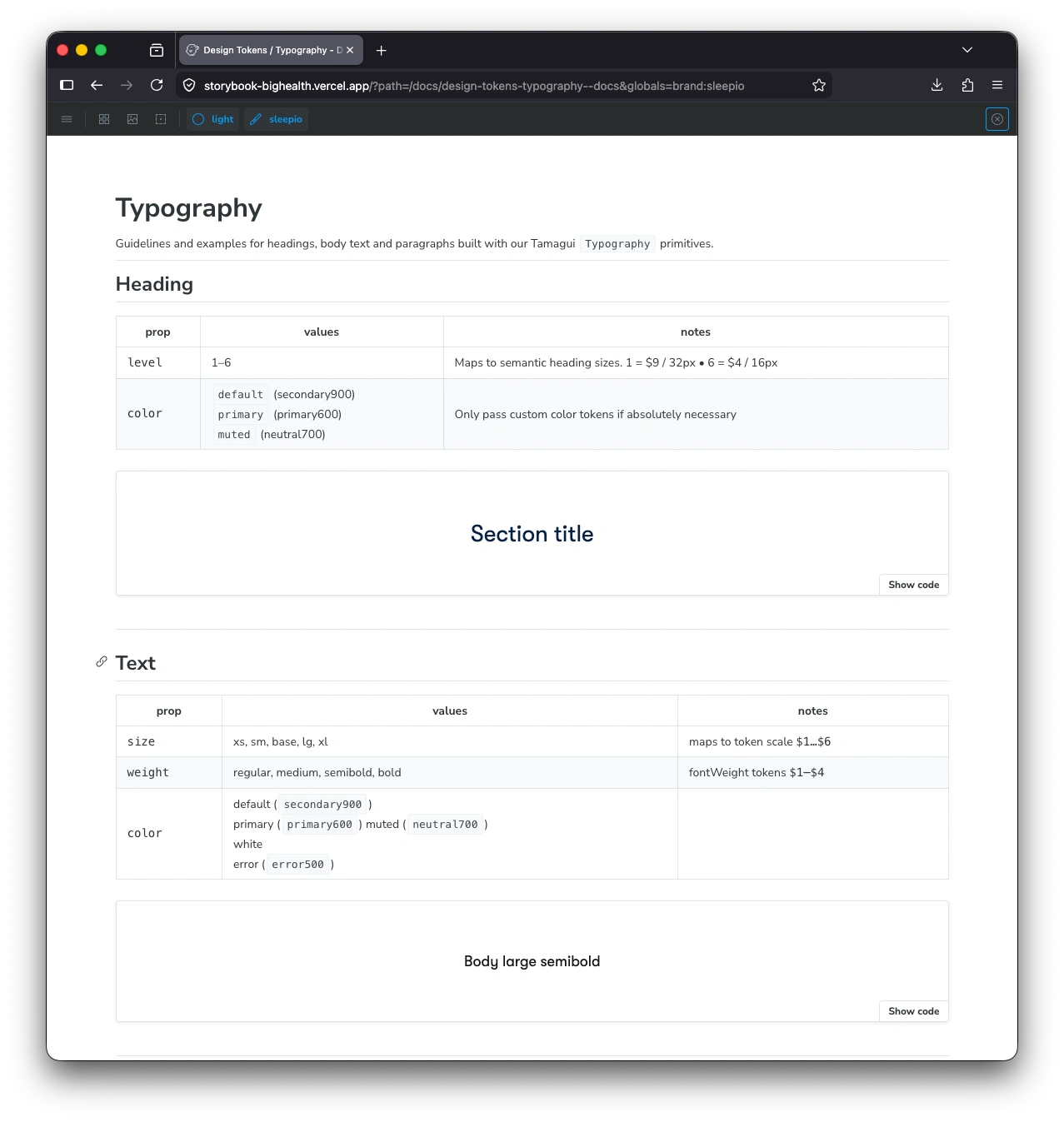
Both systems use semantic token names —
primary over blue500, named type tiers over arbitrary pixel sizes. blue500 requires every consumer to hold the mapping in their head. primary doesn't. The overhead is a one-time conversation about what "primary" means — worth it versus paying the translation cost on every implementation.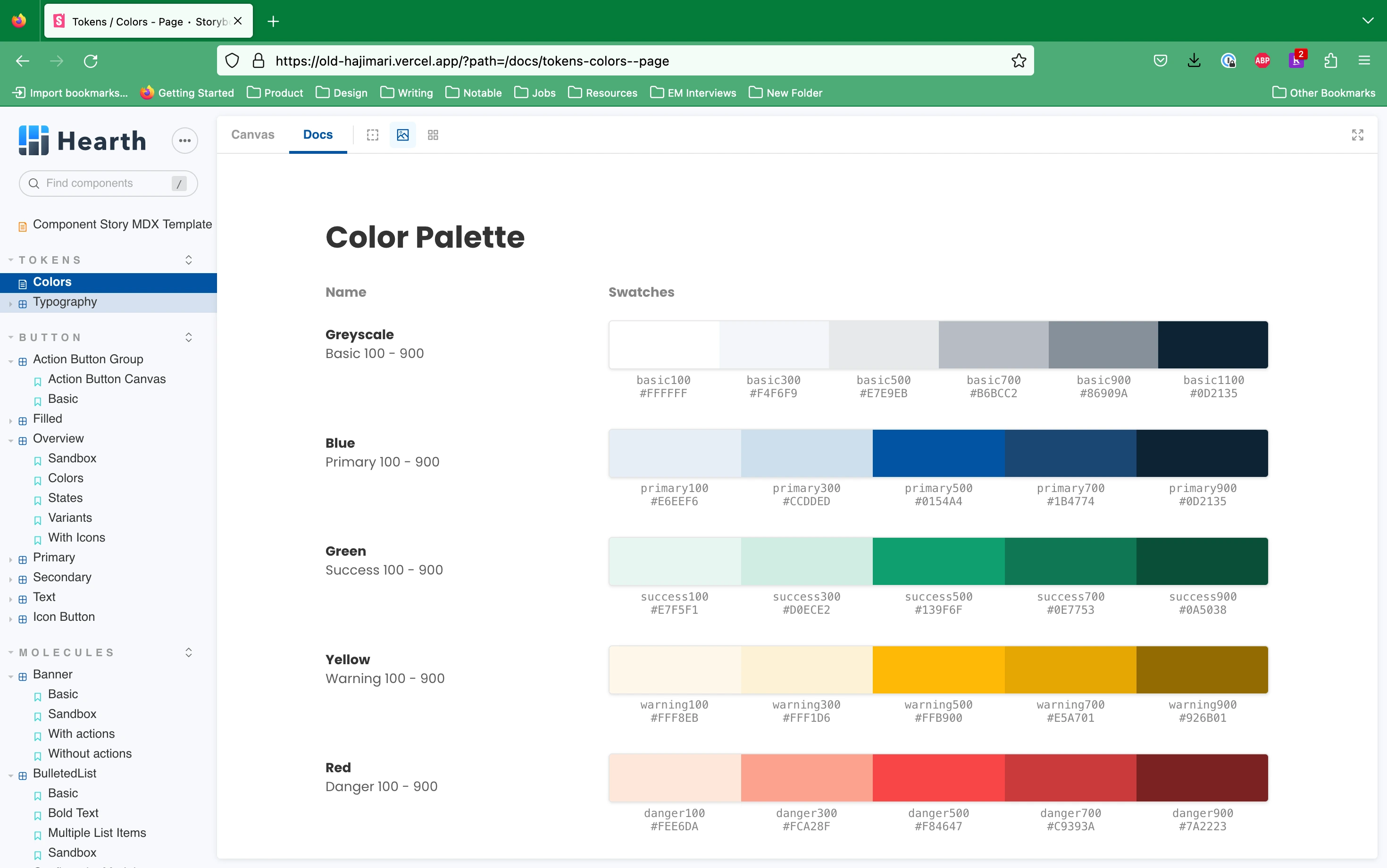
Hajimari — Hearth
COG — Big Health
The same principle applied to the Hajimari type scale. The original spec gave designers and engineers too much freedom — two separate scales for mobile and web, with sizes that diverged across projects. The revised system constrained it to five semantic tiers with weight variants: structured enough to be consistent, flexible enough to cover real product needs.
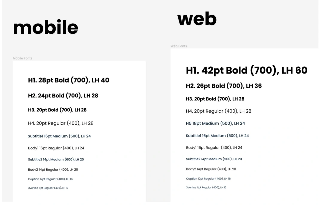
Before — two separate scales
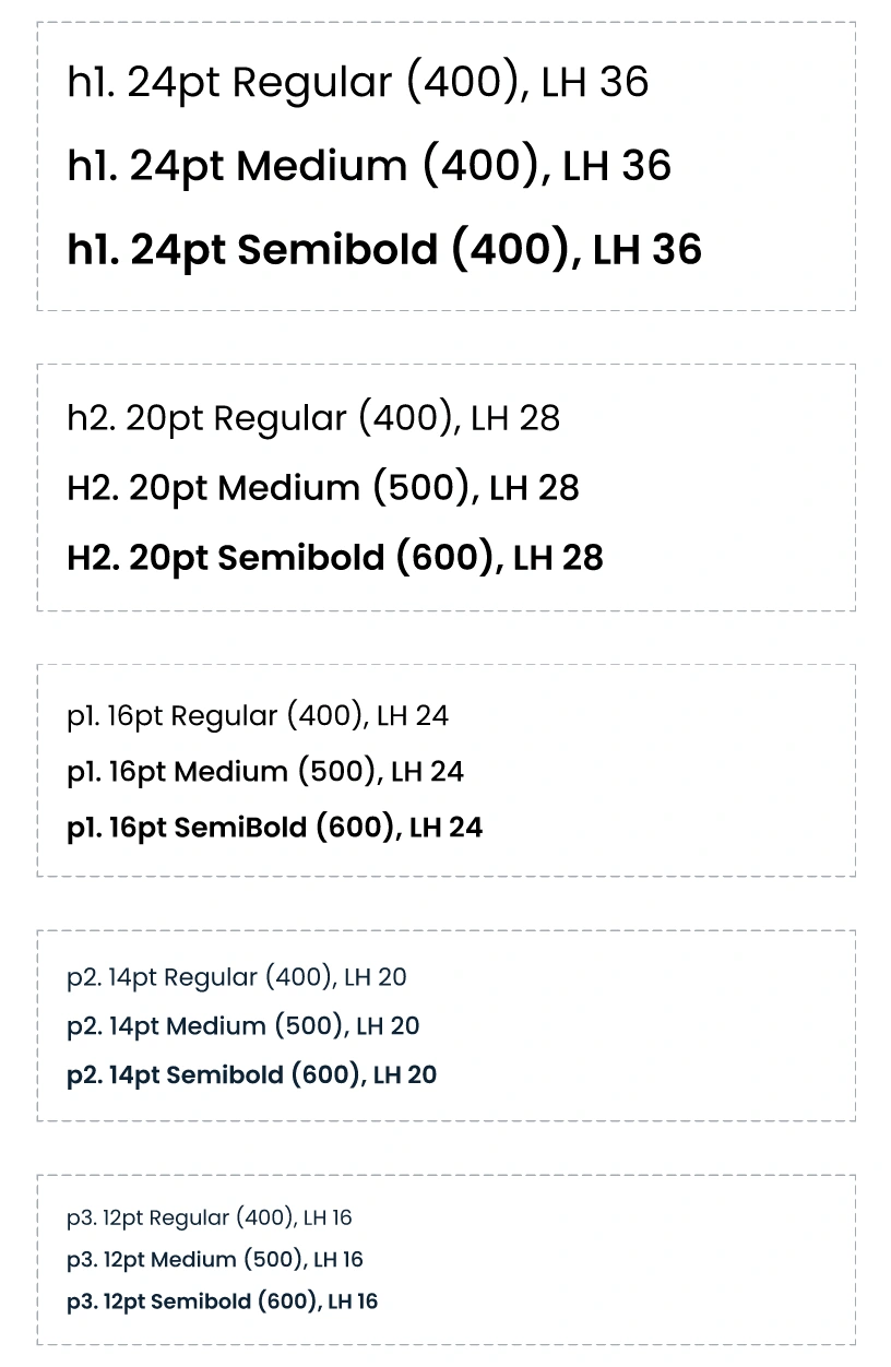
After — constrained tiers, weight variants
Tokens constrain choices in both code and design — but only if Figma specs are actually wired to them. The slippage was never intentional: a
17px padding in a spec that referenced a hardcoded value instead of the token, an engineer who implemented exactly what the file said.Opinionated API
My default was an engineer's instinct: flexible API, let the caller decide. Anastasia — the more systems-minded of the two designers on the Hearth team — reframed it.
"If a button isn't meant to communicate a warning, should we be using a warning button there?"
Flexible means the wrong option compiles as easily as the right one. Opinionated means the type system catches it before review does.
type ButtonVariant =
| 'primary'
| 'secondary'
| 'filled'
| 'text';
interface ButtonProps {
variant: ButtonVariant;
size?: 'sm' | 'md' | 'lg';
disabled?: boolean;
children: React.ReactNode;
}
Hajimari — Hearth
COG button or CTA component documentation
COG — Big Health
Designing the Collaboration
At Hearth, the design process was intuitive — good output, approximate specs. Collaboration happened at the end: code review was where mismatches between spec and token surfaced, and where the call between correcting or flagging got made.
At COG, that conversation moved to the beginning. Defining the color tokens meant working through what
primary and secondary meant in context — I explained the scale mechanics, they shaped the semantics. The token layer was built together before any component touched it.Hearth — Hajimari
Design
Spec→Hand off
Engineering
Implement→Code review
Collaboration reactive — caught at review
Big Health — COG
Design + Engineering
Co-create token layer
Design
Spec (system-aware)→Review
Engineering
Implement→Ship
Collaboration proactive — built into the foundation
Hajimari — Hearth
COG — Big Health
The System Lives in the Gaps
A token system and a component library document what you know exists. They don't cover what happens when the spec runs out.
At COG: form screens were designed for the happy path. Disabled states, loading states, the difference between "submitting" and "error" — none of that was specced. I knew what it should look like because I knew what the API returned. I'd implement and surface it in review.
Where This Lands
A single token layer — defined once, no platform-specific overrides to maintain. What ships in React and React Native looks like it belongs to the same product. Hajimari shipped that way. COG is being built toward it.
Like this project
Posted Jun 6, 2026
Showcasing design systems developed for fintech and health tech applications.
Likes
0
Views
1