Smart Commodities Brand Identity Design
Javi O'Neill
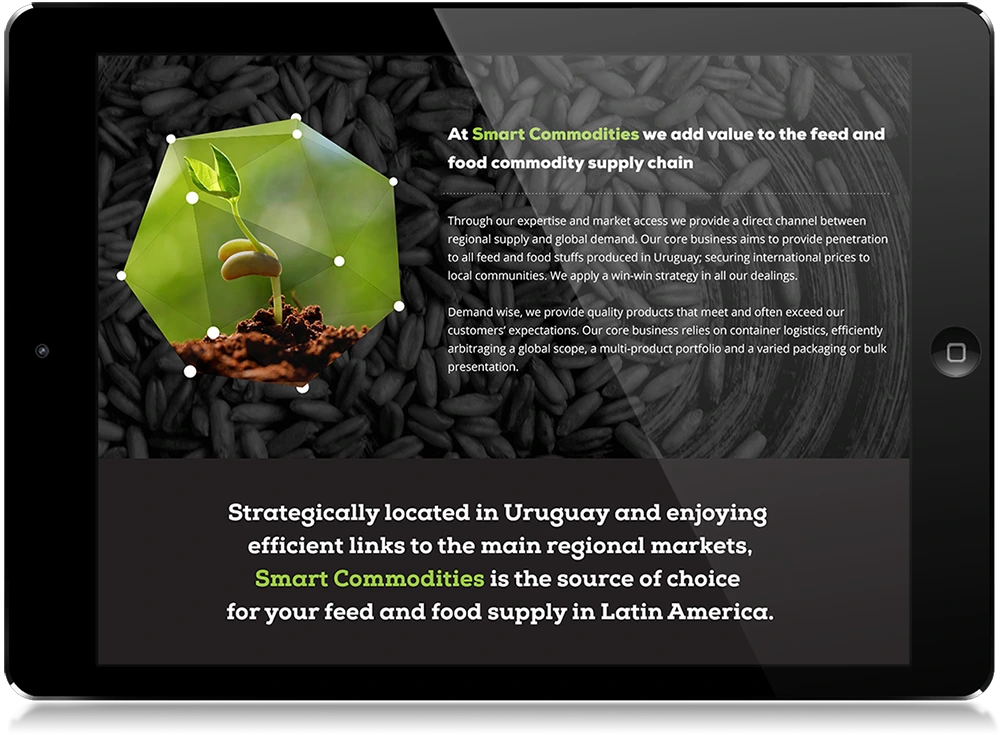
Smart Commodities, a feed and food supply chain company, sought a visual identity that reflected both innovation and global reach. I designed the logo and CMS-driven website, building a cohesive brand system that communicates the company’s smart, forward-thinking approach to agriculture.
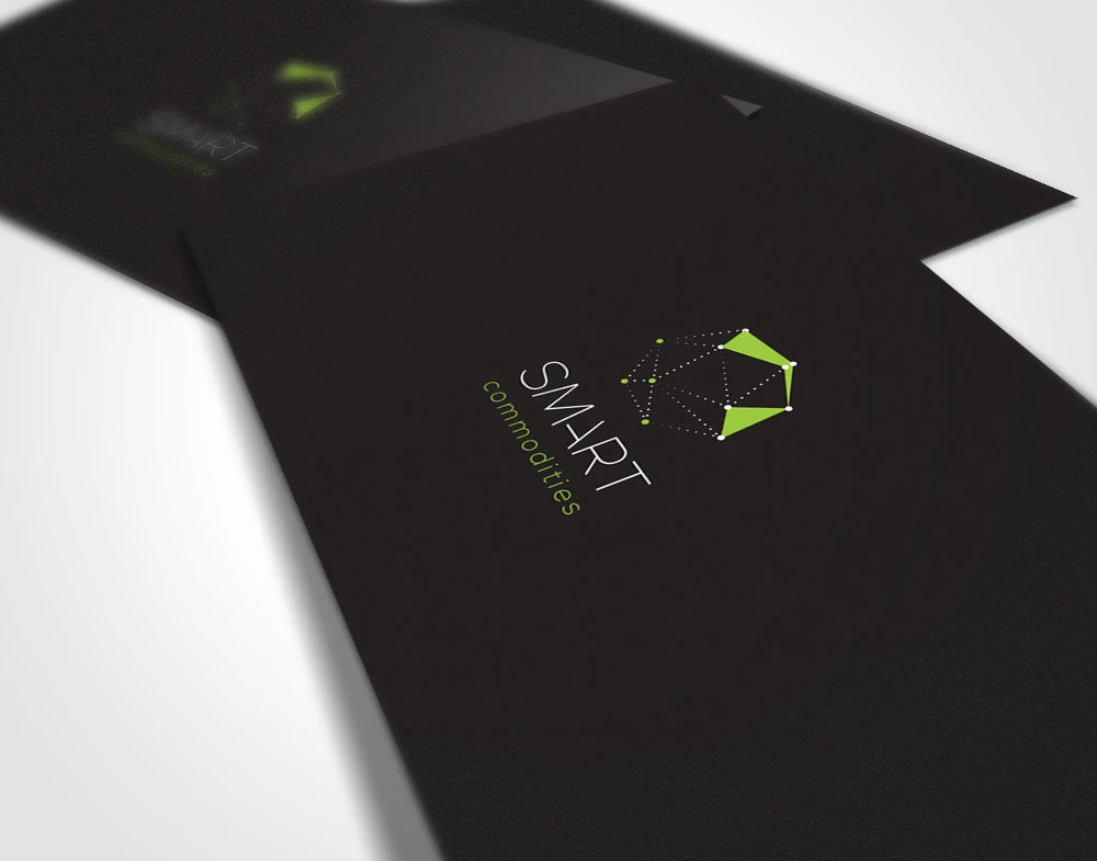
The logo was crafted around two key ideas: the “Smart” aspect of the brand and its mission to deliver premium, affordable commodities that improve lives worldwide. The resulting symbol can be interpreted in two ways — as a neural network, representing intelligence and connectivity, and as a world map, symbolizing expansion into new markets.
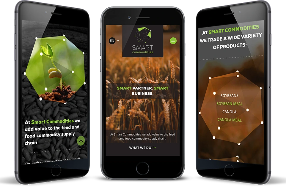
Its polygonal structure reinforces the corporate identity across all media, serving as a dynamic graphic element throughout the company’s visual system. This polygonal motif extends across print, digital materials, and the website design, creating a unified and instantly recognizable brand presence.
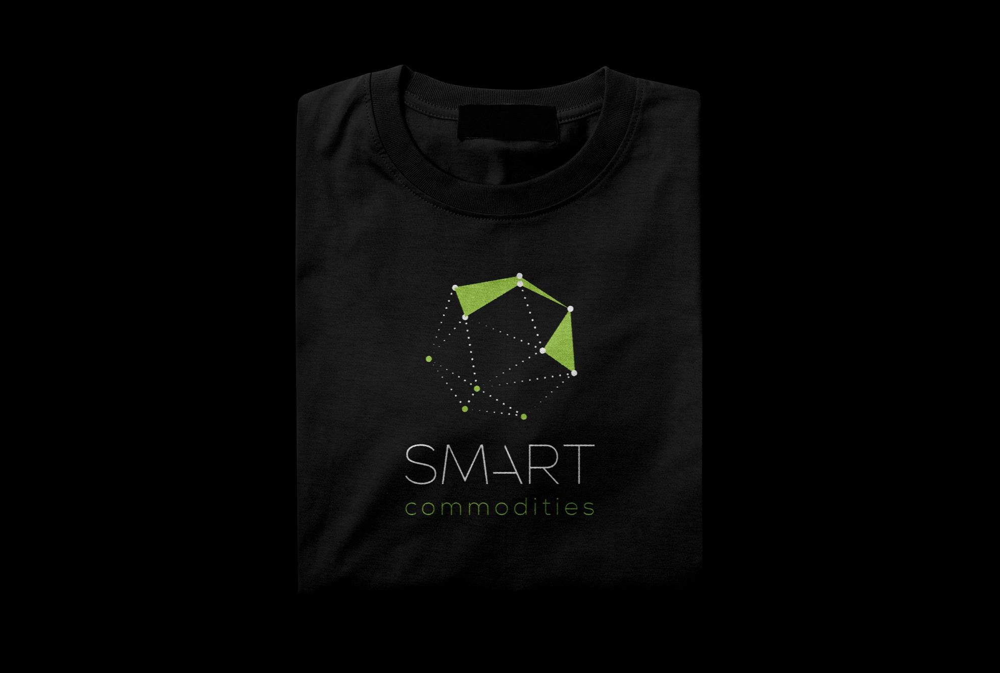
Company T-shirt design
Cohesive branding throughout print and digital
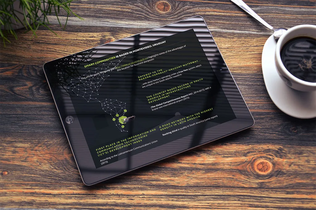
Logo elements and colors are used throughout the website to enforce brand recognition
Strong branding throughout multiple platforms
Like this project
Posted Nov 12, 2025
Logo, corporate ID and website for Smart Commodities, symbolizing a neural network and global reach, reflecting innovation and premium agricultural trade.