Healthcare presentations don’t have to

Muhammad Tabish


Healthcare presentations don’t have to feel clinical.
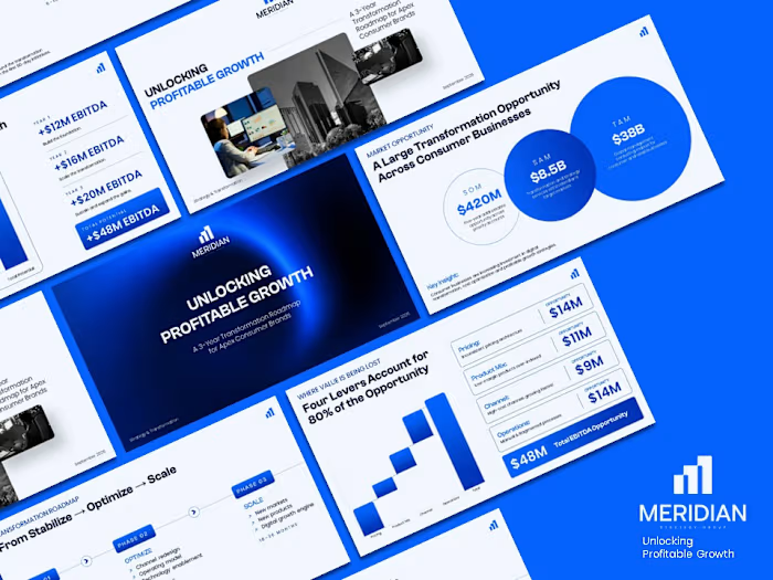
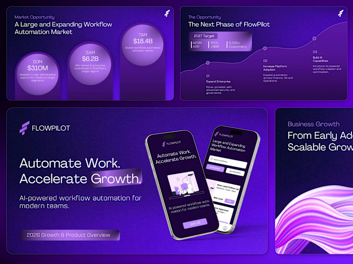
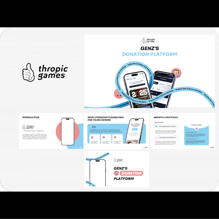
For this project, I transformed a content-heavy healthcare presentation into a clear, visual story that feels credible without becoming overwhelming.
The goal wasn’t simply to make the slides “look better.”
It was to:
→ Make complex information easier to digest
→ Create a stronger visual hierarchy
→ Guide the audience from one idea to the next
→ Keep the design professional, human, and trustworthy
From layouts and data visualization to typography and visual storytelling, every slide was designed to make the information work harder.
Another deck where design isn’t decoration. It’s communication.
#PresentationDesign #Healthcare #PitchDeck #PowerPointDesign #VisualStorytelling #Contra
Like this project
Posted Sep 24, 2026
Healthcare presentations don’t have to feel clinical. For this project, I transformed a content-heavy healthcare presentation into a clear, visual story that...