The Universe Within

overview
My role for this website re-design was to modernize the overall UI of the website, and to create a positive user journey that aligns with their existing marketing strategy, which is to increase greater interest/scale the curriculum, and to increase curriculum purchases for schools, parents, clubs, and donations.
Phase 1: Define & Empathize
🕵🏽♀️ Problem Statment:
How might we create a re-design of The Universe Within website that engages students (age 7-13), scales curriculum, and corresponds with existing branding?
🤨 Why a re-design?
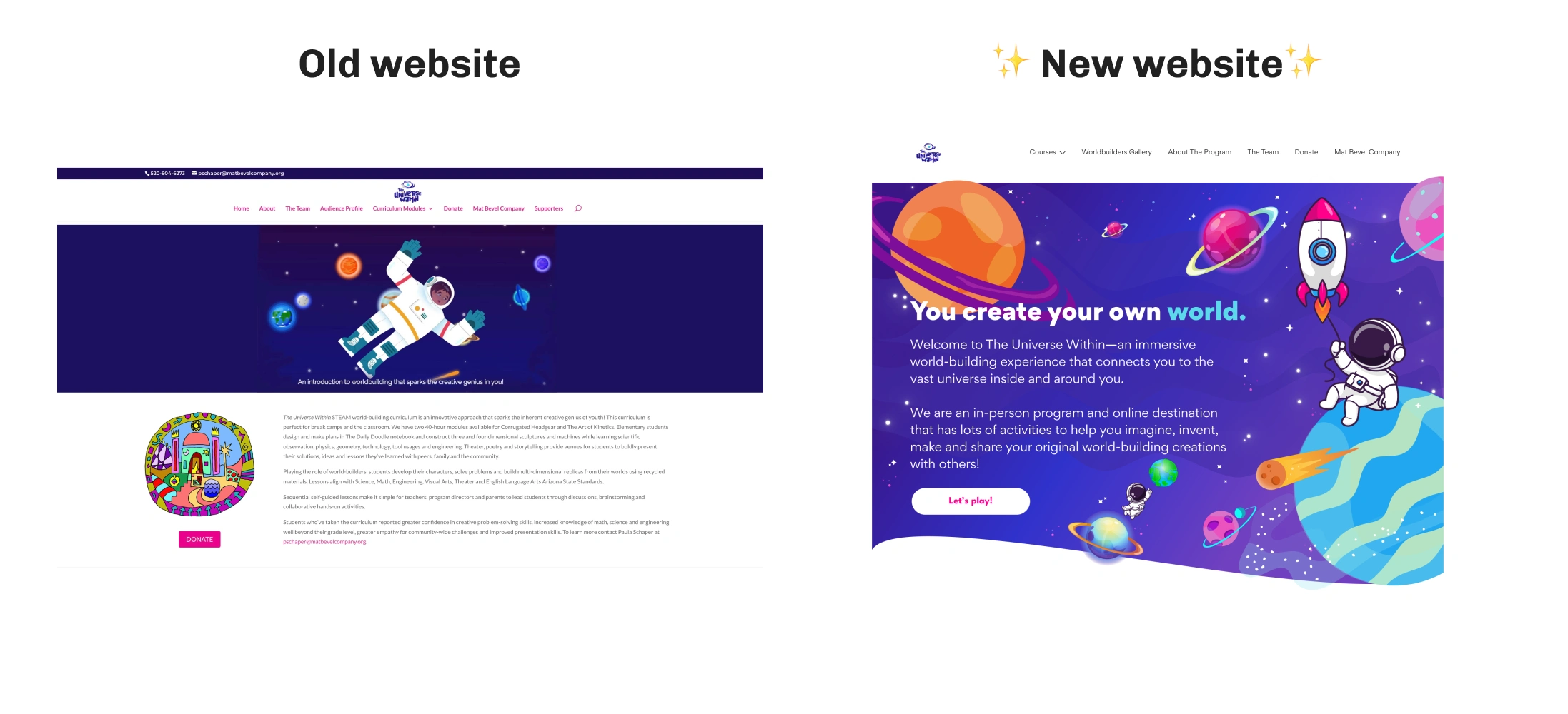
Website didn’t reflect the personality and tone of The Universe Within’s new 3-minute lesson introduction videos.
Website only consisted of lengthy paragraphs and 1 visual, making it difficult to gain a better understanding of the company.
💡 Solution:
Streamline the website and create a unique space for students to explore
Promote the significance, purpose, and benefits of the curriculum
Boost acquisition and contributions towards educational materials.
Competitive Analysis & Market Research
After understanding the brief and the brand identity that the company wants to achieve, I did a SWOT analysis to identify best practices, design patterns, and language. Here’s what I’ve discovered:

The first 3 listed are focused solely on the perspective of kids and include vibrant colors, animations, exploration, and gamification.
The last 2 seem to have a more neutral tone in comparison to the first 3; displaying neutral graphics, no gamification, and includes UX writing highlighting the benefits for both the student and parent.
phase 2: ideation — information architecture
One task that the project manager asked of me is to simplify the sitemap of the website. The site architecture constantly changed and I had to adopt to changes accordingly. Pages were being merged, added, and deleted, and as the site gets more complex, the site will move forward with a mega menu.
Original sitemap
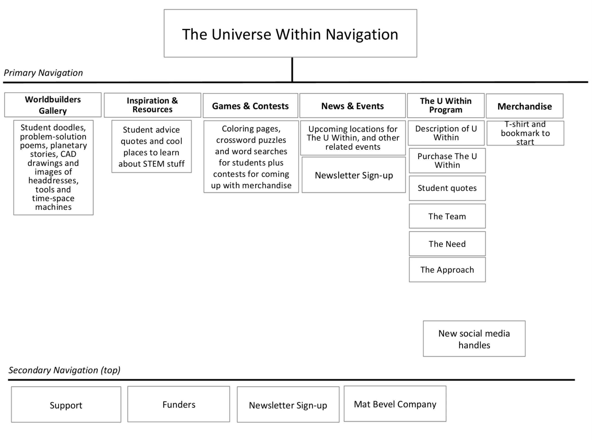
new site map and improvements
🚀 Kept the most high level categories that are the most important for launch
🗂️ Condensed subcategories into one page to decrease clutter
🖥️ Made secondary navigation a sticky footer

phase 3: design and challenges
Challenges and constraints
In retrospect, these past iterations of "The Universe Within" fell short of the mark. Upon feedback, three vital rationales have emerged during my design critiques with stakeholders and my project manager, unveiling the blueprint for the future direction. Here’s the feedback:
Didn’t feel like previous 3D design correlated with brand, and wanted to take a flatter and 2D approach moving forward.
My project manager expressed that developers might face difficulty in implementing the varying colors on the "world" element.
My project manager expressed a desire to adjust the tone on each page to cater to the student audience the most. They felt that the previous UX Writing was a bit too serious.
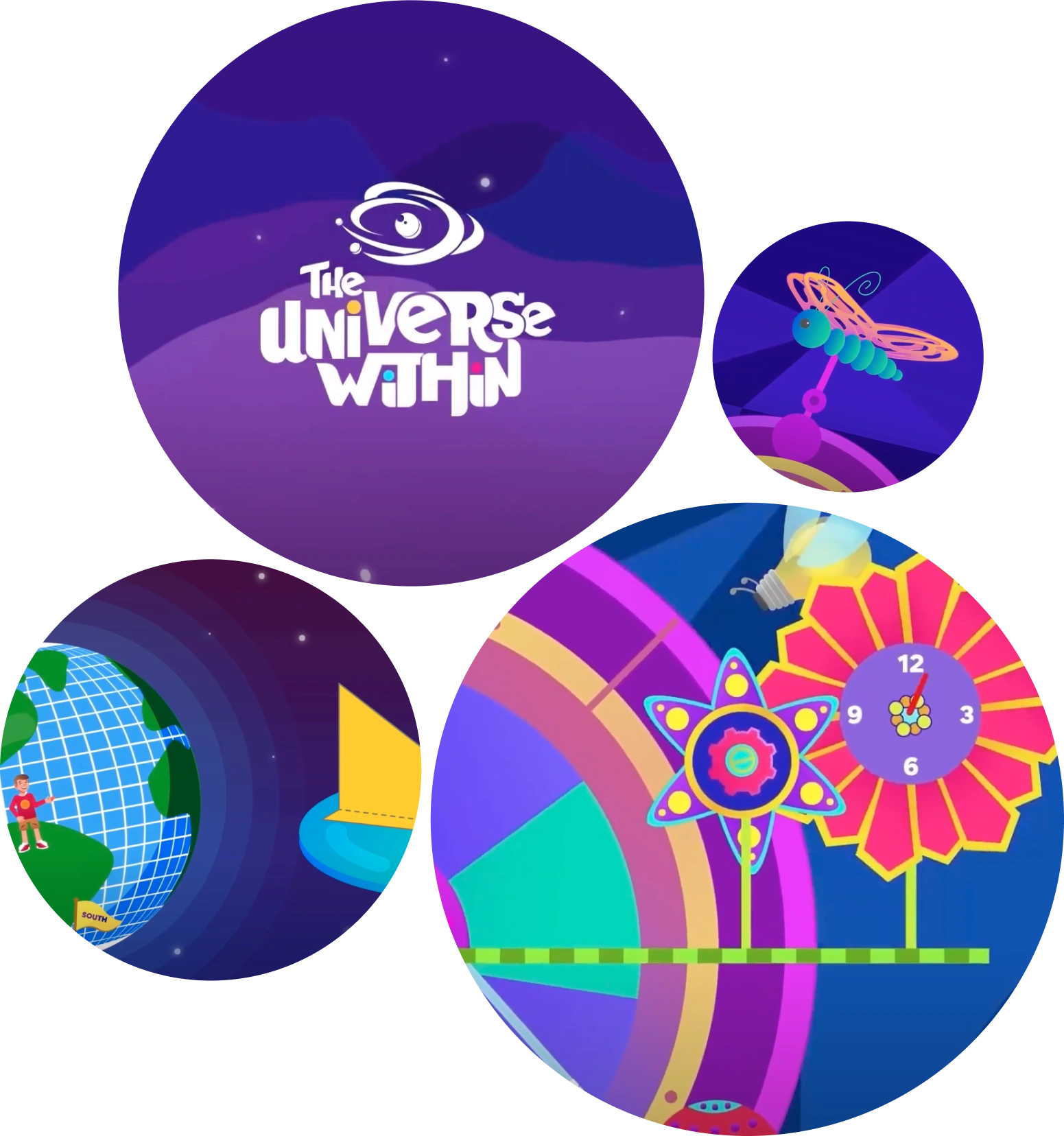
The aha moment…💡
I realized what my old designs lacked: Inspiration and branding directly from the lesson videos themselves.
After carefully analyzing and gaining inspiration/insight from the videos, I’ve distilled these fundamental concepts that will propel the overarching direction of the new website brand into action. These concepts will serve as the driving force behind the transformation, which are:
1.) Vivid colors, graphics, bold type, punchy contrast
2.) Galaxy-themed, attention grabbing, celestial elements throughout site
3.) Incorporate the characters from videos to the website to make branding more cohesive
Mockups and prototypes
Keeping the creative and marketing brief, user research, and acceptance criteria in mind, here is a showcase of the 4 most important features I’ve designed for The Universe Within:
original version
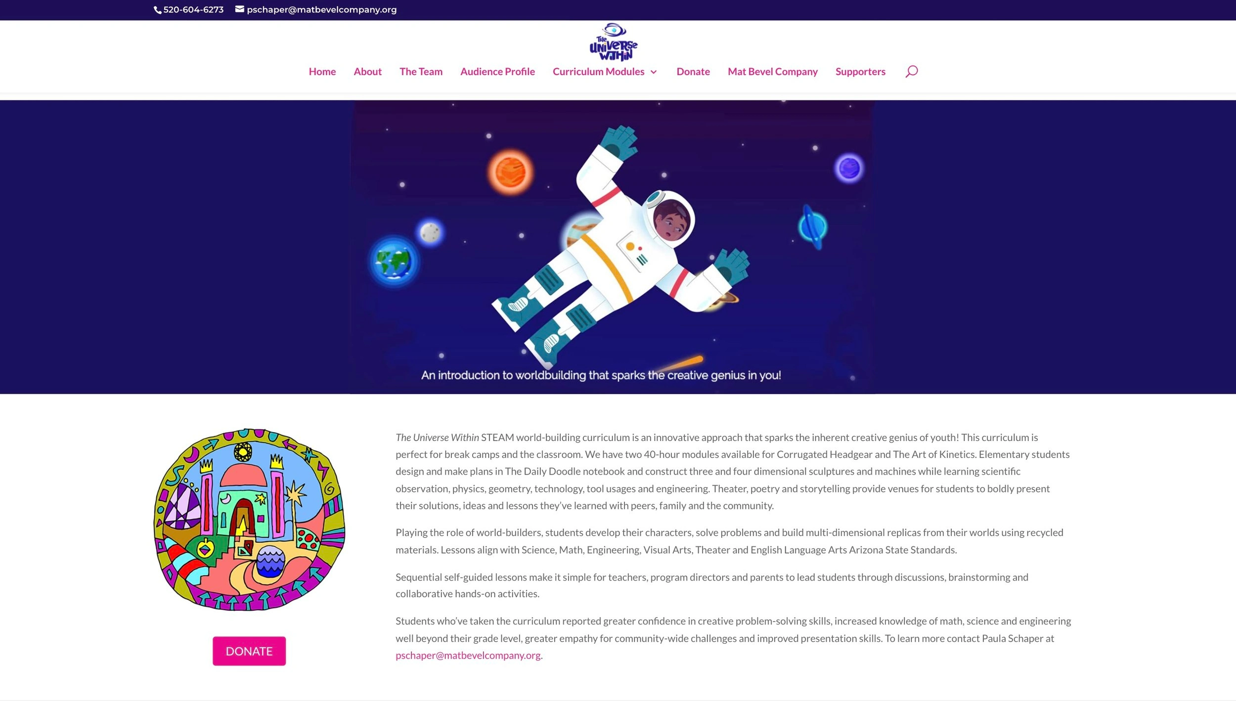
The creative brief asked that the homepage invited exploration and that the website had a language that spoke to kids primarily. I added bold graphics, color, hover micro-interactions, and a rocket ship that will blast off and expose the words while hovering over it!
Challenge & Solution: The previous iterations didn��’t adhere or speak to all demographic of students, so to make the character more relatable to all genders, I utilized the astronaut and the helmet.
redesign
2.) About The Program 🪐
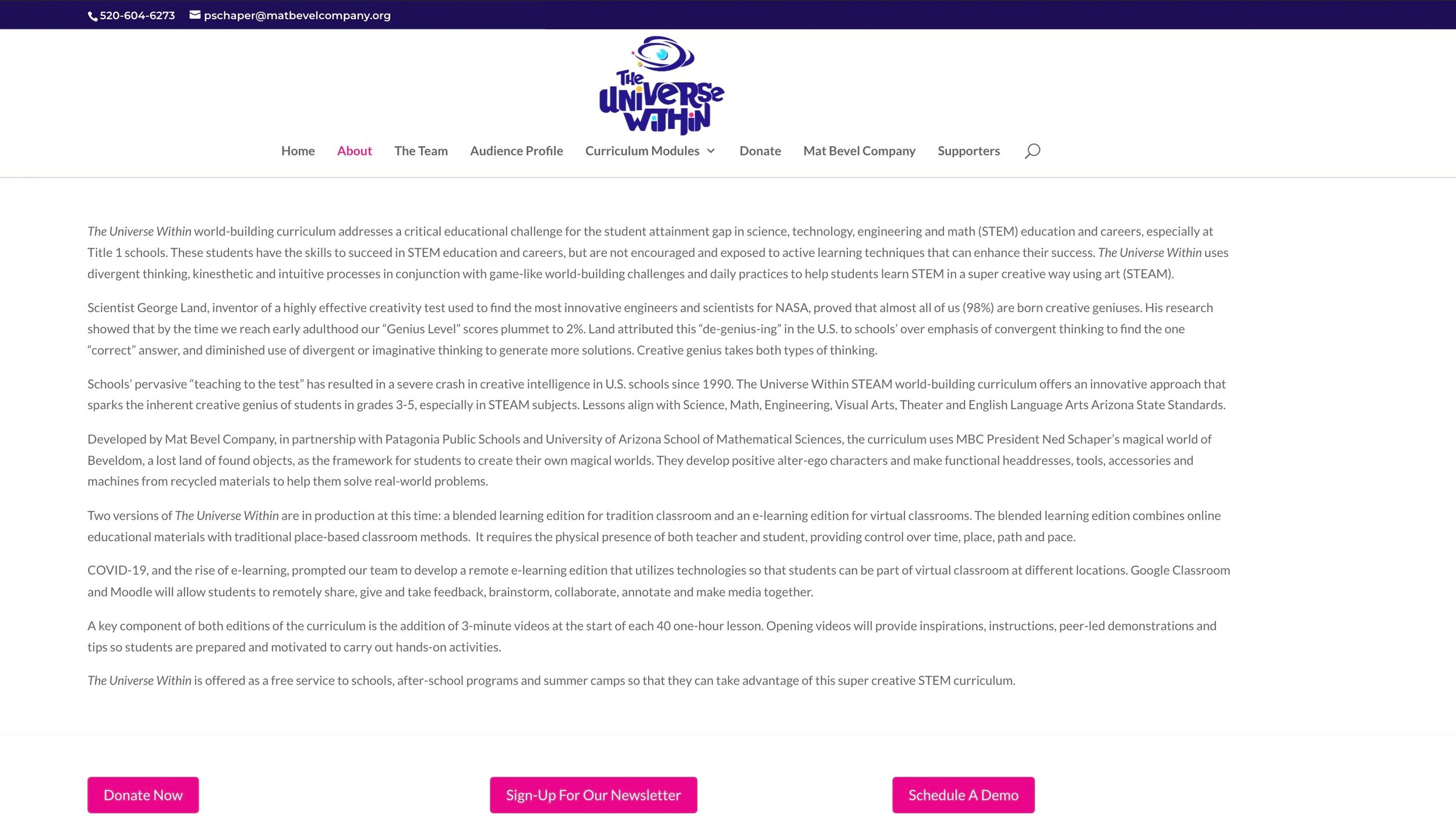
The language on this page was created with the parents, teachers, and administrators in mind. After many iterations, the marketing brief, and the competitor analysis I’ve conducted, I believe that using this page to showcase the benefits and value this curriculum has will bring traction to more curriculum purchases and happy students that struggle with STEM subjects.
Challenge & Solution: The text content originally focused on the broad scope of The Universe Within, but there was no language present for the student themself. On this page, I dedicated a section for the student (speaking directly to them) and another for the parent or administrator.
original version
Re-design
3.) Courses 📚
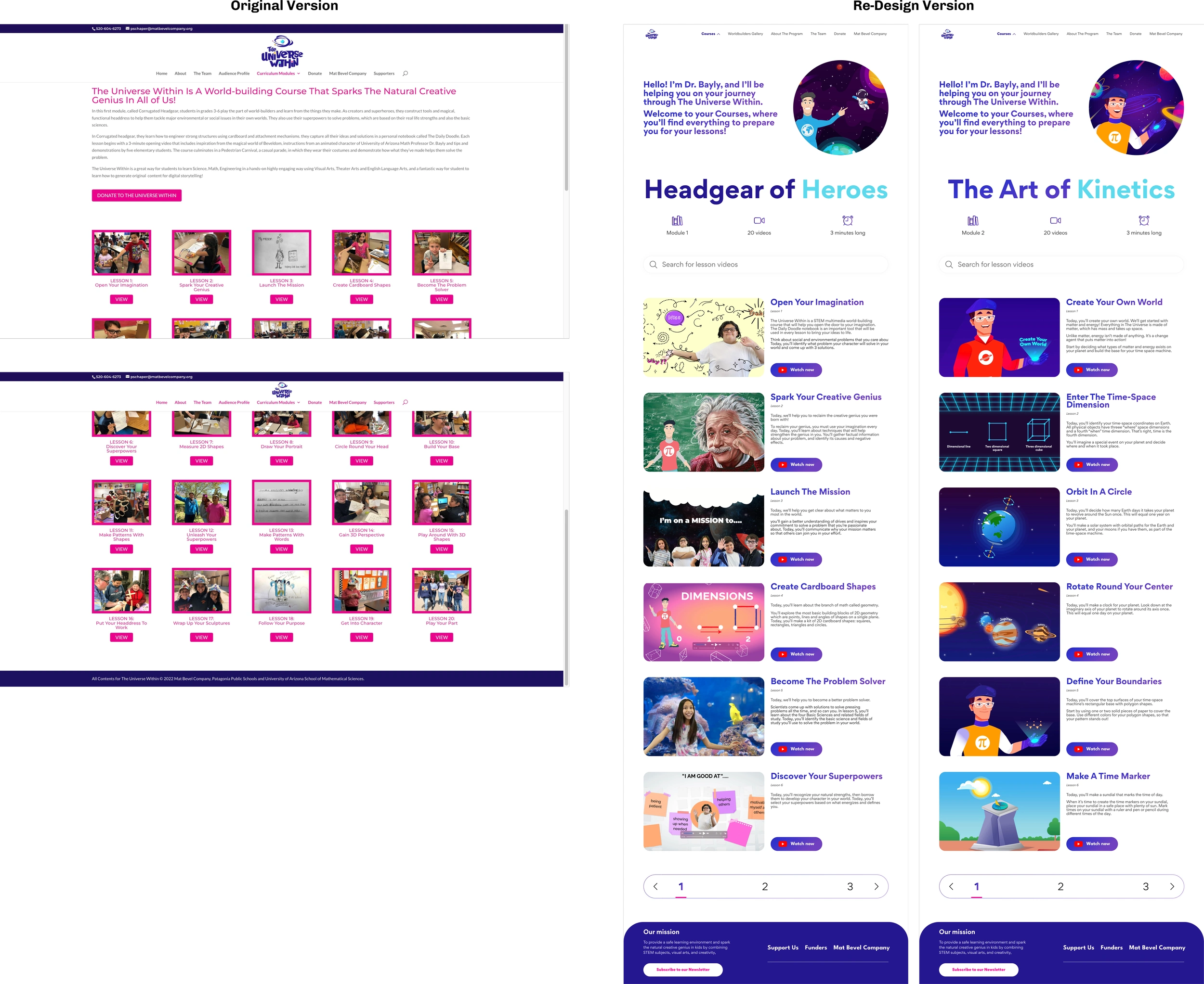
The creative brief and website goals was to create pages for the 2 courses that the curriculum offers.
Requested for these pages to be simple and to have a synopsis of each 3-minute lesson video
Challenge & Future Solution: For users that repeatedly come back to these courses to view a video, I recommended to add a search bar at the very top with autosuggest and pagination at the bottom.
4.) The Worldbuilders Gallery 📸
This particular page was the most challenging build due to developer constraints and content restrictions.
The purpose of this page is to inspire and excite new students before potentially starting this curriculum.
Students who have completed the course will also get the opportunity to showcase their designs in png, jpg, gif, or mp3 format.
Challenge & Solution: The project manager and stakeholders originally wanted to separate the content based on certain categories of work submitted. After the original creation, the second version will now have a section dedicated to each student.
re-design
Full prototype below
Interested in seeing the live website? There’s some parts still being developed, so contact me if you’d like to view the unfinished website.
Phase 4 — visual System
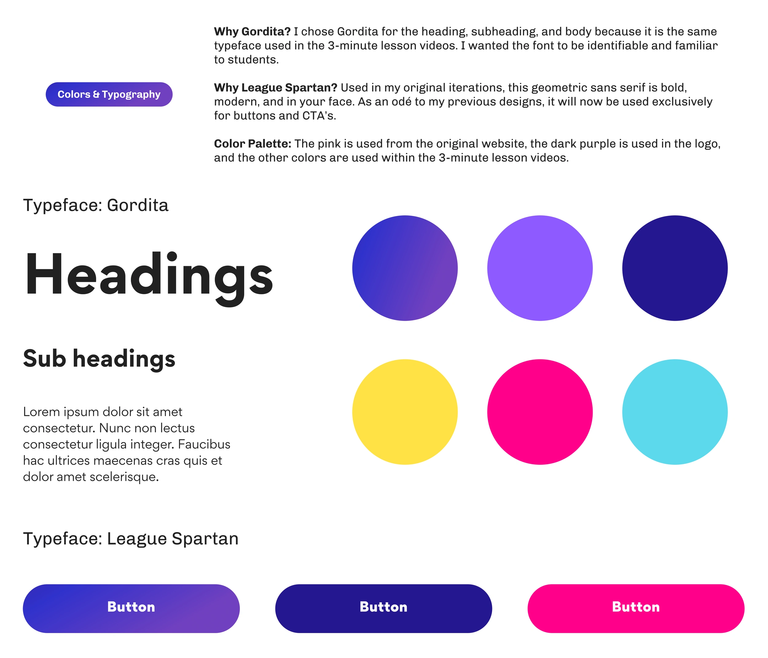
For more details of my high-fidelity designs, grids/spacing, colors, typography, icons, illustrations, effects, navigation, components, and UI elements, here’s a link to my Design System.

Phase 5 — outcome
Deliverables & Impact
Provided an online place where students have a voice to imagine, explore, get inspired, and share their original world-building creations with others.
Generate greater interest in the curriculum by featuring opening lesson course videos, student quotes, and sharing value of curriculum.
Increased donations from foundations and individuals for the curriculum.
Reflections
I’ve learned to let go and not hold on to old designs. Iteration is key to improvement for the best possible experience for the user.
I’ve learned how to balance the primary and secondary user.
I’ve learned how to build a Design System and brand from scratch, while still adhering to the original style guides and branding of the organization.
Like this project
Posted Jun 29, 2024
Led the comprehensive redesign of 'The Universe Within,' transforming its branding to be more kid-friendly while also creating dedicated spaces for parents, sch
Likes
0
Views
2
