Enhancing survey experience on 🇨🇭Switzerland's election tool
Muhamad Fachry Nurdiansyah
Vimentis Survey is a tool that Switzerland's people can use to get a recommendation of who they should choose in the election. The main users of this product are Swiss voters seeking candidates and parties that align with their ideologies based on survey results.
Previously my client created a quick MVP that has all the functionalities, he just wanted to make it more polished, better clarity, and of course better experience.
I'll showcase each screen before and after to demonstrate how I've improved the product.
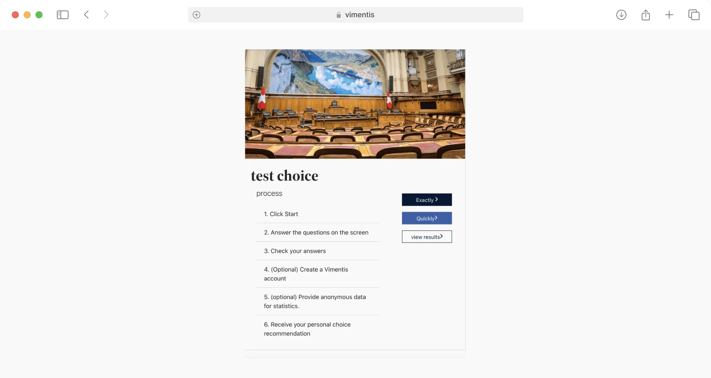
Test Options
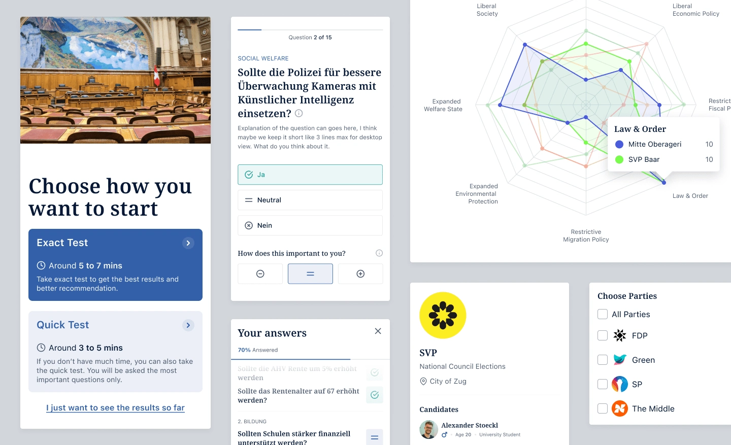
The screen below displays the test choice page, showing options to choose between a quick test or a complete test.
Before Redesign
After Redesign
I streamlined the design to maintain a formal look, emphasizing the quick and complete tests, with the “see results” button as a lower priority. I also added time estimates for each task, saving users the guesswork—because our time is precious!
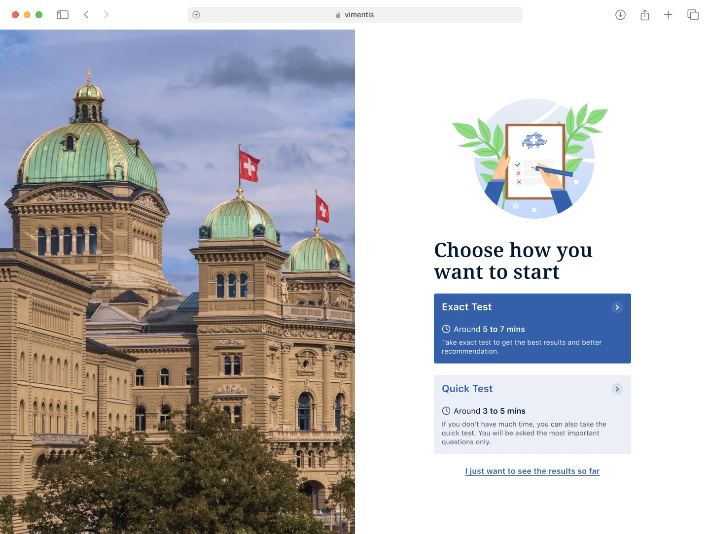
Simplifying the screen while keeping the formal theme here, giving a time estimation
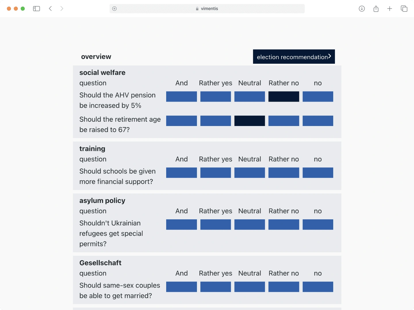
Surveys Screen
Users begin by completing a survey that helps the system identify parties and candidates aligning with their ideology.
Before Redesign
After Redesign
I've merged the overview of users' answers into a navigation tool, allowing them to easily access specific questions. Their responses are highlighted with different colors.
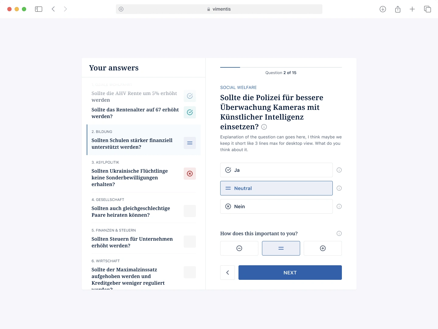
Survey Screen
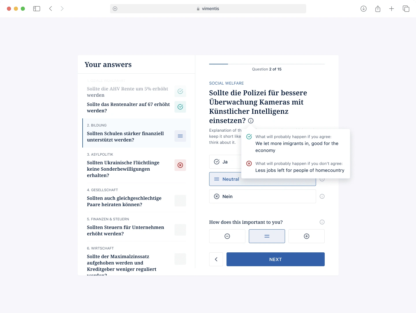
Information about the question
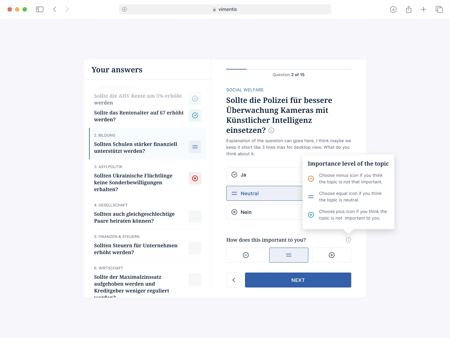
Information about importance of the topic
After Test
While waiting for the results & recommendations, the system will ask the users to create a Vimentis account
Before Redesign
After Redesign
Before displaying the results, we encourage users to register their accounts to receive future updates. I've added benefits and suggested my client include bullet points to increase interest in registration.
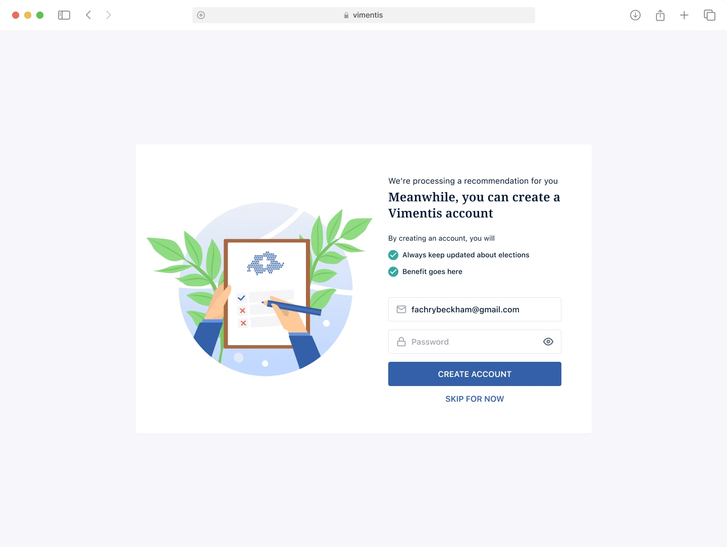
Test Completion Screen - Waiting Results
Candidate Recommendation
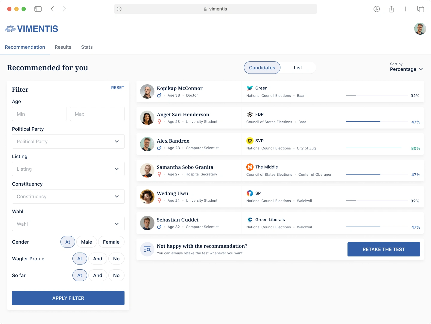
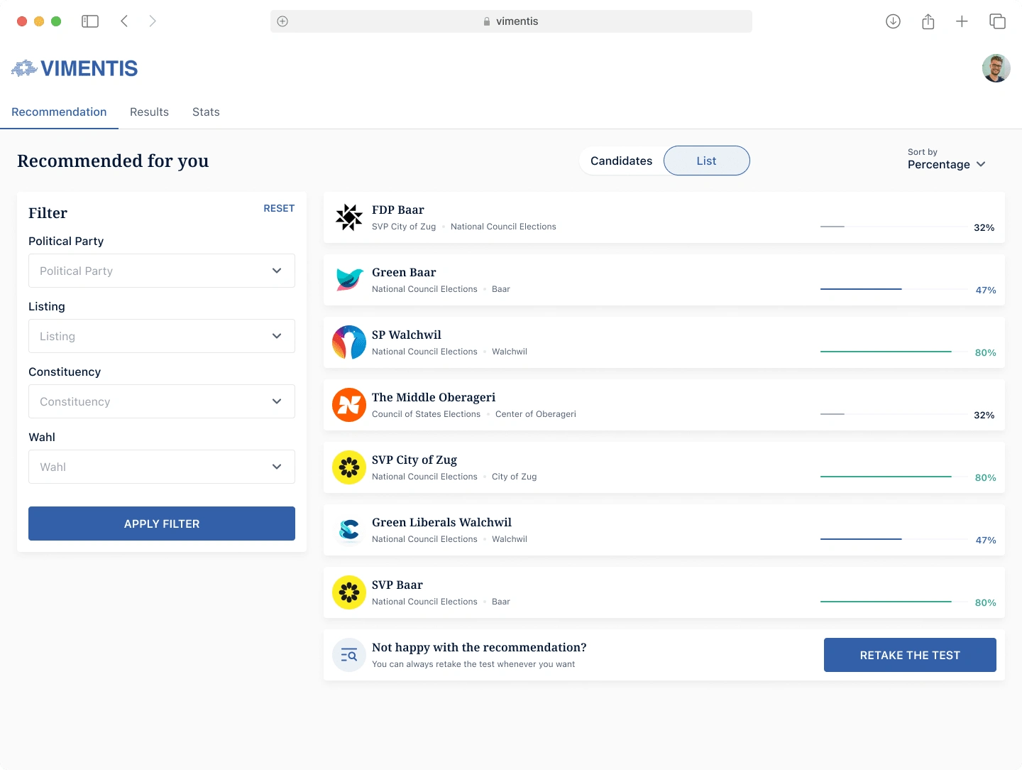
The screen below displays a list of candidates in the Swiss election, allowing users to compare candidates' ideologies with their own based on survey responses.
Before Redesign
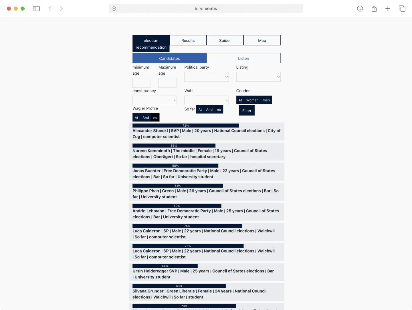
Candidate View
List View
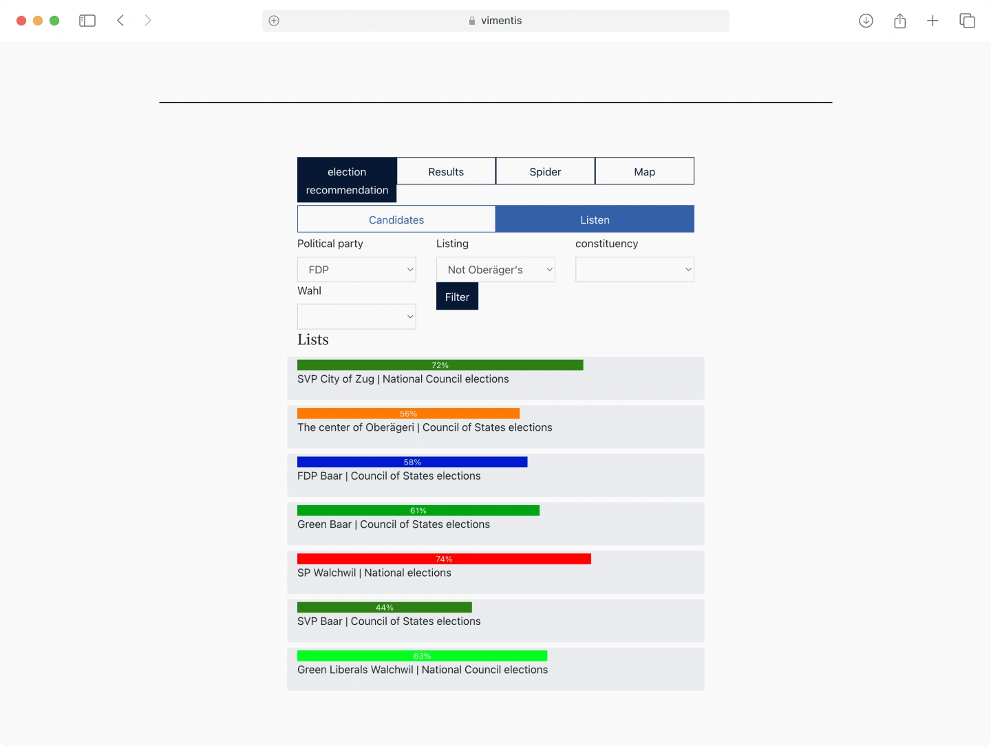
After Redesign
On this screen, I moved the filter box to the left and kept the results on the right. I placed candidate names and match percentages in their own column for easy comparison. Adding candidate photos could enhance recognition for users. If they are not happy with the results they can take a re-test which is located at the bottom of the results
Recommendation by Candidates
Recommendation by Party
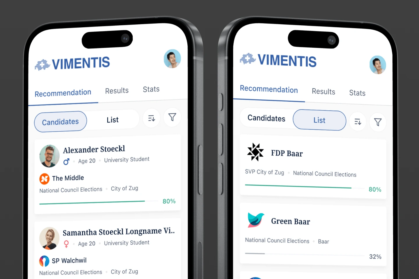
Mobile Responsive
Candidate Details View
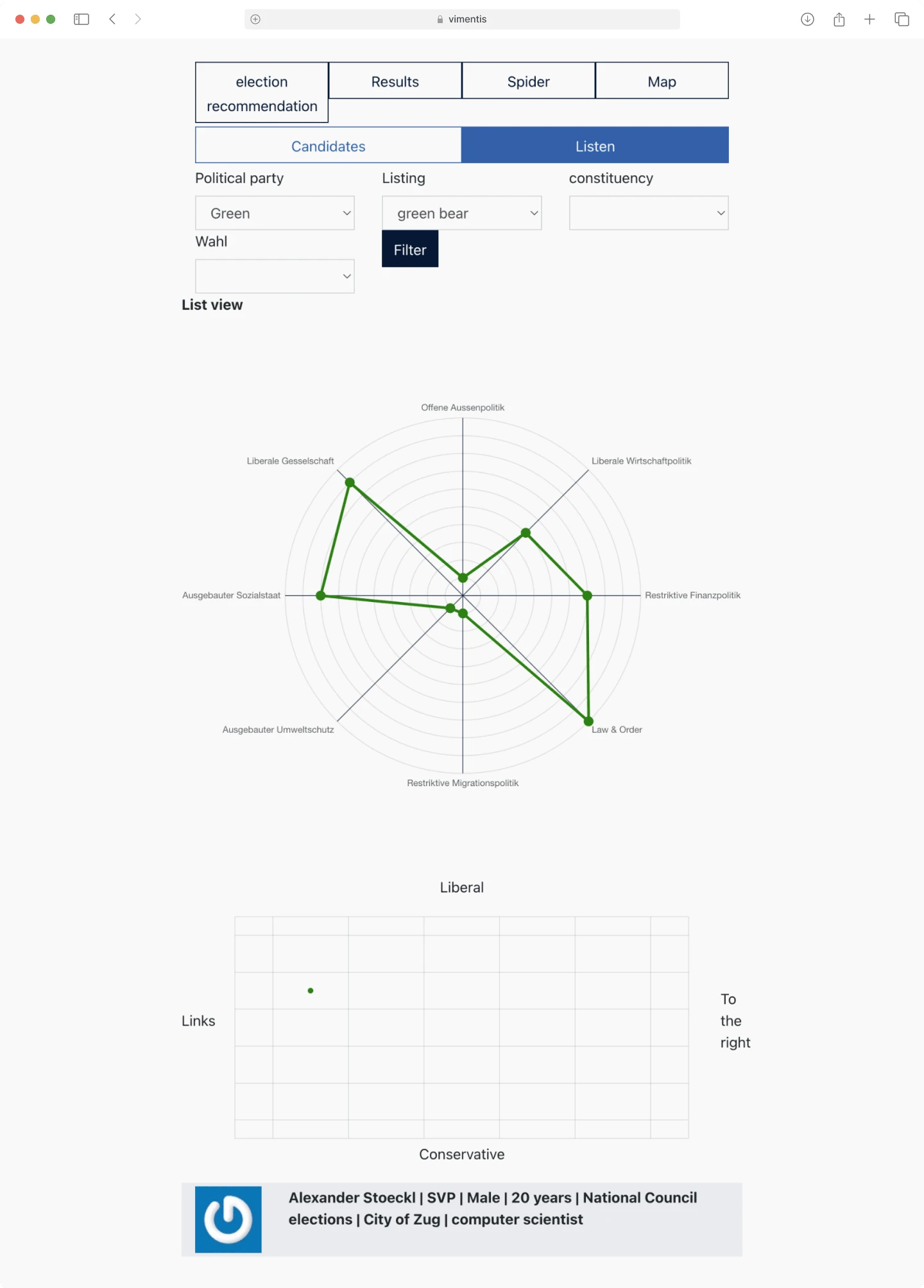
The screen below details each candidate's ideology, featuring ideology distribution, an ideology plot, and a comparison with the user's answers.
Before Redesign
After Redesign
I've made several improvements. First, I added a breadcrumb for easy navigation back to the candidate's party. The screen is now divided into two columns with enhanced information hierarchy. I put the party logo in the ideology plot to highlight more of its position in the election. We've also decided to place a comparison of the user's and candidate's answers below the charts for clarity.
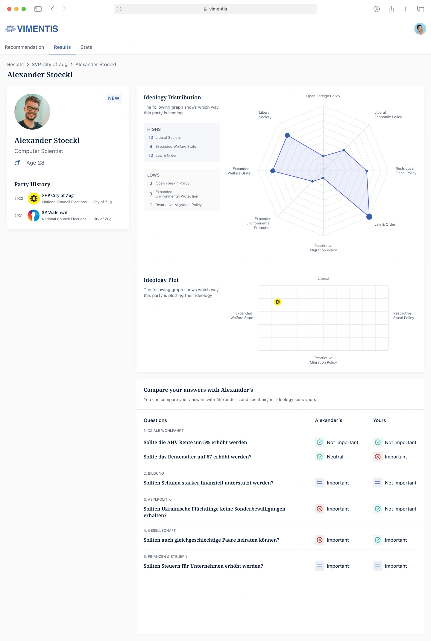
Charts showing candidate's ideology & survey answers comparison
Ideology Distribution Charts
Before Redesign
On this screen, users can view a comprehensive ideology distribution by candidates or parties. Users can filter each column to focus on specific candidates or parties.
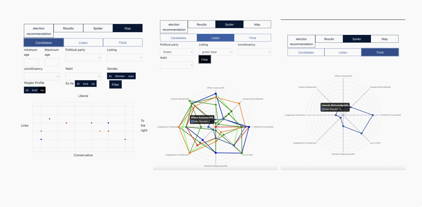
Charts showing ideology distribution
After Redesign
All the features remain the same; however, I have enhanced the interface with a cleaner look, improved chart visibility, and added logos to the plot chart to clearly indicate the positions of all parties.
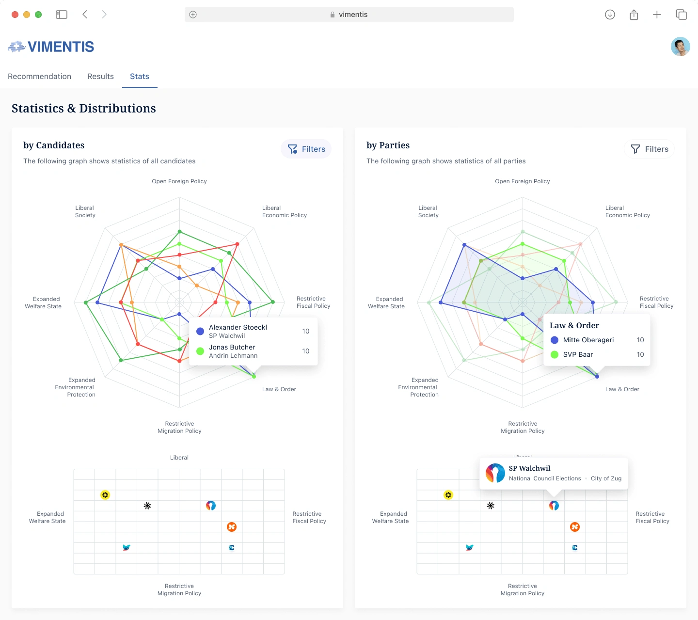
Charts showing ideology distribution

Like this project
Posted Jul 28, 2024
Vimentis Survey guides Swiss voters to candidates matching their ideologies. I enhanced the MVP for clarity and user experience, showcasing improvements.
Likes
0
Views
32