TEINPRO Protein Bar Packaging and Campaign Design

View completed workwww.behance.net
TEINPRO — Packaging That Packs a Punch
Protein Bar Packaging Design | Monocarton Packaging | Creative Campaign Design
A Stronger Bite. A Bolder Presence.
How do you make a protein bar stand out in a market full of fitness products?
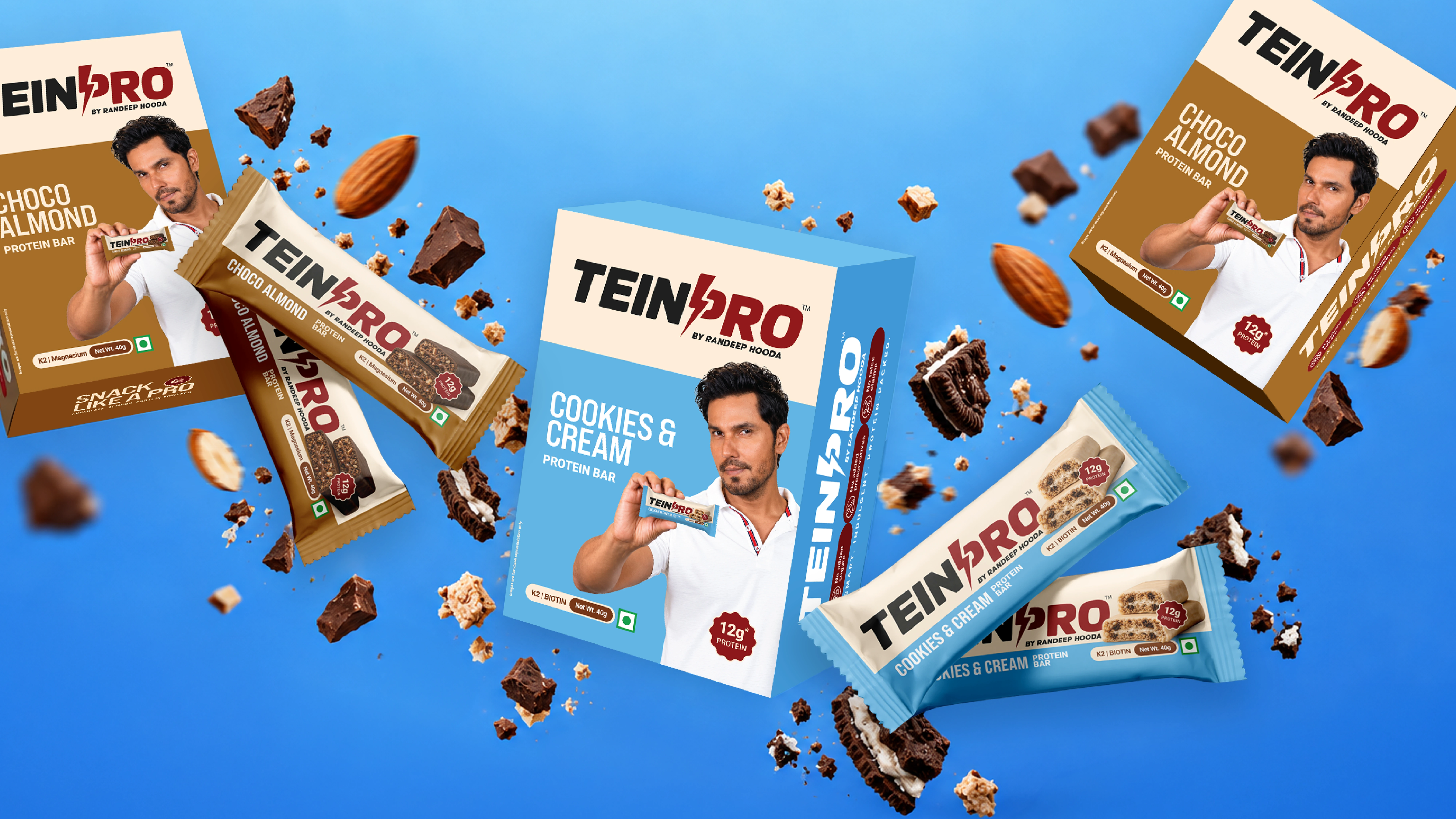
For TEINPRO by Randeep Hooda, we explored how bold packaging, flavour-driven colours, and energetic campaign visuals could give an everyday protein snack a distinctive visual presence. Our work focused on designing the individual protein bar wrappers, retail monocarton packaging, defining the packaging colour palette, and developing creative advertising campaigns that bring the product to life.
The goal was simple: make TEINPRO impossible to overlook.
The Packaging Design
Great food packaging needs to do more than communicate information. It needs to create an immediate connection with the consumer. We designed TEINPRO's protein bar packaging around strong visual contrast, impactful typography, appetising ingredient imagery, and a clear hierarchy of product information.
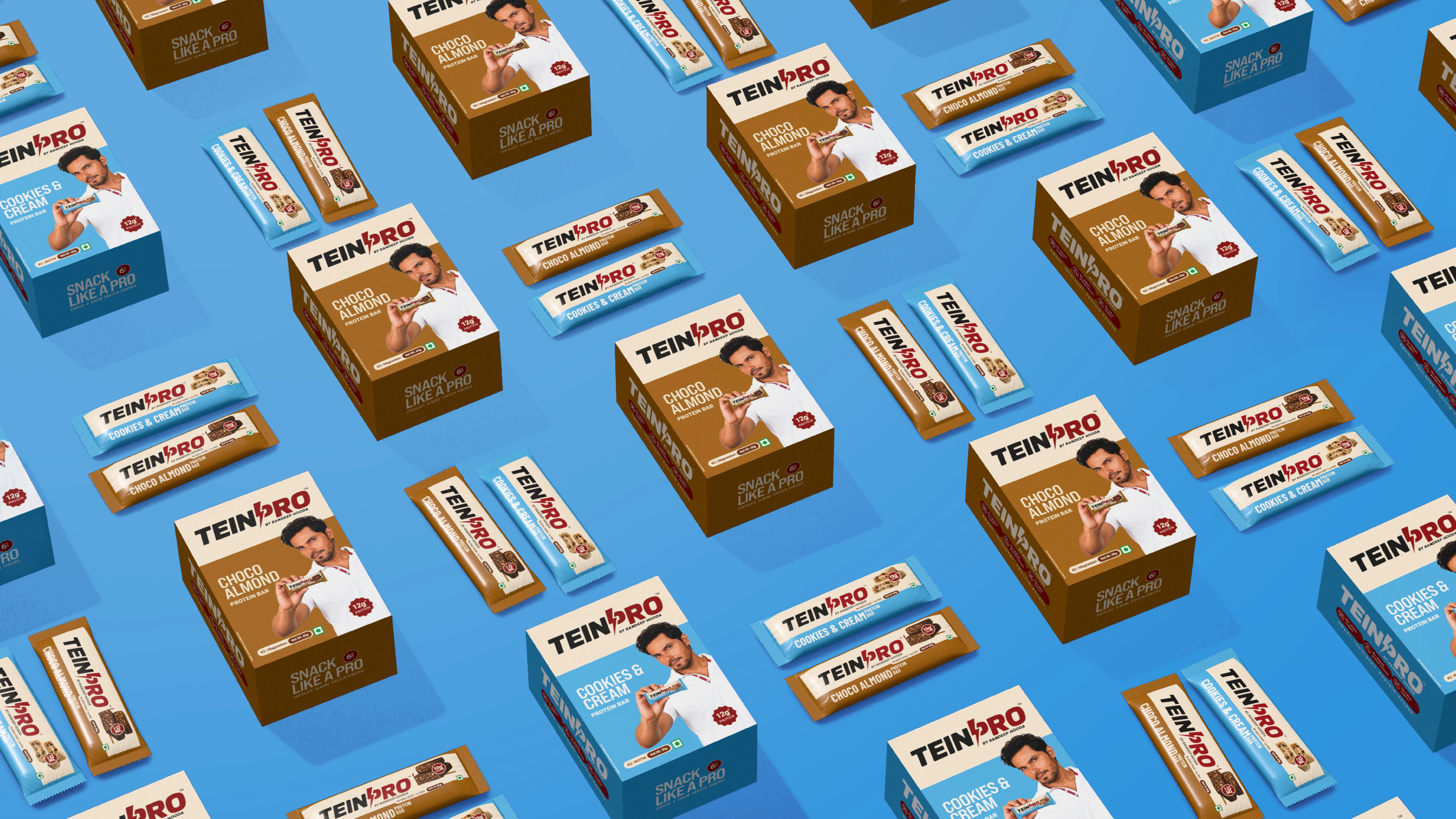
The packaging system was developed for two flavours:
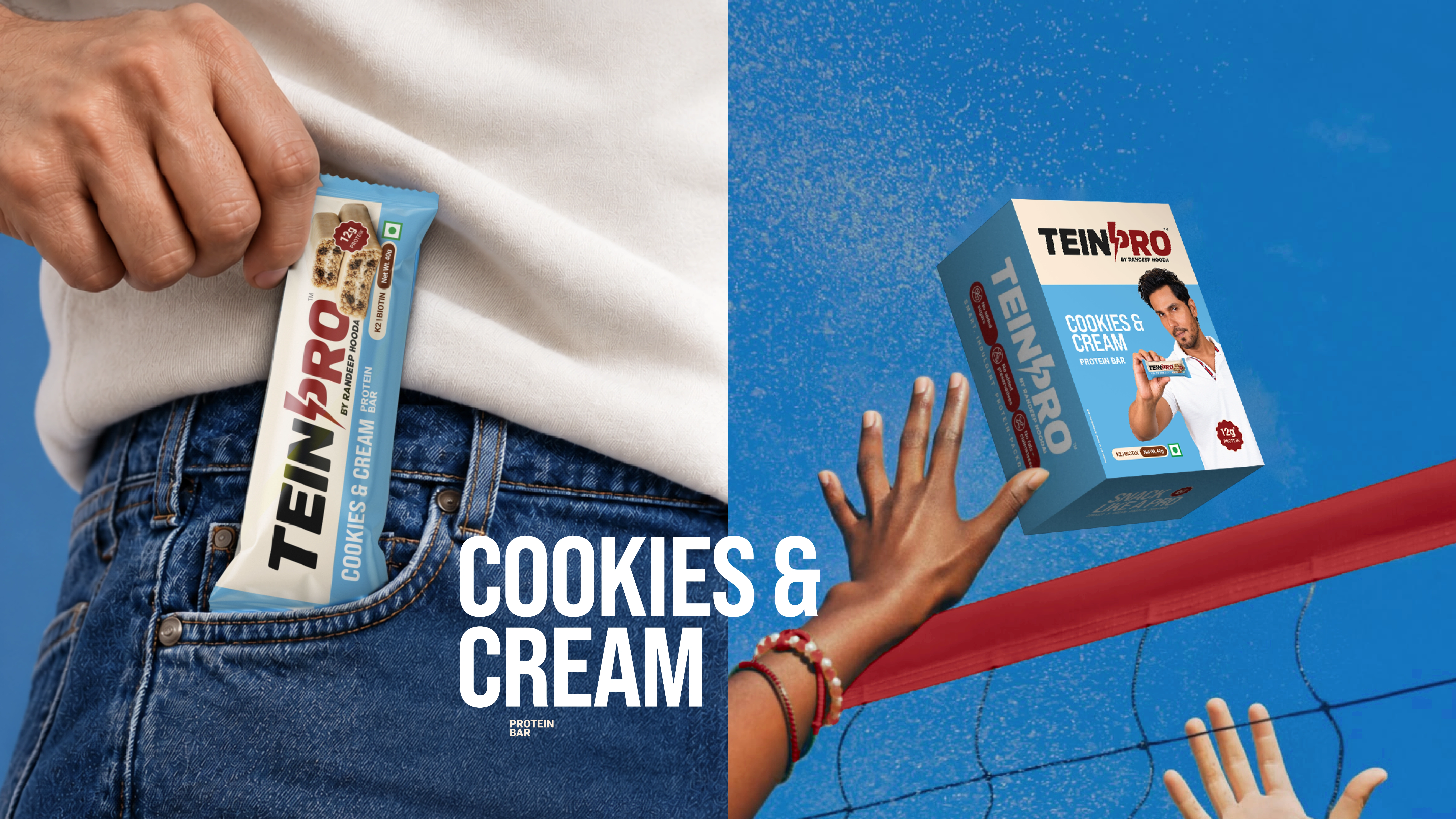
Cookies & Cream — A vibrant combination of blue and white, expressing a creamy, crunchy, and playful flavour experience.
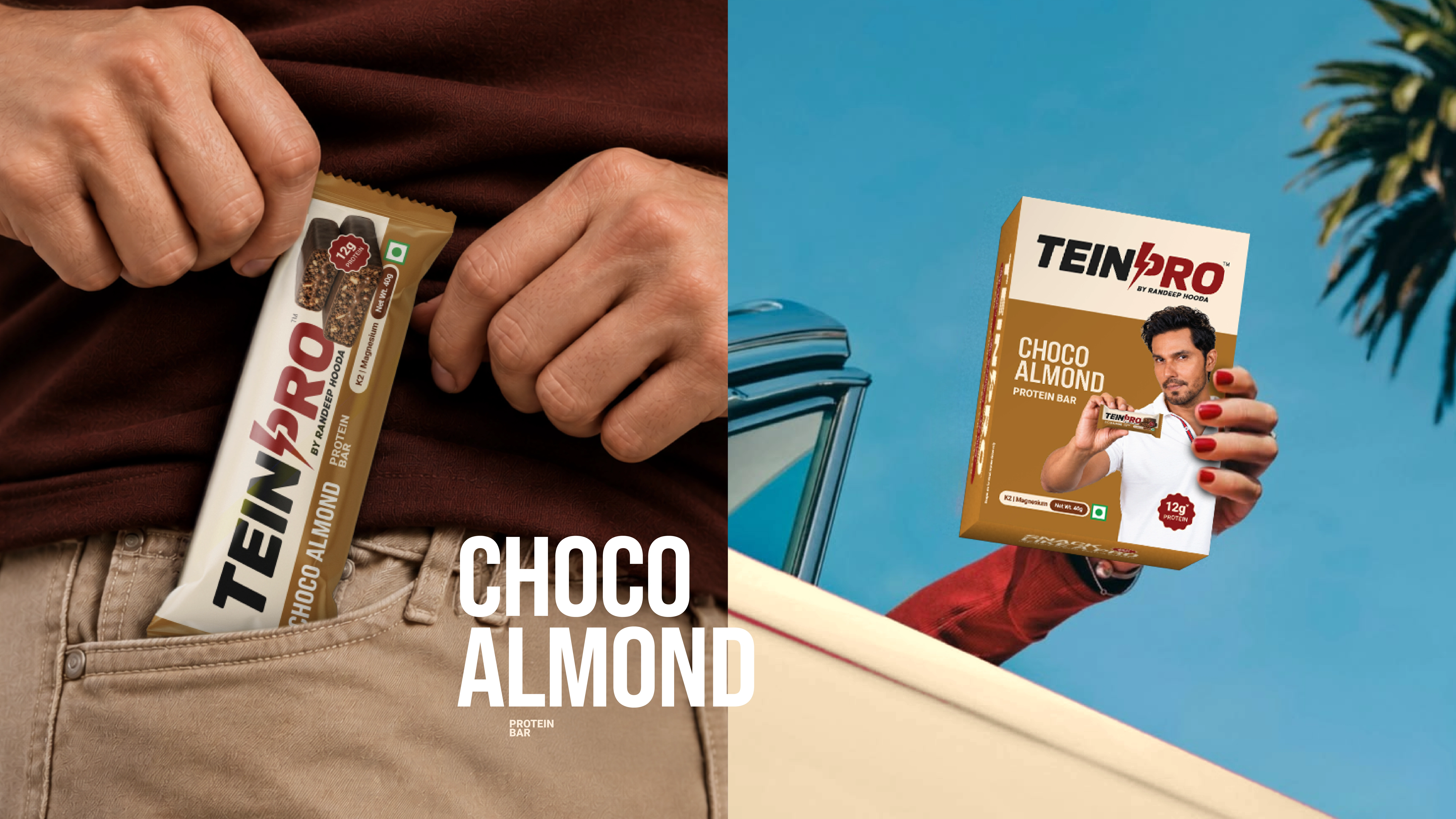
Choco Almond — A rich palette of warm browns and caramel-inspired tones, reflecting the indulgence of chocolate and almonds.
Each flavour has its own visual character while maintaining consistency across the TEINPRO product range.
From Individual Bars to Retail Monocartons
We extended the packaging design across individual protein bar wrappers and retail monocarton boxes.
The objective was to maintain a consistent visual experience across packaging formats while ensuring the products remained instantly recognisable. From flavour identification and colour differentiation to nutritional callouts and product imagery, every element was considered to create packaging that feels contemporary, confident, and shelf-ready.
Creative Campaign — Beyond the Wrapper
Packaging was only one part of the visual experience.
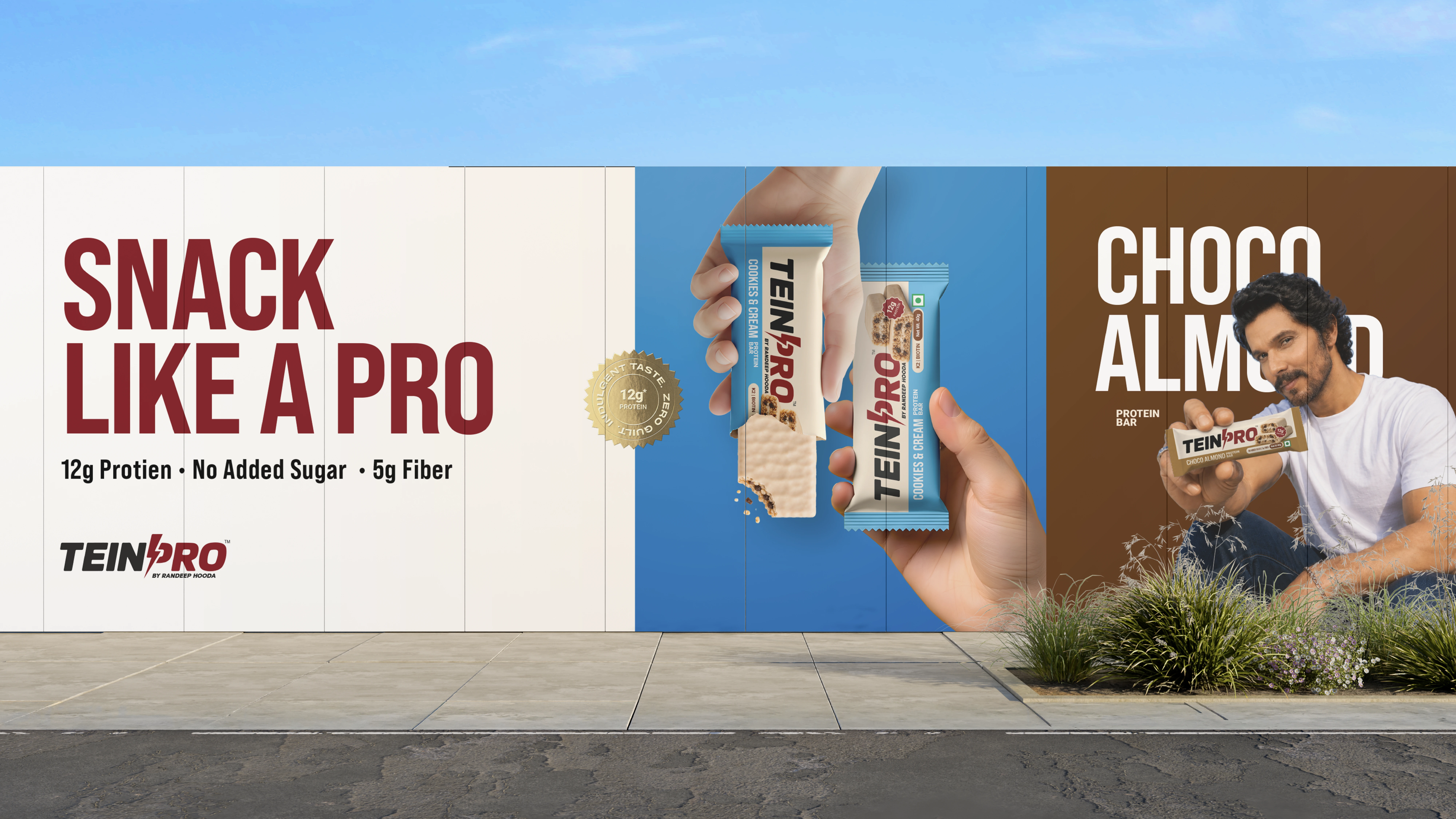
We also developed a series of creative campaign visuals exploring how TEINPRO could connect with consumers through sport, movement, flavour, and everyday lifestyle moments.
Our campaign direction combined bold product photography, dynamic compositions, ingredient-led visuals, playful perspectives, and high-energy advertising concepts. The idea was to move beyond conventional protein product advertising and create imagery that feels engaging, memorable, and visually exciting. Whether it's a dramatic product shot or a lifestyle-driven composition, each creative places TEINPRO at the centre of the story.
Designed to Be Seen. Made to Be Remembered.
From protein bar packaging and monocarton design to creative campaign executions, the project explores how thoughtful colour choices, strong visual communication, and expressive art direction can elevate a product's presence.
Two flavours. One bold packaging experience.
Project: TEINPRO by Randeep Hooda
Industry: FMCG / Food & Beverage / Protein & Nutrition
Scope of Work:
Protein Bar Wrapper Packaging Design | Monocarton Packaging Design | Packaging Colour Palette | Creative Campaign Design | Advertising Visuals & Art Direction | Product Visualisation & Promotional Creatives
Branding, Packaging & Collaterals
Studio: Design.Rohan_
Creative Director & Designer: Rohan Barwal
Brand Strategy · Visual Identity · Packaging Design · Art Direction · Brand Guidelines
Get in touch: linktr.ee/design.rohan_
Thank you.
0 likes · 1 view · Oct 28, 2026
Designed unique packaging and creative campaigns for TEINPRO protein bars.