SaaS Creator AI Product | UI Design

Gadir Shikhaliyev

Feedback

Mission
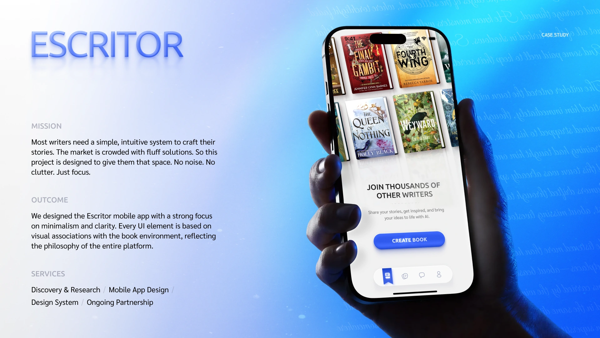
Most writers need a simple, intuitive system to craft their stories. The market is crowded with fluff solutions. So this project is designed to give them that space. No noise. No clutter. Just focus.
Outcome
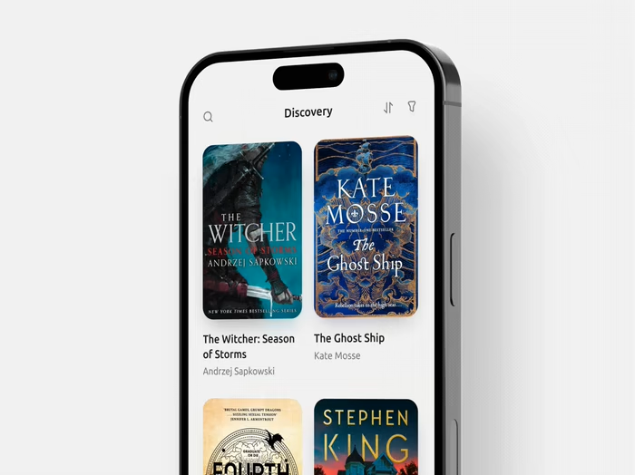
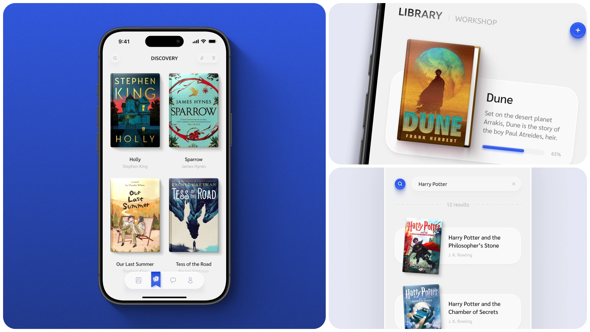
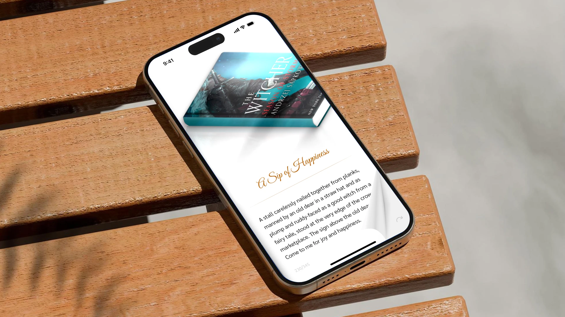
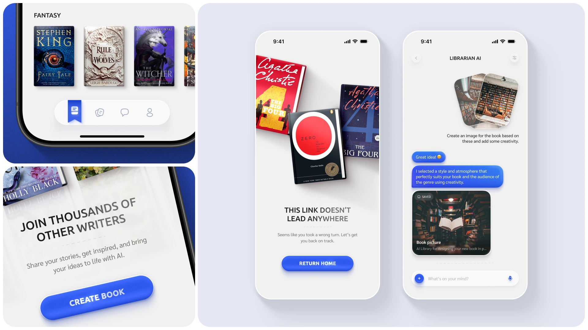
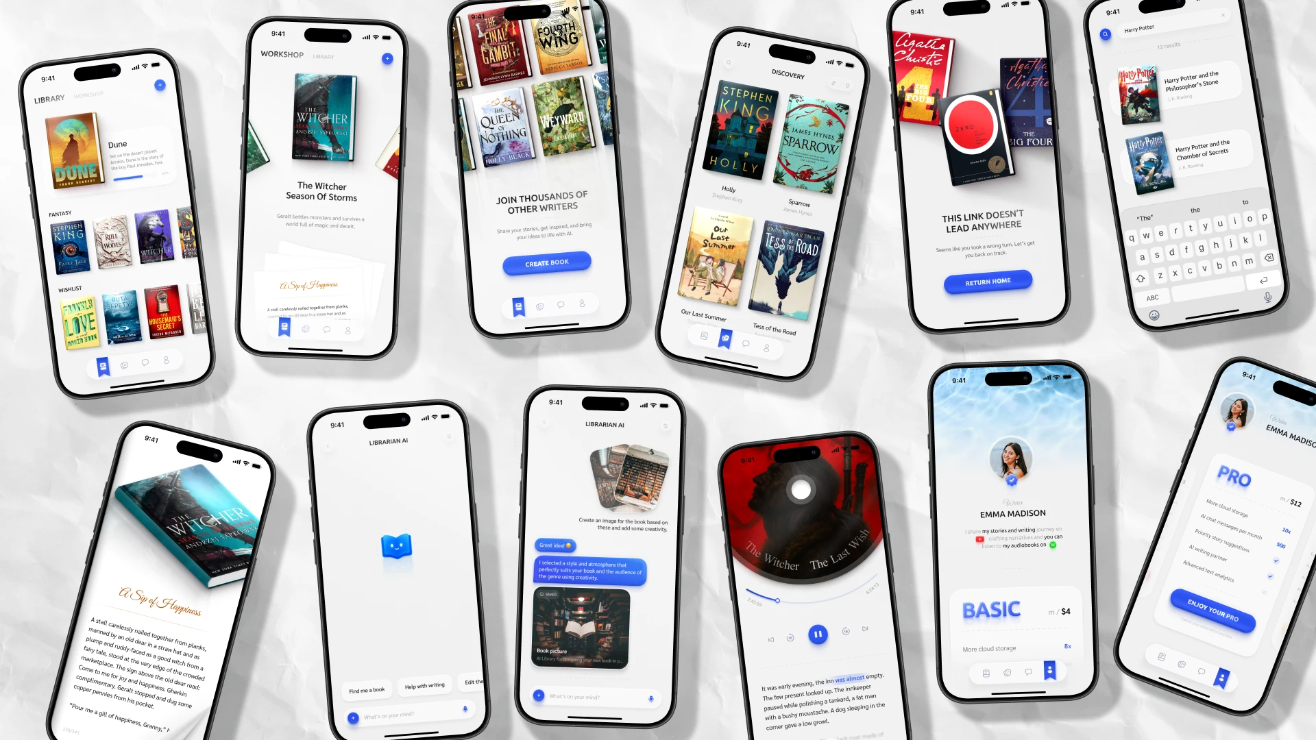
We designed the Escritor mobile app with a strong focus on minimalism and clarity. Every UI element is based on visual associations with the book environment, reflecting the philosophy of the entire platform.
Process
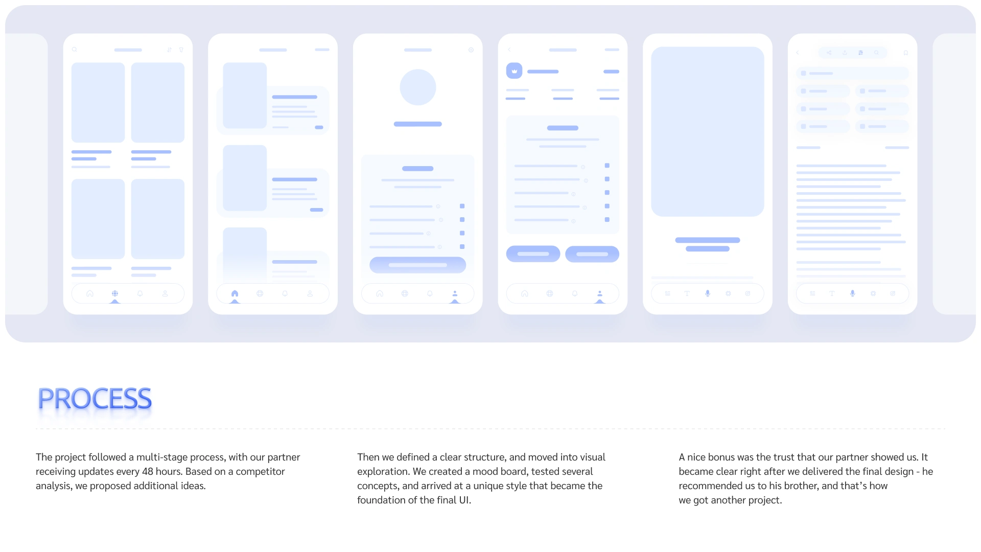
The project followed a multi-stage process, with our partner receiving updates every 48 hours. Based on a competitor analysis, we proposed additional ideas.
Then we defined a clear structure, and moved into visual exploration. We created a mood board, tested several concepts, and arrived at a unique style that became the foundation of the final UI.
A nice bonus was the trust that our partner showed us. It became clear right after we delivered the final design - he recommended us to his brother, and that’s how we got another project.
Outcome
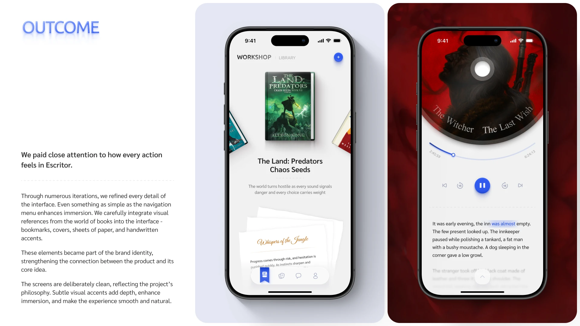
We paid close attention to how every action feels in Escritor.
Through numerous iterations, we refined every detail of the interface. Even something as simple as the navigation menu enhances immersion. We carefully integrate visual references from the world of books into the interface - bookmarks, covers, sheets of paper, and handwritten accents.
These elements became part of the brand identity, strengthening the connection between the product and its core idea.
The screens are deliberately clean, reflecting the project’s philosophy. Subtle visual accents add depth, enhance immersion, and make the experience smooth and natural.
Impact
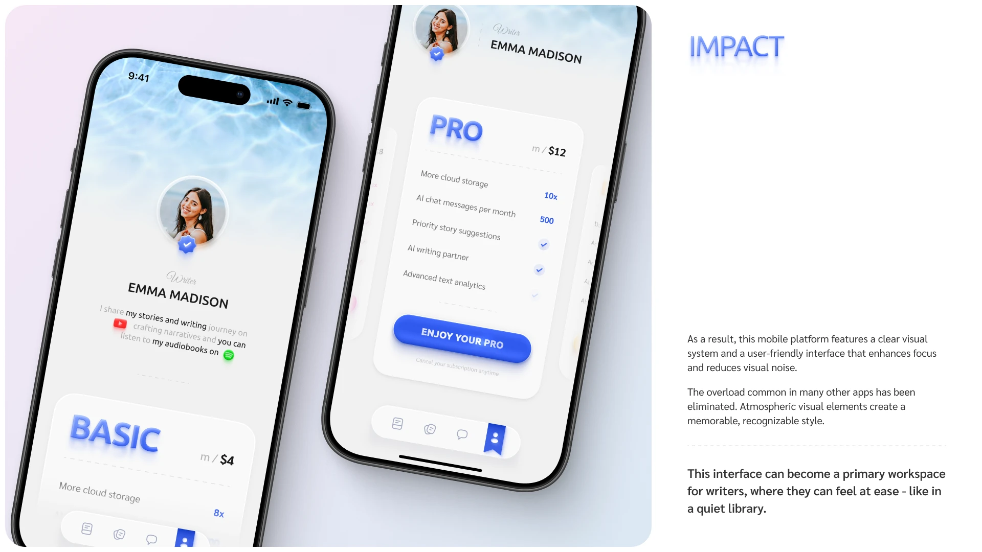
As a result, this mobile platform features a clear visual system and a user-friendly interface that enhances focus and reduces visual noise.
The overload common in many other apps has been eliminated. Atmospheric visual elements create a memorable, recognizable style.
This interface can become a primary workspace for writers, where they can feel at ease - like in a quiet library.
Like this project
Posted Dec 8, 2024
I designed the Escritor mobile app with a strong focus on minimalism and clarity. Every UI element is based on visual associations with the book environment.
Likes
7
Views
80
Timeline
May 9, 2026 - May 31, 2026