She Plus Them (Brand Identity)
Cristina Iglesias
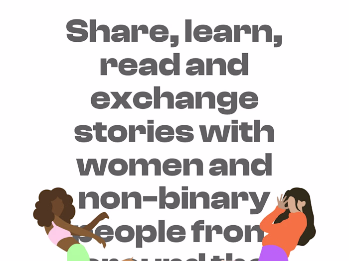
A unique visual identity was crafted from the ground up, inspired by the concepts behind the chosen name, derived from the terms «she» and «them.» The logo symbol creatively combines the international symbol for women with the non-binary symbol, resulting in an asterisk encircled by a ring. This design encapsulates inclusivity and representation at its core.
The typography merges handwritten elements with pre-designed letterforms, giving the brand a distinct, approachable, and dynamic personality. This thoughtful combination makes the brand visually engaging and appealing to its target audience.
The color palette was carefully selected to reflect the essence of the brand, inspired by words such as «women,» «non-binary people,» «safe space,» and «multiculturalism.» Bright, vibrant hues were chosen to convey energy and positivity, ensuring the visual identity captures attention and resonates with the brand’s values and audience.
Like this project
Posted Feb 13, 2025
Visual Identity/Branding for a organisation.