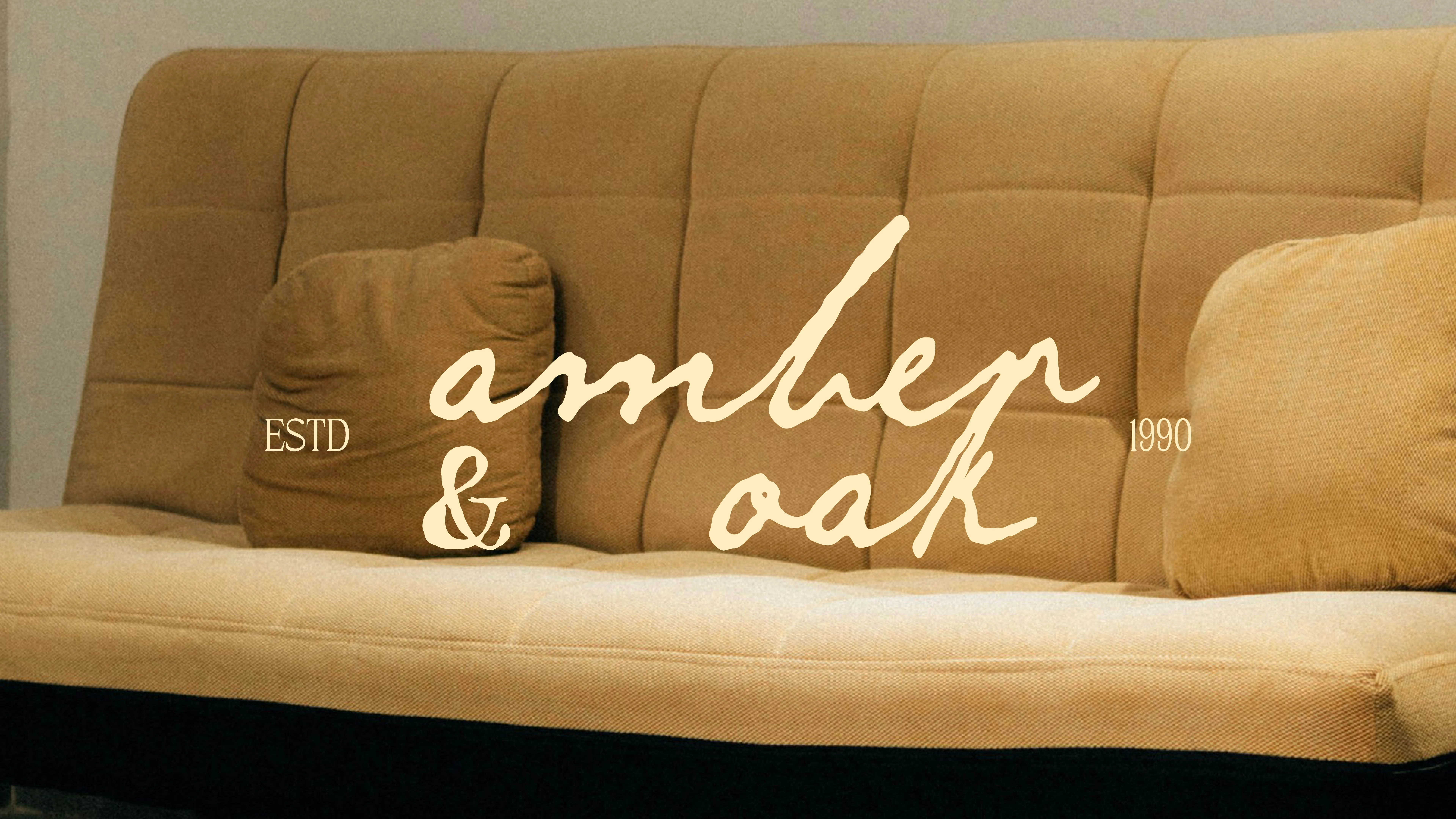
Amber & Oak | Brand Identity
Arpita Mishra
Amber & Oak celebrates the art of handcrafted furniture, blending heritage and modernity to inspire mindful living and a deep connection to nature.
This case study unpacks the thoughtful design decisions that brought this artisanal brand to life.
The Story of Amber & Oak
Amber & Oak, a family-run artisanal furniture brand, sought to revive the tradition of handcrafted, natural wood furniture. Their vision was to inspire people to slow down and cherish the beauty of their homes through meaningful, timeless pieces.
A Brand Rooted in Nature
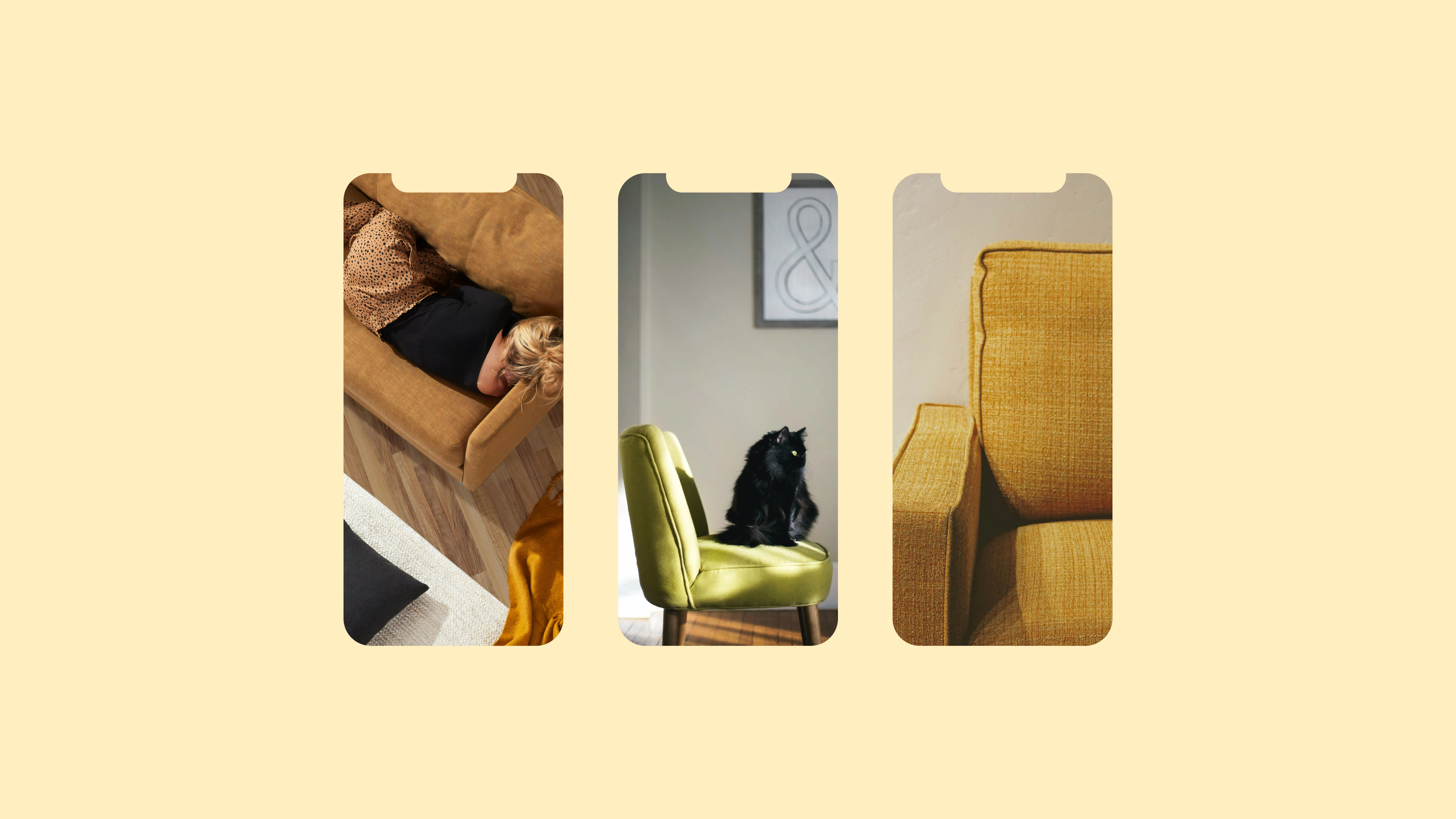
The brand's philosophy revolves around celebrating the warmth and character of nature through artisanal craftsmanship. Every piece of furniture is designed to bring the beauty of the outdoors into people’s homes, offering a deep connection to natural materials.
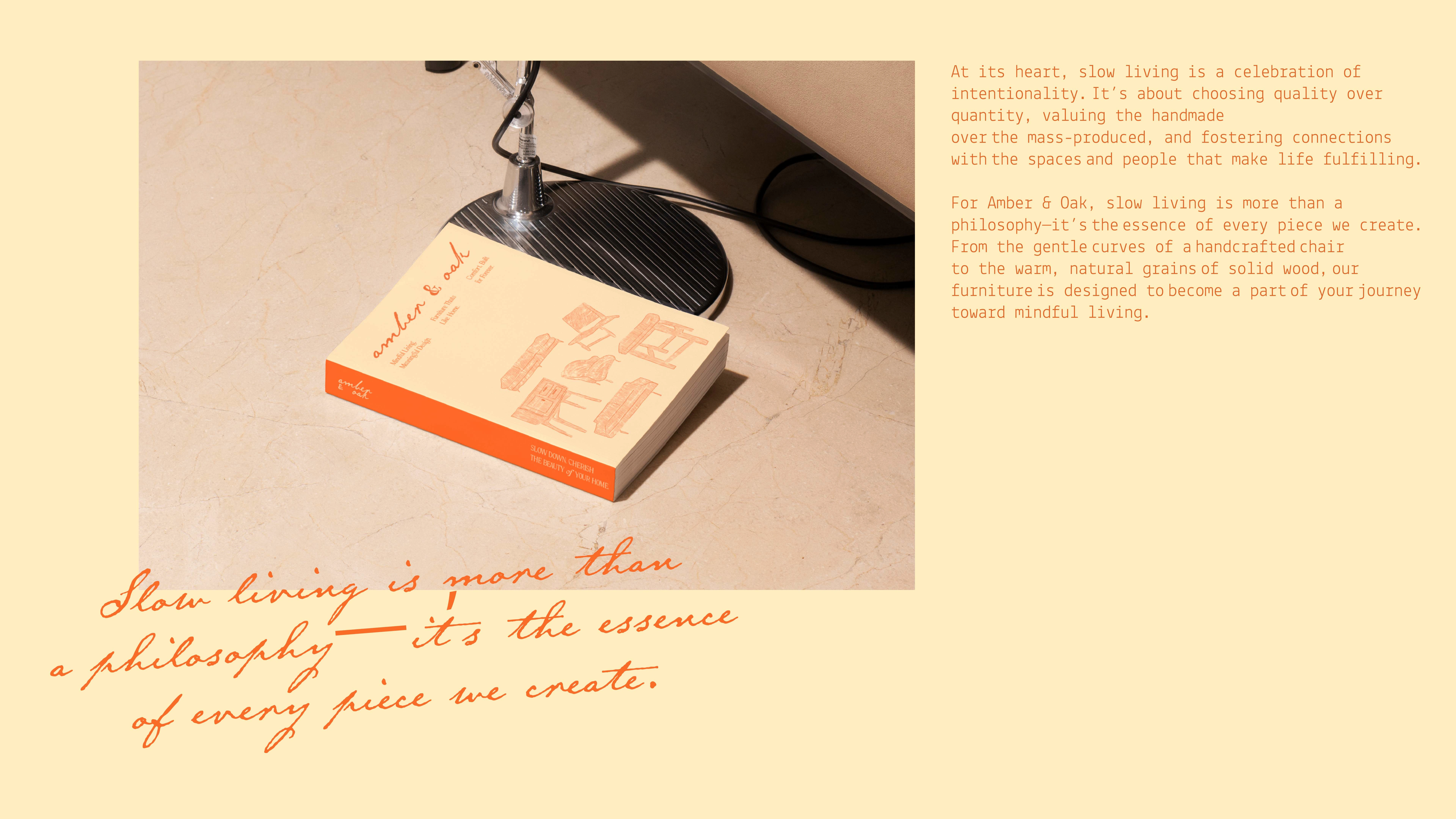
The Art of Slow Living
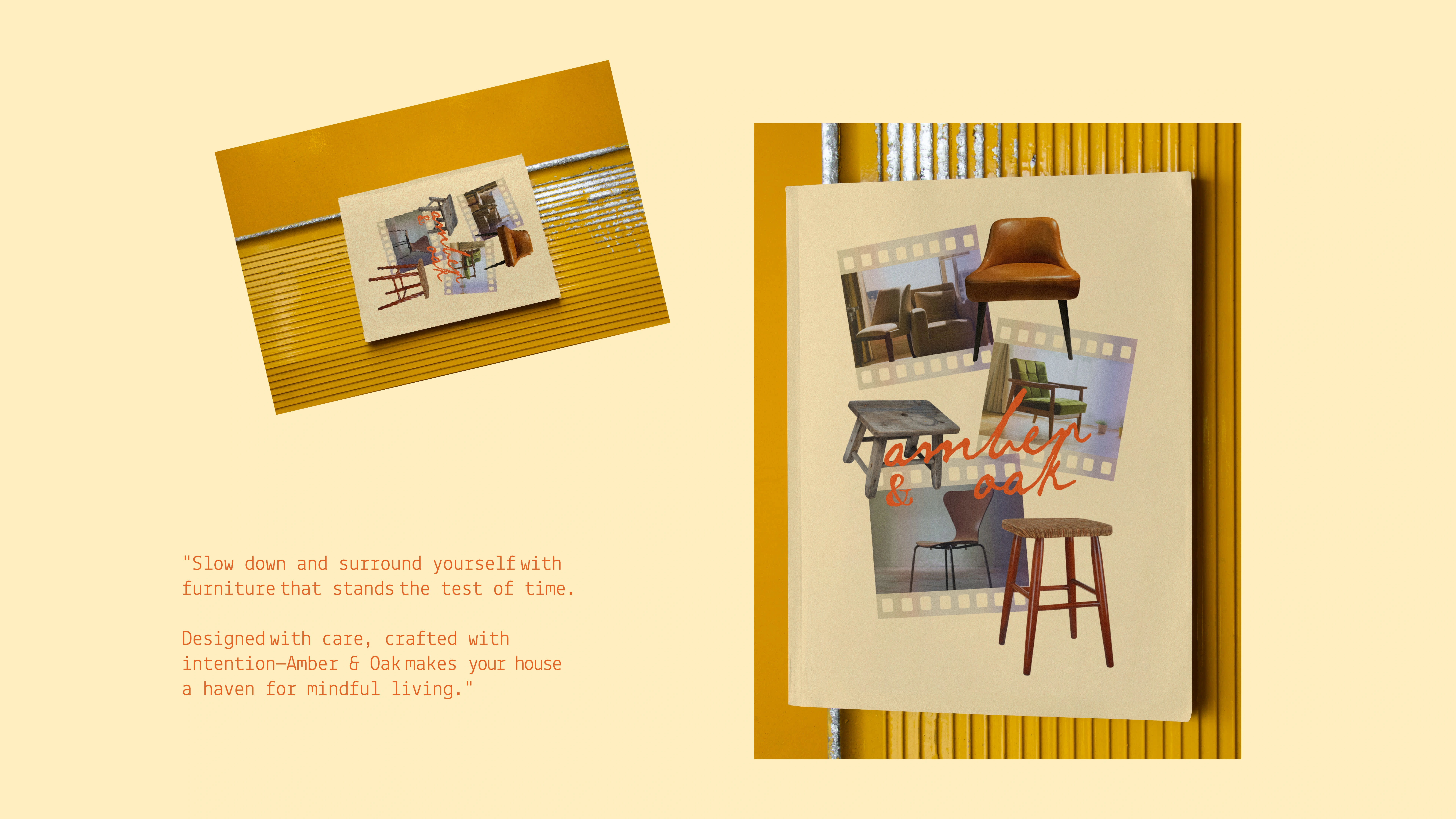
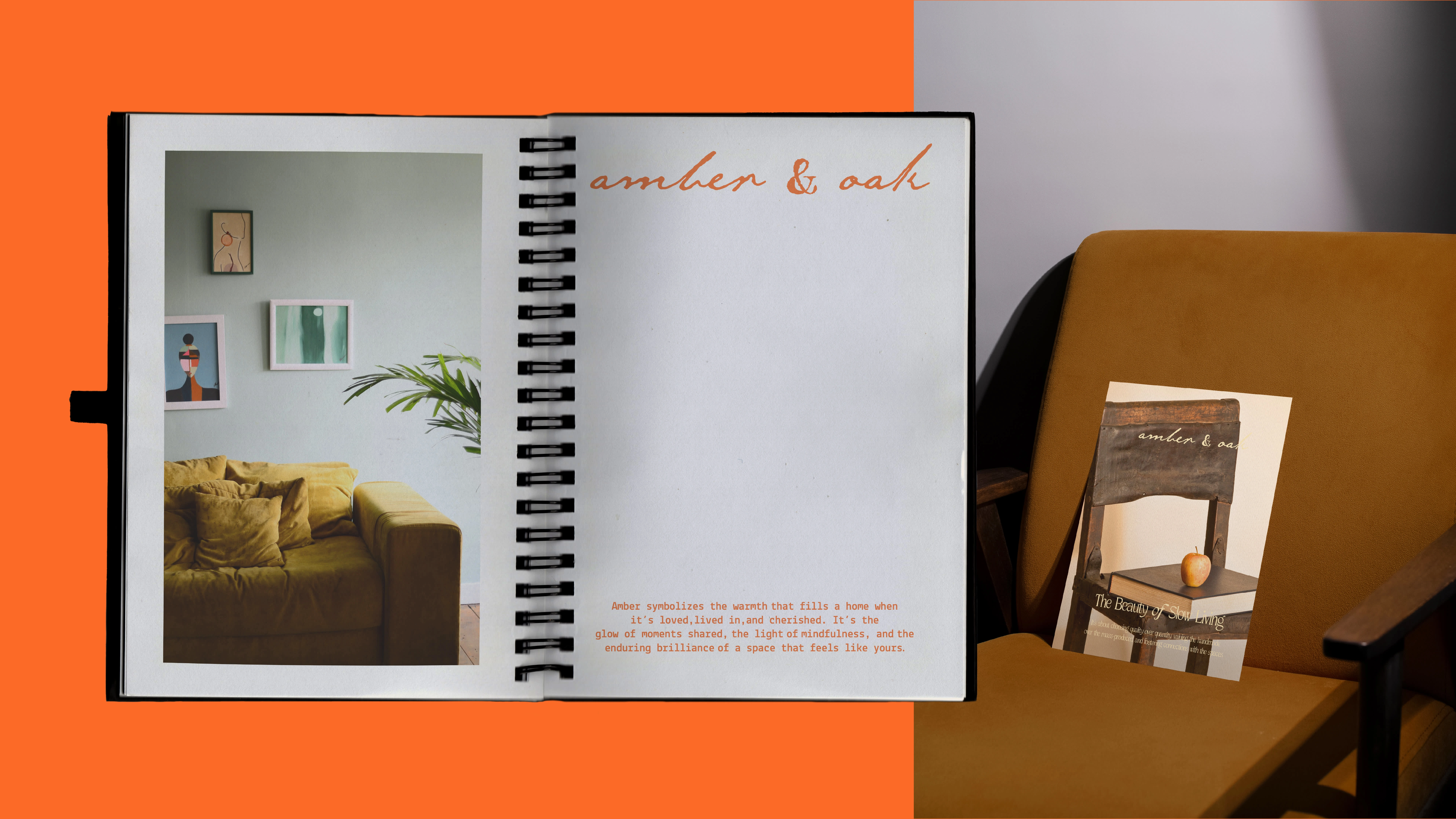
Amber & Oak champions the beauty of slow living—encouraging customers to invest in timeless designs that prioritize quality, sustainability, and mindfulness over mass production.
My Role in Bringing a Vision to Life
As a brand designer, my role was to uncover Amber & Oak’s unique story and translate it into a cohesive brand identity. Through strategy, design, and storytelling, I helped the brand connect deeply with its audience.
The purpose was clear: build a brand identity that reflects Amber & Oak’s heritage, resonates with eco-conscious customers, and positions the brand as a leader in artisanal furniture. The goal was to balance tradition and modernity to craft a timeless identity.
The creative process began with brand discovery sessions to uncover the brand’s core values. Competitor analysis and mood boards shaped the foundation, leading to concept development inspired by nature and artisanal traditions.
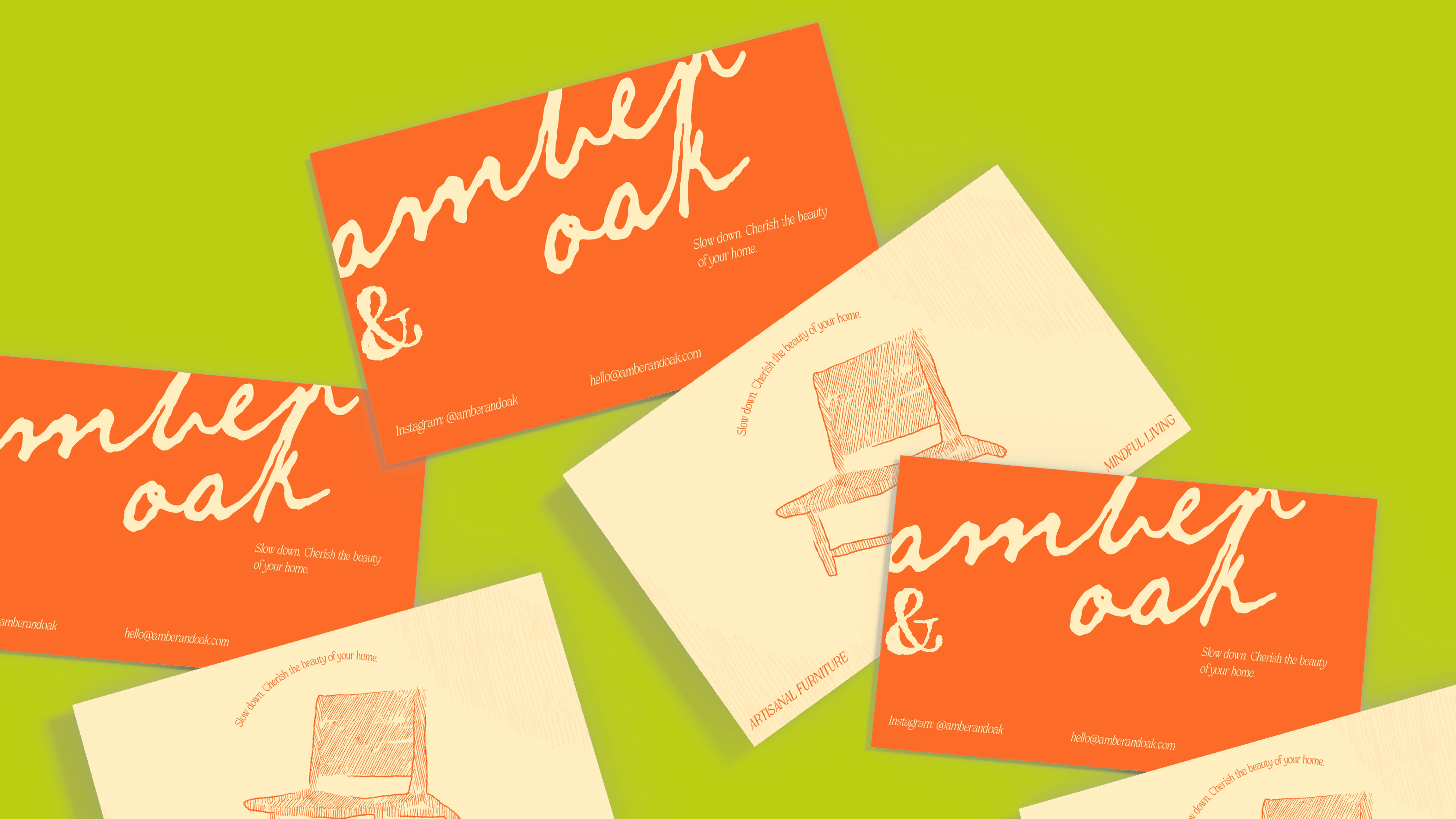
The Symbol of Artisanal Craftsmanship
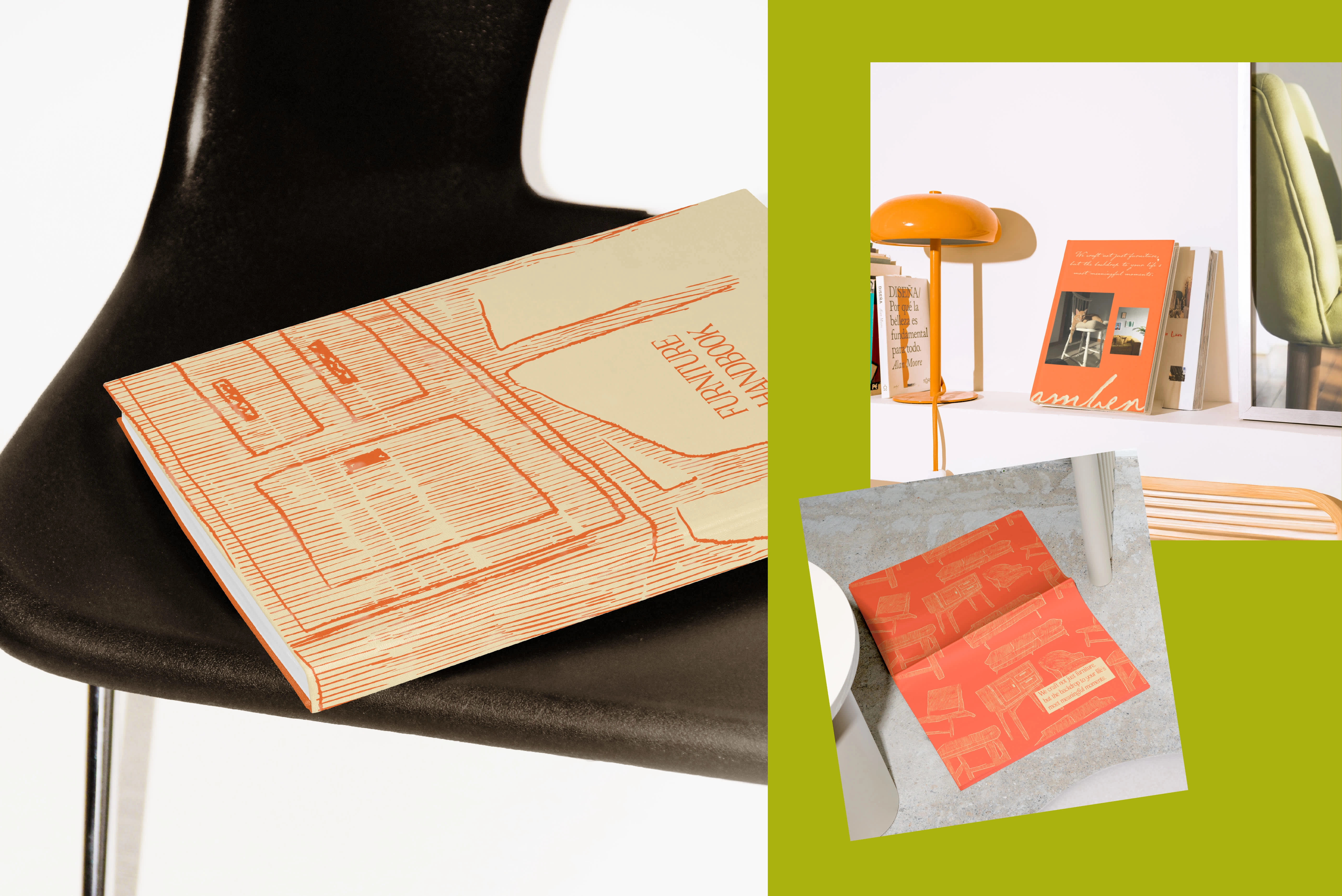
The logo is a handcrafted design that embodies the brand's artisanal essence, timeless craftsmanship, and a connection to nature while appealing to a modern audience that values quality and sustainability. Every element was thoughtfully designed to capture the brand’s essence and create a lasting impression.
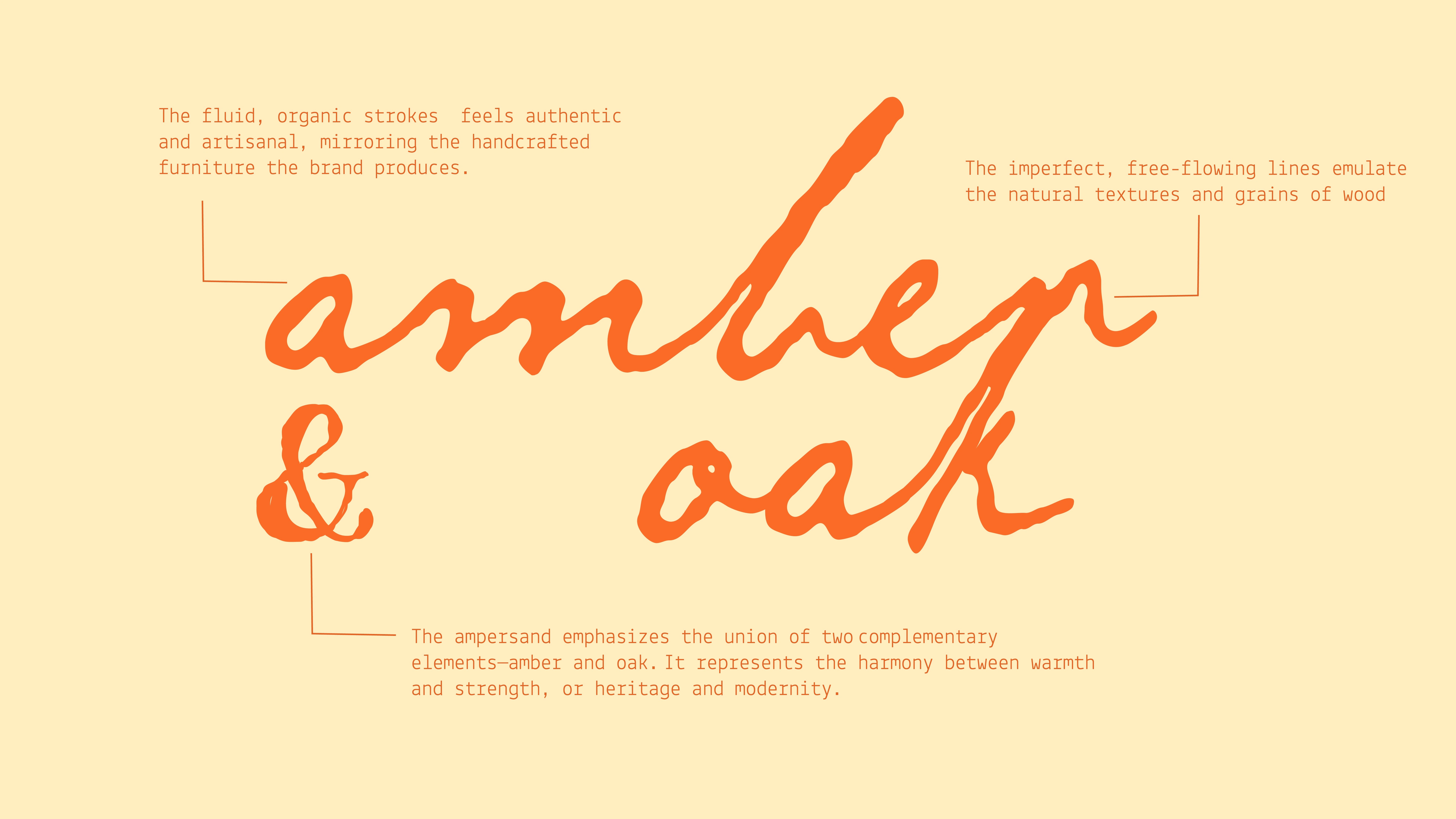
Logo Breakdown
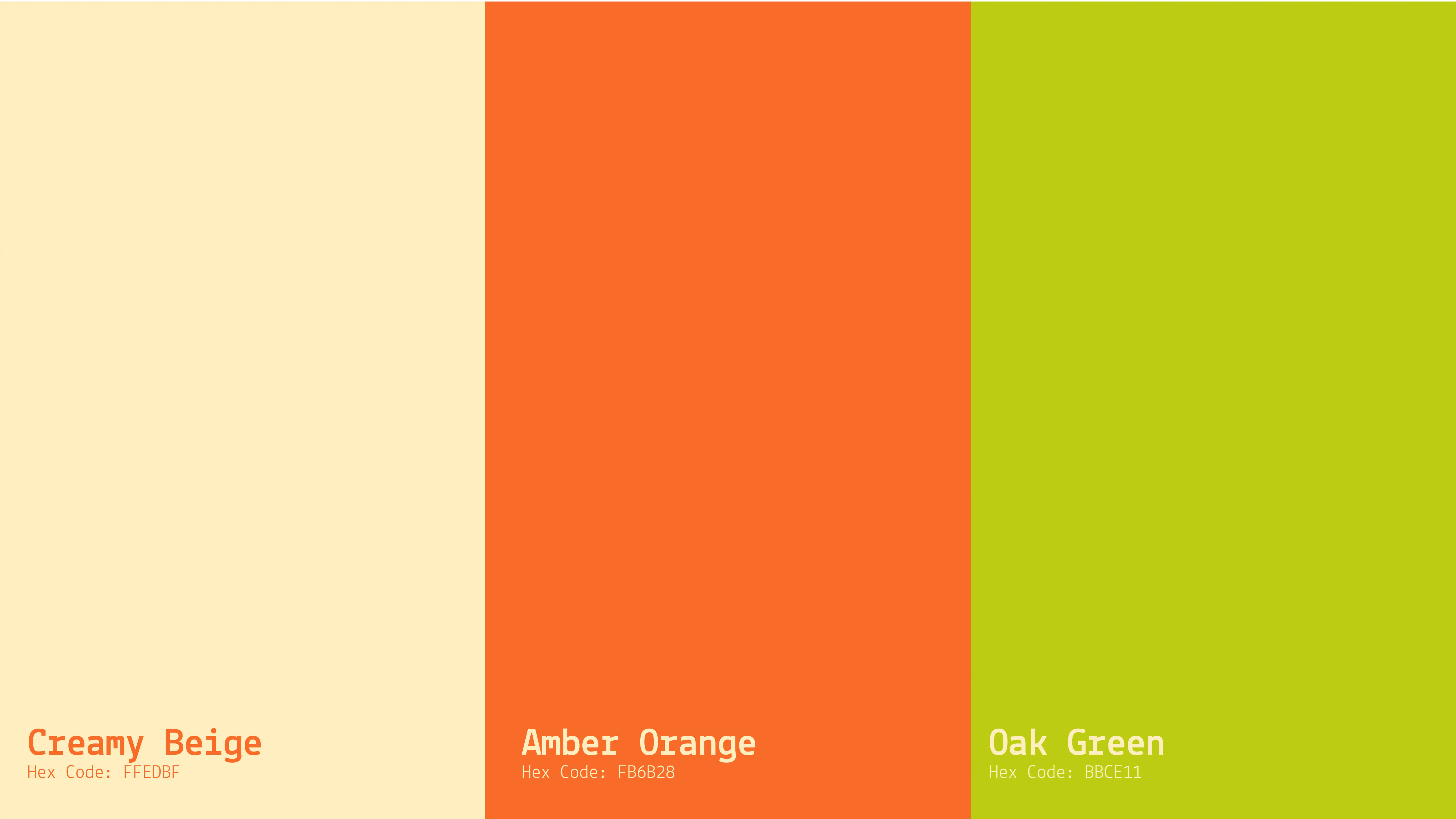
The Colors of Nature
The color palette is inspired by the richness of nature, grounding the brand in its artisanal roots:
Amber Orange: A warm hue that reflects the brand's heritage and craftsmanship.
Oak Green: A natural, earthy tone symbolizing connection to the environment.
Creamy Beige: A neutral shade that balances the vibrancy of the palette and conveys a sense of calm and simplicity.
These colors work in harmony to evoke feelings of warmth, nature, and timeless elegance.
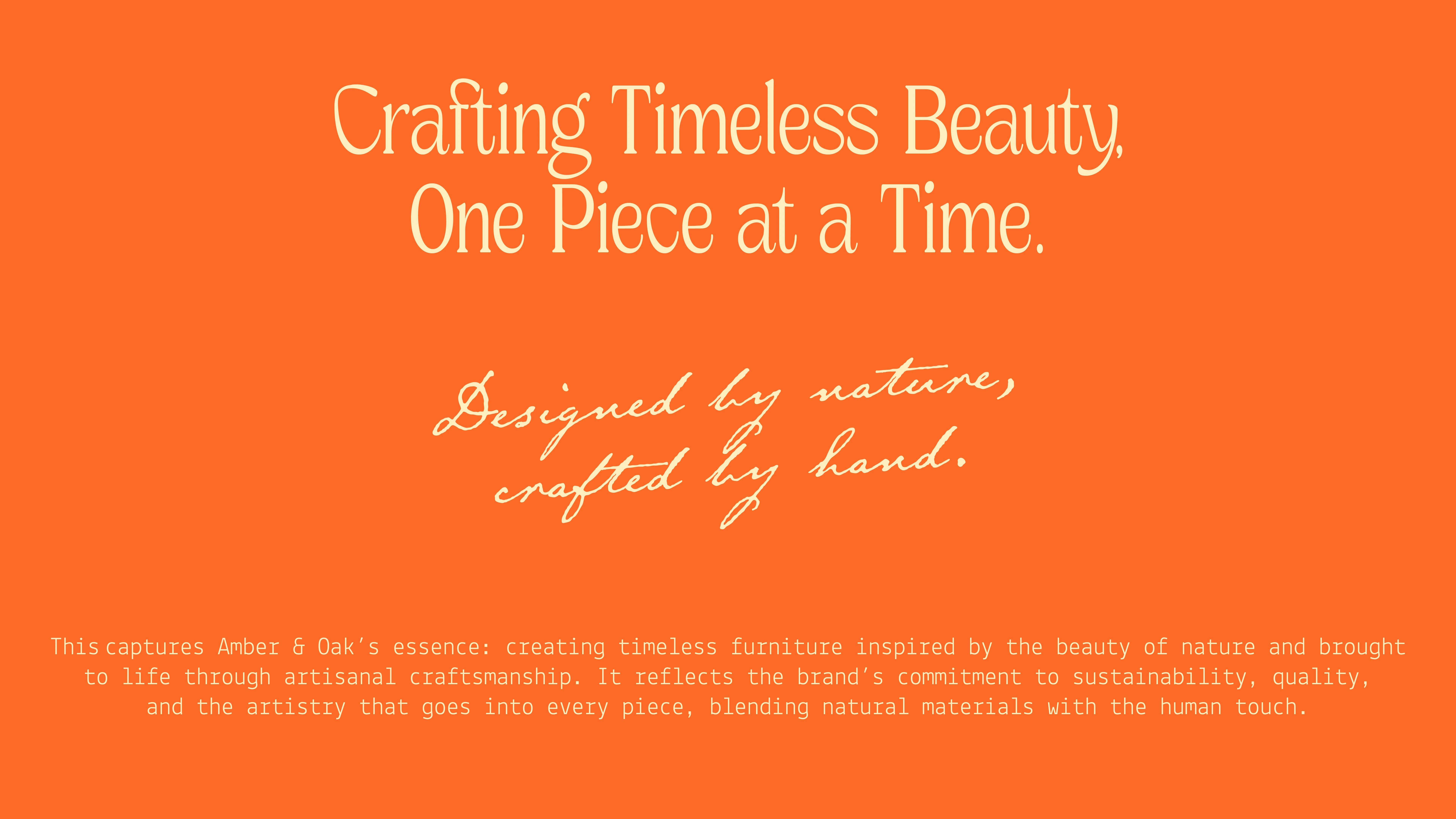
Words in Perfect Harmony
The typography for Amber & Oak combines two typefaces, each selected to enhance the brand’s narrative:
Header Typeface (Dx Nacky): A classic serif font with elegant curves to reflect the brand’s timeless nature and premium quality.
Body Typeface (Lekton): A clean, minimal sans-serif for readability and a modern touch, ensuring accessibility for the audience.
This thoughtful typographic system balances tradition and modernity, reinforcing Amber & Oak’s identity as a brand that bridges the past and present.
Bringing Stories to Life
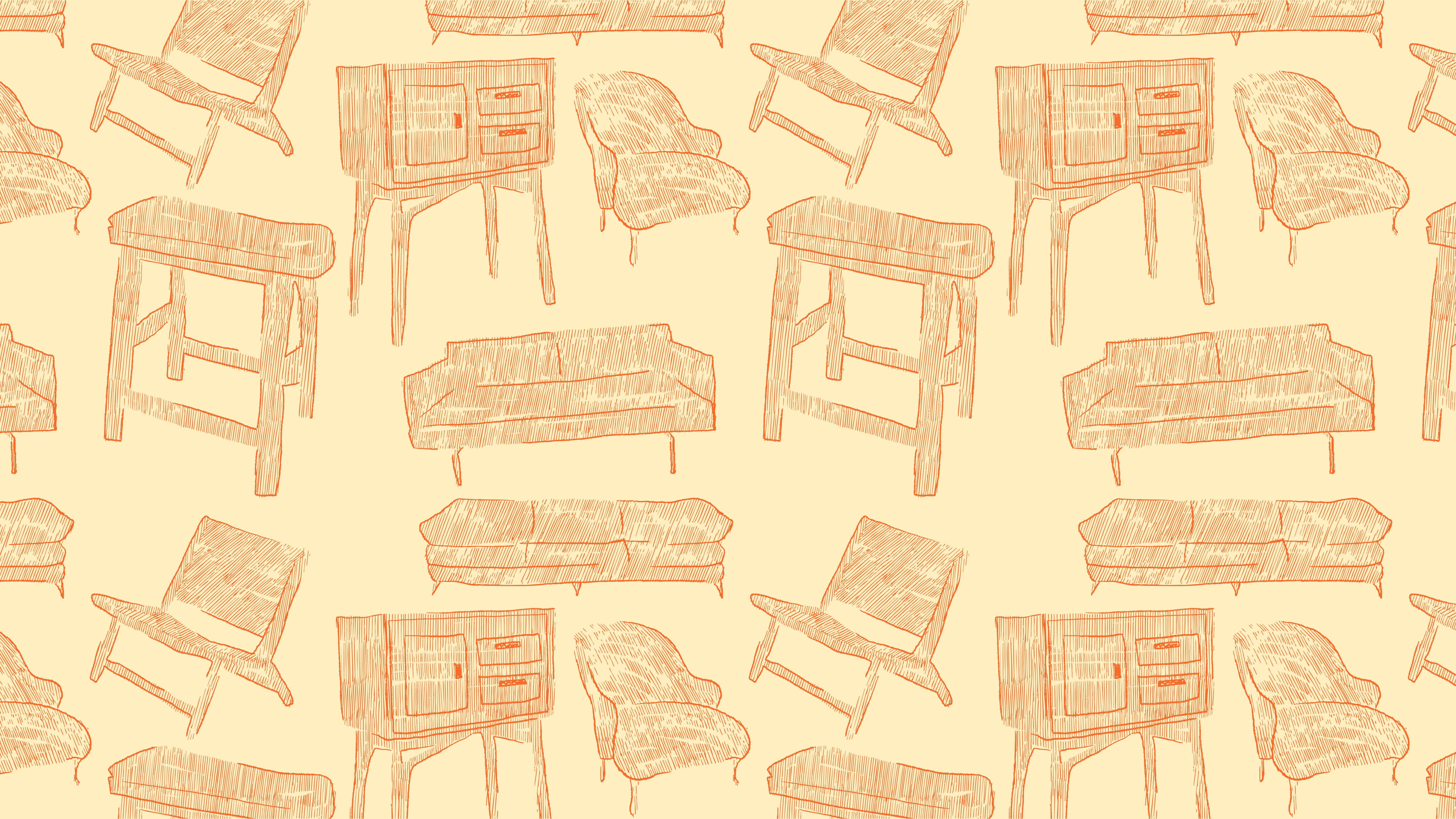
Custom hand-drawn illustrations are integral to Amber & Oak’s visual identity. The textured lines of furniture sketches echo the craftsmanship that goes into each piece. These illustrations add a layer of storytelling, celebrating the artistry and human effort behind the furniture.
Messaging that Resonates
Key messaging pillars emphasize craftsmanship, sustainability, and the beauty of slow living. Taglines such as "Artisanal Furniture for Mindful Living" and "Crafted by Hand, Designed by Nature" reinforce these values.
Reflections on Slow Living: The Designer’s Perspective
Working on Amber & Oak reinforced the value of mindfulness in design. Balancing tradition with innovation required a deep understanding of the brand’s essence and a commitment to its core values. Amber & Oak is more than a furniture brand—it’s a movement toward mindful consumption and sustainable living.
By blending heritage with modernity, Amber & Oak inspires customers to slow down and appreciate the beauty of the world around them. From the handcrafted furniture to the cohesive brand identity, every detail is a celebration of the beauty of slow living.
Like this project
Posted Feb 24, 2025
This project defines slow living and timeless craftsmanship with a handcrafted logo, earthy colors, thoughtful typography, and organic illustrations.