Hero Section Design for Trading Website

David Osamatie


Hero Section
The hero section was a big deal in the design on how the rest of the page's design will go. I had to ensure brand consistency with the colours, fonts, and many other things from their app to ensure brand consistency. So I carefully selected the color fade, I thought a dark mode would also be most befitting. Every design decision made here was research-based on how users interact with a trading website and carefully implemented. Lovely ✨ Let's work together.
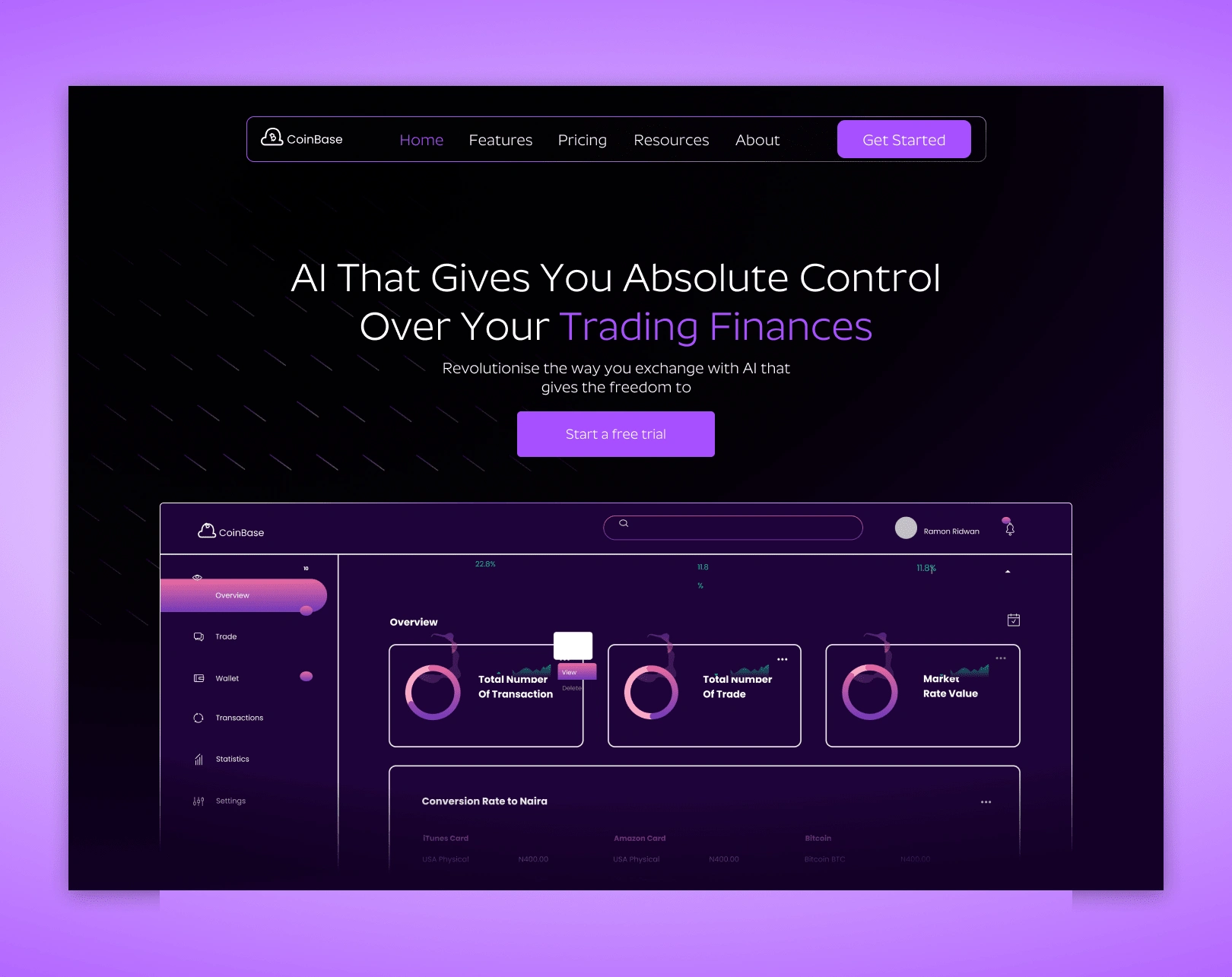
CoinBase Trading Website Landing Page Design
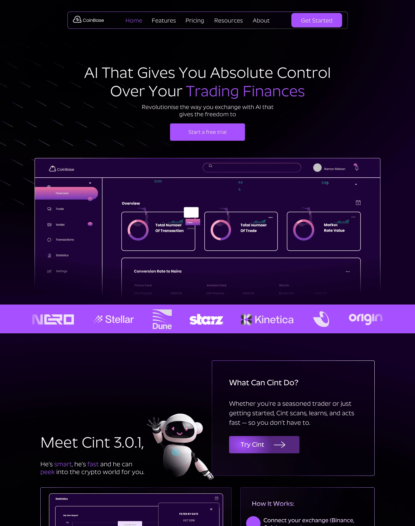
CoinBase Trading Website Landing Page Design, Hero section, Affiliated Brands section, Cint Character Introduction section
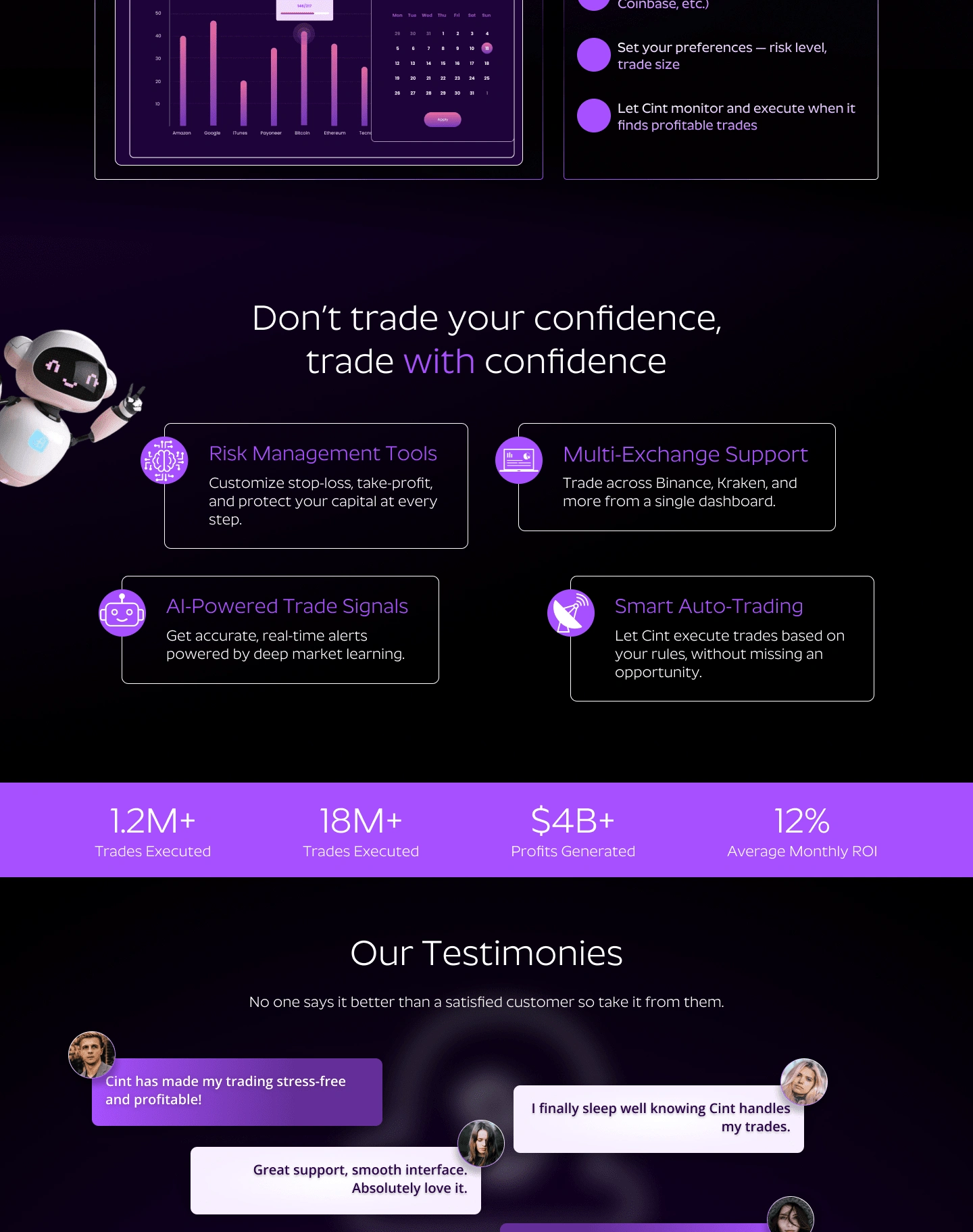
CoinBase Trading Website Landing Page Design, Features section, Testimonial section
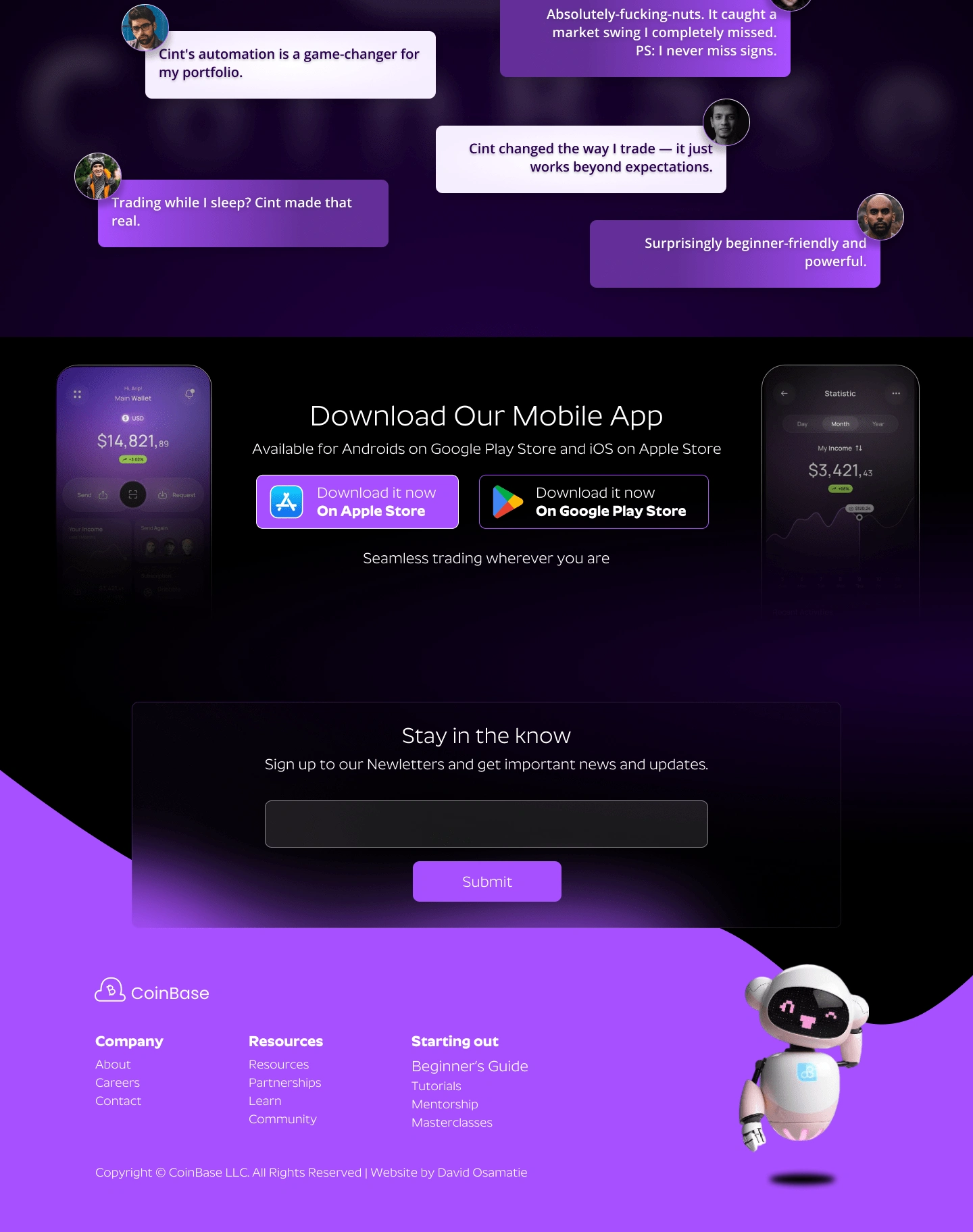
CoinBase Trading Website Landing Page Design, Testimonial section, Mobile app section, newsletter or lead magnet section, footer
Like this project
Posted May 2, 2025
CoinBase's character model inspired my design process—loved every creative moment. Need a standout website? Let’s build it together 🤝
Likes
0
Views
1
Clients
Coinbase


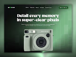
GreenCam Hero Redesign
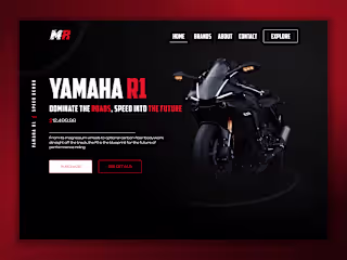
Yamaha R1 Motorcycle Hero Section Design
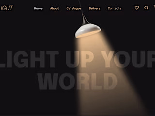
Slight Lighting Home Design and Animation
New Balance Hero Design and Animation — UI/UX + Prototyping