Built with Framer
Dokeynot CRM Website

Septimiu Cotoi


Process
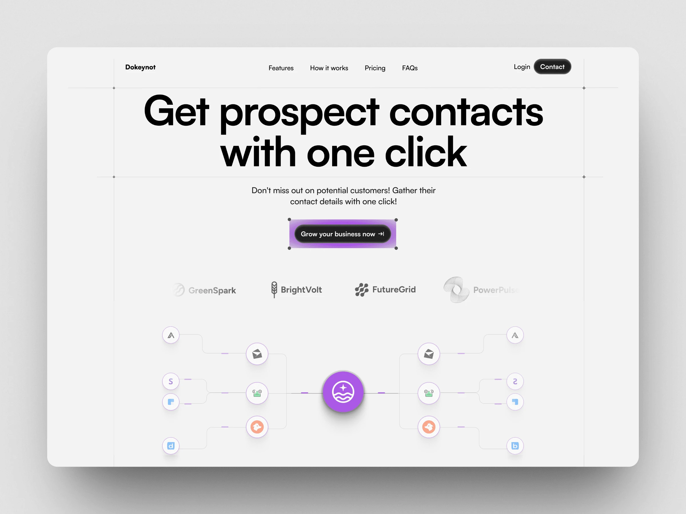
• Understanding the Problem:
The old version was packed with info but didn’t guide users clearly. It felt a bit outdated and didn’t reflect the product’s smart, modern features.
• Design & Structure:
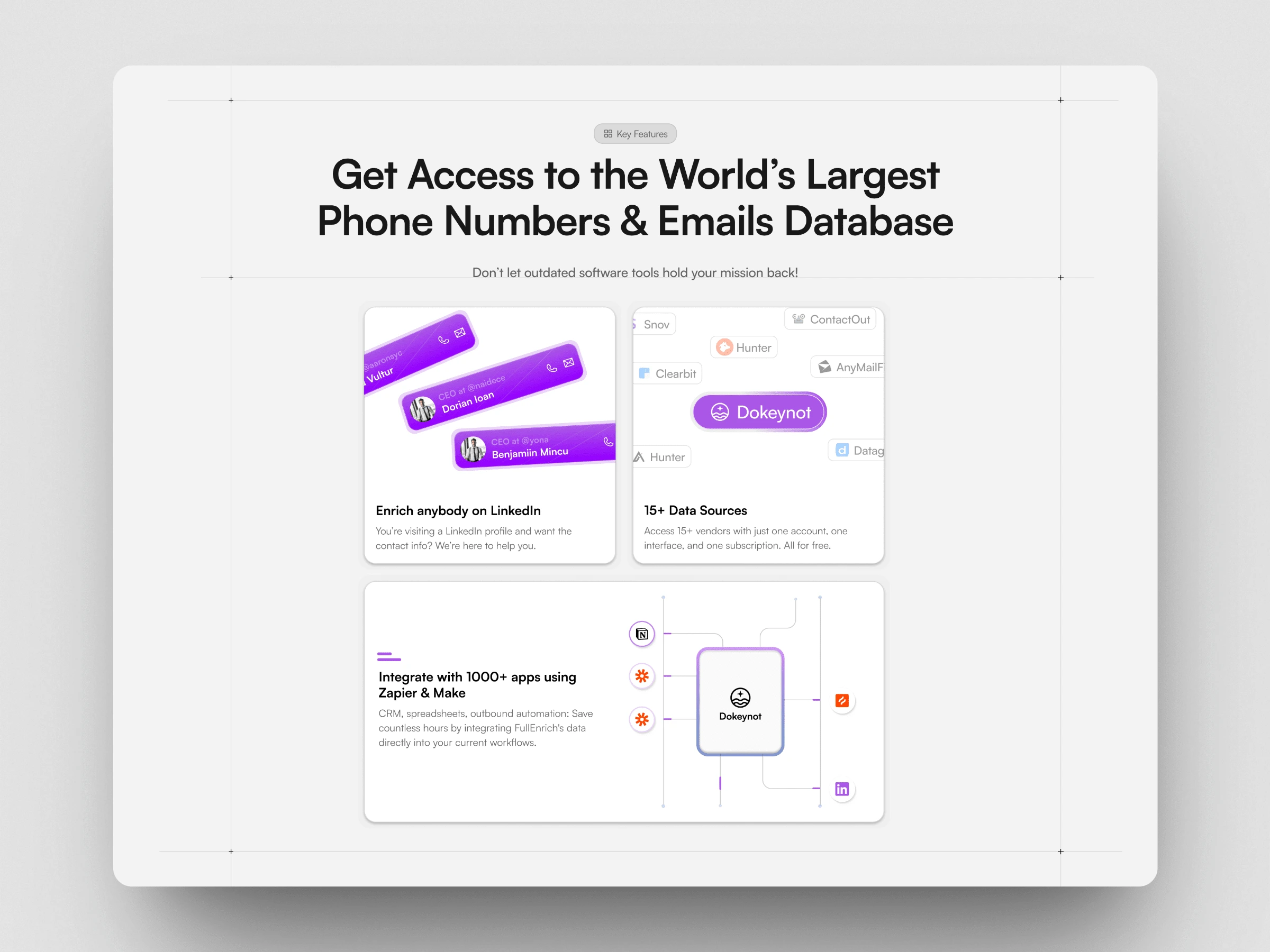
I redesigned the landing experience to feel bold, simple, and trustworthy. I used large, clear headlines and added friendly visuals to show how the product works. I also made sure the call-to-action stood out so users know exactly where to click.
• UX Improvements:
I simplified the layout and improved the way features are explained. Now it’s easier to see what the tool does and how it helps without scrolling through too much text.
Results
• A cleaner, more modern look that feels professional and trustworthy
• Clear messaging that helps users understand the value quickly
• A smoother user experience that leads to better engagement and more sign-ups
Like this project
Posted Apr 9, 2025
This project was all about redesigning a CRM landing page to make it more modern, clear, and conversion-friendly.
Likes
0
Views
11


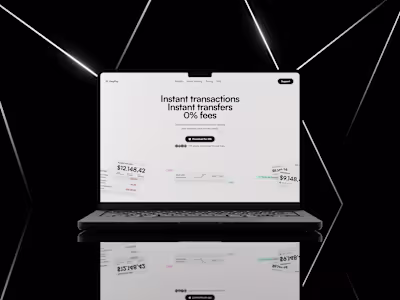
Crypto Hero Section
teach:able - Redesign Landing Page
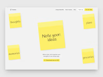
MyNote - Landing page for mobile app
EasyPay - Landing Page for mobile banking