Web Redesign — Two Projects, One Approach

natalia moin fanner


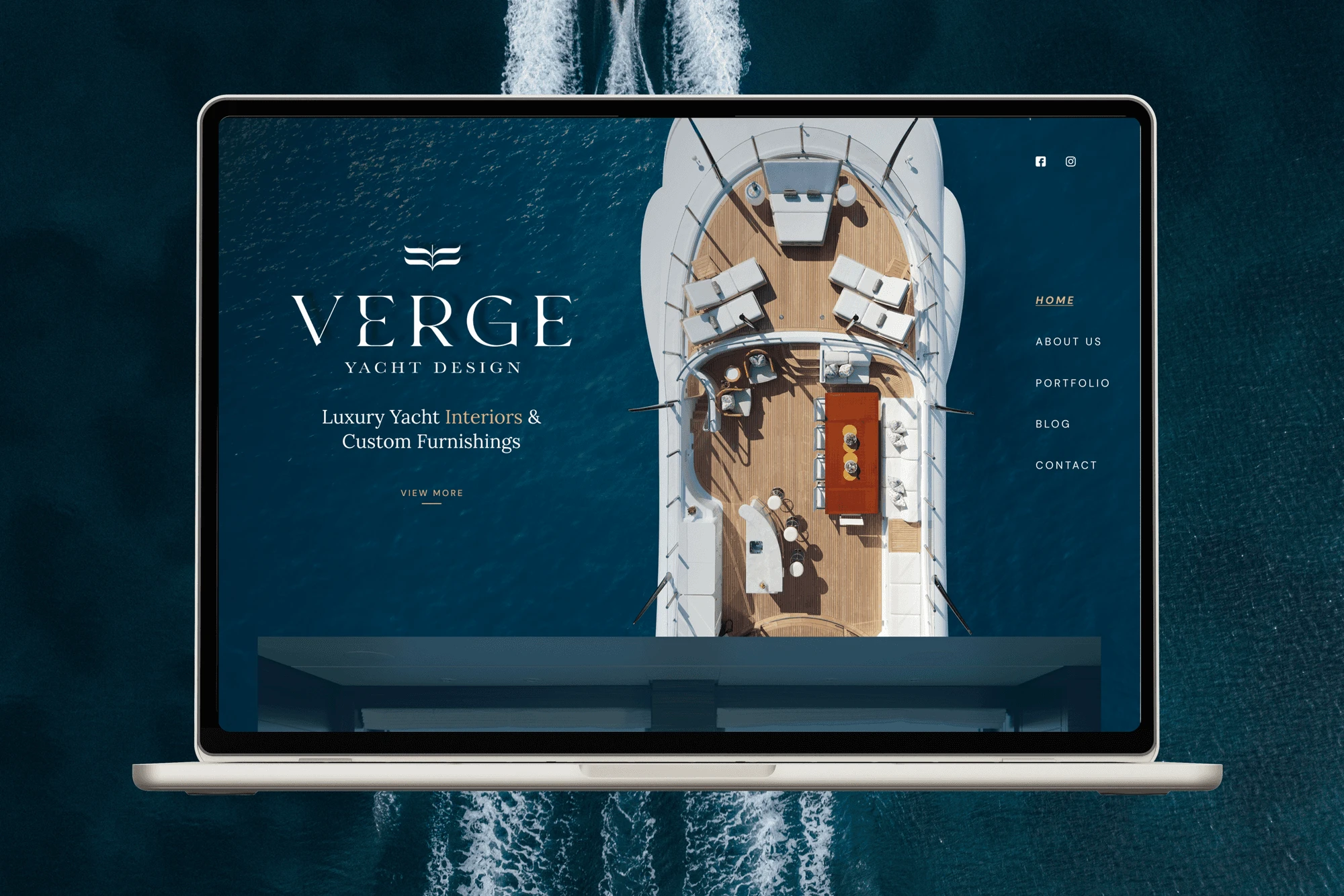
Two projects. One approach: design that serves real people
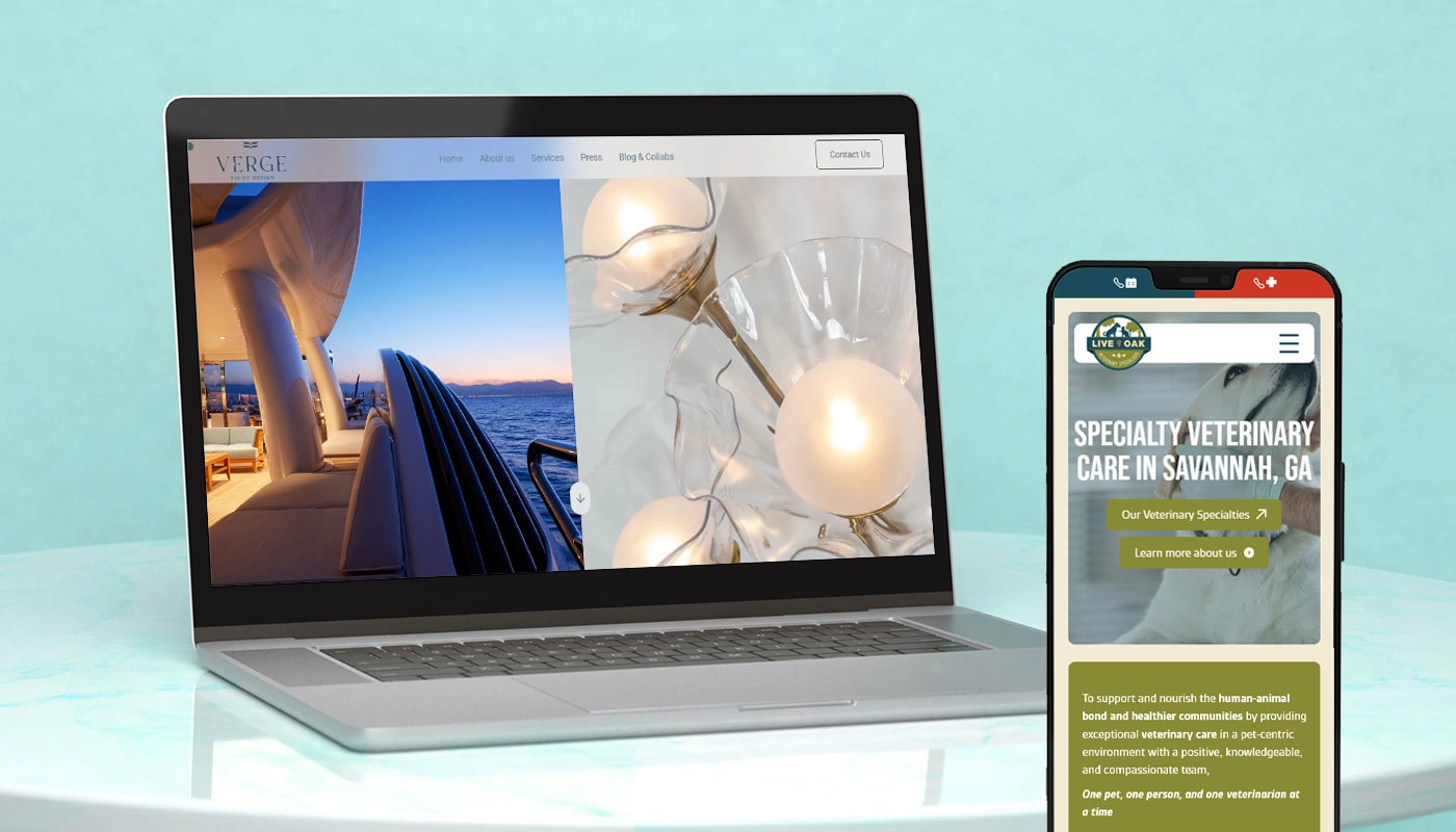
Web Design · Brand Communication · UX Strategy
Year: 2025
Industry: luxury yacht interior studio
Client: VERGE YACHT DESIGN
Project Duration: 6 Months
The challenge
Verge had strong branding but a website that worked like a mood board, beautiful imagery, no defined services, no clear audience. For a luxury yacht interior studio, the site needed to communicate authority and expertise, not just aesthetics.
Old website
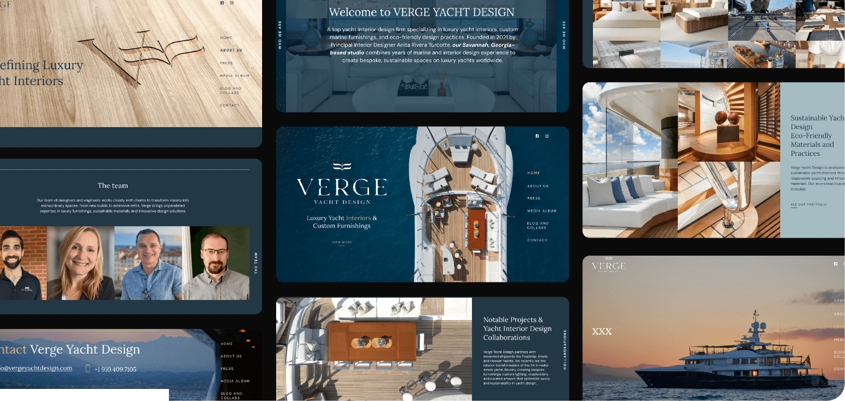
Key decisions
Audience shift: Moved the visual language toward a masculine, high-end register. Luxury that means business.
Structure: Rebuilt around what the client needed to sell: services first, then credibility, then contact.
Service definition: Added explicit service categories (Naval Architecture, Conceptual Design, Project Management, Marine Logistics), none clearly communicated before.
Phase 2: A year later, Verge returned. Added motion and animations, tightened reading fields, updated content to reflect new collaborations and industry positioning.
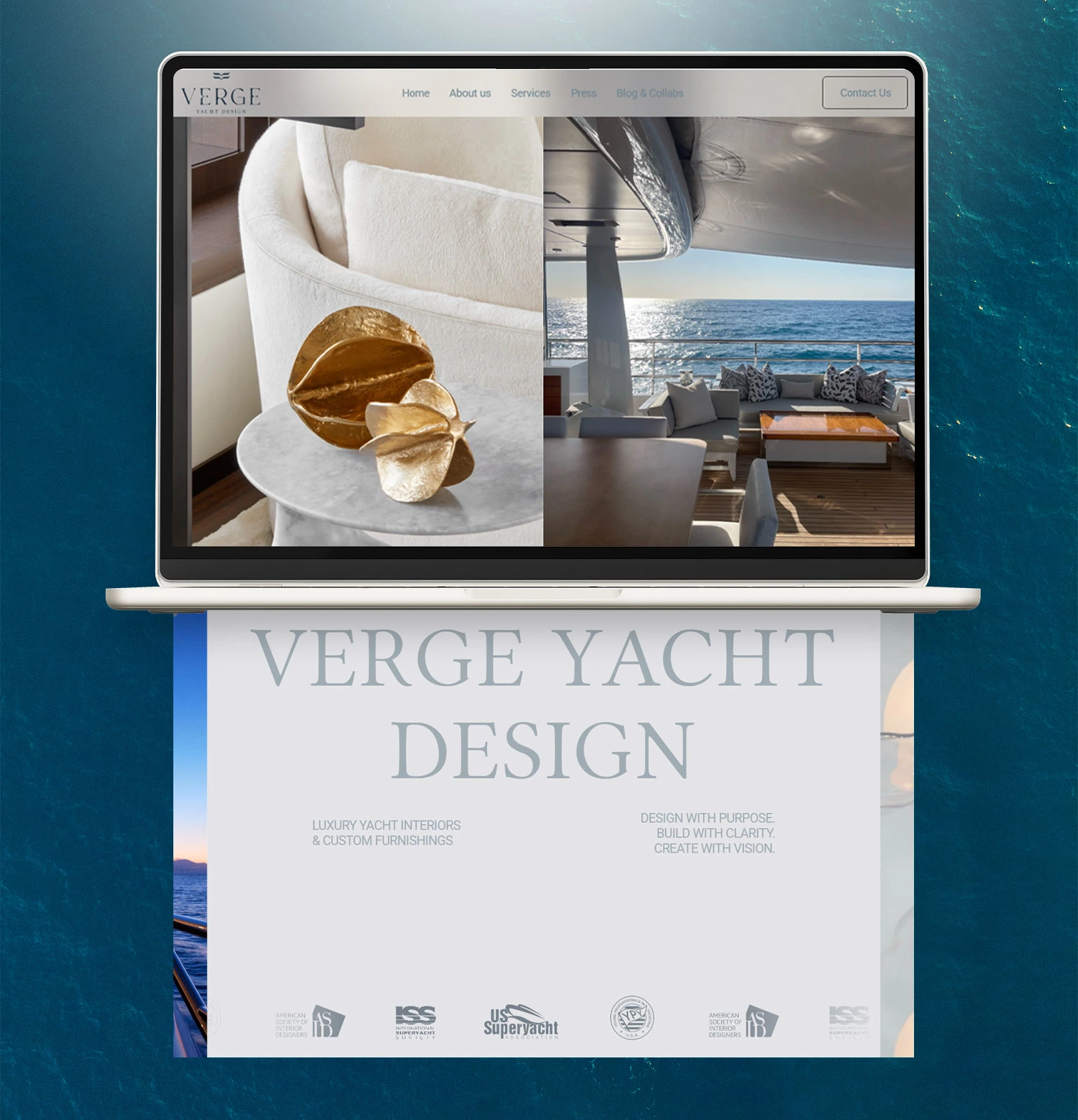
Result
A site that communicates who Verge is, what they do, and who they do it for, in the first scroll. The studio has since co-presented a major US superyacht industry event.
Web Design · Information Architecture · UX
Year: 2025
Industry: VETERINARY CLINIC
Client: Live OAK
Project Duration: 6 Months
The challenge
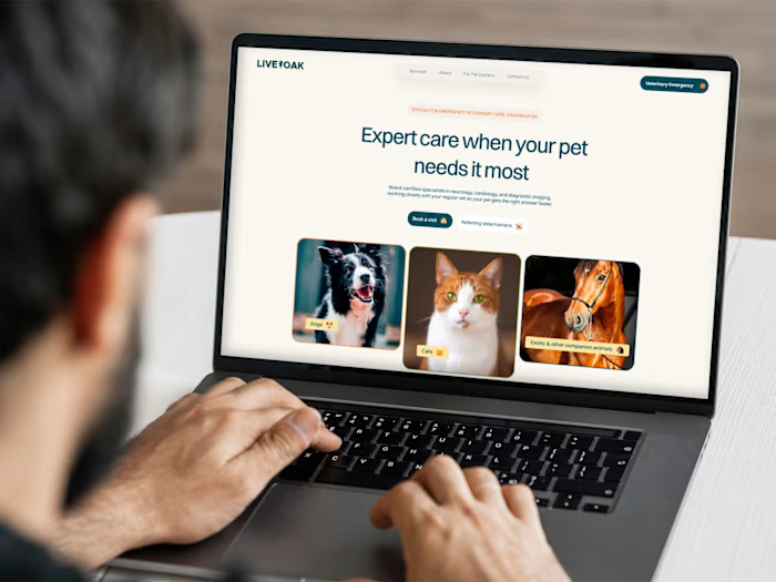
The clinic had no functional website, no services listed, no contact information structured for urgency, no way for users to find what they actually needed. For a medical service, that's not just a design problem. It's a trust problem.
The design problem
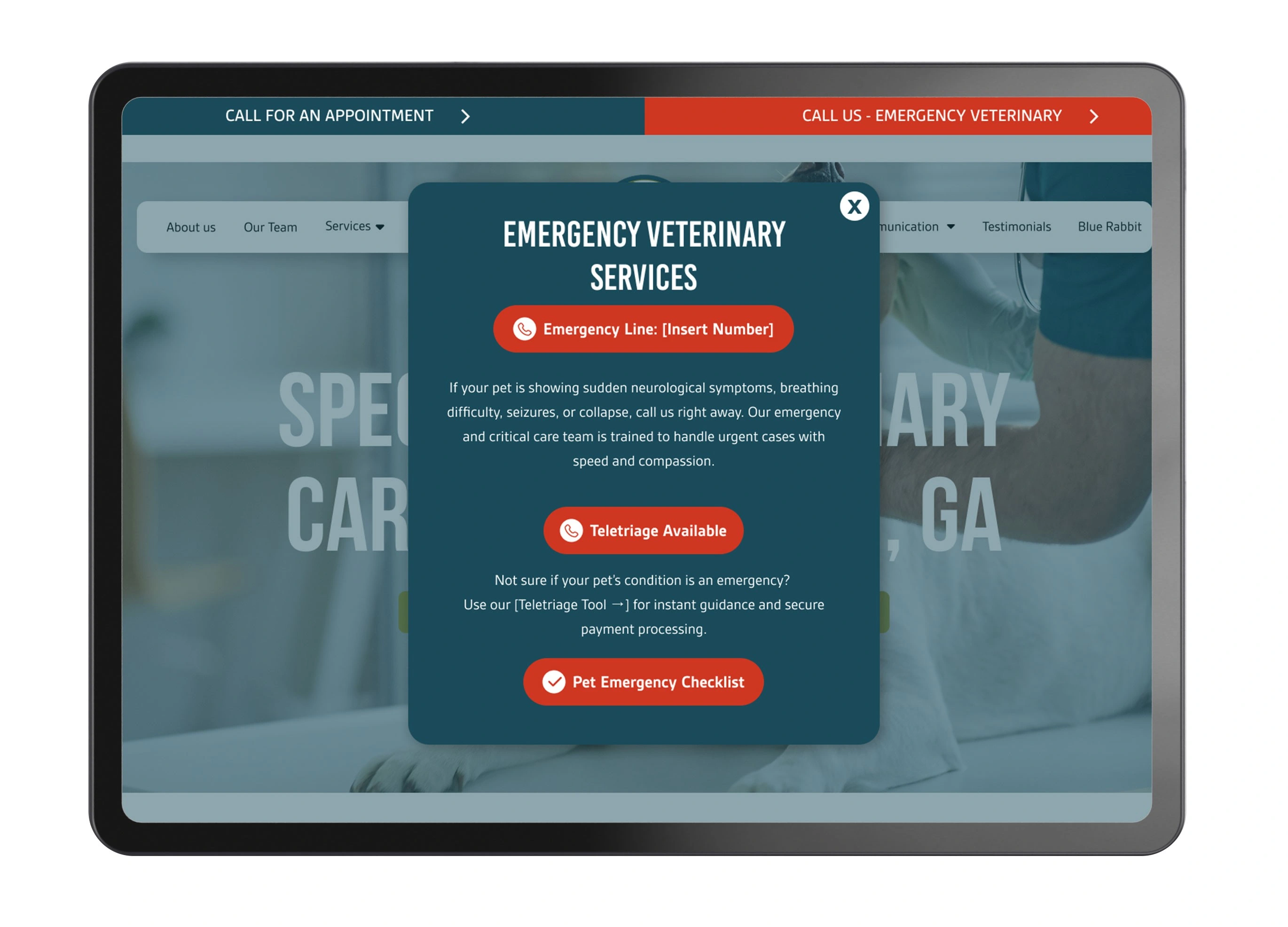
A veterinary website serves people in very different emotional states, from casual browsing to genuine emergency. The information architecture had to work for both, without making either feel secondary.
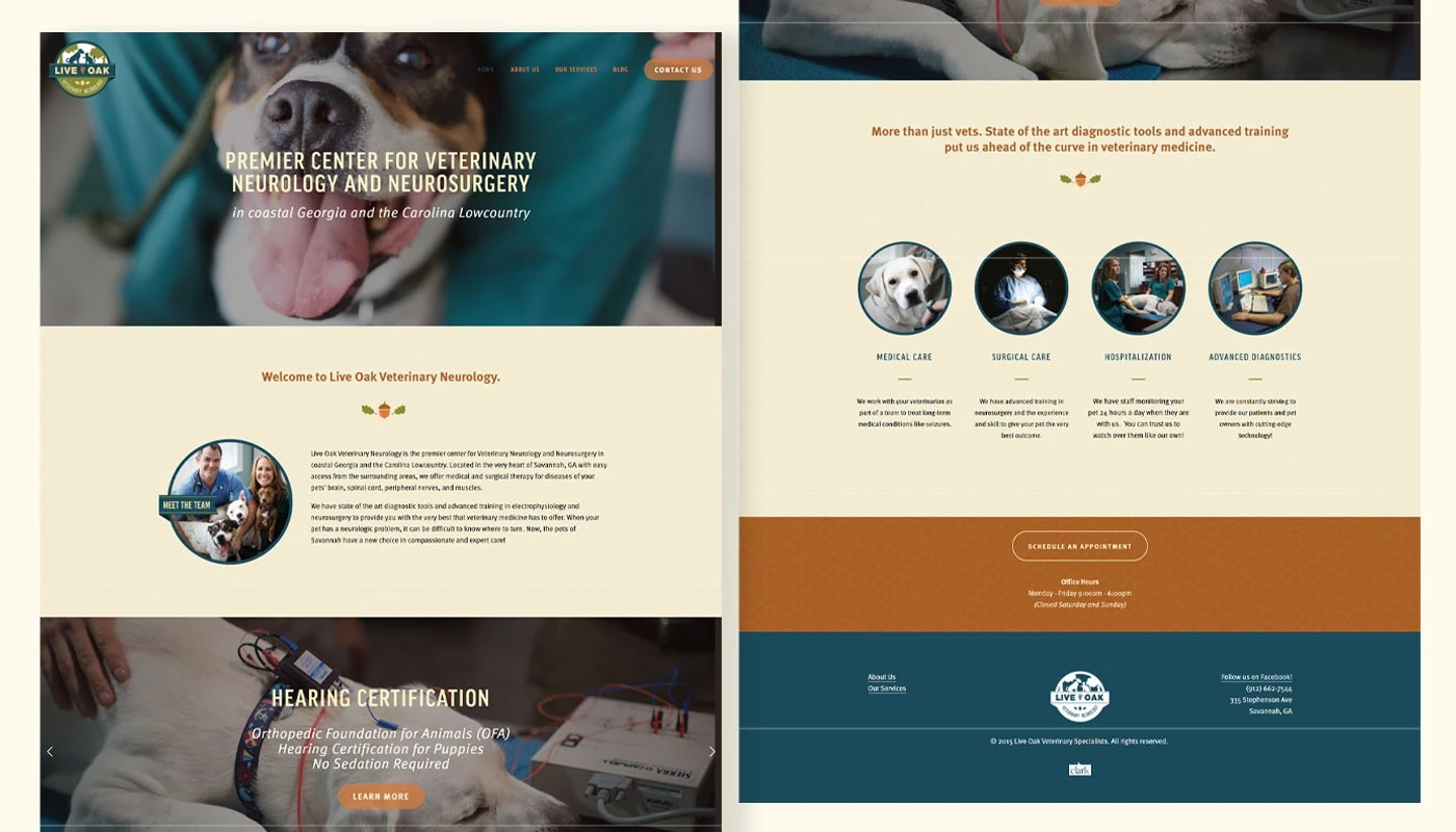
Old website
Key decisions
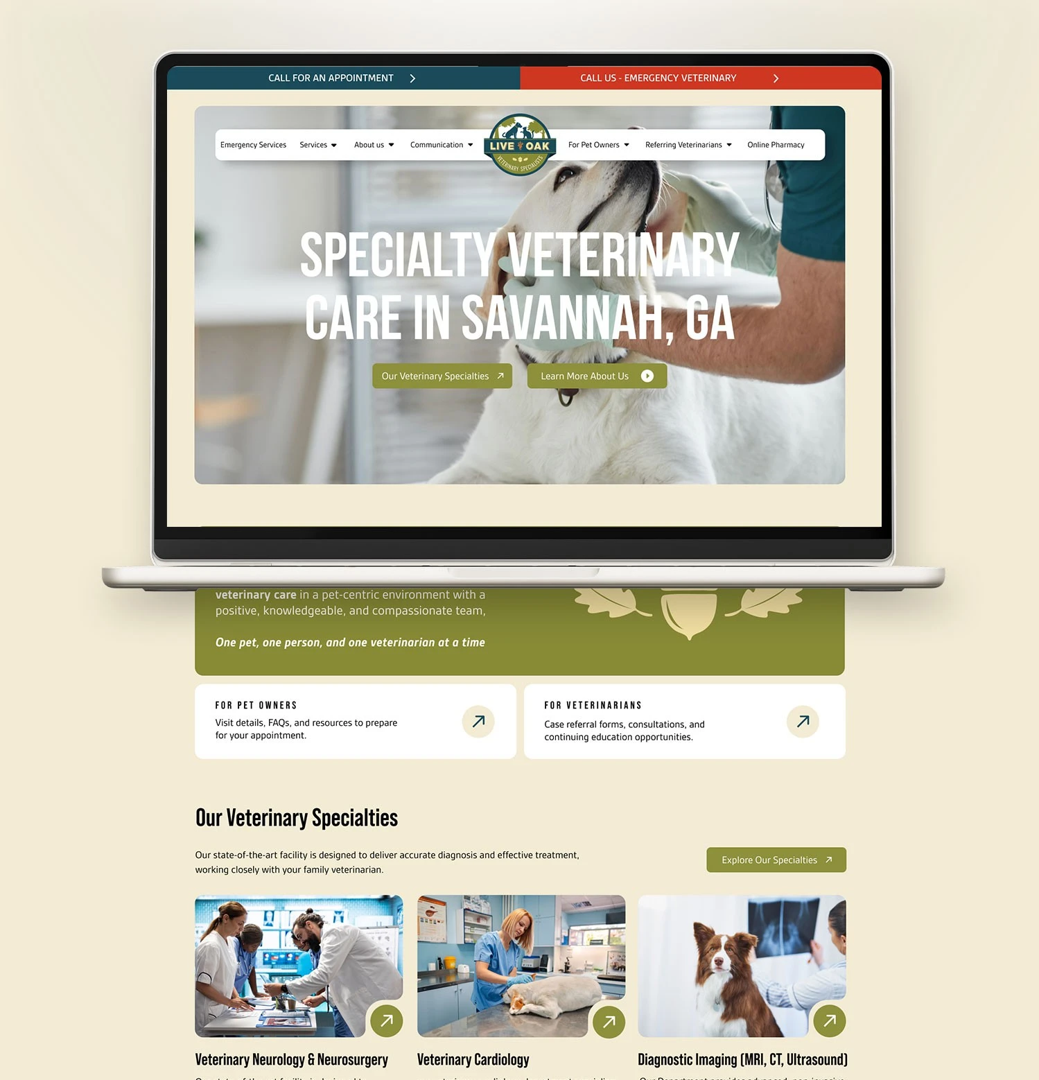
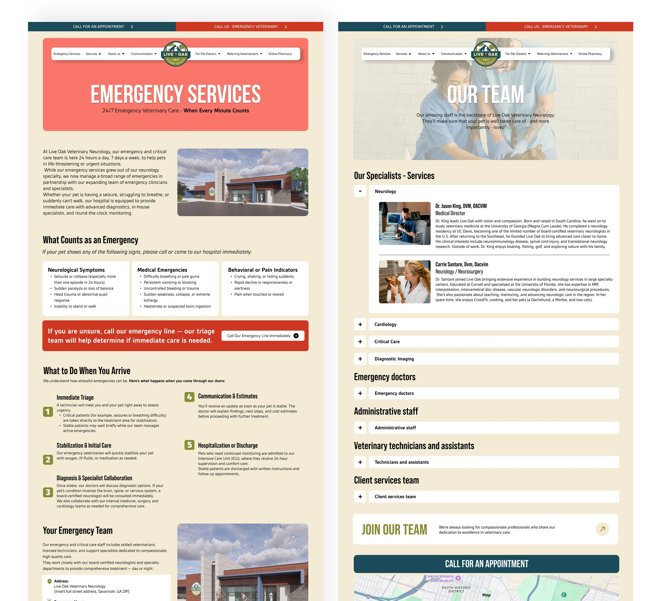
Emergency first: The most critical decision was structural. Emergency contact numbers surface immediately, before services, before about us, before anything else. A user with a sick animal at 3 AM shouldn't have to search.
Service architecture: Organized all services into dedicated pages with their own structure, making it easy to find specific care without navigating through generic content.
Meet the team: Designed a full professionals page showing each vet's name, photo, and specialties. Patients can request specific doctors by name, humanizing a clinical experience.
Blog & tutorials: Built a complete resource section with guides and tutorials for common situations. Helps users solve minor issues independently, and build trust before they ever book an appointment.
Appointment forms: Integrated booking forms directly into relevant service pages, reducing friction between "I need this" and "I booked this."
Result
A website organized around how people actually use a veterinary service, not around how the clinic thinks about itself. Every section has a clear job to do.
Like this project
Posted May 20, 2026
Web redesigns for a luxury yacht studio and a veterinary clinic focusing on usability and audience needs.