Main Squeeze: A Burst of Flavor in Design
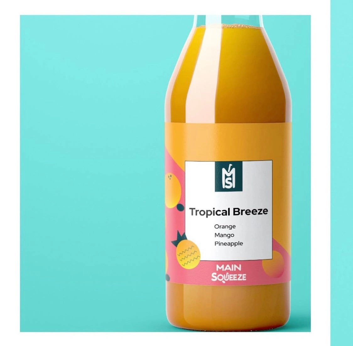
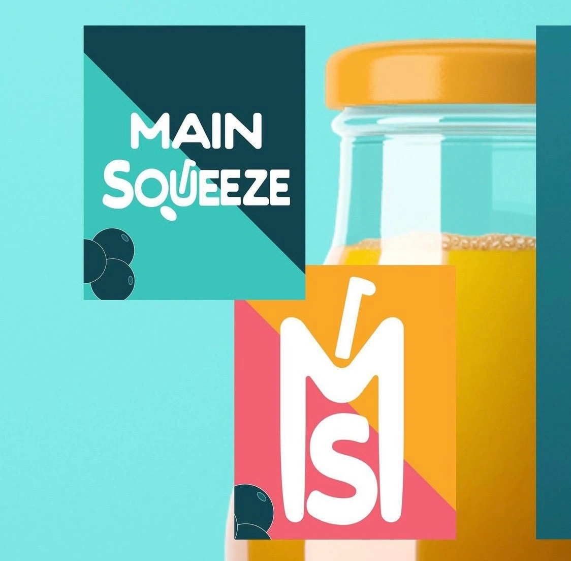
Main Squeeze, is a vibrant juice company that delivers a refreshing explosion of flavor and color. In collaboration with this dynamic brand, I had the opportunity to craft both their distinctive logo and eye-catching bottle packaging designs, infusing each element with the essence of Main Squeeze's zestful spirit.
To encapsulate the brand's vitality and vitality, we chose a palette of vibrant oranges, blues, yellows, and pinks. The logo itself is an embodiment of a citrusy burst—a visual symphony of flavors and colors that whet the appetite and evoke a sense of freshness.
The font selection was a critical aspect of the logo's design. We opted for a playful yet modern typeface that communicates both approachability and professionalism. The curvaceous lines of the lettering mimic the organic shapes found in nature, further enhancing the connection to the natural goodness of Main Squeeze's products.
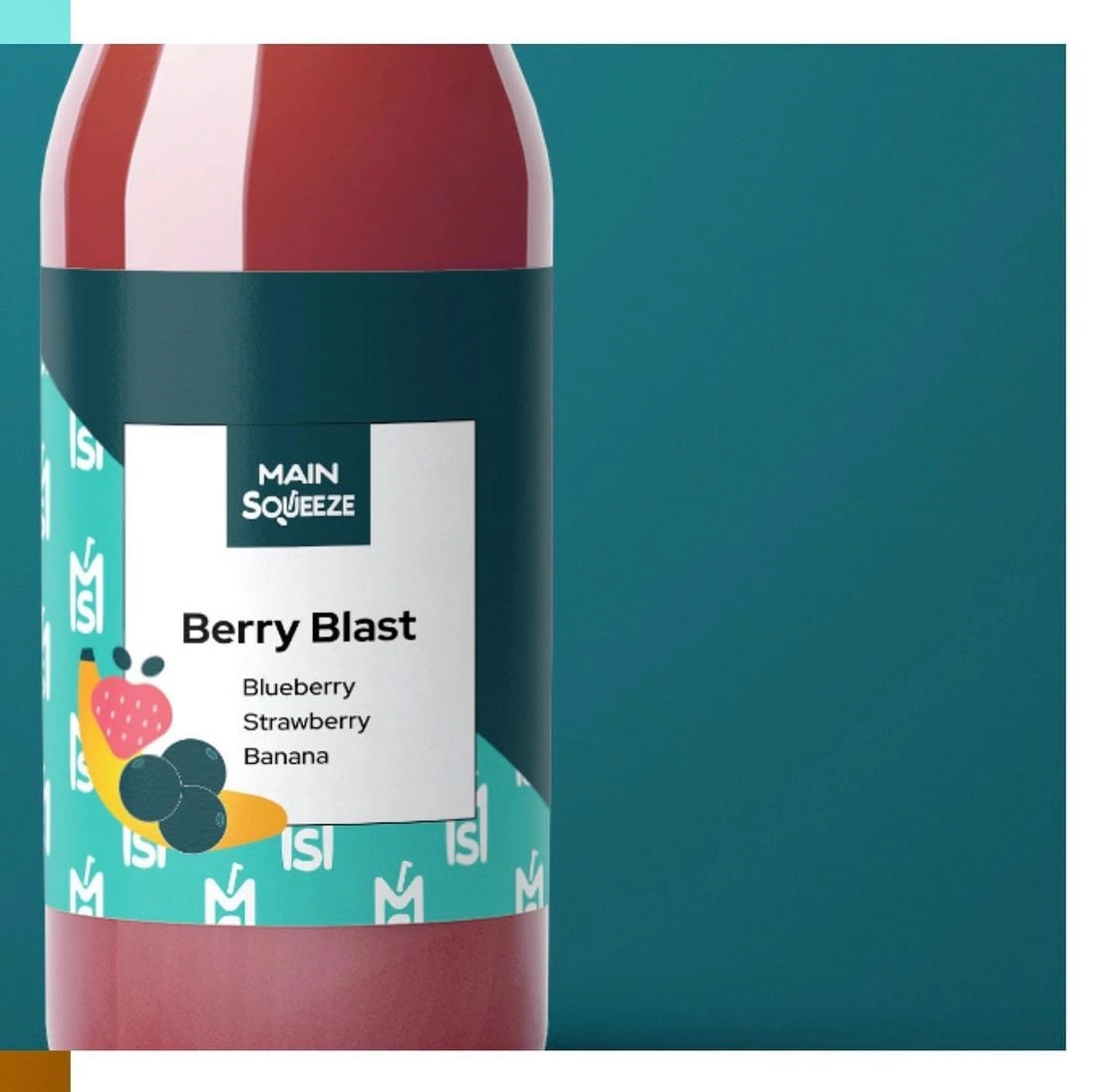
The packaging design harmoniously combines the playful elements of Main Squeeze's logo with clean, modern aesthetics. The incorporation of citrus illustrations, artfully placed, reinforces the company's commitment to using only the freshest ingredients. The textures and gradients in the design not only enhance visual appeal but also engage the sense of touch, adding an extra layer of sensory delight.
Like this project
Posted Sep 11, 2023
Logo and Packaging Design for a fruit juice brand

