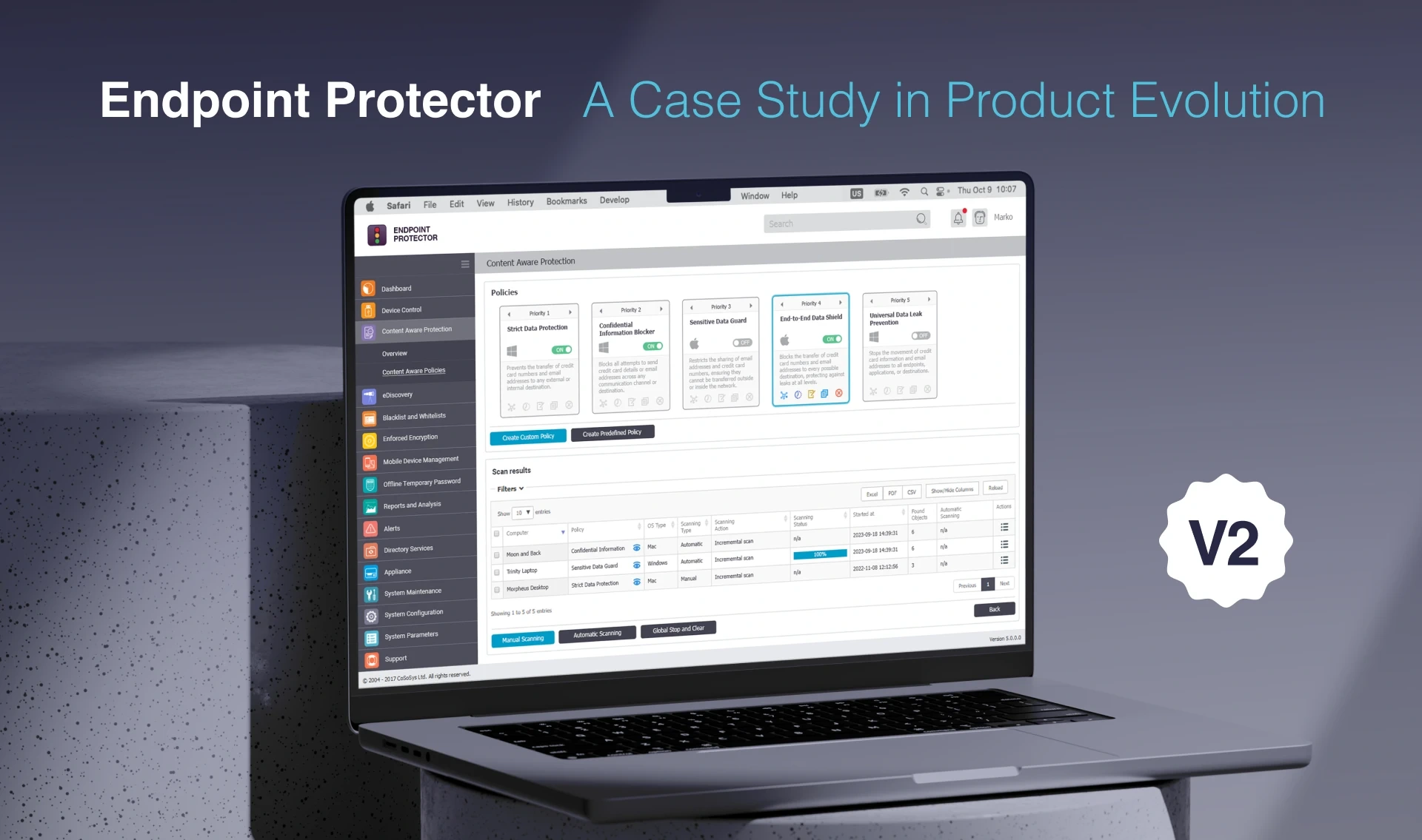
Endpoint Protector V2: A UX/UI Redesign Case Study
Tihamér Török

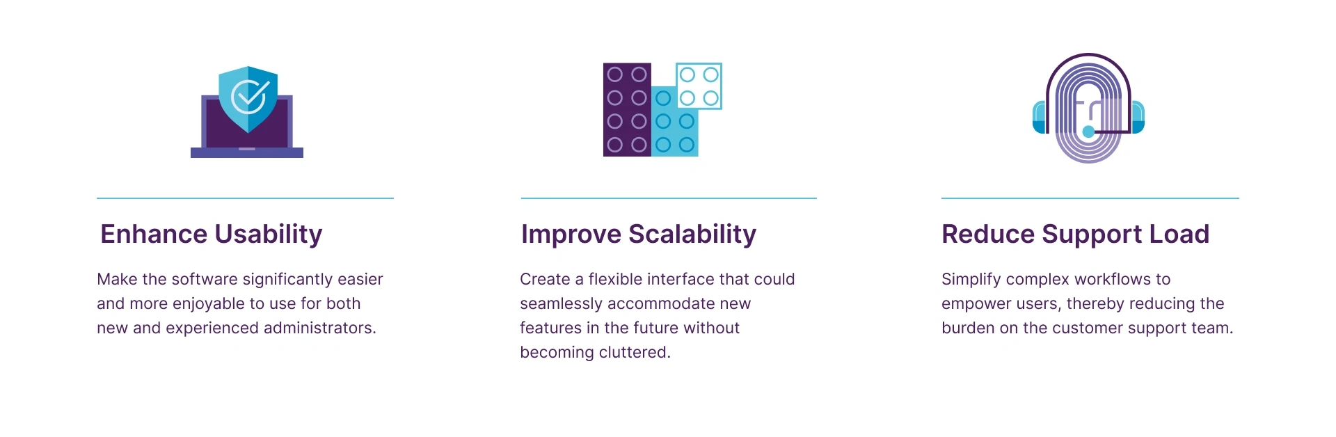
Key Business Goals
To guide the redesign, we set clear business objectives that were focused on both user satisfaction and business efficiency

My Process
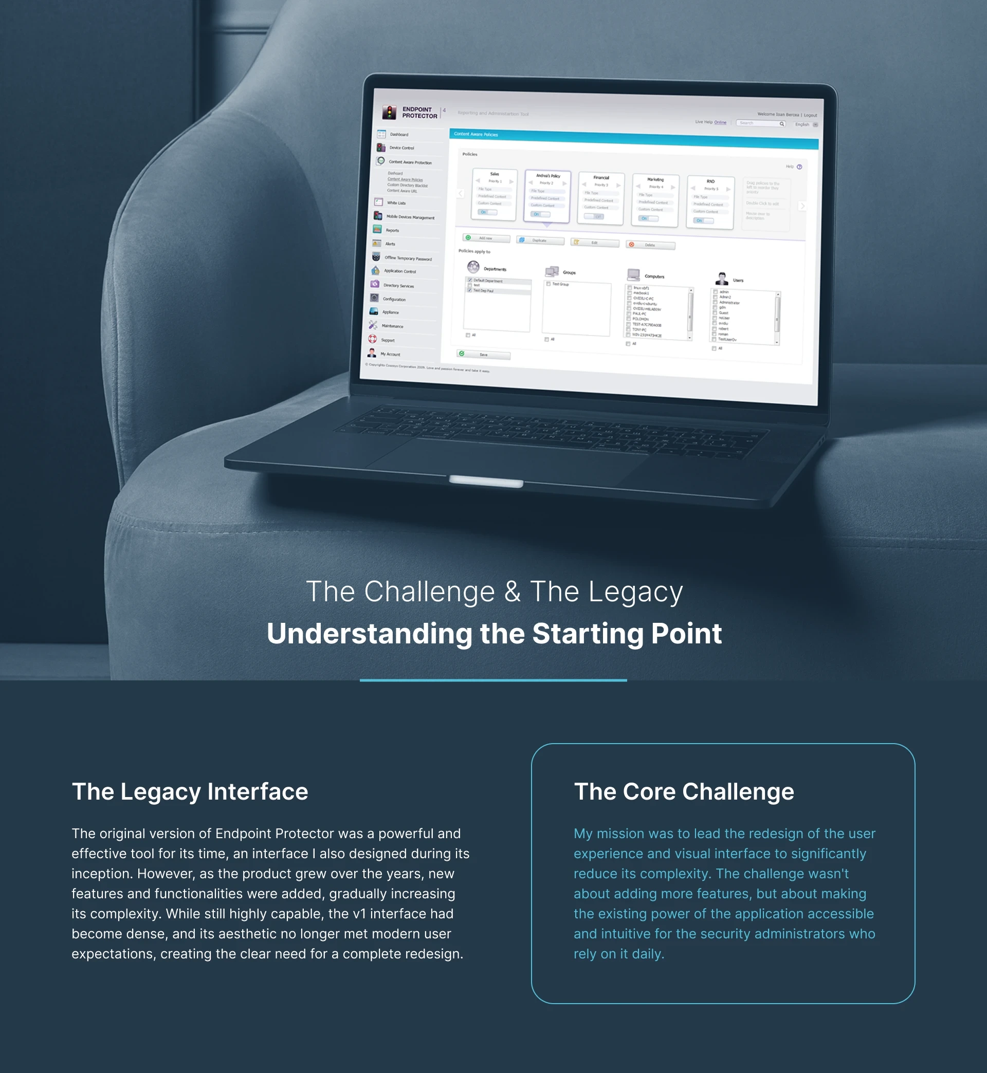
From User Insights to a Simplified Solution
User Research
To guide the v2 redesign, we moved beyond assumptions and partnered directly with several of our largest enterprise clients. We conducted a series of feedback sessions with their IT and security engineers—the people who use Endpoint Protector every day.
Initially, our discussions focused on potential new features. However, their feedback was clear and consistent: their biggest challenge wasn't a lack of features, but the complexity of the existing product. This crucial insight shifted our entire focus from adding functionality to radically simplifying the core user experience.
"Their feedback was clear: the biggest challenge was the complexity of the existing product."
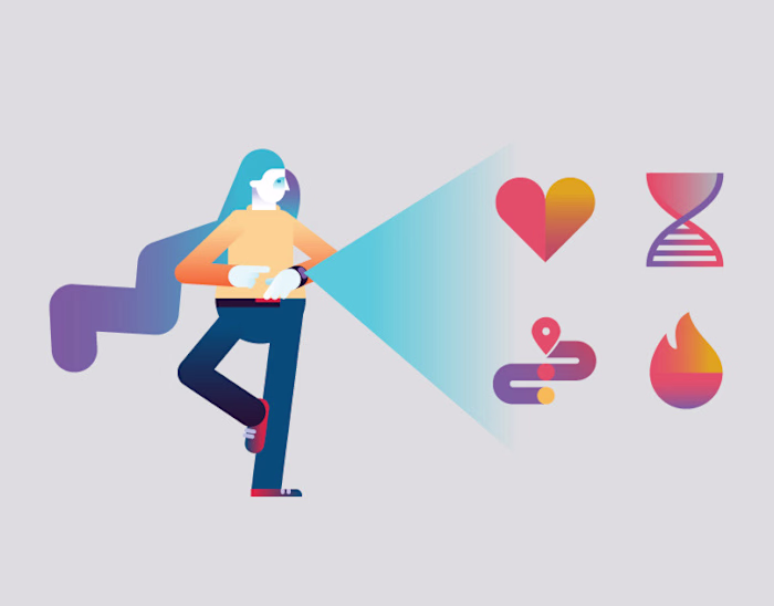
To humanize the problem and maintain focus on our users' needs, we developed a persona based on our research.
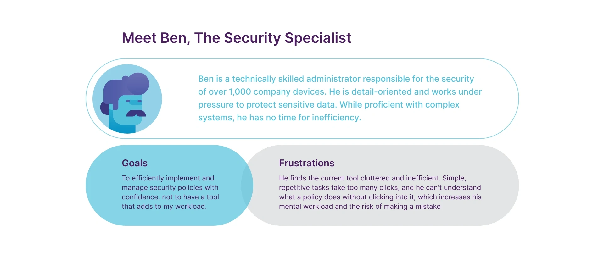
We mapped out Ben's journey of creating and applying a security policy to pinpoint specific moments of friction and identify key opportunities for improvement.
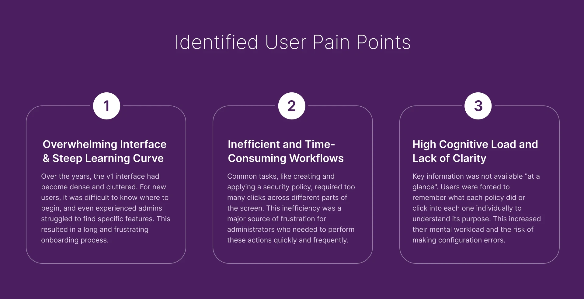
Pinpointing Friction in the User Journey

Digital Wireframes
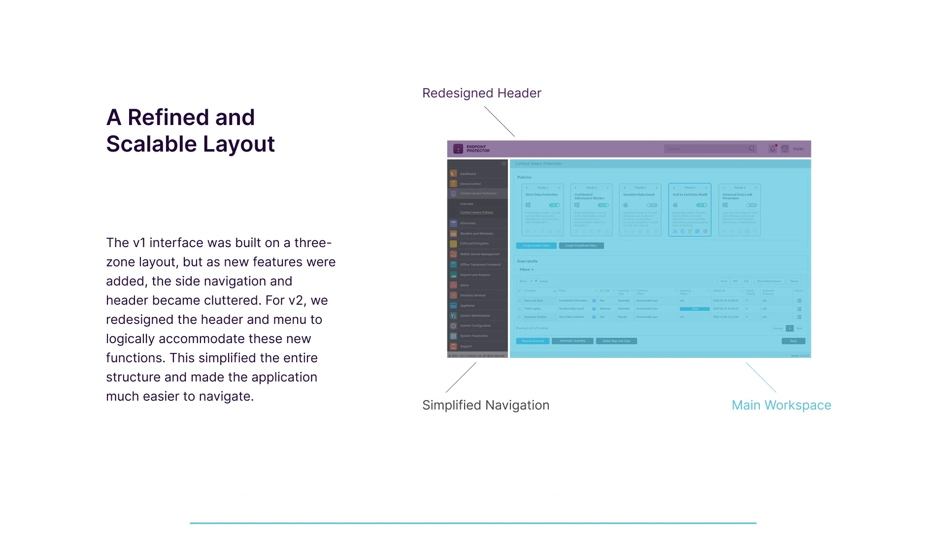
The best ideas from sketches were refined into digital wireframes to establish the final structure and user flows, focusing on a cleaner, more intuitive experience.

From Confusion to Clarity
The Redesigned Policy Cards
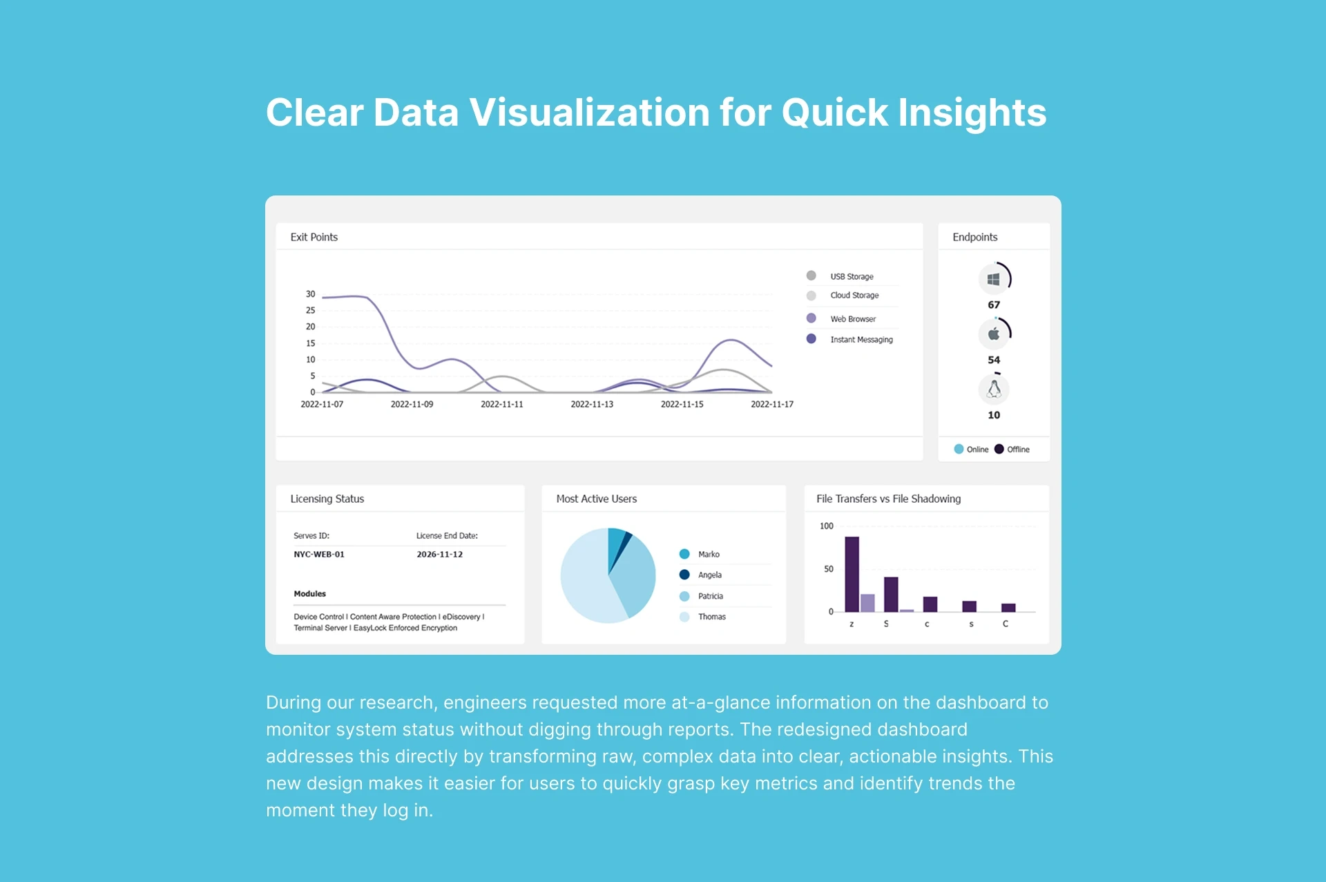
One of the biggest sources of user frustration was the lack of at-a-glance information. The policy cards became a mini case-study in solving this problem.
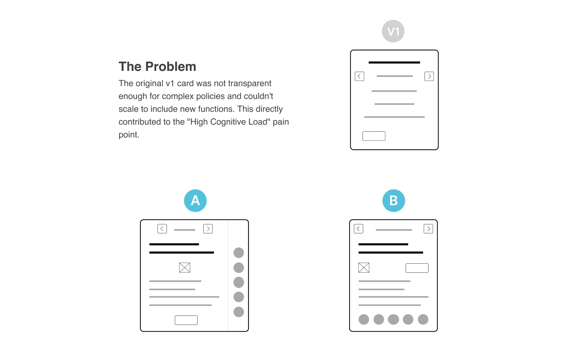
The Exploration
We explored and tested two distinct versions with our client engineers. Version A aimed for clarity with text but felt unbalanced , while Version B, an icon-driven approach, was info-dense but still lacked organization.
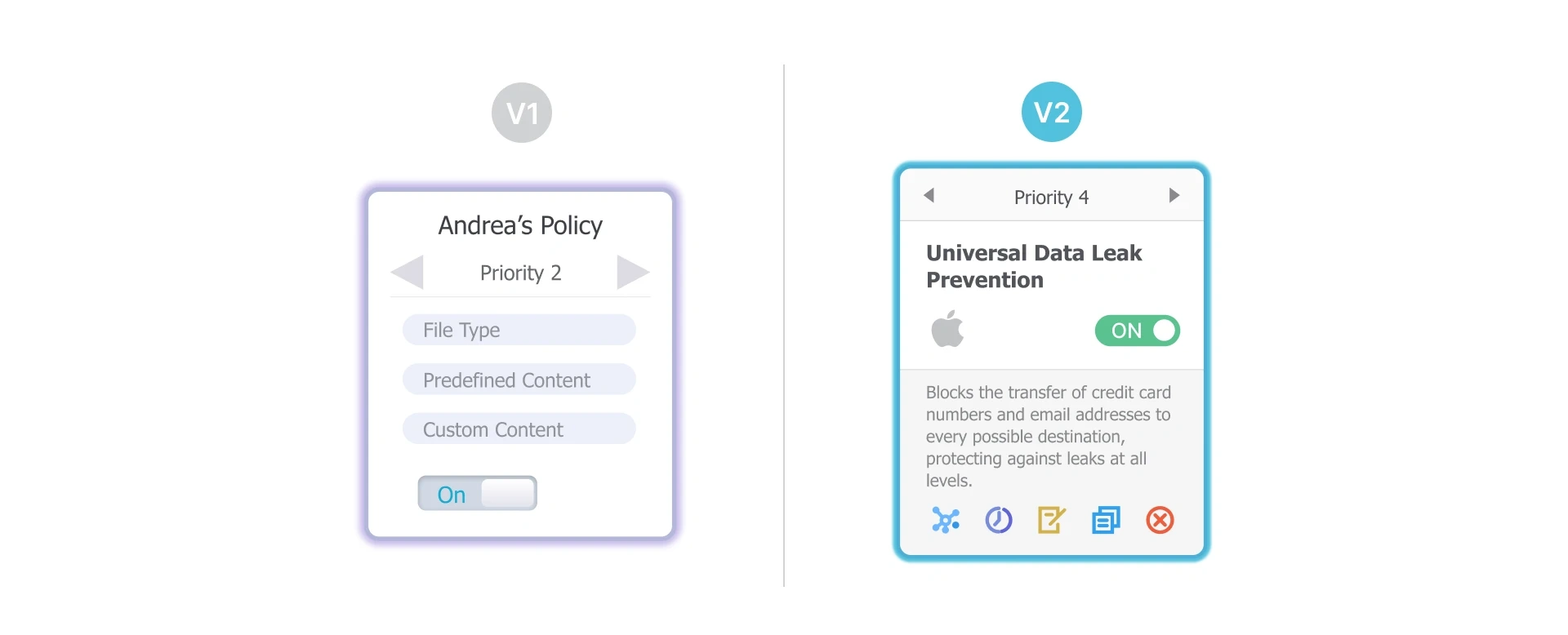
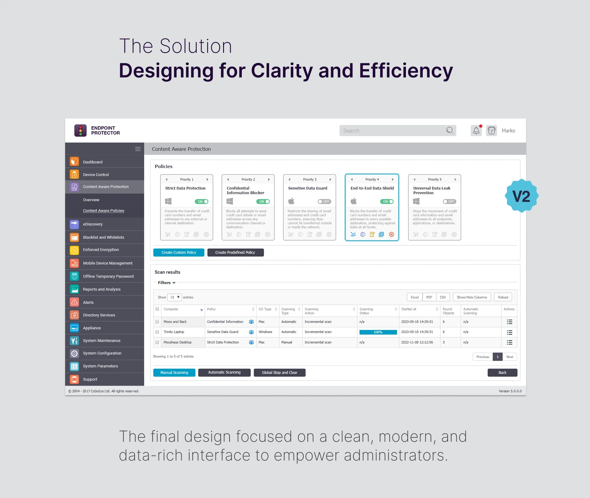
The Solution
Building on user feedback , the final card design offers both clarity and information density. Its symmetrical layout is visually balanced and easy to scan , providing a concise summary, status, and essential details at a glance. Policies are now instantly understandable without needing to click through
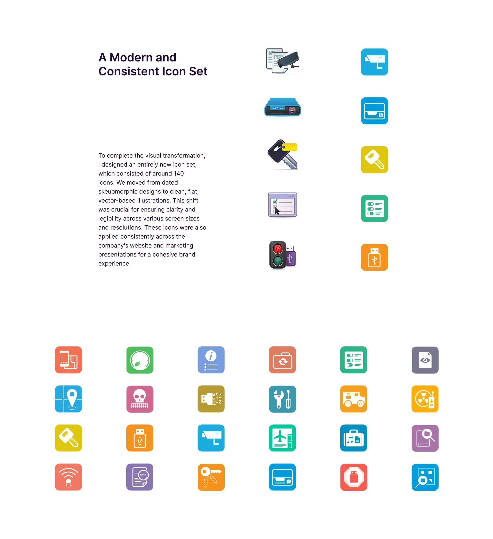
Ensuring a Cohesive Brand Experience
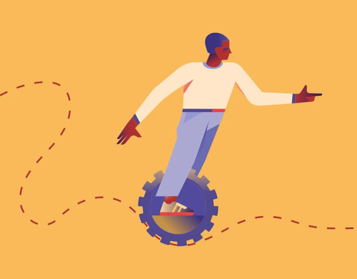
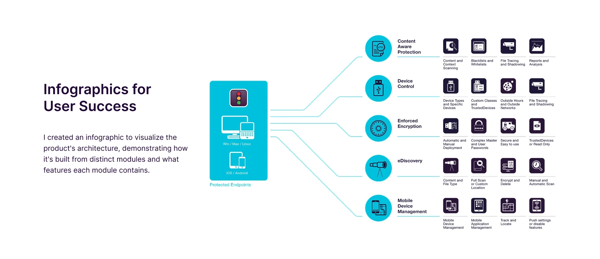
To help users fully understand the product's architecture and capabilities, I created a series of infographics. These visuals demonstrated how the product is built from distinct modules and what specific features each module contains. This was a key tool for both new user onboarding and for the sales team to clearly communicate the product's value.
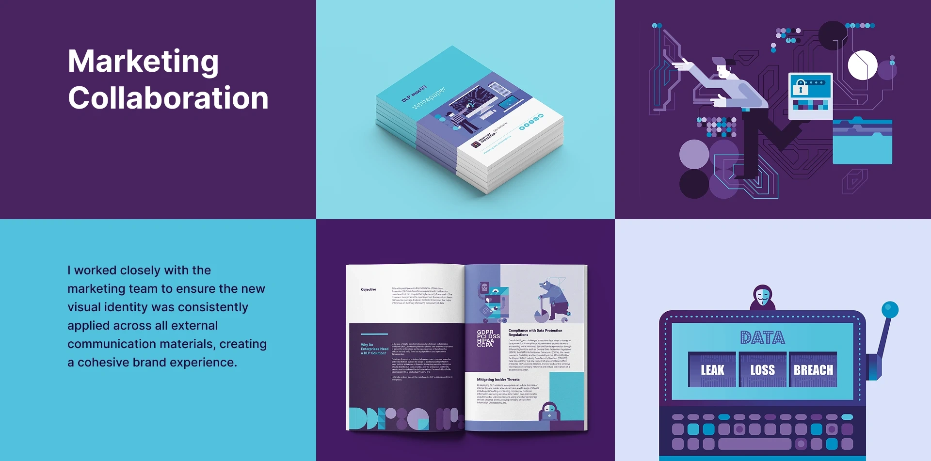
A consistent visual identity is crucial for a strong brand. I worked closely with the marketing team to ensure the new design language and visual identity were consistently applied across all external communication materials. This included brochures, presentations, and digital content, creating a unified and professional brand experience for our customers at every touchpoint.
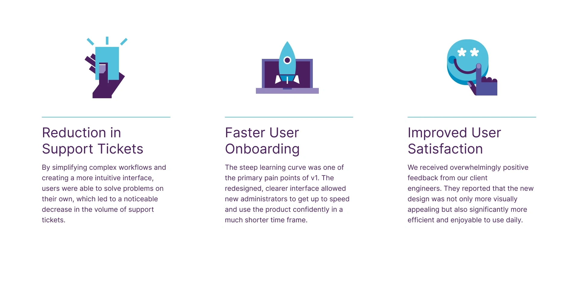
The Impact of a User-Centered Redesign
Thank you for your time.
I'm happy to answer any questions you may have.
Like this project
Posted Oct 27, 2025
A complete UX/UI redesign of a complex enterprise cybersecurity application, focusing on reducing complexity and improving usability for security administrators
Likes
1
Views
0