Case Study to find a Parking Slot
In peak hours, parking a vehicle at safe place is a challenging one. This case study is to find a car parking spot for a working professional and help him to park his car in a busy office area. Also we can utilise vacant parking space for rental to the vehicle customer.
Case Study Overview
Problem Statement
To design a mobile app that allows users to find a parking place, which also allows users to help them track back to the parked vehicle
• Many popular areas have limited parking place.
• People park most of the time on the roadside. It becomes a disturbance to workers/staff to clean roads and people driving on the roads.
• Many parking places use physical tokens or tickets.
• People forgetting the area where they have parked their vehicle.
The Challenges
• Managing crowded situations in parking spaces by deploying streamlined use of technology for users
• Attracting users from all community levels to benefit from the convenience of parking their vehicles without hassle
• Helping users from losing precious time and money
• To simplify the visual and functional aspect of the app.
Defining Key Pain-Points
• For first time users, unfamiliarity with the convenience of finding and reserving parking spots even before reaching the spot
• No resonance with the experiences and habitual responses which people cognitively have towards using other existing need-based services like a cab (like Ola) or making private travel bookings
• No control, flexibility and transparency given to the user’s basis their requirements in real-time. Lack of clarity and constant support would lose the users’ trust and thus its credibility in the users’ eyes
User Research
To identify the user behavioral patterns and psychographic profiles — i.e., their needs, pain points and motivations —Took some time to draft few open-ended and direct questions related to the topic and used them as a basis for in-person/telephonic conversations with few of the people I have known, while living in Bangalore, and who were also willing to share their experiences during an interview-like session.
Who are the users?
People who own motorcycle/bike/scooter and a car for their regular travel needs.
User Research Pain Points
1. User got frustration and switch out of app due to hard use of meter distance.
2. User should create a profile before use the app so that user can able to book the slot for certain fixed time.
3. If network coverage is not better then loading map with parking areas will be in trouble.
Purpose of User Interview
• Understand the end to end steps of the customer with respect to the platform
• Identifying customer touch points in the journey
• Identifying pain points
• What they expect from the end user
Interview Questions to Users to collect their feedback
• Do you own a car or a bike? If yes, how frequently do you use it as a mode of conveyance?
• Do you plan to travel every day before leaving from home? Either way, how does that affect your daily schedule?
• Do your office/ regular places you visit have parking spaces? If not, how do you end up parking your vehicle?
• Do you like having a reserved parking spot for places you regularly visit?
• How much time on an average do you end up spending, finding a parking space?
• How much do you ideally spend on parking vehicles?
• How do you manage the parking bills after making the payment?
User Personas
While elaborating on the types of users accounted for who would be using the platform, two predominant user groups had been identified during my research phase:
“Professionals” — People who are employed in a profession or at working age.
“Family Driven People” — People who are managing personal and professional lives in equal measure, taking care of a small/big family (i.e, with aged people, children, husband/wife)
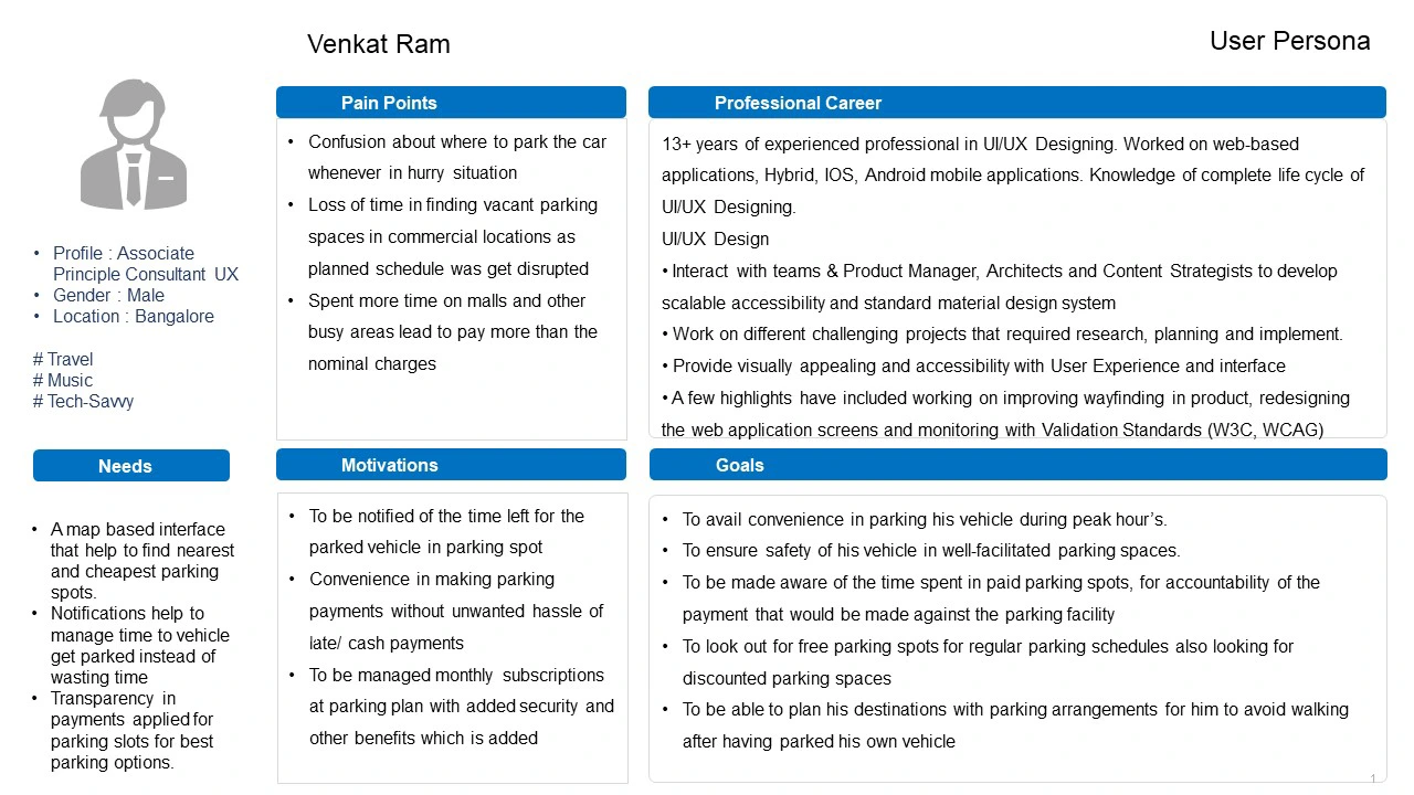
Based on the exercises done above, persona for professional has been considered primary goal. So the persona served to inform the design decisions during the initial phase of design & research.
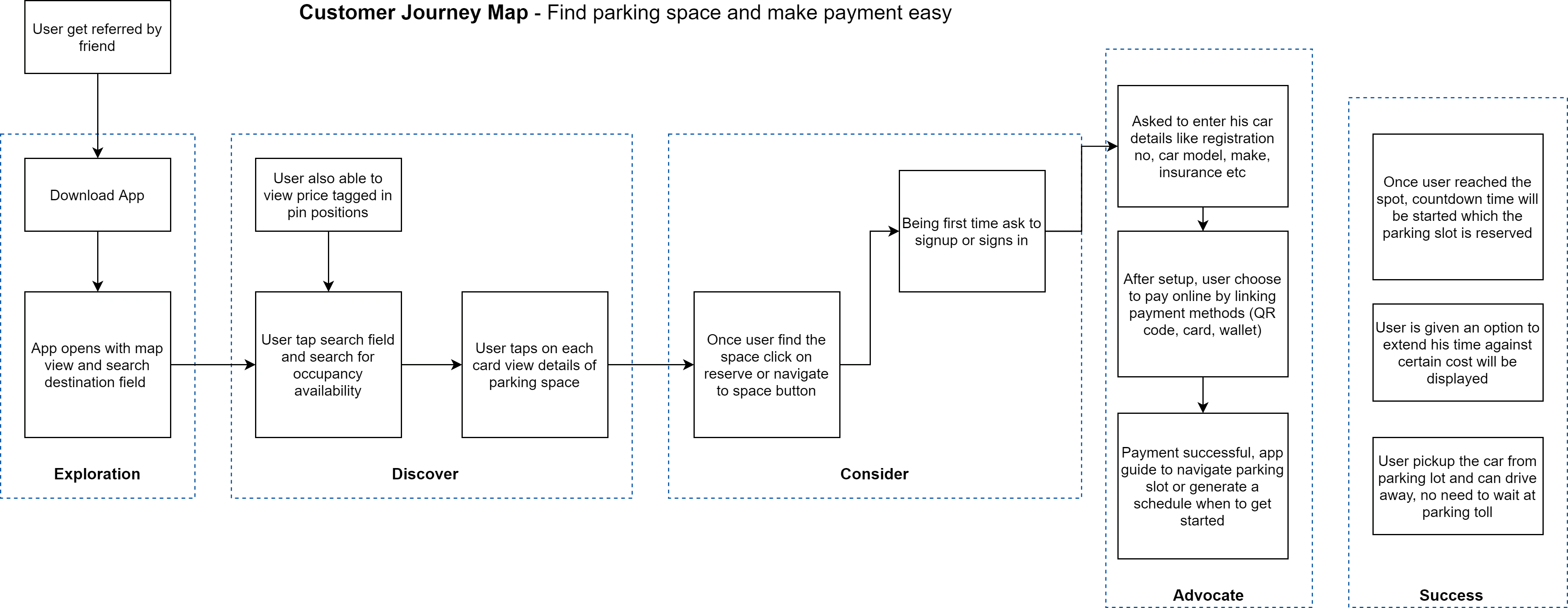
Customer Journey Map
Taking the key persona (Venkat Ram’s) behavior, goals, needs and motivations into account, the follow up on the thought process was laid out in stages and against which, every interaction touch points, the user’s emotional and psychological state and product opportunities were plotted.
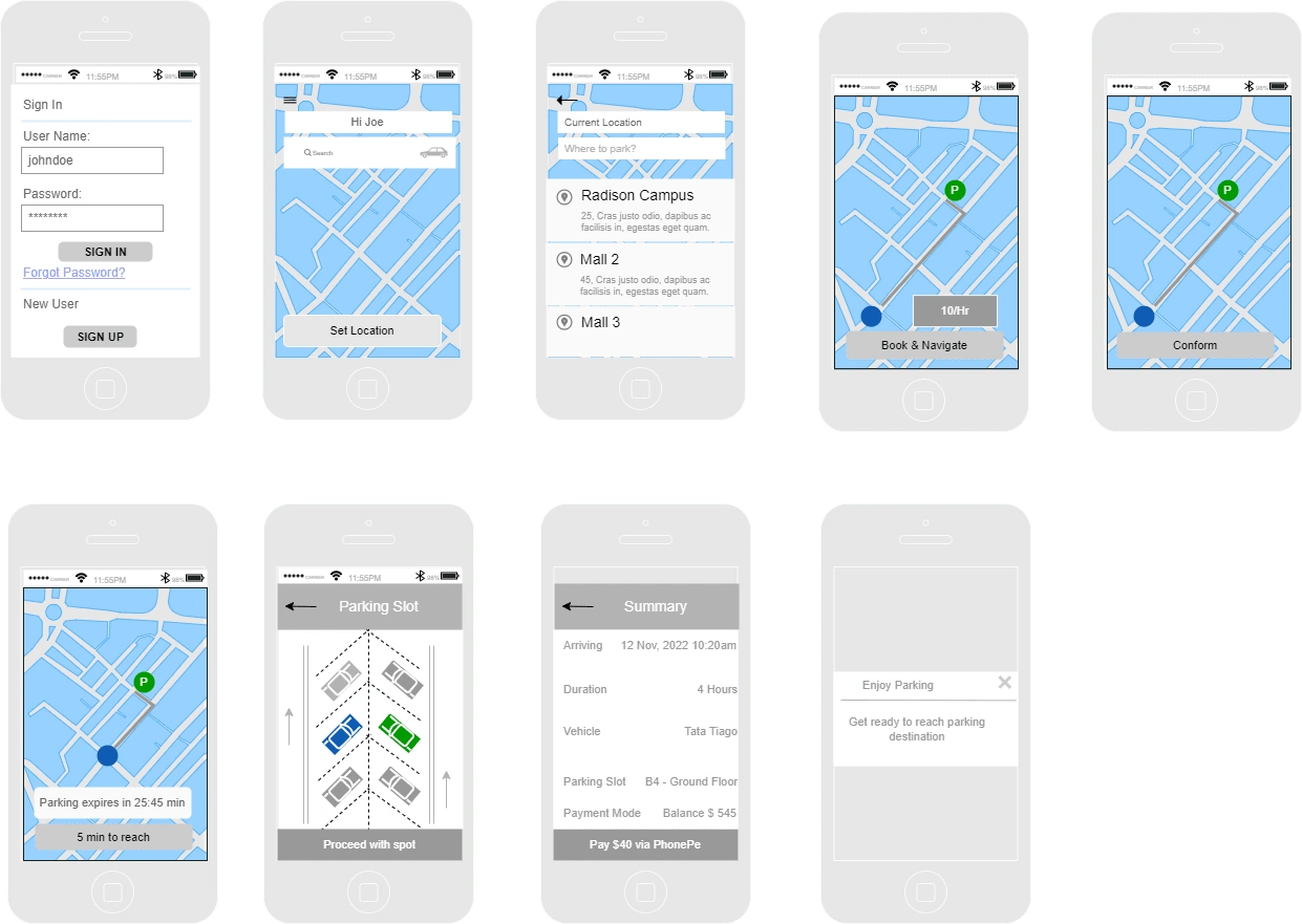
User Flow & Walkthrough
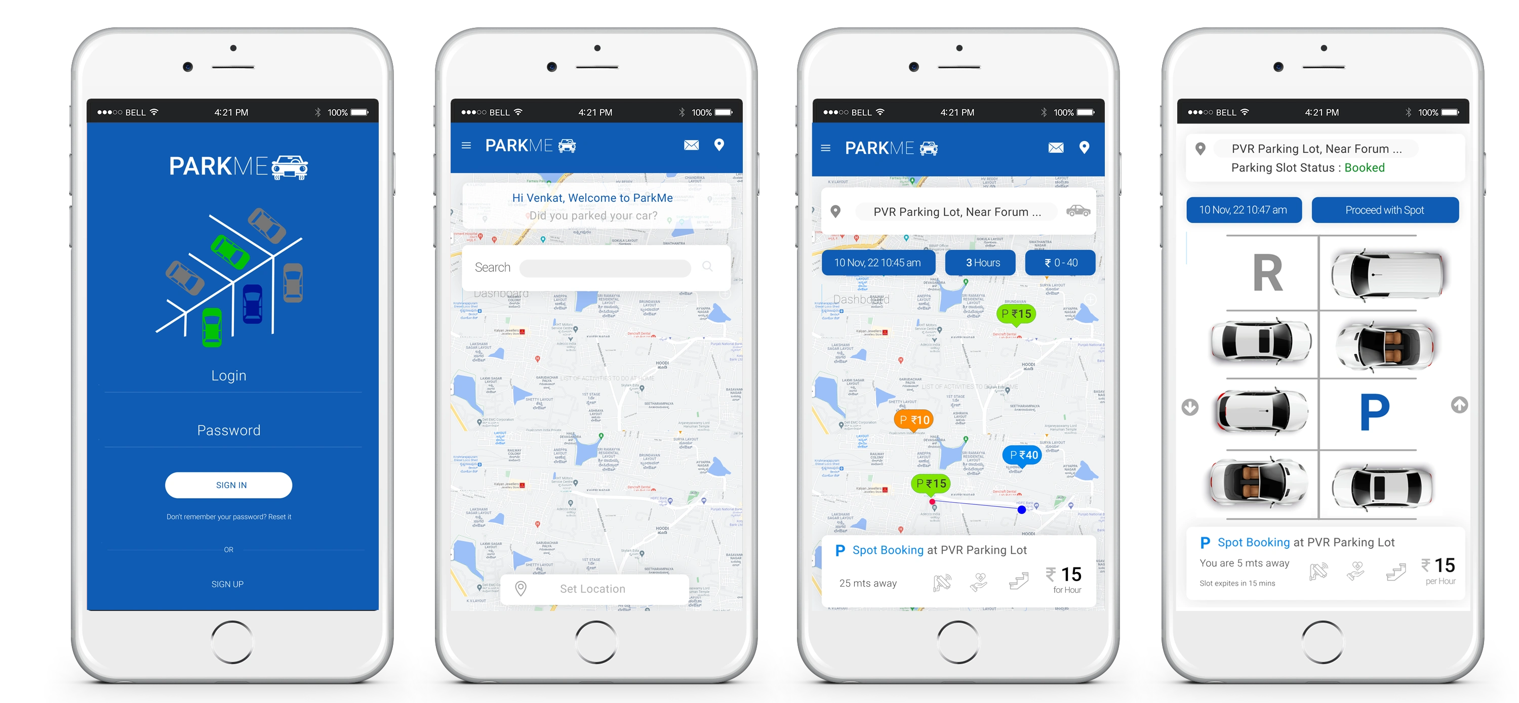
The interface should have a clean and minimal look. The interaction between various elements in the interface should be seamless and quick to uptake.
The platform should be easy to navigate with proper visual cues that make even a first time user feel at ease. The following steps can be performed by the user.
1. User can able to search oparking space and nearby
2. User know the availability of slot and price details.
3. Usear can able to navigate to parking space check with duration span.
4. User can pre-book the parking slot.
5. User can able to pay in any mode of payments ans hassle-free experience.
Usability Testing : Usability Study
Conducted few interviews with stakesholders & provided our prototype link and asked them to use.
Walkthrough
1. Cost of parking was not clear
2. Loading maps is slow in low network coverage area due to parking in underground areas
3. Usage of search option either to find parking slot of find support for payment and common questions
4. Need toll free number and customer support details.
5. Need additional/extended time to hold booking slot due to traffic conditions
Problem #1
First time users may unfamiliarity with the convenience of finding and reserving parking spots even before reaching the venue.
Solution: While some of the users may have an idea if they used other online car parking platforms, the goal is to walk them through the first-time process (as seen above), while using easy language to communicate and drive the attention of the audience towards their first step
Problem #2
Flexibility and transparency given to the users basis their requirements in real-time. Lack of clarity and constant support would lose the users’ trust and thus its credibility in the users’ eyes
Solution: Important filters like arriving time, duration of booking and price range were brought to the front to provide users the control over their search and help them see the availability and exact prices get reflected dynamically.
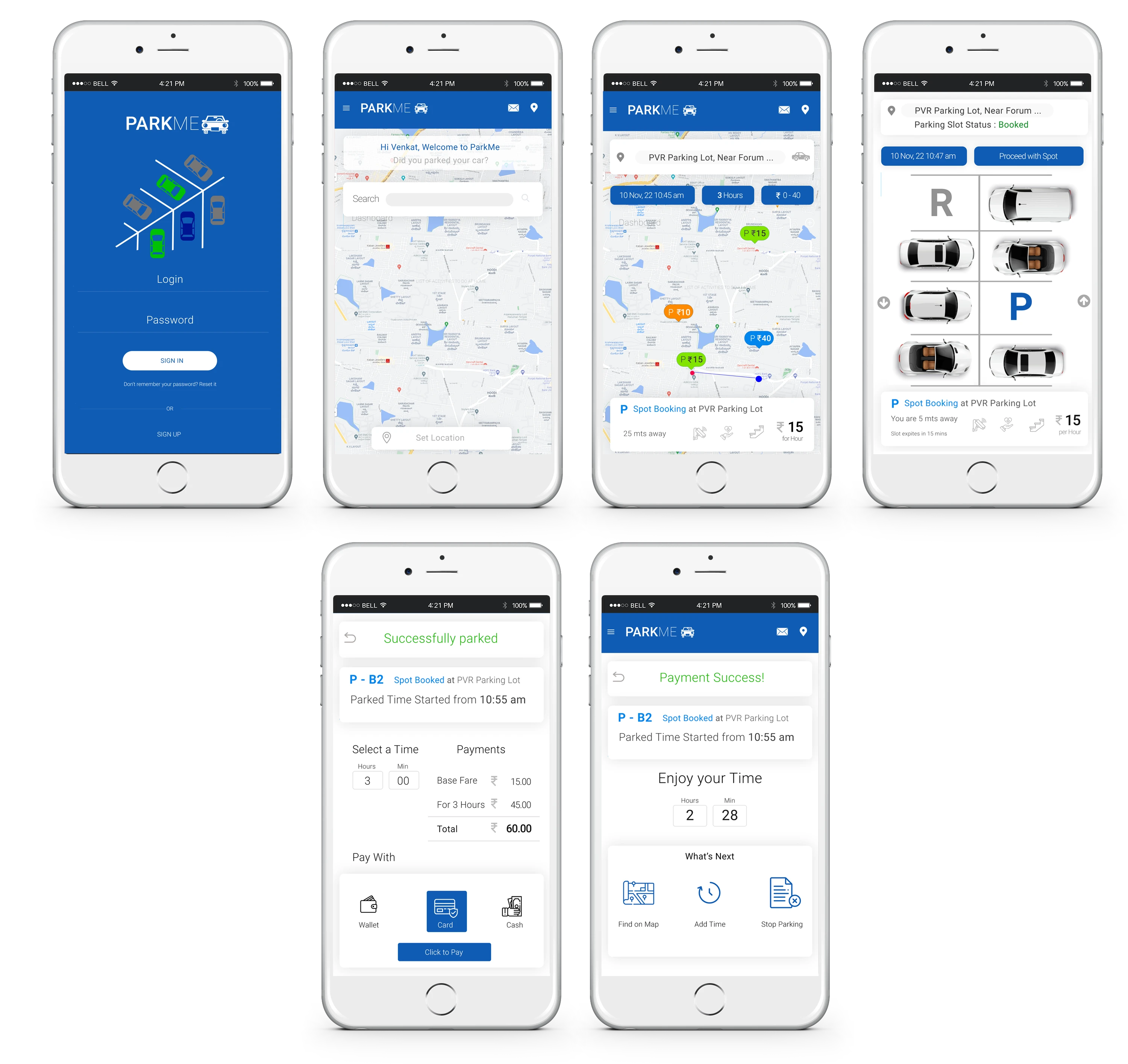
High Fidelity Prototype | Visual Design
Building a product from scratch with great user experience help to learn new stage of process. By analysing the problem and ideate to conduct user research and understand their needs and pain point problems made the research powerful and fulfilled.
Notes
Used “PARKME“ as brand/app name which is suitable for as per research for identity.Took iPhone 6 plus mobile app resolution 1242px x 2248px for focus on US market initially. Which supports iPhone 5.5/6/6.5-inch mobiles.
Fonts: Used Roboto Font family – Title (48px - #000), content (48px - #494949)
Button: Used background color (#065ed5, font size 30px), text color - #fff
Tools used
Customer Journey Map - Draw.io
Persona - Office Powerpoint
Wireframe - Balsamiq
Visual Design - Adobe Photoshop
Like this project
Posted Aug 2, 2023
In peak hours, parking a vehicle at safe place is a challenging one. This case study is to find a car parking spot for a professional and help him to park
