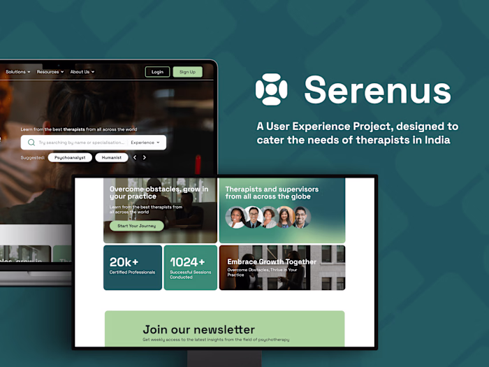
Making an intuitive and user-friendly application for caregivers
Taarush Goyal
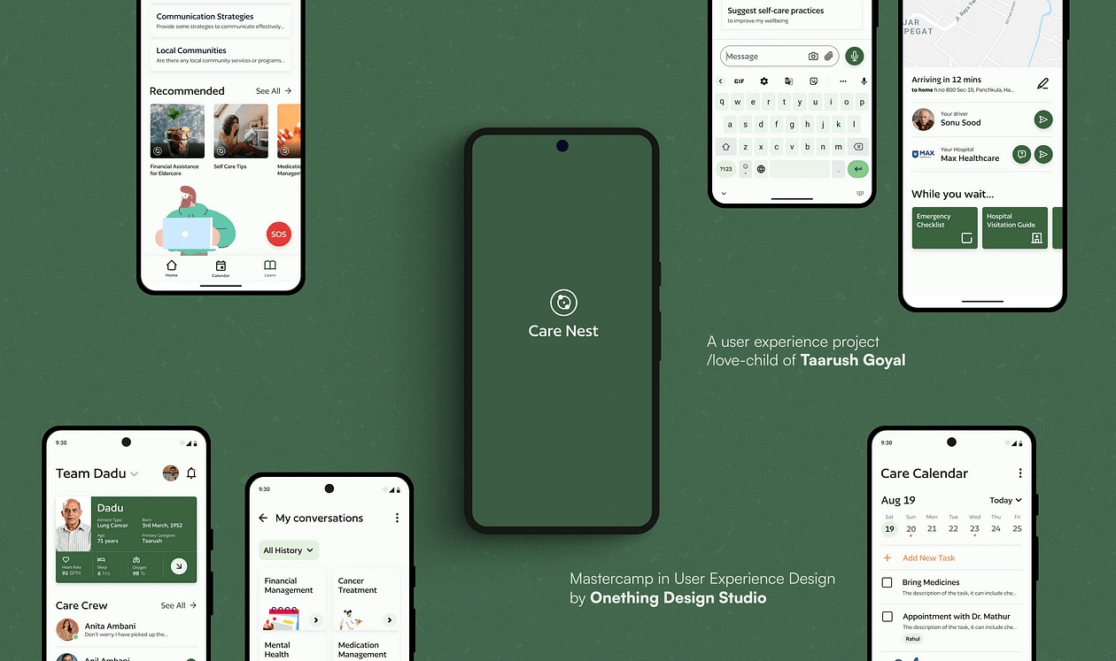
Table of contents
About me
Hi, I am Taarush, a passionate barista with a background in Psychology and Economics. In this article, we will be looking at the case study of one of the projects that I have been working on during the duration of my User Experience Mastercamp by Onething Design Agency.

Introduction
When looking at the healthcare industry it is quite easy to forget that the most personalised and the most effective form of care is given, not by doctors or nurses, but by the family members of the patient themself.
Therefore the mission of this project was to explore the problems these caregivers came across while performing their tasks, understand the roots of these obstacles and find out why they occur in the first place.
The problem statement that I got started on was
How might we assist informal caregivers in providing better quality care to their dependents?
Through user surveys and interviews, I found out that more than 80% of people involved in informal caregiving are doing some form of “elderly care”, this encouraged me to further focus my MVP towards elderly care, something that by virtue of our community-centric cultures, a majority of Indians are inclined to engage in.
Identifying problems with caregiving
Now coming to the problems and challenges faced by caregivers, the core theme that I discovered was that caregivers are predisposed towards developing symptoms of burnout and depression.
Why is this the case? Why do caregivers tend to face these mental and physical issues?
Well, there are a couple of reasons for it:
firstly caregiving requires constant attention, and it takes a toll on people who have to perform these tasks in addition to the stressful work lives that they already might have.
The transition to caregiving roles is rather abrupt, no average person is conscientious or proactive enough to expect this to happen in their lives, which makes the adaptation process confusing and quite exhaustive.
Lastly, and most importantly, the one thing that I discovered was that Pareto’s Principle is applicable here, that 80% of the caregiving responsibility is taken on by 20% of the people involved, which results in exhaustion and causes the development and anger and resentment towards other fellow caregivers (usually family members), which makes these 20% even more isolated from the other 80, …and we have ourselves a downward spiral ladies and gentlemen.
Task analysis
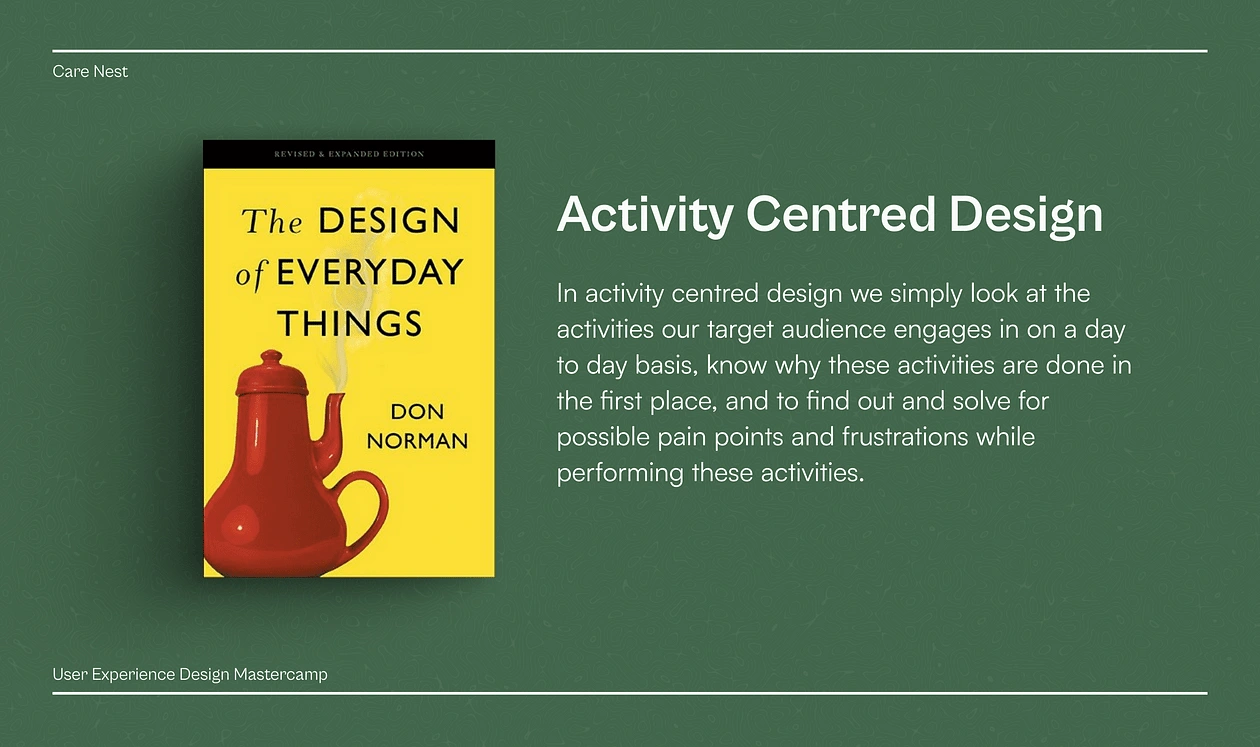
Now the question arises, How might I solve it? where do I even get started? How can one possibly solve issues like caregiver burnout and depression? Here the design legend, Mr. Don Norman through his book “The Design of Everyday Things” pointed me towards a process he likes to call Activity-Centred-Design.
Now there are hundreds of activities a caregiver juggles every single day, from managing medications, consulting doctors, and keeping track of health records, to taking care of themselves (and if time allows, having fun), the list goes on.
However, according to my research, the 20% of the tasks that make up 80% of caregiving can be summarised into 3 broad overlapping categories
Communication: A caregiver spends about 80% of her time communicating with healthcare professionals and family members.
Time Management: A caregiver is actively involved in managing tasks like procuring medications, making appointments with doctors and nurses, providing meds to their dependents etc. to fulfil her basic responsibilities
Learning: As mentioned before, the transition to one’s role as a caretaker is rather abrupt, and as per research, one feels uncertain and anxious about their position and responsibilities as a caregiver, therefore one intends to be educated about everything there is about dependent’s ailments, and about caregiving tasks.
Keeping these problems and these tasks in mind I went ahead with the design, all this felt like an impossible challenge to take on, as the problems seemed endless and solutions felt elusive, but anyways, this is what I chose to do, so let’s get started, shall we?!
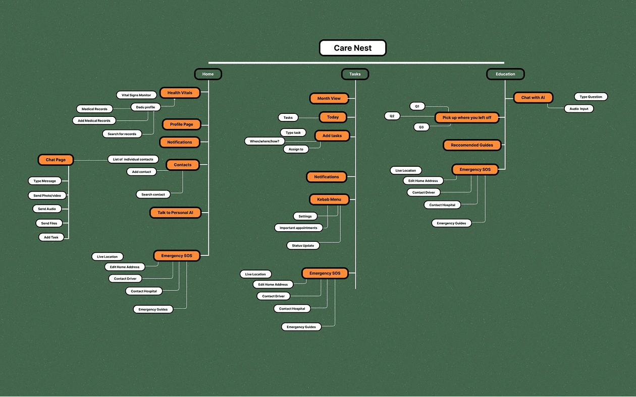
Design breakdown
Human behaviour is dictated more by the avoidance of pain than the pursuit of pleasure, therefore reducing this suffering that sometimes is caregiving, became my north star while ideating upon my designs.
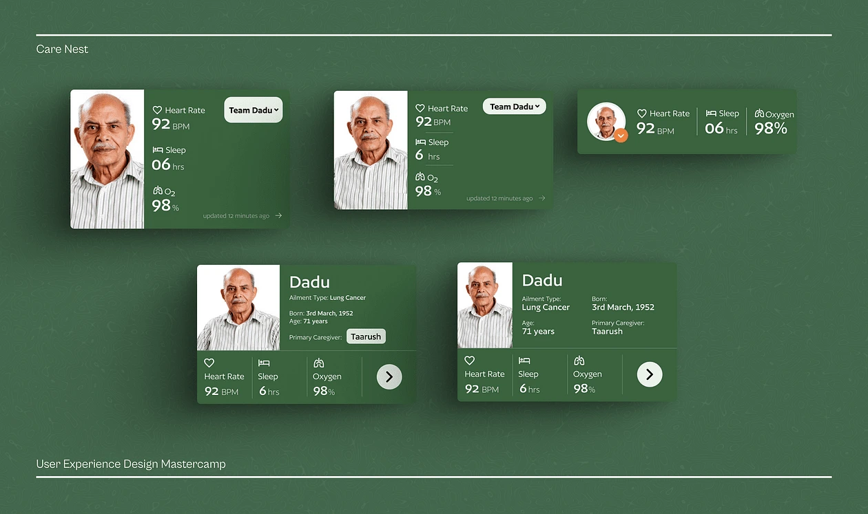
Health Vitals
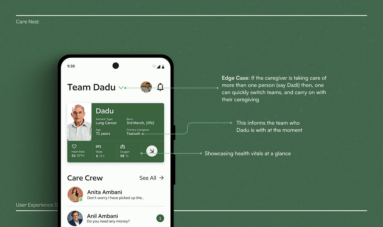
Caregivers often check the health vitals of their dependents, heart rate levels, and recently during COVID-19, their blood oxygen levels etc, therefore to simplify this flow and make it more accessible and informative, I envisioned this aspect of the application.
Not only does it allow you to have a look at the key health metrics at a glance, but can potentially allow you to keep tabs on the variability of these metrics over time.
Taking a cue from the rise of the production of smartwatches around the world, I went ahead with the incorporation of health vitals interfaces from apps like Apple Health, Google Fit, Strava etc.
This information can potentially be quite useful during appointments with doctors, as it will allow them to keep track of the variability of key health vitals of the patient over time.
This can potentially alert the caregivers of any irregularities faced in the variability of the dependent’s health metrics.
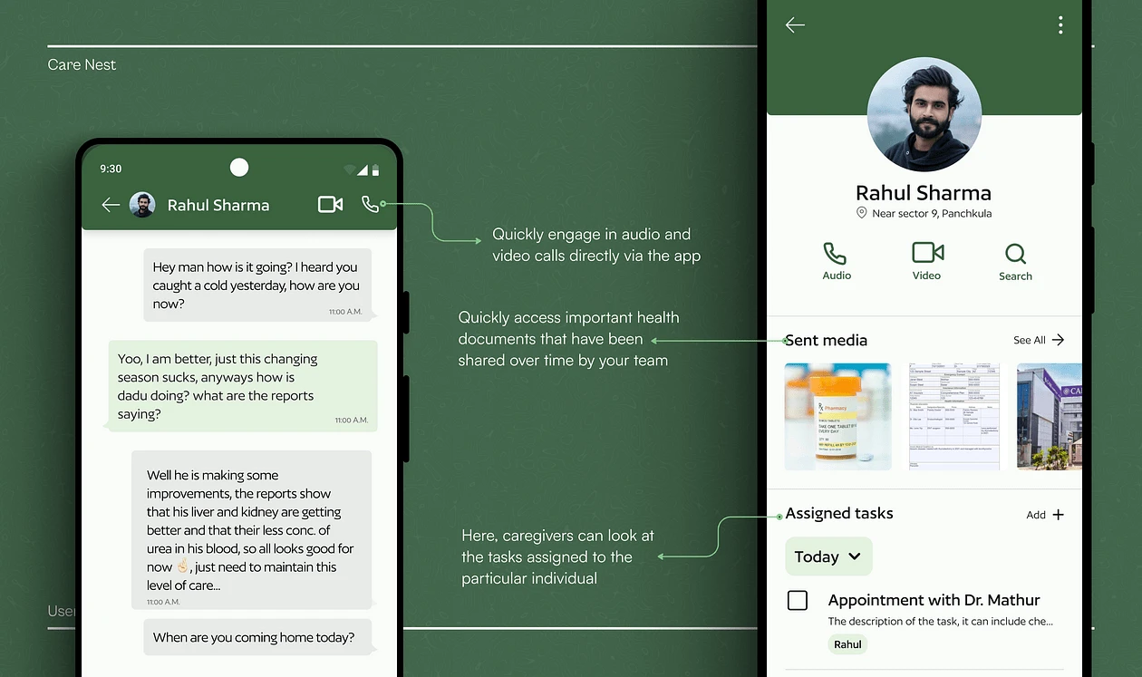
Care Crew
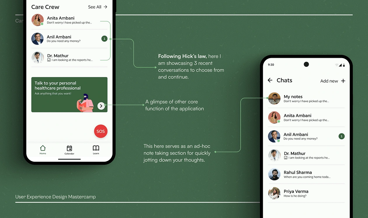
As per research, communication with family members and family doctors etc. was the most performed activity while caregiving.
Now when I enquired into the nature of these communications and the mediums that were used, applications like WhatsApp, and the good old phone calls were used almost always. These tools are good enough to get the job done,
The pain point I discovered here, particularly with WhatsApp is that, as this application scales, anyone and everyone is on it now, and it has become the go-to for all things instant messaging, which is a pain for many these days as it is getting cluttered with all kinds of tasks and activities one can perform through it.
Care Calendar
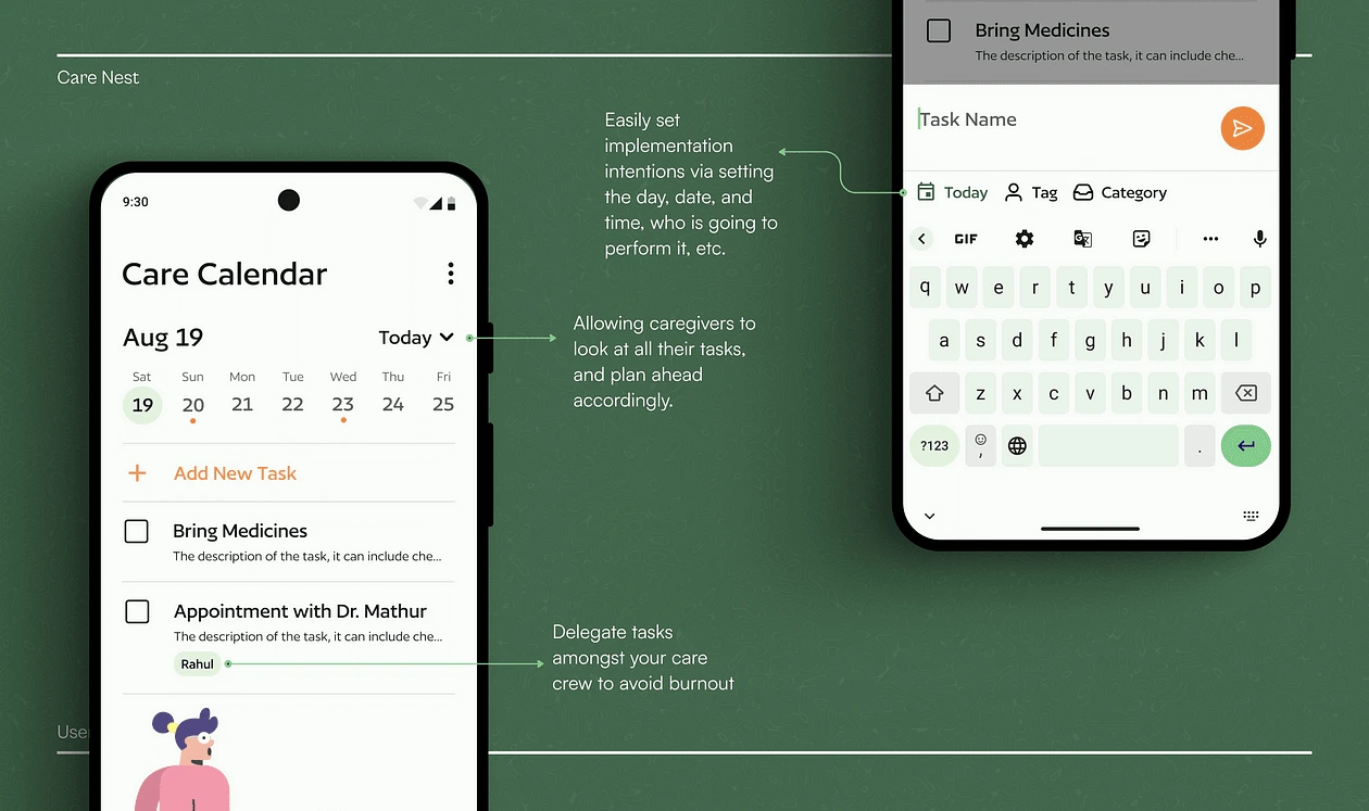
This is the segment where I attempt to address one of the most important issues of caregiving: Burnout. As I mentioned how Pareto’s principle is applicable in caregiving responsibilities as well, and how it leads to burnout, I wanted my application to facilitate a change in this reality.
Here I took a cue from the psychological literature on Implementation Intentions, discovered by Peter M. Gollwitzer in 1999.
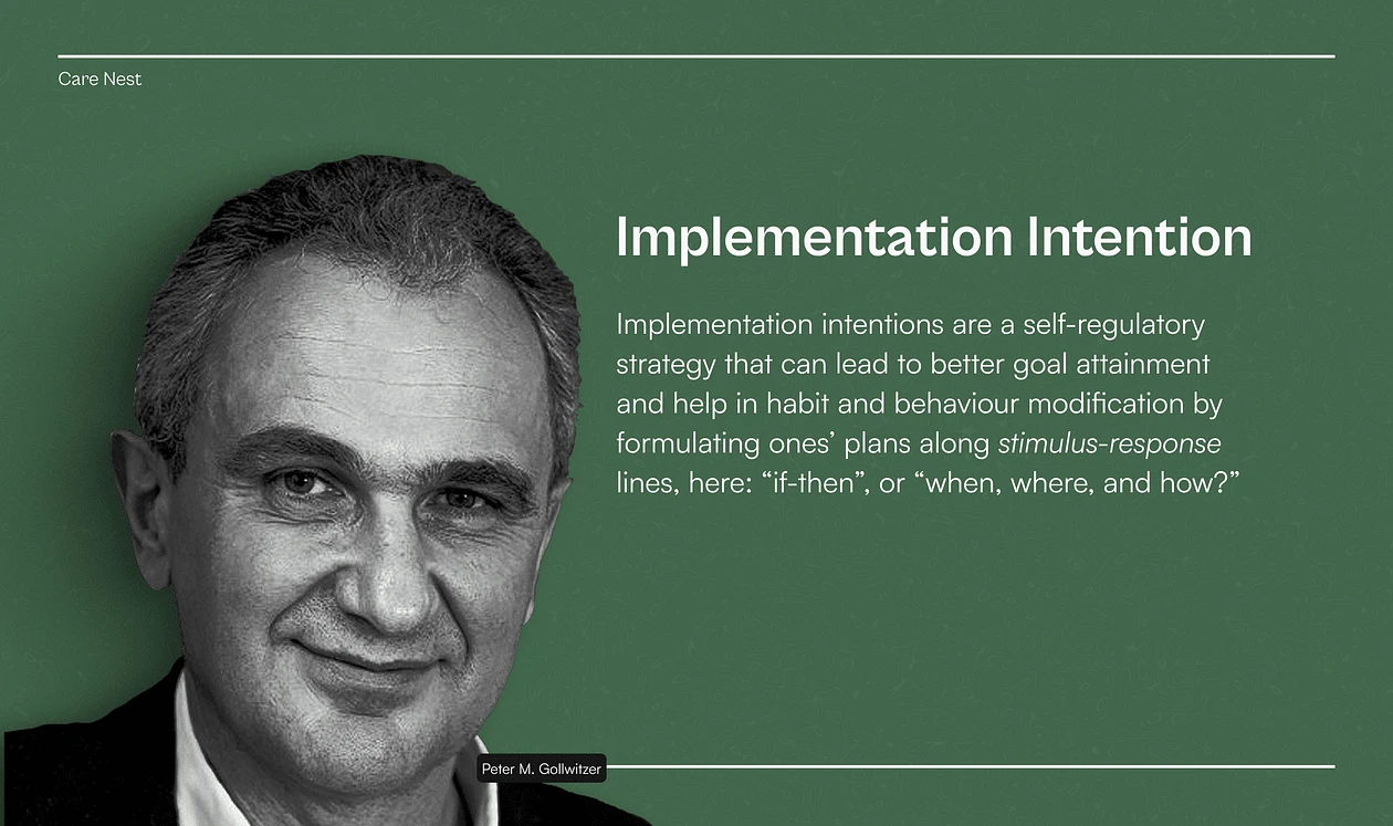
As per the research papers by Gollwitzer, it was discovered that if a participant detailed their plan (aka intentions) along the lines of “when, where, and how” or along the line “if X happens, then I will do Y”, then the chances of him accomplishing his goals increased by a whopping 157%
Therefore taking a cue from this research, I simply asked myself:
Can burnout be reduced amongst caregivers if they were encouraged to form these implementation intentions and delegate tasks better?
To test this, I went ahead and designed a task management page in my designs to incorporate and later test these insights in the future.
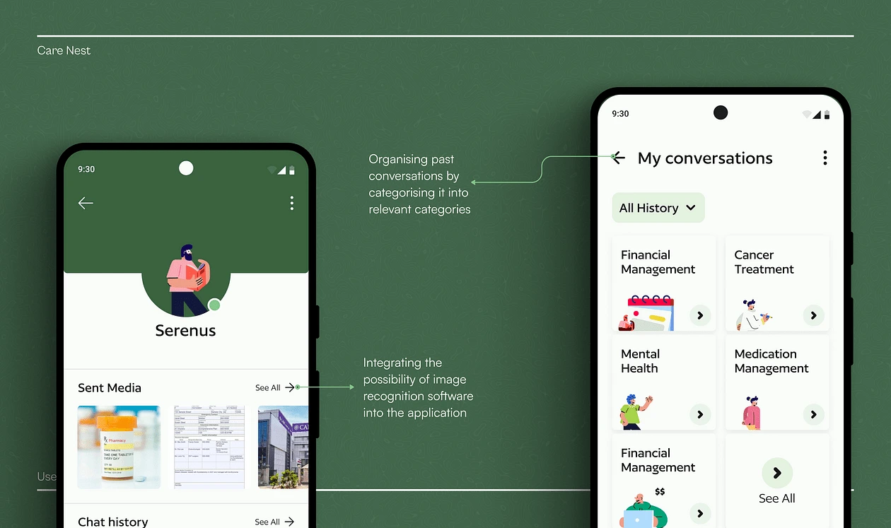
AI assistant
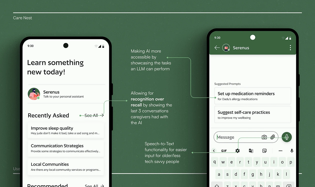
As mentioned previously, caregivers were observed using services like Google quite a lot and went through websites like WebMD just to know as much as they possibly could about anything and everything concerning the dependent’s ailments and about caregiving.
Now the thing with learning and gathering information on the internet is that it is quite tedious and time-consuming, There are 100’s and thousands of potential articles all across the internet, each approaching the questions of a caregiver from different angles.
Here the possible point of intervention I found out was inspired by the rise of LLMs like MediSearch (A YC backed startup), ChatGPT and Perplexity, and how amazing they are in finding patterns across available data, and perfectly summarising them in a short and digestible manner.
Emergency SOS
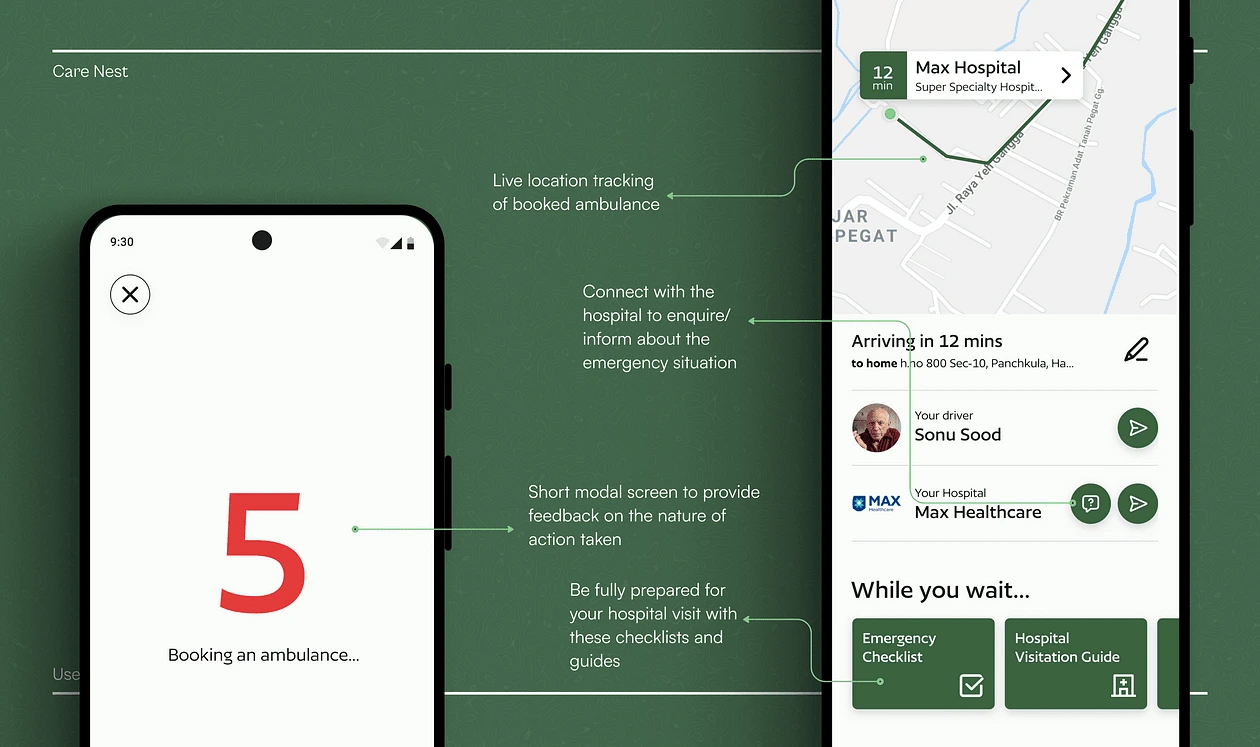
And at last, the Emergency SOS flow
Now one of the touch points that I felt would serve as the USP of my application will be the ability to immediately book an ambulance and to be able to track it live.
The insight for this flow came primarily from the case study of how the facilitation of food delivery tracking on apps like Zomato and Swiggy increased their MAUs. This encouraged me to look into a “Call 112” flow for calling an Ambulance in India today.
When you call 112 in India, the following typically happens:
Pre-recorded voice: After dialling 112, you will hear a pre-recorded voice asking you to press a specific number if you need emergency services.
Emergency assistance: Once you have selected the appropriate option, your call will be connected to an operator at the help centre 112 in the province where you are located.
Emergency services: The operator will assess your situation and dispatch the necessary emergency services, such as police, ambulance, or fire brigade, based on your needs.
I believe with the technology that we have like location info, GPS tracking etc., we can do better than this. Therefore I designed this flow which allows you to book an Ambulance to your home within 5 seconds.
Design principles that were used in this application
Scalability
This design was made while keeping scalability and modularity in mind, I don’t expect my solution to be right in one shot, therefore the conceptual model of the design needs to be flexible enough to incorporate (or in some cases remove) a variety of different functions as per the business goals of the potential company.
Aesthetic Viability
To capitalise on the Aesthetic Usability Effect, the overall visual harmony and cohesiveness of the design were intentionally taken care of.
The implementation of Gestalt principles like Proximity, Similarity, and Symmetry were crucial principles for me to strive to achieve a sense of unity in my design.
The colour green was used in this design to evoke the emotions of calm, warmth, and comfort. Things like using images of family members, etc. were done with the intent of personalising the app and making the users feel comfortable while going through it.
Simplicity
A clean and minimalistic approach often leads to better user experiences.
Progressive disclosure of features like the AI chat page was done intentionally to not overwhelm the users on their first arrival of the app.
Hicks law was implemented in a variety of places with the intention of not overwhelming the users and ensuring quicker task flows.
Learnings
The value of iteration: iteration is the bread and butter of good design, and this was made evident to me by the feedbacks and revisions given to me by my mentors, and the caregivers who I performed usability tests with.
The value of being product-oriented, and being able to incorporate insights from business models, psychology, economics, and marketing, and how good designs are never really done.
Like this project
Posted Sep 19, 2023
My process behind designing Care Nest, a product that helps people provide quality care to their loved ones.
Likes
0
Views
27