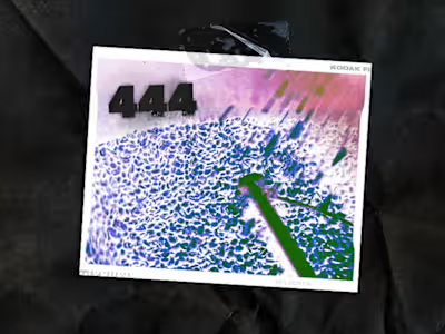
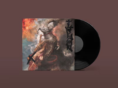
444 Collaborative Website Design
Check out the full website for this project here.
If you haven't seen the other project on my page for 444's branding, feel free to take a look here. If you're ready to move on, welcome to part 2: the website.
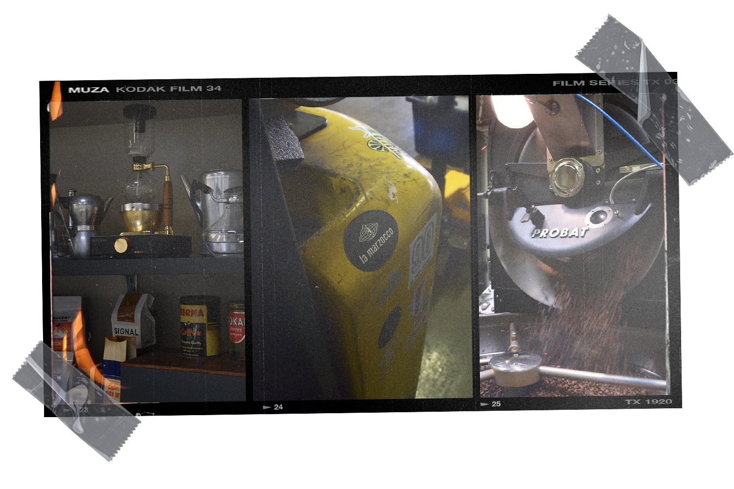
444 Collaborative, a shared-space coffee roastery in Oakland, CA wanted a website that was a departure from the clean-cut, "tech" influenced branding that has become synonymous with coffee brands, especially in the Bay Area.

At the same time, we wanted to keep the information architecture as understandable as possible-- after all, if your website is so punk that no one can navigate it, it's probably bad for business.
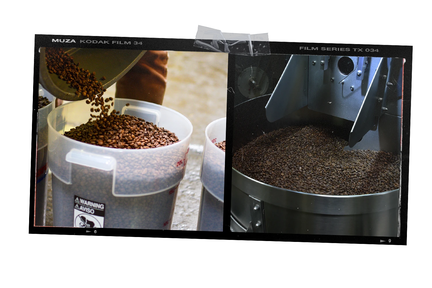
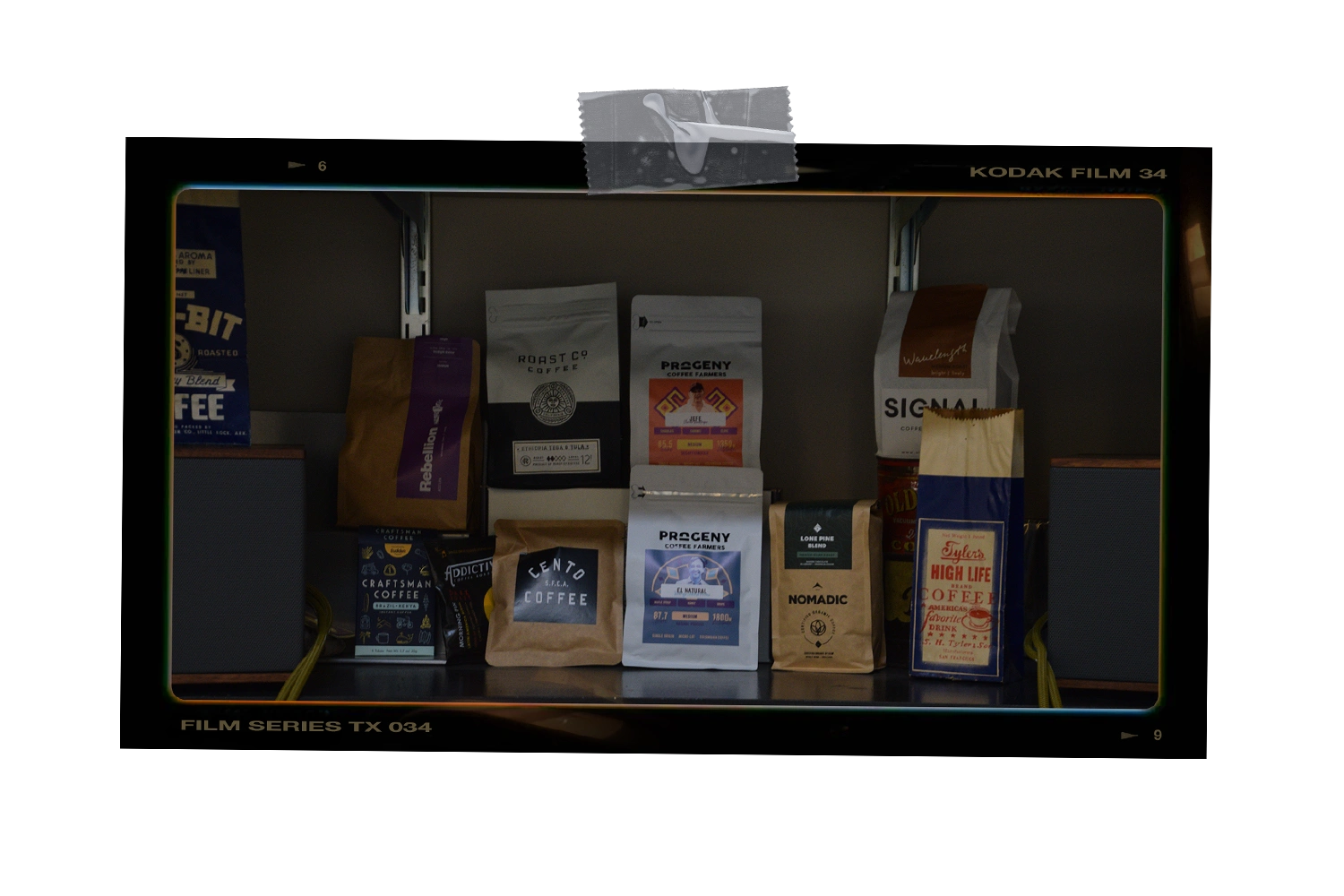
The overall theme carries from the branding-- using physical objects as landmarks for information brings the viewer in and engages them in a way that is a bit more nuanced than simply information on a page. You want to click on the pictures, and the buttons are "raised" off the page in a way that makes it look like you could press them with your finger. Even the parallax is designed to make the objects feel more "real."
I hope you enjoy 😇
Like this project
Posted Apr 23, 2021
Likes
0
Views
30
Clients

444 Collaborative

