UX Research and Website Design
Client: An Architectural Education Charity seeking a website overhaul.
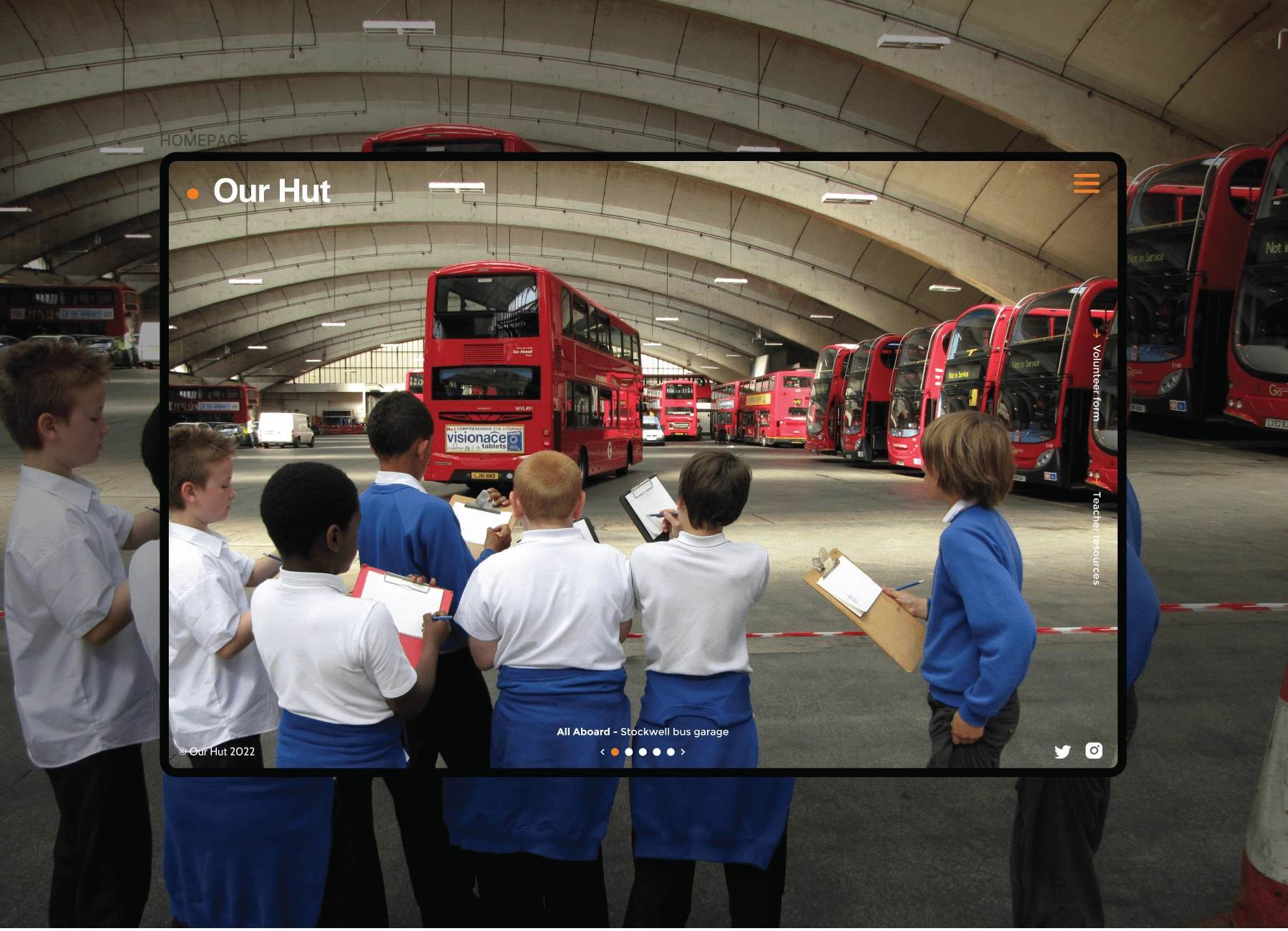
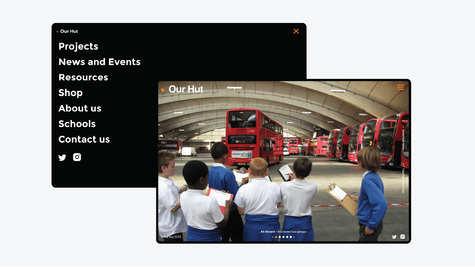
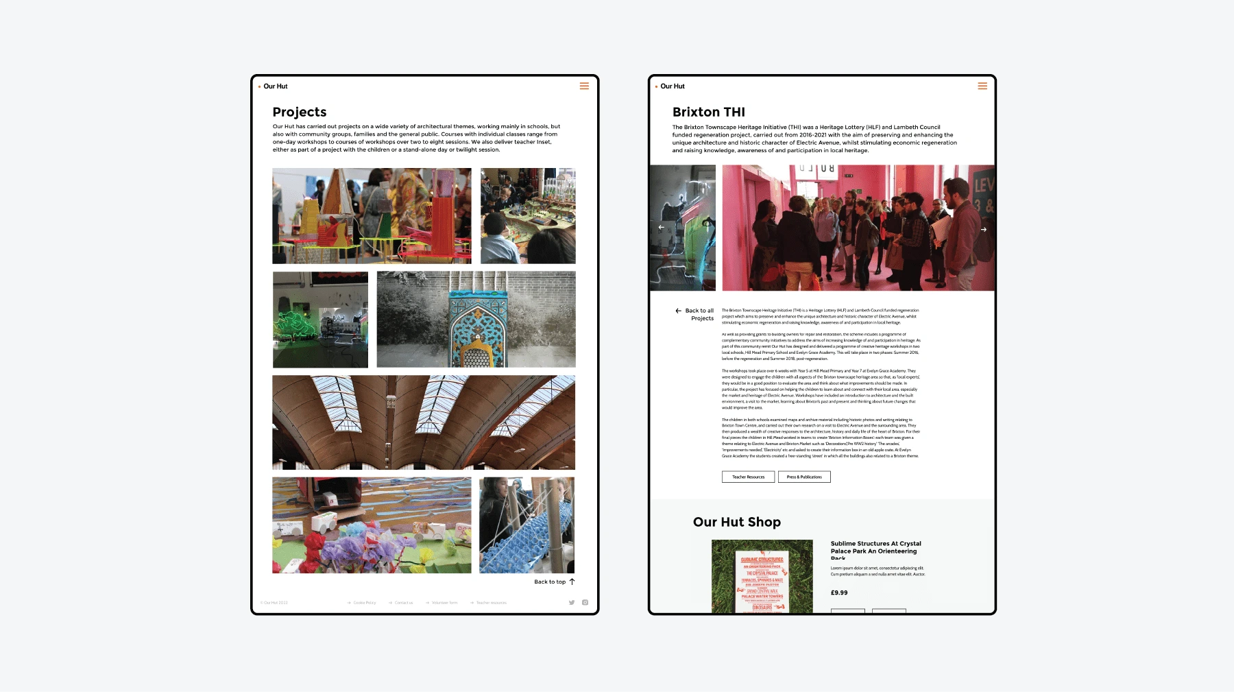
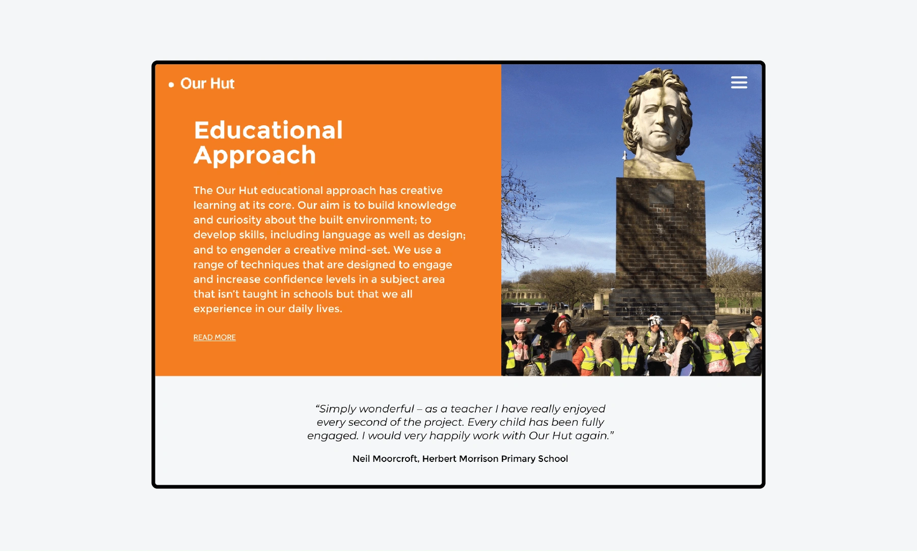
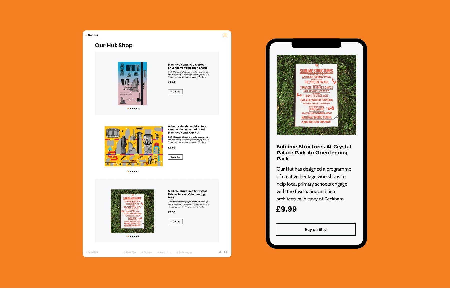
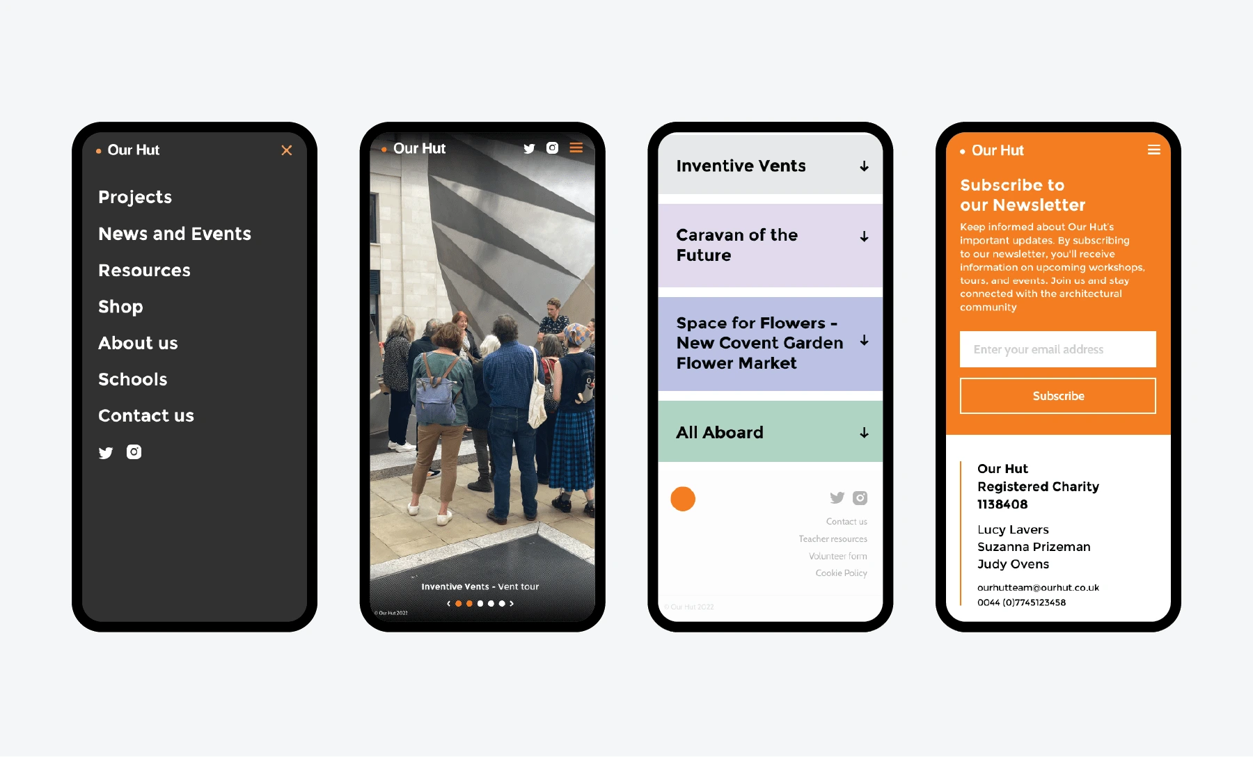
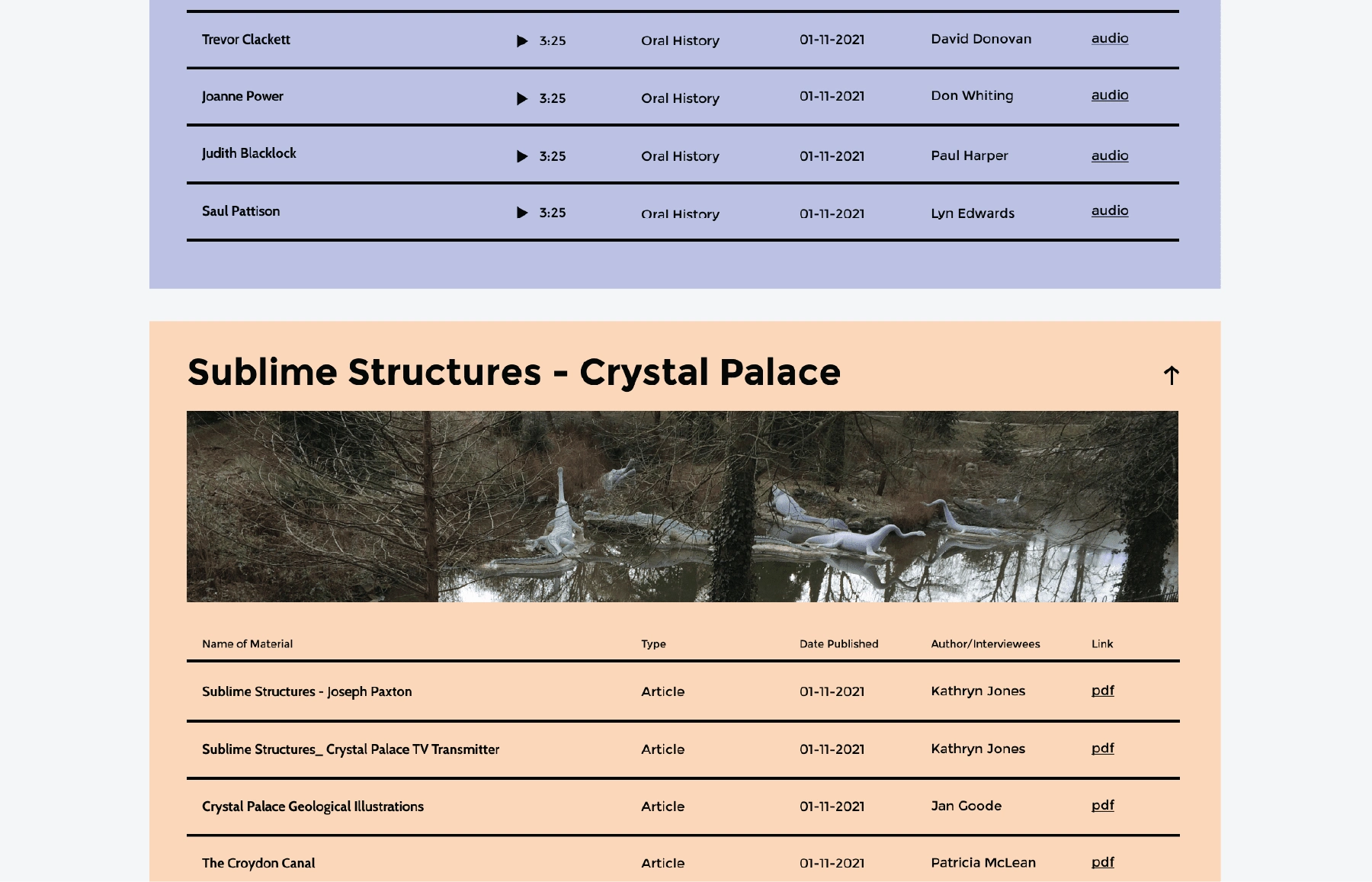
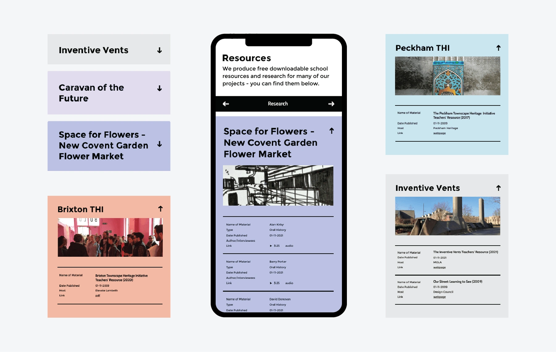
Objective: Redesign the charity's website to incorporate bespoke elements for their Teaching Materials and Publications archive. The aim was to create a more organized, user-friendly, and clutter-free digital space.
Outcome: Successfully delivered a refreshed website with custom-designed features for the archive sections. These enhancements not only decluttered the old site but also improved navigation and accessibility, making the educational resources more approachable and engaging for users.
Like this project
Posted Oct 5, 2023
Revamped an Architectural Education Charity's website, adding bespoke elements to organize and declutter teaching and publication archives.

