Enhancing Vendor Communication for Gino World Jollof Festival
Dolapo Oyekanmi

A Guinness World Record Event with a UX Writing Problem
3 min read
·
Sep 10, 2025
--
Clarity is the ingredient they forgot.
When someone gets a confirmation email, it should mean one thing: the matter is settled. No extra guesswork.
That’s why the vendor emails for the Gino World Jollof Festival stood out to me. They’re a masterclass in how a brand can unintentionally create confusion and doubt, all through a few poor UX writing decisions.
Let’s break down the emails that were sent and see where the user experience went wrong.
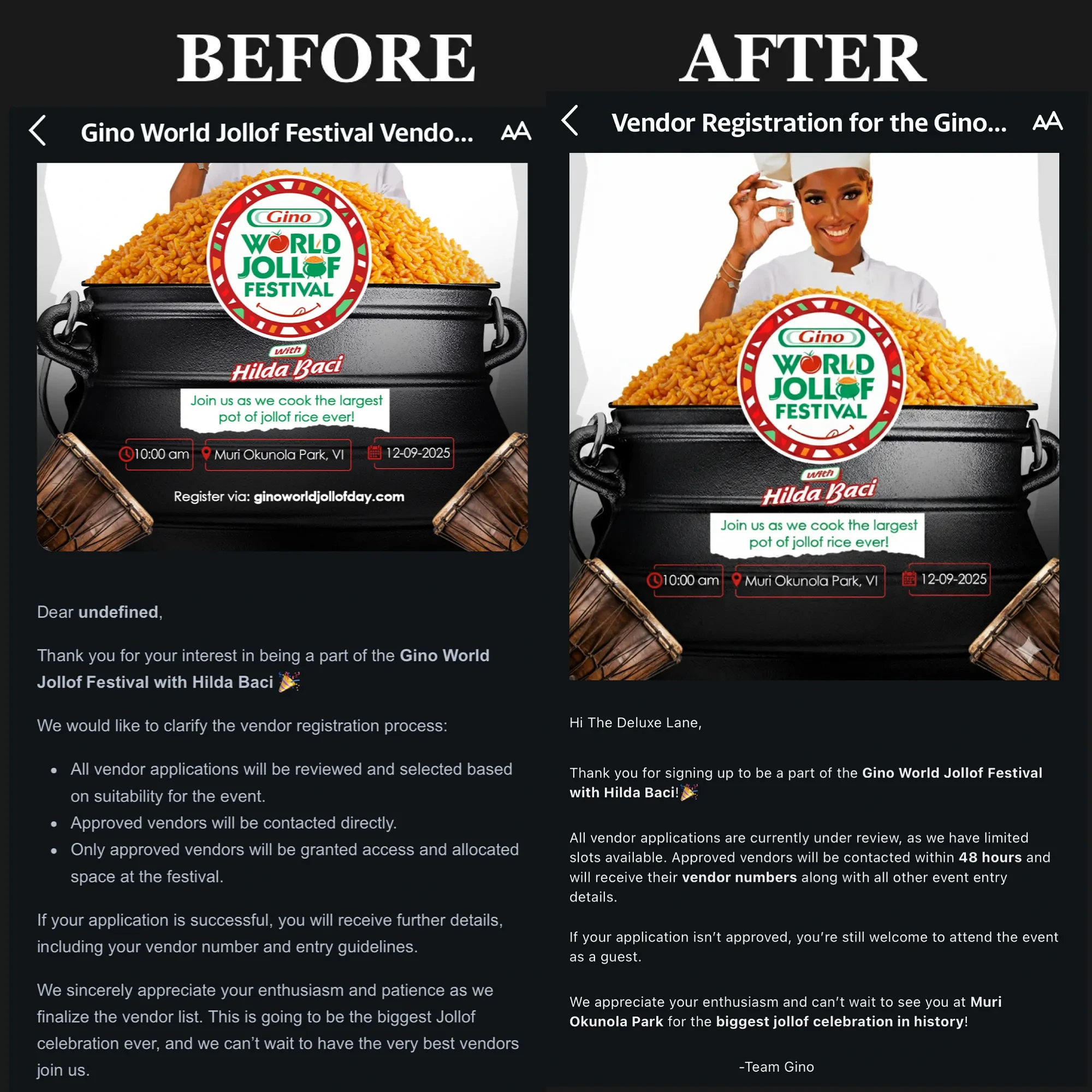
Email 1: False Alarm
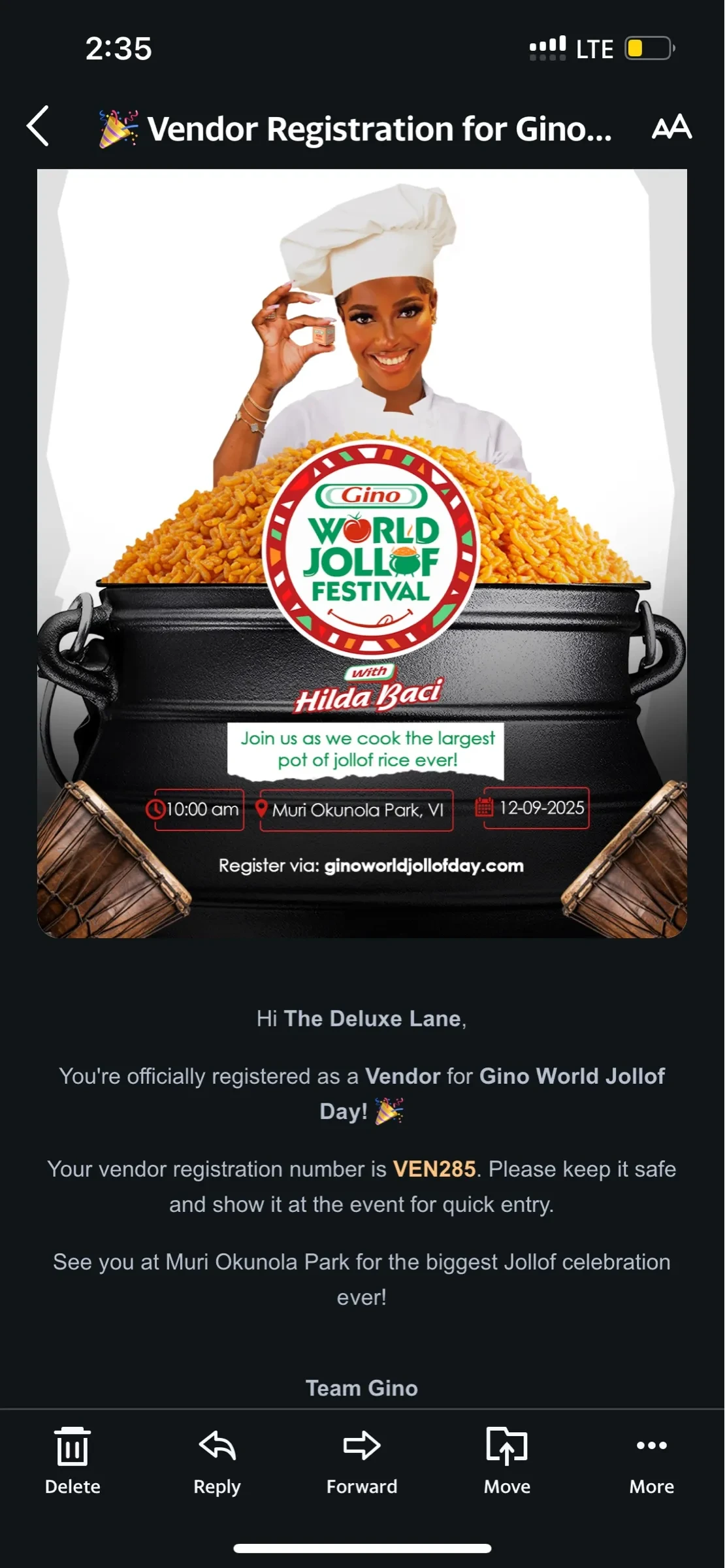
The first email told vendors their registration was confirmed and provided a “vendor registration number” to gain access to the event. A clear green light.
The copy makes it sound like a done deal.
Email 2: The Belated Clarification
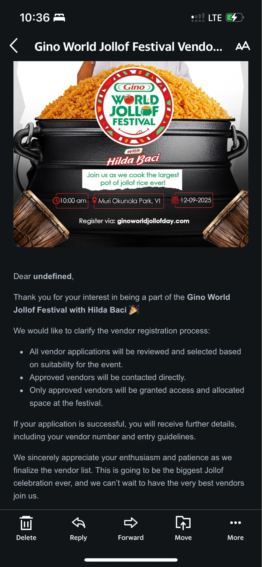
Then, in some cases, a day or more later, a second email arrived saying there would be a selection process after all.
That shift left vendors in limbo as some had already shared with their audiences that they would be at the event. First, they were “in.” Then, they were “maybe.” This is the most damaging part of the user journey.
The Flaws
The “Undefined” Problem: Addressing the user as “Dear undefined” is a glaring technical and UX error. It is a jarring, impersonal greeting, and showed a lack of personalization and care. This was an immediate red flag to me.
The Timing Gap: The delayed delivery of the clarifying information is a significant user experience flaw. It suggests a disorganized process and leaves the users in a state of uncertainty for an extended period.
The Unnecessary Two-Step: While the second email is more accurate, the fact that it was needed to correct the mistakes of the first one is a major UX failure. The user journey is filled with friction and uncertainty due to the lack of a clear, single source of truth in the communication flow.
The Solution
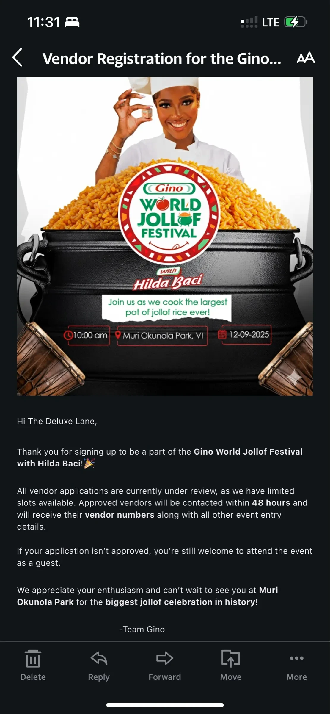
A better approach would have been a single, well-crafted email with a clear subject line, human-centered copy, full disclosure, and no contradictions.
Key Improvements
Personalized & Professional: I removed “Dear undefined,” addressed the user by their name, and used a friendly yet formal tone.
Honesty Upfront: The email sets the correct expectation from the start by removing the misleading language.
Clear Next Steps: It clearly states that applications are “currently under review” and provides a timeframe (“within 48 hours”). This manages user expectations and gives them a sense of control over the process.
A Safety Net: The most powerful part of this rewrite is the inclusion of “If your application isn’t approved, you’re still welcome to attend the event as a guest.” This is a fantastic example of empathetic UX writing. It provides a positive alternative and shows the brand values every user, regardless of their application status.
Thoughtful Design: I also removed the irrelevant “Register via:” text from the bottom of the graphic. This small but important detail shows the user is no longer in the “registration” phase. It cleans up the design and removes unnecessary clutter.
Takeaway
Clarity is seasoning. Without it, everything tastes off.
The Gino World Jollof Festival, in its quest for a world record, left out that key ingredient in their digital communication, turning what should have been a smooth user experience into a source of anxiety.
This misstep is a reminder that words reflect brands. When UX writing is done right, it goes beyond just confirming an action; you’re building trust.
Thank you for reading!
Like this project
Posted Oct 14, 2025
Improved UX writing for Gino World Jollof Festival vendor emails.
Likes
0
Views
1