Crossbridge Global Partners — Website Redesign
Gerardo Gonzalez
Crossbridge Global Partners connects talent from Latin America and the United States with companies seeking skilled tech talent. Their services include recruitment, HR & Payroll Management, and performance management strategies.
Objective
Redesign Crossbridge’s website to promote their services and highlight the diverse, borderless talent of their collaborators.
Scope and focus
The new site promotes the company’s services, along with its history, mission, and values. Additionally, it features a more comprehensive “Careers” section, designed to make the application process easier for candidates and connect talent with high-impact job opportunities.
Previous iterations and evolution
Before the latest redesign, Crossbridge’s website underwent two earlier versions. The first had a dark and outdated aesthetic, with limited functionality that did not effectively showcase the company’s services or mission. I joined the project during the second version, where my role was to refine the existing design by aligning it with the company’s brand colors, unifying typography, ensuring responsiveness, standardizing margins and paddings, and removing distracting text animations. While these adjustments brought some improvements, the site retained a dark theme and lacked the thorough, user-focused approach implemented in the latest version.
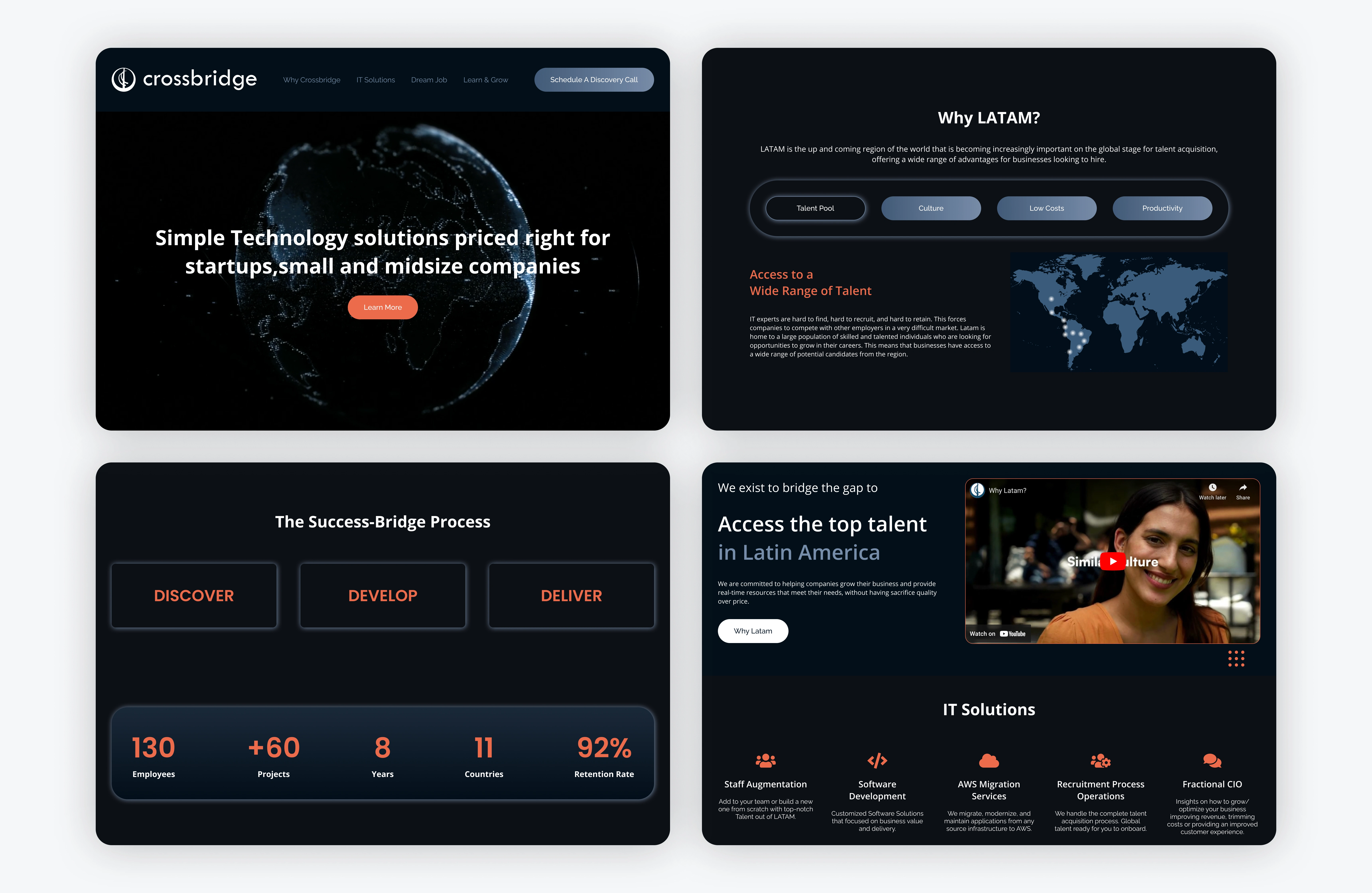
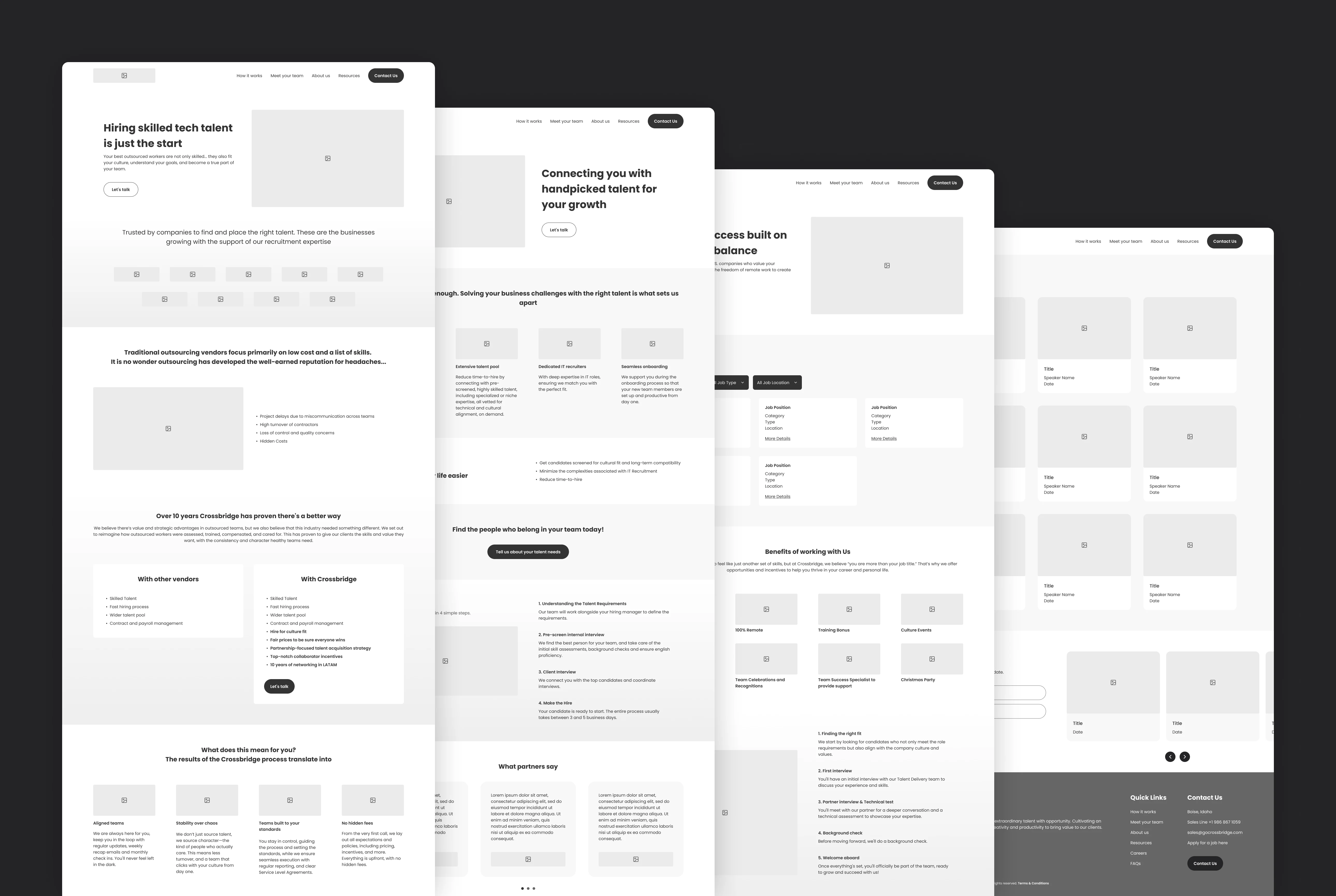
Version 1
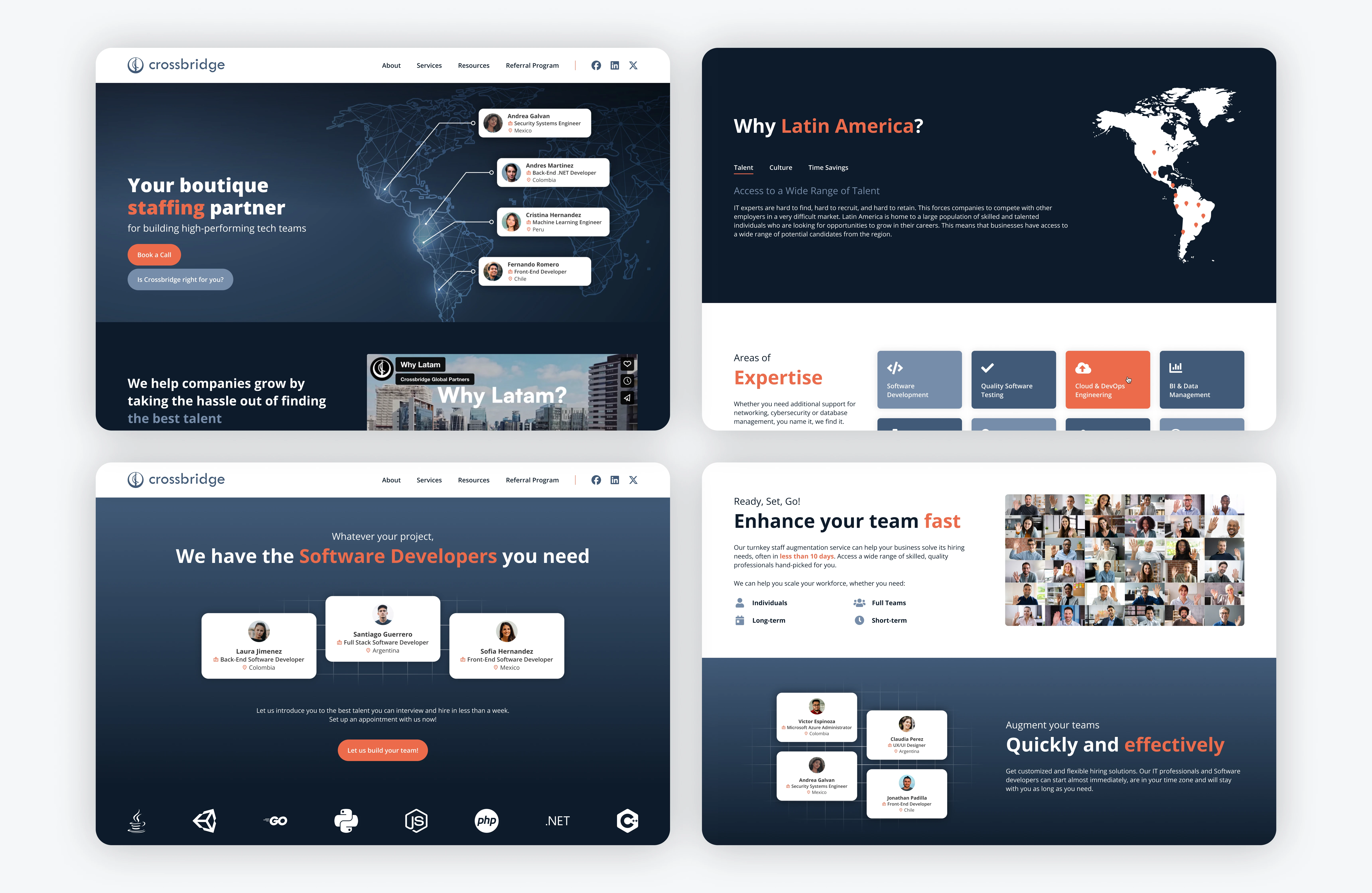
Version 2
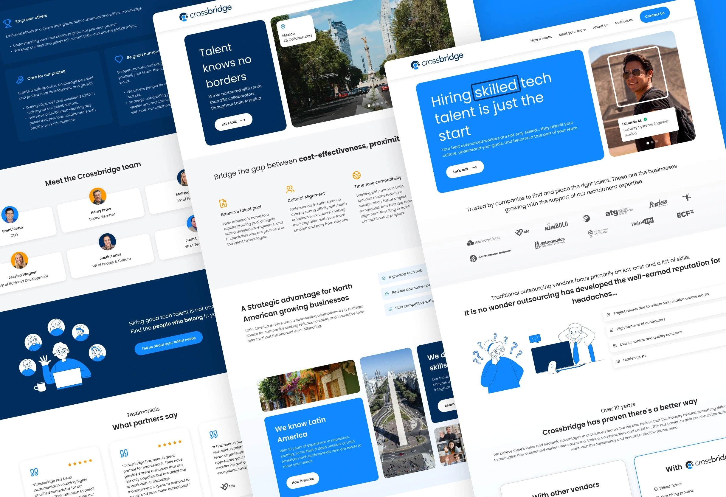
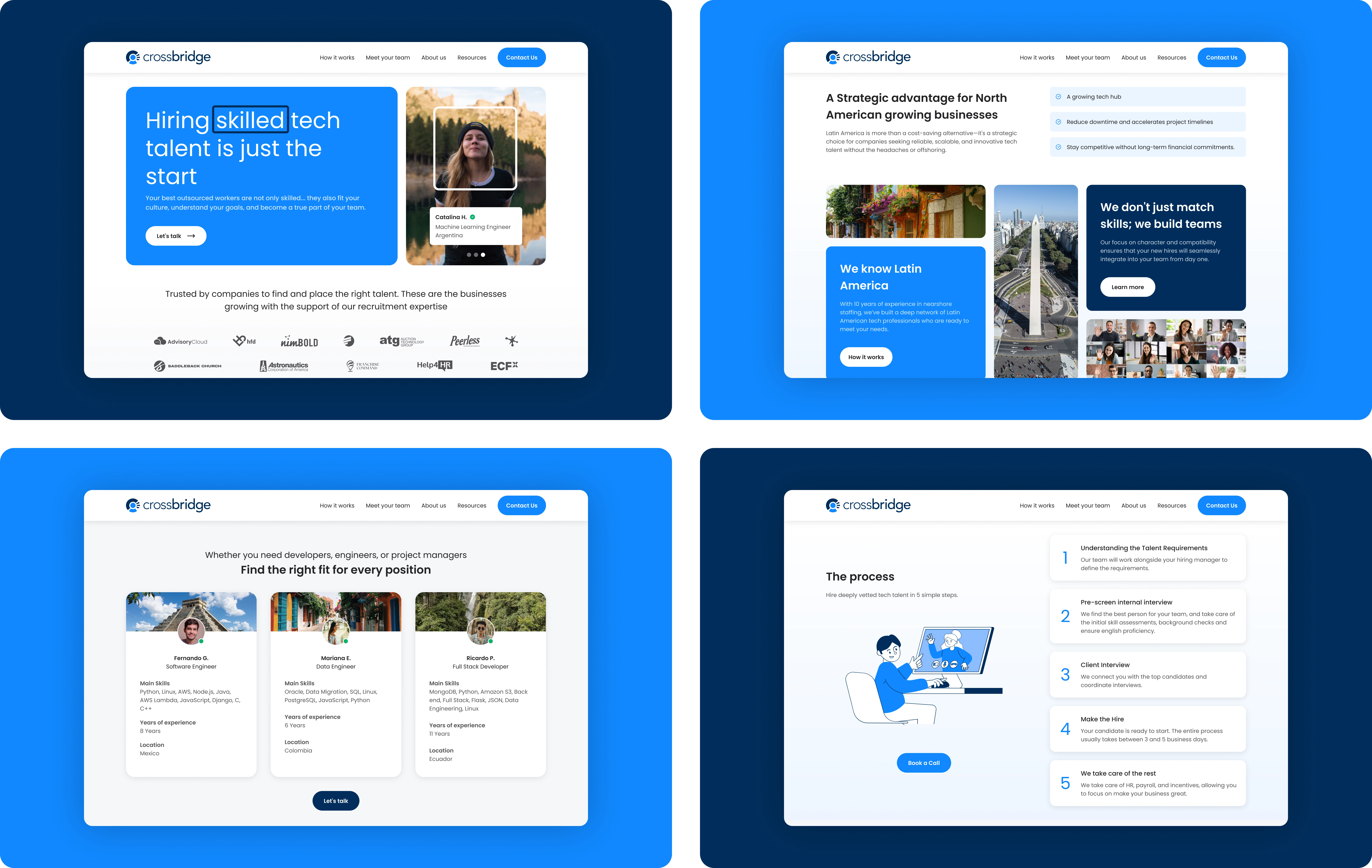
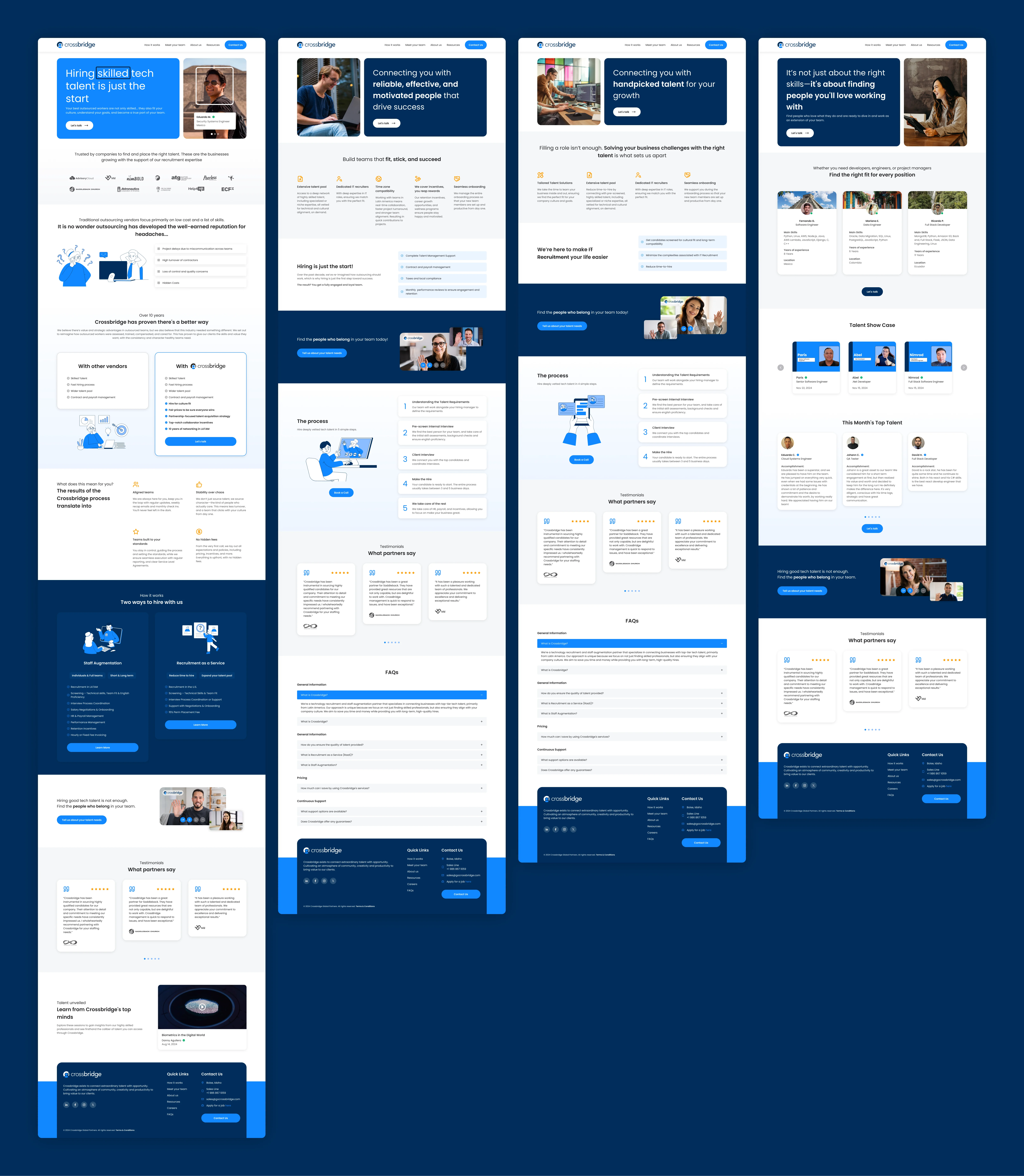
Introducing the new design
The latest redesign brings a fresh, modern look that aligns with Crossbridge’s mission and values. Featuring a lighter color palette, clean typography, and carefully selected illustrations and icons, the new design enhances the brand’s identity while improving usability and accessibility.
Tools and resources
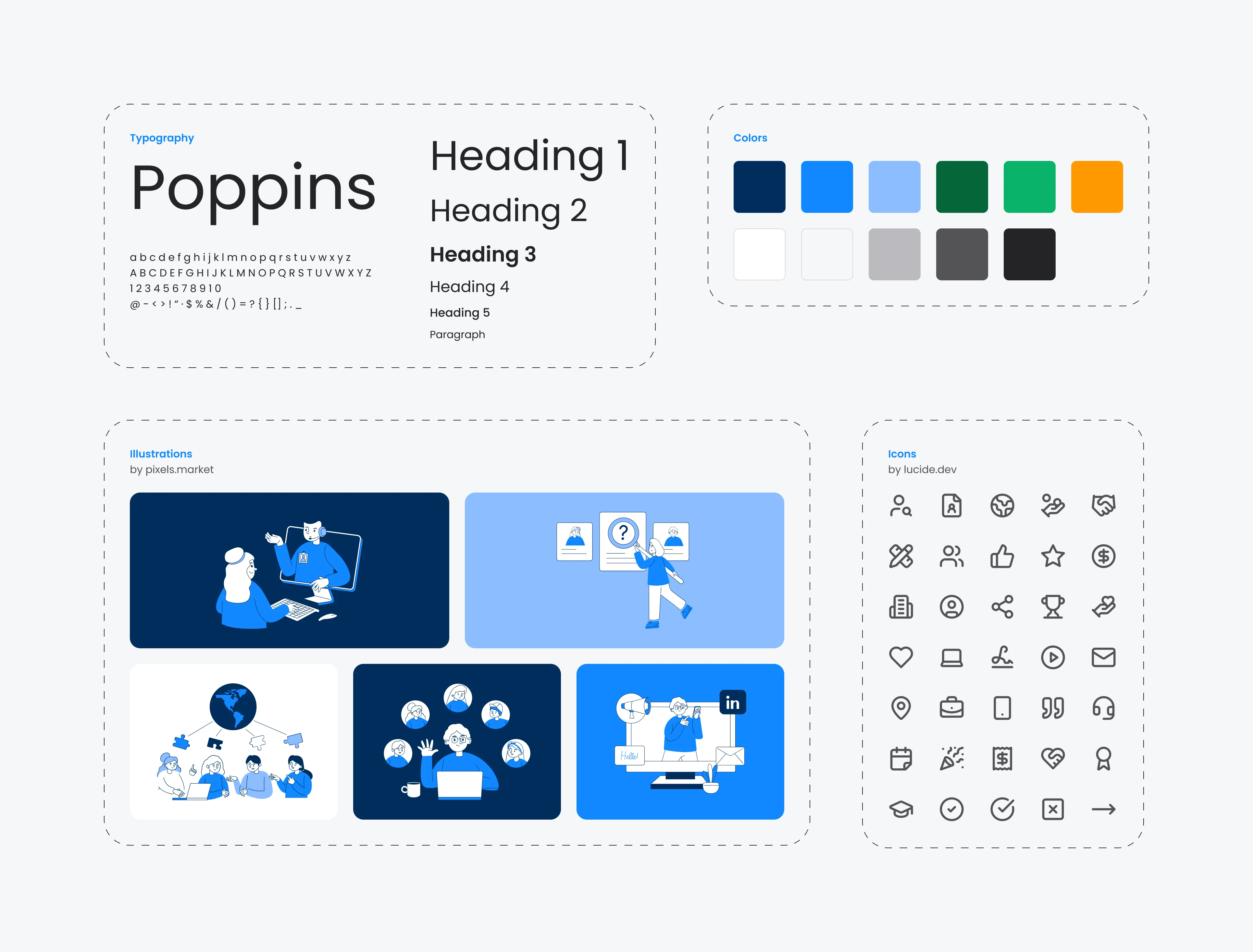
Visual design
Figma, Illustrator, and Photoshop.
Use of free libraries, such as Lucide Icons and Rubytone Illustrations, to accelerate the design process.
Technical implementation
WordPress as the CMS for site development.
Specialized plugins for form management, emails, and social media metadata.
Design and implementation process
1. Content reception
The necessary texts and sections were provided by the Marketing team, already aligned with the desired tone and objectives, making it easier to integrate them into the site design.
2. Collaboration with the marketing team
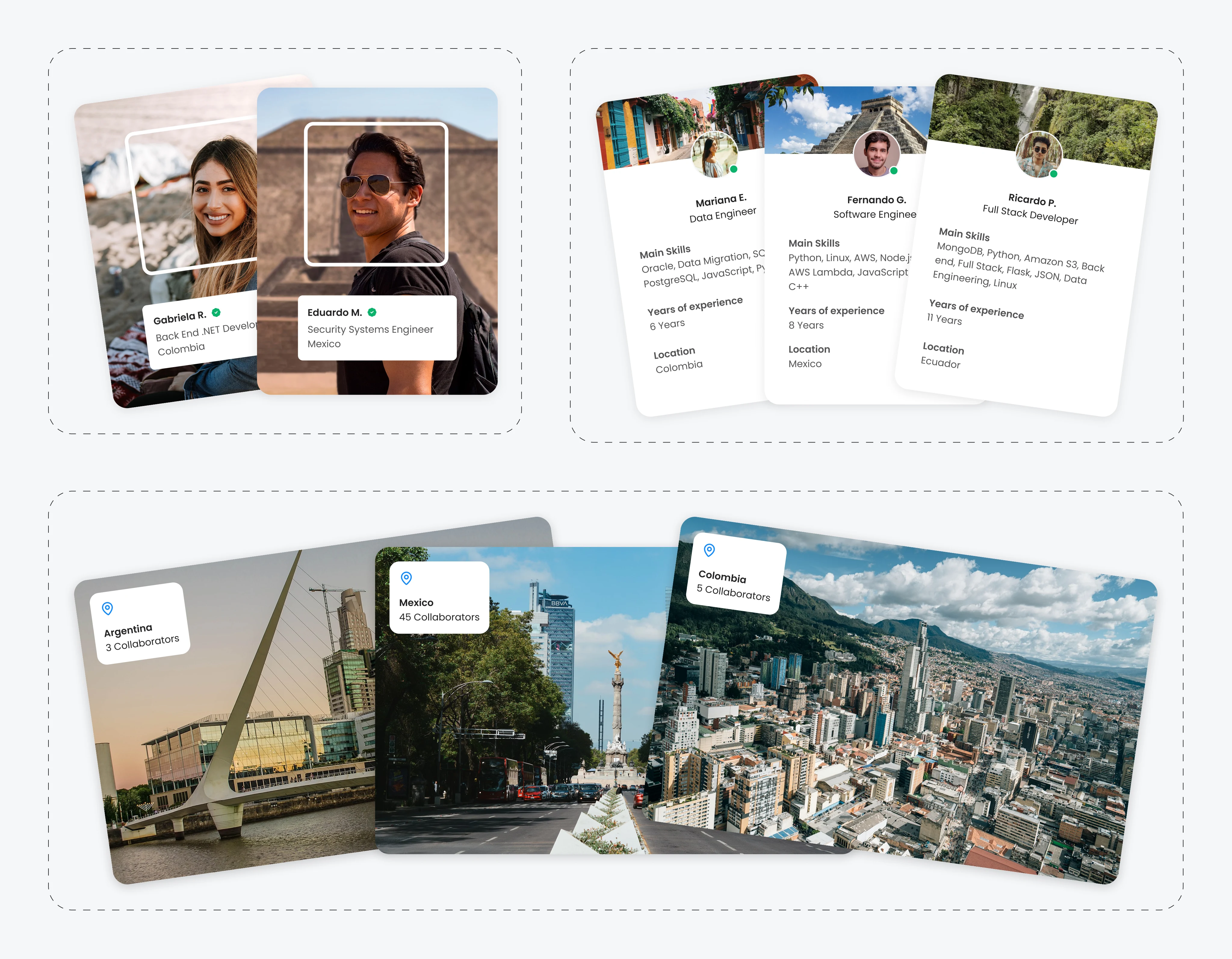
Strategic sessions were held with the Marketing department to align design objectives with the company’s vision. During these meetings, key ideas were defined, such as including photographs of collaborators in iconic locations in their home countries, highlighting their professional roles, and showcasing images of cities with the number of collaborators to emphasize Crossbridge’s presence in LATAM.
3. Visual design
The design focused on creating a cohesive visual language that aligned with the brand’s identity. The color palette, typography, and heading sizes were chosen to enhance readability and ensure consistency throughout the site. Icons and illustrations were carefully selected to complement the overall aesthetic, with slight modifications to maintain visual harmony. Each page was structured with well-defined sections, ensuring a consistent header and footer across all pages. For the initial banners, a modular design was adopted, separating images from text to improve layout flexibility and visual impact.
4. Implementation
The implementation was done progressively, page by page, starting with the most critical ones. It was completed in record time over a weekend to align with the company’s new image launch, which took place the following Monday. Each section was adapted and tested to ensure the design looked flawless and functional on various devices, including tablets and smartphones.
5. Final testing and adjustments
The site underwent a rigorous technical testing process, reviewing each form and automatic email flow to ensure they functioned without errors. Metadata (titles, descriptions, and images) were also checked to ensure proper display when sharing links on platforms like WhatsApp, Facebook, and other social media.
Results
Significant visual transformation
The redesign successfully transitioned from a dark style to a modern, accessible design with better contrast, aligning with the company’s new image and clearly highlighting its services.
Reinforced brand identity
Photographs and graphic elements personalize the user experience, emphasizing Crossbridge’s focus on diverse Latin American talent.
Immediate impact
In less than two weeks after launch, the site generated its first conversion, with an interested client scheduling a call.
Like this project
Posted Jan 3, 2026
Website redesign for Crossbridge Global Partners, highlighting borderless LATAM–US tech talent, improving careers UX, and driving first client conversion.
Likes
0
Views
18
Clients
Crossbridge Global Partners