Built with Webflow

Ace Blend Redesign Concept
🚀 Reimagining Nutrition E-commerce for the Digital Shelf
We recently took on a conceptual redesign challenge for Ace Blend, a coffee and functional nutrition brand we love, with one mission:
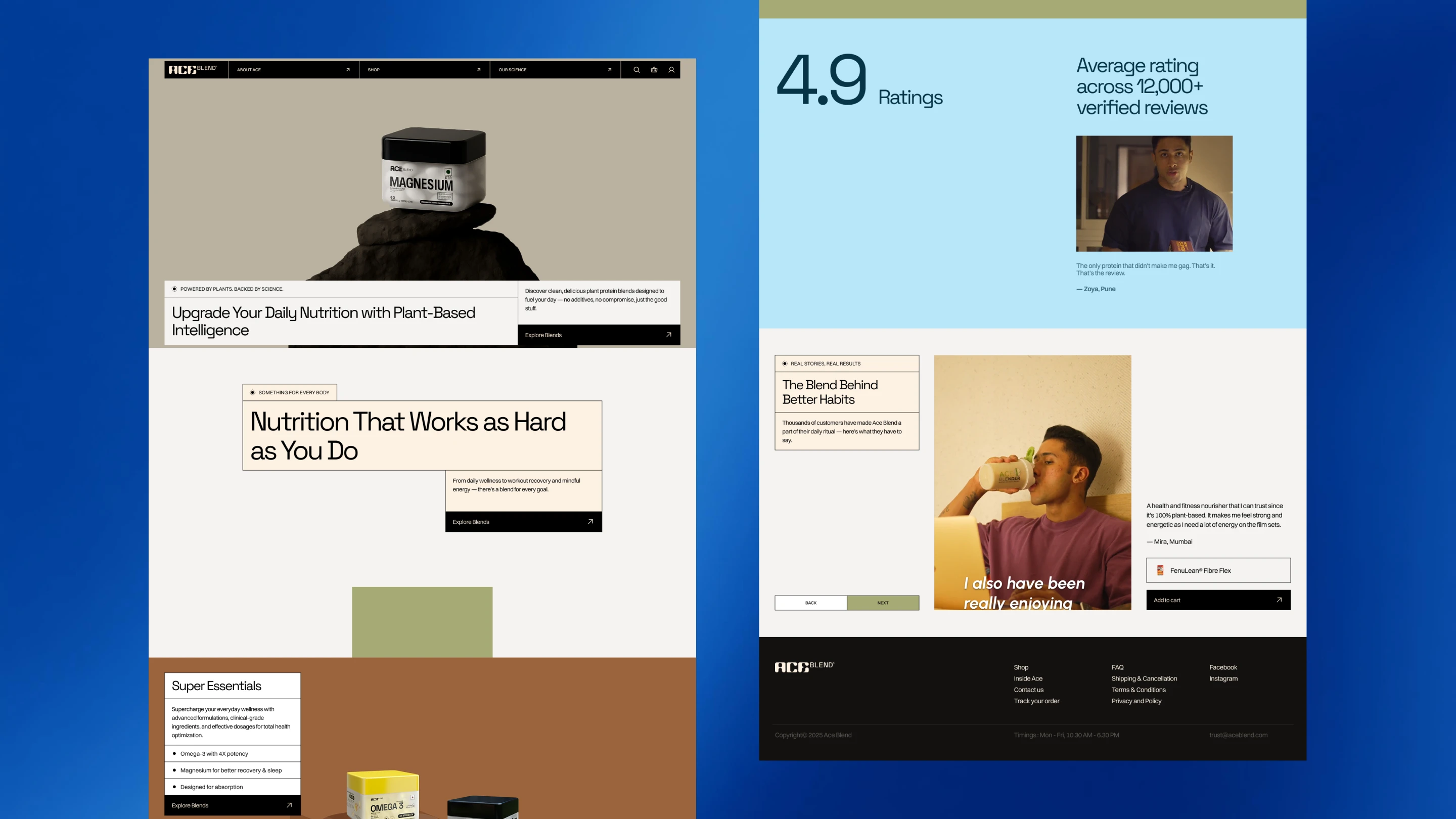
Make the website feel as premium as the product it delivers.
Here’s what we focused on:
🎥 Hero with Presence
The product takes centre stage with minimal content and maximum elegance. The hero is video-ready, perfect for showcasing product variety in motion and grabbing attention quickly.
📦 Flow that Feeds Curiosity
Every scroll is intentional - guiding users from benefits to blends without friction, making discovery as enjoyable as consumption.
🎯 Conversion at Every Step
Whether you're reading a testimonial, exploring product stats, or watching a video, you can add to the cart right there. We embedded micro-CTAs throughout to ensure seamless buying.
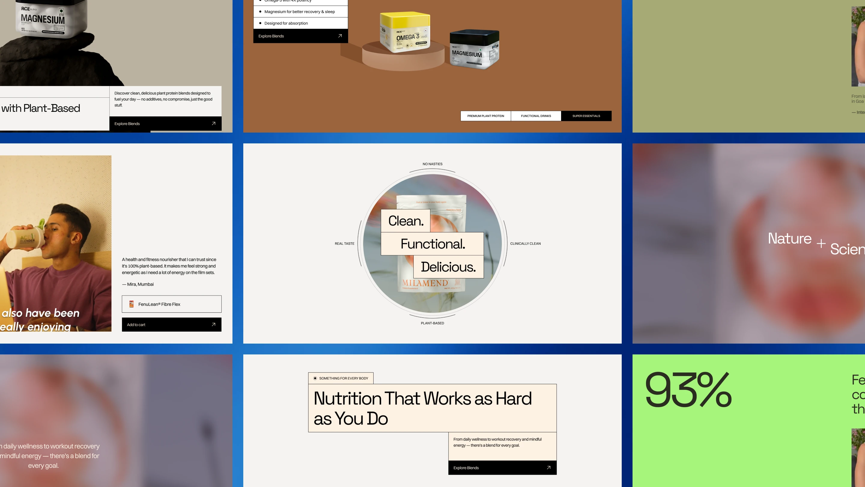
🎨 Branded Consistency
From packaging to palette, everything aligns with Ace Blend’s existing identity — building trust while elevating perception.
📊 Proof + Trust
Bold stats backed by real reviews and video content build credibility, because we know health is personal and trust is earned.
🌿 Naturally Thoughtful
We highlighted the natural ingredients and clean compounds subtly across the layout - educating without overwhelming.
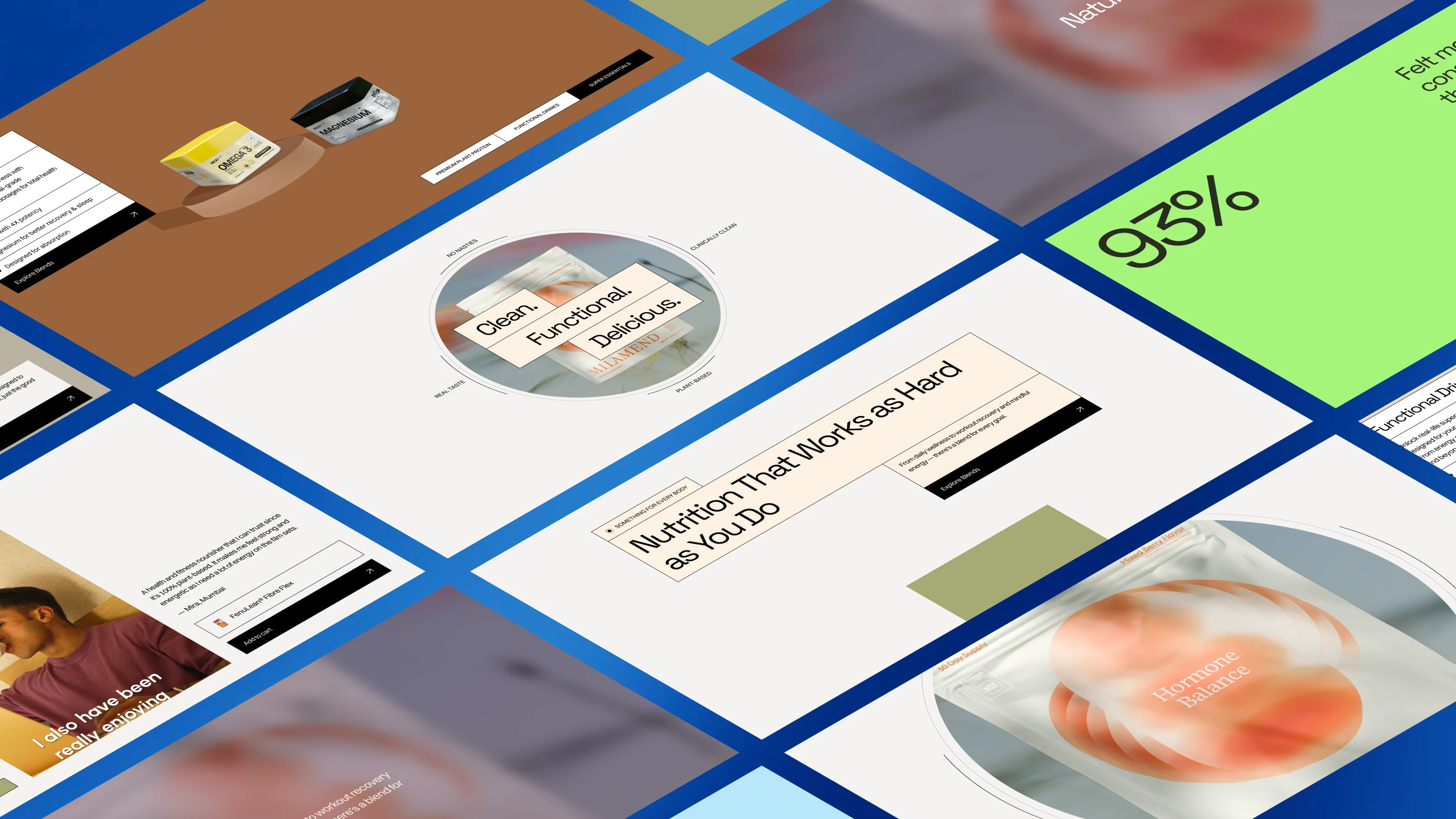
This concept wasn’t just about a prettier layout - it was about:
Aligning with the product’s mission
Respecting buyer psychology
And designing for real business outcomes
Check out the prototype in action
5 likes · 62 views · Jun 27, 2025
The redesign of Ace Blend's website focuses on improving user experience with premium features, sleek design, and intuitive navigation.


