Job Matching Platform Hero Section Redesign
Fatimuz Zehra
Job Matching Platform – Hero Section Redesign
UI Design | Visual Direction
🟣 Overview
Redesigned the hero section of a job recruitment platform to improve visual clarity, trust, and user engagement. The goal was to explore two visual styles: one clean and professional, and another bold and modern with a dark theme.
🎯 Objective
Increase first-impression trust
Clarify the platform’s value for both job seekers and recruiters
Enhance visual hierarchy and CTA visibility
🔍 Design Approach
Version 1: Minimal + Trustworthy
Clean white background
Bold headline with color-emphasized keywords
Friendly human imagery for emotional connection
Simple CTA with clear direction
Version 2: Dark Mode + Confident
Dark theme to reflect a sense of exclusivity
Stylish serif font for contrast
High-focus light on headline and CTA button
Corporate imagery showing professionalism
📐 Design Decisions
Used a split test-style layout to compare impact
Improved typography balance and whitespace
CTA color and placement tested for visibility and contrast
🧠 What I Learned
How layout tone influences trust perception
Importance of context-specific imagery in B2B products
Balancing personality with brand professionalism
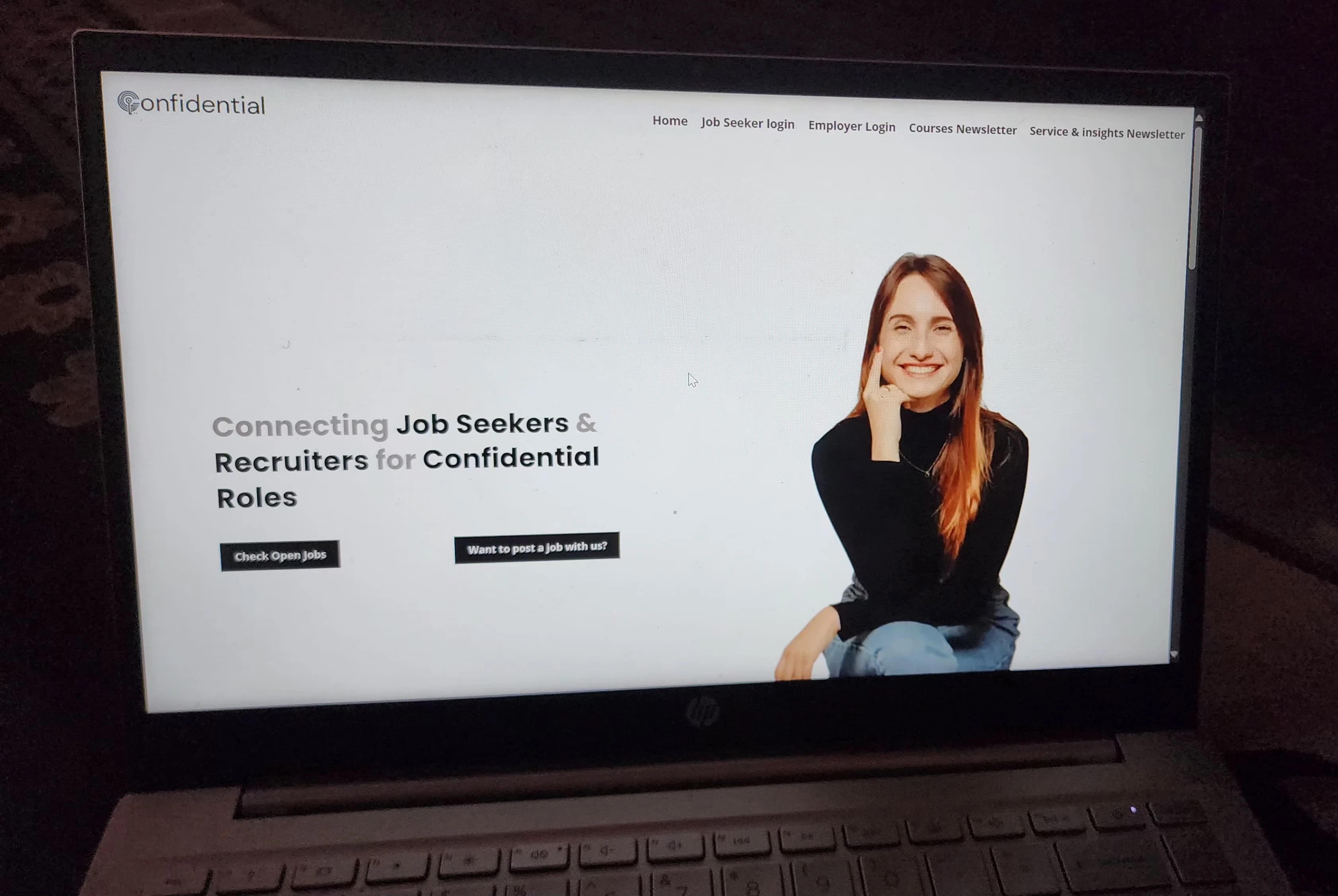
Before
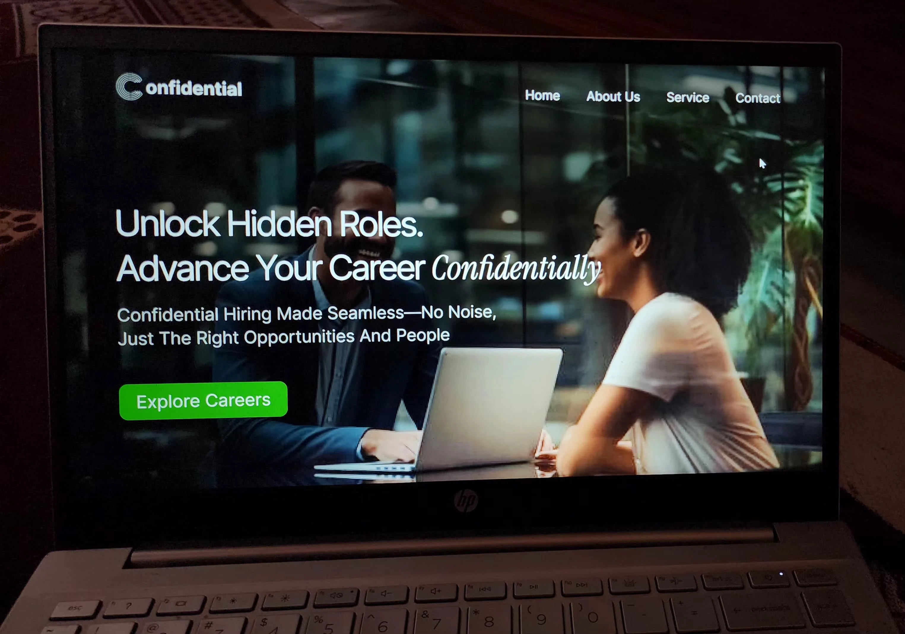
After
Like this project
Posted Jun 25, 2025
Redesigned hero section of a job recruitment platform to enhance visual clarity and user engagement.
Likes
0
Views
1