Your website looks perfect on

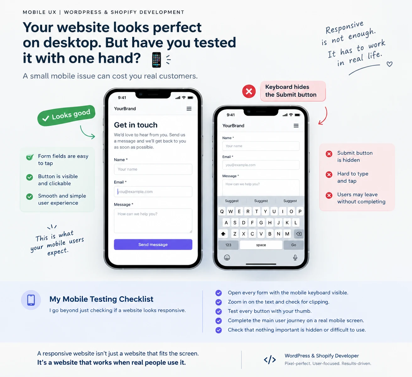
Your website looks perfect on desktop. But have you tested it with one hand? 👀
Here’s a small website issue that can quietly cost you customers.
Imagine someone visits your website on their phone. They’re ready to buy, sign up, or contact you.
But then…
❌ The button is hidden behind the keyboard.
❌ The form fields are too small to tap.
❌ The text gets cut off when they zoom in.
❌ The layout breaks on a smaller screen.
They probably won’t report the problem. They’ll simply leave.
My mobile testing checklist goes beyond checking whether a website looks responsive:
✅ Open every form with the mobile keyboard visible.
✅ Zoom in on the text and check for clipping.
✅ Test every button with your thumb.
✅ Complete the main user journey on a real mobile screen.
✅ Check that nothing important is hidden or difficult to use.
A responsive website isn’t just a website that fits the screen. It’s a website that works when real people use it.
As a WordPress and Shopify developer, I believe the small details are often what separate a website that looks good from one that delivers a great user experience.
A question for designers, developers, and business owners:
What’s the most frustrating issue you’ve encountered on a mobile website?
#WebDevelopment #WordPress #Shopify #UXDesign #WebDesign
0 likes · 4 views · Oct 21, 2026
Your website looks perfect on desktop. But have you tested it with one hand? 👀 Here’s a small website issue that can quietly cost you customers. Imagine som...