Pocket Your Finances - Smartwatch App
CASE STUDY SUMMARY
To see the full case study please refer to this link
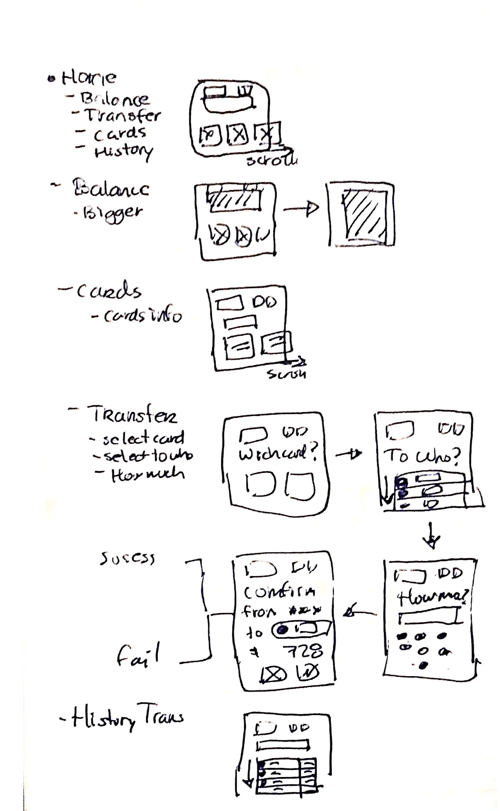
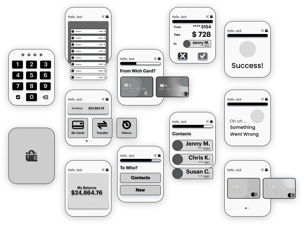
✍🏻Wireframe
🚦Research
Discovery Phase
Qualitative
Ten interviews were conducted with users familiar with the Pocket Mobile App. In this interview, 5 people who didn’t have a smartwatch and 5 with a smartwatch talked about the challenges they face when they do not have enough speed and access to their bank details.
Key Insights
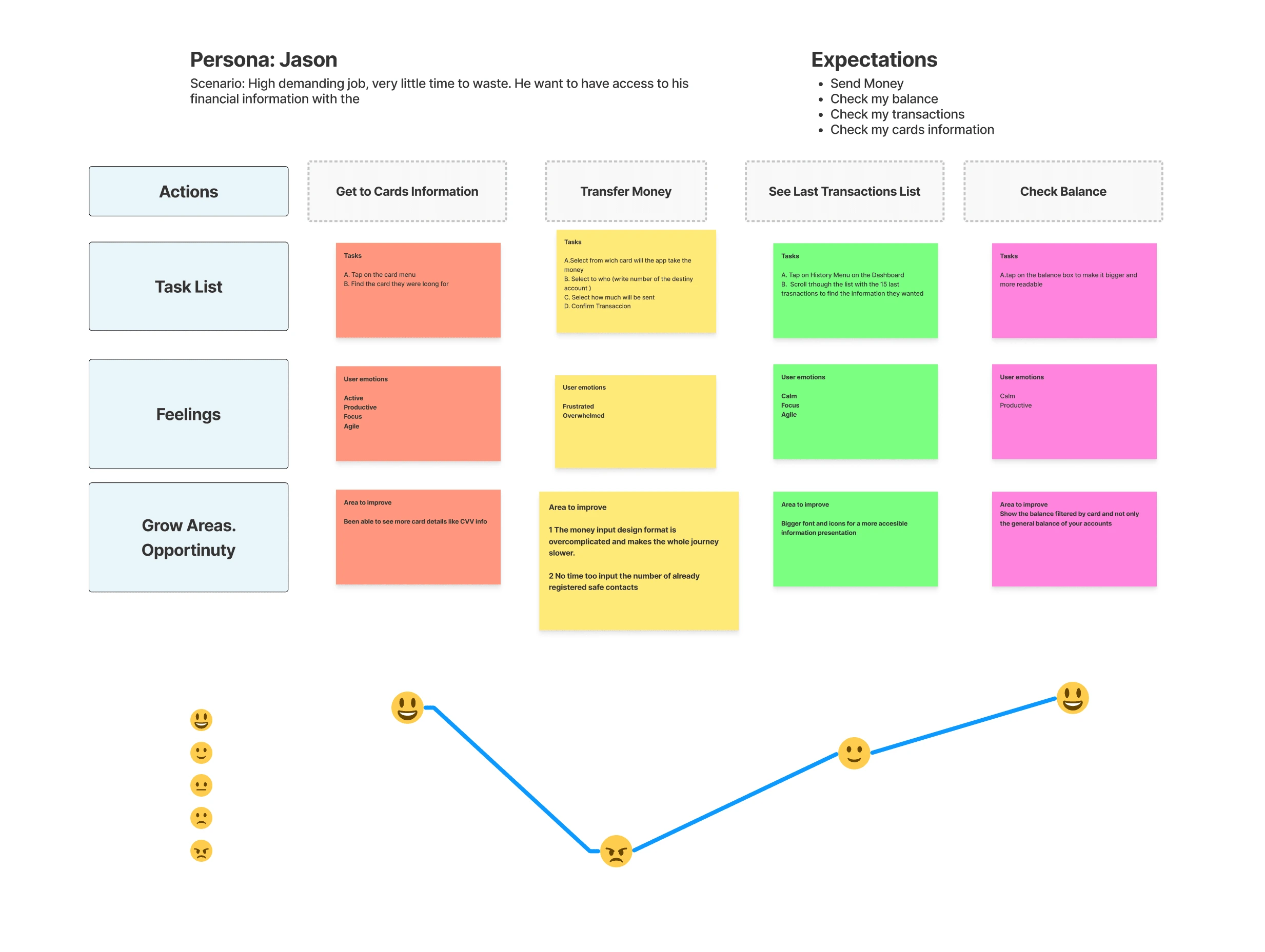
The most frequent activities done in the pocket app are: checking balance, checking card info, checking history transactions, and money transfers.
The most repetitive activities are checking balances and reviewing historical transactions.
78% feel that the most repetitive activities (checking balances and historical transactions) need too many steps and would prefer a quicker and easier way to check on them more regularly.
Quantitative
We conducted a survey via Google Forms, which was posted in a Reddit forum related to fintech to get answers from potential users. A total of 27 people completed the survey successfully, which helped us create a more narrow segmentation and a more user-centered design.
Key Insights
This survey reinforces that the 3 most frequent activities are checking the balance, checking card info, checking history transactions, and making money transfers.
17 people said they own a smartwatch, 4 said they don't have one yet but are planning to get one in the next 6 months, and 6 said they don’t have any. Which shows a potentially growing market.
People don’t have alternatives to accessing their banking information besides their phone, computer, or physically going to an atm or the bank.
Usability Test
Once the visual design was ready, I gathered 5 potential users to evaluate their behavior and comments about the Pocket x Smartwatch. The evaluation was conducted through Zoom in 1-on-1 sessions.
The tasks that were given to the participants were:
Transfer money to contacts.
Check card information.
Check the last 15 transactions.
Check Balance
Positive Reactions
The colors look pretty, and it’s fairly easy to read through.
I like that it's a straightforward app and doesn’t have so many unnecessary features.
It’s perfect for when you want to do a simple task. I like the blue combination and the white in the letters. It's pretty but not in a distracting way.
The most positive thing, I think, is that I can navigate through it almost without thinking because it’s very intuitive.
It’s fast and simple; I don’t need to make unnecessary moves to do what I intend, and it gives me the power to be in order with my finances.
Next Stage Potential Challenges
Two out of the 5 interviewees speak about their concerns about security. I decided to specify them in this section to present them as an add-on for the main project, which is the bank app.
Security
I’m concerned about what would happen if I lost my smartwatch. Even if it is password protected, how can I be sure that nobody else will access my information?
How can I dislink my account if I lose or sell my Apple watch?
Suggestions
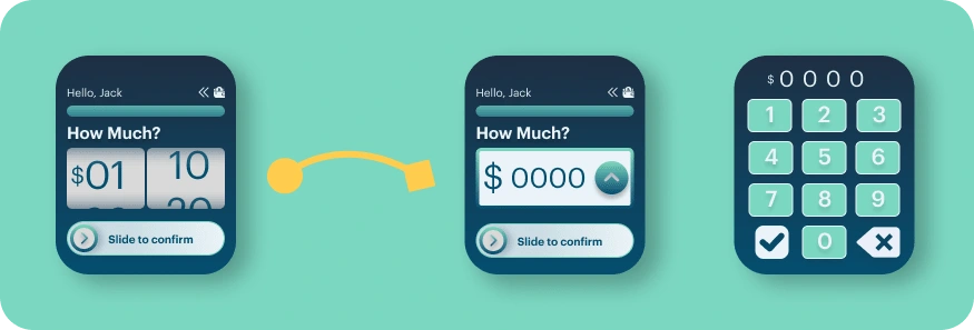
The money transfer input is too complicated. I lost a lot of time trying to input any number. I would prefer to have a number keyboard to enter my amount directly.
I would prefer to scroll horizontally rather than vertically through the cards because it feels more natural to me.
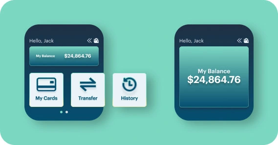
The balance number is fine in size, but I would like to be able to tap on it to zoom in and be sure.
Everything is easy and perfect but the money input in the transfer is hard to set up, and the screen is too little
Key Insights
The money input needs to be changed to potentially a pad number screen with a slide to confirm the mechanism.
The balance button needs to resize while you hover into a bigger variant for more visibility.
Add a slide to confirm instead of a check button in the money input screen inside the transfer money flow.
Before
4 out of 5 manifested had problems at this stage because of the input method.
After
I decided to change it into a number input. Here they just click on the up arrow and the number of keywords shows up. Once satisfied with it, they just click on "check” and go back to the screen with the amount they entered. Then they just need to slide to confirm their action.
🧩Solution / Summary
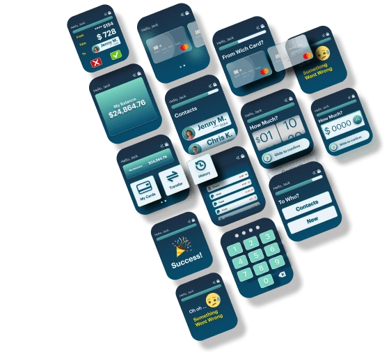
The Pocket x Smartwatch is a complimentary app created for the busiest users, always on the run and for those who want to always carry at the length of their arm their bank information as backup access.
Research shows that people want something fast, clean, straightforward, and a no-brainer.
I implemented all of these concepts into my design to create an intuitive, fast, and pleasant-looking interface.
The money input stage into the transfer flow showed a deficit, and it was changed from a “scroll-like” menu to a number pad option with a slide to confirm at the end.
Like this project
Posted Apr 29, 2023
Experience personalized banking with our smartwatch app. Securely access financial data, make transactions, and check balances on-the-go. Ciao to phone depency.


