Pulpos :: Brand Identity

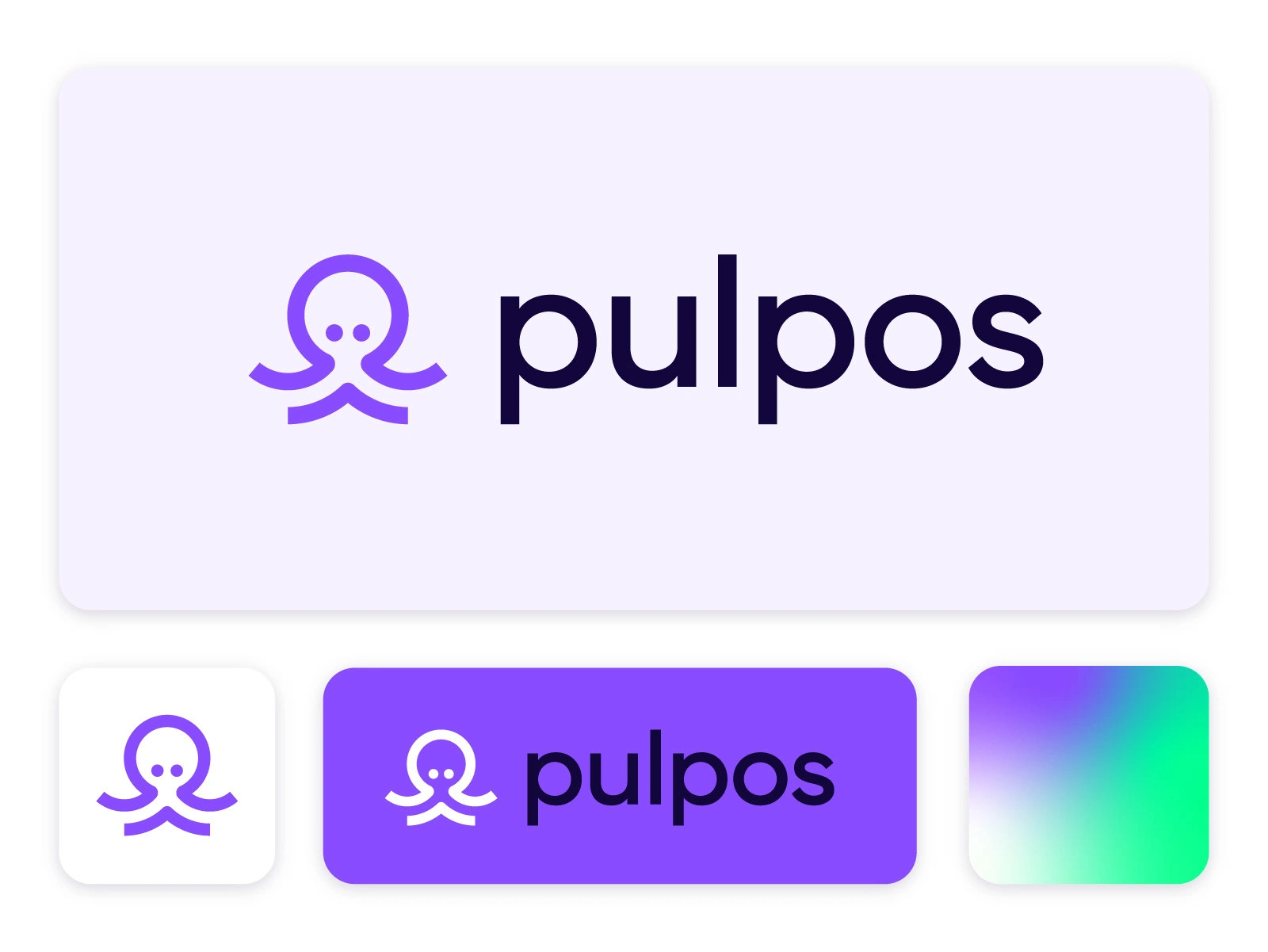
This is brand identity option for Pulpos, a point of sale from Mexico. The goal was to develop a tone that's friendly enough for business runners, but also reliable and technologically current. Also the word 'pulpo' means octopus in Spanish, and the idea was to depict the animal in a way that doesn't stands out its monstrous features 🐙
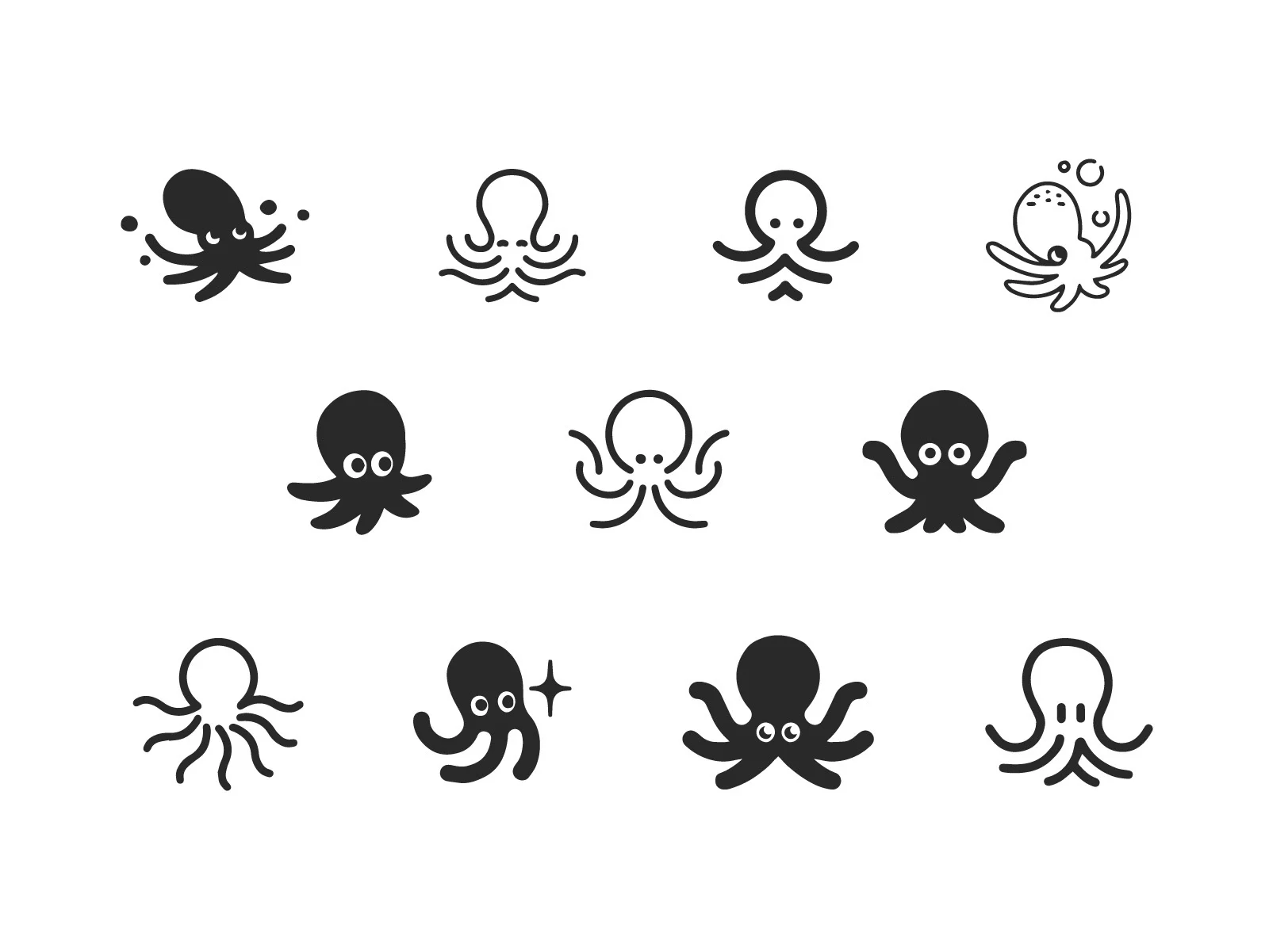
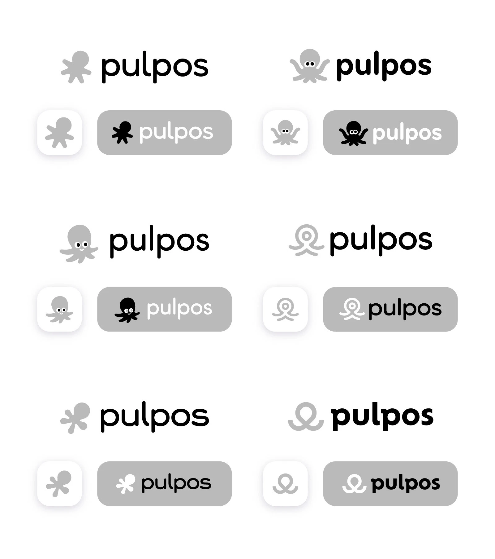
Here's a few of the sketches and explorations that I made towards this proposal. Please take a look!


Thank you for watching!
I'm open to commissions and collaborations. Feel free to email me at ivcoti@gmail.com and tell me about your project!
Like this project
Posted Jun 11, 2024
This is the brand identity option for Pulpos, a Mexican point of sale. It aims to be friendly for business runners yet reliable and technologically current.


