Brand Identity + UX/UI Design (Framer) | TBAC
Ana Victoria González
Renewed brand for this Alternative Provision
Visit the website:
TBAC (Training and Building Achievement Centre) is an alternative provision in Nottingham City Centre.
The challenge
The challenge was to modernize TBAC’s visual identity and create a brand system that communicates trust, care, and structure. As an Alternative Provision, TBAC supports young people facing educational barriers, and the brand needed to reflect that mission with clarity, warmth, and professionalism.
The Approach
Working with BBVisual, we refreshed TBAC’s brand by developing a stronger visual system, consistent color palette, and modern typography. We also worked in the web to ensure the updated identity translated seamlessly into their new website.
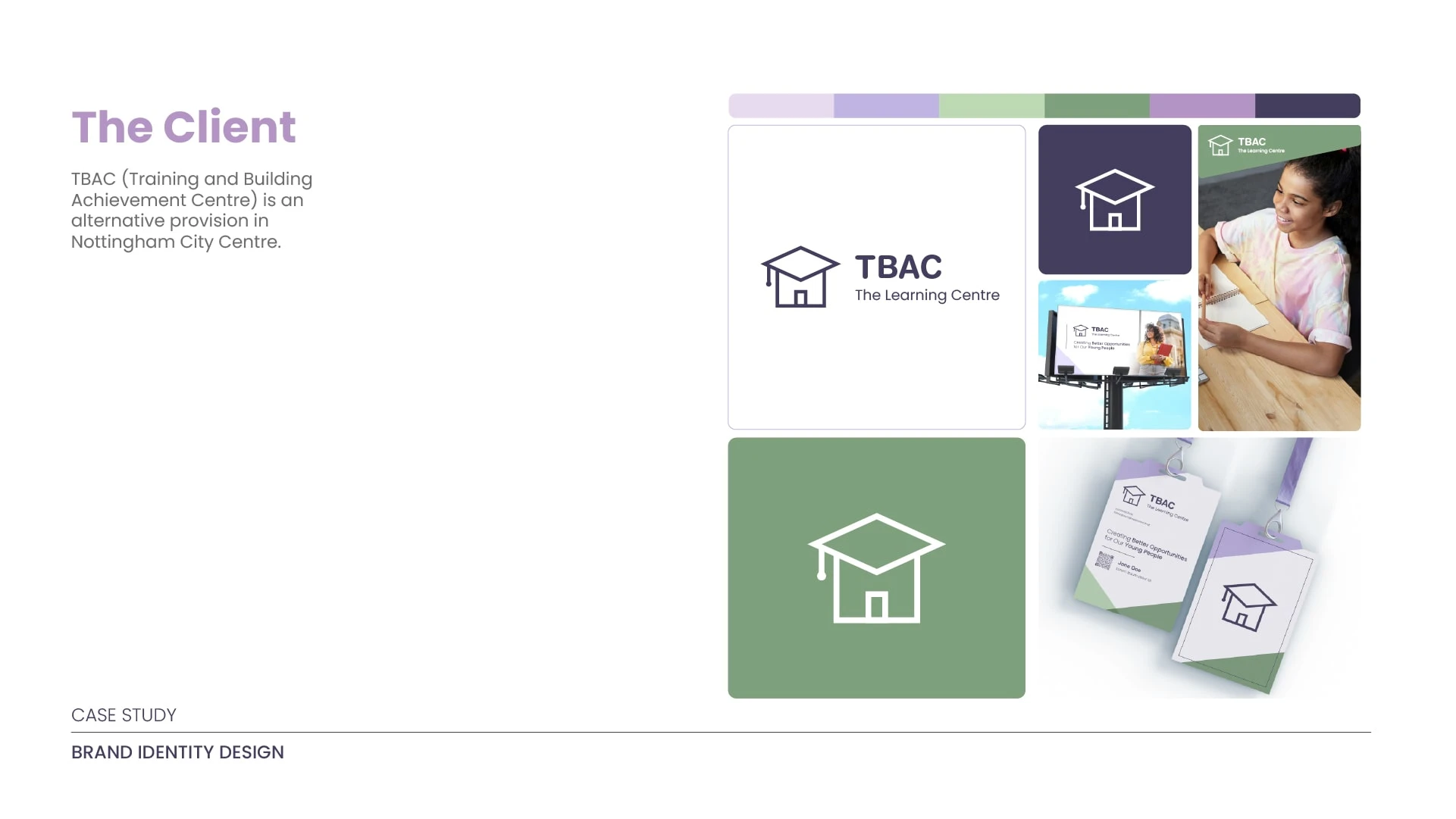
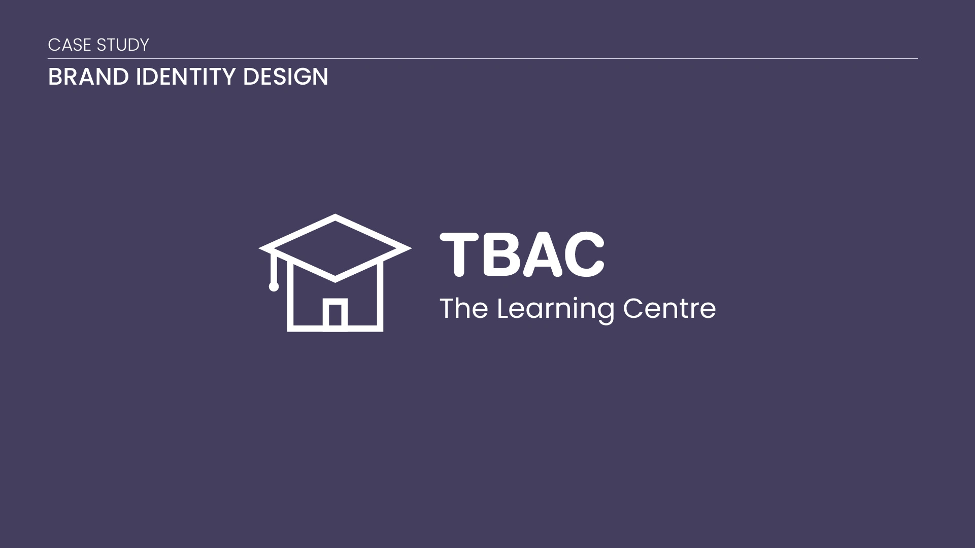
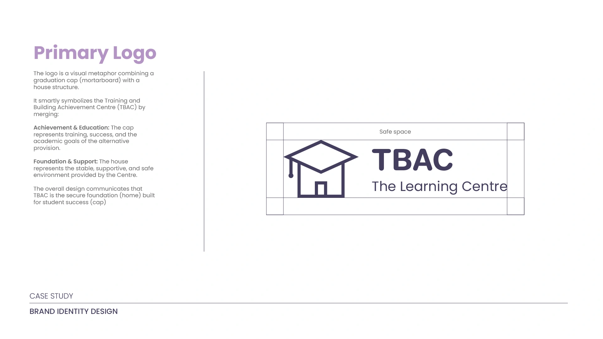
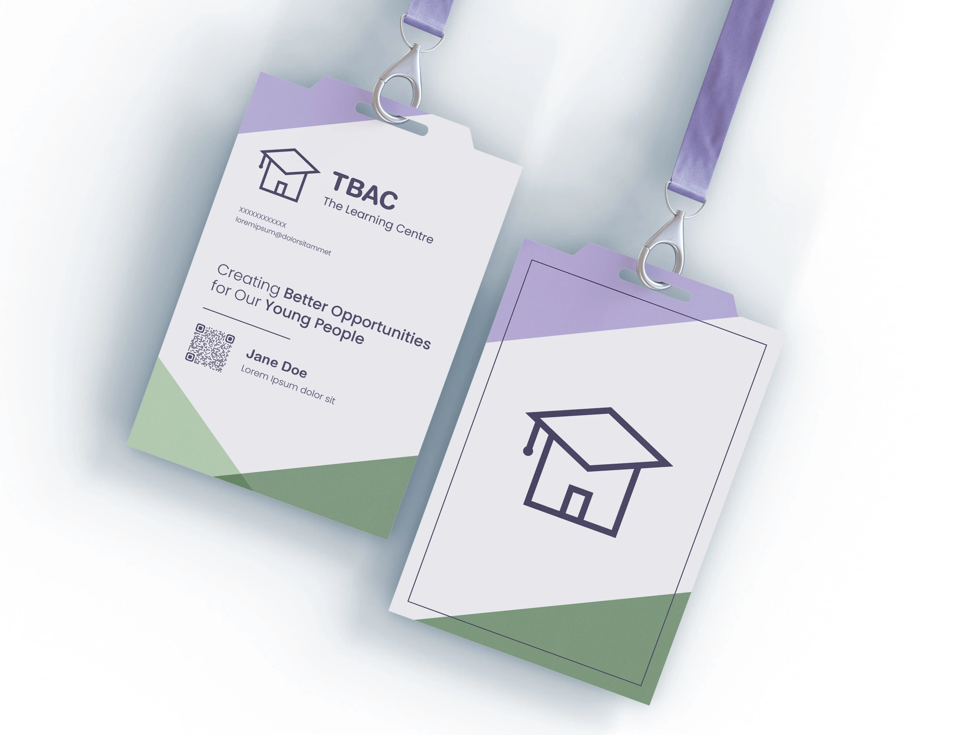
Logo Design
The logo suite includes the primary logo and the monogram logo.
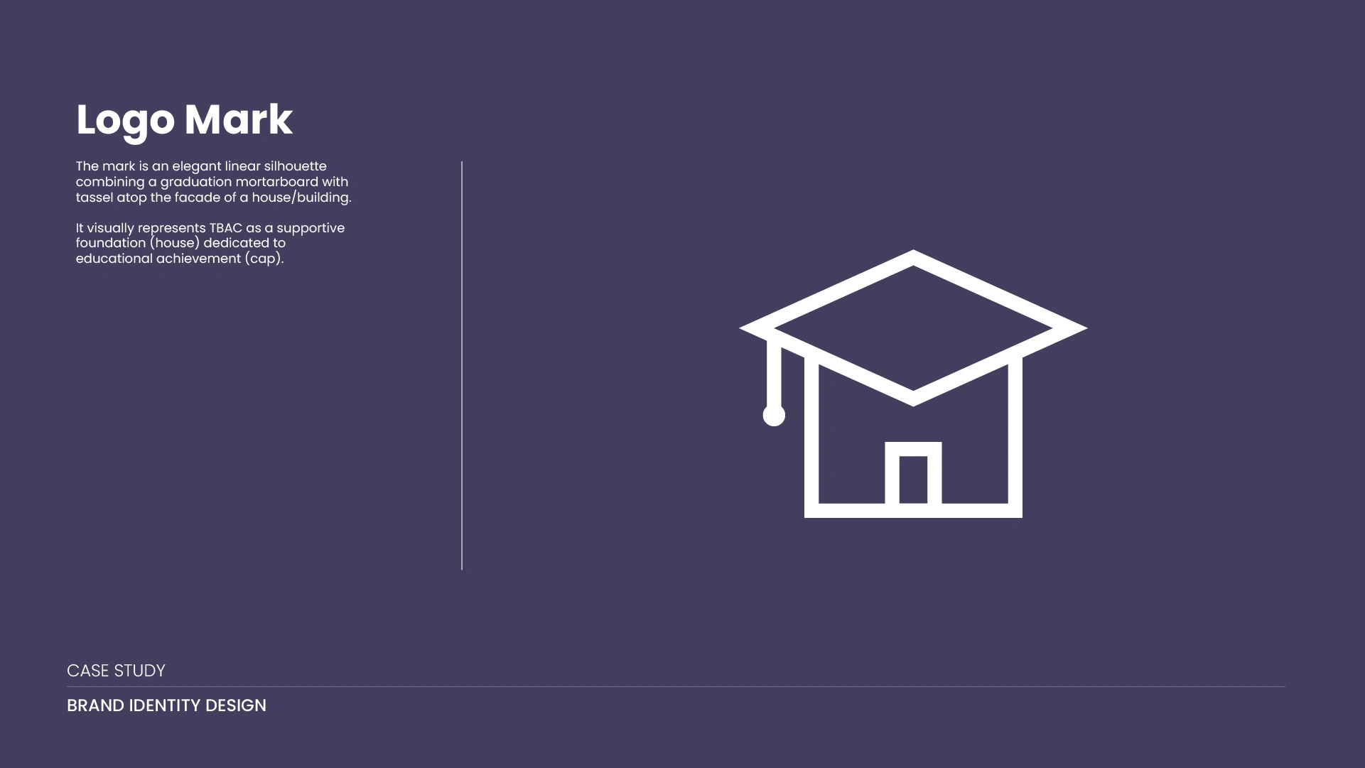
The logo elegantly merges the outline of a tassel-adorned graduation cap (a mortarboard) with the outline of a simple house or building.
The Graduation Cap (Education/Training): The upper portion, forming the roof, is the mortarboard, which universally symbolizes achievement, training, learning, and academic success. The attached tassel confirms this association and suggests the ultimate goal of graduation or successful completion of a program.
The House/Building (Provision/Foundation): The lower portion depicts the walls and entrance of a house or structure. This element symbolizes the "Centre"—the physical foundation, stability, support, and safe environment of the alternative provision. It suggests that TBAC is a safe, nurturing place where learning takes place, akin to a second home.
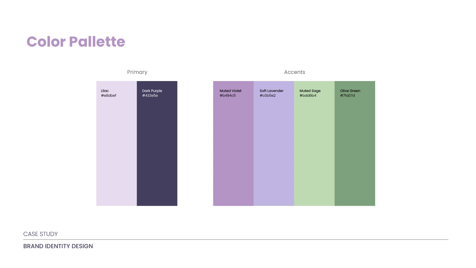
Color Pallette
Psychological Representation
Purples: Calmness, Creativity, Reflection, Nurturing. Purple often inspires thoughtfulness and is associated with wisdom and respect.
Why it works for TBAC: The lilac, muted violet, and soft lavender provide a calming, non-threatening atmosphere, which is vital for students who may struggle in traditional settings. It encourages creativity and a personalized approach to learning. The dark purple adds a level of maturity and sincerity to the provision.
Greens: Growth, Stability, Safety, Balance, Renewal. Green is the color most associated with nature, harmony, and well-being.
Why it works for TBAC: The Olive Green provides a strong sense of stability and trust, reflecting TBAC's role as a reliable foundation (as seen in the logo). The lighter Muted Sage promotes renewal and progress (Growth), suggesting a fresh start and forward movement for the students.
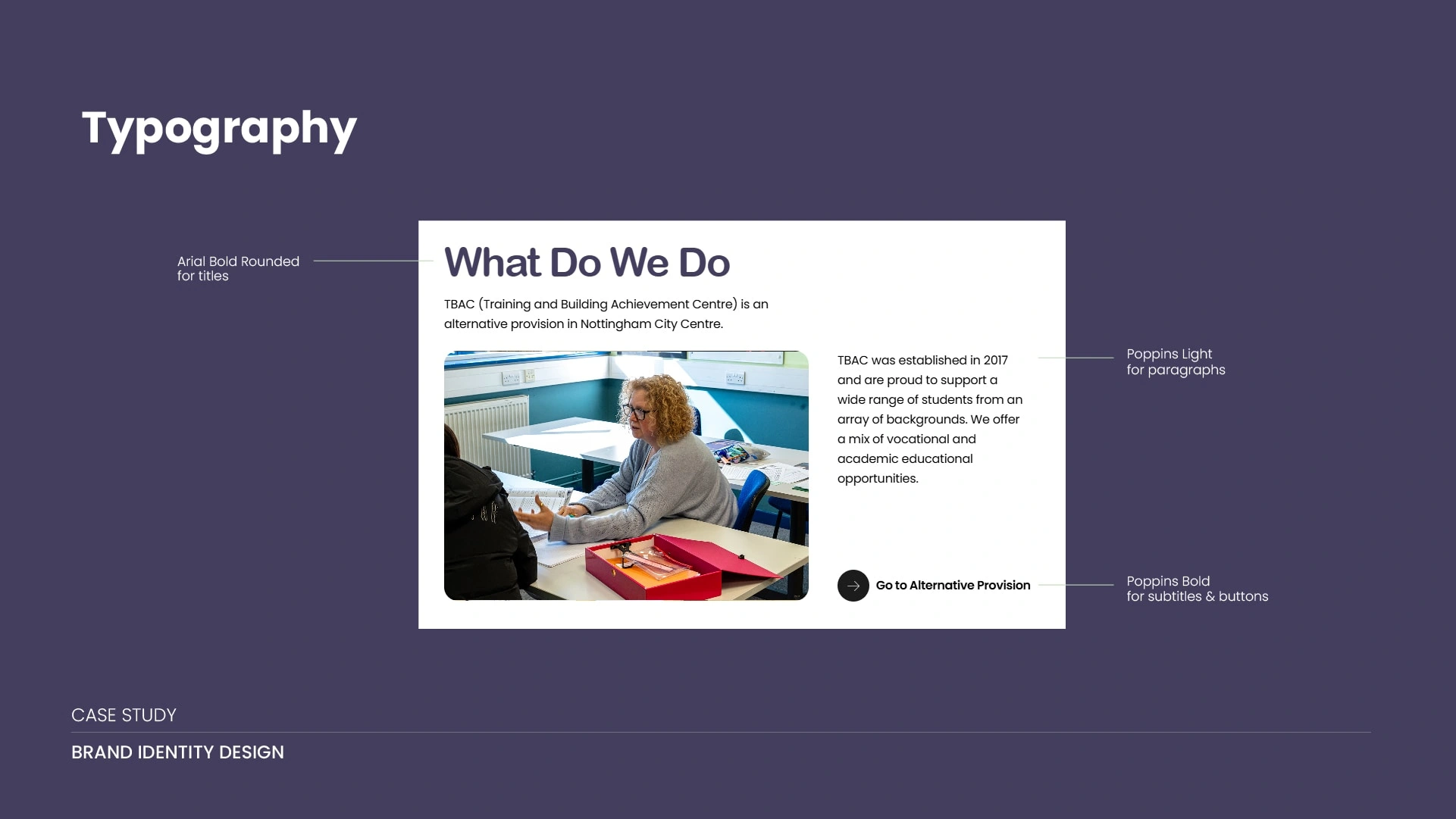
Fonts
Arial Rounded Bold provides a friendly, welcoming voice for headlines, using its soft terminals to signal a non-threatening and supportive environment. This warmth is grounded by Poppins, a clean, modern geometric sans-serif that ensures outstanding readability and structural professionalism in all body text. Together, they create a clear, accessible hierarchy that makes the brand feel trustworthy and easy to engage with.
Brand Application
Work with me:
avgj27@gmail.com
Like this project
Posted Nov 20, 2025
Modernized TBAC's brand identity with a new visual system and website.