Wight CBD Visual Identity and Branding
CBD was associated with dodgy street corner head shops and shady practitioners when it arrived on UK shores, more Darren than Darcy. A real shame then, as it has very real medicinal benefits. Shifting the perspective from disreputable to aspirational was no easy task, but one I relished.
I’m a big believer in drawing solutions from the problem, in truth telling, but the stigma surrounding the iconography of cannabis is very real and toxic to potential stockists. So how to represent the product without referencing cannabis? The hemp farm the company owned was situated on the Isle of Wight, and channeling that affluent beachside aesthetic was key to positioning the brand.
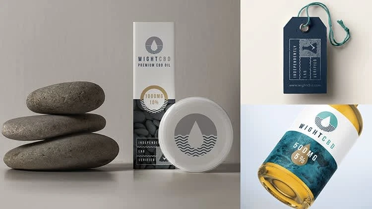
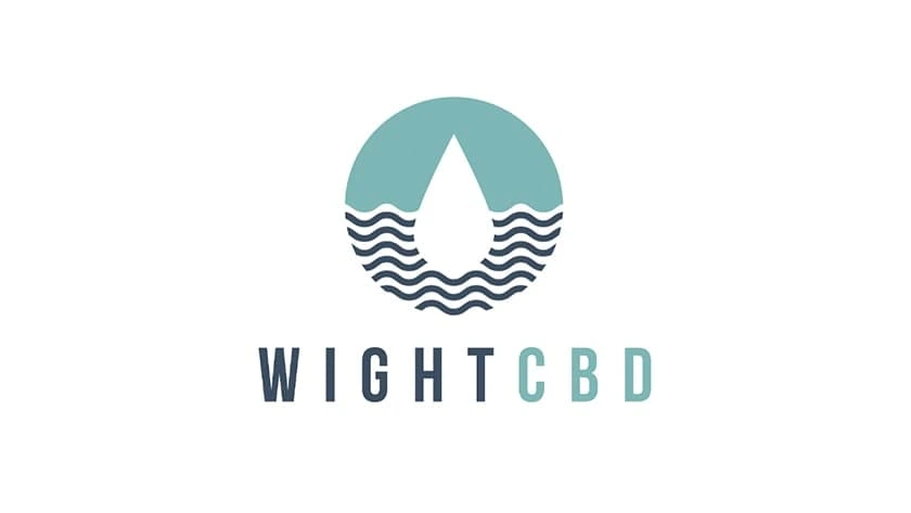
The logo took shape from the iconic shape of the delivery system of CBD – the drop. Thinking about how to remain true to the product (CBD) and the desired lifestyle (the Isle of Wight), I loved the symmetry of brainwaves and ocean waves. The metaphor perfectly marries the two separate ideas of calm minds and calm seas into a relevant, successful mark.
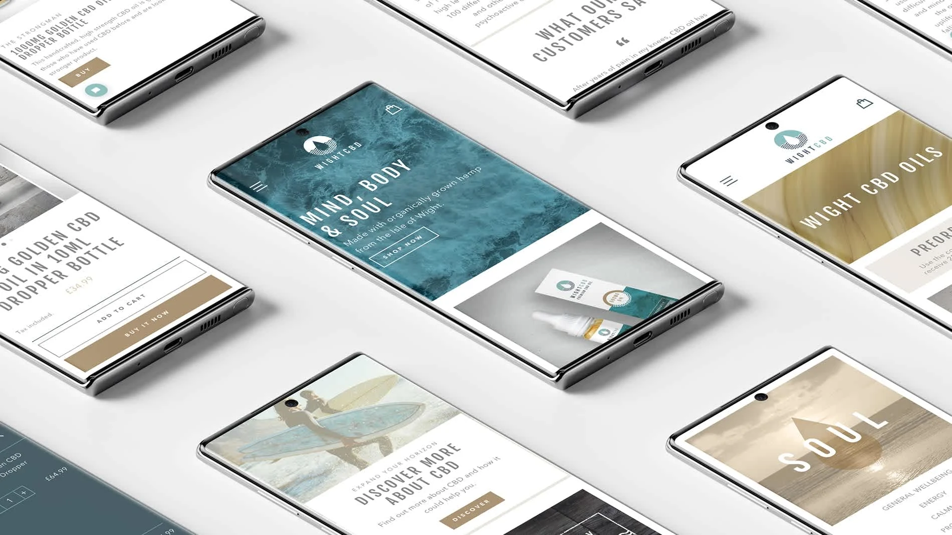
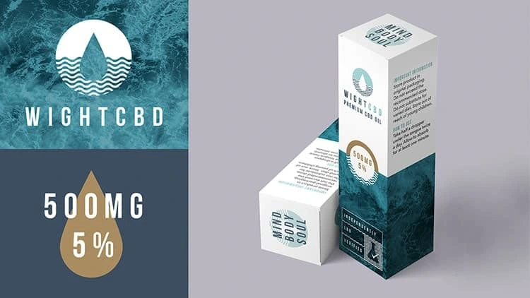
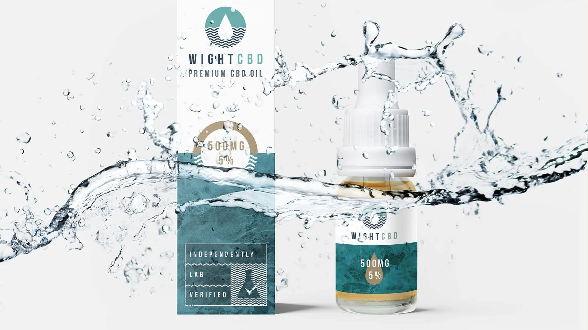
A palette inspired by the beach lifestyle was the antithesis to the garish rave like packaging of head shop CBD. Pastel blues, sandy neutrals and the gold of the oil itself created a premium feel, far removed from local shop car parks and on to sunset barbecues on the beach. It was an exhaustive project, from the original identity and branding through to packaging, print and digital marketing, ending with an e-commerce site, all of which the client was delighted with.
Like this project
Posted Nov 18, 2024
Created a bespoke, premium brand, using insight, strategy and skill to solve real world obstacles in the route to market.
