Yazaki North America Branding
Lauren Keel Williams

About Yazaki
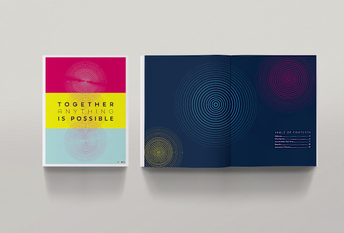
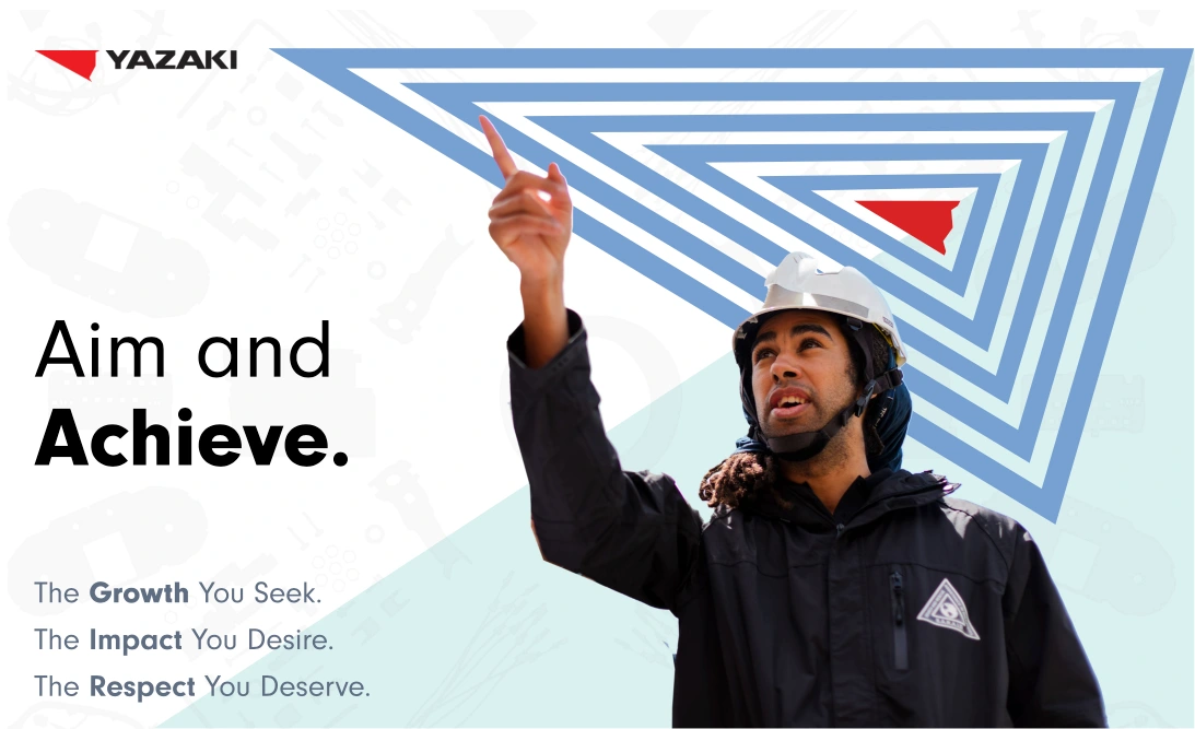
Yazaki came to us with a need for an internal brand refresh. Having been in the industry for over 70 years, the times, the culture, and their messaging had all changed drastically since their inception. We created a concept utilizing forward momentum depicted in their logo of a simple paper airplane. Considering the shape of the icon and their goals for their company into a upward movement that would translate across all aspects of their brand. It was simple but effective.
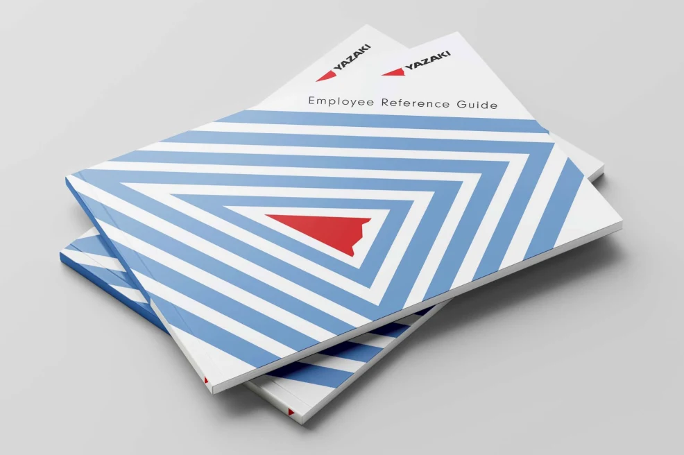
Employee Brochure - Branded Collateral
The Concept
We created an exaggerated effect of the shape as a framing element on their human-centric photography to highlight the concept of embodying the brand. Finally, we utilized graphic shapes of their products as background textures to not only incorporate their products, but to emphasize people first due to the placement. For the color palette, we made an addition to their red, white and black with sky blue and a pale teal. Being based in Japan, the red represents honor, strength, and resilience. While taking note of the cultural representation, the blue brings forth a sense of calmness, stability, and also luck.
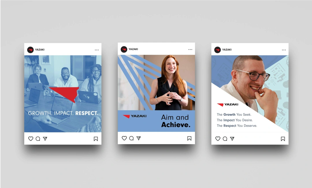
Social Media Templates
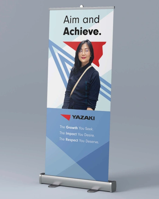
Branded Signage and Environmental Design
Like this project
Posted May 8, 2025
An internal Employee campaign for Yazaki Japan to enter into the North American Market. Utilizing the East meets West concept, we created a dynamic strategy!
Likes
1
Views
4
Timeline
May 8, 2022 - May 30, 2022
Clients
Yazaki