
This is a concept, not a LinkedIn feature. I built it as a working prototype.
The problem
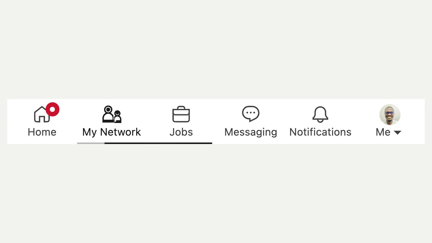
LinkedIn's top nav is almost static. Hover changes the colour, and selecting a tab swaps the outline icon for the filled one instantly. The new icon set is good geometry, and it deserves motion that says something about each tab.
What I built
The same icons, the same layout and the same colours, rebuilt in SVG so each one has its own small motion. The house lights up, the two people make room for a third, the briefcase opens, the message bubble types and the bell rings. Hover gives a hint, a click plays the full motion, and the selected tab gets a filled icon with an underline that glides between tabs. Badges come alive too: a new notification bumps in and the bell rings on its own.
Decisions
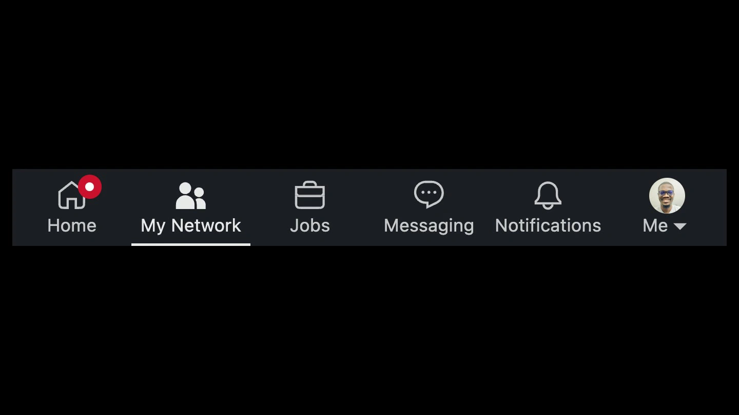
At rest, the bar is meant to be impossible to tell apart from linkedin.com, in light and dark. I measured the real nav and used the shipped icon paths, then checked pixel identity at rest in Chrome and Safari.
Every motion is interruptible. Hover, click and badge events can overlap and the bar still settles back to exactly where it started.
Touch targets are 44px, every tab is labelled for screen readers, and reduced motion falls back to the static icons.
Built with React, TypeScript and Motion. Try it here, best on a laptop: https://uzookafor.com/linkedin-nav
0 likes · 0 views · Nov 12, 2026
A LinkedIn top nav concept where every icon has its own motion: the house lights up, the briefcase opens and the bell rings. Built in React and Motion.


