answer™ Brand Identity
Prateek Sharma
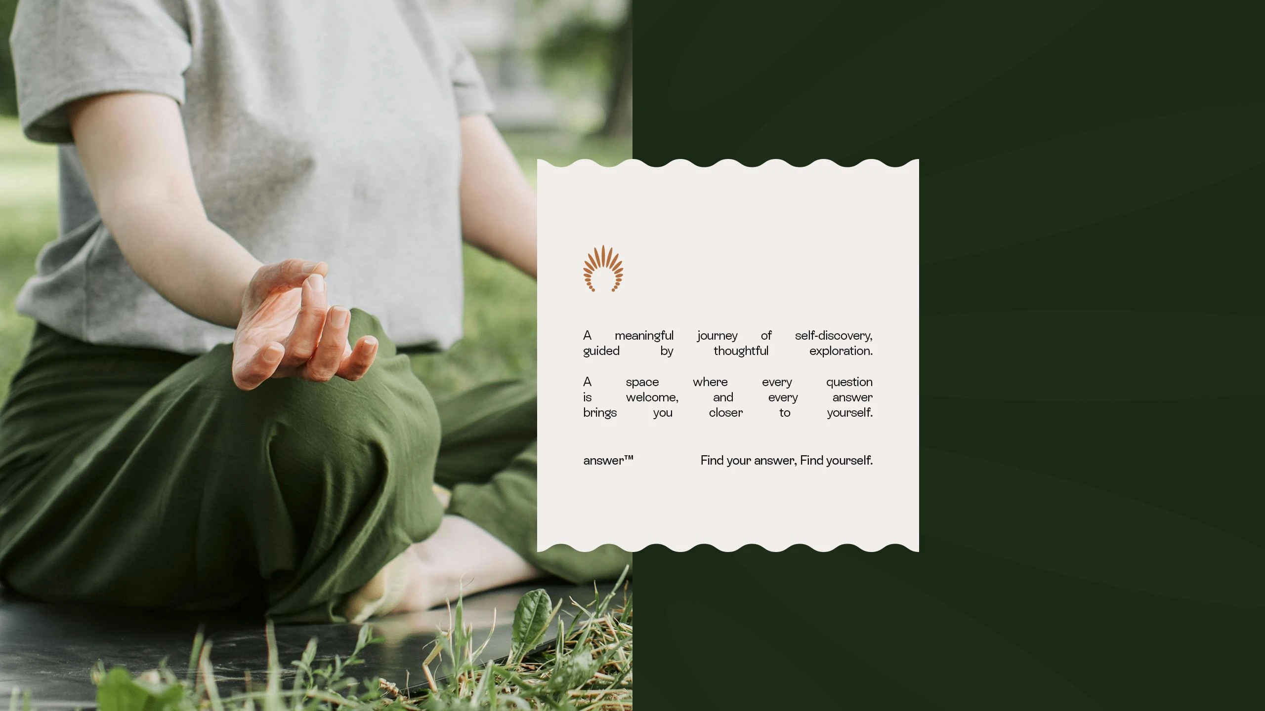
answer™
Find Your Answer. Find Yourself.
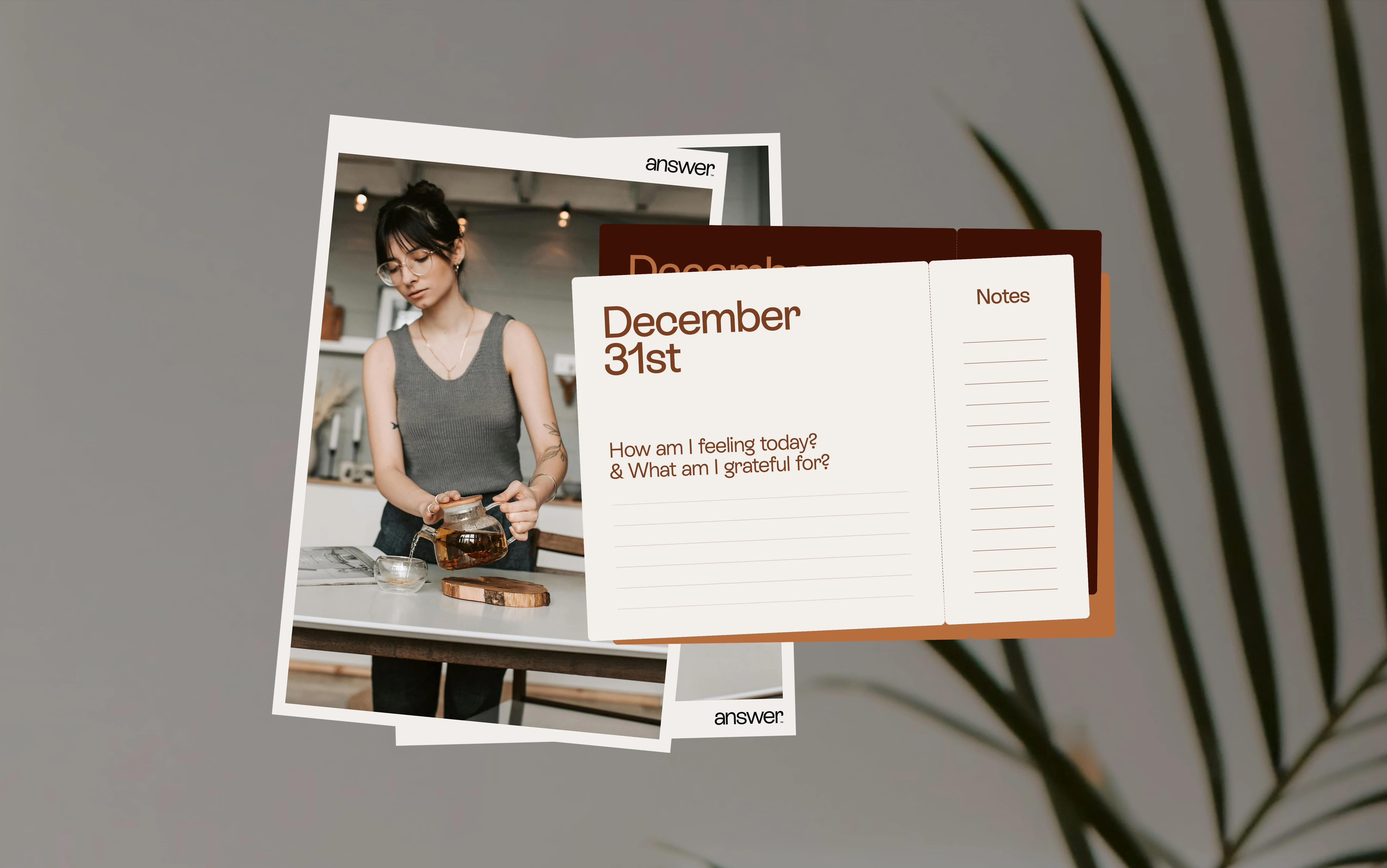
answer™ is a digital platform designed for contemporary seekers on a journey of deeper understanding. It curates a rich library of articles, videos, and podcasts led by inspiring voices, alongside classes focused on holistic well-being.
With the aspiration to be a trusted guide in self-discovery, answer™ aims to empower a generation of self-aware individuals seeking a more mindful existence. Additionally, it offers select physical products that echo its commitment to well-being.
The Challenge/Opportunity
The initial challenge for answer™ was to establish a distinct and resonant brand identity within the growing digital wellness space. While offering valuable resources for self-discovery, the platform lacked a cohesive visual and verbal language to effectively communicate its unique value proposition to modern seekers.
The opportunity lay in crafting a brand that felt both contemporary and trustworthy, clearly conveying its role as a guiding light for individuals seeking deeper meaning and well-being in their lives, ultimately fostering a more mindful and empowered community.

The Solution/Approach
A holistic branding solution was crafted for answer™, focusing on a modern yet grounded visual identity and clear communication.
The approach involved developing a symbolic logo representing growth and guidance, a natural and calming color palette, and an approachable typographic system.
Empowering and insightful messaging guidelines were also established. The aim was a cohesive brand experience positioning answer™ as a trusted companion for self-discovery.
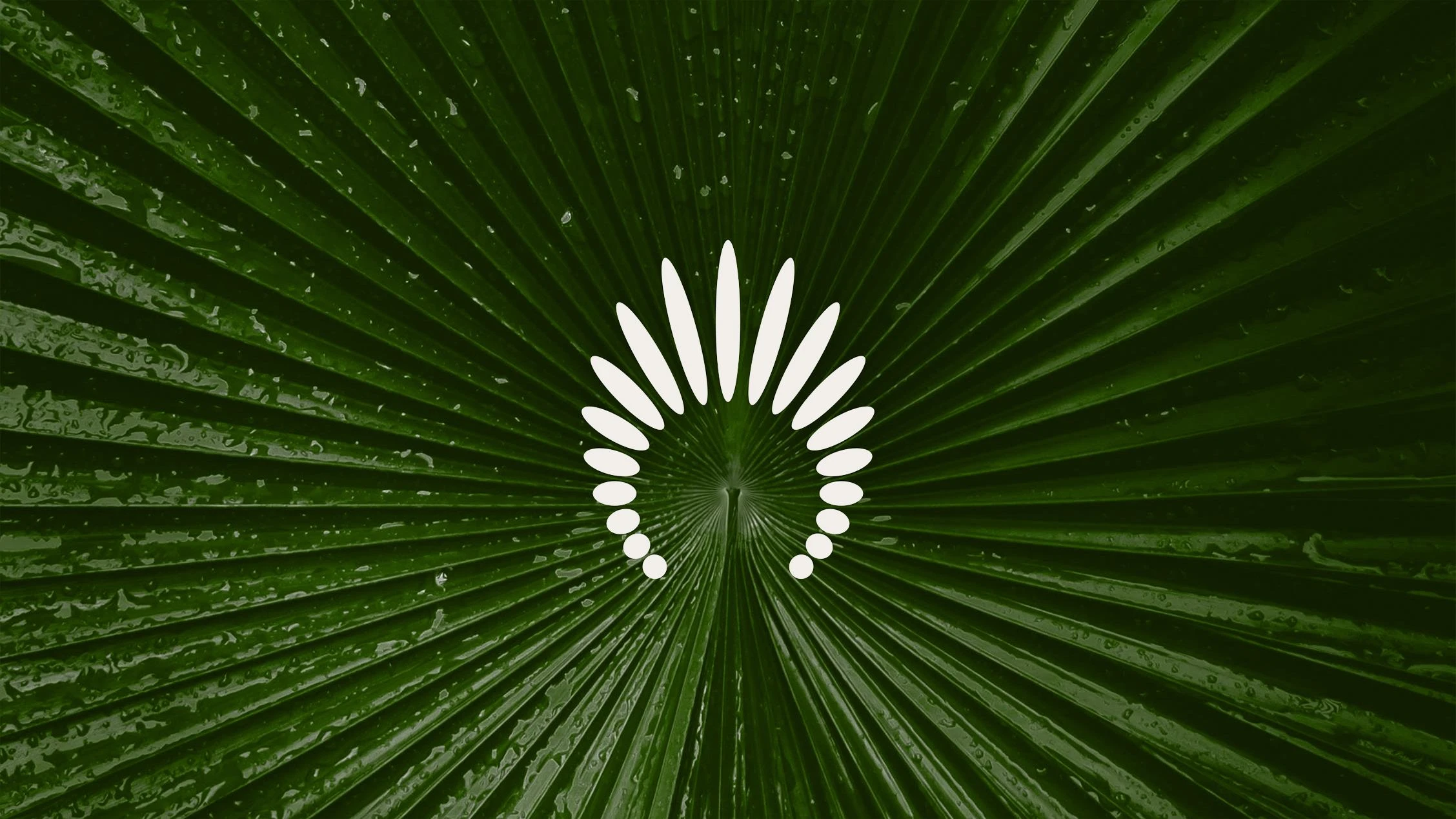
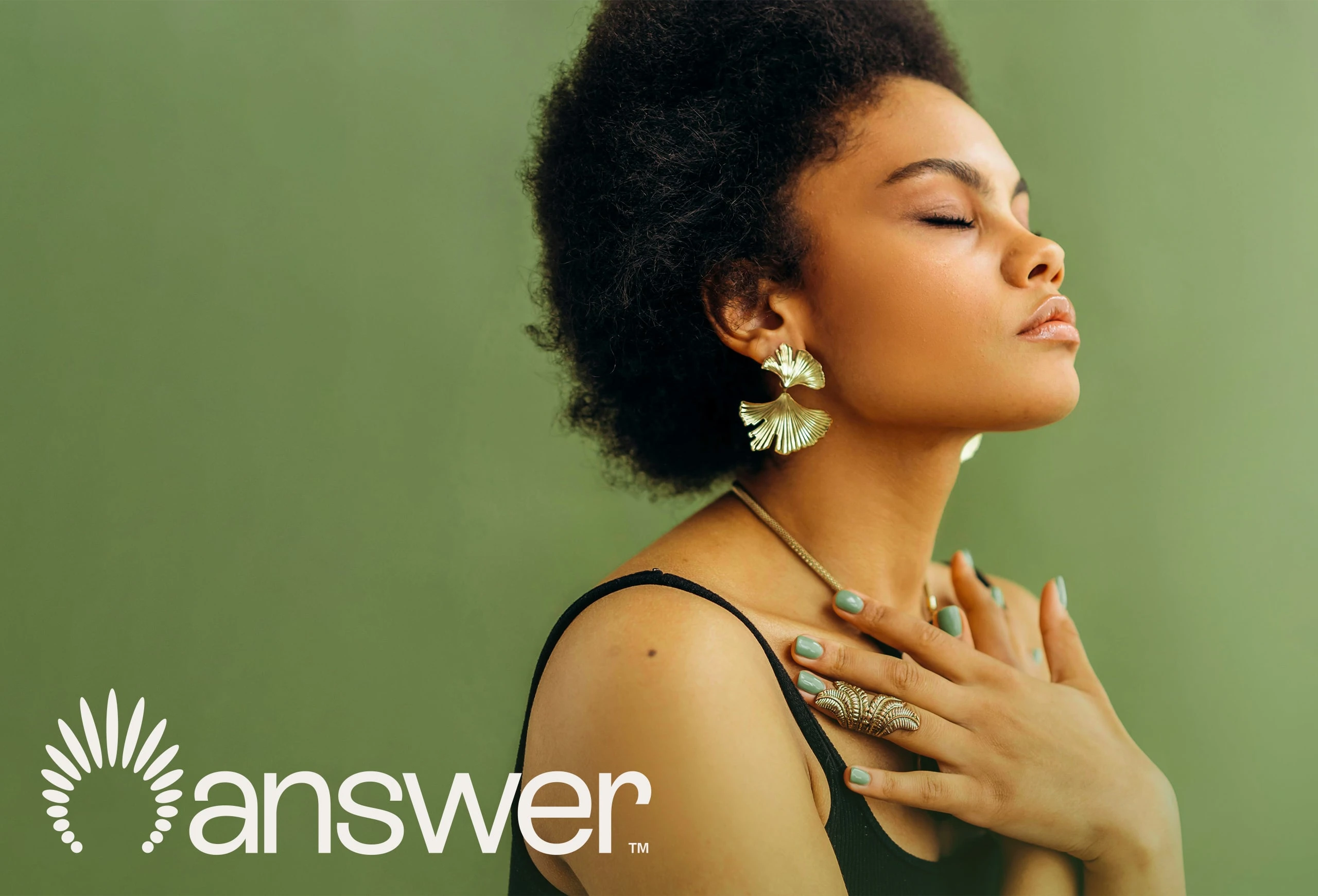
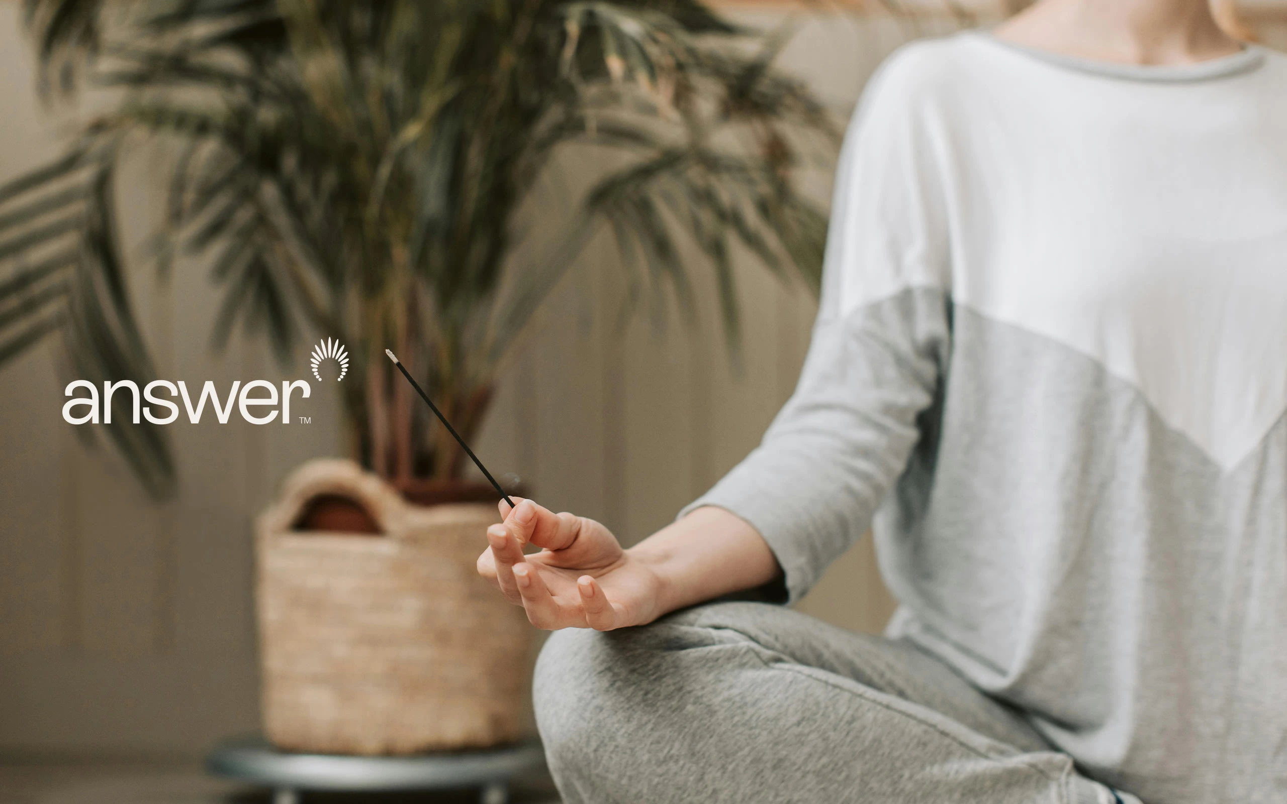
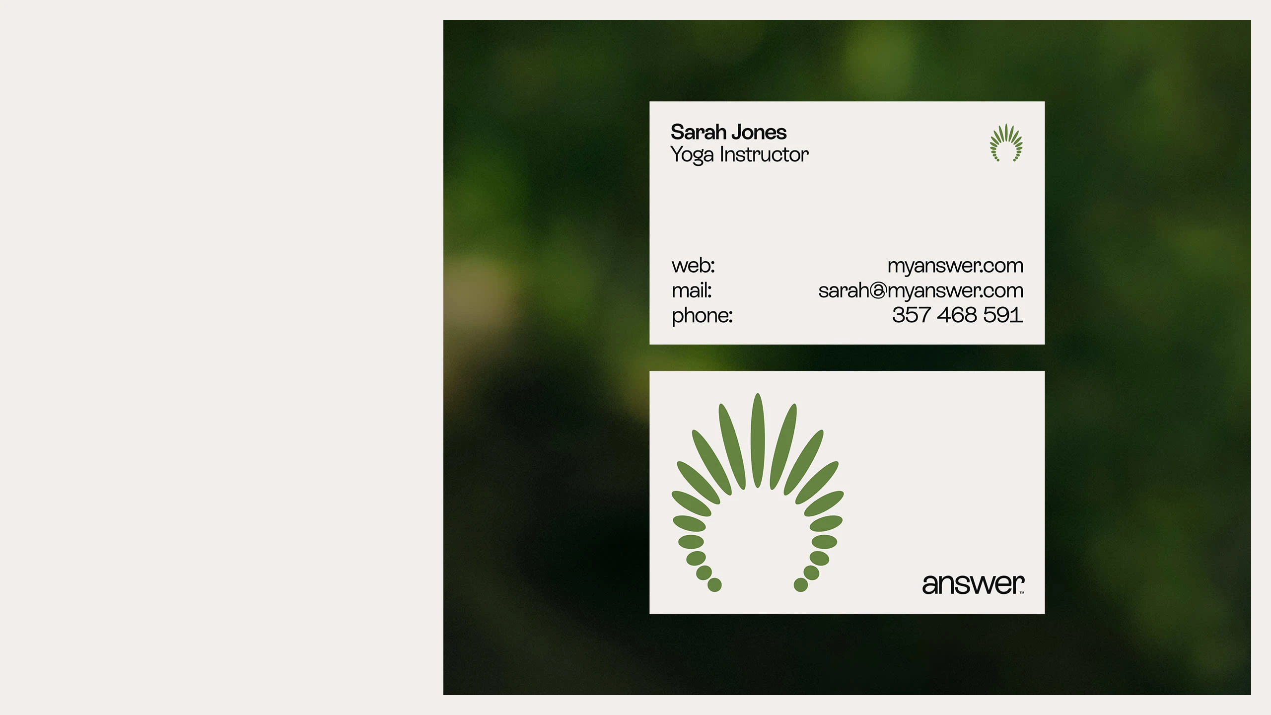
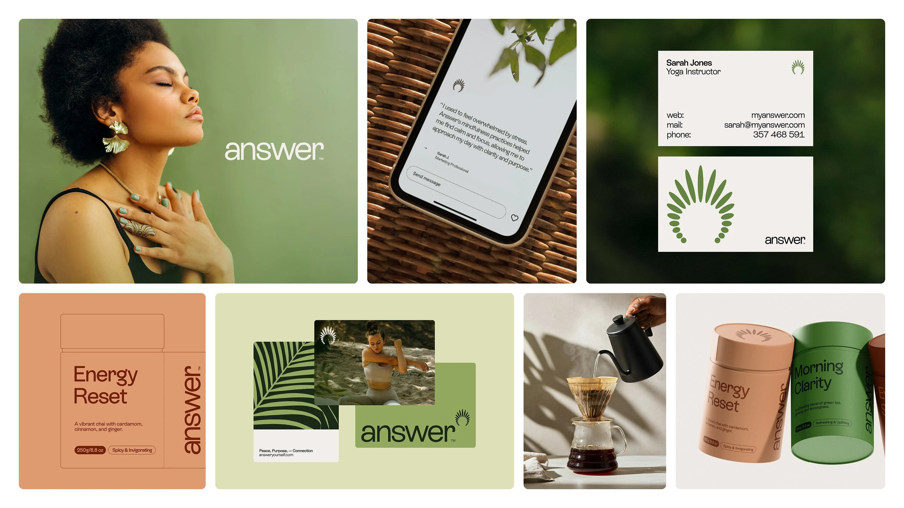
The Logo
The answer™ logo centers on a dynamic arrangement of radiating shapes emanating from a core point. This visual metaphor represents guidance, the unfolding of knowledge, and the outward journey of self-discovery offered by the platform.
The clean, abstract form provides a modern and versatile mark, acting as a recognizable symbol of illumination and direction for individuals seeking deeper meaning.

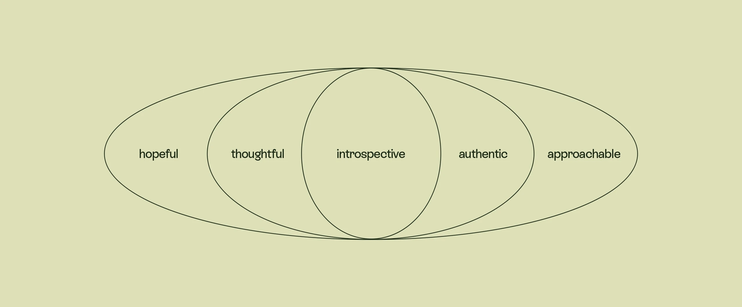
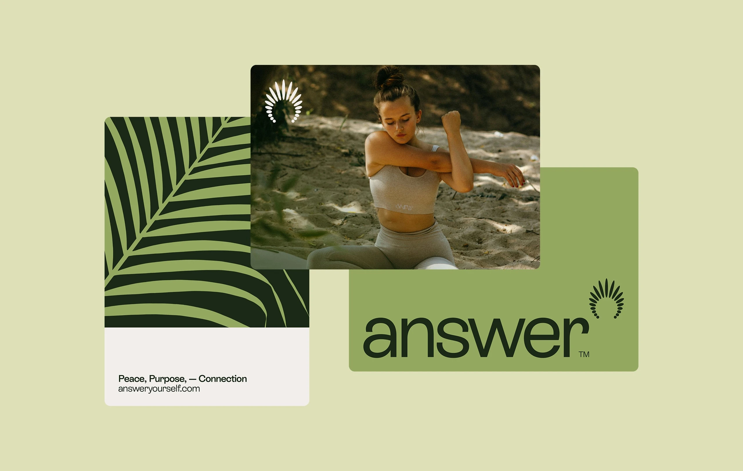
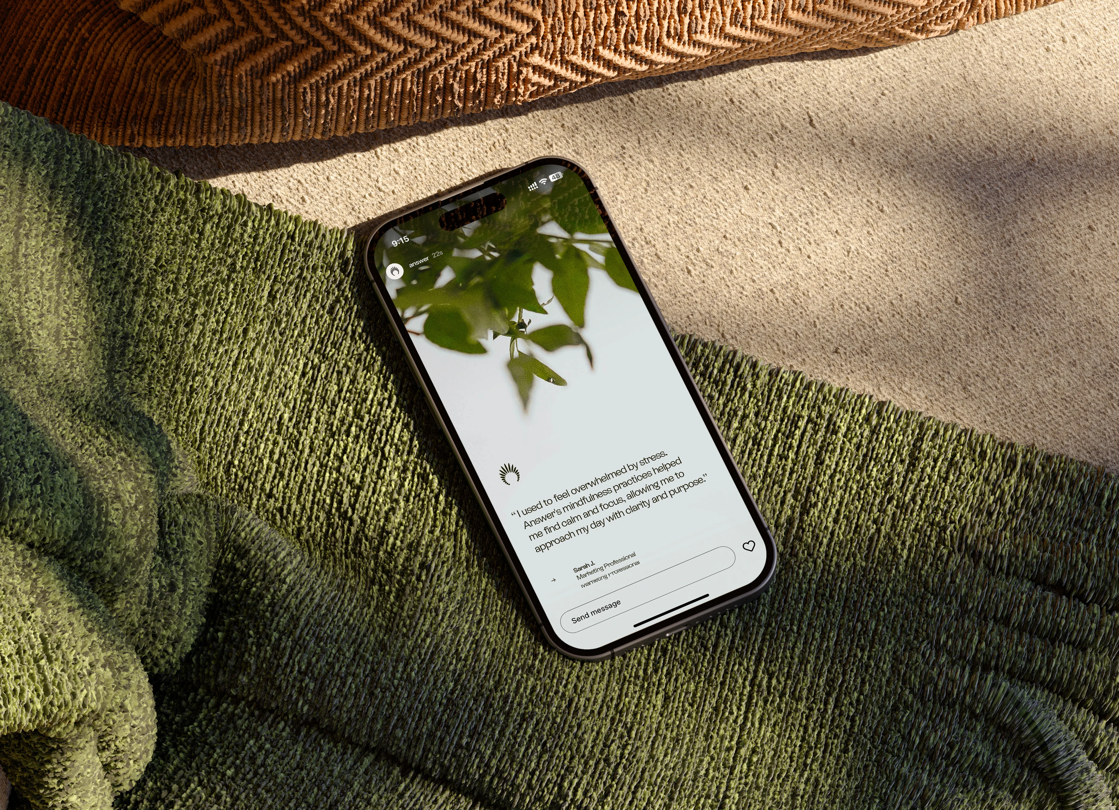
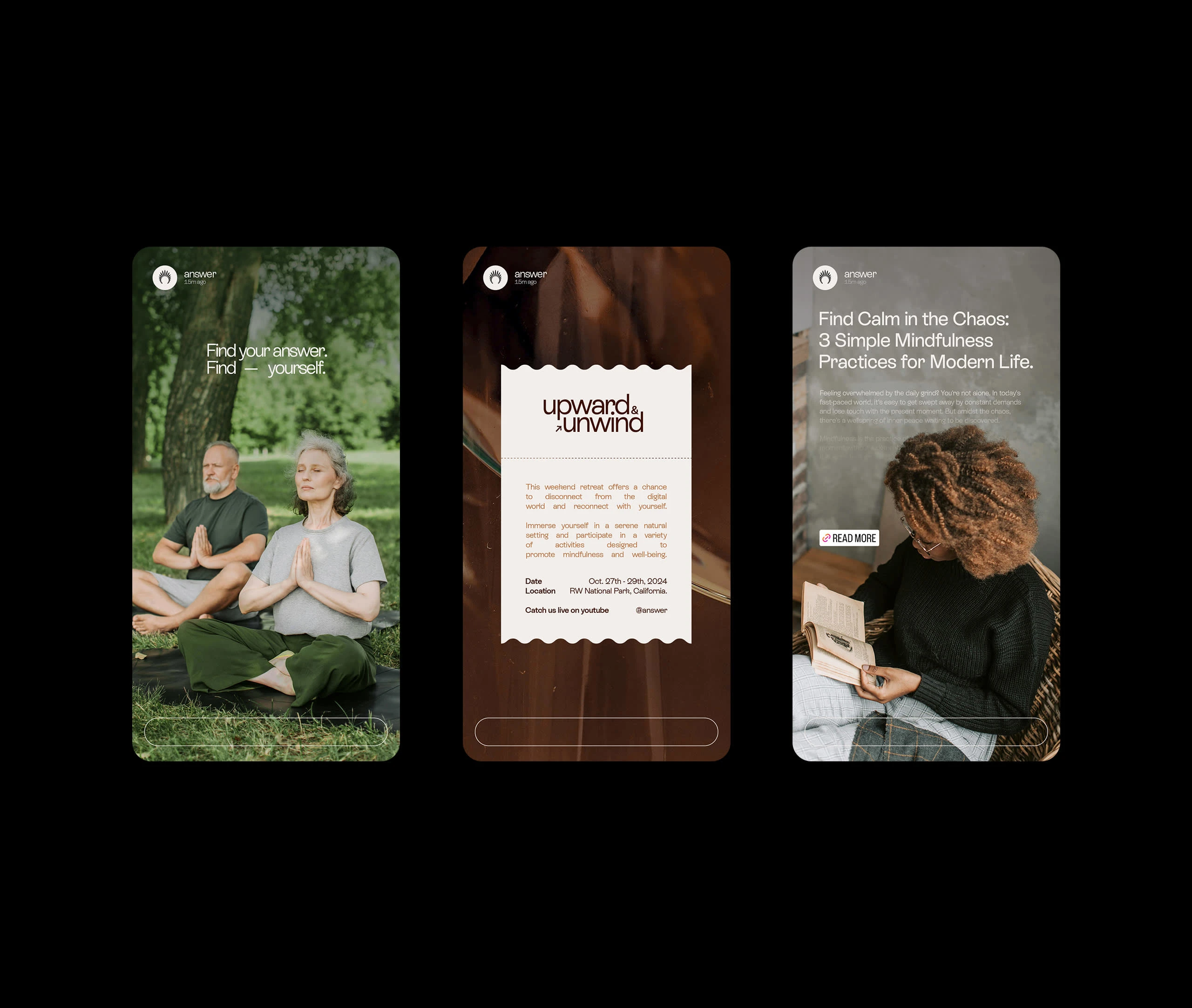
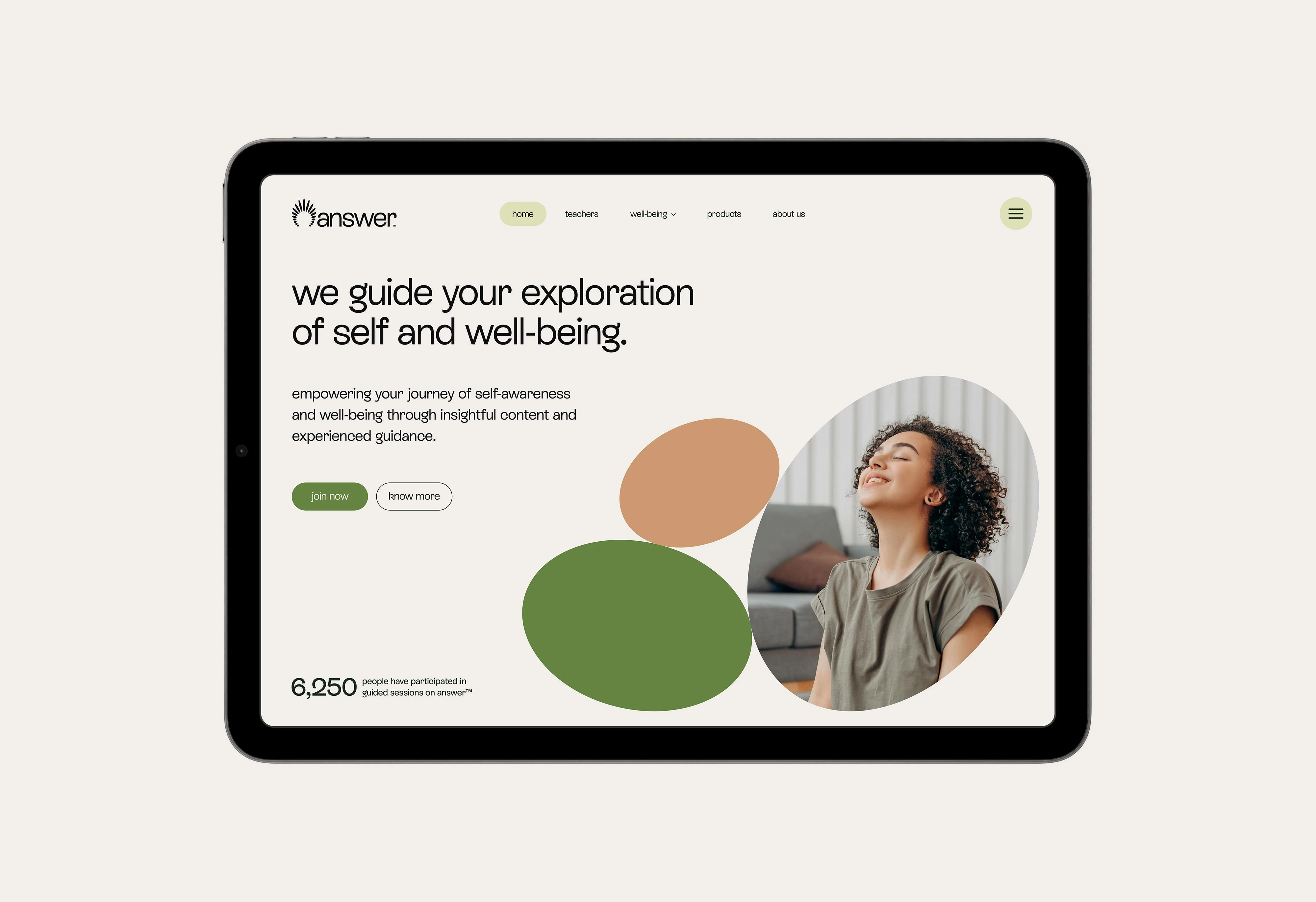
The Visual Language
The visual language of answer™ is designed to evoke a sense of calm guidance and modern clarity. The radiating logo subtly suggests illumination, while the natural color palette creates a trustworthy and approachable feel.
Combined with clean typography and thoughtful use of imagery, motion and the overall aesthetic aims to create a welcoming and inspiring digital space for seekers to explore deeper aspects of life and well-being.
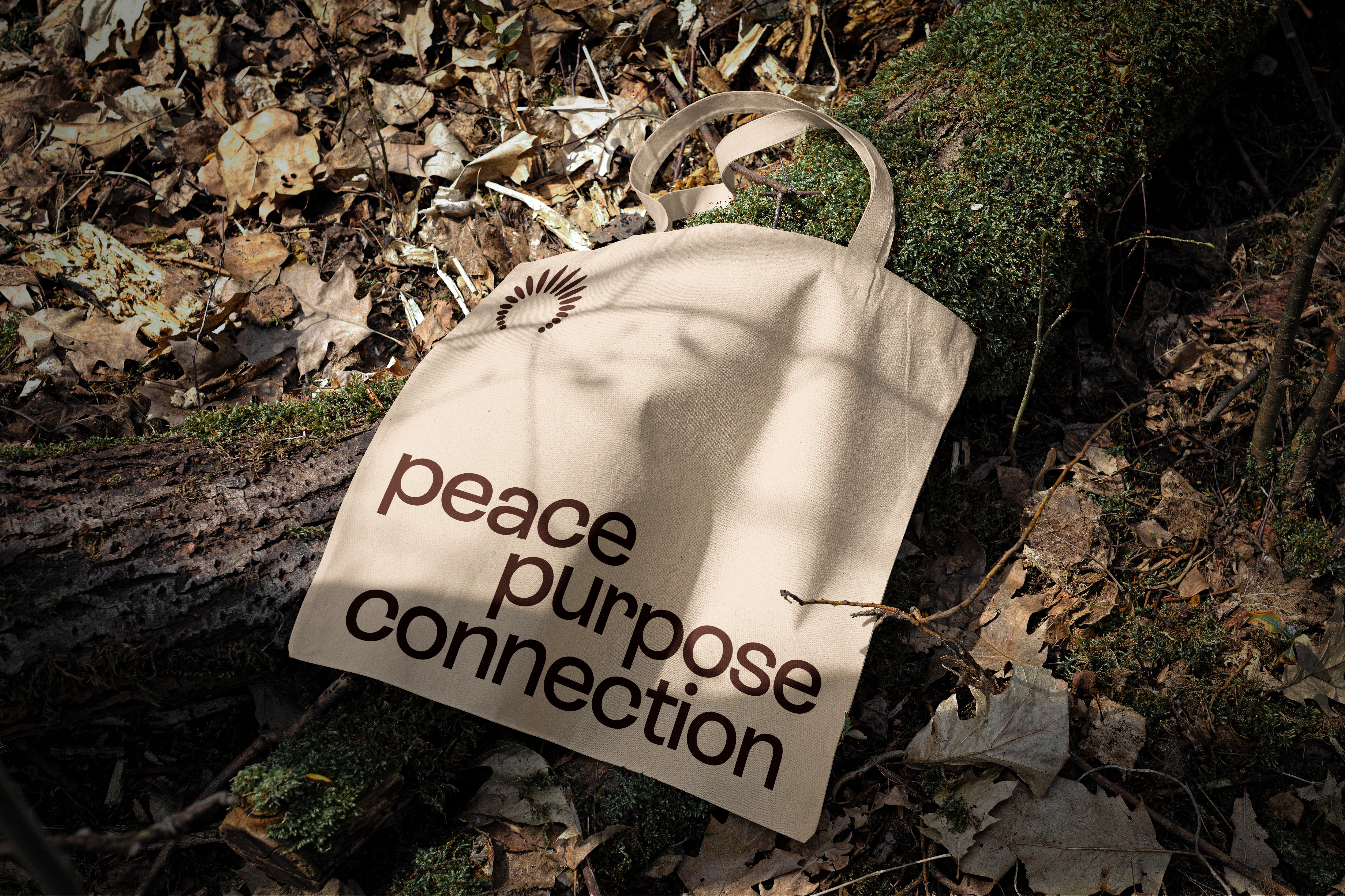
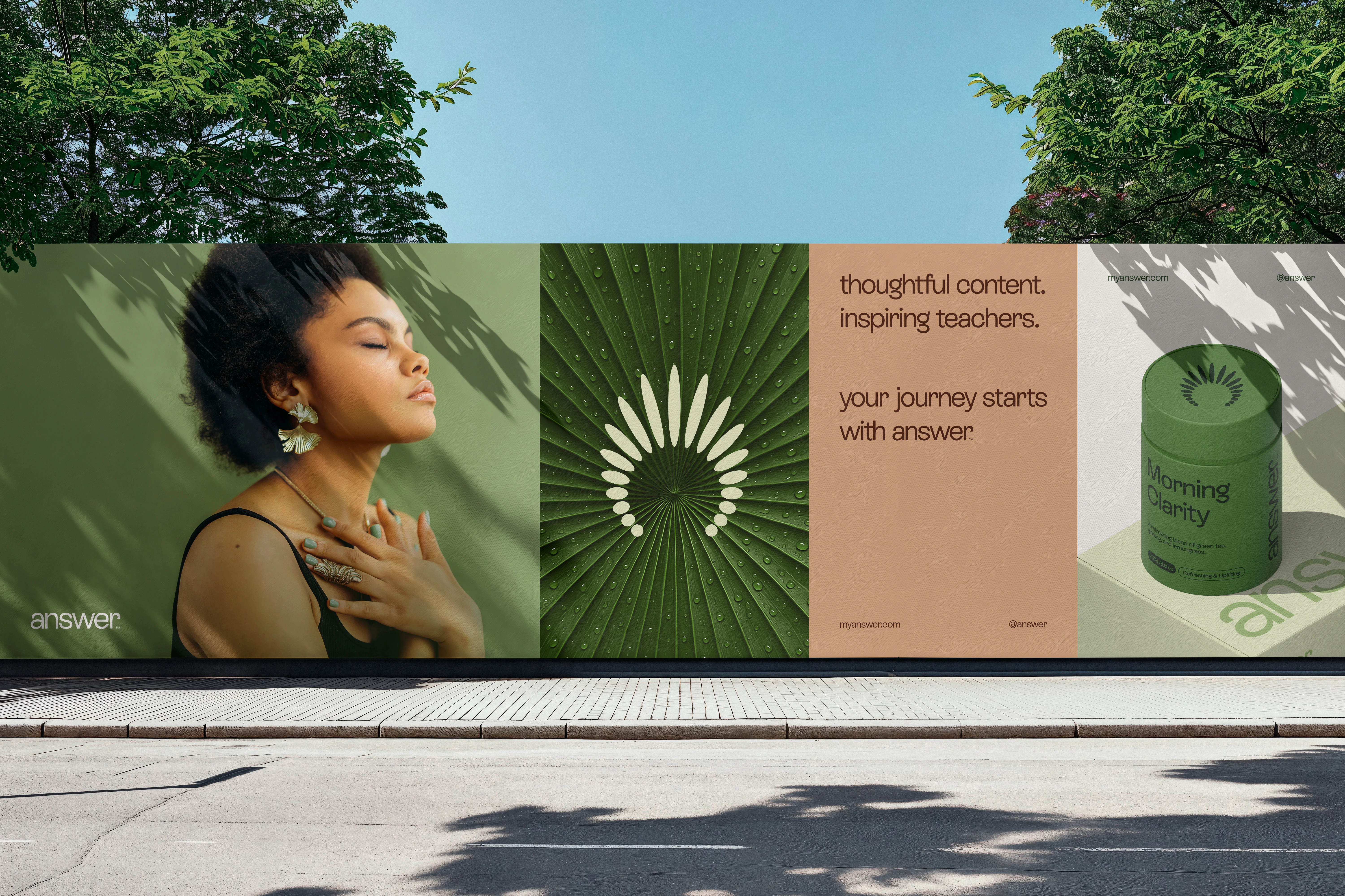
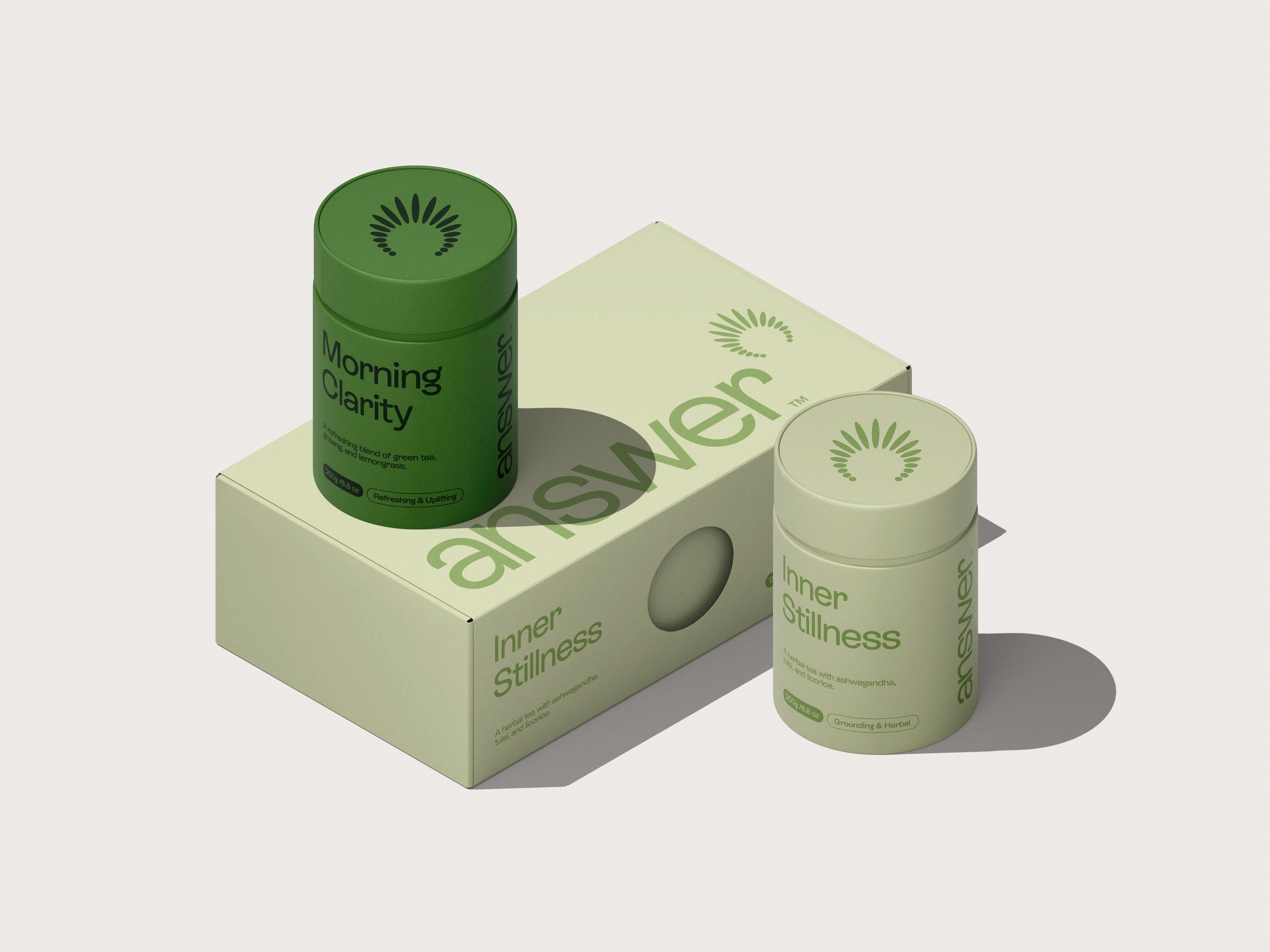
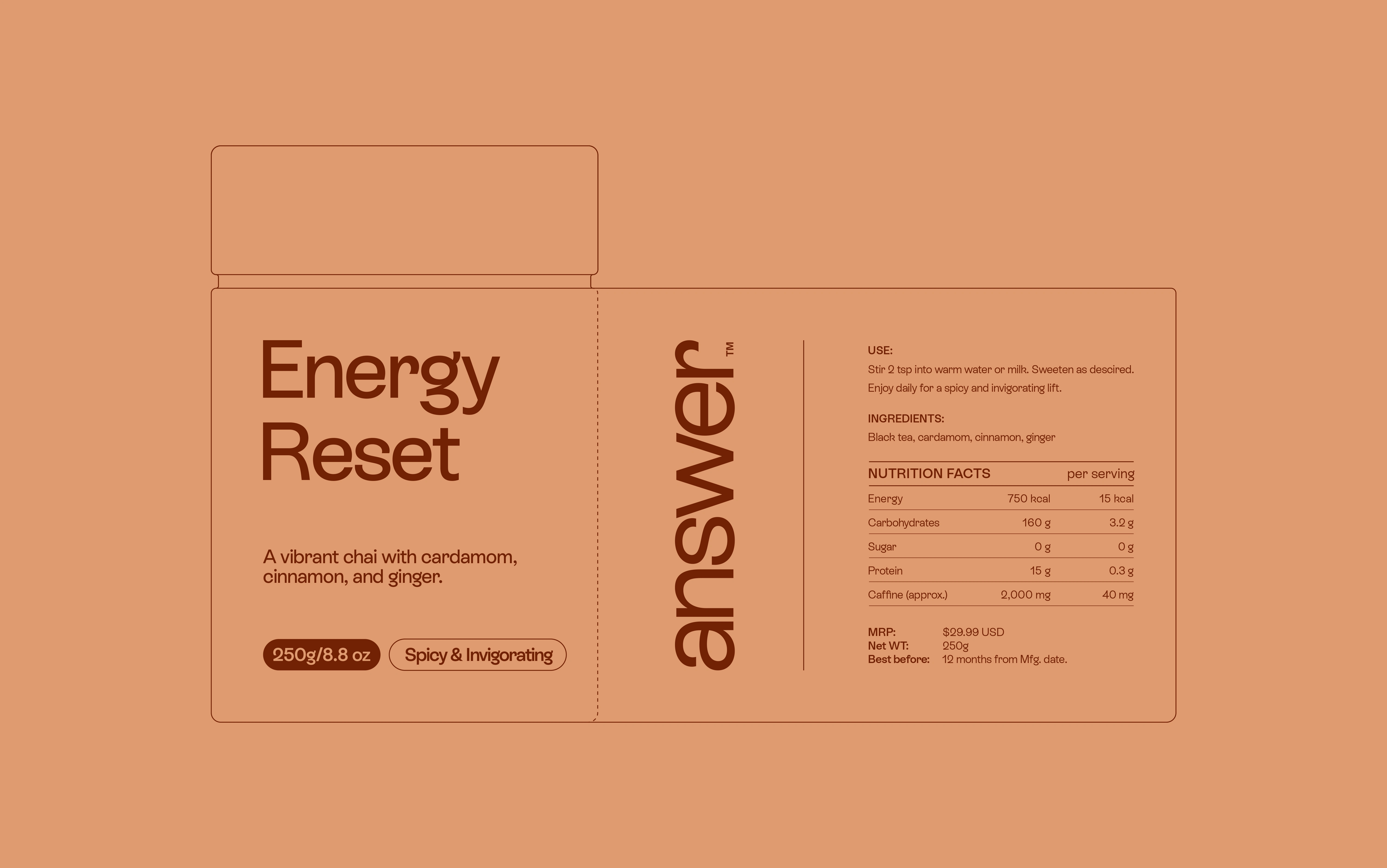
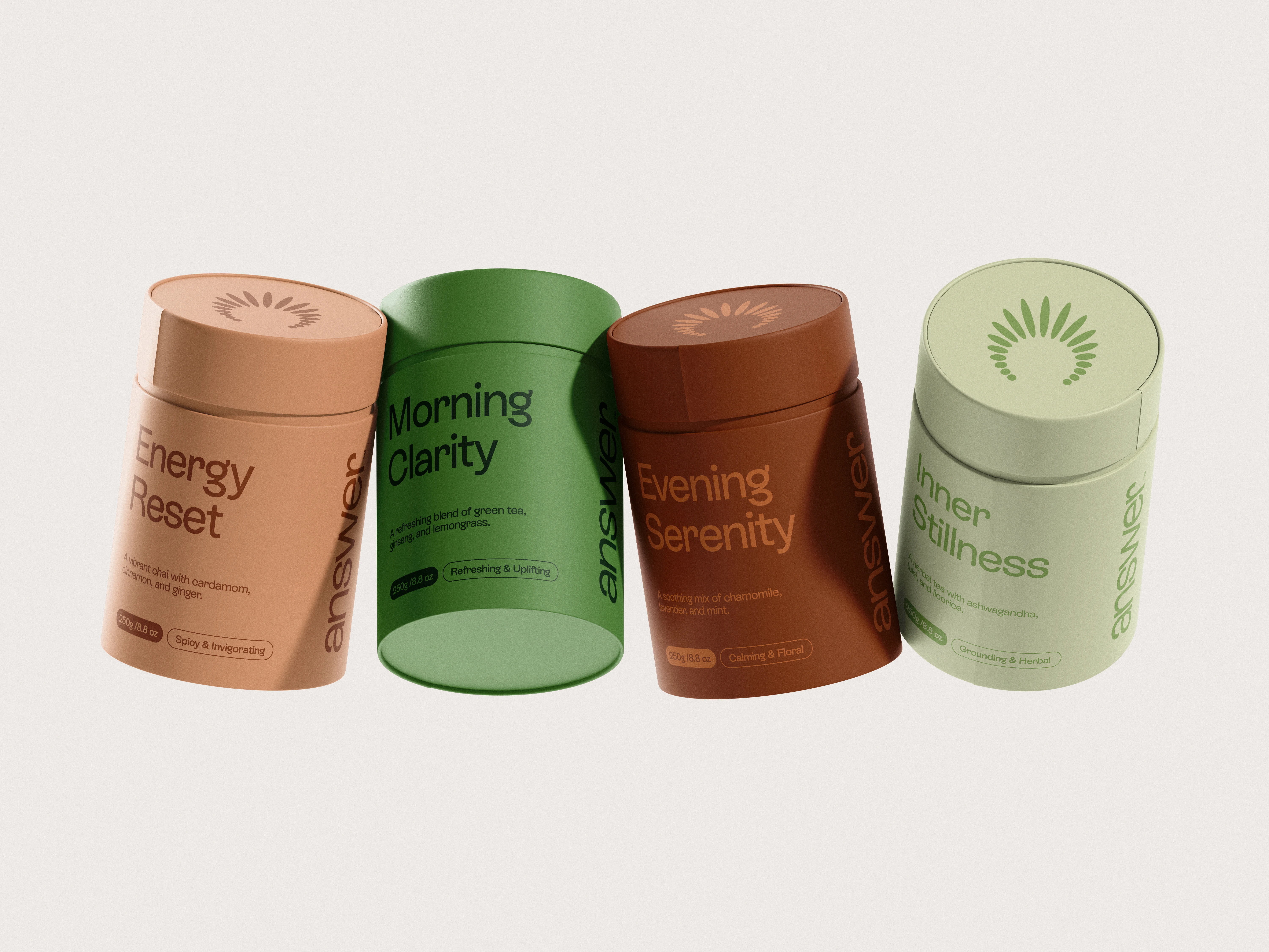
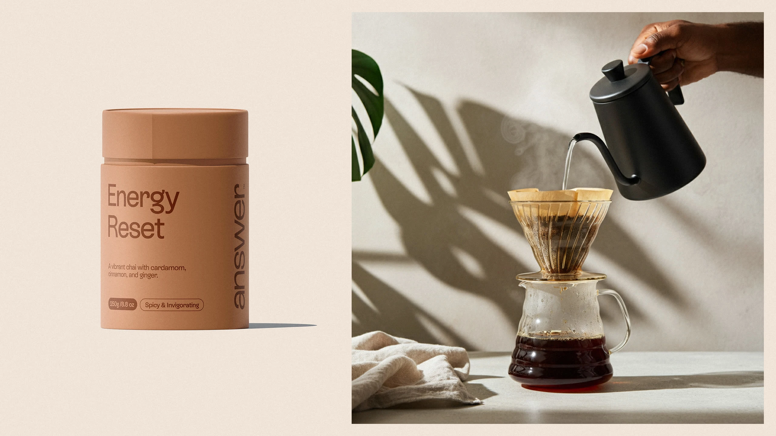
Product Line
Not only in the digital media but extending the experience into the physical realm, answer™ also focuses on its product lines with a design language seamlessly aligned with the overall brand identity.
The understated packaging and considered presentation echo the platform's commitment to clarity and mindful living. These products serve as a natural complement, reinforcing answer™'s holistic approach to well-being and personal growth.
Client / answer™
Project / Branding, Logo Design, Logo Animation, Package Design
2025© All rights reserved.
Let's build your brand:
hey@layoutguy.com
Follow me on Instagram @layoutguy
View the full project on Behance →
Like this project
Posted Apr 7, 2026
Crafted a modern, grounded brand identity for answer™, including logo, colour, type, and messaging focused on clarity and self-discovery.
Likes
0
Views
1
Timeline
Mar 3, 2025 - May 23, 2025