Brand Identity Design for Genomix
Aidana Sakbay
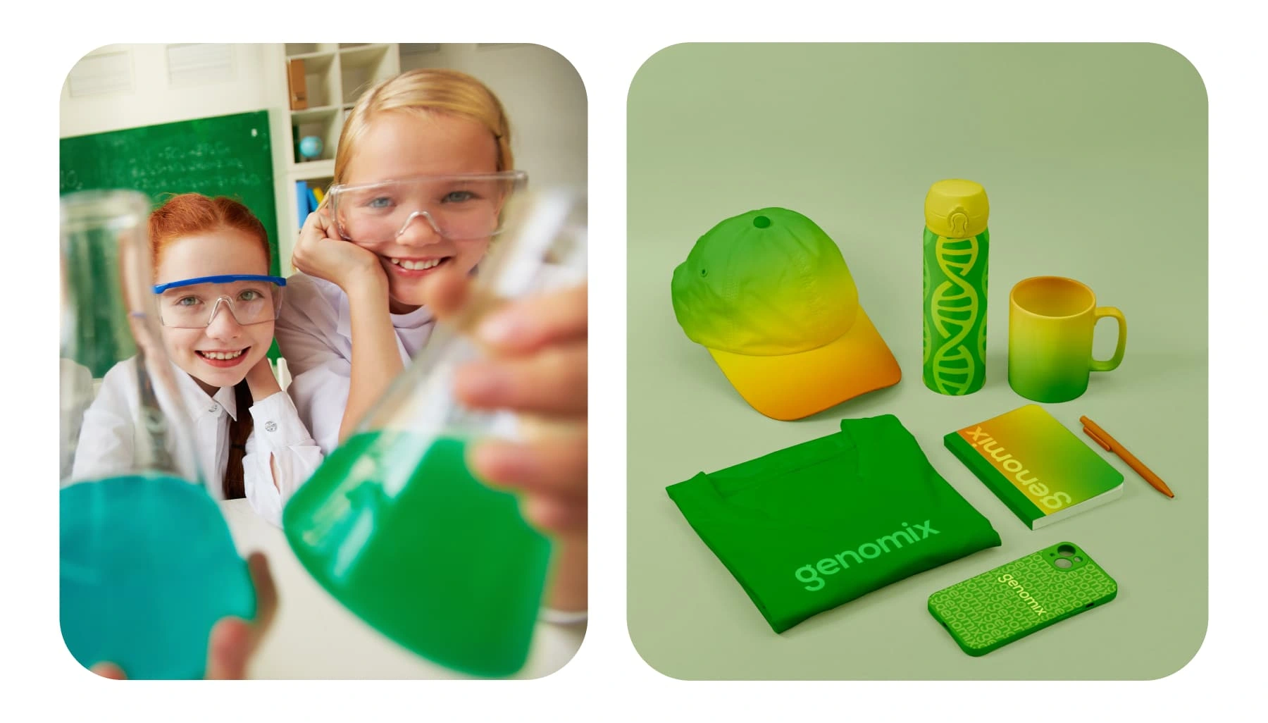
Genomix is a dynamic educational platform that delivers interactive bioscience workshops to children aged 7-15. By making science easy and fun, Genomix hopes to motivate young students to pursue opportunities in STEM.


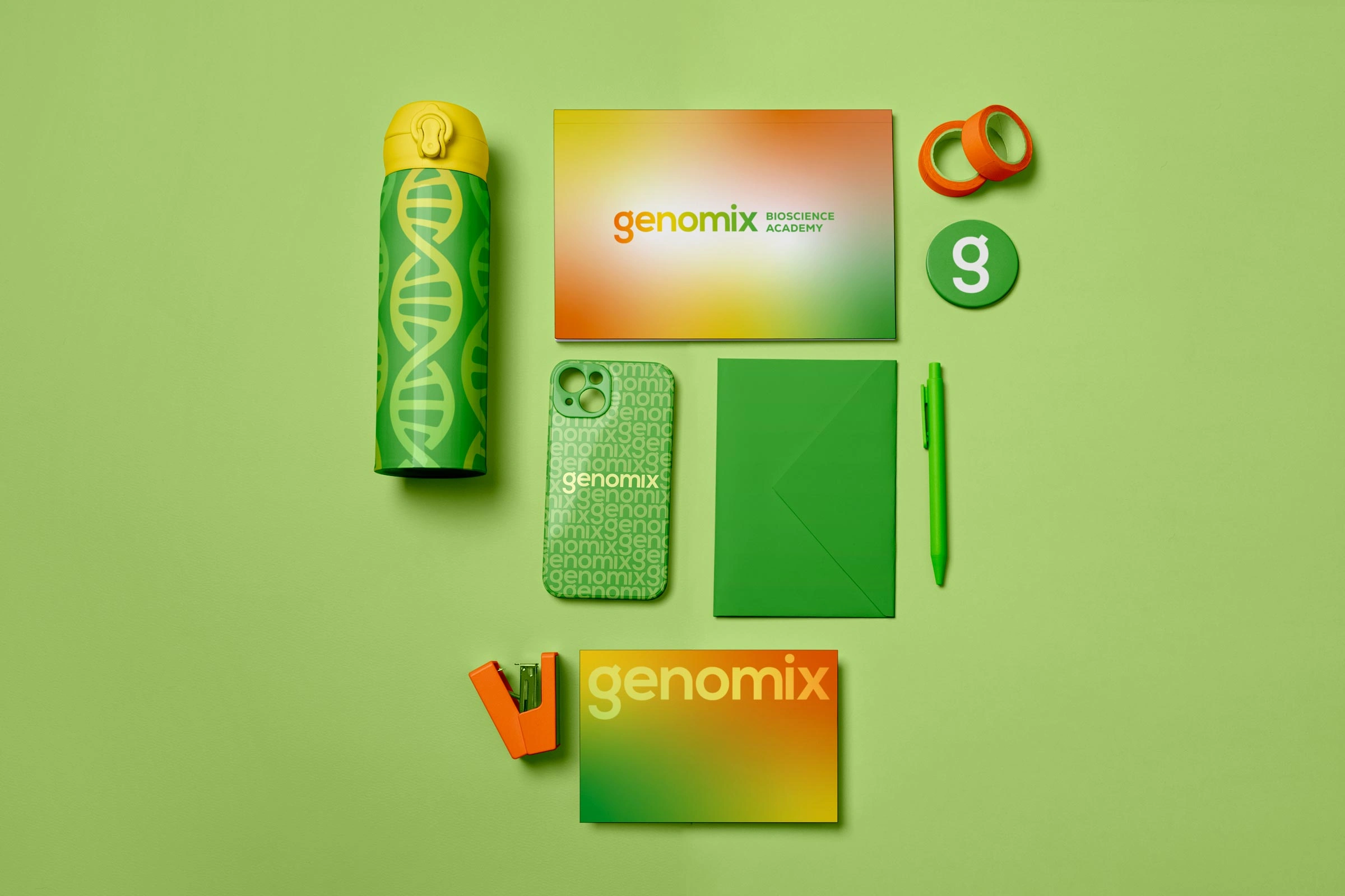
Green was an important colour for the client, and we chose to keep it, as it aligned well with the brand—symbolising biosciences, nature, growth, and prosperity. Following research, I suggested incorporating additional colours through gradients. Their vibrancy symbolised the joy found in the learning process and are inspired by the multitude of colours seen in lab experiments. They also reinforce the brand’s core message: science can be fun and exciting!
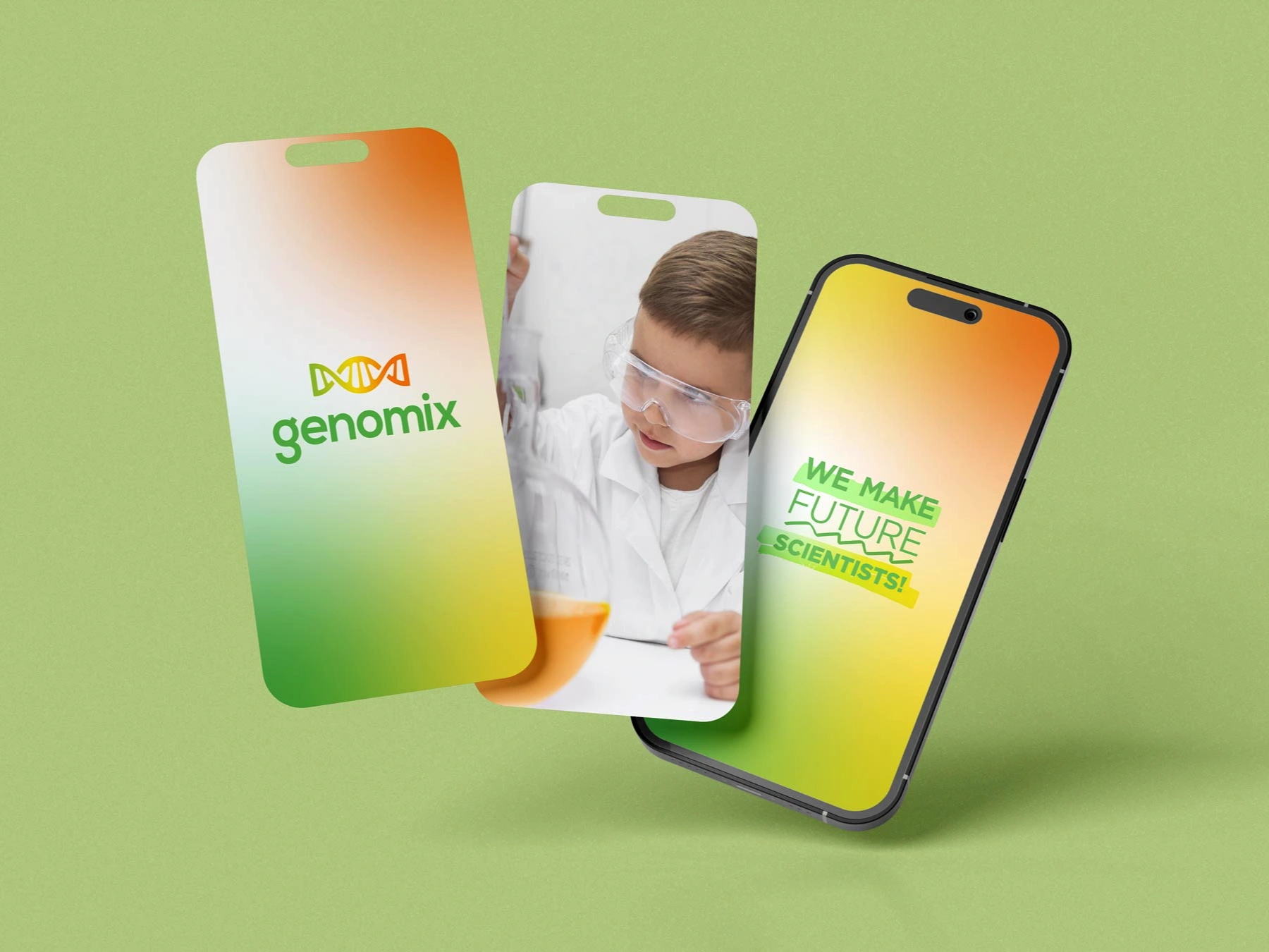
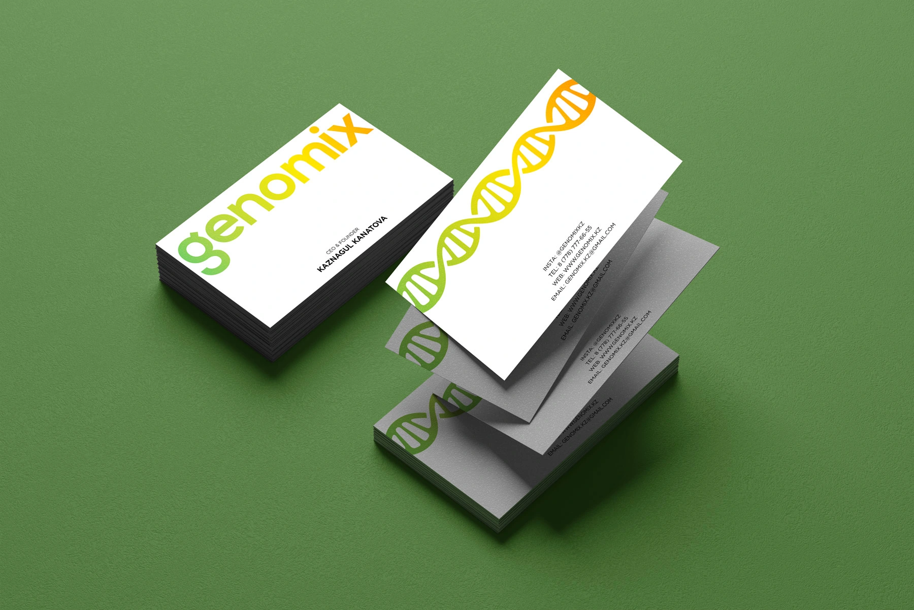
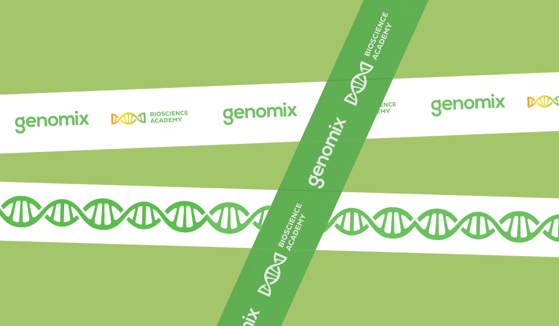
DNA was a must-have for the client, and after a few sketches and tweaks, I created an icon that fit well—bonus points for resembling a candy, which aligns nicely with our child-focused audience!


This brand identity was created for a bioscience startup based in Astana. If you liked it, show some support by liking this project and following me for more creative designs! Thank you for your time ❤️
Like this project
Posted Apr 18, 2025
Designed a vibrant, playful brand identity for Genomix — an educational bioscience startup that inspires the next generation of young scientists.