Brand OS: Motion-Designed Video Sales Letter

Benjamin C


Brand OS is a 41-second video sales letter built around a founder-led pitch. I used motion graphics, selective typography, and product footage to give the message a clear visual structure.
The approach
The edit moves from experience and costly mistakes to the offer, then ends with a direct invitation to sign up. The main design challenge was giving each part its own emphasis while keeping the speaker at the centre of the video.
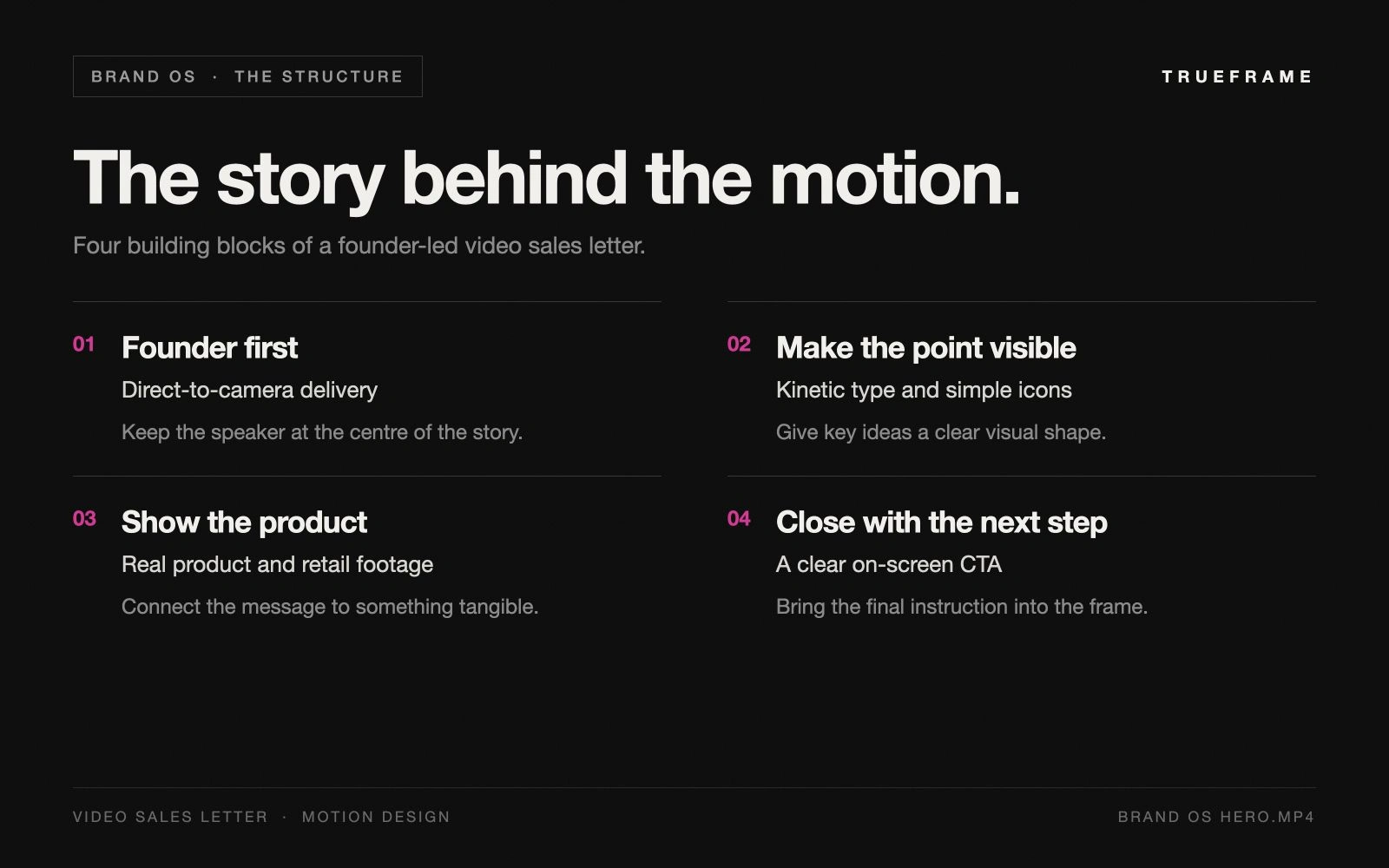
The visual structure: founder delivery, key graphics, product context, and a clear call to action.
Keep the founder in focus
Direct-to-camera delivery anchors the piece. Changes in framing create pace, while the desk, microphone, and magenta-lit background give the sequence a consistent setting. The graphics leave room for the speaker’s face and gestures.
Turn key ideas into graphics
Large type brings emphasis to selected phrases. Simple icons summarise experience, oversized dollar symbols give the cost of mistakes a visual form, and a folder-based animation introduces the idea of an operating system. Each graphic connects to the point being made in that moment.
Make the offer tangible
Product and retail footage connects the pitch to the consumer-brand world. White and magenta typography carries the visual style across these cutaways, so the sequence still feels connected when it leaves the studio.
Finish with a clear next step
The closing section returns to the speaker and reinforces the call to click the link. The finished piece combines a personal delivery with designed visual beats, taking the viewer from the founder’s experience to the offer in 41 seconds.
Have a founder-led offer to explain? See more of my work at www.trueframe.xyz.
Like this project
Posted Sep 5, 2026
A 41-second founder-led VSL combining kinetic typography, motion graphics, and product footage to explain the offer and lead into a clear CTA.