Praction Studio® - Brand Identity
Praction Studio
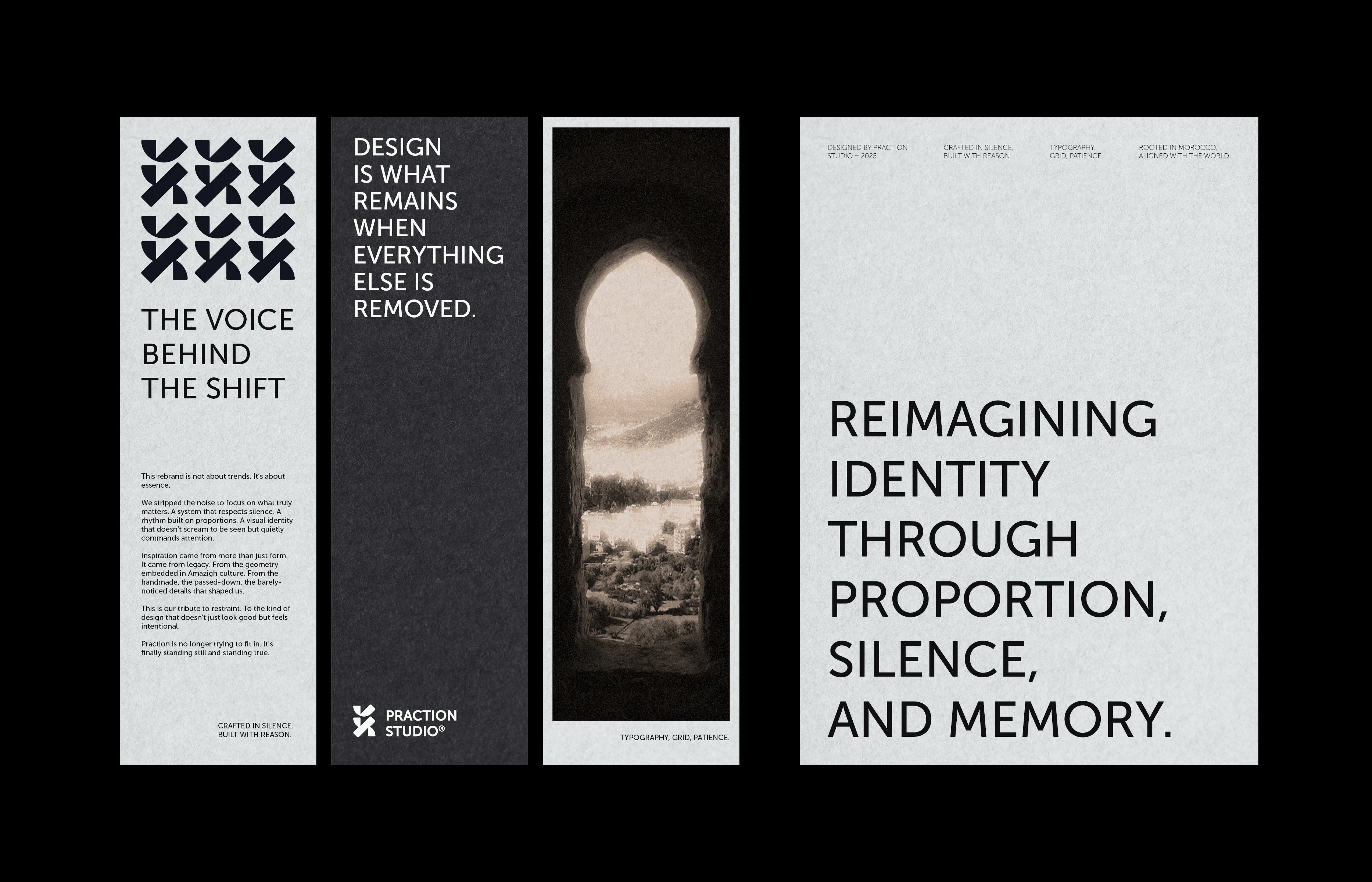
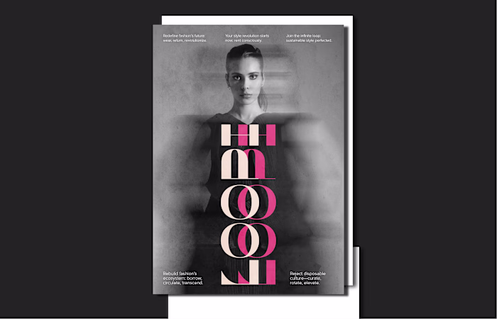
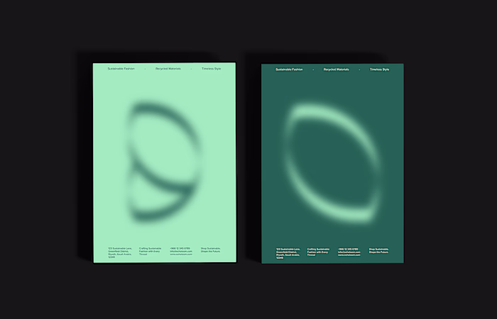
This is the visual rebranding of PRACTION, a design studio reimagining its identity with clarity, edge, and editorial elegance. The new direction reflects our mindset as designers: thoughtful, timeless, and quietly confident.
The identity subtly draws influence from cultural roots, not as a statement but as a personal layer of meaning. From abstract symbols to editorial compositions, the project is built around systems that feel intentional and content-driven.
This presentation highlights the printed aspects of the brand: bold posters, refined stationery, a typographic logo system, and editorial brand pieces. Every element was crafted to serve as both functional design and an inspiring visual experience
Thanks for being here. Dive in.
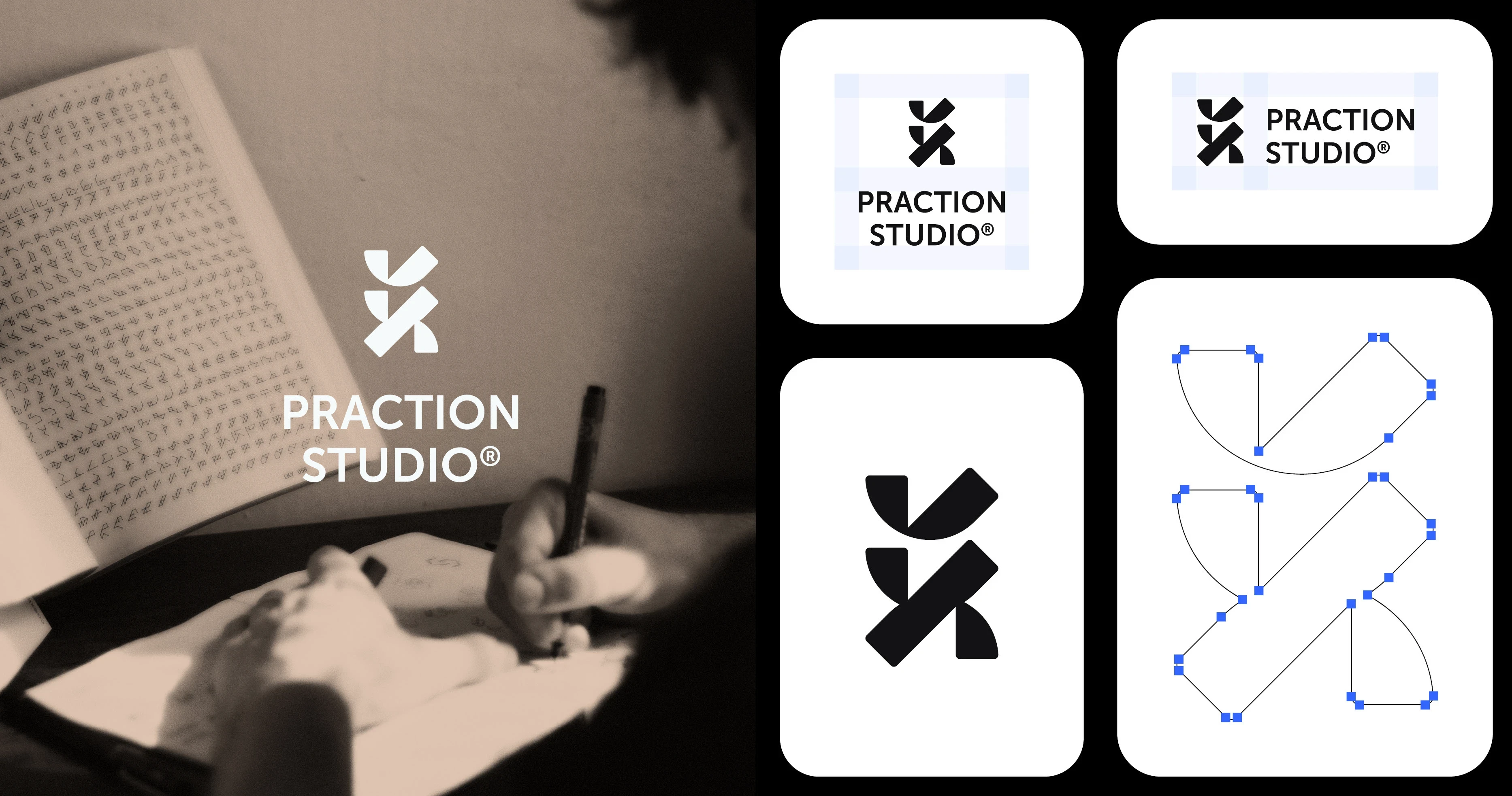
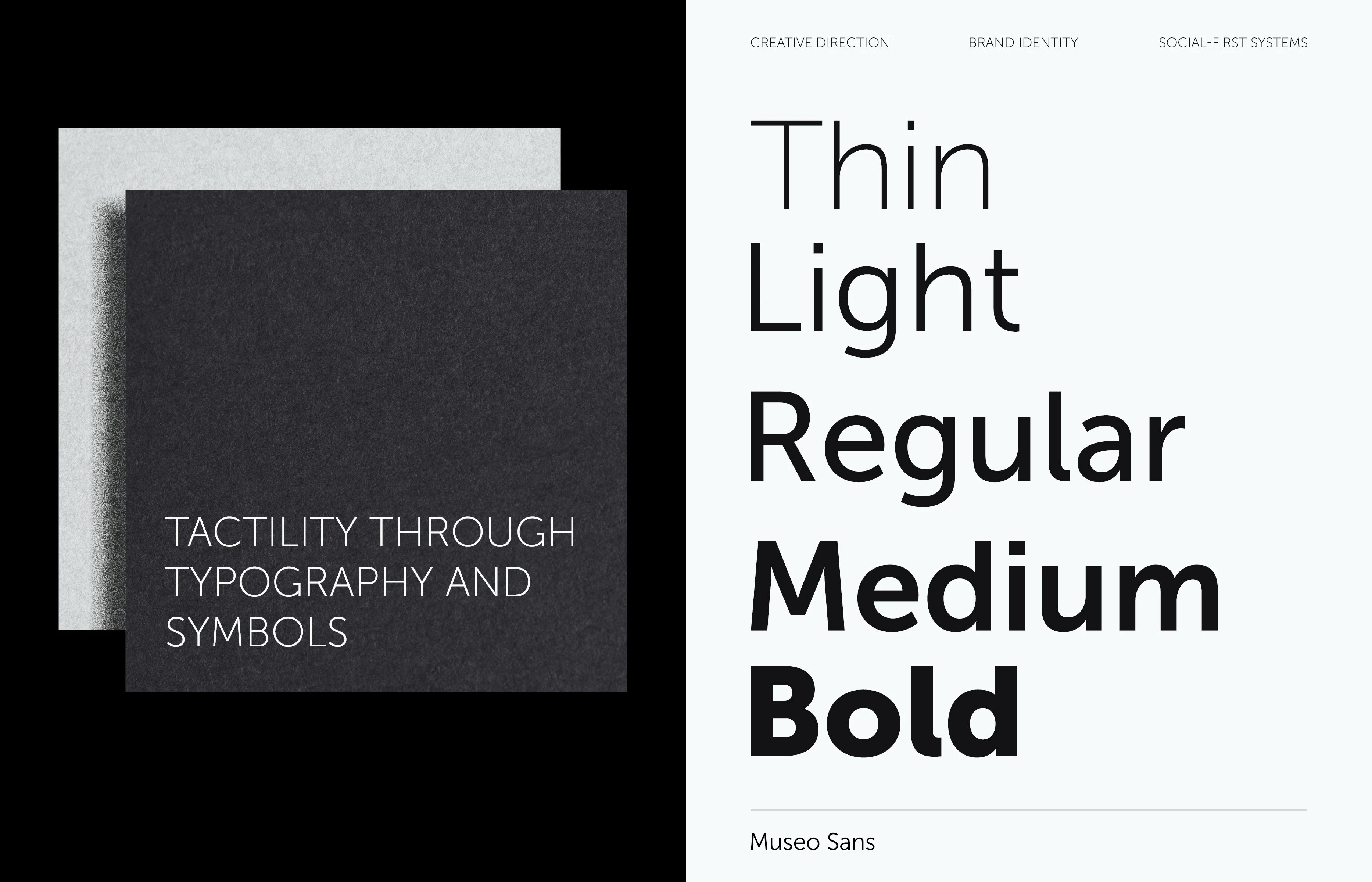
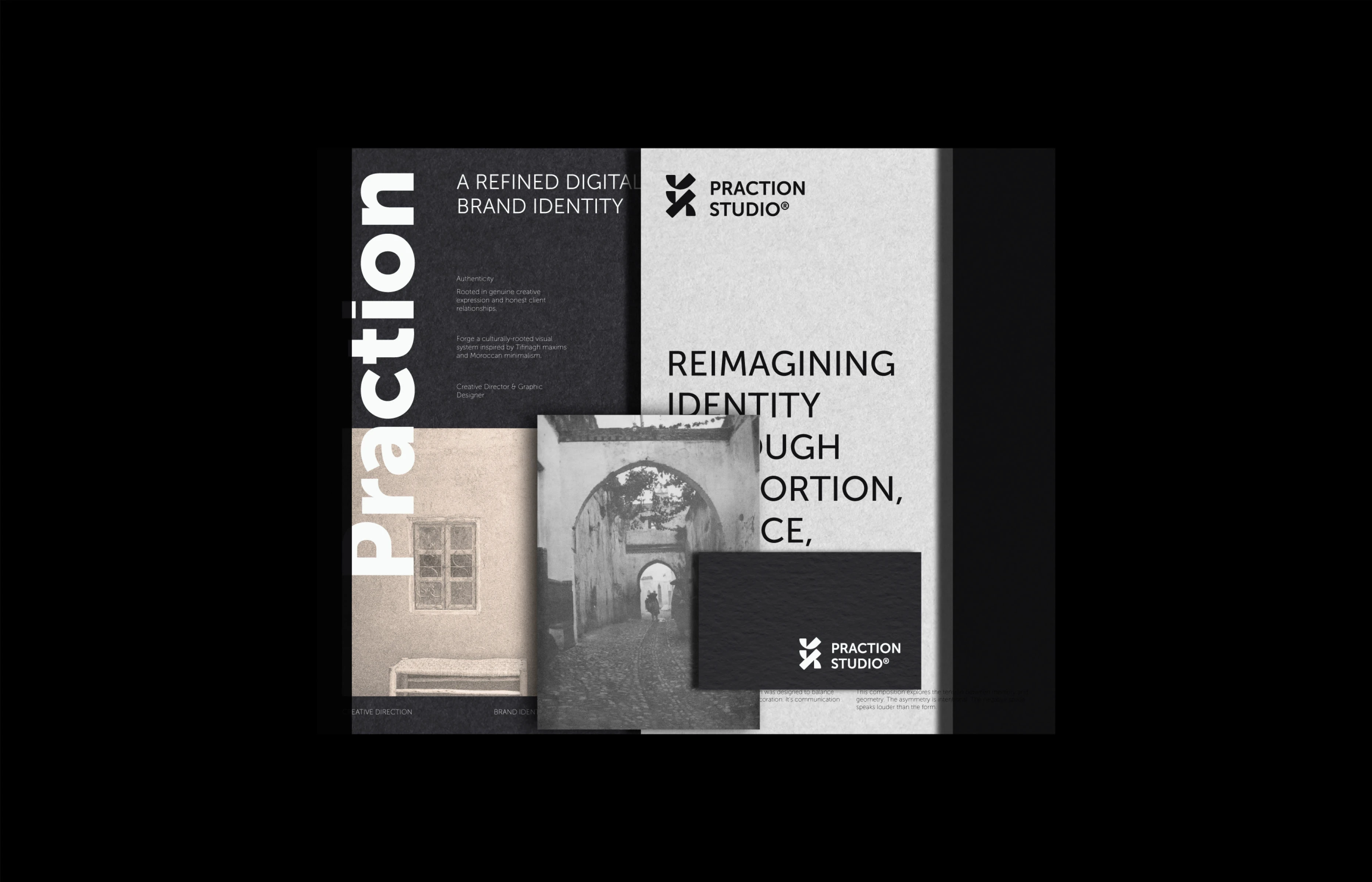
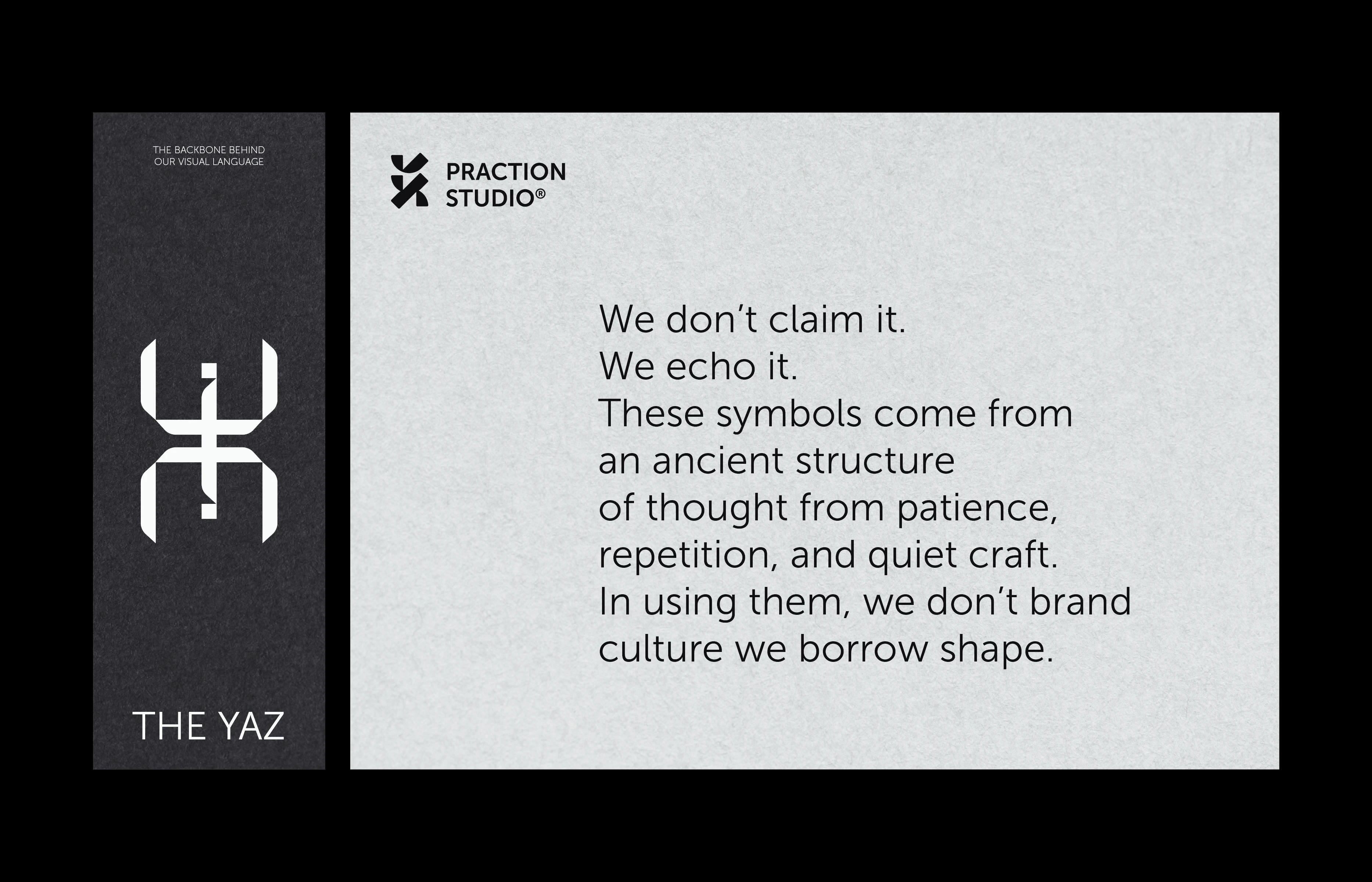
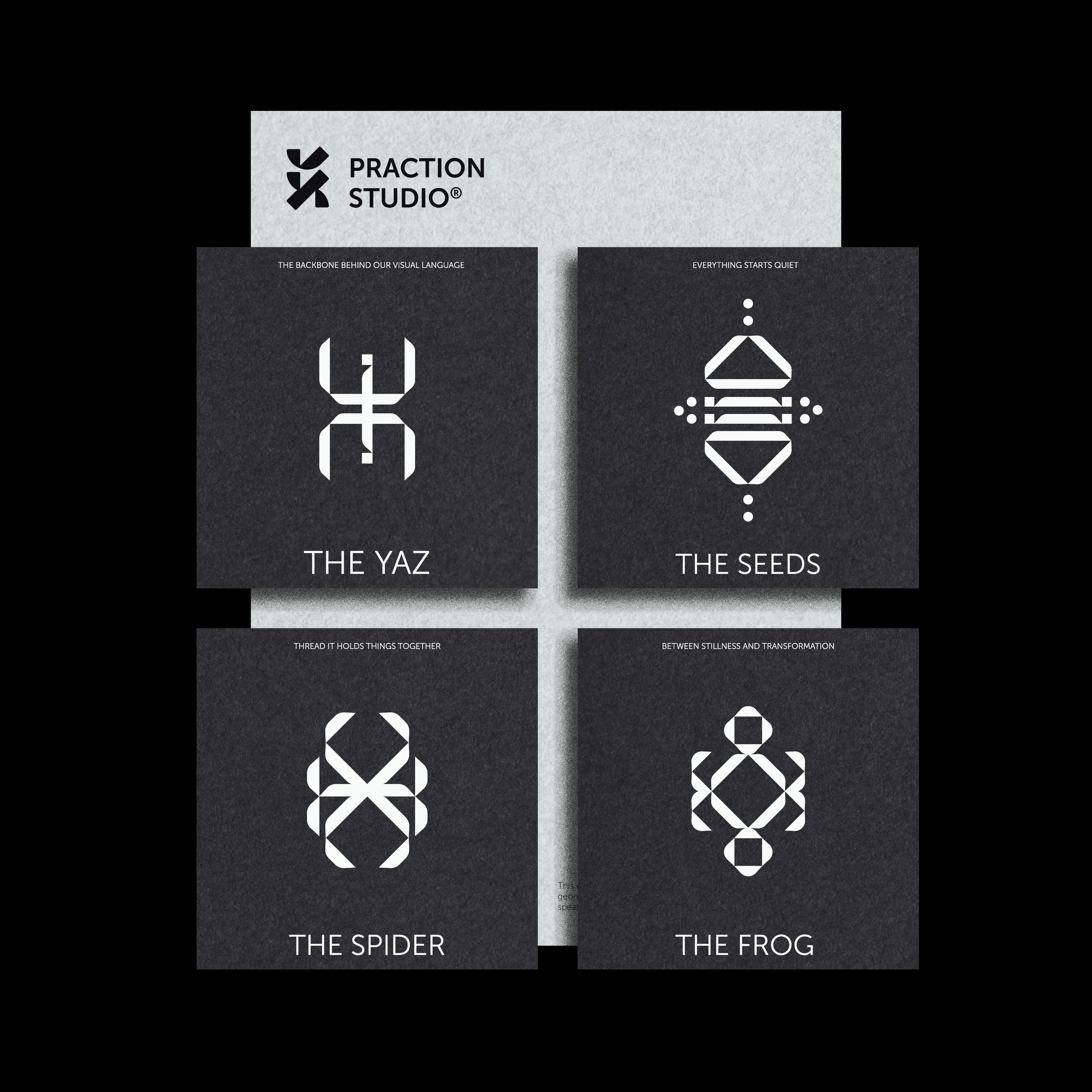
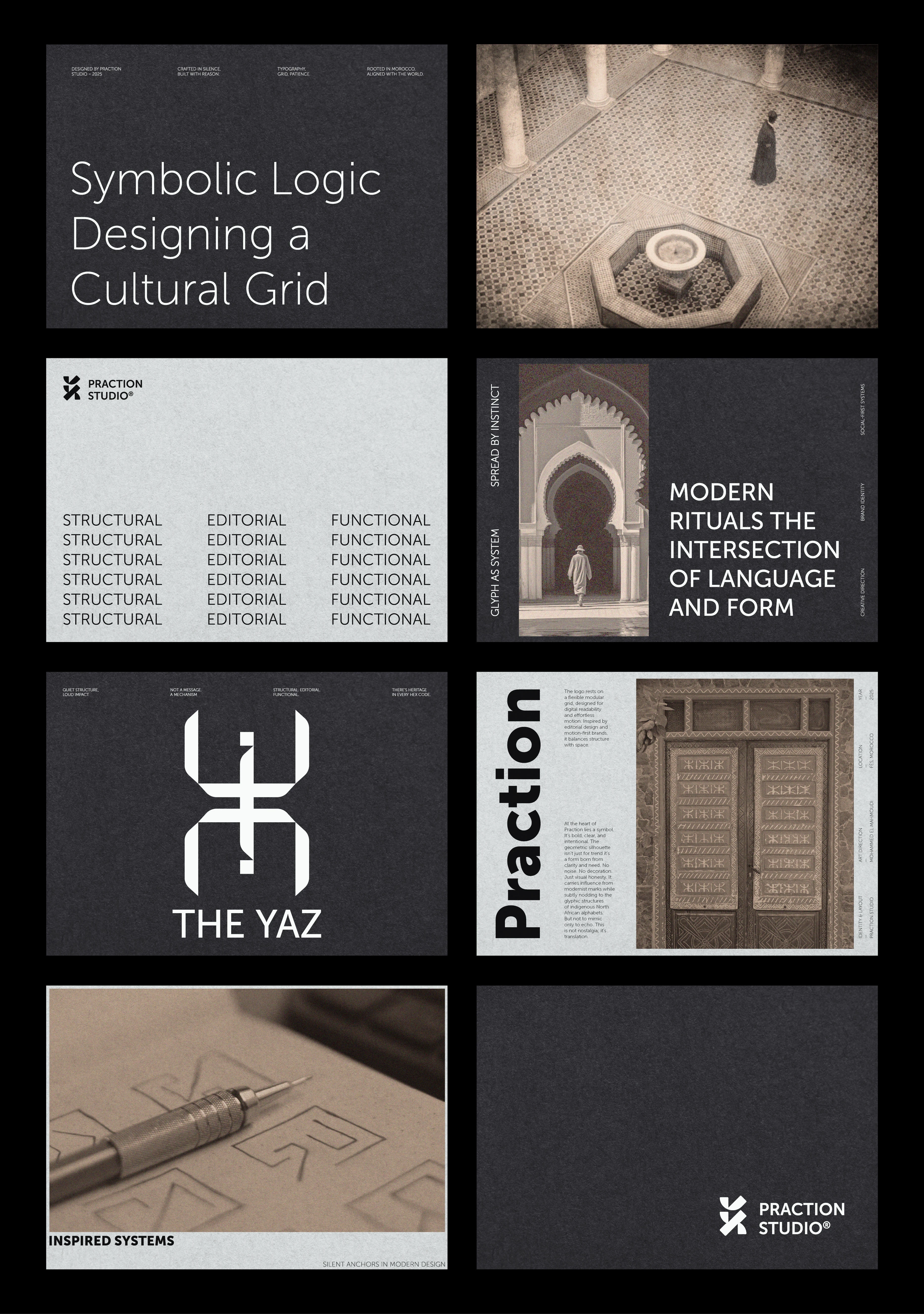
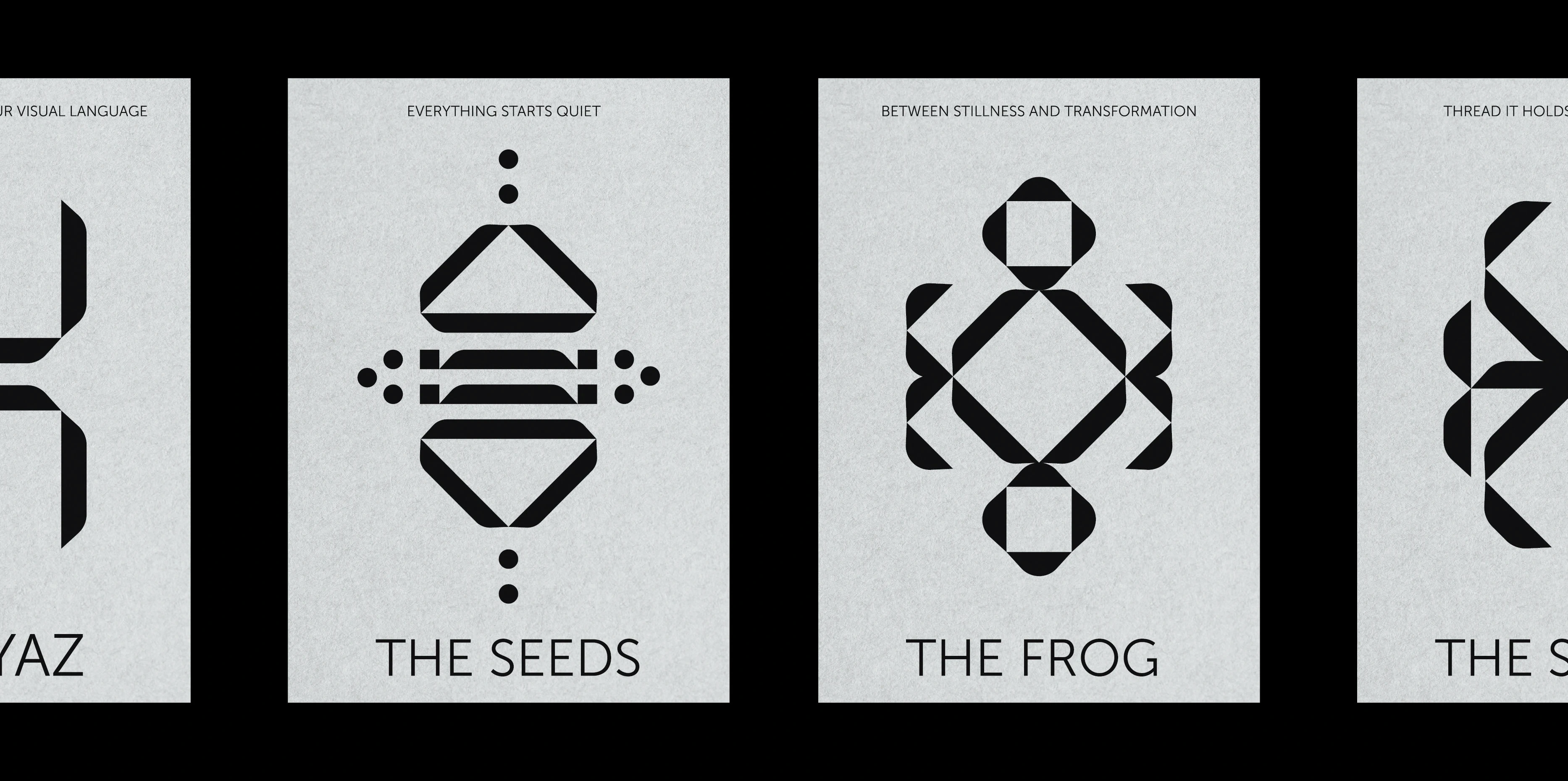
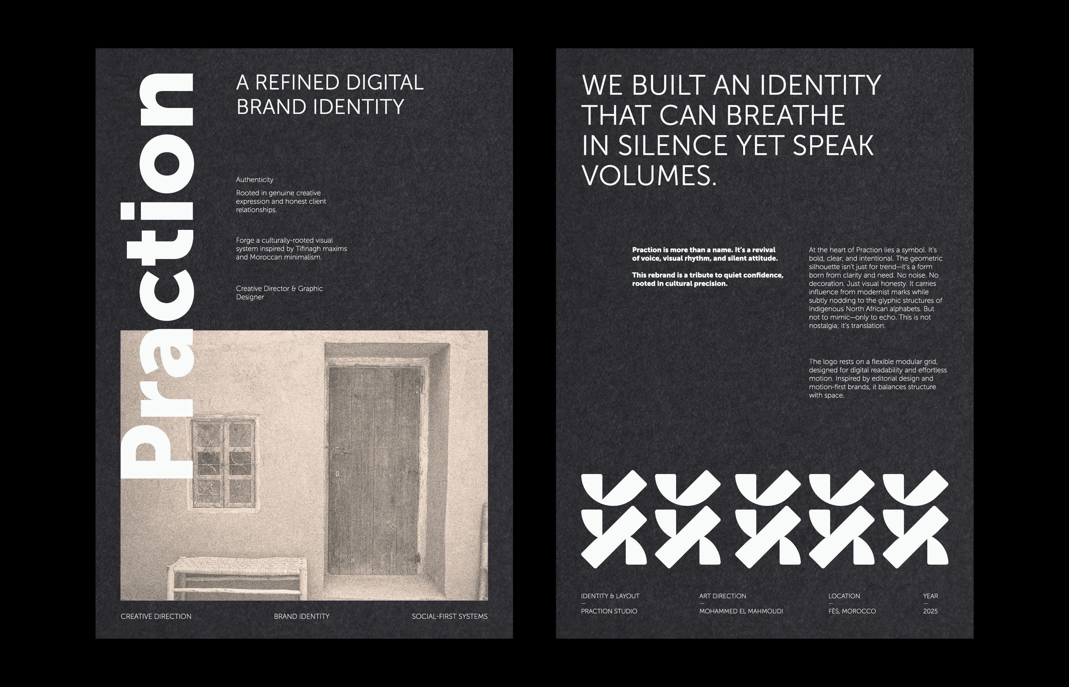

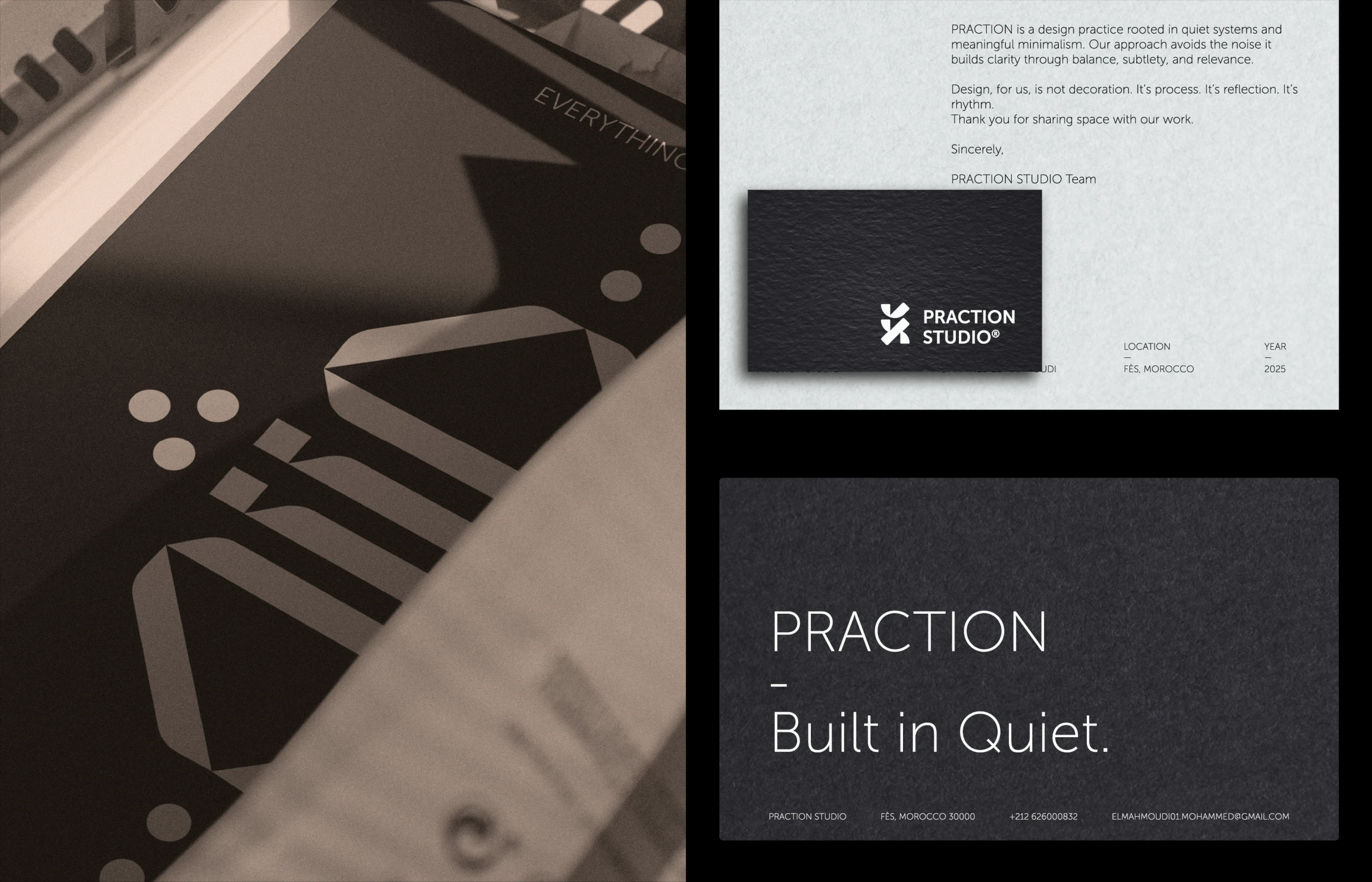
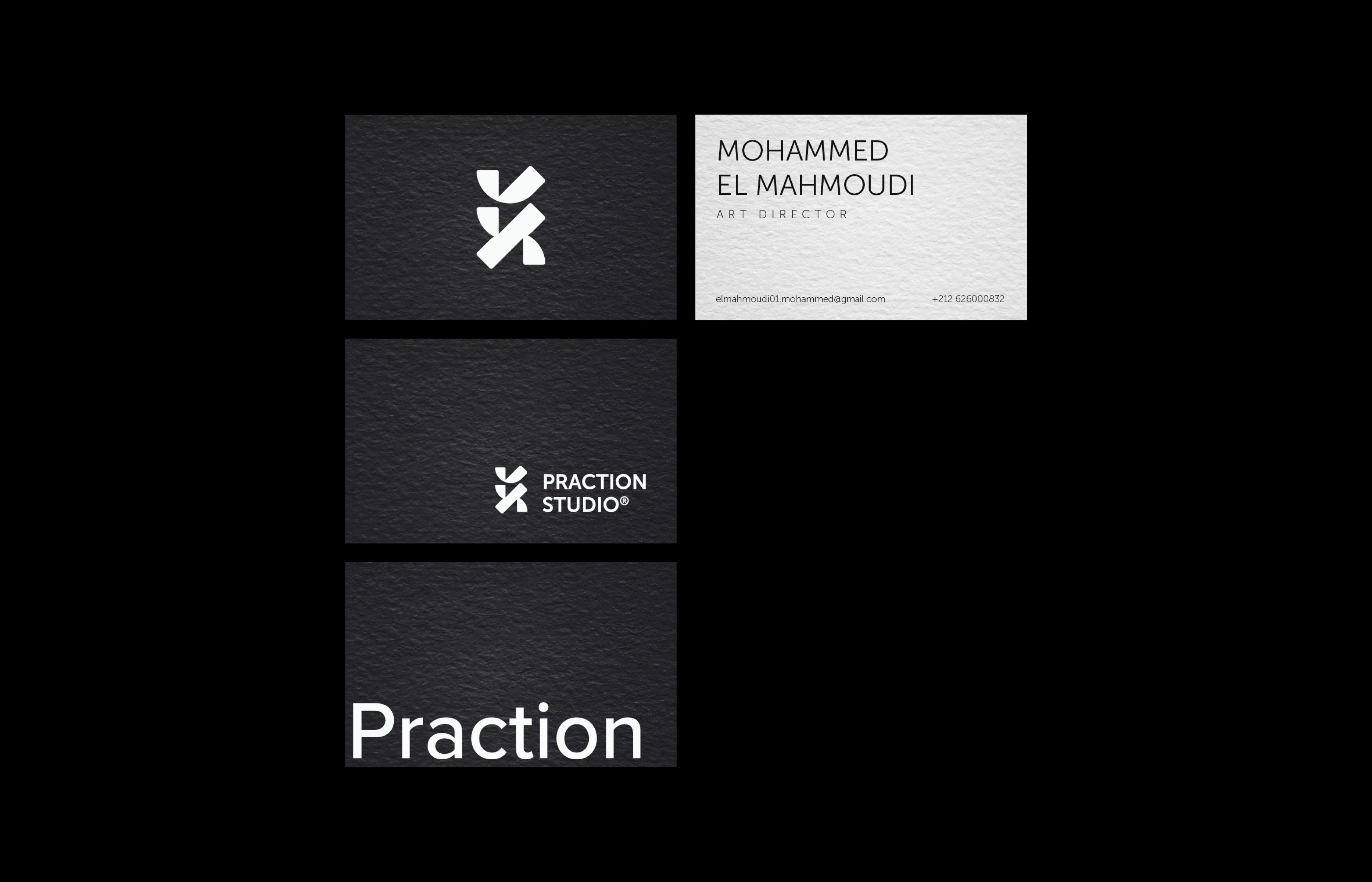
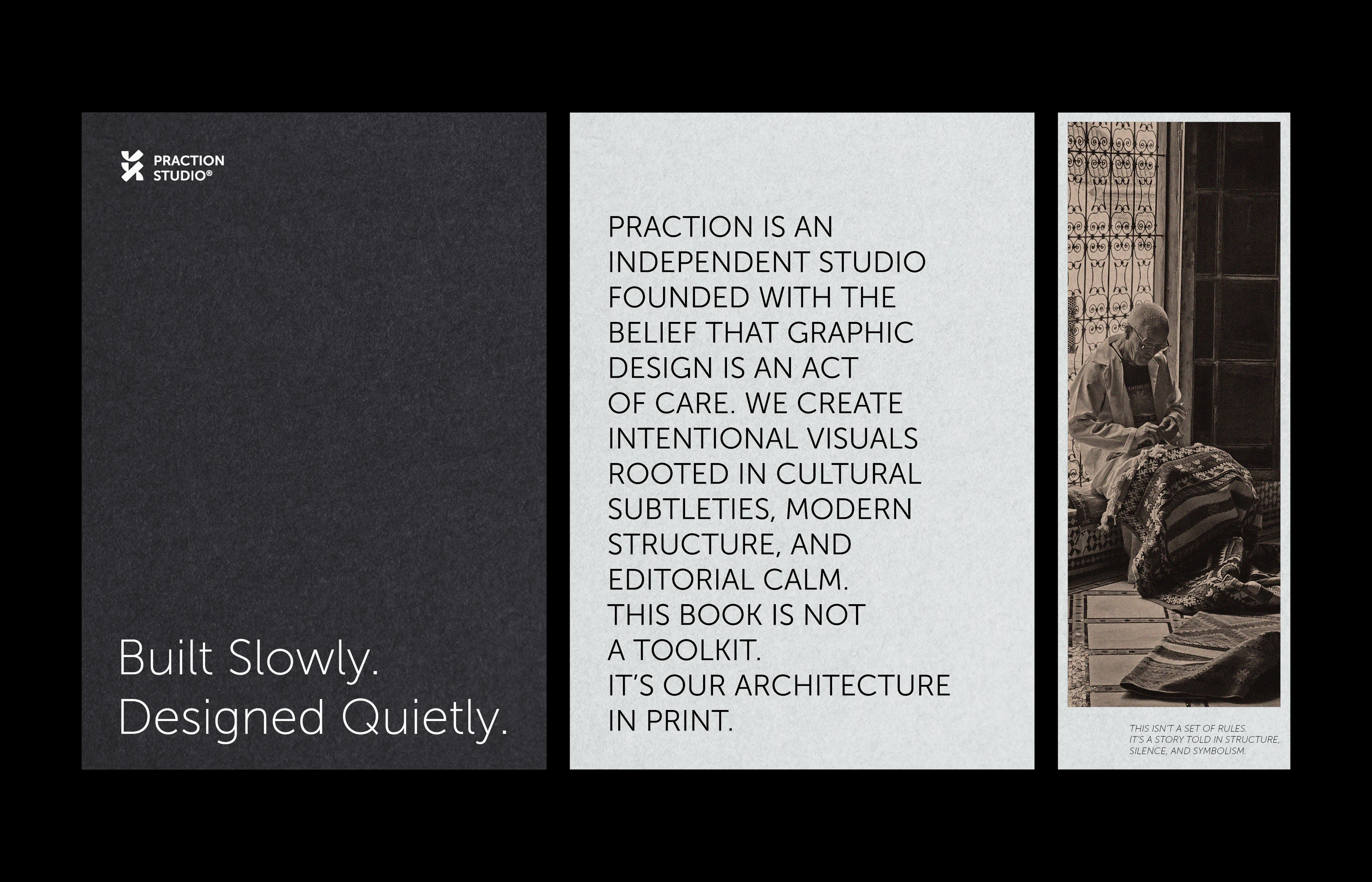
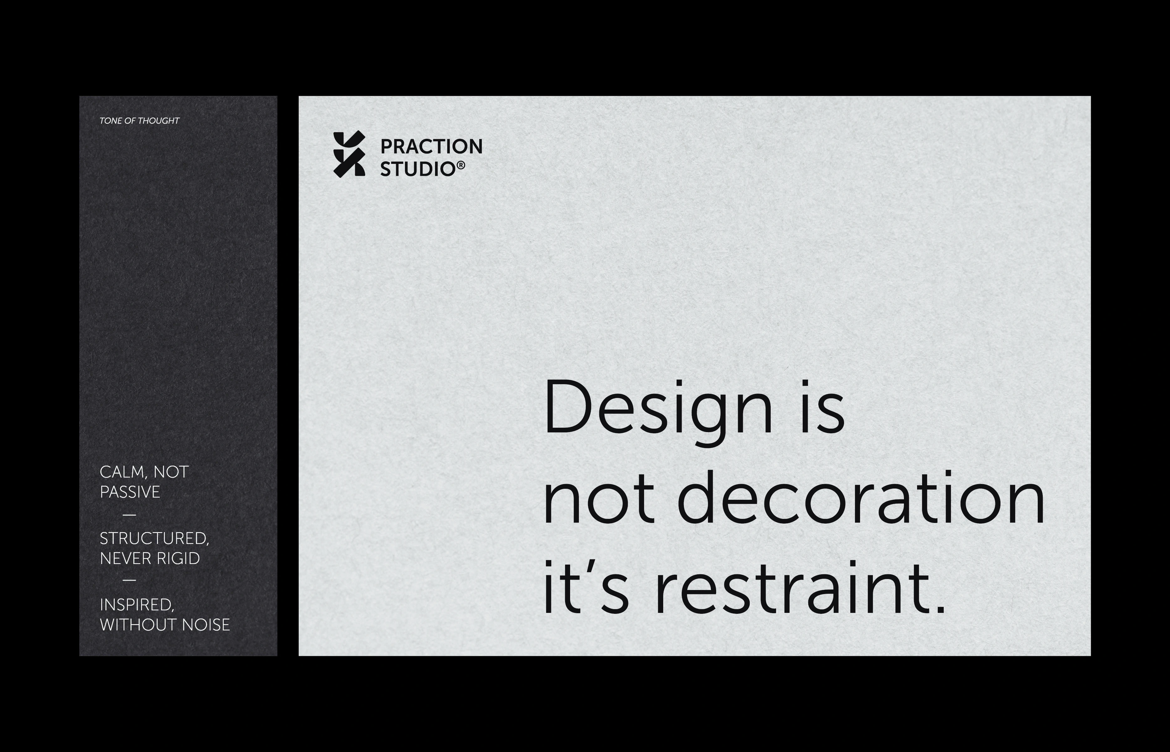
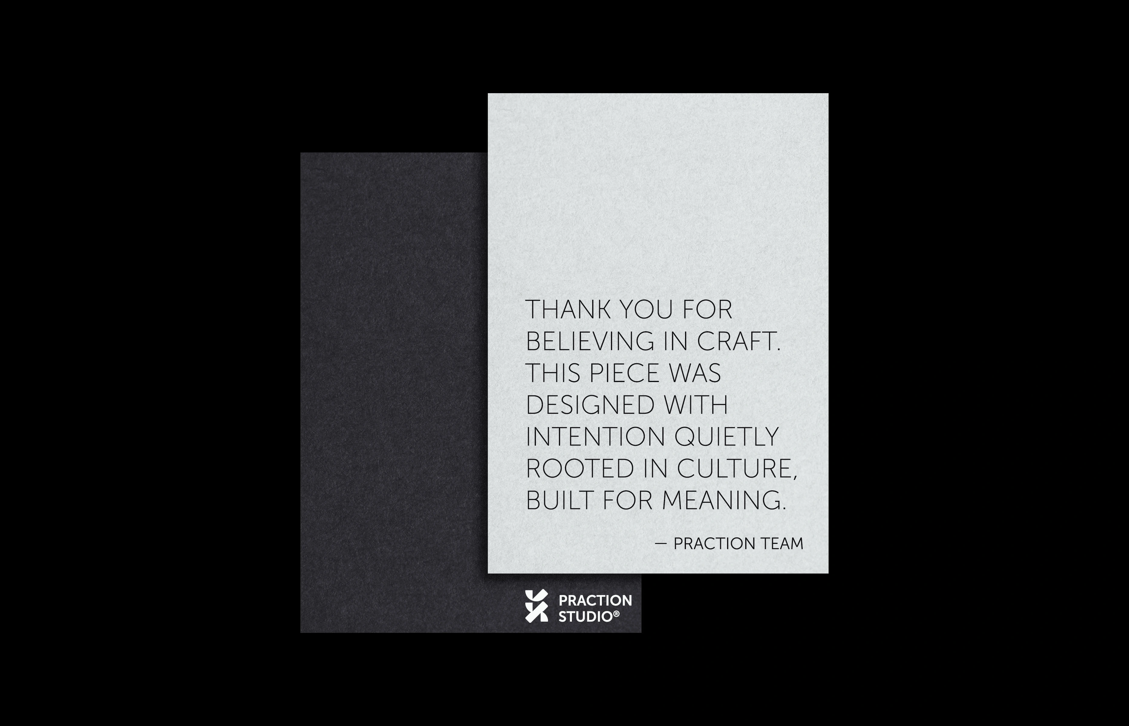
Image Credits
Photography used throughout this case study was sourced from talented artists on:
Unsplash
-
Pexels
-
Flickr
-
As well as archival imagery published in the public domain via Archive.org.
Huge thanks to the creators who made these visuals available your contributions brought depth and soul to this presentation.

Like this project
Posted Jul 20, 2025
Rebranding of PRACTION with a new identity reflecting clarity and editorial elegance.
Likes
1
Views
6
Timeline
Apr 7, 2025 - Dec 7, 2025