Theory of Tea
Marie Hermez
Visual identity for a (fictional) premium tea brand, made for those who like and enjoy it as an experience. The identity is placed under four major values : the elegance, the balance, the diffusion and the person.
The logo evokes the steam escaping from a cup of tea and forms the silhouette of a person about to drink it. It puts the consumer at the center of the brand and includes him as a key element. The roundness, the downstrokes and upstrokes bring softness
and tranquility. The typographic choice reintegrates elegance and reinforce the balance and the overall stability of the logo.
The wide choice of colours represent the six major categories of tea, allows to create variations and gradients
Different types of logo and their minimal size
Construction of the logo
Logo variations for every teas
Packaging - First version - Black Tea
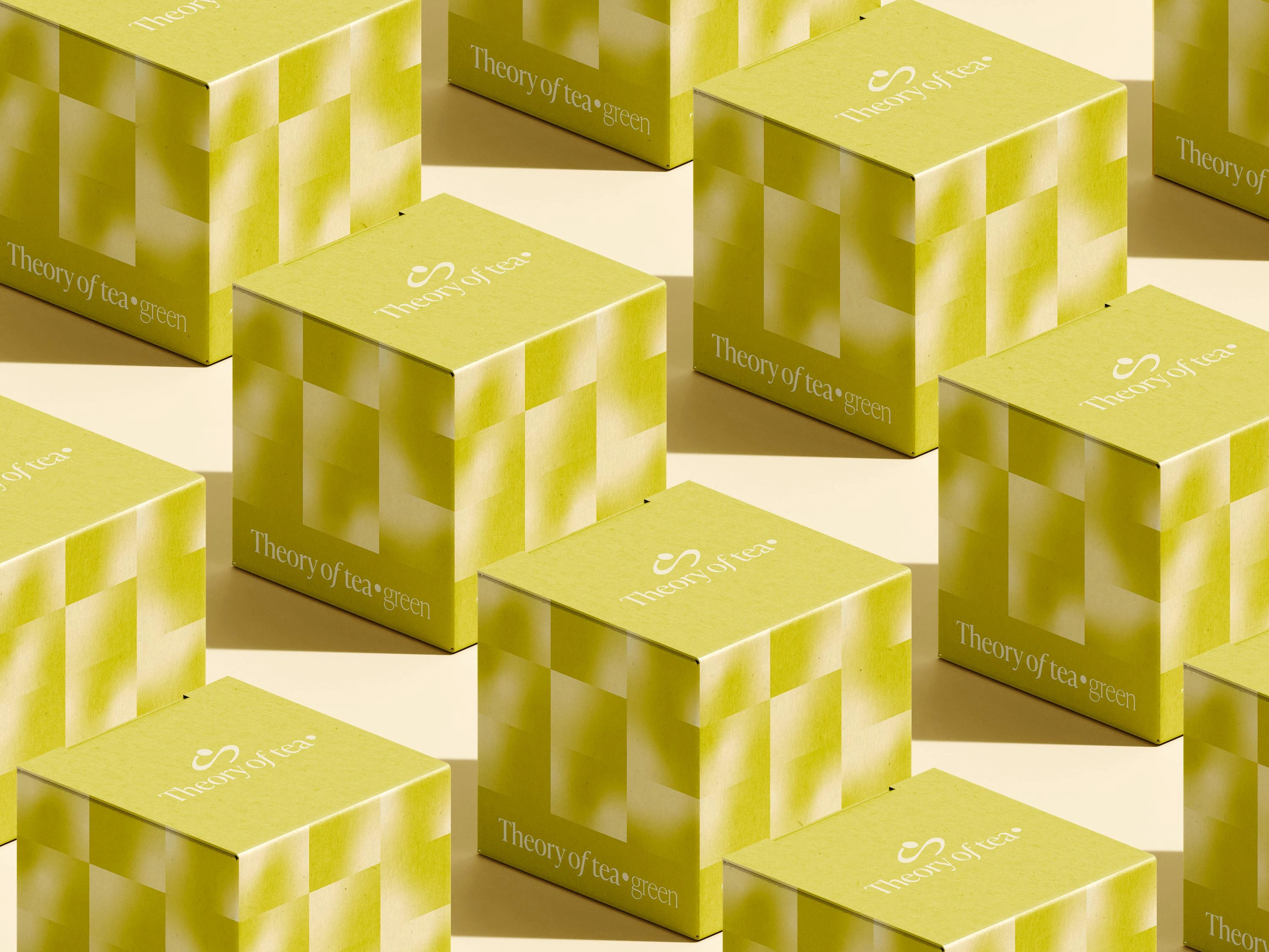
Packaging - Second version - Green Tea
Like this project
Posted Jan 7, 2025
Visual identity for a fictional Premium Tea brand